
Thank you! Your submission has been received!
Oops! Something went wrong while submitting the form.


Sprint teams often discover aging work too late - at the review, when a missed commitment is already a fact. The Sprint Aging chart shifts that conversation earlier by showing exactly which items are at risk, which sprint stages are accumulating work, and how current progress compares to your team's own historical delivery patterns.
From a single Scrum team to a multi-team SAFe ART, Agile WIP Charts scale to match your scope. Select one or multiple boards, segment aging by any Jira field, and share insights directly on a Jira dashboard, so the whole team stays aligned without needing to open the app separately.
✅ Agile Coach I use the Sprint Aging chart to help teams develop a habit of flow-based thinking. Reviewing aging data together during stand-ups and retrospectives shifts the team's focus from individual task updates to collective ownership of in-progress work.
✅ Scrum Master I open the Sprint Aging chart at every stand-up to focus the team's attention on the oldest items first. It replaces the question "what did you do yesterday?" with "what is blocking this item from moving forward?"
✅ Engineering Manager I use the chart to detect where in the development workflow work tends to slow down - for example, whether items are aging in code review or testing more than in active development. It helps me rebalance capacity before the bottleneck impacts the sprint outcome.
✅ Delivery Manager I use the Sprint Aging chart to get a cross-team view of delivery health without having to attend every stand-up. Aging patterns across boards help me identify where to focus support and where escalation may be needed.
✅ Release Manager I use the chart to monitor whether items are getting stuck in deployment or release stages at the end of the sprint. Aging in late workflow stages often points to environment issues, approval delays, or missing automation that slows down the final steps of delivery.



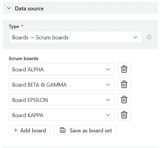
The Sprint Aging chart supports one or multiple Scrum boards as a data source, giving you flexibility to analyze sprint work at any scale - from a single team to a cross-team or program-level view.
To add a board, select Boards → Scrum boards in the Data source section and pick a board from the list. If your organization runs multiple teams on separate boards, click Add board to include them all in one chart.
✅ This feature is helpful for
The Sprint Aging chart gives you a real-time view of how long work items have been sitting in each stage of your sprint workflow. Instead of waiting until the sprint review to discover delays, the chart surfaces aging risks as they develop, so the team can act before items miss their commitment. Each item is compared against your team's own historical performance, making the thresholds evidence-based rather than arbitrary.
📊 How to read the chart
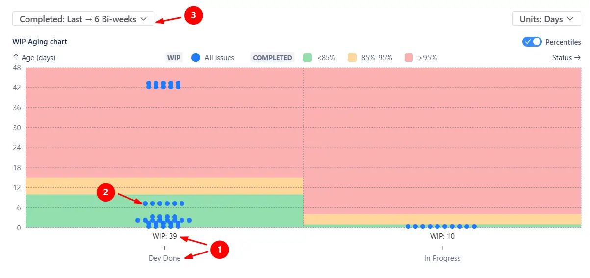
Each column represents a workflow stage (1️⃣), with a WIP indicator showing how many items are currently in that stage. Each dot represents an individual work item (2️⃣), positioned by how long it has been in its current stage - the higher the dot, the longer it has been waiting. Hover over a dot to see the issue key, assignee, and full age details.
The colored percentile zones are calculated from completed issues over a selected historical interval (3️⃣):
In the example, most items in In Progress sit in the green zone, while one item in Dev Done has been there for 42 days, well into the red, signaling it may need escalation before the sprint ends.
✅ This feature is helpful for
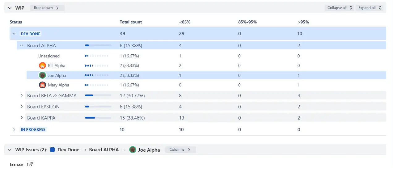
The Breakdown and Issue list below the chart lets you move from a high-level view to a detailed analysis of who owns the aging work. Segment current WIP items by any Jira field across two levels: for example, Board → Assignee, or Issue type → Epic, to pinpoint exactly where aging is concentrated. Click Find issues from any row to inspect the individual tickets behind each segment.
✅ This feature is helpful for
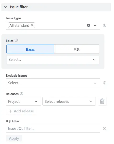
The Sprint Aging chart can be narrowed down to a specific slice of sprint work using issue filters. Instead of analyzing everything on the board, focus on the exact subset of work that is most relevant - whether that is a particular issue type, epic, or a custom JQL query.
You can filter by:
✅ This feature is helpful for
Once the chart is configured, you can share it in two ways. Add it as a gadget to any Jira dashboard to keep sprint aging visible to the whole team without anyone needing to open the app. For reporting outside Jira, export the chart as a PNG or PDF to include in stakeholder updates, PI planning documentation, or retrospective materials.
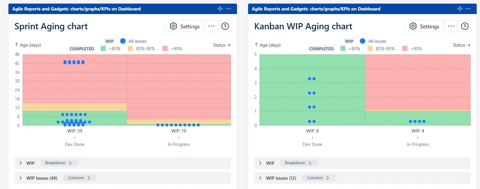
✅ This feature is helpful for
The chart offers several configuration options to ensure the aging analysis reflects how your team actually works:


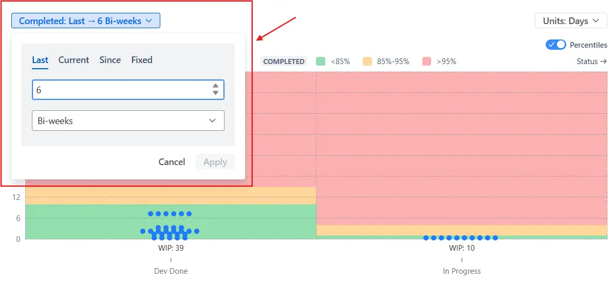
Jira's Average Age Report was not designed for sprint flow analysis. It tells you the average age of unresolved issues, but gives you no way to act on that information during an active sprint:
❌ It shows a single aggregated number with no visibility into individual items - you cannot tell which specific tickets are at risk or need attention.
❌ There is no breakdown by workflow stage, so you cannot see where in the sprint work is getting stuck or accumulating.
❌ There is no percentile context - the report cannot distinguish between a normally aging item and an outlier that warrants escalation.
❌ It is limited to a single board with no way to combine multiple Scrum teams, which makes it impractical for SAFe teams tracking aging across an ART.
❌ There are no filtering or segmentation options - you cannot focus the analysis on a specific issue type, epic, or assignee.
The Sprint Aging chart provides a detailed, real-time view of aging work across your sprint workflow:
Use these examples to create your own WIP Aging report use cases on the Jira Dashboard.
Both Jira apps (plugins) featured here offer a 30-day free trial and are completely free for teams of up to 10 users:
The Agile Reports and Gadgets app includes WIP Aging chart functionality plus a wide range of additional charts and reports.





.svg)



.png)
