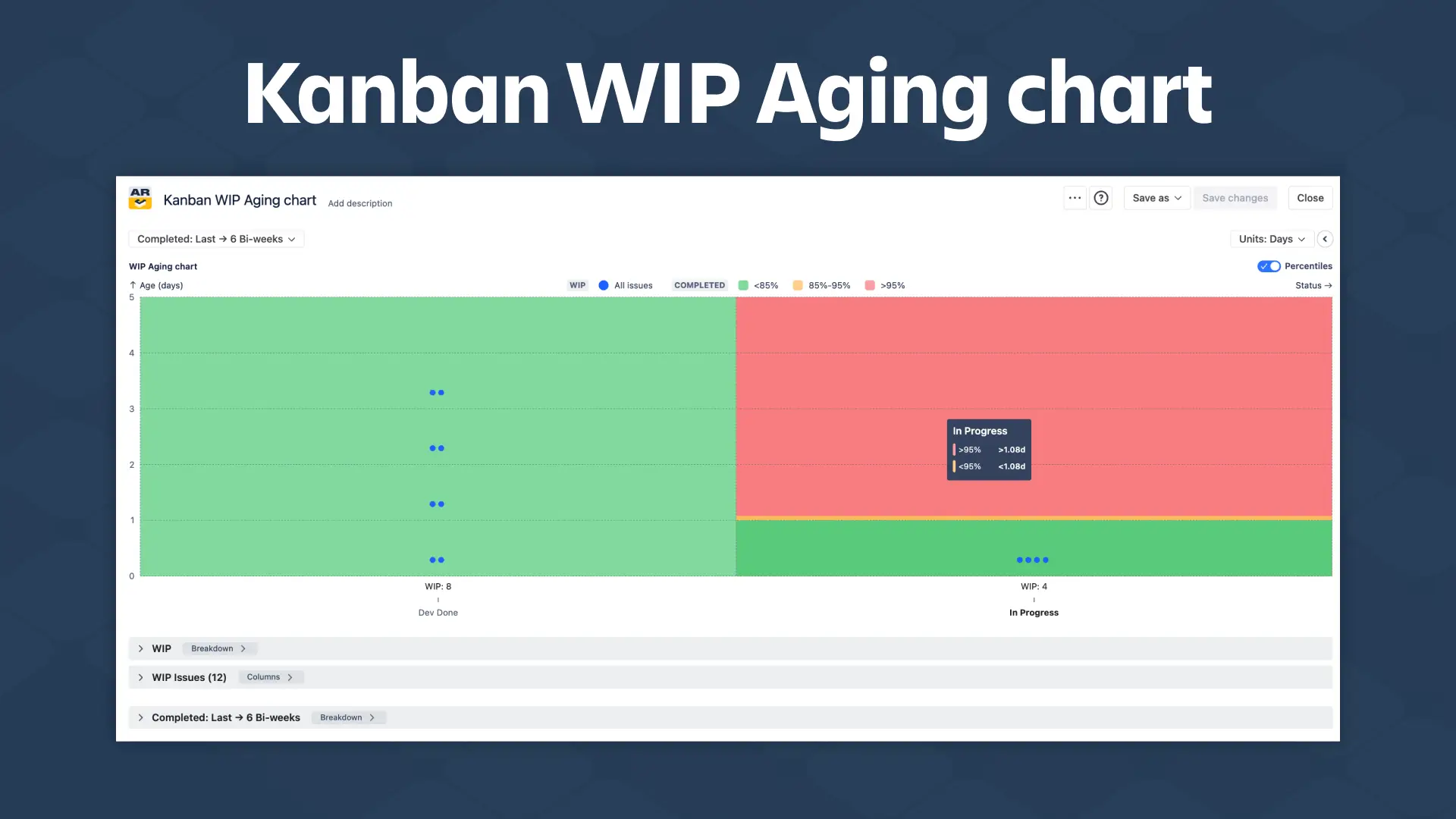
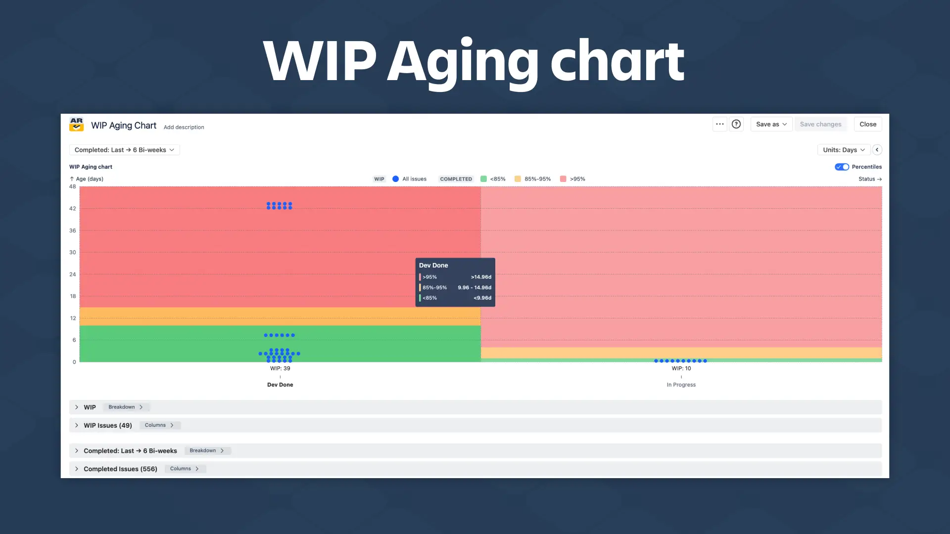
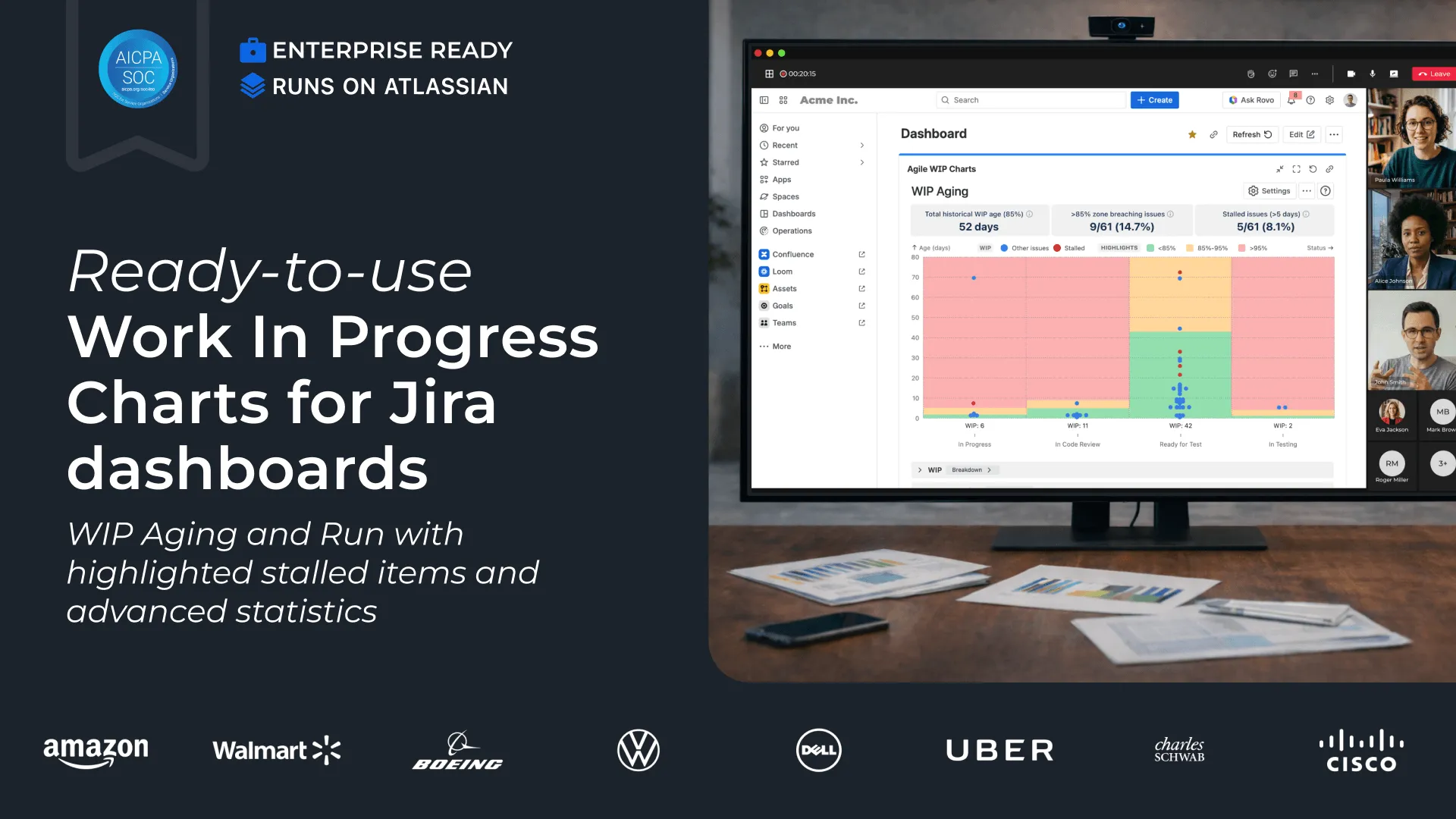
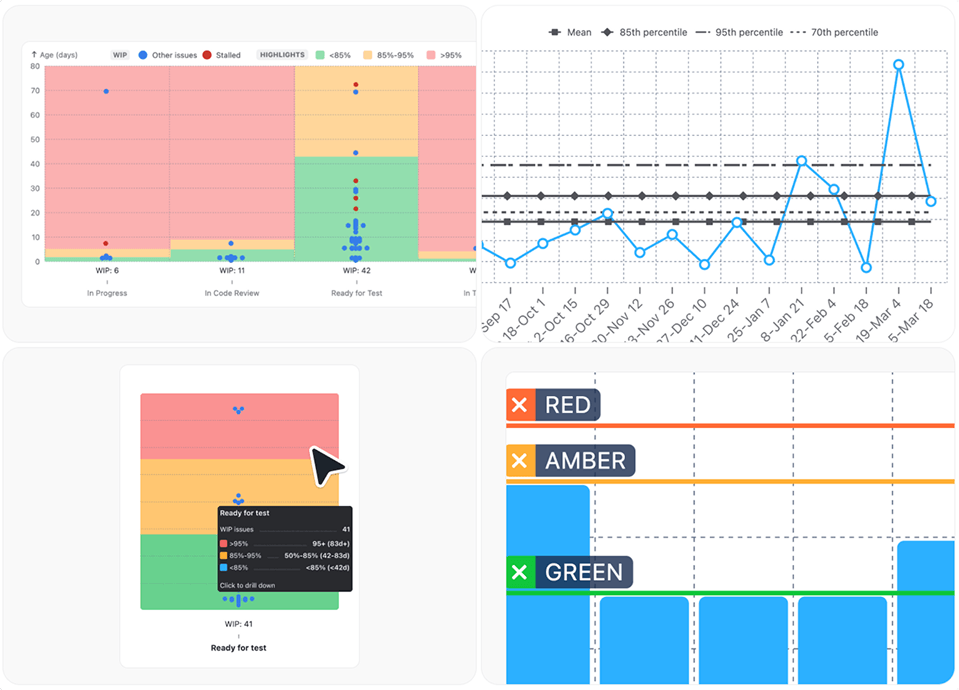
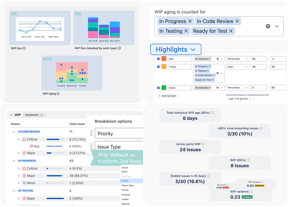
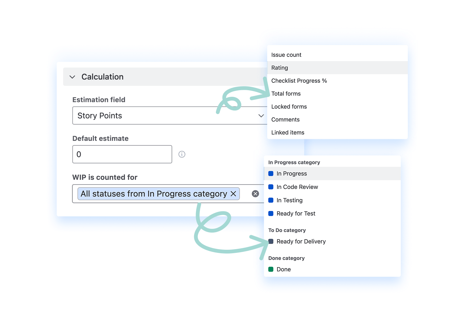
Agile WIP Charts
Two perspectives. One complete view of your WIP items.
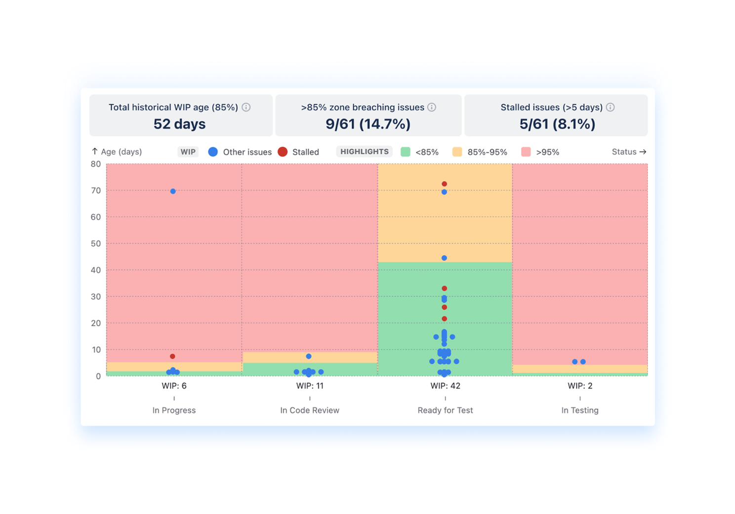
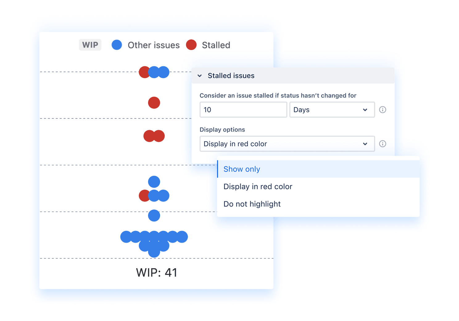
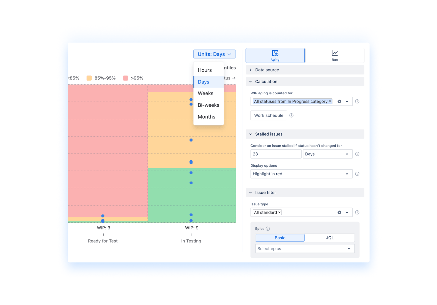
- See how long work stays in each workflow stage (WIP Aging chart)
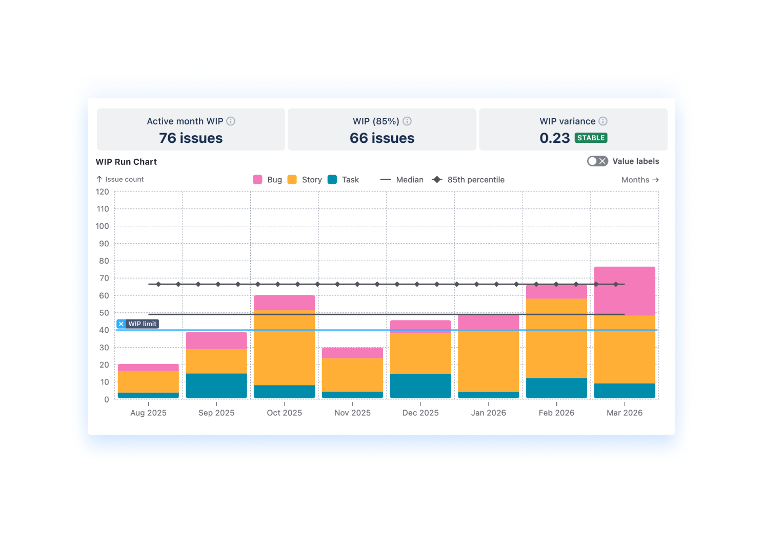
- See how much work is in progress over time (WIP Run chart)
- Detect bottlenecks, spikes, and flow inefficiencies early
- Validate insights with real issue-level data


.png)


.png)