
Thank you! Your submission has been received!
Oops! Something went wrong while submitting the form.


The WIP Aging chart gives you a clear, real-time view of how work progresses across your workflow by showing how long items have been in each stage. It helps you quickly identify aging work, detect bottlenecks, and understand where the flow is slowing down. With flexible data source selection, customizable WIP definitions, percentile-based highlights grounded in historical performance, and detailed Breakdown and Issue list views, you can analyze work at any level - from a single team to a portfolio.
Whether you are triaging daily work or investigating systemic delays, the Agile WIP Charts provide the visibility needed to catch risks early and keep flow under control.
✅ Product Owner
I use the WIP Aging chart to see whether work is progressing smoothly across the workflow. It helps me identify items that are taking longer than expected and prioritize work that risks missing commitments.
✅ Scrum Master
I use the chart during stand-ups to identify aging and stalled items. It helps the team focus on removing blockers and keeping work flowing, rather than starting new tasks.
✅ Tech Lead / Engineering Manager
I use the work item aging chart to understand where work slows down in the development process. It helps me detect bottlenecks (for example, in code review or testing) and rebalance capacity.
✅ Release Train Engineer (RTE)
Across multiple teams, the WIP Aging chart helps me identify systemic bottlenecks and aging work that may impact program delivery. It highlights where flow breaks down across the ART.
✅ C-level Executive
I use the WIP aging report to understand where work tends to slow down across the organization. Persistent aging in certain stages signals systemic issues that may impact delivery predictability.


WIP Aging chart allows you to analyze work in progress across any scope in Jira, from a single team to a multi-team or portfolio-level view. Instead of being limited to one board, combine multiple data sources to reflect how your organization actually works. You can build your WIP analysis using:
%20Aging%20chart%20in%20Jira.webp)
✅ This feature is helpful for
The WIP (Work in Progress) aging report in Jira shows how long work items have been in progress across each stage of your workflow, helping you quickly identify aging items, bottlenecks, and flow risks. Instead of focusing on completed work, the chart visualizes only current WIP, allowing teams to take action before delays impact delivery.
📊 How to read the chart
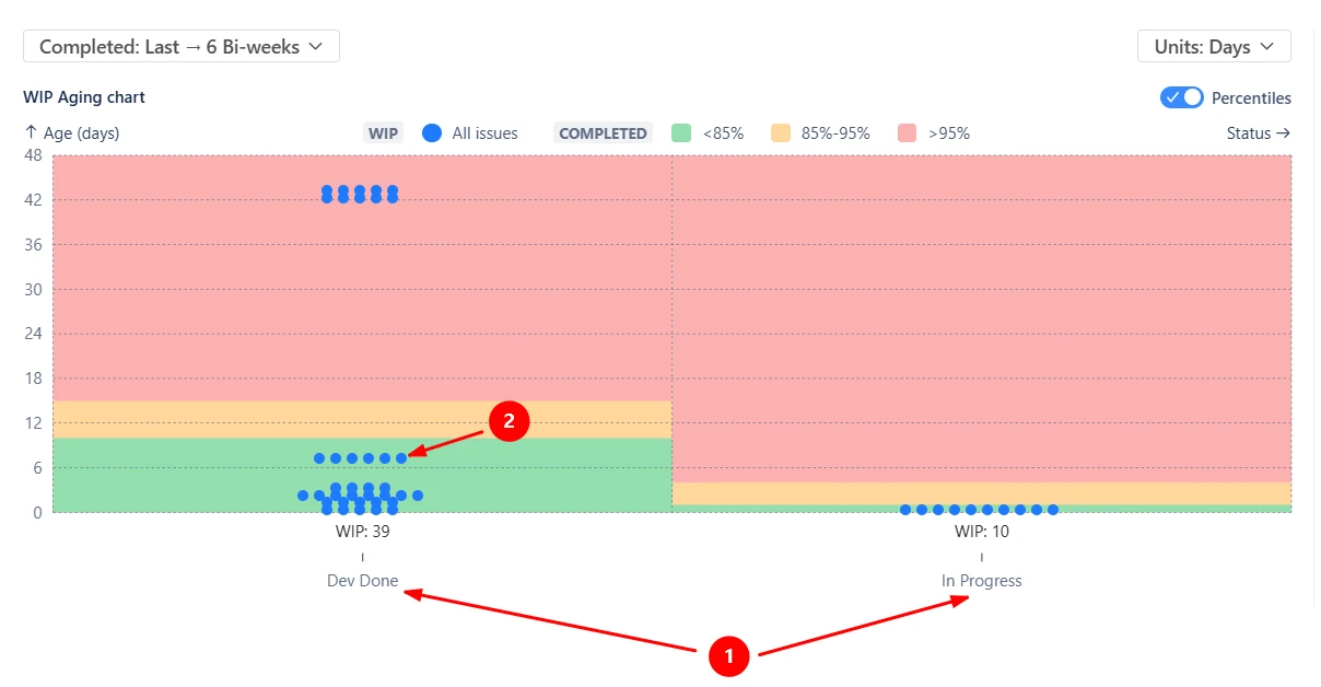
Each column represents a workflow stage (1️⃣), with a WIP indicator showing how many items are currently in that stage. Each dot represents an individual work item (2️⃣), positioned according to how long it has been in that stage. Items higher on the chart have been waiting longer and may require attention.
In the example, most items in In Progress are relatively new, while several items in Dev Done have been sitting significantly longer, indicating a potential bottleneck or waiting stage.
✅ This feature is helpful for
Percentile highlights allow you to compare the age of current work items against the historical performance of completed issues, helping you quickly identify items that are aging beyond expectations.
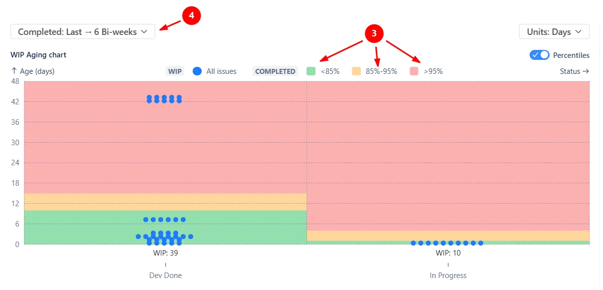
By default, the chart displays three highlight zones (3️⃣):
These thresholds are calculated using completed issues from a selected historical interval (for example, Last → 6 bi-weeks (4️⃣)). This means aging is evaluated relative to your team’s actual past performance, not arbitrary limits.
✅ This feature is helpful for
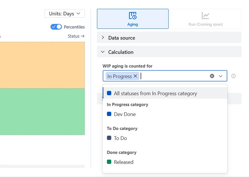
By default, the chart includes all statuses from the In Progress category. However, many workflows include additional steps, parallel stages, or intermediate statuses that may or may not represent active work.
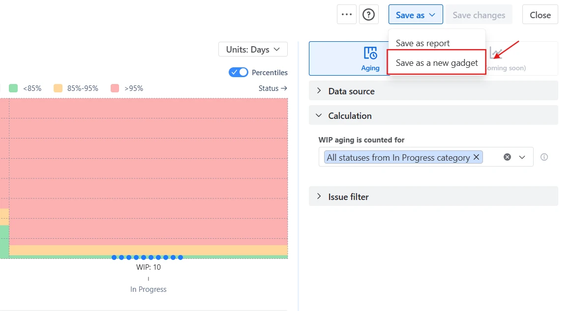
With custom WIP statuses, you can select exactly which statuses should be included in the analysis to reflect how your team actually works. The selected statuses define which items appear on the chart, how WIP age is calculated, and which workflow columns are displayed.
✅ This feature is helpful for
The Aging chart is supported by Breakdowns and Issue lists that help you move from a high-level view to a detailed analysis of individual work items. These views cover both current WIP items displayed on the chart (5️⃣) and historical completed items used as a benchmark for percentile highlights (6️⃣).
The Breakdown summarizes items across workflow stages and allows you to segment data by any Jira field across two levels (for example, Issue type → Assignee (7️⃣)). The Issue lists allow you to inspect the exact items behind each segment (8️⃣).

✅ This feature is helpful for
The aged WIP (Work in progress) chart allows you to refine the dataset using Issue filters, ensuring the analysis reflects exactly the work you want to track. This helps you isolate specific slices of work, such as a single team, a release, an initiative, or high-priority work, and avoid noise from unrelated items.
You can filter by:
%20aging%20chart.webp)
You can export the WIP Aging chart as an image (PNG) or PDF, making it easy to share insights with stakeholders outside Jira. This is useful for reporting in team or stakeholder meetings or documenting flow analysis and bottlenecks.
%20aging%20chart%20in%20the%20Jira%20dashboard.webp)
Jira does offer an Average Age Report, but its capabilities are limited compared to what teams typically need for flow analysis:
❌ It provides only a single aggregated metric (average age), with no visibility into distribution, outliers, or individual items.
❌ It does not show which specific items are aging, making it difficult to act on risks.
❌ It is typically limited to a single board or scope, with no support for combining multiple boards or focusing on a specific epic or release.
❌ There is no way to define what counts as WIP - the report relies on default workflow assumptions.
❌ There is no breakdown by workflow stages, so you cannot see where work is getting stuck.
❌ It lacks percentile-based insights, so teams cannot distinguish between typical aging and outliers.
❌ There are no visual thresholds or highlights to identify at-risk or overdue work.
❌ There is no way to segment the underlying data through Breakdown.
The WIP Aging chart in the Broken Build app provides a detailed, real-time view of work in progress:
Use these examples to create your own WIP Aging report use cases on the Jira Dashboard.
Both Jira apps (plugins) featured here offer a 30-day free trial and are completely free for teams of up to 10 users:
The Agile Reports and Gadgets app includes WIP Aging chart functionality plus a wide range of additional charts and reports.
WIP aging refers to how long work items have been in progress without being completed. It helps teams understand how long work stays in the system and whether items are progressing within expected timeframes.
WIP age measures how long an item has been in progress so far, while cycle time measures how long it took to complete an item after it is finished. WIP age is used to monitor current work and detect risks early, whereas cycle time is used to analyze past performance and delivery speed.
The work item aging chart shows how long each in-progress item has been in its current workflow stage. It visualizes individual items, highlights those aging beyond typical thresholds, and helps identify bottlenecks or delays in real time.
Aged WIP refers to work items that have been in progress longer than expected based on historical performance or defined thresholds. These items are more likely to be delayed and may indicate blockers, bottlenecks, or process inefficiencies.
Items appear high on the chart simply because they have spent a long time in their current stage, not necessarily because they are blocked. This can happen when work is complex, low priority, waiting for external input, or intentionally paused. Even if progress is ongoing, a long duration in one stage will increase the item’s age and move it higher on the chart.
You can either add the WIP Chart gadget to your Jira dashboard or create a chart from the app’s Home page or your team’s space page, then save it to a dashboard as a gadget.
Once added, the chart updates automatically based on the selected configuration and always reflects the latest data:
Yes, you can analyze both Kanban and Scrum teams in a single WIP Aging chart by selecting Projects or using a custom JQL filter as your data source. This allows you to combine work from different boards and workflows into one view, making it easier to track aging across multiple teams or delivery models.


.svg)

.png)
