The interactive chart is available on larger screens
Please open this page on a desktop to try it out
Key features of Sprint velocity chart
The Sprint velocity chart helps Scrum teams track the progress, spot planning gaps, and adjust plans based on actual performance. By visualizing commitment, scope change, and completion statuses, it shows how delivery aligns with sprint goals - across one or multiple Scrum teams.
You can analyze 10 velocity metrics, drill into issue lists and breakdowns, and explore trends for each metric. Relative (%) views, moving averages, and target lines with capacity allocation help to track and improve the most important Scrum metrics.
Unlike static reports, this chart provides real-time insights that instantly reflect Jira updates, enabling smarter sprint planning and continuous improvement.
➡️ While native Jira only includes a basic Velocity chart, with the Agile Velocity Chart Gadget, you unlock advanced metrics, targets, and deep analysis right on your Jira Dashboard.
How different roles use Sprint velocity report
✅ Delivery Leaders (Managers / RTEs): Track aggregated sprint progress of multiple teams aligned at the program level, commitments vs. completed work, monitor scope changes, and set targets for consistent planning. Ensure that delivery aligns with organizational goals and provides transparency for stakeholders.
✅ Scrum Masters: Explore detailed velocity metrics, breakdowns, and completion statuses to improve sprint outcomes. Use relative views and moving averages to spot stability issues and drive continuous improvement. Gain insights that support sprint planning, sprint progress tracking, and sprint review discussions, helping teams stay aligned and deliver consistently.
✅ Agile Coaches: Combine capacity allocation and targets to assess team health and value delivery sustainability. Leverage velocity insights to coach teams and scale practices across the organization. Apply these metrics during sprint retrospectives to identify improvement areas and strengthen long-term delivery practices.
Turn sprint goals into measurable results with SPRINT VELOCITY CHART
✅ Completion status – completed vs. not completed work
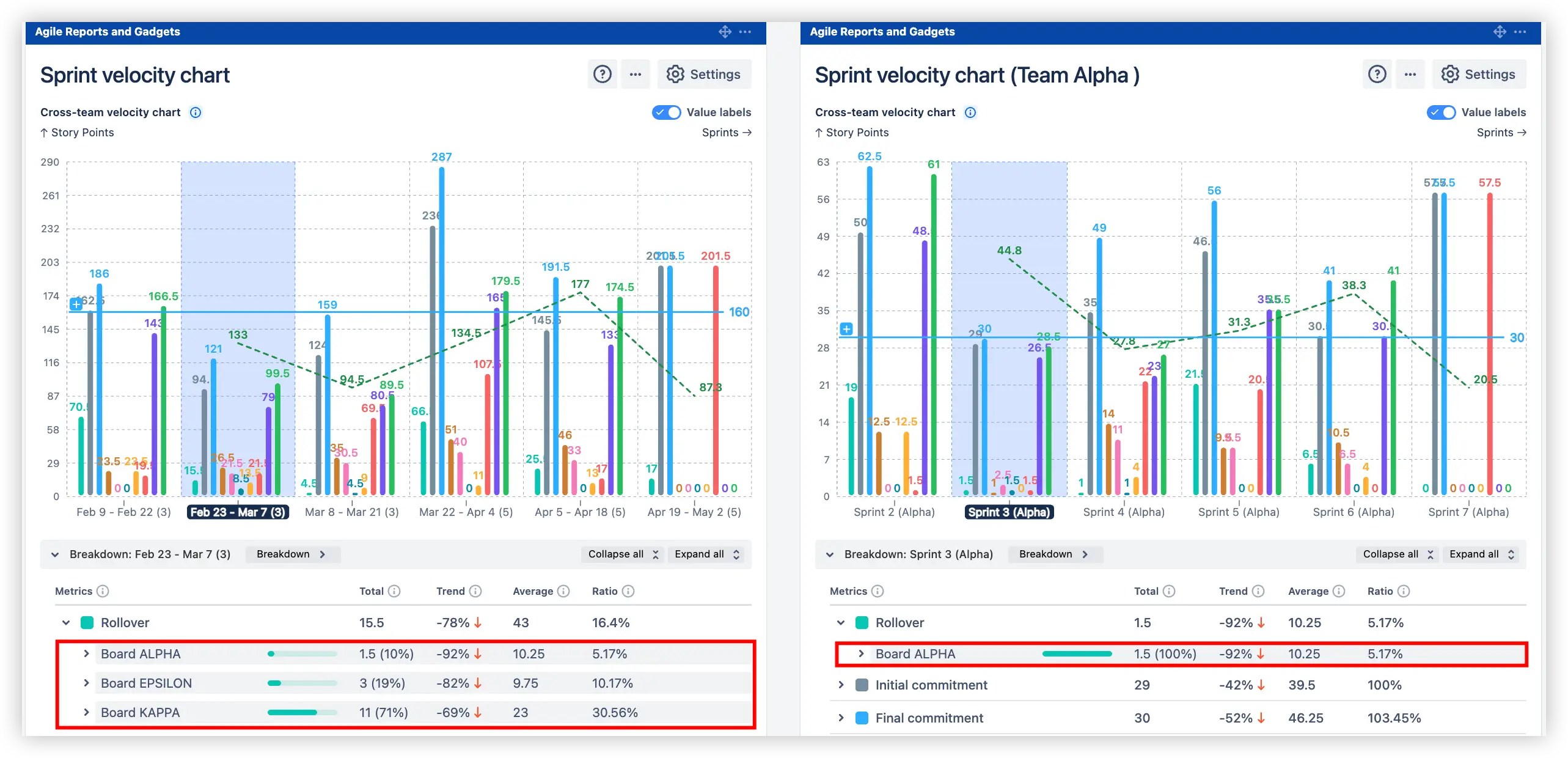
10 velocity metrics tracking on the Jira velocity chart for sprint
Compare results across one or multiple Scrum teams to see trends and planning accuracy:
10 velocity metrics tracking across one or multiple Scrum teams on the Jira Dashboard
✅With these insights, you can:
Compare say/do ratio (planned vs. actual) delivery for each sprint
Detect scope creep and frequent estimation changes
Spot unfinished work and rollover trends that affect estimation and forecasting reliability
Evaluate sprint planning accuracy across multiple teams
This feature helps Scrum Masters, Product Managers, and Agile Coaches uncover hidden inefficiencies and improve predictability by basing sprint planning on real delivery data rather than assumptions, enabling more effective sprint reviews and retrospectives.
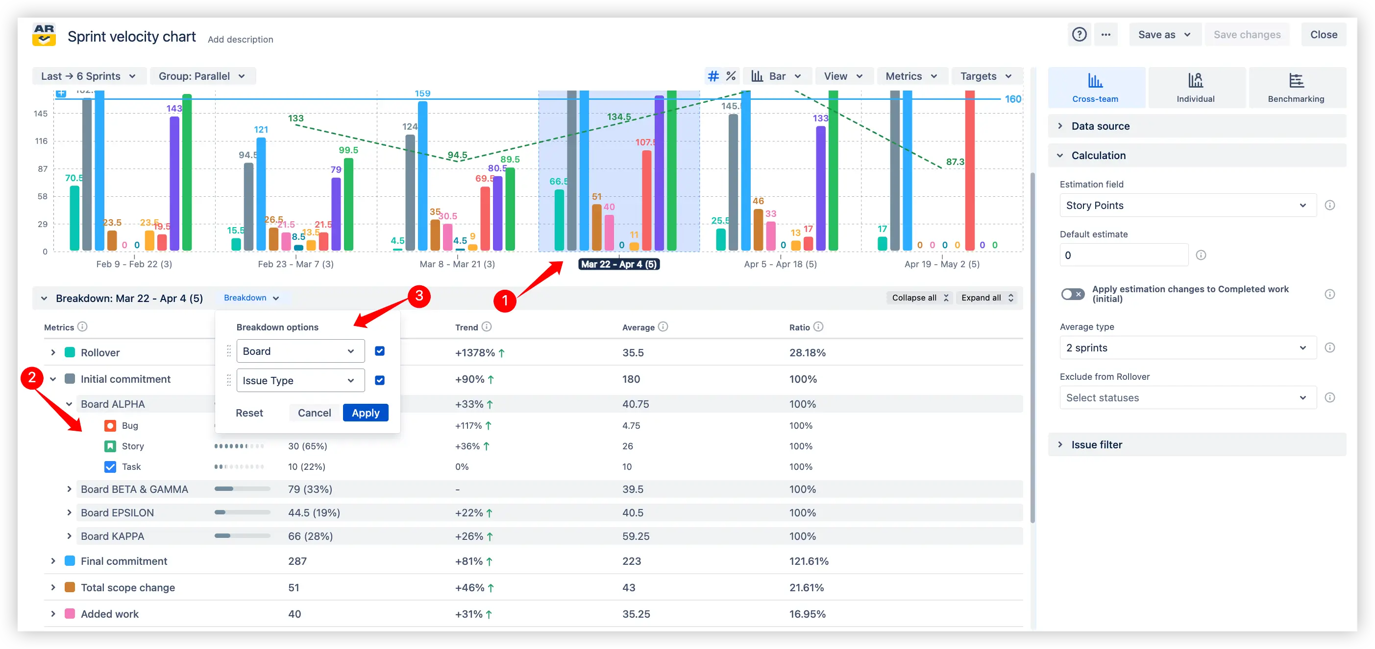
2. Key feature: Breakdowns and Issue list for deep analysis
Go beyond high-level metrics with detailed breakdowns and issue-level visibility directly in the Sprint velocity chart in Jira. To view the Breakdown and Issue list, select a specific sprint on the chart (1️⃣) and scroll down:
🔎 Breakdowns – segment velocity data by any Jira field (2️⃣), e.g., issue type, and track totals, trends, averages, and ratios to uncover hidden anomalies or performance shifts. You can also apply nested breakdowns (3️⃣) with up to two levels of grouping (e.g., by Board and Issue type, or any other Jira field) to analyze velocity from multiple perspectives.
Breakdownsby any Jira field for deep analysis in the Sprint velocity report example
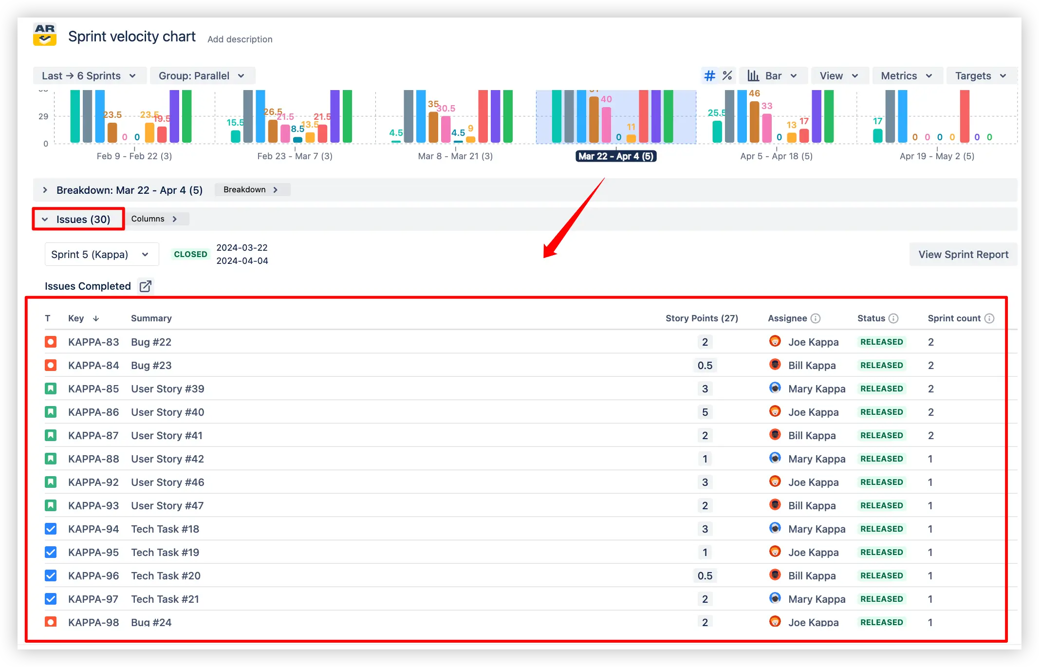
📋 Issue list – validate the underlying data by reviewing the exact issues that make up each metric (e.g., Final commitment, Rollover, Completed work). This ensures data accuracy and transparency in delivery outcomes.
Issue list for deep analysis on the Sprint velocity graph in the Jira dashboard
✅With these insights, you can:
Identify which issue types impact velocity the most
Detect anomalies or unexpected spikes in specific categories
Trace metrics back to individual issues for complete clarity
Make retrospectives more data-driven and actionable
This feature enables Scrum teams to link metrics directly to the work items and categories that shape them, allowing for smarter analysis, improved sprint progress tracking, and continuous improvement through data-driven sprint retrospectives.
Dive deeper into your sprint performance by analyzing each velocity metric individually, helping teams improve accuracy in sprint planning:
📊 Select any metric under the Sprint velocity chart gadget (e.g., Rollover, Final commitment, Completed work) to see its detailed breakdown across sprints.
🔎 View totals, trends, averages, and ratios for the chosen metric to uncover performance shifts and recurring patterns.
🧩 Drill down into related issue types or categories (e.g., Bugs, Stories, Tasks, Priorities) for more granular insights.
Velocity metrics in-depth analysis in Jira
✅With these insights, you can:
Detect which sprint velocity metrics fluctuate most and impact value delivery reliability
Spot recurring bottlenecks such as rollover or unfinished work
Identify improvement opportunities in planning or execution
Track how changes in scope or estimation affect actual results
This feature gives Agile teams full transparency into how each sprint velocity metric contributes to sprint outcomes, making it easier to align sprint planning with real delivery capacity and track sprint progress with confidence.
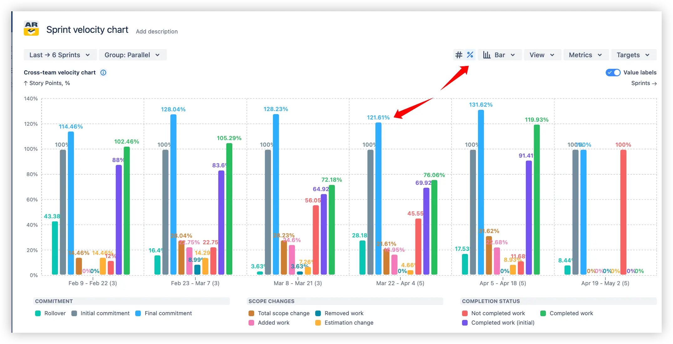
4. Key feature: Relative values (%) view
Normalize velocity metrics with a percentage-based view on the y-axis. Instead of absolute story points, the Sprint velocity report displays values as percentages up to 100%, making it easier to compare progress across sprints of different sizes.
Percentage-based view of the Sprint velocity chart example
You can choose what counts as 100% for calculations (e.g., Initial or Final commitment), and visualize delivery consistency with the say/do ratio – the percentage of committed work actually delivered.
Delivery consistency visualization in the Jira Sprint velocity report
✅With these insights, you can:
Assess how much of the planned work was completed (say/do ratio)
Compare sprints consistently, regardless of scope size
Highlight over- or under-delivery in percentage terms
Improve transparency when communicating progress to stakeholders
This feature helps Scrum teams track sprintplanning accuracy and delivery reliability, ensuring progress reports reflect reality rather than raw numbers.
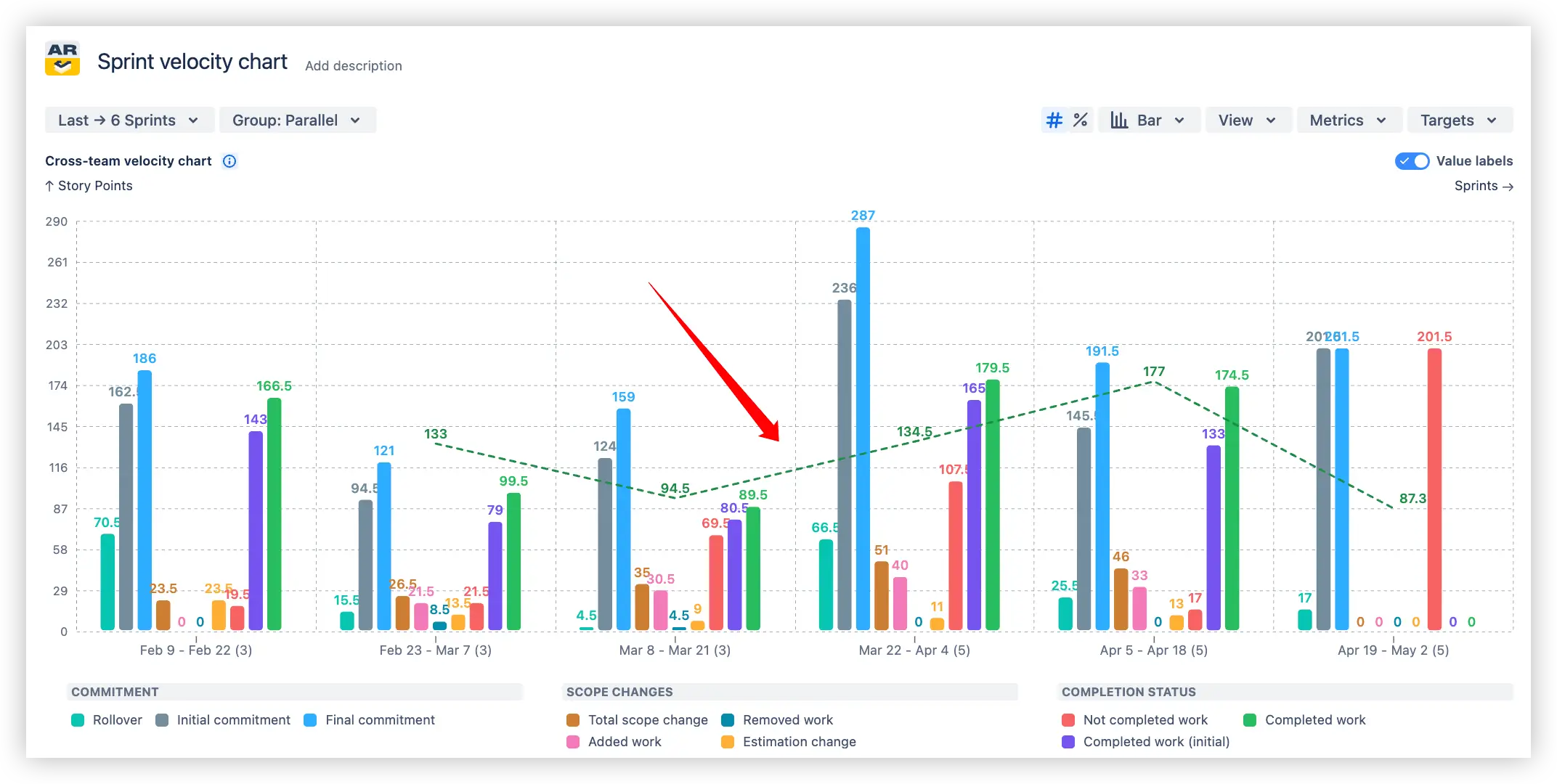
5. Key feature: Moving average trend line
Track long-term delivery stability with a moving average trend line applied to completed work.
💡 The average line can be visualized for any velocity metric, not just completed work, giving teams more flexibility in analyzing trends.
The Sprint velocity chart smooths fluctuations by averaging results across a configurable number of sprints, helping you clearly see whether your team’s output is increasing, decreasing, or staying consistent - supporting more accurate sprint planning and sprint progress tracking.
Moving average trend line in the Jira sprint velocity chart
⚙️ Custom settings:
Average: Only for Completed work (or any selected metric)
Average type: Choose the number of sprints to calculate the trend line
Settings for the Moving average trend line in the Sprint velocity chart
✅With these insights, you can:
Detect gradual improvements or slowdowns in delivery performance
Avoid misinterpretations caused by short-term spikes or dips
Communicate progress to stakeholders with a clear trend line
Use historical data to support realistic planning for future sprints and more meaningful sprint reviews
Make retrospectives more data-driven by highlighting long-term patterns for sprint retrospectives
This feature highlights the true delivery trend behind sprint results, making it easier to base planning on sustainable performance rather than isolated sprint outcomes.
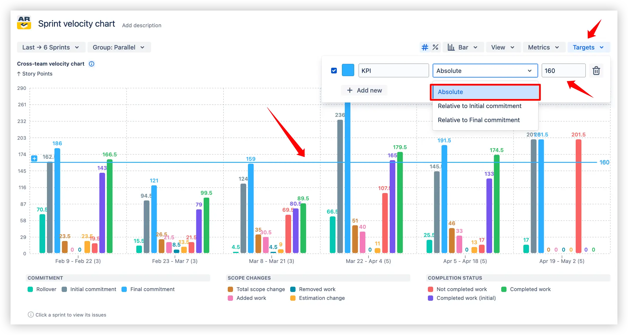
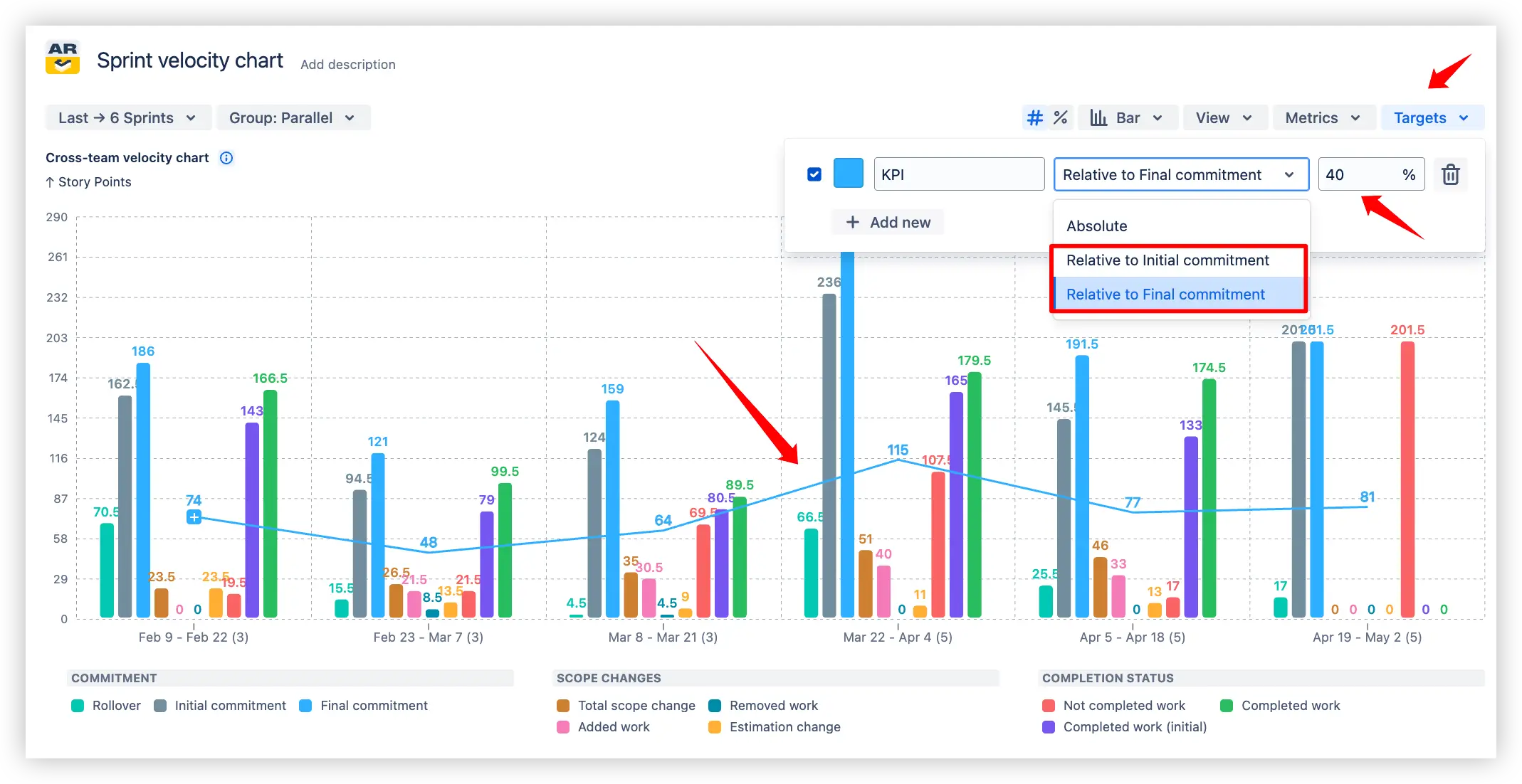
6. Key feature: Sprint velocity performance against targets
Set target lines on the Sprint velocity chart to track KPIs and measure sprint outcomes against expectations. Targets appear as horizontal lines, making it easy to compare actual scrum team velocity with planned goals during sprint planning and sprint progress tracking.
🎯 Target types:
Absolute – A flat line with a fixed value.
Sprint velocity performance against the absolute target line
Relative to Initial commitment – A moving line that adjusts in percentage relative to the initial scope.
Relative to Final commitment – A moving line that adjusts in percentage relative to the final scope.
Sprint velocity performance against the relative target line
✅With these insights, you can:
Align sprint value delivery with organizational or team KPIs
Easily check if your team stays within planned commitments, hits Agile sprint velocity targets, or delivers the expected amount of work
Highlight consistent performance or recurring gaps in planning
Create accountability by visualizing expectations directly on the Sprint velocity chart in Jira dashboard
This feature ensures sprint results are evaluated not in isolation, but against clear performance benchmarks, bringing transparency to delivery commitments.
Additional features of the Sprint velocity chart
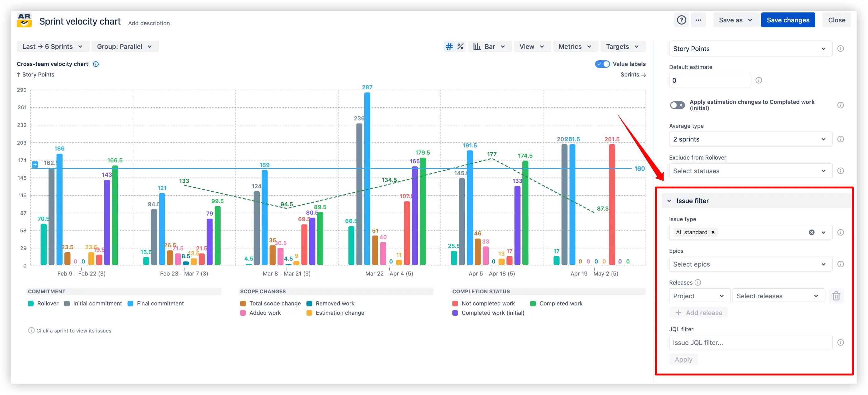
1. Advanced issue filtering
Refine the chart scope to match your workflow by applying flexible filters:
Filter by issue types
Focus on specific epics
Limit data to selected releases
Use a custom JQL filter for maximum control
Advanced issue filtering in the Sprint velocity chart on the Jira dashboard
Advanced issue filtering in the Sprint velocity chart on the Jira dashboard
✅ This feature makes it easy to tailor the Sprint velocity chart to the exact set of issues you want to analyze, ensuring your insights stay relevant and actionable for sprint planning and retrospectives.
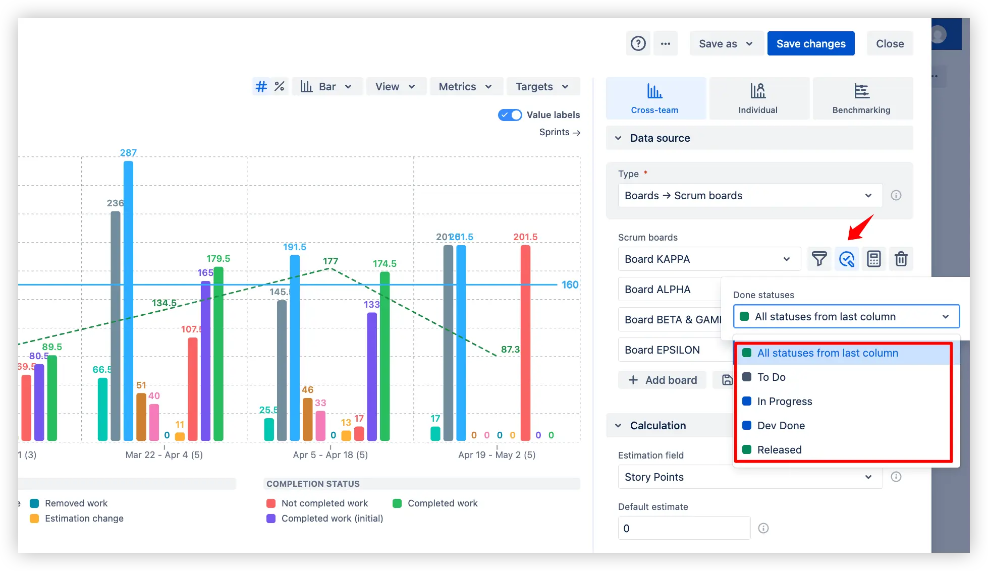
2. Flexible done-status configuration
Adapt the Scrum velocity chart to your team’s unique workflow by customizing what counts as “done.”:
Select all statuses from the last column
Or specify particular statuses such as Ready for Delivery, In Progress, In Code Review, In Testing
Flexible done-status configuration in the Sprint velocity report in Jira
✅ This flexibility ensures completed work is measured according to your team’s actual process, keeping sprint team velocity data accurate and meaningful for sprint progress tracking and sprint reviews.
3. Sprint capacity allocation
Use target lines on the Velocity chart in Scrum to allocate and track planned Scrum team capacity for a sprint:
Choose the reference metric (Initial commitment or Final commitment)
Define the percentage of capacity you want to allocate (e.g., 50%)
Visualize a clear target line across sprints to check whether planned capacity is being met
Sprint capacity allocation on the Sprint velocity graph
✅ This makes it easy to see if sprint planning aligns with expected capacity and to highlight cases where the team under- or over-allocated effort compared to planned goals.
What about native Jira velocity chart
Native Jira provides a Velocity Chart inside a Scrum board, which shows how many story points were committed vs. completed in past sprints. However, this report is very limited compared to the Broken Build’s Sprint velocity chart:
❌ Board-only scope: Jira’s Velocity Chart works only within a single Scrum board. You can’t aggregate across multiple teams or compare results on one chart.
❌ No dashboard gadget: the Velocity Chart is available only in the board reports section. You cannot add it to a Jira Dashboard for stakeholders. The Broken Build’s Sprint velocity chart is a gadget, so you can pin it alongside other metrics.
❌ Basic metrics only: Jira’s report shows just initial commitment and completed work. It doesn’t track scope changes, estimation updates, rollover, or unfinished work – meaning you miss most of the key velocity insights that are critical for sprint planning, tracking sprint progress, and running effective reviews and retrospectives.
❌ No advanced analysis: Jira’s report doesn’t let you drill down into metrics, apply breakdowns, or set targets. There are no trend lines or moving averages.
In short, while Jira’s native Velocity Chart provides a very basic snapshot of committed vs. completed, the Broken Build’s Sprint velocity chart delivers a full set of velocity metrics, trend analysis, targets, and multi-team visibility - supporting accurate sprint planning, transparent progress tracking, and actionable retrospectives.
Advantages of using Sprint velocity report
Comprehensive velocity tracking provides visibility into 10 key metrics, including commitments, completed work, rollover, and scope changes - giving a full picture of sprint performance for sprint planning and progress tracking.
Multi-team visibility enables analysis across one or multiple Scrum teams, making it easy to compare delivery pace and planning accuracy for sprint reviews.
In-depth metric analysis allows drilling down into each sprint velocity metric with breakdowns and issue lists, so you can validate data behind trends and anomalies - improving retrospectives.
Trend visualization with moving averages highlights long-term delivery stability and helps smooth out short-term fluctuations.
Target line tracking lets you set realistic goals with absolute or relative values, making it simple to check whether sprint outcomes align with expectations.
Relative (%) view normalizes metrics by commitments, allowing progress comparison across sprints of different sizes. Combined with the say/do ratio, it provides deeper insight into how well teams deliver on their commitments.
Flexible configuration supports advanced filtering by issue type, epic, release, or custom JQL, plus custom “done” statuses to reflect real team workflows.
Agile Reports and Gadgets include the Sprint velocity chartfunctionality along with many other reports/charts.
Frequently Asked Questions
1. What is a Jira velocity chart?
A Jira Velocity Chart shows how much work a Scrum team completes in each sprint, helping teams understand delivery pace and forecast future capacity based on past performance.
In native Jira, the Velocity Chart is available within a Scrum board and provides a basic view of committed vs. completed story points across past sprints. However, it has several limitations — it works only within a single board, cannot be added to dashboards, and includes only basic metrics, without deeper analysis such as scope changes, rollover, or estimation updates. It also lacks advanced capabilities like trend lines, targets, or drill-down into underlying data.
With advanced solutions like Agile Velocity Charts by Broken Build, teams can overcome these limitations by accessing a full set of velocity metrics — including commitments, completed work, rollover, and scope changes — along with multi-team visibility, trend analysis with moving averages, target tracking, and flexible configuration. This enables more accurate sprint planning, better progress tracking, and more effective retrospectives — all in a single Jira gadget.
2. What is a Sprint velocity chart?
The Sprint velocity chart shows how much work a team delivers in each sprint, based on completed story points or issues. It helps teams understand their delivery pace, spot variations over time, and plan future sprints with more confidence. By comparing commitments, completed work, and trends, it provides visibility into team capacity and performance across multiple sprints.
3. What is a good sprint velocity?
A good Sprint velocity is one that is stable and consistent over several sprints, showing that the team delivers a predictable amount of work. It’s not about hitting a specific number of story points, but about maintaining reliability. Each team has its own “good” velocity, as it reflects their size, skills, and workflow. The key is steady trends that help set realistic commitments and improve planning.
4. How to calculate team velocity in Scrum?
The Velocity chart in Scrum automatically calculates Agile sprint velocity based on completed work (e.g., Story Points or issue count) in each sprint. You can customize how it’s measured: choose an estimation field, set a default value, exclude specific statuses from rollover, and decide whether calculations use initial or final commitments. The chart then aggregates these values, applies averages across sprints, and highlights trends in real time - no manual calculation needed.
5. How many sprints should you track to get reliable velocity?
Velocity becomes more reliable after tracking at least 3-5 completed sprints, as this provides enough historical data to smooth out anomalies. In the Sprint velocity report in Jira, you can adjust the averaging method (e.g., mean, median, or selected time window) to reflect your team’s performance more accurately. With the Agile Velocity Chart Gadget, you can also filter out irrelevant statuses or sprints for cleaner insights right inside your Jira Dashboard.
6. Can Scrum team velocity be compared across teams using different estimation fields?
Yes. When adding multiple boards to the Sprint velocity report in Jira dashboard, you can configure a custom estimation field for each board individually (e.g., Story Points, Issue Count). If no custom field is set, the board inherits the general estimation field defined in the chart’s calculation settings.
Note: board-specific estimation fields are not available if the general estimation field is set to Time spent and remaining time.
7. How to save the Sprint velocity chart in a Jira dashboard?
You can add the Agile Velocity Chart Gadget to your Jira dashboard, then configure it to display the Sprint velocity chart. You can start from the app’s Getting started page using the default setup or a template, or add the gadget directly from the dashboard via the Add gadget button and select Agile Velocity Chart Gadget.


.svg)


.png)
.png)
