
Thank you! Your submission has been received!
Oops! Something went wrong while submitting the form.


The Kanban Cumulative Flow Diagram provides an end-to-end view of how work flows through your system. It highlights whether your team is taking on more work than it can deliver, shows how much time items spend waiting vs. being actively worked on, and surfaces bottlenecks the moment they appear.
With flexible visualizations, percentage-based insights, status-level analysis, and deep drill-downs, the chart turns complex workflow data into actionable signals. Whether you’re keeping WIP under control, validating process improvements, or monitoring multi-team flow, the Agile Cumulative Flow Charts provide the visibility you need to maintain a healthy system.
✅ Scrum Master: I use the Kanban Cumulative flow chart to guide the team toward maintaining sustainable WIP. Peaks in In Progress signal overcommitment; flat Departure shows stalled delivery. The chart makes these patterns easy to discuss in stand-ups and retros.
✅ Service / Support Team Lead: In Kanban environments, the Cumulative Flow Diagram in Kanban helps me see demand patterns and workload spikes. When Arrival spikes or queues form in Waiting for customer or In Review, I can adjust SLAs and staffing accordingly.
✅ Delivery Manager: The Kanban flow diagram helps me see if work is piling up in certain stages - especially in QA, Review, or external waiting queues. I use it to coordinate handoffs, adjust staffing, and remove blockers before they impact throughput.
✅ VP of Engineering: I rely on the Kanban Cumulative Flow report to understand whether the organization can deliver at a predictable pace. Stable trends and controlled WIP indicate healthy delivery systems; rising queues signal strategic risks that may impact commitments, customer satisfaction, or long-term investment decisions.


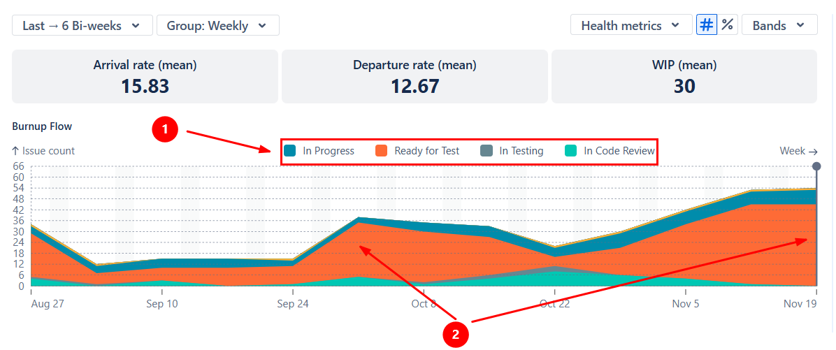
The Kanban Cumulative Flow Diagram helps you see how much work the team takes in (Arrival) compared to how much work it completes (Departure) - ideal for infinite-scope environments like Kanban.
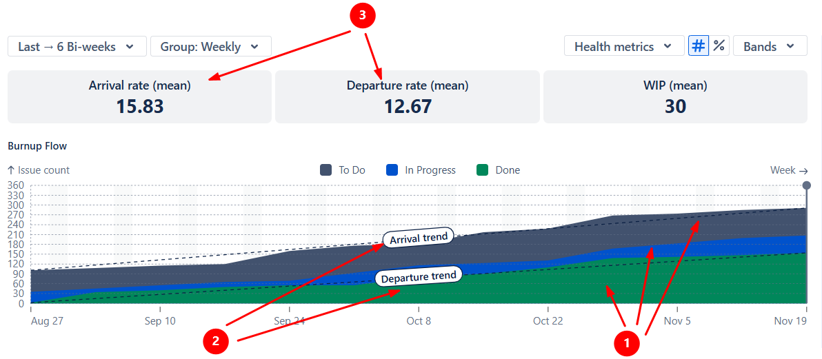
The colored bands represent the high-level categories of work (To Do, In Progress, Done) (1️⃣): the steeper a band grows, the more work is added to that category. Enable trend lines (2️⃣) to get a clearer picture of your workflow health. In a stable system, Arrival and Departure trend lines run roughly in parallel, meaning the team completes work at the same rate it receives it.
In example A, the Arrival trend line is slightly steeper than the Departure line. Combined with the average weekly Arrival/Departure tiles (3️⃣), this shows that new work is coming in faster than the team can finish it. The Product Owner or RTE should monitor this imbalance and reduce intake, re-prioritize, or reallocate capacity.
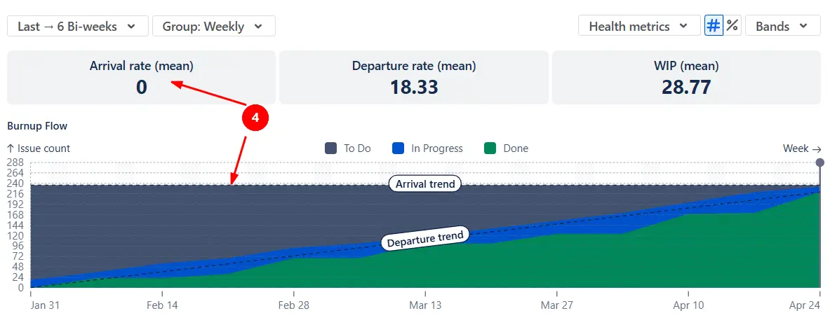
In example B, the Arrival line is flat, and the Arrival rate is 0 (4️⃣). This can be normal if the team is finishing a project and intentionally not pulling new work.
✅ This feature is helpful for:
The Kanban Flow Diagram gives you a high-level view of the Flow efficiency metric without calculating lead time. Instead, you can visually compare how much work sits in the waiting queue (To Do) versus the active queue (In Progress).
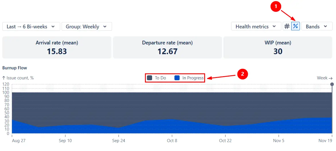
Switch the chart to percentage view (1️⃣) and hide the To Do band (2️⃣) to focus on the relative size of the active queue.
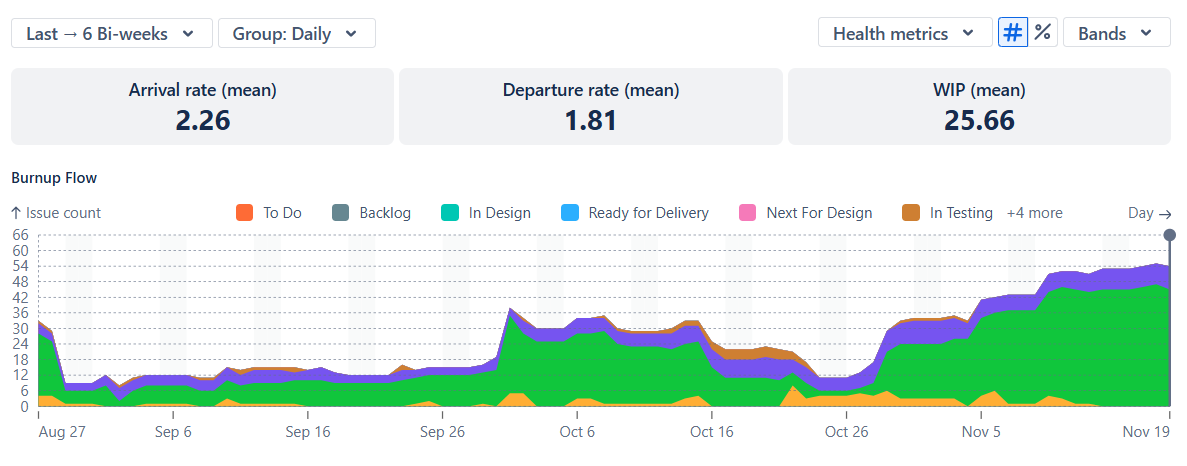
To understand which workflow stages accumulate work, switch the chart to display individual statuses and show only the In Progress statuses (1️⃣). This lets you see where tasks slow down - for example, whether items sit too long in QA, Review, or Waiting for the client.
In the example below, work tends to accumulate in the Ready for Test status (2️⃣). Once the team identifies the stage causing delays, they can take targeted action - reinforce QA capacity or escalate the issue before it affects delivery.
✅ This feature is helpful for:
Click any period on the Kanban Cumulative Flow Diagram to open the Breakdown table. It shows the totals behind each band (To Do, In Progress, Done) and lets you segment the data by any two Jira fields - for example, by board (team), project, issue type, epic, or assignee:

From the Breakdown table, click any row to open the Issue list, where you can inspect the exact items behind each data point, complete with their status, story points, assignee, and links back to Jira for validation or follow-up:

✅ This feature is helpful for:
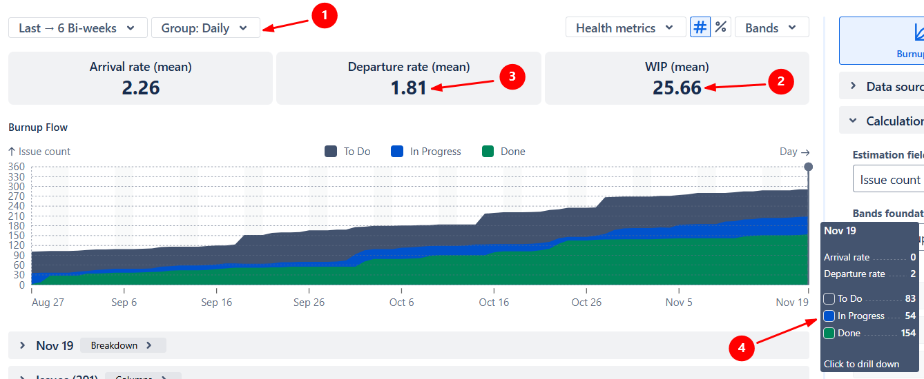
Use the Cumulative Flow Diagram in Kanban to monitor and reinforce your Work in Progress (WIP) limit. Choose a grouping (e.g., daily, weekly, bi-weekly) to track how WIP evolves over time and catch overload early.
In the example below, the chart is grouped by day (1️⃣), and the average daily WIP is 25.66 issues (2️⃣), which is significantly higher than the average daily Departure rate (3️⃣). On November 19, WIP peaks at 54 In Progress issues (4️⃣), signaling clear overloading that requires immediate action.
To make it easier to see how WIP moves across individual workflow stages, switch the chart to status-level bands and hide To Do and Done. This creates a simplified WIP view similar to a dedicated WIP Run chart:
✅ This feature is helpful for:
You can tailor how work is stacked on the Kanban Cumulative Flow Diagram. Select which statuses belong to the To Do, In Progress, or Done bands, or create custom bands to highlight specific workflow stages:
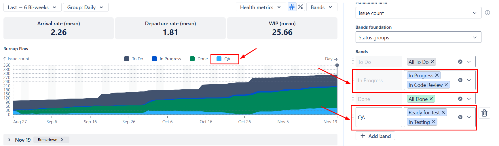
Whether you use status groups or individual statuses, you can show or hide them, drag to reorder, and adjust colors to match your reporting needs:

Jira includes a basic Cumulative Flow Diagram, but it is limited in scope and flexibility:
❌ Works with only one board
❌ Grouped only by day
❌ Measures work only in issue count
❌ Displays absolute values only — no percentage mode
❌ Bands are restricted to status categories
❌ Filtering is restricted to swimlanes
❌ No Burnup/Burndown Flow views
❌ No Arrival/Departure trend lines, Ideal slope, or Initial scope
❌ No health metric tiles (Arrival, Departure, WIP)
❌ No Breakdown or Issue list to investigate bottlenecks or validate data
The Broken Build Kanban CFD provides full flexibility for Kanban and multi-team flow analysis:
Use our examples to build your use cases on the Jira Dashboard.
The Jira apps (plugins) used in these examples have a 30-day free trial and are completely free for teams under 10 people:
The Agile Reports and Gadgets app includes Kanban cumulative flow diagram functionality plus a wide range of additional charts and reports.
A Jira Cumulative Flow Diagram (CFD) is a visual chart that shows how work items move through different workflow stages over time. It helps teams understand flow, track work in progress, and identify bottlenecks by visualizing how items accumulate in each status.
In native Jira, the CFD provides a basic view of workflow states over time. However, it has several limitations — it works within a single board, is grouped only by day, and measures work only by issue count. It also displays only absolute values, offers limited filtering (e.g., swimlanes), and lacks advanced features such as trend lines, scope tracking, or detailed breakdowns.
With advanced solutions like Agile Cumulative Flow Charts by Broken Build, teams can analyze flow across multiple boards and projects, apply flexible filtering, and customize how data is grouped (daily, weekly, sprint-based, etc.).
It also supports multiple estimation fields, absolute and percentage views, customizable status bands, and additional chart modes like burnup/burndown flow. With reference lines (e.g., arrival/departure trends), health metrics, and drill-down into underlying issues, teams gain deeper insights into flow efficiency and can proactively identify and resolve bottlenecks — directly in Jira.
A Kanban Cumulative Flow Diagram is a chart that shows how work moves through a Kanban system over time. Each colored band represents a stage in the workflow (such as “To Do,” “In Progress,” or “Done”), and the thickness of each band indicates the amount of work in that stage at any given time.
By observing how the bands grow or shrink, you can determine whether work is flowing smoothly, where queues are forming, and whether the team is taking in work faster than it completes it.
This pattern indicates that the team is not pulling much new work or finishing existing work, yet a large amount of work still sits in the system. In practice, this often points to hidden blockers or slow-moving queues inside the workflow. Items may be stuck waiting for external input, approvals, or a specific role (e.g., QA, UX, security review), which prevents progress even if the team’s intake is low.
To uncover the root cause, open the chart in status-level view to identify the stages where items accumulate.
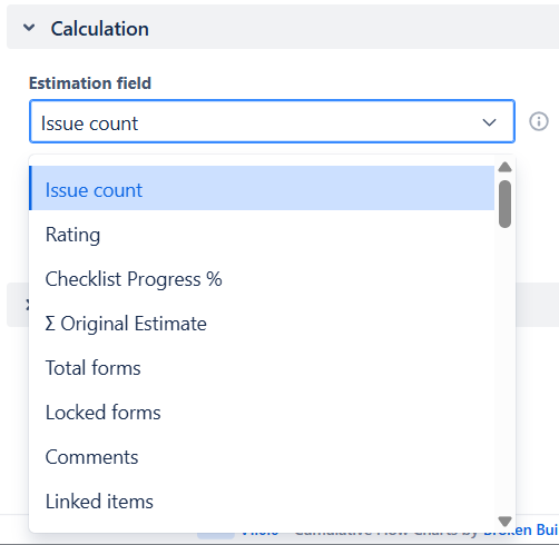
Yes. The Kanban Cumulative Flow Diagram works perfectly even if your team doesn’t use story points or any other estimation method. In this case, the chart uses issue count to measure Arrival, Departure, and WIP. If you do want more nuance, you can switch the estimation field to any numeric value your team uses (e.g., “effort,” “size,” “priority weight”), but it’s optional.
A good WIP limit keeps work moving without overloading the team. To check whether your current limit makes sense, look at how often the In Progress band exceeds the limit and how WIP behaves over time. If WIP frequently spikes or stays above the limit for long periods, the limit is likely too low or the workflow has hidden bottlenecks.
Opening the chart in status-level view helps you see which stages contribute most to WIP growth. You can also compare the WIP trend with the Departure rate: if WIP grows while Departure stays flat, the team is taking on more work than it can finish.
The percentage view is most useful when you want to understand the shape of your workflow rather than the exact volume of work. This view is helpful when comparing periods with very different item counts or when analyzing teams with varying levels of throughput. It also provides a simple proxy for Flow efficiency by showing how much work sits in the active queue vs. the waiting queue, even if you’re not measuring time-based metrics.


.svg)

.png)
