
Thank you! Your submission has been received!
Oops! Something went wrong while submitting the form.


The Epic progress report in Jira helps teams, RTEs, and program managers visualize how much work has been completed across one or multiple boards, projects, or teams, grouped by epics. It provides an epic-level view of delivery progress, showing which workstreams drive overall throughput and how capacity is distributed between epics.
With filtering, target lines, and customizable metrics, the Agile Velocity Chart Gadget app allows you to analyze both the pace of delivery and the balance of effort across key epics.
✅ Scrum Master / Agile Coach: I review epic-level progress to identify delivery bottlenecks across teams. When some epics consistently lag, it helps me facilitate discussions on workload balance and coordination during retrospectives or ART syncs.
✅ Release Train Engineer (RTE): I rely on the Epic progress in the Jira dashboard to track cross-team delivery and confirm whether capacity is distributed according to PI objectives. It gives me an overview of epic progress across multiple boards in one view.
✅ Product Manager: I use the Epic report in Jira to assess whether roadmap epics are on track and if delivery pace aligns with business priorities. Comparing epics side by side helps me evaluate progress against planned capacity and adjust scope when needed.
✅ Program Manager: I track epic trends at the program or portfolio level to ensure strategic work is advancing as expected. When some epics consume more or less capacity than planned, it signals the need to revisit investment balance or adjust planning cadence.


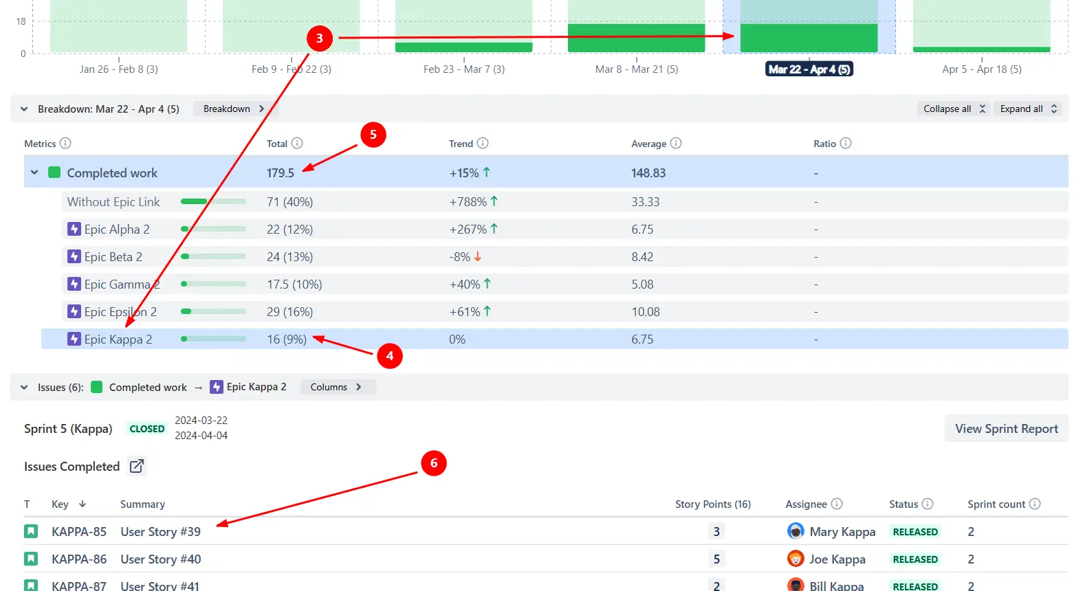
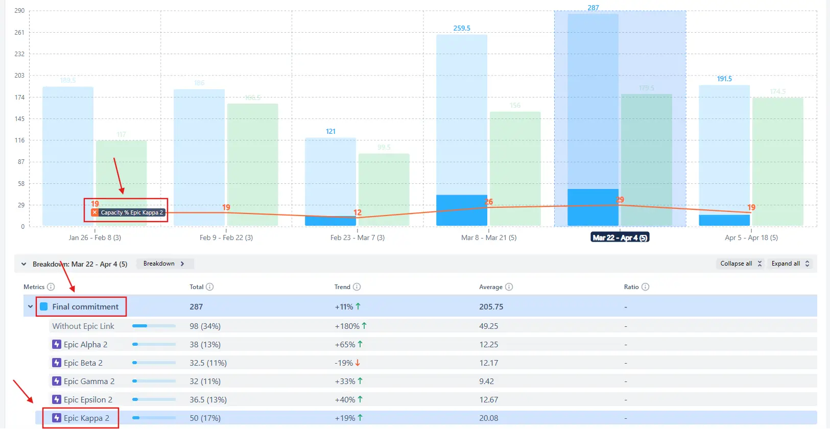
The Epic progress report shows the amount of work completed toward different epics across one or multiple data sources - whether they’re Scrum boards, Kanban boards, projects, or any other supported source. Click any sprint or interval (1️⃣) to open the Breakdown and see how much completed work came from each epic (2️⃣):

Selecting an epic highlights its contribution to the total completed work across teams, giving you instant visibility into which workstreams drive delivery.
In the example below, the interval Mar 22 – Apr 4 shows that Epic Kappa 2 (3️⃣) contributed 16 story points (9%) (4️⃣) to the total completed work of 179.5 SP (5️⃣). You can also scroll down to the Issue list (6️⃣) to view the individual completed items that make up this epic’s progress.
✅ This feature is useful for:
Use the Issue filter to narrow the chart’s scope and display only the progress of a specific epic. This allows you to isolate one workstream, providing a focused visualization of its velocity over time:
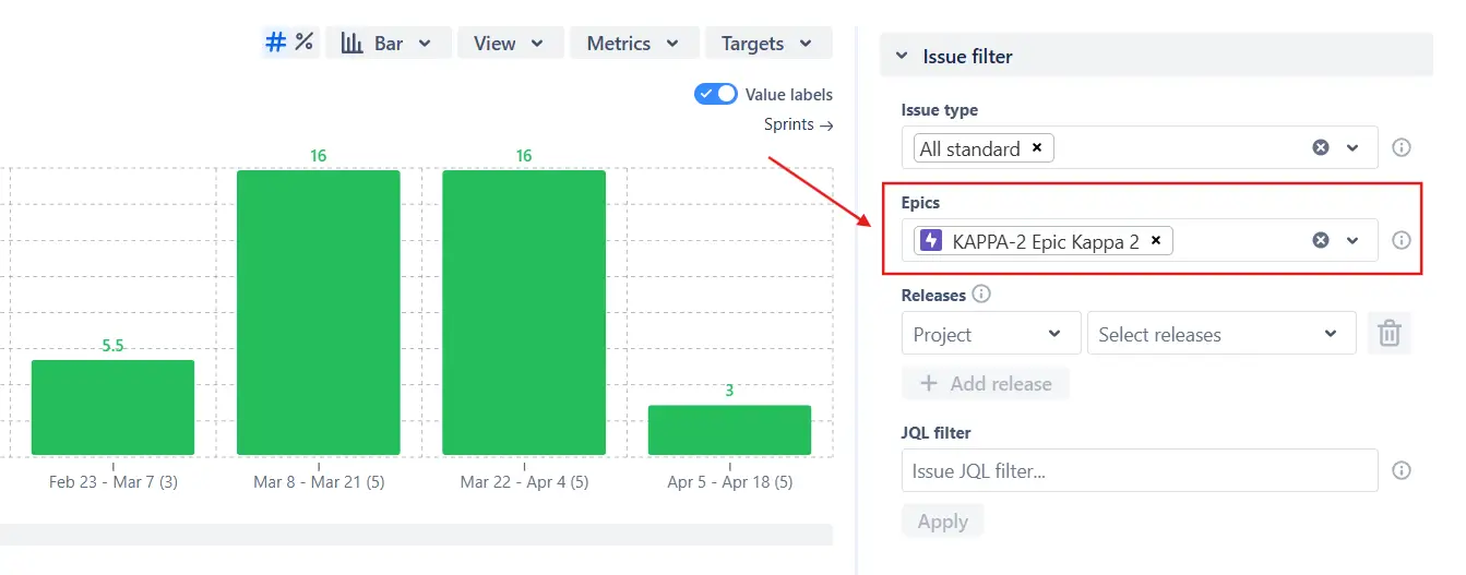
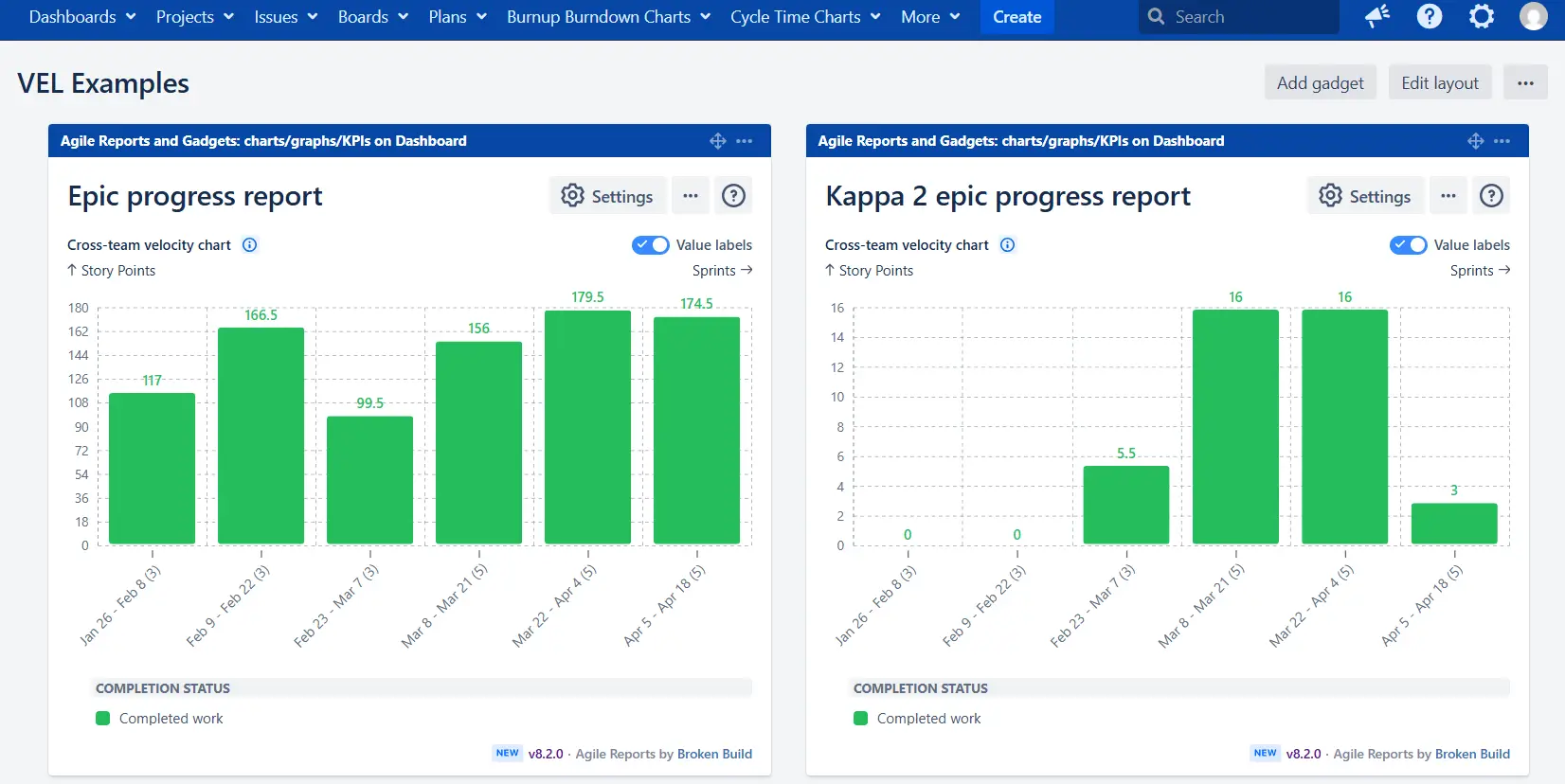
Once filtered, you can save this version of the chart as a new gadget on the same Jira dashboard. This way, you can easily compare the selected epic’s contribution to the overall team throughput against the progress of an individual epic side by side:
✅ This feature is useful for:
For Scrum boards, the Metrics menu allows you to go beyond completed work and add other key indicators to the Epic progress report. You can display additional metrics such as Initial commitment, Final commitment, Rollover, Added work, Removed work, or Estimation change to understand not just how much was delivered, but also how the scope evolved:
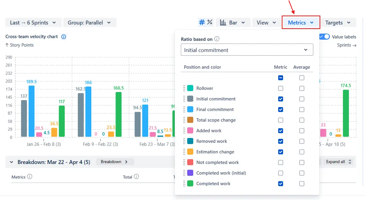
📌 Note: The metrics take into account all work from the selected sprints, including items not assigned to any epic.
✅ This feature is useful for:
Use the Targets menu to add a reference line that represents the planned capacity allocation for a specific epic. You can set the target either as an absolute value, such as story points (for all data sources), or as a percentage relative to the initial or final commitment (for Scrum boards):
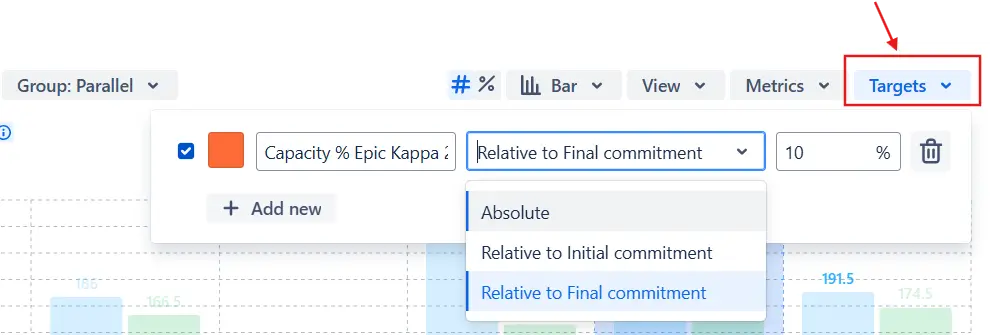
In the example below, the target line “Capacity % Kappa 2” shows that the Kappa 2 epic was expected to take up 10% of the total effort, helping you instantly see whether the actual delivery aligns with the planned capacity:
✅ This feature is useful for:
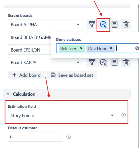
You can define what counts as Done for the entire chart or individually for each team by configuring custom Done statuses or custom from–to columns (for Kanban boards). You can also set a custom estimation field, whether it’s Story Points, Issue Count, Effort, or any other field, ensuring that the Completed work metric accurately reflects how each team measures progress:
✅ This feature is useful for:
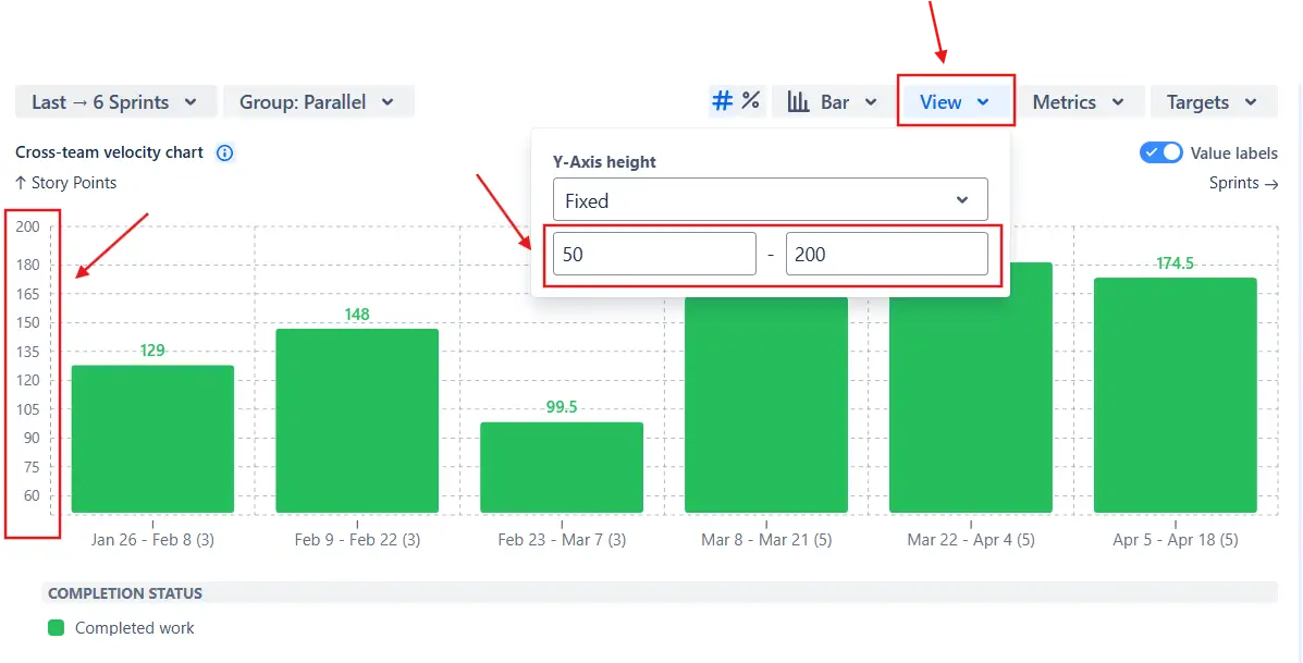
You can control the Y-axis height of the Epic progress report to make dashboards and presentations more consistent. In the View menu, choose between Auto height (adjusts dynamically to fit data) or Fixed height, where you can define custom minimum and maximum values:
✅ This feature is useful for:
Jira’s built-in Epic Report provides only a basic progress overview and comes with several limitations:
❌ Works with only one epic and one team at a time.
❌ Uses default estimation fields and default Done statuses - can’t be customized.
❌ Displays only absolute values - no percentages or advanced metrics.
❌ Shows only completed work, without additional progress indicators.
❌ Uses a fixed timeframe, offering no flexibility for historical analysis.
❌ No issue filter - includes all issues linked to the epic, even irrelevant ones.
While useful for a quick check of a single team’s progress, the native report cannot analyze multi-team delivery, capacity allocation, or cross-epic performance trends.
The Agile Velocity Chart Gadget app by Broken Build expands Jira’s native functionality with flexible analysis tools suitable for team, program, and portfolio levels:
✅ Track one or multiple epics across several teams, boards, or projects in a single view.
✅ See how much each epic contributes to the total delivery effort.
✅ Add target lines to visualize planned capacity allocation for an epic.
✅ Use custom estimation fields and Done statuses globally or per team.
✅ Display results in absolute values or percentages for easier comparison.
✅ Add multiple delivery metrics, such as Initial or Final commitment, Total scope change, or Rollover.
✅ Show averages (mean, median, or moving average) across sprints or intervals to track long-term trends.
✅ Apply issue filters by type, release, or custom JQL to focus on the relevant scope.
✅ Break down results by team, project, issue type, or assignee to uncover detailed insights.
✅ Adjust the time frame to analyze short-term progress or long-term delivery patterns.
Explore our examples to create your own Jira Dashboard use cases.
Both Jira plugins featured here offer a 30-day free trial and are completely free for small teams of up to 10 users:
The Agile Reports and Gadgets app additionally provides the Epic progress report along with many other insightful reports and visualizations.
A Jira Epic Report provides a summary of progress within a specific epic, showing completed, incomplete, and unestimated work. It helps teams track how an epic evolves across sprints and understand overall delivery progress.
In native Jira, the Epic Report offers only a basic overview and has several limitations. It works with a single epic and team at a time, uses default estimation fields and Done statuses, and displays only absolute values. It also lacks advanced metrics, flexible timeframes, filtering, and deeper analysis capabilities.
With advanced solutions like Epic progress tracking in Agile Velocity Charts by Broken Build, teams can analyze one or multiple epics across boards and projects, apply custom filters, and use both absolute and percentage views. It also enables tracking additional metrics like scope changes, commitments, and rollover, along with trend analysis using averages.
This allows teams to better understand epic performance, align delivery across teams, and make more informed planning decisions directly in Jira.
Yes. The Epic progress report supports multiple data sources, including Kanban boards, Scrum boards, projects, releases, or even custom JQL filters.
When using Kanban boards, the chart groups completed work by time intervals (such as weeks, months, or quarters) instead of sprints, allowing you to visualize how much work was delivered toward each epic over time. You can also apply the same configuration options as with Scrum boards - such as custom from-to columns, estimation fields, and filters - to ensure consistent reporting across both delivery styles.
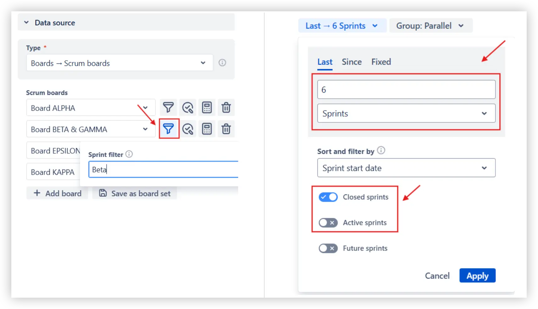
You can control which sprints appear in the Epic progress report in Jira using the Sprint filter and Interval configuration menus above the chart. With the Sprint filter, you can include or exclude sprints by name - for example, if multiple teams share the same board but you only want to show a specific team’s sprints. The Interval configuration lets you choose how many past sprints to show and include or exclude active or closed sprints.
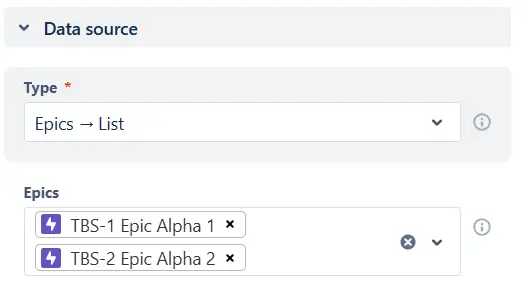
Yes. The Epic progress report can visualize delivery across different programs or Agile Release Trains (ARTs) in a single view. You can select several boards or projects as data sources and filter by relevant epics to focus the chart on a specific scope. If needed, you can also select one or multiple epics directly as the data source (from the list or with custom JQL), allowing you to track progress only for the workstreams that matter most:
The Epic progress report focuses on tracking how much work has been completed across one or multiple teams, rather than predicting when the epic will be finished. If you want to forecast completion dates, we recommend using the Epic Burndown chart instead. It’s designed to show how quickly remaining work decreases over time and can project the likely completion date based on your team’s historical velocity or throughput trends.


.svg)


.png)
.png)
