
Thank you! Your submission has been received!
Oops! Something went wrong while submitting the form.


The Say-do ratio report helps teams and leaders assess how reliably sprint commitments turn into delivered results. It visualizes both parts of the ratio - the “say” (initial and final commitments) and the “do” (completed work) - alongside scope changes that occurred during the sprint.
By combining commitment metrics, scope-adjustment insights, and delivery trends, the Agile Velocity Chart Gadget app makes it easy to see whether missed goals stem from unstable scope or execution gaps. With customizable metrics, estimation settings, and filtering options, it gives a transparent view of delivery predictability across teams and sprints.
✅ Scrum Master / Agile Coach: I use the Say-do ratio chart to help the team see how reliably sprint goals are met and what drives the gaps - unstable scope or delivery execution. It’s a great visual for retrospectives and helps guide discussions on improving commitment accuracy.
✅ Product Owner: The say-do ratio in Jira helps me explain to stakeholders why sprint outcomes differ from the plan. By showing scope additions, removals, and re-estimations, I can set clearer expectations and make better trade-off decisions when new work appears mid-sprint.
✅ Release Train Engineer (RTE): I rely on the Say-do ratio graph to assess commitment reliability across multiple teams in the ART. Persistent say/do gaps point to systemic issues - like overloaded sprints or late scope changes - that I can address during ART syncs and PI planning.
✅ Engineering Manager: The Say-do ratio chart gadget helps me see where technical work or architectural spikes cause unexpected scope fluctuations. That visibility lets me balance technical priorities with predictable delivery.
✅ C-Level Executive: I track say/do trends at the program level to evaluate investment reliability. When commitments are frequently missed or scope churn is high, it’s a signal to revisit capacity allocation or planning cadence.


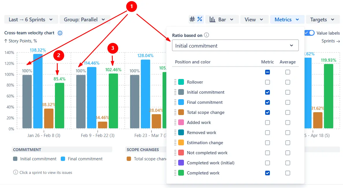
The Say-do ratio chart combines four metrics to show how each sprint or interval evolved: initial commitment (the “say”), final commitment (the scope at the end of the sprint), total scope change during the sprint, and completed work (the “do” in the ratio)
All metrics are normalized against either the initial or final commitment, making it easy to compare sprints or teams of different sizes.
✅ This feature is useful for:
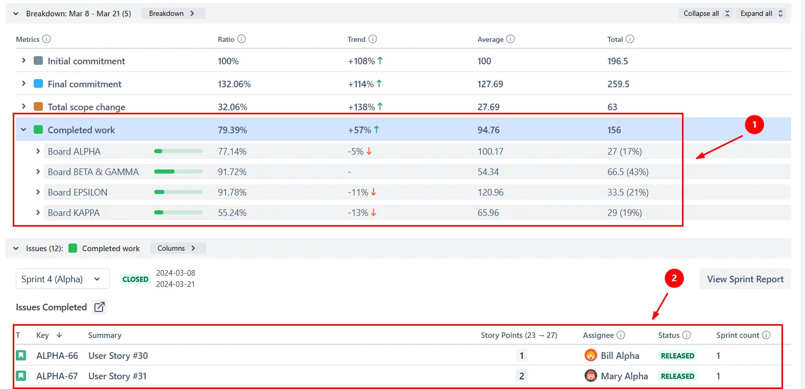
Click any sprint or interval on the chart to open the Breakdown view (1️⃣) and compare results across boards, projects, or issue types. From there, use the Find issues option to open the Issue list (2️⃣), where you can see the exact work items that contributed to each metric - complete with story points, assignee, and status:
✅ This feature is useful for:
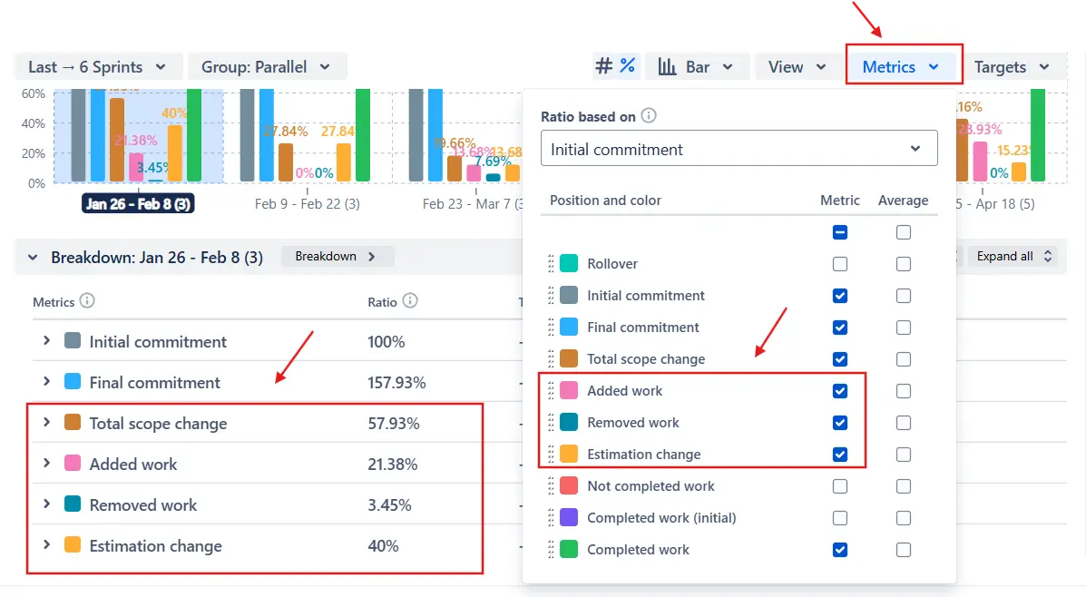
To understand why the scope changed during a sprint, the Say-do ratio chart allows you to display additional scope-adjustment metrics in the menu above the chart: Added work, Removed work, and Estimation change.
📘 Formula:
Total scope change = Added work + Removed work + Estimation change
In the example below, a significant portion of the total scope change stems not from new work added to the sprint, but from estimation changes. This often indicates that teams initially underestimate the effort, highlighting the need to improve estimation accuracy.
✅ This feature is useful for:
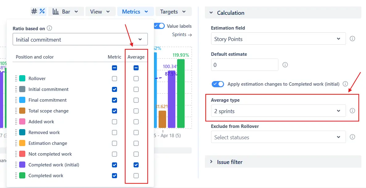
In addition to standard metrics like commitments and total completed work, the Say-do ratio report lets you display Completed work (initial) - the portion of the initial commitment that was actually delivered by the end of the sprint. You can enable this metric from the Metrics menu above the chart:
%20alongside%20Completed%20work.webp)
To fine-tune this metric, use the Apply estimation changes to Completed work (initial) toggle in the Calculation settings:
.webp)
✅ This feature is useful for:
To spot trends in delivery consistency, the Say-do ratio chart allows you to display average lines for any metric. You can turn on the average line in the Metrics menu and choose the average type in the Calculation section:
In the example below, the dotted purple line represents the moving average for Completed work (initial). While the values fluctuate between sprints, the average line highlights a gradual downward trend in commitment reliability, signaling the need to review planning and estimation practices:
%20average%20line%20enabled.webp)
✅ This feature is useful for:
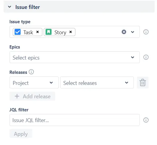
Use the Issue filter to decide which issues are included in the chart’s calculations.
You can narrow the chart scope by issue type, epics, releases, or with custom JQL.
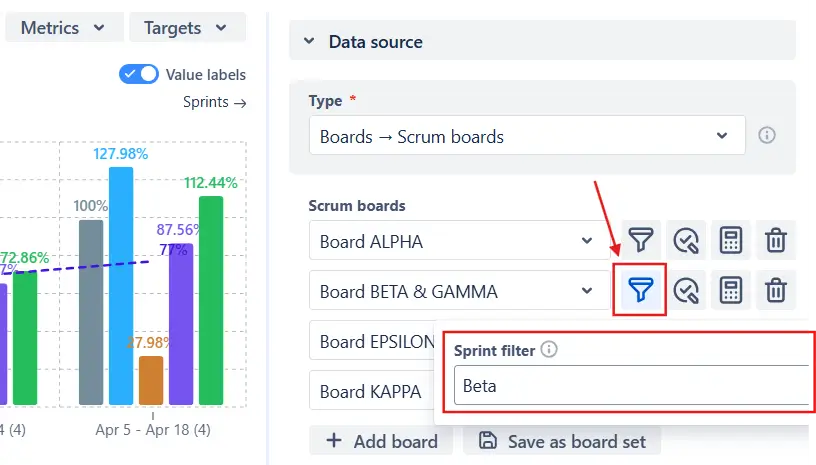
If you’re using one or multiple Scrum boards as the data source, you can use the Sprint filter to include only the sprints that match a specific name pattern. This is especially helpful when several teams share the same board:
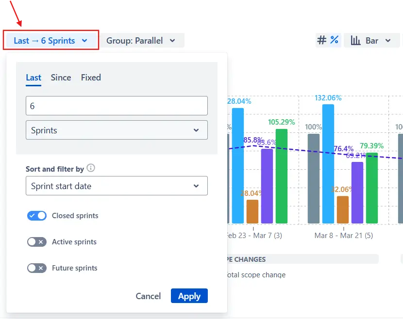
You can also choose how many sprints to display and fine-tune the timeline by including or excluding active and closed sprints in the Interval configuration menu above the chart:
✅ These features are useful for:
Jira doesn’t include a built-in report that visualizes the say/do ratio. The Velocity report is the closest equivalent, but it focuses solely on committed and completed work, offering a one-dimensional view of delivery reliability. It doesn’t explain why results deviate from the plan or how the scope evolves during the sprint.
Its main limitations include:
❌ Single-team focus
❌ Fixed time range
❌ No visibility into scope evolution
❌ No benchmarking tools
❌ No percentage view
❌ Filtering, grouping, and drill-downs aren’t available
Here’s how the Say-do ratio chart extends Jira’s reporting capabilities:
✅ Track initial and final commitments, scope changes, and completed work to understand why goals were met or missed.
✅ Identify whether delivery shortfalls come from inaccurate estimation, added work, or unplanned re-estimation.
✅ Use the percentage view to evaluate say/do ratios across teams and sprints of different sizes.
✅ Monitor averages over time to reveal whether reliability is improving or declining.
✅ Add target and average lines to define clear delivery expectations and make trends visible.
✅ Choose estimation fields and “done” statuses per board so each team is evaluated on its own terms.
✅ Filter by issue type, epic, release, or custom JQL to analyze only the data that matters.
✅ Connect high-level ratios to the specific issues and assignees behind them through the Breakdown and Issue list.
✅ Pull data from multiple Scrum boards or projects into one chart to evaluate how reliably different teams deliver within the same release or Agile Release Train.
✅ Turn commitment metrics into actionable insights that help teams improve planning accuracy and execution discipline.
Explore our examples to create your own Jira Dashboard use cases.
Both Jira plugins featured here offer a 30-day free trial and are completely free for small teams of up to 10 users:
The Agile Reports and Gadgets app additionally provides the Say-do ratio report along with many other insightful reports and visualizations.
You can measure the say/do ratio using the Agile Velocity Chart Gadget app by Broken Build. Either select the Say-do ratio template from the Getting started page or create a new chart and adjust its settings manually.
Settings used in this example:
This configuration highlights how much of the initial plan was delivered, how the scope evolved during the sprint, and whether say/do reliability is improving over time.
Both metrics measure team performance, but they focus on different aspects of delivery.
A team can have high velocity but low say/do reliability if they take on too much work or frequently change scope mid-sprint.
Yes. The Say-do ratio chart can track commitment reliability across several Program Increments (PIs) or releases by combining data from multiple sources.
You can build the chart using the following data sources:
You can adjust which statuses are treated as Done in the Say-do ratio chart to reflect your team’s real workflow.
By default, the chart counts all statuses in the last column of the board as Done. But if your process marks items as complete earlier - for example, Released, Ready for QA, or Dev Done - you can redefine what “done” means for each team in the Data source section for Scrum/Kanban boards and in the Calculation settings for other data sources:


.svg)


.png)
.png)
