
Thank you! Your submission has been received!
Oops! Something went wrong while submitting the form.


The Scrum Cumulative Flow Diagram gives you a clear picture of how work moves across your sprints from intake to completion. It helps you see if your teams deliver at a steady pace, how scope evolves during the sprint, and where work tends to accumulate. With flexible board and sprint selection, Burnup and Burndown Flow views, and detailed status-level insights, you can assess sprint health, track delivery stability, and catch bottlenecks early.
Whether you're analyzing a single team or combining boards across an ART, the Agile Cumulative Flow Charts provide the visibility needed to guide sustainable delivery.
✅ Product Owner: I use the Scrum CFD to see whether our sprint scope is under control. The Burnup Flow view helps me understand if we’re adding too much work mid-sprint, and the Burndown Flow view shows how close we are to completing the commitment.
✅ Tech Lead: We look at the Cumulative Flow Diagram in Scrum to validate whether our workflow is smooth. When the Done band grows steadily and Arrival stays predictable, we know we’re pacing ourselves correctly. Status-level bands help us identify where work slows down.
✅ Release Train Engineer (RTE): Across multiple boards, the Scrum Cumulative Flow chart helps me understand how teams within the ART perform over a series of sprints. It highlights scope churn, delivery stability, and which teams struggle with WIP or specific workflow stages.
✅ Product Manager: I use the Scrum Cumulative Flow chart gadget to evaluate team throughput across sprints and understand whether delays originate from scope changes, uneven capacity, or process bottlenecks. It also shows whether the team can sustain planned delivery for PI objectives.
✅ C-level Executive: I look at the CFD in Scrum to understand the organization’s delivery predictability across sprints. Consistent Arrival–Departure balance and stable trends signal reliable execution, while widening gaps point to systemic issues that may affect roadmap commitments.


When building a Scrum Cumulative Flow Diagram, the first step is choosing which work the chart should represent. You can select a single board to focus on one team or combine multiple boards to visualize flow across the entire ART. If several teams share the same Scrum board, sprint name filtering helps you isolate each team’s sprints.
You can also control the time window: show the last N sprints, focus on a fixed date range for PI-level analysis, or display a specific sprint.
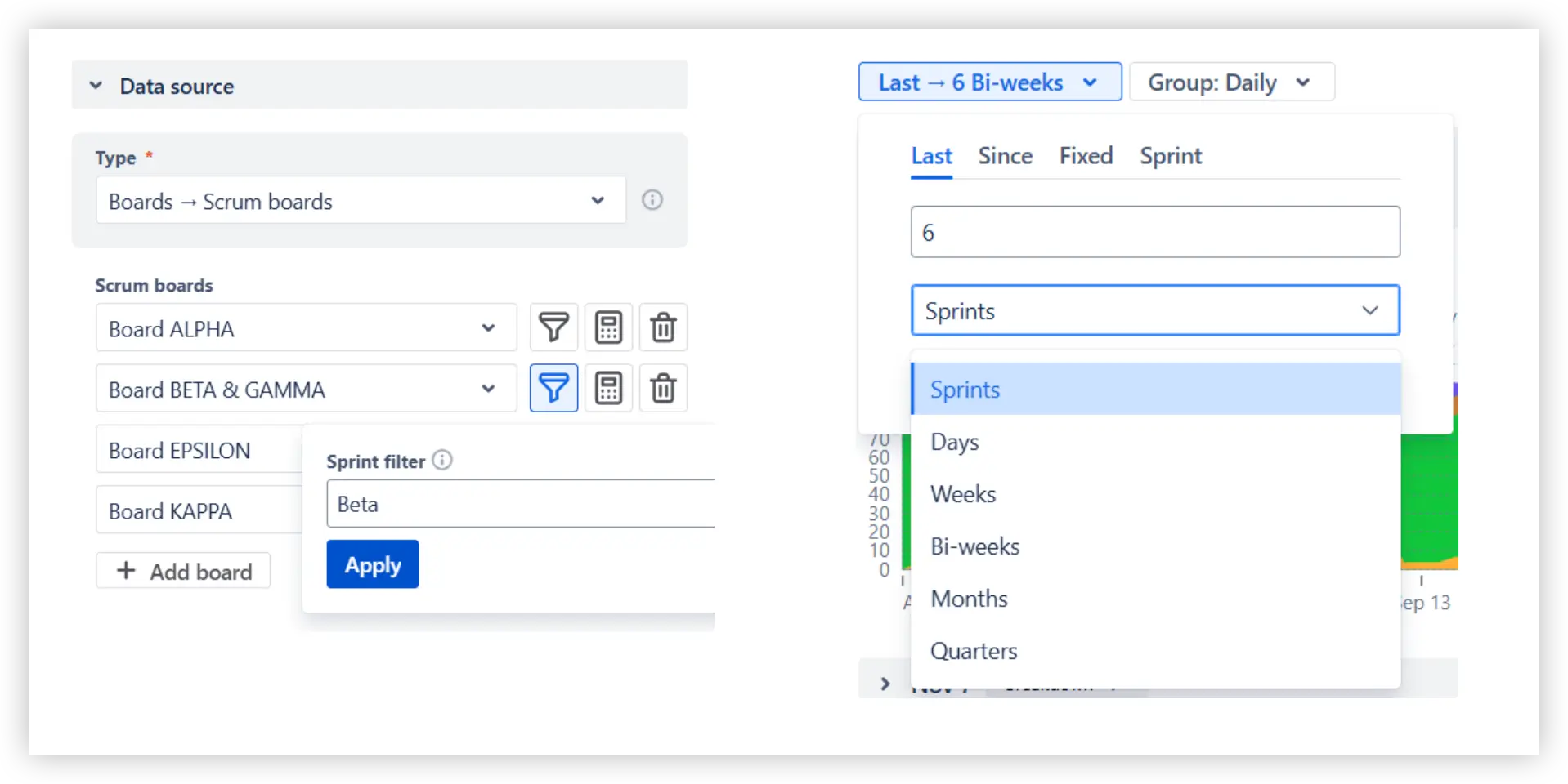
Beyond boards and sprints, issue-level filters let you narrow the scope even further: include only certain issue types, epics, or releases, or exclude items that could skew the trends, such as test tickets or one-off technical work:

The Scrum Cumulative Flow Diagram shows how work enters, advances, and gets completed across your sprints. By looking at how the To Do, In Progress, and Done bands evolve, you can quickly understand whether the team keeps a healthy balance between new work and completed work.
At the beginning of a planning cycle, we recommend using the Burnup Flow view to focus on how much work is being completed over time. Trend lines for Arrival and Departure help you compare how much work is added versus finished in each sprint. When these lines remain close, the team delivers at a predictable pace. When Arrival outpaces Departure, the backlog grows - an early sign of scope creep.
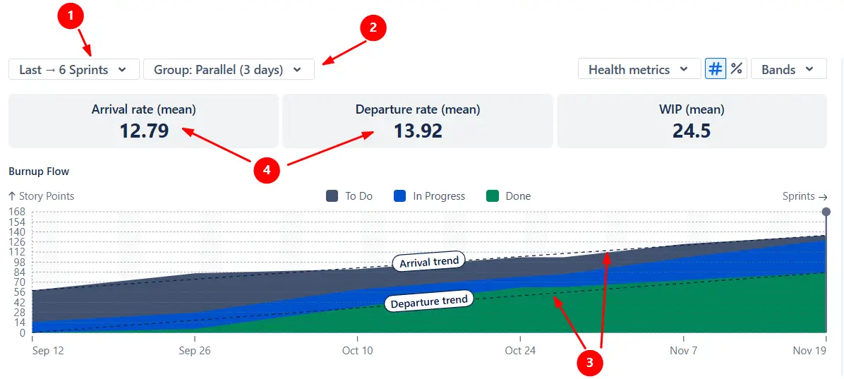
In the examples below, the chart displays the last six sprints (1️⃣), grouped by sprint with a 3-day gap (2️⃣), meaning that sprints from different teams starting or ending within three days of each other are treated as parallel.
In Example A, the Departure trend increases more steeply than Arrival (3️⃣), indicating that the team consistently completes slightly more work than it brings in. The Health metrics confirm this: an average Arrival of 16.04 story points per sprint versus an average Departure of 18.25 story points (4️⃣). The delivery flow is stable:
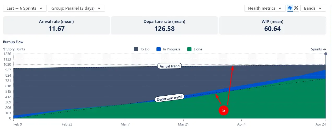
In Example B, the Arrival trend is almost flat, while the Departure rate is significantly higher (5️⃣). The backlog is shrinking, suggesting the team is deliberately reducing existing work to bring the system back to a healthy state:
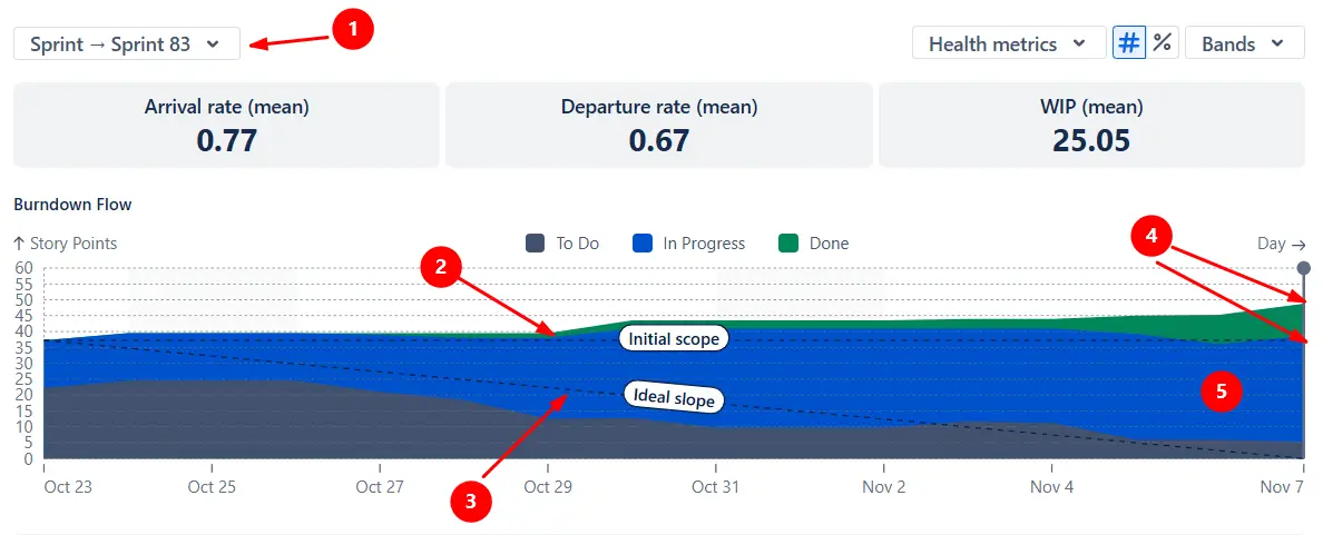
If your goal is to understand how the team is progressing toward completing the scope, switch the chart to the Burndown Flow view. When the interval is limited to a single sprint (1️⃣), the chart works as an enhanced version of the standard Sprint Burndown.
The Initial scope line (2️⃣) shows how the amount of committed work changed during the sprint, while the Ideal slope (3️⃣) provides a benchmark for how the To Do and In Progress areas should decline if the team were to complete the entire sprint commitment.
In the example below, the scope remained relatively stable throughout the sprint (4️⃣), but throughput lagged significantly behind expectations. Most items were still in In Progress at the end (5️⃣) - this pattern typically points to capacity constraints, late work starts, or bottlenecks within the workflow.
To understand exactly where work slows down during the sprint, switch the Scrum Cumulative Flow chart to show a separate band for each status (1️⃣). This view helps you pinpoint the stages where tasks accumulate - whether they wait too long in QA, sit in Review, or stall in Waiting for client.
In the example below, most unfinished work is concentrated in the Ready for Test status (2️⃣). This indicates that the team wasn’t able to move items through the final steps of the workflow. Once the problematic stage is identified, the team can take targeted action - such as adding QA capacity, adjusting handoffs, or escalating blockers:
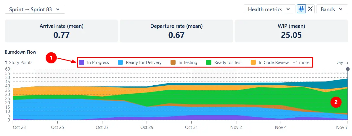
To reduce noise, you can hide specific statuses or reorder the bands to highlight the most important stages in your sprint workflow:
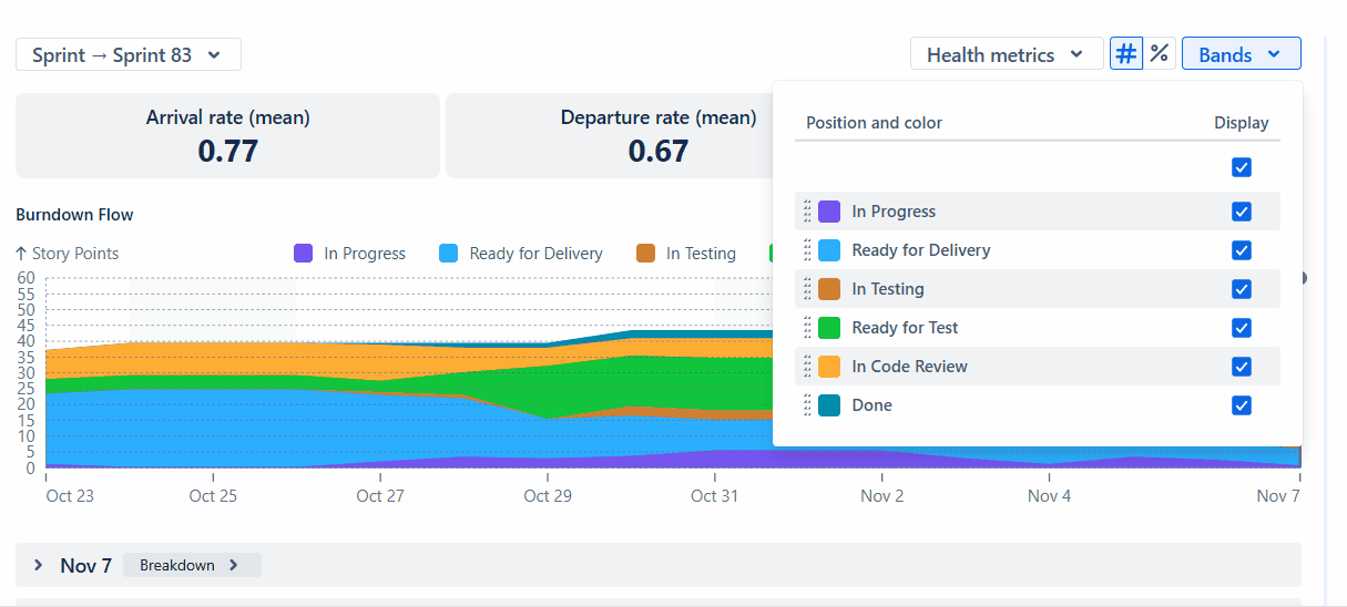
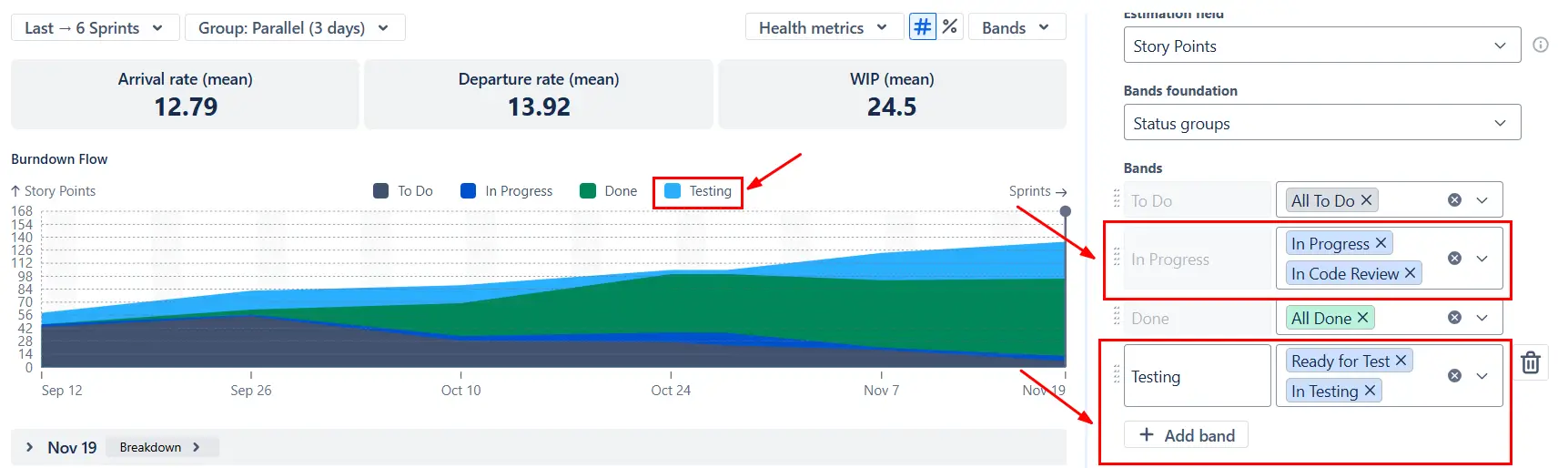
The Scrum Cumulative Flow Diagram lets you shape the bands so they mirror how your team actually works. You can decide which statuses should roll up into To Do, In Progress, or Done, or define your own bands to spotlight key areas of the process - such as grouping all testing steps together or separating development activities from review stages.
At any point in the sprint timeline, you can open the Breakdown view to see what’s behind the chart. The table shows how many items sit in each band (To Do, In Progress, Done) and lets you slice the data by board, team, epic, issue type, or any other Jira field. You can apply up to two levels of segmentation to compare teams, work types, or epics:
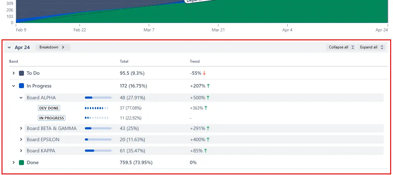
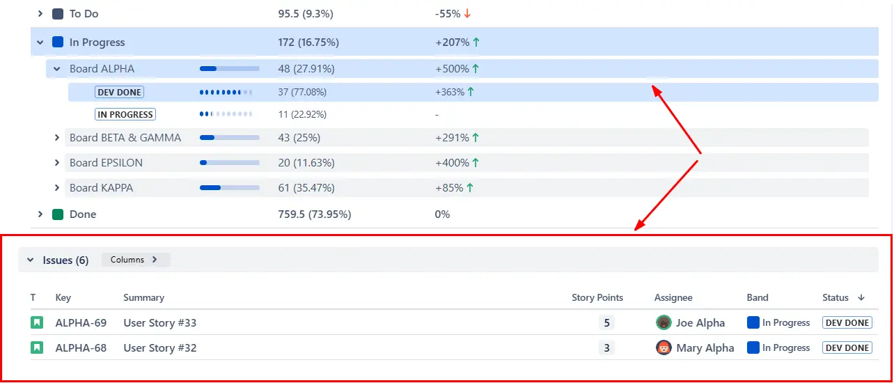
From there, selecting any row brings you to the Issue list, where you can examine the specific items contributing to each data point. You’ll see their statuses, story points, assignees, and direct Jira links:
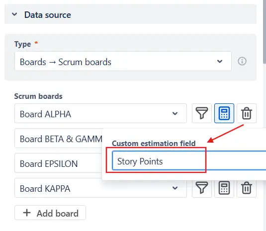
The Scrum Cumulative Flow Diagram allows you to decide how effort is measured. Instead of being limited to issue count, you can select the estimation field that reflects how your team plans and tracks work - Story Points, Original Estimate, Time Spent, or any numeric custom field used in your workflow.
When working with multiple Scrum boards, you can even assign board-specific estimation fields. This is especially useful when different teams estimate differently (for example, one team uses Story Points while another uses hours):
Jira does offer a Cumulative Flow Diagram for Scrum boards, but its capabilities are fairly limited compared to what teams usually need:
The Scrum Cumulative Flow Diagram in the Broken Build app provides a configurable and sprint-friendly view of how work moves through the system:
Use our examples to build your use cases on the Jira Dashboard.
The Jira apps (plugins) used in these examples have a 30-day free trial and are completely free for teams under 10 people:
The Agile Reports and Gadgets app includes Scrum cumulative flow diagram functionality plus a wide range of additional charts and reports.
A Cumulative Flow Diagram (CFD) in Scrum is a chart that shows how work moves through the sprint workflow over time. Each colored band represents a stage, such as To Do, In Progress, or Done, and the thickness of each band shows how many items are in that stage on any given day of the sprint.
By observing how these bands expand or contract, you can understand whether the team is delivering at a steady pace, whether scope is increasing during the sprint, and where work tends to accumulate.
While the Scrum CFD is not a date-based forecasting tool on its own, it can indicate whether the team is likely to finish the sprint scope based on current flow patterns. By comparing the Arrival and Departure trend lines and observing how quickly the Done band grows, you can gauge whether throughput is high enough to meet the sprint commitment.
In Burndown Flow view, the Ideal slope provides an additional benchmark: if the To Do and In Progress areas consistently stay above this line, the team will likely struggle to complete all planned work.
For more precise forecasting, we recommend using the Agile Burnup Burndown Charts by Broken Build.
A flat Done band usually means that completed items are not reaching the statuses mapped to the Done category in the chart. This can happen for several reasons:
To fix this, check how your statuses are mapped in the chart and verify that completed work is actually transitioning to the final Done state.
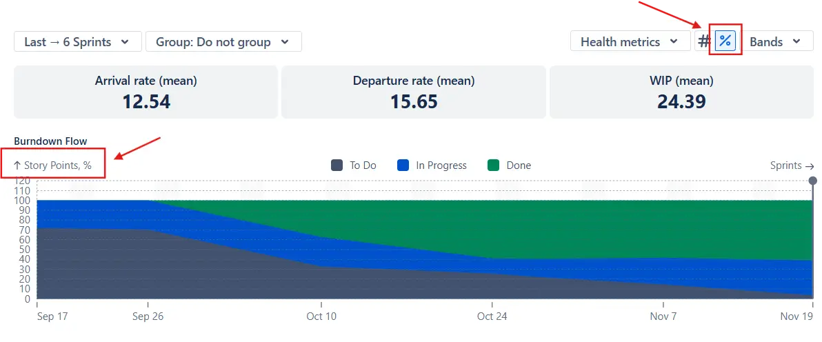
When volumes vary significantly between boards or sprints, switch to the percentage view to normalize the data and compare the workflow shape rather than raw totals:


.svg)

.png)
