
Thank you! Your submission has been received!
Oops! Something went wrong while submitting the form.


The Active sprint cumulative flow diagram provides teams with a real-time view of how the sprint work flows through the workflow. Instead of focusing only on how much remains like a traditional sprint burndown, it shows how items transition from To Do to In Progress to Done, helping teams understand how work is flowing, not just whether it will finish on time.
With visual indicators for scope changes, customizable workflow bands, health metrics, and drill-down views, the Agile Cumulative Flow Charts provide a complete picture of sprint stability, bottlenecks, and delivery pace, enabling teams to make timely adjustments and keep the sprint on track.
✅ Scrum Master: I use the active sprint CFD in Jira to spot early signs of flow instability, such as rising WIP, widening In Progress bands, or work piling up in specific statuses. It helps me identify bottlenecks, facilitate daily standups with real data, and guide the team toward smoother workflow.
✅ Product Owner: The Initial scope line and trend lines give me a clear picture of whether scope creep is affecting the sprint goal. I can quickly see if new work is being added or if the team is progressing at a pace that aligns with our commitment, which helps me communicate expectations to stakeholders.
✅ Developer Lead: I rely on the statuses view and the In Progress band to understand where work is stuck (QA, Code Review, testing queues) and to rebalance capacity. The Active sprint cumulative flow chart helps the team coordinate handoffs and avoid overloading specific workflow stages.
✅ RTE: The flow metrics (Arrival, Departure, WIP) show whether the team is on track to finish the sprint. I use the Cumulative flow diagram for active sprints across teams to compare flow health, identify systemic bottlenecks, and support teams in improving predictability during PI execution.


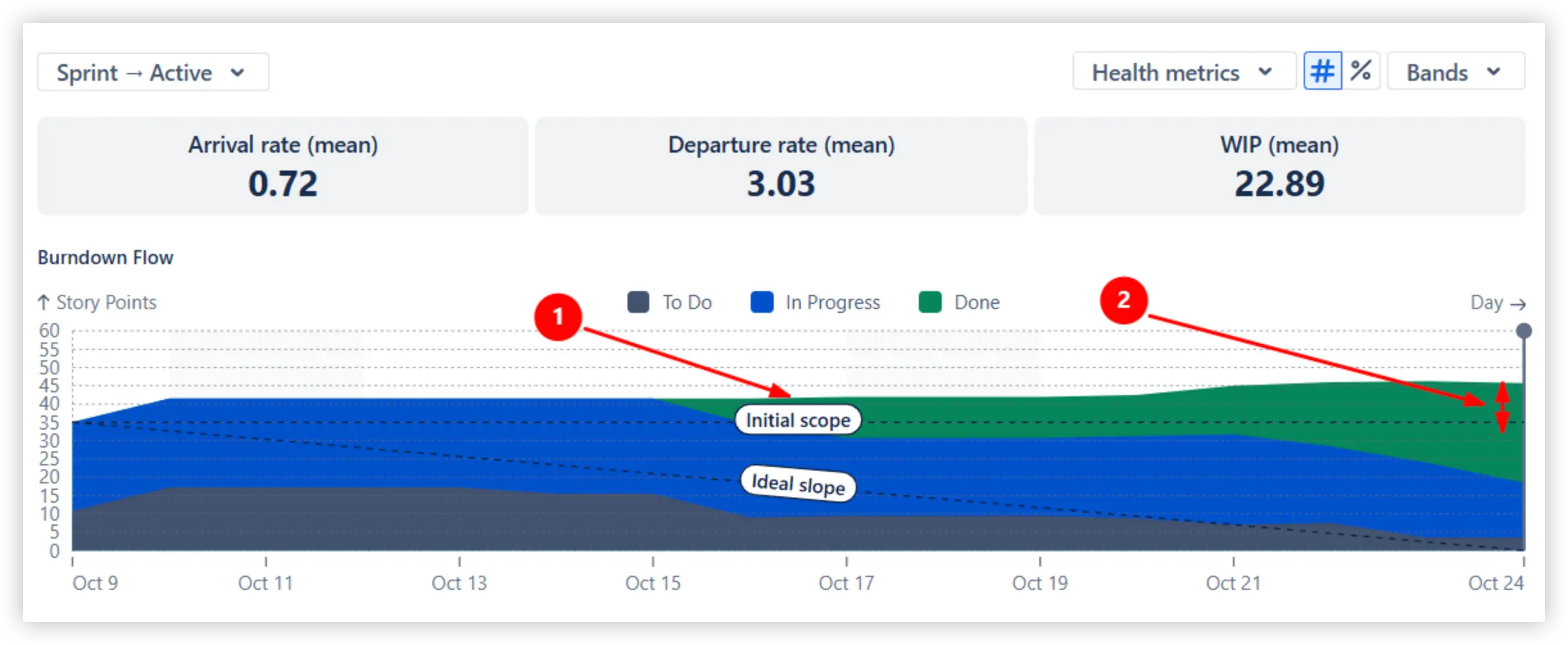
An Active sprint cumulative flow diagram acts as an enhanced version of the traditional sprint burndown chart. Instead of showing only the remaining work, it visualizes how the To Do, In Progress, and Done areas (1️⃣) change throughout the sprint. The To Do band gradually shrinks as work is started, while the Done band grows as items reach completion.
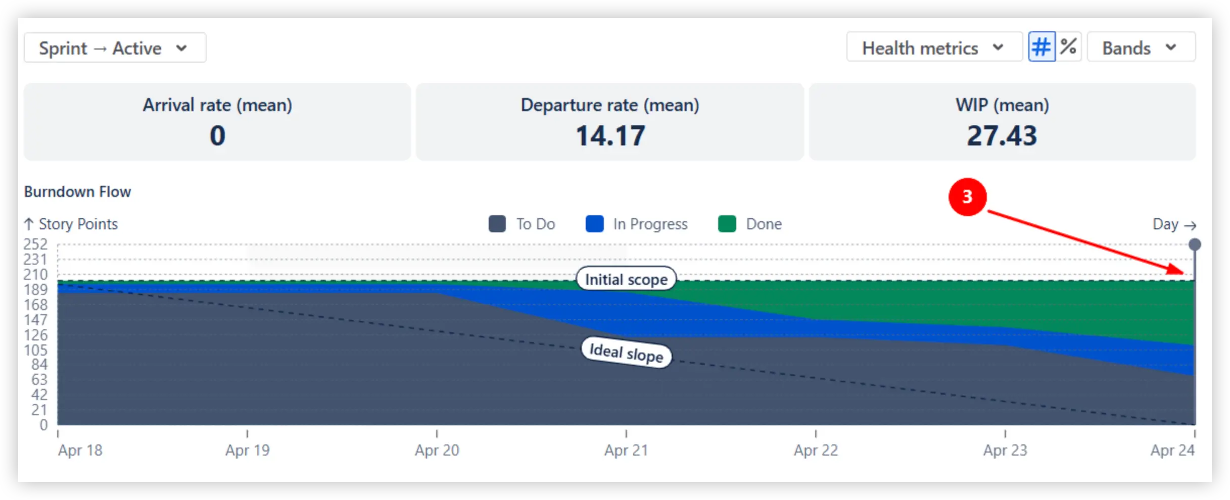
To track whether the sprint is on schedule, compare the Done area against the Ideal slope line (2️⃣). To complete the sprint scope within the timeframe, the entire zone above the reference line (3️⃣) should ideally be green (Done).

To complete the sprint commitment, it’s crucial to identify scope creep as early as possible. The Initial scope line (1️⃣) provides a visual baseline for the work originally planned at the start of the sprint. As the sprint progresses, any portion of the colored bands that appears above the Initial scope line represents items that were added mid-sprint.
In Example A, the scope increased from approximately 35 to 45 Story Points (2️⃣), showing a significant mid-sprint expansion:
In Example B, the colored bands stay on the Initial scope line (3️⃣), indicating that the sprint scope remained stable with no added work:
The Active sprint cumulative flow report lets you map any status to any band, so the chart reflects how your team actually works. For example, you can map Dev Done to the Done band even if Jira classifies it as In Progress. This can be useful when development is complete, and only QA remains, giving you a more accurate view of engineering progress:

You can also create custom bands. For instance, creating a separate Waiting band (e.g., Ready for Test, Blocked) makes queues easy to spot at a glance. Select colours for bands or reorder them as needed.

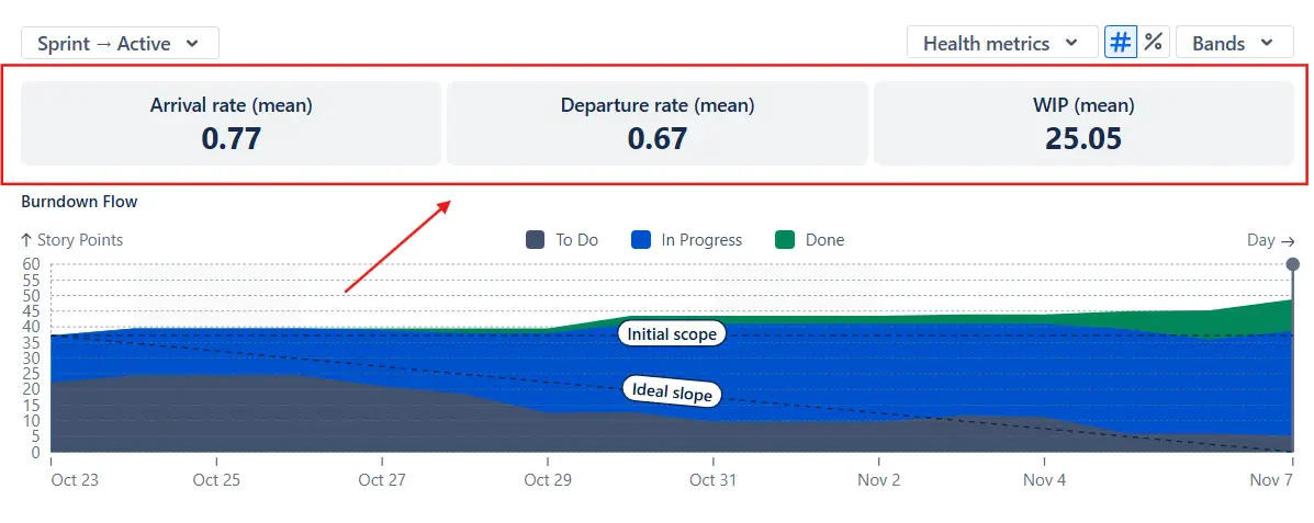
The health tiles above the chart summarize the most crucial flow indicators for the sprint: Arrival rate, Departure rate, and WIP:
Together, these values provide early warning signals, enabling teams to take corrective action before the sprint goal is at risk. If arrivals consistently exceed departures, the scope is growing faster than the team can complete it. If WIP is unusually high, work may be piling up in intermediate statuses - often a sign of bottlenecks or context switching.
When the In Progress band starts getting thicker, or the Done band falls noticeably behind the Ideal slope, it’s a sign that work may be stuck in a specific stage. You can switch the chart to the individual statuses view to see where items are accumulating, whether it's Code Review, QA, Ready for Test, or another workflow step.
This makes bottlenecks easy to spot and helps teams quickly identify where to add capacity, adjust priorities, or improve handoff procedures.

You can switch the chart from Burndown Flow to Burnup Flow to view the sprint progress from a different angle. While the Burndown Flow focuses on how much work remains compared to the Ideal slope, the Burnup Flow highlights how much work is added and completed over time.
Compare the Arrival and Departure trend lines to validate the sprint flow stability. Parallel lines indicate a balanced system, while a steeper Departure trend line shows that the team is making progress toward finishing the sprint scope.

Click any day on the chart to open the Breakdown (1️⃣), which lets you segment the selected point in time by any Jira field. You can choose fields such as issue type, assignee, project, board, epic, or others to understand where work is coming from and where it is accumulating.
For even deeper insight, expand the Issue list (2️⃣) to see the exact items contributing to each band.

Jira’s built-in CFD provides only a basic snapshot of how work moves through the workflow. Because it is tied to a single board, it cannot be used for cross-team views, which limits its usefulness for programs and ARTs.
Jira always displays issue count only, with no ability to switch to story points or any custom estimation field your team uses. Workflow visualization is also restricted: Jira maps bands to default status categories, without letting teams regroup statuses or create special-purpose workflow buckets.
Jira’s CFD filtering capabilities are minimal, and it also lacks percentage mode, reference lines, and Burnup/Burndown Flow variations.
The native report doesn’t include Arrival/Departure/WIP health metrics, nor any Breakdown or Issue list; therefore, there’s no way to drill into the data behind a specific point on the chart or understand what actually makes the flow behave the way it does.
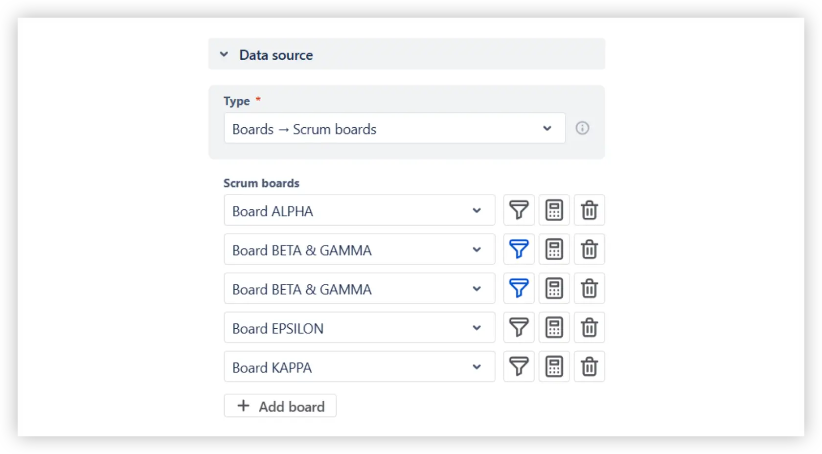
The Active sprint cumulative flow diagram in the Broken Build app allows you to combine multiple Scrum boards to build a unified view of how sprint items move through the workflow. Advanced filtering lets you include only the work that matters.
You can measure work using story points, issue count, or any other numeric field available in your Jira instance. Teams can also choose percentage mode to examine how much work sits in To Do, In Progress, or Done - a lightweight way to approximate Flow efficiency. Bands are fully customizable: regroup statuses, rename categories, reorder them, or change their colors to match your workflow.
The chart supports both Burnup Flow and Burndown Flow perspectives, and you can display Initial Scope, Ideal Slope, and Arrival/Departure trend lines to understand sprint pacing and flow stability.
For deeper insight, the chart provides Arrival, Departure, and WIP health metrics, a flexible Breakdown view that segments results by any Jira field, and an Issue list that lets you inspect every item included in the selected point on the CFD.
Use our examples to build your use cases on the Jira Dashboard.
The Jira apps (plugins) used in these examples have a 30-day free trial and are completely free for teams under 10 people.
The Agile Reports and Gadgets app includes Active sprint cumulative flow diagram functionality plus a wide range of additional charts and reports.
Yes. You can track a whole Program or ART by selecting multiple Scrum boards that represent all teams involved. The Active sprint CFD will combine all selected scopes into a single flow view, letting you see how work progresses across teams during the sprint. You can also use the Breakdown to compare results by board or project to understand where bottlenecks occur.
Yes. You can analyze not only a single past sprint but also multiple previous sprints or any fixed time frame. In the Interval configuration, you can:
You can also choose how these sprints are displayed on the timeline: use parallel sprint grouping, or switch to daily, weekly, or bi-weekly grouping.
This is especially useful for SAFe teams that deliver on the same PI cadence.

A one-day WIP spike usually means several items are moved into In Progress at the same time without progressing to the next stage. This often happens when work is started in batches, when a deployment fails, and items roll back to earlier statuses, or when multiple issues are unblocked simultaneously.
A short spike isn’t always a problem, but it’s a sign worth checking. Open the Statuses view or the Breakdown for that day to see which status grew. If the same pattern repeats across sprints, it may indicate a workflow habit (like starting too many items at once) or a recurring blocker that briefly stalls progress.
You can compare teams or sprints by adding multiple Active Sprint CFD gadgets to the same Jira dashboard. Each gadget can use a different board, team, or sprint as its data source. This lets you place charts next to each other and visually compare flow patterns, bottlenecks, scope changes, and pacing across teams or across several past sprints.


.svg)

.png)
