
Thank you! Your submission has been received!
Oops! Something went wrong while submitting the form.


The Kanban Monte Carlo simulation chart provides a probabilistic view of how delivery is likely to unfold based on your team’s historical throughput. Instead of relying on averages, it models thousands of possible future outcomes to estimate completion dates or forecast the scope that can be delivered within a defined timeframe.
With flexible data sources, customizable calculation settings, scenario modeling, and visual target comparison, the chart helps you assess delivery confidence, quantify risk, and align commitments with realistic capacity. Whether you are forecasting across a single Kanban board or combining multiple boards for cross-team initiatives, the Agile Monte Carlo Charts offer the visibility needed to make data-driven planning decisions.
✅ Team Lead: I use the Monte Carlo simulation for Kanban to understand how much work we can realistically complete in the next month and to prevent overcommitting. If a request exceeds our P85 forecast, I know we need to adjust scope or expectations.
✅ Engineering Manager: I rely on the “When” forecast to communicate delivery confidence to stakeholders. Instead of giving a single date, I present probability-based options and explain the associated risk levels.
✅ Release Train Engineer (RTE): I use the “How many” view during quarterly planning to determine how much scope fits into the next planning increment. The probability distribution helps align commitments across teams.
✅ C-level Executive: I want to understand delivery risk without reviewing detailed reports. The health metrics and percentile forecasts help me evaluate whether commitments are statistically achievable.


Use the When Monte Carlo forecast to estimate when the remaining work across one or multiple Kanban boards is likely to be completed. Instead of relying on a single average, the chart runs 100,000 simulations based on historical throughput from all selected boards. Each trial samples real past delivery rates to model natural variability, producing a probability distribution of possible completion dates.
📊 How to read the chart:
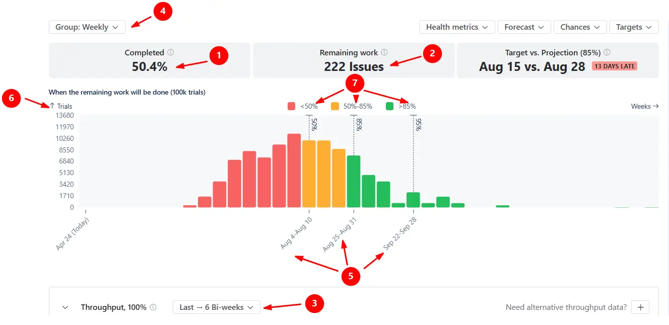
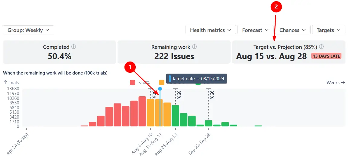
In the example below, 50.4% of the scope across the selected Kanban boards is completed (1️⃣), with 222 items remaining (2️⃣). The forecast runs 100,000 simulations using throughput from the last six bi-weekly periods (3️⃣). Since the data is grouped weekly (4️⃣), the model samples past weekly delivery rates to estimate how many future weeks may be needed to finish the scope.
The x-axis shows projected completion weeks (5️⃣), and the y-axis shows the number of simulation trials. The histogram displays how many trials finish on each date (6️⃣).
Dashed vertical lines (7️⃣) mark key confidence levels:
✅ This feature is helpful for:
Switch to the How many view to estimate the amount of work your teams are likely to complete within a defined period. This mode answers the question: How much can we realistically deliver within a certain timeframe?
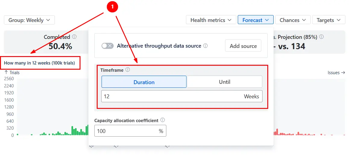
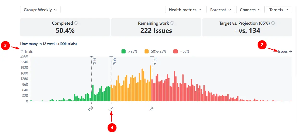
The example below models how many items could be completed over the next 12 weeks (1️⃣) based on the team’s historical weekly throughput:
The x-axis shows the number of items delivered within the selected timeframe (2️⃣), while the y-axis shows the number of simulation trials that produced that result (3️⃣). With the P85 line at 134 items (4️⃣), there is an 85% probability that the team will complete at least 134 items within the next twelve weeks. Any commitment beyond that level carries progressively higher delivery risk.
✅ This feature is helpful for:
You can add target dates (When view) or target scope values (How many view) directly on the chart using the Targets menu.
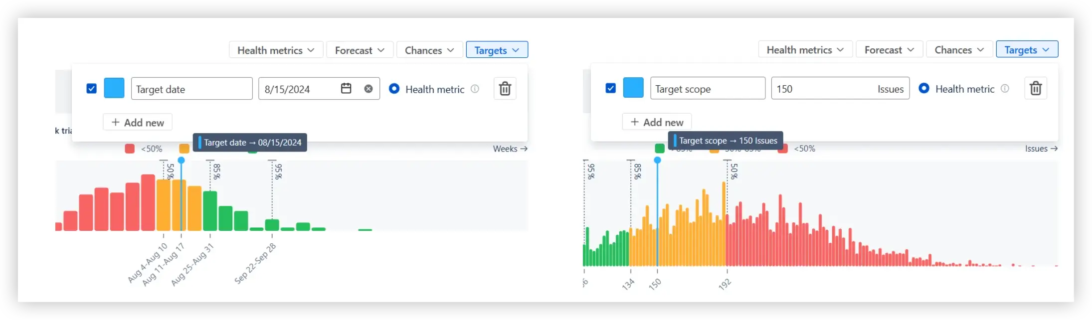
Once added, the target appears as a vertical marker on the histogram (1️⃣), allowing you to see whether it falls within a low-, medium-, or high-confidence zone. The Target vs. Projection health metric tile at the top of the chart (2️⃣) compares the target to a selected percentile (P50, P85, P95, or a custom value) configured in the Chances menu.
✅ This feature is helpful for:
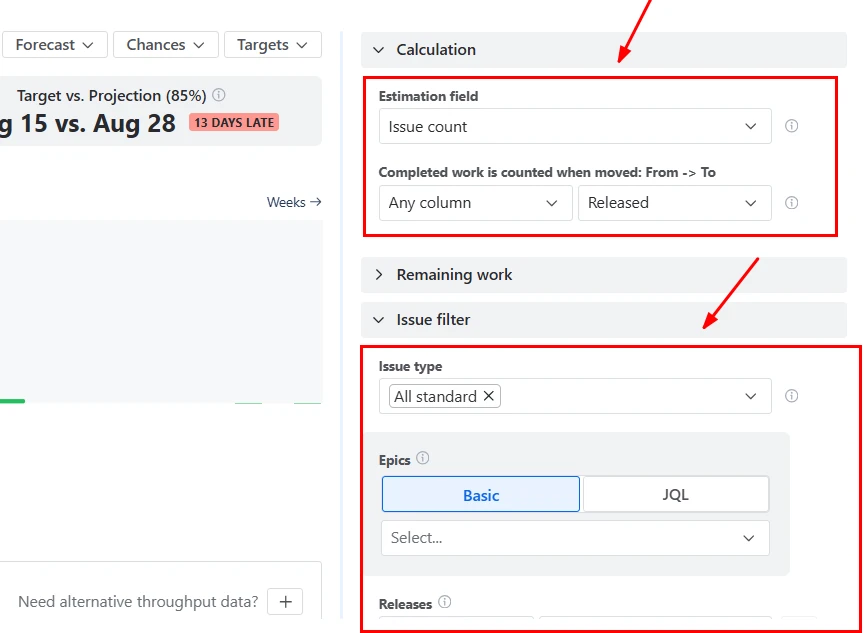
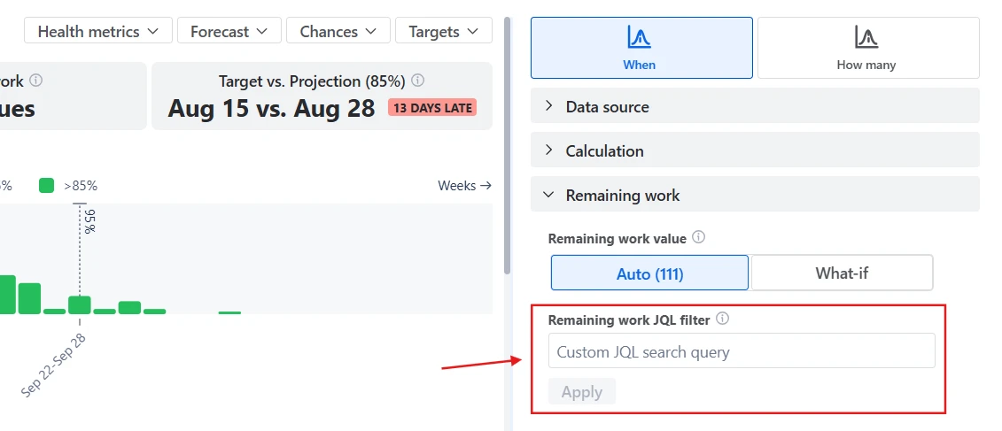
In both When and How many views, you can modify the Remaining work and the Capacity allocation coefficient to simulate different delivery conditions.
By default, remaining work equals the number of unresolved items in the selected Kanban boards. However, you can enter a custom “What-if” value or filter the backlog using JQL.
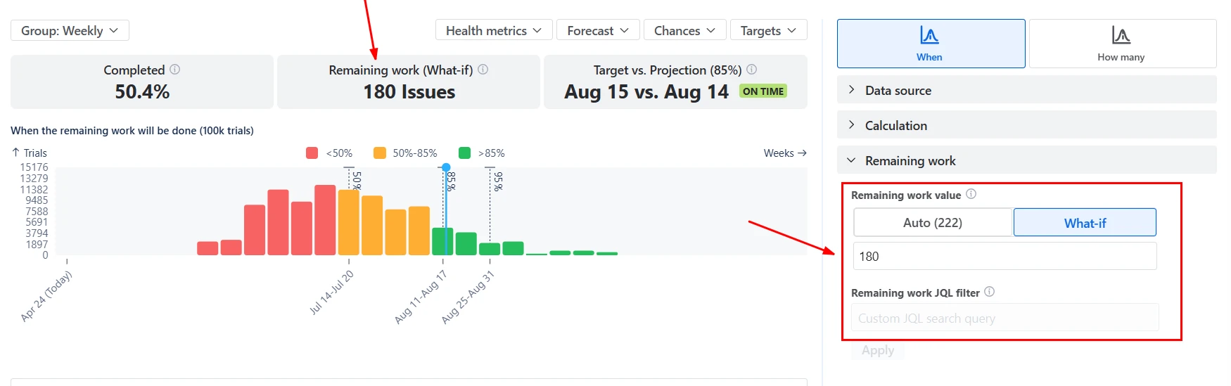
The Capacity allocation coefficient lets you model how much of the team’s throughput is dedicated to this scope. 100% assumes full focus, while 50% simulates a team splitting time across initiatives.
When you adjust either parameter, the distribution updates immediately.
✅ This feature is helpful for:
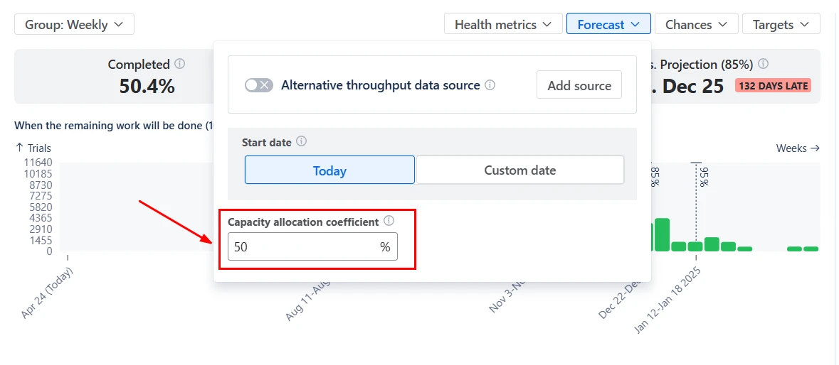
In some cases, the selected Kanban boards may not provide enough historical data to generate a stable forecast - for example, when forecasting a new initiative, a recently created board, or a scope with irregular delivery patterns.
With the Alternative throughput data source option, you can decouple the scope from the throughput history used for simulation. Instead of sampling delivery rates from the current selection, the chart can use throughput from another Kanban board, project, or release.
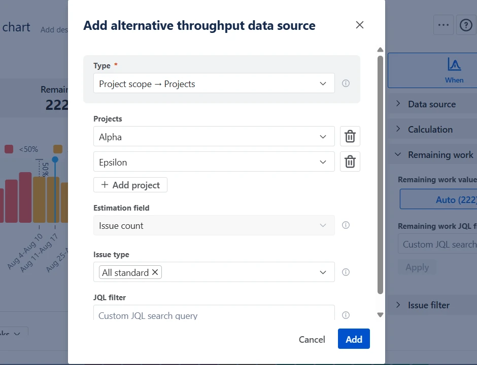
✅ This feature is helpful for:
The Kanban Monte Carlo chart can be configured to reflect how your teams actually work.
You can:
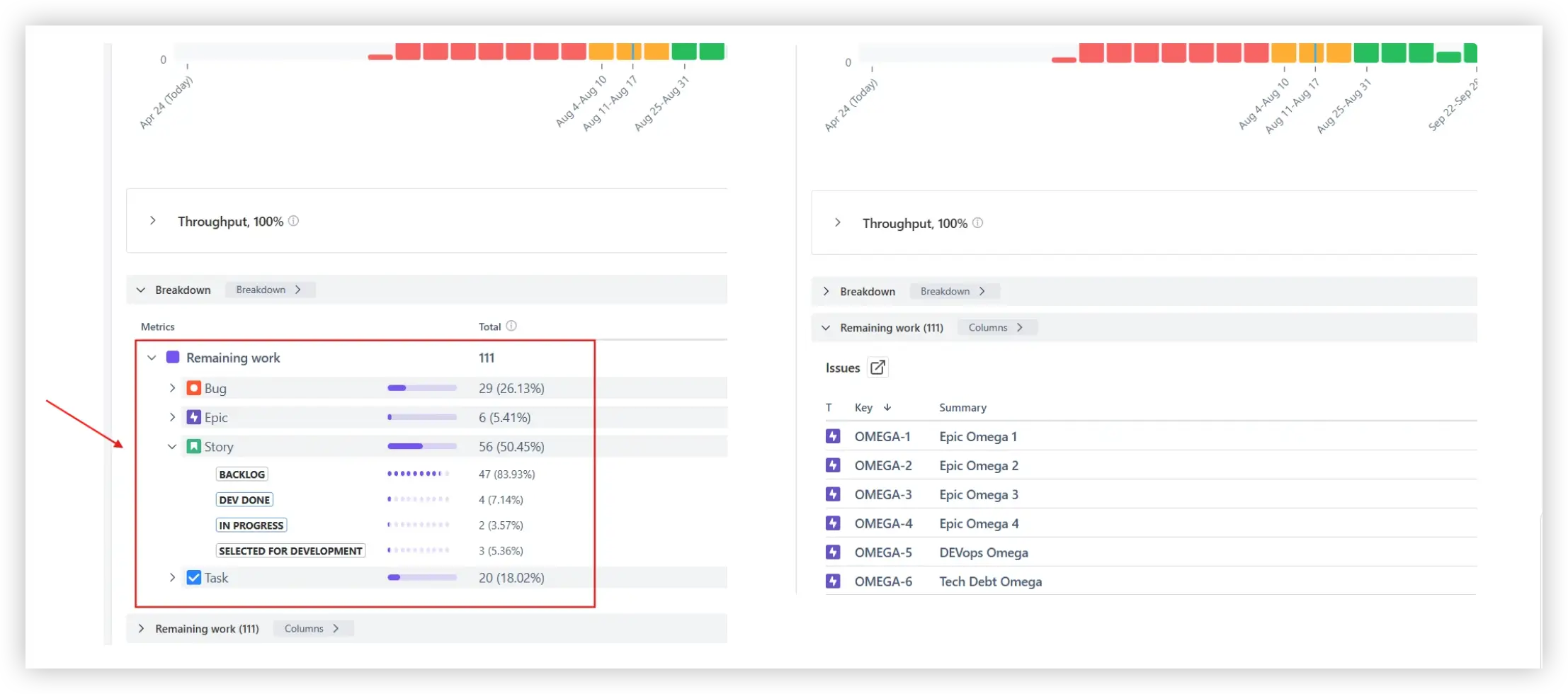
Below the forecast chart, you’ll find the Breakdown and the Remaining work list. The Breakdown groups remaining items by any Jira field - such as status, issue type, epic, assignee, component, or label. This helps you understand which segments of work contribute most to the forecast and where bottlenecks may exist.
The Remaining work list shows the exact unresolved items included in the simulation. Each issue is clickable and linked back to Jira, allowing teams to move from probabilistic forecasting to operational action.
Jira does not provide built-in Monte Carlo simulations or probabilistic forecasting.
Native Jira reports, such as the Control Chart, Cumulative Flow Diagram, and Burnup Chart, provide historical performance insights. They help understand past performance and identify bottlenecks.
However, they do not:
As a result, delivery expectations are often based on averages rather than risk-adjusted forecasts.
The Kanban Monte Carlo chart combines probabilistic modeling with advanced configuration and analysis capabilities:
Use these examples to create your own Kanban Monte Carlo simulation chart use cases on the Jira Dashboard.
Both Jira apps (plugins) featured here offer a 30-day free trial and are completely free for teams of up to 10 users:
The Agile Reports and Gadgets app includes Monte Carlo simulations functionality plus a wide range of additional charts and reports.
Monte Carlo simulation in Kanban is a probabilistic forecasting method that uses historical throughput data to model thousands of possible future delivery outcomes. Instead of calculating a single expected date or scope using averages, the simulation repeatedly samples past weekly delivery rates to generate a distribution of completion scenarios. This approach makes delivery uncertainty visible and expresses forecasts in terms of probability (e.g., 85% confidence), rather than fixed assumptions.
For a stable, statistically meaningful forecast, it is recommended to have at least 6 historical periods and approximately 50 completed items. Too little data may produce wide and unstable probability ranges.
If the dataset is limited, use the alternative throughput source setting to improve reliability.
Yes. You can use the Remaining work JQL filter to include only specific issue types, epics, labels, components, or any custom field.
For example, you can forecast only Features, exclude Bugs, or model a single initiative within a larger Kanban board. The simulation will run based solely on the filtered remaining work, allowing highly targeted forecasting.
Percentiles (P50, P85, P95, etc.) are derived from the full distribution of simulated outcomes.
After running 100,000 trials, all simulated completion dates (or scope quantities) are sorted from earliest to latest.


.svg)


.png)
