
Thank you! Your submission has been received!
Oops! Something went wrong while submitting the form.


The Epic cumulative flow diagram gives you a high-level view of how work flows across one or several epics over time. It helps you understand whether epic-level work is progressing at a sustainable pace, where items accumulate in the workflow, and how scope evolves during delivery.
With Arrival and Departure trends, flexible filtering, status-level analysis, and detailed drill-downs, Agile Cumulative Flow Charts let you evaluate the health and predictability of delivery, whether you're tracking a few roadmap initiatives or managing dozens of cross-team epics in a PI.
✅ Epic Owner: I use the Cumulative flow for Epics to understand whether our roadmap epics are moving at a healthy pace. Arrival and Departure trends show if teams are taking in more work than they can finish, and the Burndown Flow view tells me how close we are to completing the epic. It helps me prioritize, communicate expectations, and catch scope creep early.
✅ Scrum Master: The Epic cumulative flow chart gadget helps me see how work related to a specific epic flows through the team’s workflow. If too much work piles up in certain statuses or if WIP climbs across teams, I can address bottlenecks and ensure the team collaborates smoothly on cross-team epic work.
✅ Release Train Engineer (RTE): I rely on the Epic cumulative flow diagram to track epic progress across multiple teams within the ART. Trend lines and WIP metrics show whether epic delivery is stable, while Breakdown helps me see which teams, issue types, or workflow stages are slowing progress. This gives me clear signals for PI syncs and ART stakeholder updates.
✅ System Architect / Solution Manager: For architectural or cross-team capabilities, the Epic CFD helps me evaluate whether implementation work is progressing as expected or stuck in specific technical stages (e.g., blocked by integrations, QA, or reviews). It supports decision-making around sequencing and capacity allocation.
✅ Portfolio Manager: The Epic cumulative flow diagram chart gives me a high-level view of how strategic initiatives are moving through the system. Stable Arrival–Departure trends, controlled WIP, and steady progress toward the Ideal slope indicate predictable execution. When trends drift or bottlenecks grow, it signals investment, staffing, or prioritization issues that require attention.


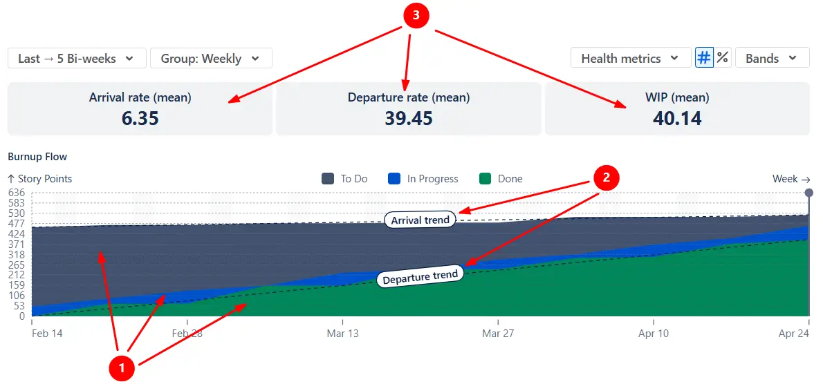
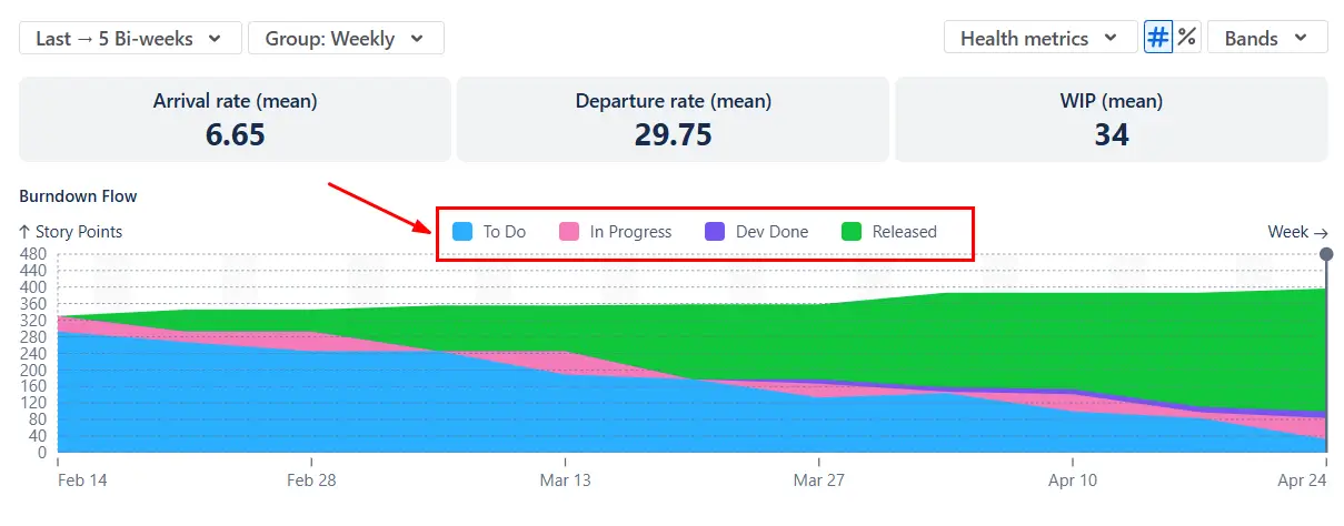
In the Cumulative flow diagram for Epics, the Burnup Flow view helps you see whether work on your epics is flowing at a sustainable pace. The colored bands show how items move through To Do, In Progress, and Done (1️⃣), while the Arrival and Departure trend lines (2️⃣) summarize how much work is added vs. completed in each period. When these trend lines stay close together, flow across your epics is stable; when Arrival consistently outpaces Departure, the backlog of epic-related work grows and risks accumulate.
Above the chart, the health metrics (3️⃣) report statistical averages (daily, weekly, or per sprint) for Arrival, Departure, and WIP (Work in Progress)
In the example below, the Arrival rate stays well below the Departure rate, with an almost flat Arrival trend line. The team is taking on little to no new work and is consistently moving toward completing the epics:
✅ This feature is helpful for:
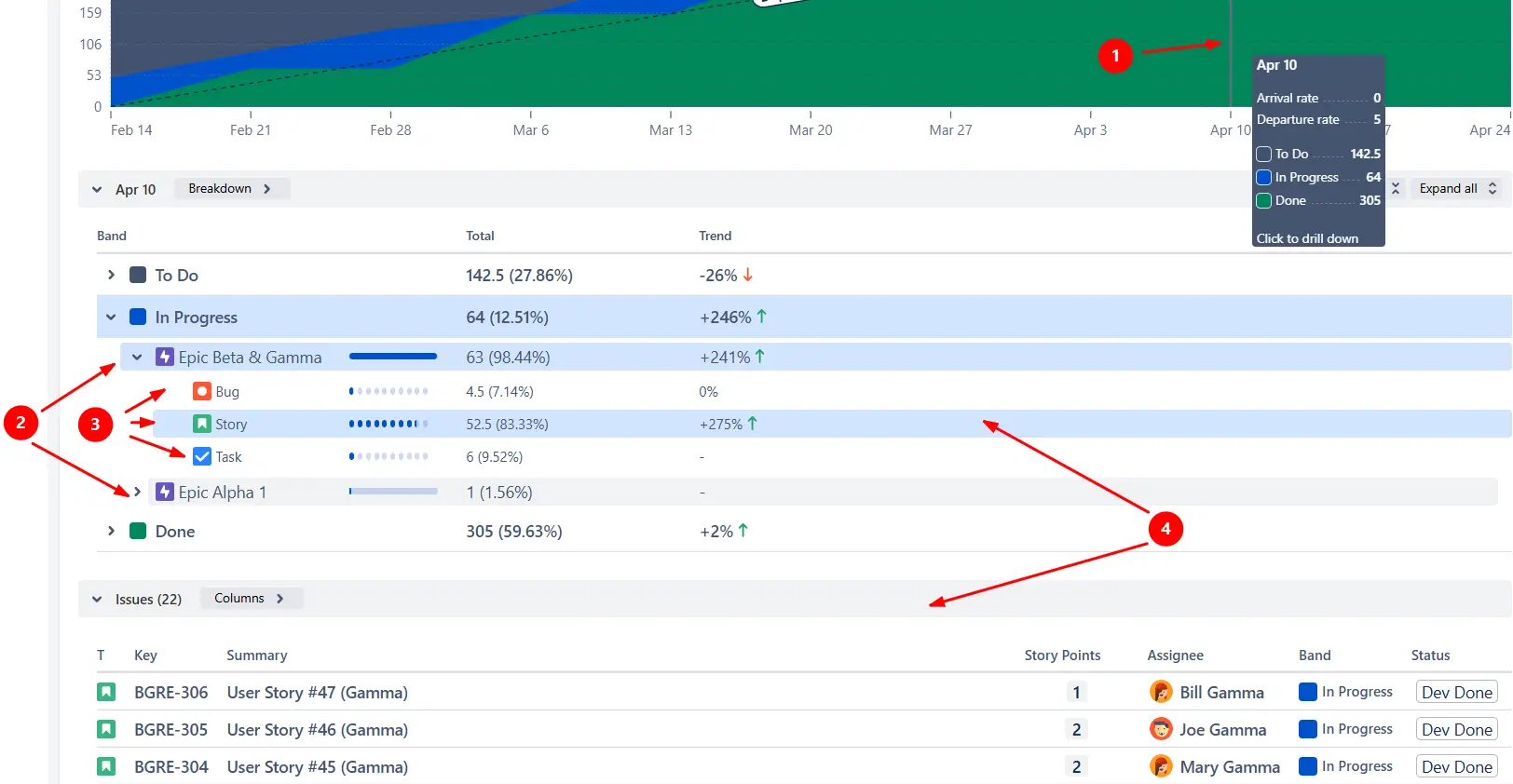
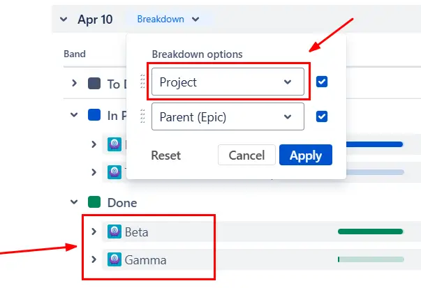
You can click any zone on the chart (1️⃣) to open the Breakdown for that interval and segment the data by epic (2️⃣) to see how each epic contributes to the overall flow. If you need deeper insight, you can add a second level of Breakdown grouped by any Jira field (3️⃣), such as issue type, assignee, project, or board. This helps you understand not only which epic is growing or slowing down, but why - for example, whether a specific team, work type, or stage of the process is causing delays.
From the Breakdown, you can open the Issue list (4️⃣) to review the exact items behind each segment. Every issue includes its status, estimation, assignee, and a direct link back to Jira for validation or follow-up.
✅ This feature is helpful for:
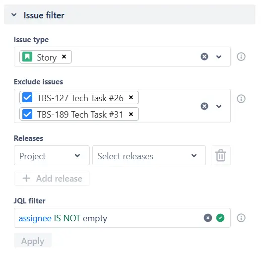
With the Cumulative flow diagram for Epics, you can include or exclude issues using issue type, assignee, project, labels, epic link, or any custom JQL expression. This allows you to isolate a specific slice of epic-related work, such as only user stories, only backend tasks, or issues assigned to a particular team.
✅ This feature is helpful for:
Switching the Cumulative flow diagram for Epics to the Burndown Flow view helps you understand how quickly the selected epics are progressing toward completion.
The Ideal slope (1️⃣) gives you a reference line that represents a steady pace required to finish the selected epic scope within the chosen timeframe. By comparing the To Do and In Progress areas with this line, you can immediately see whether epic work is ahead, behind, or on track.
The Initial scope marker (2️⃣) shows how much work was originally included at the start of the interval. If the coloured bands grow above this line (3️⃣), the epics are gaining scope.

✅ This feature is helpful for:
To understand where work inside your epics slows down, you can switch the Epic progress flow chart from status groups to individual statuses. If a particular status band becomes noticeably thicker over time, that’s a signal that items are accumulating in that stage. For epics involving multiple teams or specialties (e.g., backend, frontend, QA), status-level bands also show whether delays occur within one function or across multiple stages of the process.
You can hide or reorder bands to focus on the most critical parts of your workflow.
✅ This feature is helpful for:
You can tailor the Epic cumulative flow diagram to show the time window you want to analyze. Using the Interval configuration, you can display the last N days/weeks/bi-weeks/months/quarters or a fixed date range.
Once you select the timeframe, you can control how data is grouped. Choose daily, weekly, bi-weekly, or monthly to zoom in for detailed analysis or zoom out to see higher-level trends across multiple iterations or an entire PI.

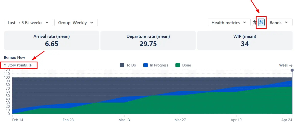
When you’re analyzing several epics of different sizes, the absolute values can be hard to compare. Switching the Epic cumulative flow diagrams to the percentage view normalizes the data so each chart shows the relative share of work in To Do, In Progress, and Done, regardless of how many issues each epic contains.
This makes it easier to compare multiple Epic CFDs side by side on a Jira dashboard.
Jira provides a basic CFD and a basic Epic Report, but their functionality is limited when analyzing epics, especially across teams:
❌ Single-board or single-epic only
❌ Fixed daily timeline
❌ Issue count only
❌ Rigid band structure - statuses are locked to Jira’s default categories
❌ Minimal filtering
❌ No Arrival/Departure trend lines, WIP metrics, Ideal slope, and Initial scope markers.
❌ No Burnup/Burndown Flow - you can’t switch perspectives to evaluate scope changes or remaining work.
❌ No drill-down tools
For multi-team epics, PI planning, or cross-board analysis, the native Jira CFD often isn’t sufficient.
The Epic cumulative flow diagram by Broken Build provides a flexible way to analyze how work flows through one or multiple epics:
✅ Combine multiple epics in one chart
✅ Include or exclude work by issue type, team, project, label, or any Jira field.
✅ Choose daily, weekly, bi-weekly, monthly, or sprint grouping to match team or PI cadence.
✅ Analyze epic flow in Story Points, issue count, or any numeric custom field.
✅ Normalize charts for dashboard comparisons with the percentage view.
✅ Create your own workflow groupings, map statuses freely, reorder bands, and change colors.
✅ Switch perspectives with the Burnup and Burndown Flow views.
✅ Use Arrival/Departure trends, Initial scope, and Ideal slope lines for visual benchmarking.
✅ See aggregated Arrival, Departure, and WIP for the selected interval.
✅ Drill into data by epic, board, team, issue type, or assignee and inspect exact items.
Use our examples to build your use cases on the Jira Dashboard.
The Jira apps (plugins) used in these examples have a 30-day free trial and are completely free for teams under 10 people.
The Agile Reports and Gadgets app includes Epic cumulative flow diagram functionality plus a wide range of additional charts and reports.
To identify which team contributes the most work to the epic, click any zone on the chart to open the Breakdown and group the results by board or project:
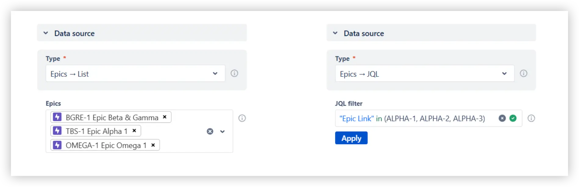
Yes. In the Data source section, you can select multiple epics directly from the dropdown or define them using a custom JQL query. The Epic CFD will aggregate all issues linked to those epics, regardless of which boards or projects they come from, into a single flow view.
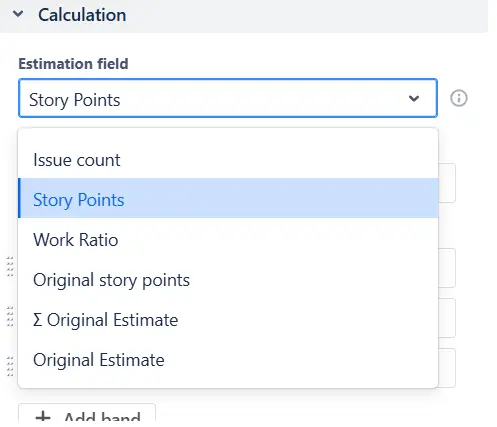
No problem - the Cumulative flow diagram for Epics works even if your teams don’t use story points. You can choose issue count or any other numeric Jira field (such as “Original Estimate,” “Time Spent,” or a custom estimation field) as the measurement basis. The chart will calculate Arrival, Departure, WIP, and all trend lines using the field you select.
Yes. You can create custom bands to reflect how different teams or functions contribute to an epic. Simply map the relevant statuses (such as "In Development", "Code Review", "Ready for Test", or "In QA") into their own bands. This allows you to visualize how much work sits in each stage of the cross-team workflow.


.svg)

.png)
