Thank you! Your submission has been received!
Oops! Something went wrong while submitting the form.

Created vs. Resolved by period chart

Interactive сhart example
info
The interactive chart is available on larger screens
Please open this page on a desktop to try it out

Key features of the Created vs. Resolved by period chart

The Created vs. Resolved by period chart shows, side by side for each period, how many Jira issues were created and how many were resolved. Plotted as bars per week, sprint, month, or any other period you choose, it makes the rhythm of incoming demand and completed delivery immediately visible – so teams can tell whether a given period was balanced, whether resolution kept up with new work, and how today's pace compares with the weeks or sprints before.

The chart adapts to almost any way teams organize their work in Jira. Scope can be defined from a single Scrum or Kanban board, several boards combined, a project, a saved JQL filter, a custom JQL query, an epic, an initiative, or a project version. Results can be segmented by different Jira attributes, helping teams spot which categories of work drive demand and which absorb delivery capacity.

With configurable definitions of "created" and "resolved", a choice between counting issues or weighting them by story points, and granular period units from day to quarter or sprint, the Agile Created Resolved Charts app turns raw activity data into a clear per-period report. Drill down on any bar to see the underlying issues, expand the breakdown tree to compare segments with previous-period trends, or switch between bar, line, and stacked bar views to read the same data through different lenses.

How different roles use Created vs. Resolved by period report        

Product Owner: I use the Jira Created vs. Resolved by period chart per sprint to see whether the team closed at least as much as came in. When several sprints in a row show more Created than Resolved, I treat it as a signal to refine intake, push back on scope, or rebalance the backlog before the gap compounds.

Scrum Master: I review the chart weekly with the team in retrospectives. Spikes in Created without a matching rise in Resolved usually point to an interruption – incidents, unplanned requests, or a blocker – and the breakdown by issue type or assignee tells us exactly where the pressure landed.      

Team Lead: I track Created vs. Resolved per week to keep the flow steady. If resolution drops while creation stays flat, I drill into the bar to see which issues stalled and use the breakdown by status or component to find the bottleneck.

Engineering Manager: I look at the chart per month across multiple boards to compare how teams are absorbing demand. Segmenting by board or component shows me which areas are consistently outpaced by incoming work and where I should invest in capacity, automation, or process changes.

Spot where new work outpaces delivery – and act before the backlog grows with the Created vs. Resolved by period chart

Key feature 1: Compare Created vs Resolved per period at a glance

The Created vs Resolved by period chart shows two side-by-side bars for every period – one for the number of issues created, one for the number resolved. Unlike the cumulative view, every period is independent, so a single bad week or strong sprint stands out instead of being smoothed into a running total. Teams use this to read the rhythm of their workflow: which periods were balanced, which had a spike of new work, and where delivery actually caught up.

You can configure what each bar represents and how the periods are sliced. Pick a period unit that matches your cadence (day, week, bi-week, month, quarter, year or sprint), choose between counting issues or weighting them by story points or any numeric custom field, and switch the visualization between bar, line, and stacked bar without changing the underlying data.

📊 How to read the chart

Created vs Resolved by period report in Jira Dashboard

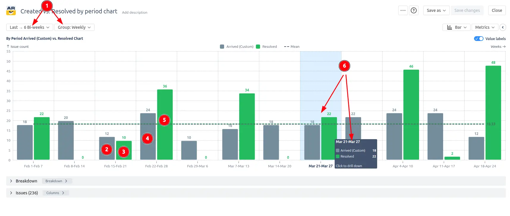
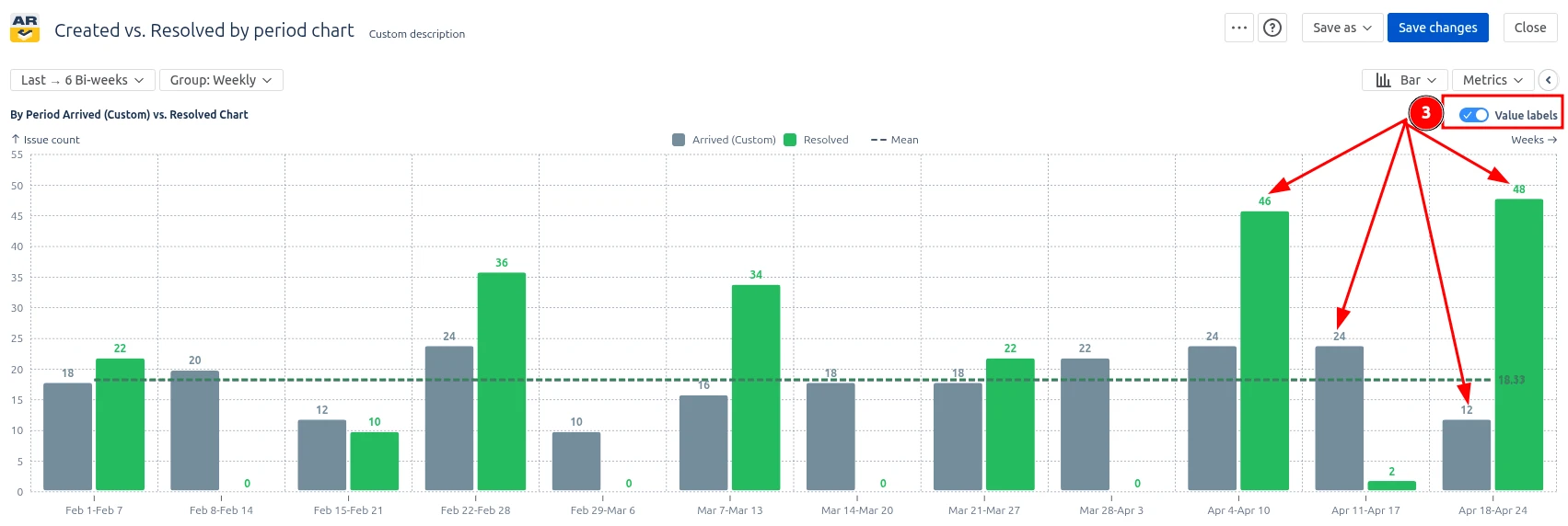
In the screenshot above, the chart displays the last six bi-weekly periods grouped weekly (1️⃣). Each week shows two bars: the grey bar is the number of issues Created that week, and the green bar is the number Resolved. In the middle of February, the Created bar reaches 12 (2️⃣) while Resolved stays at 10 (3️⃣) – a small spike of incoming work that delivery did not absorb in the same period. A week later, the Resolved bar climbs to 36 (4️⃣) against 24 Created (5️⃣), showing the team caught up. Hovering on any bar opens a drill-down with the exact issues counted in that period (6️⃣), so the team can move from the signal to the underlying tickets in one hover.

This feature is helpful for:                                      

  • Spotting individual weeks or sprints where incoming work outpaced delivery, instead of waiting for a long-term trend to appear
  • Driving retrospective conversations grounded in a specific period – "What happened in sprint 24?"                                                  
  • Reading workflow volatility, not just direction: a balanced average can still hide alternating spikes

Key feature 2: Define what Created and Resolved mean in your Jira workflow

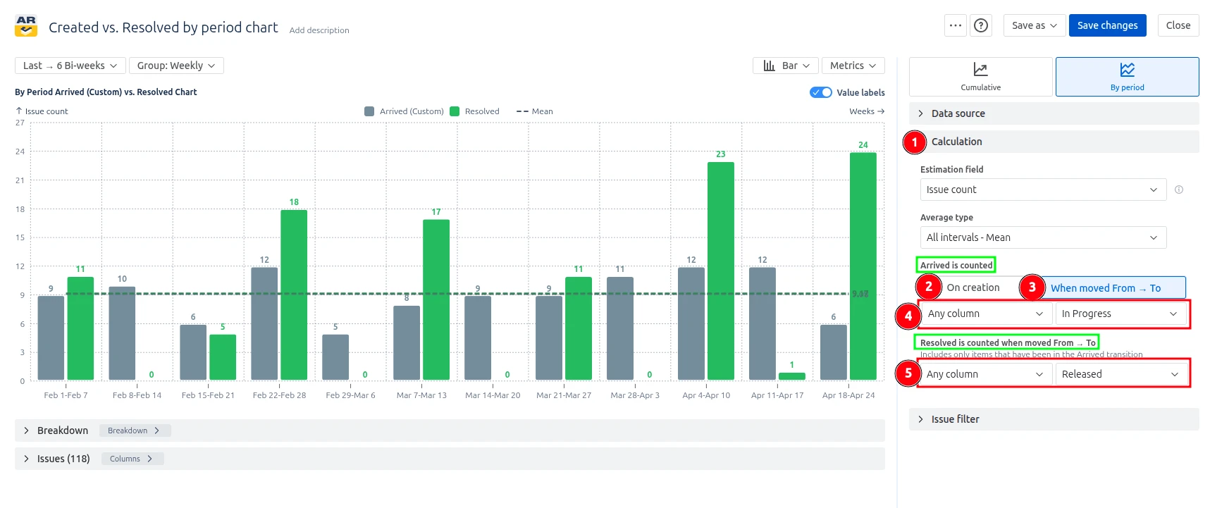
Every team treats "Created" and "Resolved" a little differently. Some count an issue as "Created" the moment it lands in the system; others only when it leaves an intake or triage status. Some consider an issue "Resolved" as soon as it reaches Done; others want it to stop counting if a tester reopens it. The Jira Created vs. Resolved by period graph lets you encode those rules directly, so the bars reflect your team's working definitions instead of a generic default.

Configure the calculation in three places:

  • First, choose the Created date source: either the issue's original creation timestamp or the date it transitioned from a specific status into another specific status.
  • Second, pick the same for Done statuses.
  • Third, the chart automatically applies reopen logic: when an issue moves from the out to a Done status, the resolution is rolled back, and the issue is re-counted only when it transitions to Done again, in whichever period that happens.

⚙️ How to set it up              

Configuring how Created and Resolved are counted
  1. Open the chart settings and find the Calculation section (1️⃣).              
  2. Set Created date to either Issue created date (2️⃣) or Status transition (3️⃣), and
    pick the desired columns "Arrived is counted" when moved From and To (4️⃣).                    
  3. In Done statuses, select desired columns "Resolved is counted" when moved "From" and "To" (5️⃣).                                                            

✅ This feature is helpful for:                                                  

  • Making the chart match the team's real definition of "done" instead of a generic Resolution                                                
  • Filtering out triage and intake noise from the Created count by anchoring it to a meaningful workflow status                                      
  • Surfacing rework honestly, so periods with high reopen rates are not misread as strong delivery weeks                                    
  • Keeping the chart consistent across teams with different workflows – each chart can use its own calculation rules without changing Jira itself

Key feature 3: Bar and line chart views – switch perspectives on the same data

The Created vs. Resolved by period report in the Jira dashboard shows how many issues your team adds (Created/Arrived) and completes (Resolved) within each time period. Unlike the cumulative view, every bar or point represents the value for that period only, so you can read throughput period-by-period instead of as a running total.

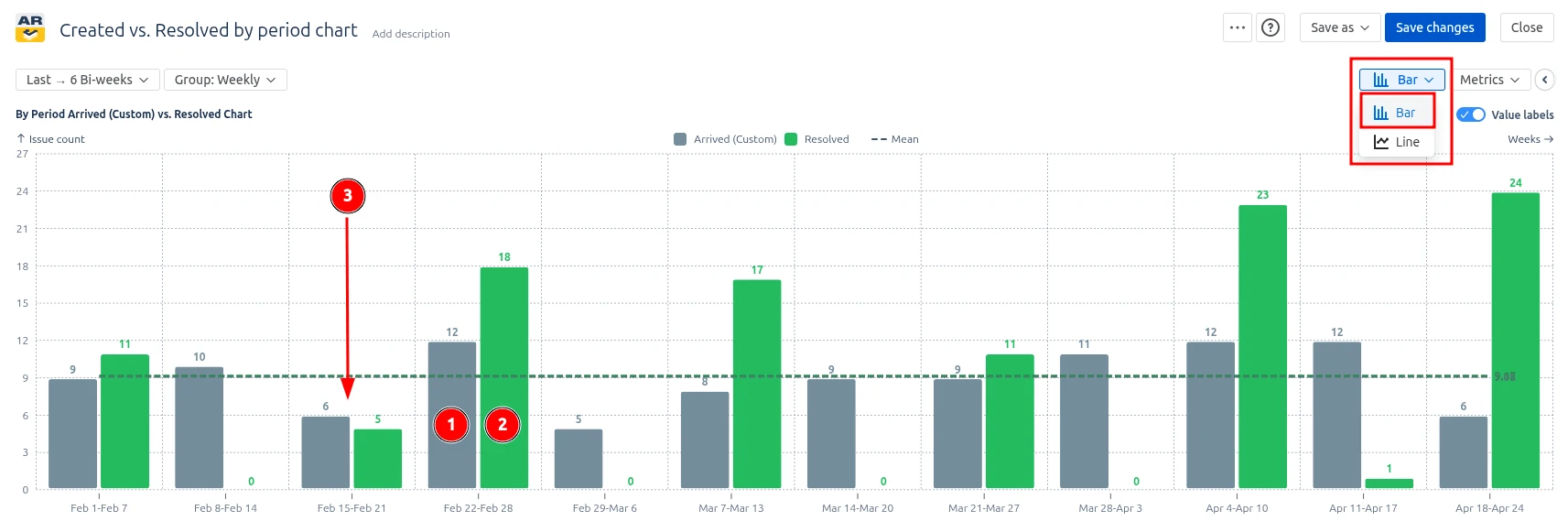
To match different reading habits and review scenarios, the chart can be displayed in two interchangeable visualizations of the same data:

  • Bar view – Created and Resolved are drawn as two grouped bars side-by-side
    for every period. Best when you want to compare absolute values inside a
    single period at a glance.
  • Line view – Created and Resolved are drawn as two continuous lines across
    periods. Best when you want to read direction, momentum, and turning points
    over time.

📊 How to read the chart

To switch between modes, find a chart mode selector in the chart header. In the bar view, each period contains two bars: grey (1️⃣) for Created issues and green (2️⃣) for Resolved. This makes it easy to spot a single problematic period – for example, a week where 6 issues arrived but only 5 were closed (3️⃣) – because the height difference between the two bars stands out immediately.

Bar chart type of the Created vs. Resolved by period chart

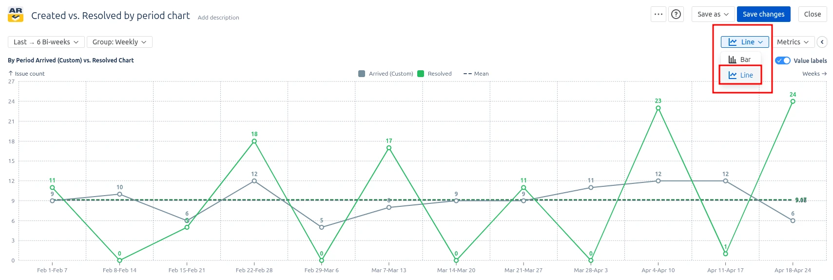
Switching to the line view on the very same data set replaces the bars with two lines. The eye now follows the direction of work instead of comparing pairs. In the image below, the Created line trends stay almost flat while the Resolved is unstable, signalling that there are some problems with delivery capacity.

Line chart type of the Created vs. Resolved by period chart

This feature is helpful for:

  • Comparing absolute Created vs. Resolved values within a single period (bar view) – useful for sprint reviews and weekly throughput checks
  • Spotting trends, slowdowns, and turning points across multiple periods (line view) – useful for quarterly reviews and capacity planning conversations
  • Presenting the same delivery data to different audiences without rebuilding checks

Key feature 4: Add a moving average to see the trend through the noise

Period-by-period charts tell the truth, but the truth can be noisy. One sprint, a holiday lands on Tuesday, another a release goes out, and the next someone closes a backlog of stale tickets in a single afternoon. Looking at the raw bars or lines, you see the spikes – but it can be hard to tell whether the team is actually trending up, down, or sideways.

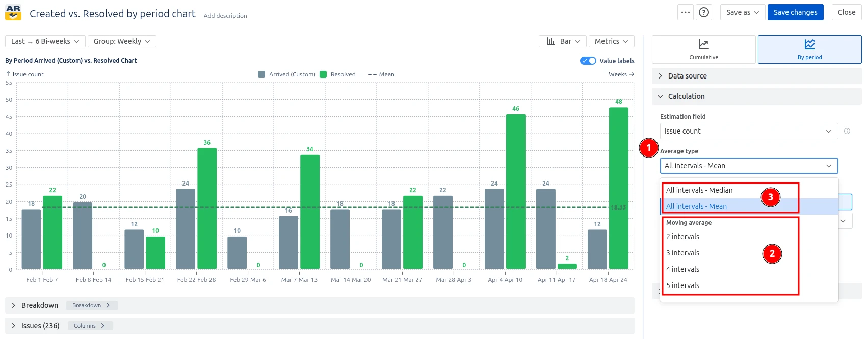
The Created vs. Resolved by period chart can overlay a moving average trendline on top of either metric (Created, Resolved, or both). Instead of plotting the raw value of each period, the moving average plots the average of the last N periods at every point – so the line glides through the noise and shows the underlying direction of work.

You can pick the window size for the moving average that matches your team's rhythm:

  • 2 intervals – very responsive, follows recent shifts closely
  • 3 intervals – balanced; a good default for weekly or bi-weekly grouping
  • 4 intervals – smoother, good for monthly reviews
  • 5 intervals – the smoothest option, best for spotting long-term direction

The same selector also offers two non-moving alternatives, which draw a single horizontal reference line across the whole chart:

  • All intervals – Mean
  • All intervals – Median

Use "Non-moving average", when you want a baseline. Use "Moving average" when you want a trend.

⚙️ How to configure it

  1. Open the Calculation section of the chart settings and find the Average type selector (1️⃣).
  2. Under Moving average, pick 2, 3, 4, or 5 intervals if you want a trend (2️⃣).
  3. Above "Moving average", pick "Mean" or "Median" option if you want a baseline (3️⃣).
Configuring the Average type of the Created vs. Resolved by period chart
  1. In the Metrics section, make sure the average toggle is enabled for the metrics you want a trendline on – Created, Resolved, or both. Both are enabled by default (4️⃣).

Configuring the display of the metrics on the chart

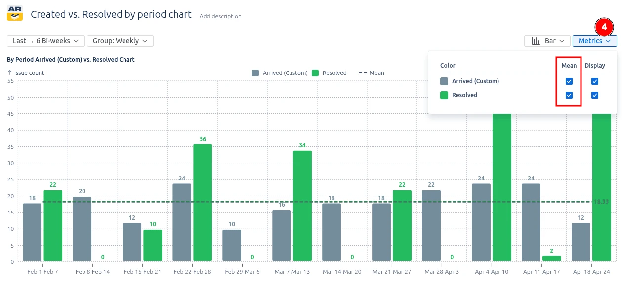
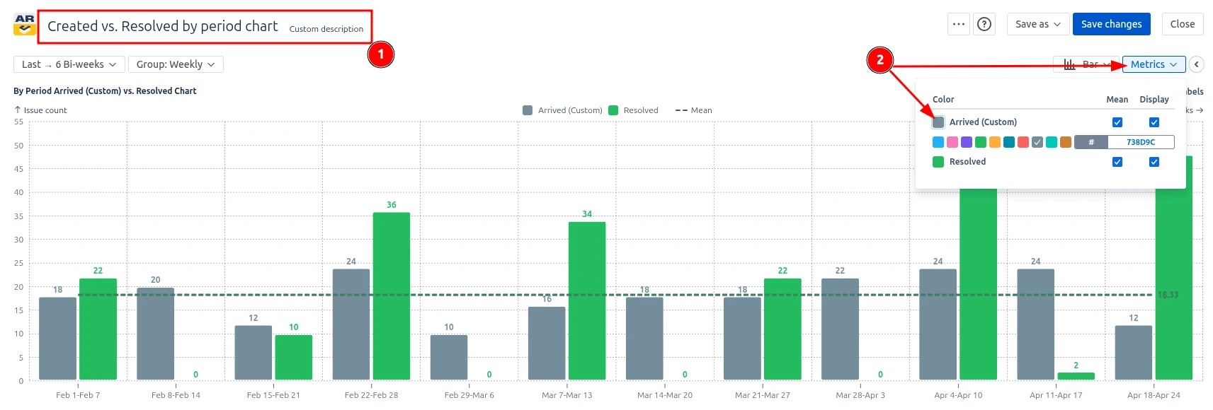
The trendline inherits the color of its metric (in a slightly darker shade), so Created and Resolved trends remain easy to tell apart.

Key feature 5: Drill down from any period to the underlying issues

A chart is only useful if you can ask it the next question: "Which issues are behind that spike?" The Created vs. Resolved by period chart makes that question one click away. Every bar (or point, in line view) is interactive – click it, and the entire panel below the chart re-scopes itself to just that period.

You don't move to a new screen, open a search, or copy a JQL. The chart, the breakdown tree, and the issue list all live on the same view, and the period you click instantly becomes the lens for the other two.

📊 What you see when you click a period

Selected interval features of the Created vs. Resolved by period chart

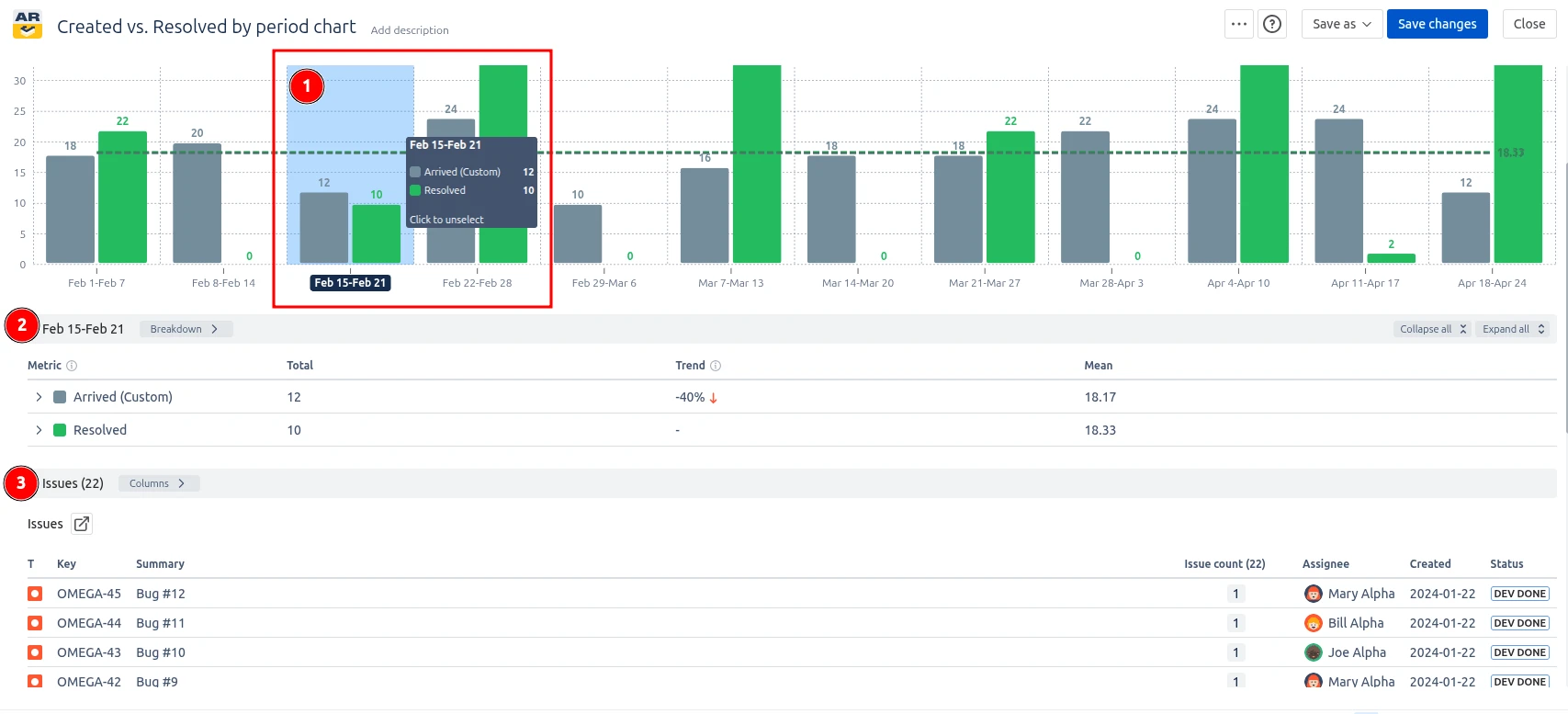
1️⃣ The bar lights up. A soft blue overlay marks the selected period, and its label on the X-axis turns into a dark pill with white text – so you always know which interval you're looking at, even after scrolling.

2️⃣ The breakdown tree narrows down now to show only that one period, broken down by your chosen grouping (board, project, status, assignee, epic, priority, and so on). Trends and percentages recalculate against the selected interval.

3️⃣ The issue list re-filters. The table below the breakdown now lists only the issues that were Created or Resolved within that period. Standard columns are there – key, summary, assignee status, created date, and your estimation field – sortable as usual.

Additional features of Created vs. Resolved by period report

1. Customize titles, colors, and value labels for clean reporting

A chart that lives on a dashboard usually needs to be read at a glance. The chart settings let you:

  • Set a custom title and description so the gadget speaks the language of its audience (1️⃣)
  • Pick custom colors for Created and Resolved to match your team's chart palette or to mirror Jira project colors (2️⃣)  
Title and color settings for the chart
  • Toggle value labels on or off – show exact numbers on every bar/point for executive reports, or hide them for a cleaner trend-only view (3️⃣)        
Label settings for the chart

2. Use a custom estimation field

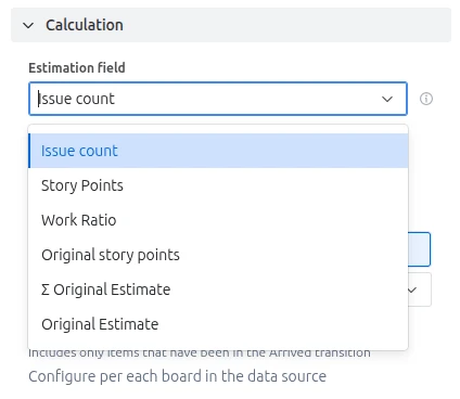
The chart is not limited to counting issues. You can choose what unit the chart should measure by selecting a custom estimation field in the Calculation settings. Pick story points or any custom numeric field from your Jira instance. This lets teams track demand and delivery in the unit that best reflects their planning model – issue count for ticket-based teams, story points for estimated Scrum teams, or any custom field for specialised workflows.

If an issue has no value for the selected field, you can set a Default estimation to make sure it still contributes to the period totals instead of silently dropping out.

Custom estimation field in the Created vs. Resolved by period chart

What about the native Jira Created vs. Resolved by period chart

Jira provides a built-in Created vs Resolved report that shows the number of issues created and the number of issues resolved over a chosen period, on a single project or saved filter.                                                                                                                                                                              

It does the job for a glance, but the picture it paints is rough. The gadget is tied to a single project or saved filter, treats every issue as the same size regardless of effort, and gives you almost no levers to adjust what you're measuring. "Created" always means the day the issue was opened, and "resolved" always means whatever the project's resolution field says – even if your team treats "ready for release" or a custom Done column as the real finish line. The list of available time periods is short, there is no way to compare segments of the data side by side, and the report cannot follow work across multiple boards or releases at once.

Additionally, the native report provides no breakdown or segmentation capabilities and no averaging or trend overlays, making it harder to analyze specific teams, work types, components, or workflow stages and to spot whether the gap between created and resolved is growing or shrinking over time.

Advantages of using Created vs. Resolved issues by period report

The Created vs Resolved by period chart from Broken Build turns Jira's basic intake-vs-throughput view into a configurable instrument you can shape around the way your team actually delivers work.                            

Beyond the basics, the chart lets you:                                                                                                                                              

  • Pull data from any combination of Scrum boards, Kanban boards, board sets, projects, releases, epics, initiatives, or a custom JQL query, so a single chart can cover one team or a
    whole portfolio.
  • Decide what "arrived" and "resolved" actually mean in your workflow – count work from the moment an issue is created or only after it reaches a specific status, and pick the exact
    statuses that represent Done.                                                                        
  • Measure throughput in the unit that matches the conversation: issue count, story points, time estimates, or any numeric custom field, with an ability to set a default value for unestimated items.                                                                                                                  
  • Narrow the dataset with issue-type, epic, version, and exclusion filters, or with full JQL when the built-in filters aren't enough.
  • Choose the reporting window that fits the question – the last N periods, everything since a given date, a fixed date range, or just the current period.    
  • Break the trend down by board, project, issue type, component, assignee, priority, or any custom field to see which slice of the work is driving the numbers.      
Explore the interactive chart, no setup, no risk
TRY THE CHART
Chart embeded

Apps used in this Created vs. Resolved by period chart example

Use these examples to recreate similar use cases or to build your own on your Jira Dashboard.

Both Jira apps (plugins) showcased here come with a 30-day free trial and are completely free for teams sized up to 10 people:

The Agile Reports and Gadgets app includes Created vs. Resolved by period chart functionality and a multitude of other reports/charts.

Frequently Asked Questions

1. What is the Created vs Resolved by period chart?

The Created vs Resolved by period chart shows for each chosen interval how many issues entered your workflow and how many were closed during that same span. Each period gets its own pair of bars, so intake and throughput sit side by side instead of being summed into a running total.

Teams use it to spot spikes in incoming work, drops in delivery, and the rhythm at which their system is keeping up with demand.

2. When should I use by-period instead of a cumulative view?

Pick the by-period view when you care about what is happening inside a specific interval rather than the overall trend. Each bar represents a single sprint, week, or month, which makes it easy to see where throughput surged, when intake jumped, and how individual periods compare. The cumulative view is stronger for long-term backlog signals, but the Created vs. Resolved issues by period report is the right tool for sprint retrospectives, weekly standups, and any conversation about a specific time slice.

3. Can I customize when an issue is counted as Created or Resolved?

Yes! The chart lets you redefine "arrived" as either the issue creation date or the first transition into a configurable status, and lets you choose exactly which workflow statuses (or Kanban column transitions) count as Done. Reopened issues are detected automatically.

Teams whose real intake or finish line lives in a custom status, such as "Ready for development" or "Ready for release", can therefore produce numbers that reflect how their workflow actually behaves.

4. Which time periods does the chart support?

The Agile Created Resolved Charts app supports day, week, bi-week, month, quarter, year, and sprint, so the granularity matches the cadence of your work.

You can also limit the visible range to the last N periods, anchor it to a specific start date, define a fixed window, or focus on the current period only. The same underlying data can therefore drive a daily standup chart, a sprint review chart, and a quarterly business review chart.

5. Can I measure work in story points instead of issue count?

Yes. The chart can count issues, story points, original or remaining estimates, or any numeric custom field, and you can set a default value for issues that have not been estimated, so missing fields do not break the calculation. Switching the unit lets the conversation move from "how many tickets" to "how much work," which is especially useful when ticket sizes vary widely between teams, projects, or issue types.

6. Can the chart combine multiple boards or projects?

Yes. The Created vs Resolved by period chart can pull from a single Scrum or Kanban board, a board set, a Jira project, a release, an epic, an initiative, or a JQL query. This means you can analyze one team in isolation or roll several teams into a single delivery view. JQL filters and exclusion lists then let you fine-tune exactly which issues are included, regardless of where they live in Jira.

7. How does the chart help with sprint and capacity planning?

By looking at past periods, teams can see how much they typically resolve per sprint and how often new work is created during that same window. If Created consistently exceeds Resolved sprint after sprint, the planned scope is likely too ambitious, or scope creep is leaking in mid-sprint.

Adding a moving average on top of the bars smooths out one-off noise and gives planners a realistic baseline for how many issues or story points the team can safely commit to next.

Why trust Broken Build apps?

Gold Marketplace Partner
apps