
Thank you! Your submission has been received!
Oops! Something went wrong while submitting the form.


The Scrum Throughput run chart provides a clear view of how delivery evolves over time based on your teams’ actual completed work. Instead of relying on assumptions or isolated team metrics, it aggregates throughput data across one or multiple Scrum teams to reveal real delivery patterns, variability, and trends.
With flexible data sources, configurable time intervals and filters, customizable calculation settings, and multiple ways to break down and visualize data, the chart helps teams understand not just how much work is delivered, but also how delivery is distributed and how it changes over time. Whether you’re analyzing a single team or coordinating delivery across multiple boards, Agile Throughput Charts support more informed planning, better capacity alignment, and data-driven decision-making.
✅ Scrum Master: I rely on throughput patterns to identify inconsistencies in delivery and facilitate data-driven team discussions. When I see unusual spikes or drops, I use them as a starting point to uncover blockers, workflow issues, or process inefficiencies that may be affecting the team’s ability to deliver consistently.
✅ Team Lead: I monitor throughput stability to ensure the team is delivering at a sustainable pace. By tracking how throughput evolves across sprints, I can quickly spot deviations from typical performance and investigate whether they are caused by external dependencies, workload imbalance, or internal process issues.
✅ Release Train Engineer (RTE): I use cross-team throughput insights to coordinate delivery across the ART and ensure alignment with PI objectives. By understanding how different teams contribute to overall throughput, I can identify imbalances, manage dependencies, and support more effective PI planning and execution.
✅ Portfolio Manager: I look at throughput across multiple teams and projects to assess overall delivery capacity at the portfolio level. This helps me understand whether strategic initiatives are realistically achievable and make informed decisions about investment, prioritization, and roadmap planning.


The Sprint Throughput run chart lets you combine multiple Scrum teams into a single view to understand how much work is being delivered across the system, not just within one team.
Instead of analyzing teams in isolation, you can select several Scrum boards as the data source and track their combined throughput. Since teams often run sprints in parallel but not perfectly aligned, the chart groups data by time period to normalize results across teams.
📊 How to read the chart
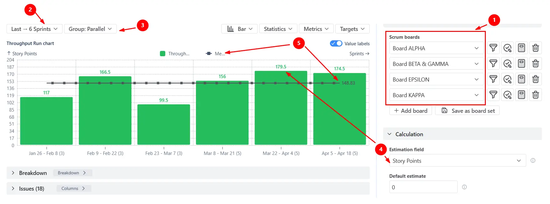
In the screenshot, the chart shows the total throughput delivered by four Scrum teams (Alpha, Beta & Gamma, Epsilon, and Kappa (1️⃣)) across the last six sprints (2️⃣). The x-axis groups data by sprint (Parallel mode), meaning that even if teams have slightly different sprint dates, their results are aligned into comparable time buckets (3️⃣).
The values displayed on top of each bar represent the total amount of completed work (in this case, story points (4️⃣)) across all teams for that sprint. The horizontal reference line shows a statistical benchmark (e.g., mean throughput (5️⃣), helping you understand what “typical” delivery looks like across all teams combined.
✅ This feature is helpful for
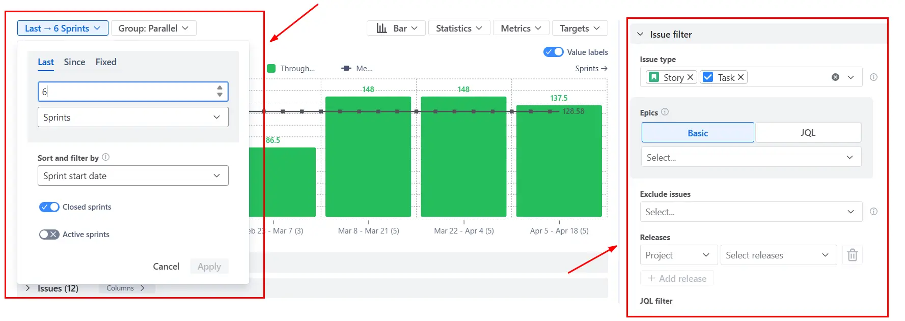
The Scrum Throughput Run chart allows you to define a specific time interval and apply issue filters to focus only on the relevant subset of work. Instead of analyzing all completed issues, you can limit the scope to a particular epic, release, issue type, or any custom JQL-defined dataset.
By adjusting the time window, you also control how much historical data is included in the analysis. Shorter intervals highlight recent delivery behavior, while longer intervals provide a more stable view of overall trends.
✅ This feature is helpful for
Different teams measure work differently - and the Scrum Throughput Run chart adapts to that.
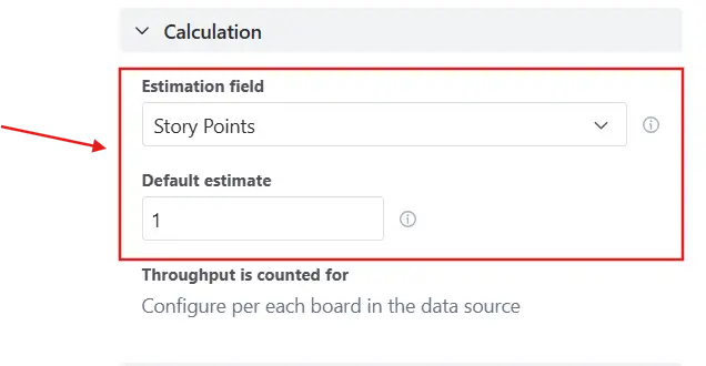
Instead of being limited to a single metric, you can choose the estimation field used to calculate throughput for each board individually. This can be story points, issue count, time-based fields, or any custom numeric field available in your Jira instance.
To ensure consistency, you can also define a default estimate for issues that don’t have a value. Without this, unestimated items would contribute zero to throughput, potentially distorting results - especially in mixed datasets where some teams estimate, and others don’t.
✅ This feature is helpful for
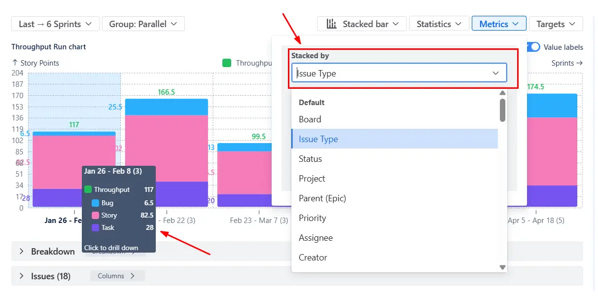
Total throughput only tells part of the story. To understand how teams spend their capacity, you can switch the chart to a stacked bar view and break down throughput by issue type or any other field.
This perspective is especially valuable in multi-team setups. While total throughput may appear stable, the composition can shift - for example, an increasing share of bugs or operational work may indicate quality issues or hidden capacity drains.
✅ This feature is helpful for
When working with multiple Scrum teams, a combined view is only the starting point. To understand what’s really happening, you can drill down into the data using the Breakdown section.
By grouping results by board (team), you can see how each team contributes to the total throughput in any given period. This allows you to compare delivery levels, identify imbalances, and understand whether changes in overall throughput are driven by specific teams or system-wide factors.
You can also extend the analysis further by adding another level of grouping (e.g., issue type, assignee), making it possible to move from a high-level overview to detailed operational insights.

✅ This feature is helpful for
Instead of relying only on individual data points, you can display statistical indicators such as mean, median (P50), or custom percentiles (P85, P95, etc). These lines show what “typical” and “high-confidence” delivery levels look like based on historical data.
To better reflect recent performance, statistics can be calculated using a moving window of the last X intervals rather than the entire dataset. This reduces the impact of outdated data and highlights how delivery evolves over time.
In addition to statistics, you can define custom target lines that represent expected throughput levels or KPIs.

✅ This feature is helpful for
If you’re trying to understand throughput in Scrum, Jira’s native reports don’t quite get you there:
❌ Insights are locked to individual boards, making cross-team analysis difficult
❌ Delivery is viewed sprint by sprint, with no easy way to analyze longer-term trends
❌ There’s no concept of “typical throughput”, so teams rely on intuition instead of statistical context
❌ You can’t adjust how throughput is calculated, which makes it hard to align reports with real workflows
❌ There’s no visibility into what types of work drive delivery, limiting meaningful discussions about capacity
As a result, teams often end up exporting data or building custom reports just to understand something as fundamental as throughput.
The Scrum Throughput Run chart extends Jira’s reporting capabilities by providing a flexible and scalable way to analyze delivery performance across teams and timeframes.
With this chart, you can:
✅ Combine throughput from multiple Scrum boards, projects, or JQL-defined scopes into a single, unified view
✅ Track delivery across custom time intervals (daily, weekly, monthly, or sprint-based), not just sprint boundaries
✅ Adapt calculations to your workflow by selecting the estimation field, defining Done statuses, and standardizing how throughput is measured
✅ Use statistical lines and moving averages to understand typical delivery levels and identify variability
✅ Break down throughput by issue type, epic, assignee, component, or any Jira field to reveal where capacity is actually spent
✅ Switch between bar and line views to explore both discrete sprint output and long-term delivery trends
✅ Drill down into any interval to inspect the exact issues completed, enabling deeper analysis and validation
✅ Apply advanced filters (JQL) to focus on specific initiatives, teams, or work types and eliminate noise from unrelated data
Use these examples to create your own Scrum Throughput run report use cases on the Jira Dashboard.
Both Jira apps (plugins) featured here offer a 30-day free trial and are completely free for teams of up to 10 users:
The Agile Reports and Gadgets app includes Scrum Throughput run chart functionality plus a wide range of additional charts and reports.


.svg)

.png)
.png)
