Thank you! Your submission has been received!
Oops! Something went wrong while submitting the form.

Throughput Run chart

Interactive сhart example
info
The interactive chart is available on larger screens
Please open this page on a desktop to try it out

Key features of the Throughput Run chart

The Throughput Run chart helps teams understand how much work is delivered over time, how stable the delivery pace is, and how team capacity is distributed across different types of work. Flexible scope selection allows you to analyze throughput for a single team or combine data from multiple boards, projects, or initiatives. You can also visually segment throughput by any Jira field, such as issue type, epic, assignee, component, label, or custom fields, to see what kinds of work consume the team’s capacity.

Together, these capabilities of the Agile Throughput Charts turn throughput data into a practical management signal, enabling teams and delivery leaders to better understand performance, explain changes in output, and support more informed planning decisions.

How different roles use the Throughput Run chart

Team Lead: I use the Throughput Run chart to monitor how consistently the team delivers work over time. By looking at throughput trends and statistical benchmarks, I can quickly see if delivery pace is stable or if something is disrupting the workflow.

Product Manager: When a stakeholder is worried that their feature is being neglected, I can break the chart down by Epic or Initiative to show how the team’s capacity is distributed. For example, the chart may reveal that 20% of the team’s throughput in each sprint is consistently dedicated to that feature, helping stakeholders understand how much capacity is allocated to their request.

Release Train Engineer (RTE): I use the chart to track delivery across multiple teams contributing to the same program or initiative. Aggregating throughput from several boards helps me monitor progress at the ART level and identify trends that might affect planning or commitments.

Engineering Manager: I use the throughput breakdown to understand what types of work consume the team’s capacity - features, bugs, or operational tasks. This helps me balance priorities and ensure that feature development does not get overwhelmed by support or maintenance work.

Understand delivery pace and capacity allocation with the THROUGHPUT RUN CHART
TPC

Key feature 1: Define the scope of your throughput analysis

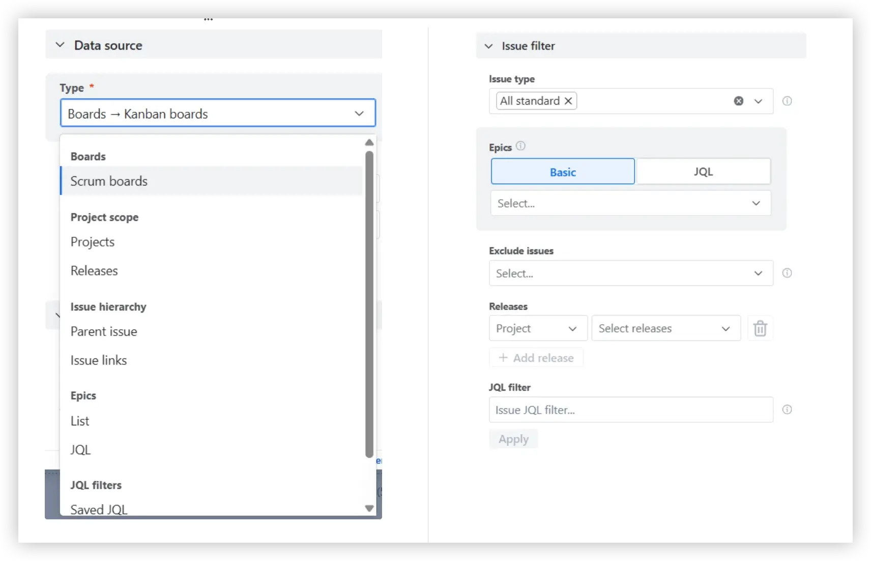
The Throughput Run chart is not limited to a single Jira board. You can aggregate throughput from multiple Scrum or Kanban boards, as well as from projects, releases, epics, initiatives, or custom JQL queries.

Additionally, the Issue filter allows you to further refine the dataset by including or excluding specific issue types, labels, components, assignees, or any custom fields.

Data source selection and Issue filter in the Throughput run report

✅ This feature is helpful for:

  • Monitoring delivery across multiple teams contributing to the same initiative or product
  • Tracking throughput at the program or ART level in SAFe environments
  • Focusing analysis on specific releases, initiatives, or types of work using JQL filters

Key feature 2: Track your team’s throughput over time

The Throughput Run chart shows how much work your team completes in each sprint or time interval, helping you understand delivery pace and how consistently work moves to Done. You can visualize throughput as bars or a line chart and track data at the cadence that fits your workflow—daily, weekly, bi-weekly, monthly, or quarterly.

📊 How to read the chart

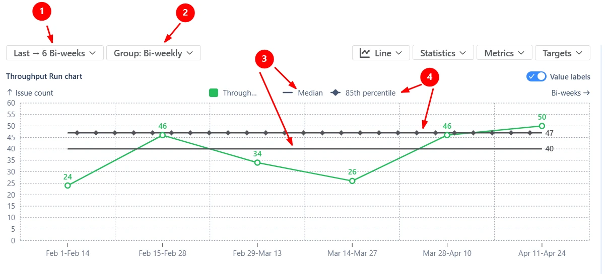
In the screenshot below, the chart shows how many issues the team completed in each two-week interval (2️⃣) over the last six bi-weekly periods (1️⃣). Looking at the trend, the team’s delivery fluctuates between lower periods (24–26 issues) and stronger periods (46–50 issues). The horizontal reference lines represent statistical benchmarks: the team’s typical (median) delivery is 40 work items per two weeks (3️⃣), with 85% of the periods delivering 47 issues or fewer (4️⃣).

The team can realistically plan roughly 40 completed items per two-week interval. However, the fluctuations indicate that capacity may still be influenced by blocked work or uneven workload distribution.

Throughput run chart

✅ This feature is helpful for:

  • Understanding how much work the team typically completes in each sprint or time interval
  • Establishing a realistic baseline for sprint planning or delivery expectations
  • Detecting fluctuations that may signal process instability or capacity changes

Key feature 3: Visualize where the team’s capacity is spent

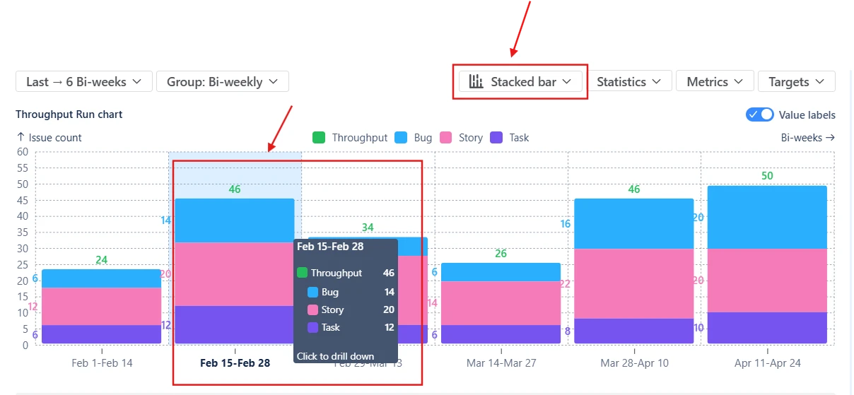
Switch to the Stacked bar view to understand how the team’s throughput is distributed across different types of work. Instead of showing only the total number of completed issues per interval, the stacked chart breaks the throughput down by any Jira field, including custom ones. The stacked segments can also be reordered or recolored, allowing you to adjust the visual hierarchy.

In the screenshot below, the throughput of the Feb 15 – Feb 28 interval includes 14 Bugs, 20 Stories, and 12 Tasks. Together, they form the total throughput of 46 completed issues during that period.

Throughput run chart stacked by issue type

✅ This feature is helpful for:

  • Understanding what types of work consume the team’s capacity
  • Detecting when bugs, operational tasks, or support work start dominating delivery
  • Analyzing how work is distributed across epics, teams, or initiatives

Key feature 4: Examine the work items behind each interval

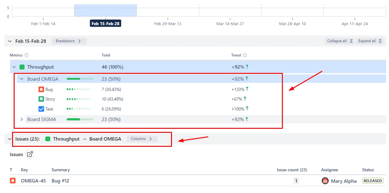
The Throughput Run chart allows you to go beyond aggregated metrics and inspect the underlying data. By clicking a data point, you can open the Breakdown and Issue list, which shows which issues contributed to the throughput during that period.

The Breakdown groups completed work by two selected dimensions, such as board, epic, assignee, or any custom Jira field. Below the breakdown, the Issue list displays the exact completed issues included in the calculation. Each item links directly back to Jira, allowing you to quickly investigate anomalies or follow up on specific tickets:

Breakdown and Issue list in the Throughput Run report example

✅ This feature is helpful for:

  • Understanding which teams or work categories contributed to delivery in a given period
  • Investigating unusual spikes or drops in throughput
  • Quickly navigating from high-level delivery metrics to specific Jira issues

Key feature 5: Customize how throughput is calculated

The Throughput Run chart can be configured to match how your teams define and measure completed work.

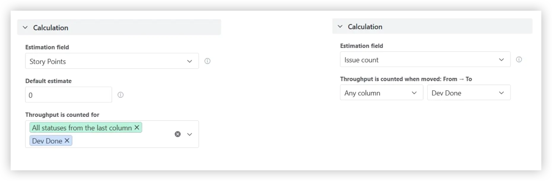
You can specify which workflow transitions count as throughput by selecting Done statuses or from–to columns. This allows teams to align the chart with their delivery process or track delivery up to specific stages, such as Ready for QA or Ready for Release.

You can also choose the estimation field used to measure throughput, including issue count, story points, time-based fields, or any custom numeric field. If some issues are missing estimates, you can define a default estimate value to keep calculations consistent.

Calculation settings in the Scrum and Kanban Throughput run chart in Jira

✅ This feature is helpful for:

  • Aligning throughput calculations with your workflow and definition of Done
  • Tracking delivery up to specific workflow milestones
  • Measuring delivery using story points, issue count, or other estimation fields

Additional features of the Throughput run report

1. Smooth delivery trends with moving statistics

Instead of calculating statistics for the entire dataset, the chart can compute them using a moving window of the last X intervals. This helps reduce short-term noise and highlight how delivery performance evolves over time. In some cases, teams may choose to hide the raw throughput line entirely and visualize only the moving percentiles to focus on the underlying delivery trend rather than individual spikes or dips:

Moving statistics in the Jira dashboard Throughput Run chart

2. Share and export the chart

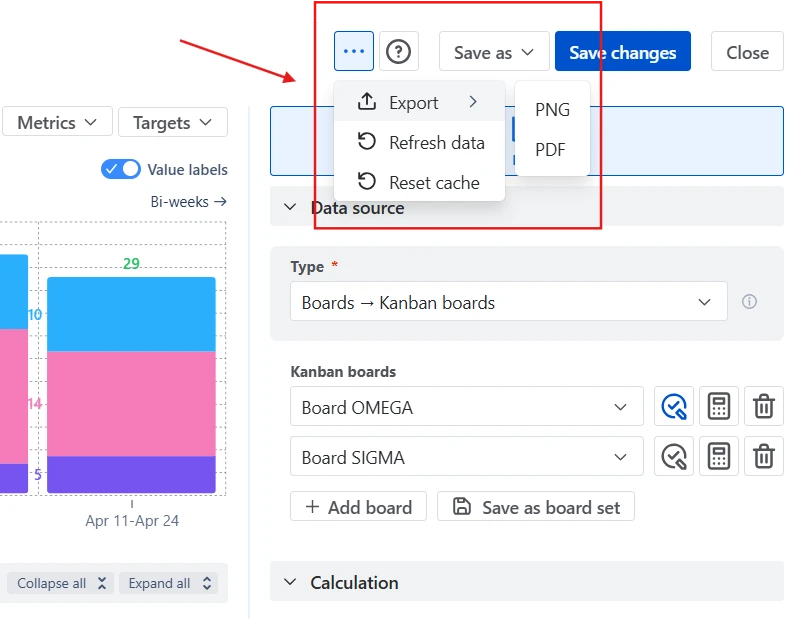
The Throughput Run chart can be easily shared with stakeholders. You can:

  • Add the chart to a Jira dashboard, allowing delivery managers, product leaders, and executives to monitor throughput trends directly inside Jira.
  • Export charts as PNG or PDF files, making it easy to include them in presentations, reports, or documentation.
Sharing options in the Throughput run graph example

What about the native Jira Throughput run chart

Jira does not provide a dedicated Throughput Run chart. Instead, teams typically rely on reports such as the Velocity Chart (Scrum) or the Control Chart, which focus on sprint performance or cycle time rather than throughput trends.

These native reports have several limitations when analyzing throughput:

❌ The Velocity chart works only with Scrum boards and cannot easily combine throughput across multiple boards, projects, or teams.

❌ Throughput is typically shown per sprint, making it difficult to analyze trends across weeks, months, or custom timeframes.

❌ Native Jira charts do not provide statistical reference lines, making it harder to assess delivery stability.

❌ Jira does not allow you to configure key calculation parameters such as the estimation field (story points, issue count, time-based metrics, or custom numeric fields) or define which workflow statuses should count as Done.

❌ Native reports do not allow you to break down throughput by Jira fields such as issue type, epic, assignee, component, or label to understand what the team’s capacity is actually spent on.

Advantages of using the Throughput run chart

  • The Throughput Run chart extends Jira’s capabilities with a flexible view of delivery performance:
  • Analyze throughput across Scrum boards, Kanban boards, projects, releases, epics, initiatives, or custom JQL queries in a single chart.
  • Track delivery across daily, weekly, bi-weekly, monthly, or quarterly periods, not just sprints.
  • Choose the estimation field, configure Done statuses, and adapt calculations to match your team’s workflow.
  • Add percentile lines or moving averages to understand typical throughput and delivery variability.
  • Get capacity allocation insights by breaking down throughput by issue type, epic, component, assignee, or any Jira field to reveal where the team’s capacity is actually spent.
  • Switch between bar and line charts to compare discrete periods or highlight longer-term delivery trends.
  • Drill down into each interval to inspect the exact issues completed in that period.
  • Use the Issue filter (JQL) to include or exclude specific issue types, epics, labels, components, assignees, or any custom fields.
Explore the interactive chart, no setup, no risk
TRY THE CHART
Chart embeded

App used in this Throughput run chart

Use these examples to create your own Throughput run report use cases on the Jira Dashboard.

Both Jira apps (plugins) featured here offer a 30-day free trial and are completely free for teams of up to 10 users:

The Agile Reports and Gadgets app includes Throughput run chart functionality plus a wide range of additional charts and reports.

Frequently Asked Questions

1. What is a Throughput Run chart?

A throughput run chart visualizes how much work a team completes over a given time interval, such as a sprint, week, or month. In tools like Agile Throughput Charts by Broken Build, this type of chart helps teams track completed work over time directly in Jira. Each point or bar represents the amount of completed work during that period, typically measured by issue count, story points, or another numeric estimation field.

By plotting throughput over time, the chart helps teams understand their delivery pace, stability, and trends. Statistical benchmarks such as median or percentiles can be added to evaluate whether throughput is consistent or highly variable. Teams can also break the data down by Jira fields such as issue type, epic, or assignee to see how their capacity is distributed across different types of work.

2. How can I share the chart outside Jira?

You can share the Throughput Run chart in several ways.

The most common option is to add the chart to a Jira dashboard, where stakeholders can monitor delivery performance directly in Jira.

If you need to share the chart outside the platform, you can also export it as a PNG image or PDF file. This makes it easy to include the chart in presentations, reports, documentation, or stakeholder updates.

3. What is the difference between throughput and velocity?

Throughput and velocity both measure delivery performance, but they focus on different aspects of team output.

Velocity measures how many story points a Scrum team completes in each sprint. It is typically used for sprint planning, helping teams estimate how much work they can commit to in upcoming sprints based on their past performance.

Throughput, on the other hand, measures the number of work items completed in a given time interval (such as a sprint, week, or month). It focuses on the flow of completed work, regardless of how that work was estimated.

Because throughput relies on actual completed items rather than story point estimates, it is often used in Kanban or flow-based workflows, where teams may not estimate work using story points.

4. How can I track throughput for a specific initiative or feature?

You can track throughput for a specific initiative, feature, or program by narrowing the chart’s data scope to only the relevant work items.

One option is to use the Issue hierarchy or Epic data sources that allow you to select a specific initiative, epic, or parent issue, and the chart will automatically include all underlying work items in the hierarchy.

You can also define the scope using custom JQL queries. For example, you might filter issues by epic link, label, component, issue type, or a custom field that identifies the feature or initiative.

5. Can throughput data be used to forecast future delivery capacity?

Yes. Historical throughput data can provide a useful baseline for estimating how much work a team may deliver in the future. By analyzing how many items were completed per sprint or time interval in the past, managers can approximate the team’s typical delivery capacity and use it to inform planning discussions.

However, simple throughput charts primarily help understand past delivery patterns, not perform advanced forecasting. For more accurate projections, Broken Build provides dedicated forecasting tools:

  • Agile Burnup Burndown Charts - extend historical delivery trends into the future to help estimate completion dates, evaluate different forecasting scenarios, and assess whether current delivery pace aligns with target deadlines.
  • Agile Monte Carlo Charts - run thousands of simulations based on historical throughput to forecast completion dates or achievable scope with probability-based confidence levels.

Both forecasting tools are available as standalone Jira apps or as part of the Agile Reports and Gadgets bundle.

Why trust Broken Build apps?

Gold Marketplace Partner
apps
Use this example 
in these apps: