
Thank you! Your submission has been received!
Oops! Something went wrong while submitting the form.


The Scrum Monte Carlo forecasting chart provides a probability-based view of how backlog delivery may unfold based on your team’s historical sprint throughput. Rather than projecting the future from a single velocity average, the simulation runs thousands of trials using past sprint results to estimate when the remaining backlog could be completed or how much work can realistically be delivered within upcoming sprints.
With configurable data sources, flexible calculation settings, backlog analysis tools, and scenario modeling for scope and capacity, the chart helps teams evaluate delivery confidence and understand planning risk. Whether forecasting for a single Scrum team or coordinating larger initiatives across multiple boards or projects, Agile Monte Carlo Charts provide the insights needed to support more reliable Scrum planning and data-driven delivery decisions.
✅ Product Owner: I rely on the “How many” forecast during sprint and release planning to determine how much backlog scope can realistically fit into a fixed timeframe. Instead of guessing based on average velocity, I can align commitments with a probability-based forecast.
✅ Agile Coach: I use Monte Carlo forecasts to help Scrum teams shift from velocity-based planning to probabilistic forecasting. This helps teams better understand delivery variability and build more realistic planning habits.
✅ Delivery Manager: I monitor Monte Carlo forecasts across several Scrum teams to detect delivery risk early. If forecasts show delays or unstable throughput patterns, we can address blockers or rebalance capacity before commitments are missed.
✅ Portfolio Manager: I use aggregated forecasts across multiple projects to evaluate whether strategic initiatives can realistically be delivered within the planned roadmap timeline.


The When Monte Carlo forecast estimates when the remaining backlog scope is most likely to be completed based on how much work your team has delivered in previous sprints.
Rather than assuming that the team will always deliver the same velocity, the simulation analyzes historical sprint throughput and runs 100,000 randomized trials. In each trial, the model samples real past sprint outcomes to reflect the natural fluctuations in delivery speed.
The result is a probability distribution of possible completion dates, allowing Scrum teams to understand the range of realistic outcomes.
📊 How to read the chart
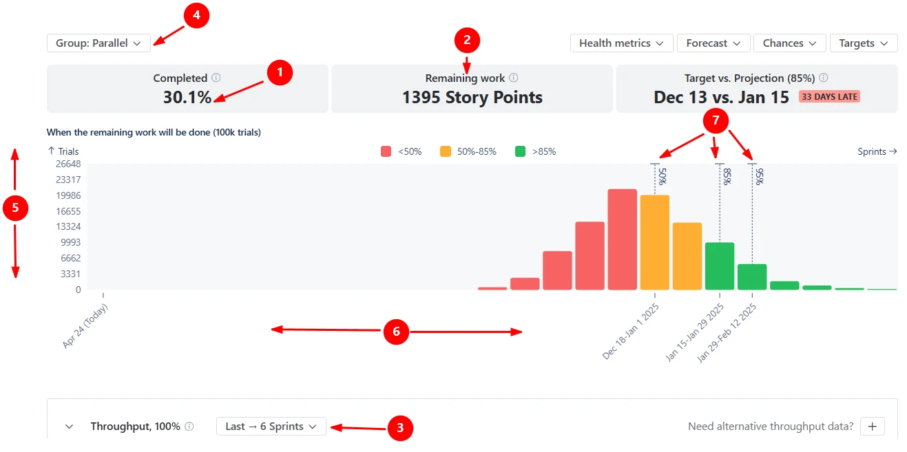
In the screenshot, 30.1% of the planned scope is already complete (1️⃣), and the backlog still contains 1,395 story points of remaining work (2️⃣).
The forecast runs 100,000 simulation trials using throughput data from the last six completed sprints (3️⃣). Because the chart groups data by sprints (Parallel option) (4️⃣), each simulation samples historical sprint delivery values to estimate how many future sprints might be required to finish the remaining scope.
The histogram visualizes the results of these simulations: the horizontal axis shows projected completion periods (5️⃣), and the vertical axis represents how many simulated scenarios produced that outcome (6️⃣).
Several dashed markers indicate confidence levels within the distribution (7️⃣):
✅ This feature is helpful for
The How many Monte Carlo forecast helps Scrum teams estimate how much backlog scope can realistically be completed within a defined number of future sprints.
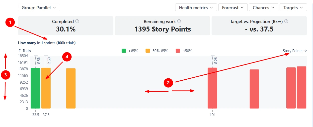
In this example below, the forecast models how many story points could be completed in one sprint (1️⃣). The x-axis shows the amount of work delivered within the selected timeframe, expressed in story points (2️⃣). The y-axis represents how many simulation trials produced each outcome (3️⃣).
In the screenshot, the P85 forecast is around 37.5 story points (4️⃣), meaning there is an 85% probability that the team will deliver at least that amount of work in the next sprint. Any sprint commitment above this level would carry progressively higher delivery risk.
✅ This feature is helpful for
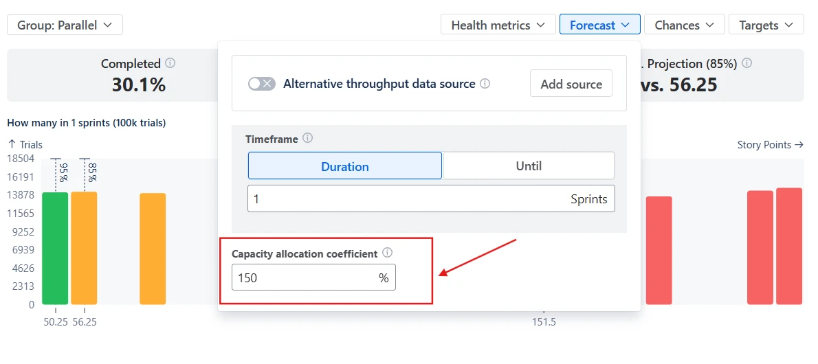
Sometimes, the backlog you want to forecast does not contain enough historical sprint data to produce a stable Monte Carlo forecast. This can happen when you start a new initiative, a new Scrum board, or a recently created epic.
The Alternative throughput data source option allows you to use historical delivery data from another board, project, or dataset as the basis for the simulation. Instead of calculating velocity from the current scope, the forecast samples throughput values from the selected alternative source.

✅ This feature is helpful for
Scrum Monte Carlo simulations tell you when the backlog is likely to be finished, but Scrum teams also need to understand why the forecast looks the way it does. The Monte Carlo simulation chart for Scrum allows you to investigate the backlog behind the forecast and identify which work items contribute most to the projected delivery timeline.
The breakdown aggregates the remaining scope by dimensions such as epics, issue types, or other Jira fields. By selecting a segment in the breakdown, you can immediately open the issue list containing the exact tickets included in that portion of the scope.

✅ This feature is helpful for
Once the Scrum Monte Carlo forecast shows that delivery dates are later than expected or that the forecasted scope for the next sprint is smaller than planned, teams naturally ask the next question: What can we change to improve the outcome?
The Monte Carlo chart for Scrum allows you to experiment with delivery scenarios by adjusting remaining work and team capacity allocation directly in the forecast.
The Remaining work parameter represents the total backlog scope included in the simulation. By modifying this value or filtering the backlog with JQL, teams can evaluate how reducing or expanding the scope would affect delivery timelines:

The Capacity allocation coefficient represents how much of the team’s throughput is dedicated to the selected work. A value of 100% assumes the team focuses entirely on this backlog, while lower values simulate situations where the team splits effort across multiple initiatives:
✅ This feature is helpful for
The Scrum Monte Carlo chart allows you to visualize delivery goals, such as release dates or scope commitments, directly in the forecast using Targets (1️⃣). Once a target is configured, the chart compares it with the simulation results and calculates the Target vs Projection health metric (2️⃣).
This makes it easier to answer questions such as:

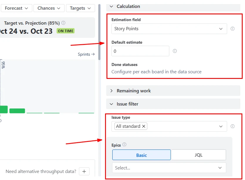
The Monte Carlo chart for Scrum provides several configuration options to ensure the forecast reflects how your team actually works.
You can customize the calculation by:
Jira does not provide native Monte Carlo forecasting. Built-in Jira reports focus on historical performance analysis rather than probabilistic forecasting. Examples include:
While these reports help teams analyze past delivery behavior, they do not:
As a result, delivery commitments in Jira are often based on velocity averages or manual estimates, which do not reflect uncertainty.
The Scrum Monte Carlo chart combines statistical forecasting with flexible Jira analytics:
This approach replaces fixed estimates with risk-aware forecasting, enabling Scrum teams to plan and commit with greater confidence.
Use these examples to create your own Scrum Monte Carlo simulation chart use cases on the Jira Dashboard.
Both Jira apps (plugins) featured here offer a 30-day free trial and are completely free for teams of up to 10 users:
The Agile Reports and Gadgets app includes Scrum Monte Carlo simulation chart functionality plus a wide range of additional charts and reports.


.svg)


.png)
