
Thank you! Your submission has been received!
Oops! Something went wrong while submitting the form.


The Cumulative Created vs Resolved chart highlights the relationship between incoming work and completed delivery in Jira. By visualizing these two streams over time, teams can quickly see whether work is accumulating, being cleared at a steady pace, or fluctuating due to changing demand.
The chart supports a wide range of analysis scenarios. You can examine activity within a single team or combine several boards, projects, or initiatives to understand broader delivery dynamics. Results can also be segmented using Jira attributes such as issue type, epic, assignee, component, label, or other custom fields, making it easier to identify which categories of work drive demand and occupy delivery capacity.
With configurable calculation rules, flexible scope selection, and detailed drill-down capabilities, the Agile Created Resolved Charts help teams interpret workflow signals, detect emerging imbalances, and support more confident planning and operational decisions.
✅ Product Owner: I use the cumulative Created vs Resolved graph to understand whether the backlog is growing faster than the team can deliver. If demand consistently exceeds delivery, I revisit prioritization and scope to keep work manageable.
✅ QA Lead: I use the chart to track how many issues arrive in testing compared with how many are verified and closed, helping ensure the testing stage does not become a bottleneck.
✅ Agile Coach: I analyze the chart to assess the health of the team’s workflow. A widening gap between Created and Resolved signals that the system may be overloaded or that work is entering faster than it can be completed.
✅ Portfolio Manager: I use the chart to understand how work accumulates across projects and whether organizational demand aligns with delivery capacity over longer periods.


The Cumulative Created vs Resolved chart compares the amount of work added to the system (Arrived/Created) and completed (Resolved) over time. The cumulative view continuously sums both metrics, making it easy to see whether the backlog is growing, shrinking, or staying balanced.
You can configure the chart using flexible data source selection: one or multiple Scrum or Kanban boards, projects, releases, parent issues, or custom JQL queries.
📊 How to read the chart

In the screenshot above, the chart displays the last six bi-weekly periods grouped weekly (1️⃣). The grey line represents the cumulative number of Created issues (2️⃣), while the green line shows the cumulative number of Resolved issues (3️⃣).
At the start of the timeline, both lines grow gradually as work is created and completed. From February onward (4️⃣), the Resolved line grows much faster, reaching 396 resolved issues compared to 196 created issues by the end of the period (5️⃣). This widening gap indicates that the team is closing work faster than new work is entering the system, suggesting a significant backlog reduction.
✅ This feature is helpful for:
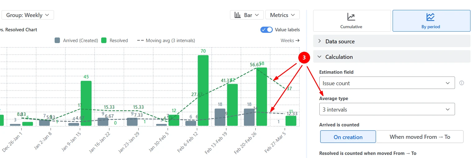
Switch to the By Period view to compare how much work enters the system and how much work is completed in each interval. This mode helps answer the question: Are we keeping up with demand in each time period?
In the example below, each bar represents the amount of work created or resolved within a week (1️⃣). The average reference lines provide a baseline to compare each period against (2️⃣):

You can also switch to a moving average (based on the last 2-5 intervals) to smooth short-term fluctuations and highlight longer-term demand and delivery trends (3️⃣):
✅ This feature is helpful for:
You can customize when work is considered Arrived (Created) and when it is considered Resolved (completed) to match how your workflow actually operates. Instead of counting arrivals strictly on issue creation, the chart can treat work as Arrived when it transitions to a specific workflow stage (such as Ready for Dev, Ready for Testing, or the first In Progress status). Likewise, work can be counted as Resolved only when it moves to selected Done statuses or columns.

✅ This feature is helpful for:
High-level trends are useful, but sometimes you need to understand what exactly drives those changes. The chart allows you to segment results using the Breakdown option and then inspect the underlying work items directly in the Issue list.
The example below groups Created and Resolved work by board and issue type, helping teams see which teams and types of work contribute most to incoming demand and completed work:

To investigate further, open the Issue list to see the individual tickets behind each segment:

✅ This feature is helpful for:
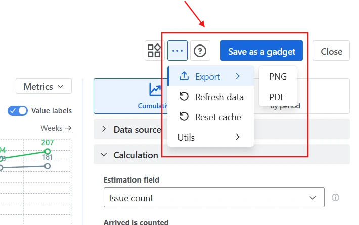
The most common option is to save the chart as a gadget on a Jira dashboard, allowing teams and managers to monitor demand and delivery trends alongside other reports. You can also embed the chart on Confluence pages for documentation, sprint reviews, or reporting. Embedded charts remain interactive and update automatically as Jira data changes.

For presentations or external reporting, the chart can be exported as an image or PDF:
✅ This feature is helpful for:
The chart is not limited to counting issues. You can choose what unit the chart should measure by selecting a custom estimation field in the Calculation settings. Select Story points or any custom field from your Jira instance. This allows teams to track demand and delivery using the unit that best reflects their planning model:

Use the Issue filter to focus the chart on a specific segment of work - for example, only certain issue types (like Bugs vs Stories), a particular epic/release, or a subset of owners/assignees.
This makes it possible to analyze demand and delivery for:

Jira provides a built-in Created vs Resolved report that compares the number of issues created and completed over time.
While useful for a quick overview, the native report has several limitations. It works only at the project level, counts issues rather than work size, and offers limited configuration options. You cannot redefine when work is considered to have entered the system or when it is considered completed, which can make the report less accurate for teams with complex workflows.
In addition, the native report provides no filtering and segmentation capabilities, making it harder to analyze specific teams, work types, or workflow stages.
Cumulative Created vs Resolved Charts by Broken Build provide a much more flexible way to analyze how work enters and leaves your system.
Unlike the native Jira report, the chart allows you to:
These capabilities make the chart suitable not only for simple project tracking but also for cross-team delivery monitoring, capacity planning, and workflow analysis.
Use these examples to create your own Cumulative Created vs Resolved report use cases on the Jira Dashboard.
Both Jira apps (plugins) featured here offer a 30-day free trial and are completely free for teams of up to 10 users:
The Agile Reports and Gadgets app includes Cumulative Created vs Resolved chart functionality plus a wide range of additional charts and reports.


.svg)

.png)
.png)
