
Thank you! Your submission has been received!
Oops! Something went wrong while submitting the form.


The Kanban Created vs. Resolved chart shows whether Kanban teams are finishing work at the same pace at which new issues enter the system. For each day, week, or bi-week, the report compares Created or Arrived work with Resolved work, so teams can see when demand is balanced, when intake starts to exceed delivery, and when the backlog is being reduced.
This example is built from two Kanban boards across a focused weekly window. The chart uses Story Points, so the Kanban Created vs. Resolved report shows the size of arrived and completed work rather than a flat issue count. The same report can be read as a by-period balance view, a cumulative backlog trend, or a service desk intake view. Together, these views help team leads, flow managers, and service owners keep delivery visible without converting Kanban work into sprint-only reporting.
With Agile Created Resolved Charts, teams can choose Kanban boards as the data source, define what counts as Created or Arrived, select the Done statuses for Resolved work, group results daily or weekly, and drill into the Jira issues behind each bar. The result is a practical Kanban created vs. resolved chart in Jira for flow reviews and operational dashboards.
Jira has a native Created vs Resolved report that can show open and resolved issues over time for a project or saved filter. It is useful for a basic backlog trend, but it is limited when Kanban teams need workflow-aware flow reporting on a dashboard.
The native report does not provide the same control over Kanban board sources, custom commitment gates, Done definitions, issue weighting, breakdowns, or drill-down from a selected period into the underlying work. The Broken Build Kanban Created vs. Resolved chart in Jira is designed for teams that need Created and Resolved to match how their Kanban system actually works.



The app includes Created vs. Resolved configuration templates that can be used as presets. This example shows two Kanban-ready presets on the same data source: Board SIGMA and Board OMEGA, weekly grouping, Story Points estimation, Arrived counted from the transition into In Progress, and Resolved counted from the release workflow step.
The Created vs. Resolved Run preset compares weekly work arrived with weekly work resolved. It is useful when a Kanban team wants to see whether completed Story Points keep pace with demand within the same review window.

The Cumulative Created vs. Resolved preset turns the same Kanban data into a trend line. It helps teams see whether resolved Story Points are catching up with arrived Story Points or whether the gap is widening over time.
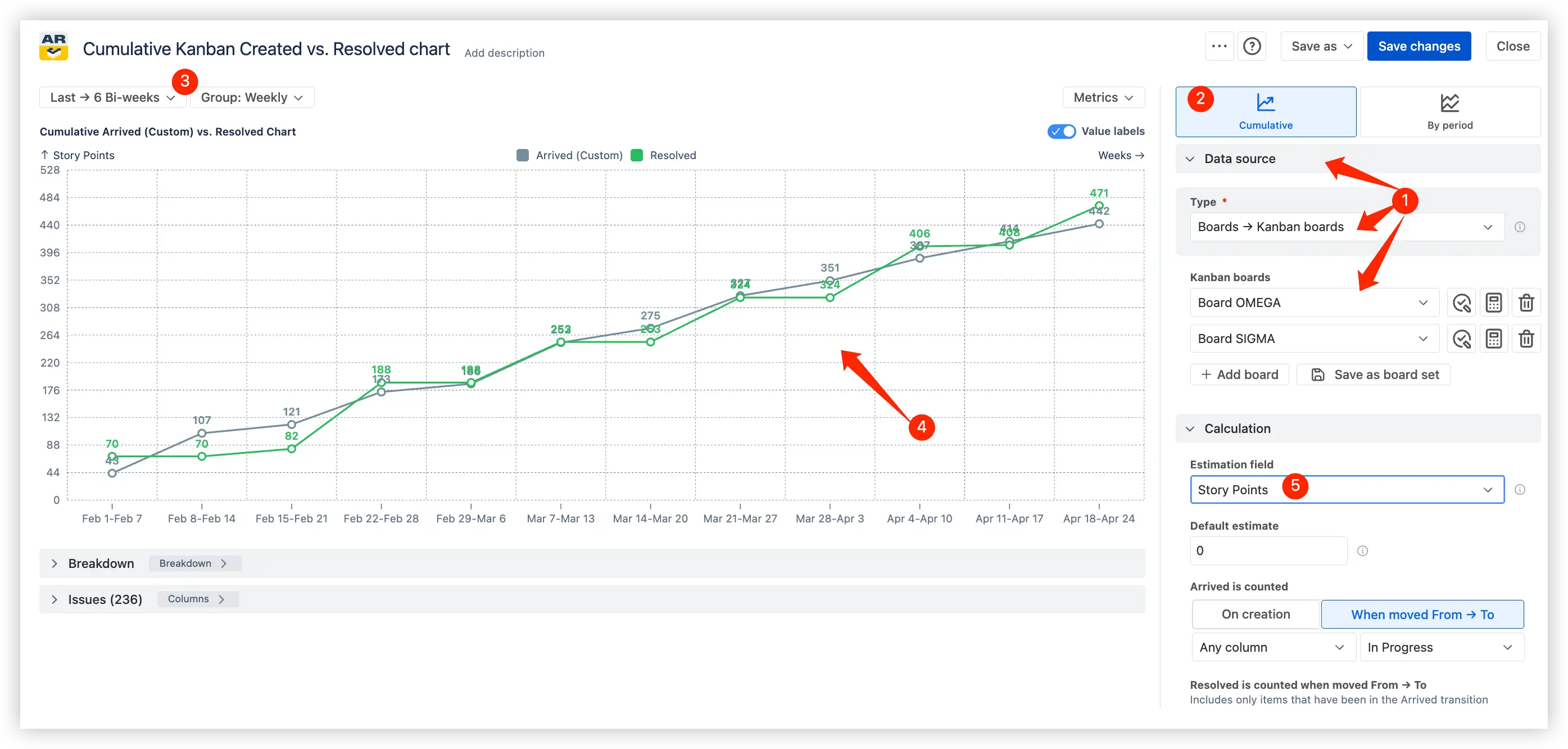
Some Kanban teams do not want Created to mean the moment an issue was opened. They want the chart to count work only after it passes an intake or commitment gate, such as Ready for development or Selected for work. The Kanban Created vs. Resolved report can anchor Created to that transition and compare it with the team's Done statuses.
The demo chart uses a workflow-aware Arrived calculation, so the Created side of the report reflects work entering the active Kanban system rather than every issue creation event.
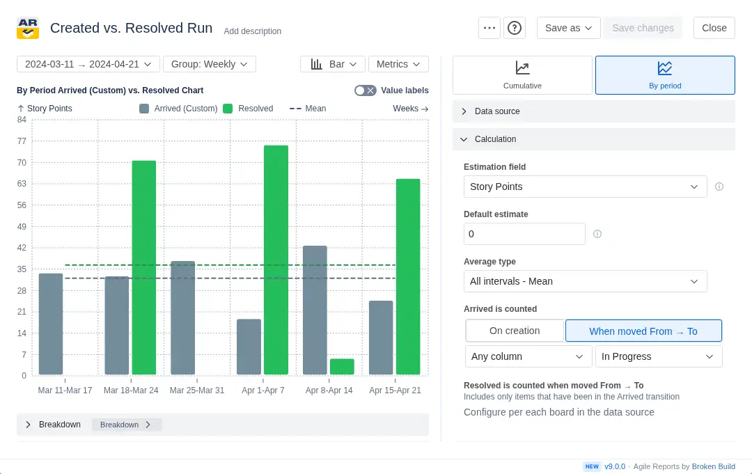
This removes grooming noise from the report. The team sees real system load, not every early idea or triage item. Weekly grouping makes the pattern easier to discuss in replenishment, service delivery reviews, and management reporting.
Support and operations teams often need a daily Created vs. Resolved view because ticket queues can grow quickly. For incident or service desk work, the report shows whether new requests are being closed at the same rate they are arriving and whether the team is at risk of SLA pressure.
The same daily grouping used in the demo can be applied to service desk or incident boards to make short queue-growth periods visible.

When Created is above Resolved for several days, the team can drill into the bar to identify which incidents, request types, or components are driving the queue. When Resolved rises above Created, the chart shows active queue reduction rather than just a flat backlog count.
A top-level Created vs. Resolved signal is useful, but Kanban teams often need to know which work category caused the change. The chart can break results down by board, project, issue type, priority, component, assignee, or another Jira field, then show the issue list behind the selected period.
For cross-team Kanban reporting, breakdowns make team and work-type patterns visible. One team may be stable while another receives a burst of incidents, or one issue type may absorb most of the completed work. Drill-down keeps the conversation tied to real Jira issues instead of abstract totals.
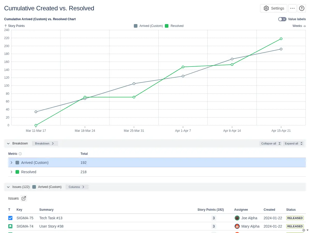
A Kanban Created vs. Resolved chart turns incoming demand and completed work into a practical flow signal. It helps teams spot imbalance early, understand whether queues are growing, and inspect the work behind a spike without leaving the dashboard.
✅ Flow Manager: I use the Kanban Created vs. Resolved chart to check whether arrivals are balanced by completed work. If Created stays above Resolved across a review period, I review intake rules and blocked work before the queue grows.
✅ Kanban Team Lead: I review the chart during replenishment and delivery meetings. A spike in Created work helps me see where demand entered the system, while a drop in Resolved work tells me where to inspect blockers or aging items.
✅ Service Desk Manager: I use the report to watch incidents and requests at a daily cadence. If incoming tickets outpace resolved tickets, I can adjust triage, staffing, or escalation paths before SLA pressure builds.
✅ Engineering Manager: I compare Created vs. Resolved trends across active workflow streams to see whether teams are absorbing demand at a sustainable rate or whether one queue needs support.
Keep Kanban intake and delivery in balance with the Kanban Created vs. Resolved chart.
Use this example to recreate a similar Kanban Created vs. Resolved report on a Jira dashboard or to build a custom chart for your own Kanban teams.
The Agile Reports and Gadgets app includes Created vs. Resolved functionality together with other Jira dashboard reports for Scrum, Kanban, and scaled agile teams.
Both apps have a 30-day free trial and are free for teams under 10 people.




.svg)


.png)
.png)
