The interactive chart is available on larger screens
Please open this page on a desktop to try it out
Key features of Team velocity chart
The Team velocity chart visualizes team capacity and delivery predictability by comparing key metrics such as initial vs. final commitments, rollovers, and completed work, while also highlighting estimation changes and scope creep across any selected interval. This helps teams identify capacity bottlenecks and plan more effectively.
You can select one or multiple Jira boards, choose the desired time interval and grouping, define the estimation field (Story Points, Issue Count, etc.), and configure various other settings. The chart then provides a detailed breakdown for each interval, with the ability to drill down into individual issues. Advanced options allow you to customize the chart type (Bar, Line, or Stacked Bar), add an average line for each metric for improved forecasting, add custom target lines for tracking goals, and more.
Since Jira doesn’t natively provide a Team velocity chart that compares commitments vs. completion and shows detailed scope or estimation changes, our Agile Velocity Chart Gadget fills that gap - delivering multi-team velocity aggregation, in-depth breakdowns, and powerful customization - all directly within the Jira dashboard for fast, actionable capacity planning and cross-team coordination.
How different roles use Team velocity chart in Jira
✅ Product / Delivery Manager: I rely on the Team velocity chart to forecast delivery capacity across teams and align roadmaps with realistic timelines. Multi-board aggregation, average/target lines, and scope-change breakdowns let me run “what-if” scenarios, surface risks early, and communicate clear expectations to stakeholders.
✅ Marketing Manager: I use the Team velocity graph to understand which teams and sprints are likely to deliver planned features by fixed dates. Seeing commitment vs. completion and forecast trends helps me schedule campaigns and adjust messaging when delivery windows shift.
✅ Scrum Master / Team Lead: I monitor sprint-to-sprint velocity, rollovers, and scope changes to spot blocked work or chronic overcommitment. When the Team velocity chart shows growing estimation deltas or repeated missed commitments, it prompts immediate conversations with product owners and the team to rebalance scope or improve estimation practices.
✅ QA / Test Lead: I track spikes in scope changes or late additions to see when testing capacity will be impacted. By correlating added work and estimation changes with completed work, I can plan test cycles, schedule regression windows, and flag quality risks early.
Track team performance and delivery trends with the TEAM VELOCITY CHART
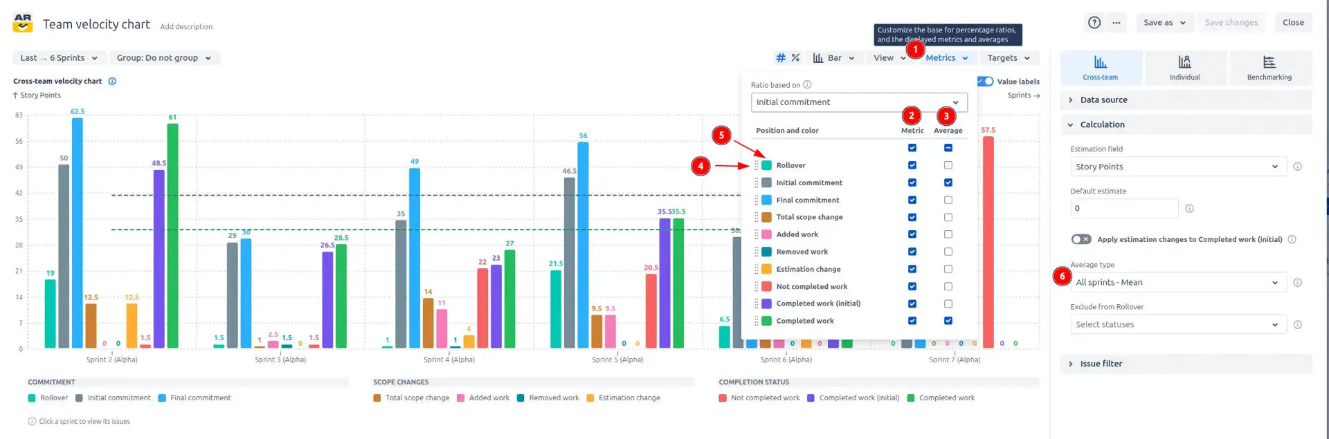
The metrics dropdown lets you show or hide any velocity metric and add per-metric average lines so charts stay focused and meaningful. The average line is a horizontal line that shows the average value of a metric, calculated based on the selected time interval by default.
The dropdown has the following metrics:
Rollover – Work carried between intervals.
Initial commitment – Sum of estimates for issues that were in scope at the start of the interval.
Final commitment – Sum of estimates for issues considered in scope at the end of the interval (after additions, removals, and re-estimates).
Total scope change – Net change in scope during the interval: Total scope change = Added work + Estimate change - Removed work
Added work – Estimates for issues added to the interval after it started (positive scope creep).
Removed work – Estimates for issues removed or deferred during the interval. Useful to see scope pruning or priority shifts.
Estimation change – Net difference caused by re-estimating issues within the interval (increases and decreases).
Not completed work – Work still open at the interval end. Represents unfinished commitments that need re-planning.
Completed work (initial) – Portion of completed work that was part of the initial commitment. Helps measure how well the team met what it originally promised.
Completed work – Total estimates completed in the interval, regardless of when they were added
You can toggle any metric and show only the trend lines you need.
⚙️ Quick instructions:
Open the Metricsdropdown from the chart toolbar.
Use the Metriccheckbox next to each row to show or hide that metric on the chart.
Use the Averagecheckbox to add or remove the average line for that metric (average line uses the metric color).
Drag the handle at a metric’s left to reorder (controls stacking/order).
Click the color swatch to change a metric’s color for emphasis.
In Calculation → Average type, choose All sprints – Mean, All sprints – Median, or Moving average (2–5 sprints) to control how averages are computed.
How to customize metrics display
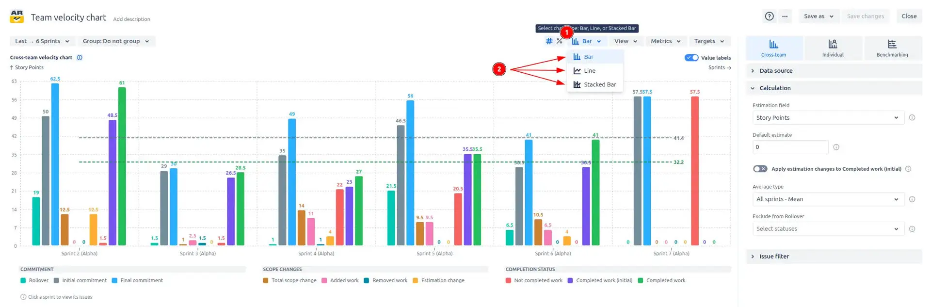
2. Key feature: Flexible Team velocity chart types
Want to view your data from a different perspective? Switch between Bar, Line, and Stacked Bar charts instantly to find the visualization that best fits your analysis.
The Flexible chart types feature lets you switch instantly between Bar, Line, and Stacked Bar visualizations so you can pick the best view for the question at hand. Bar charts highlight per-interval values, line charts emphasize trends and comparisons, and stacked bars show how multiple metrics compose a total for each interval.
Bar charts are ideal for comparing metric values interval by interval, making it easy to see exact performance changes.
Line charts focus on trends over time, showing how metrics move up or down and helping to identify long-term patterns.
Stacked bar display how multiple metrics combine into a total for each interval, revealing the composition of work, such as how much was completed versus added or removed.
⚙️ Quick instructions:
Open the Bar dropdown in the toolbar.
Choose Bar, Line, or Stacked Bar – the chart updates immediately.
How to switch between chart types
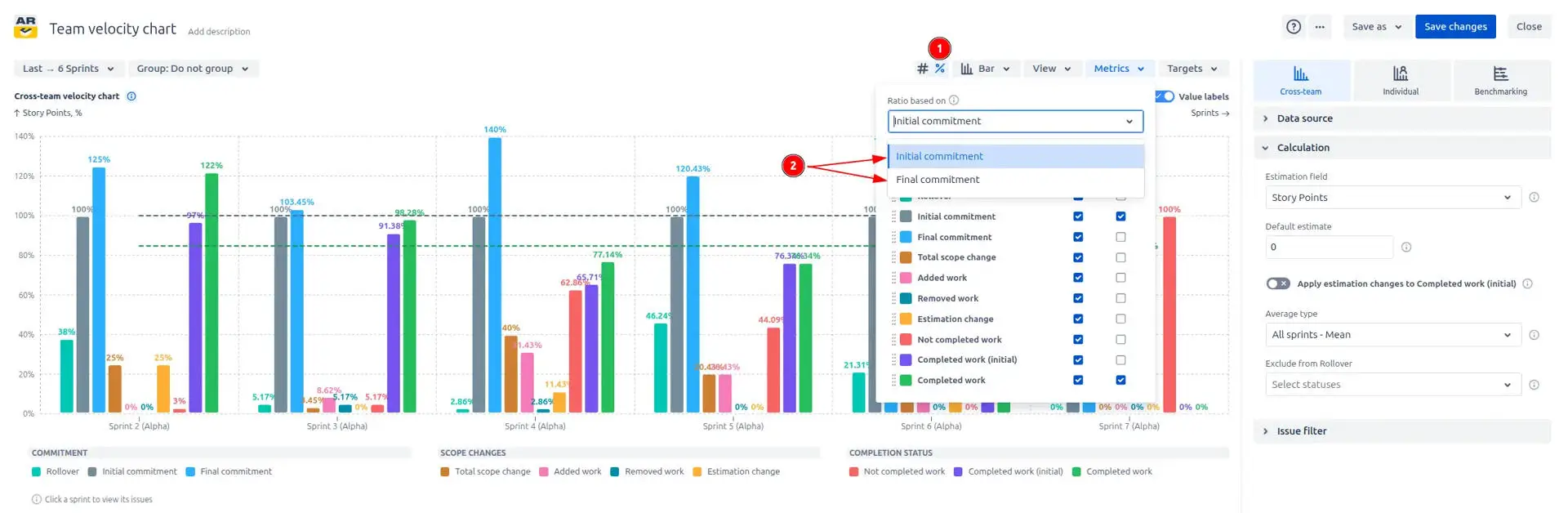
3. Key feature: Percentage view based on commitment
The Percentage view lets you display each metric as a percentage of the interval commitment instead of raw estimation values, making comparisons across intervals and teams straightforward. For each interval, the percentage is calculated as (metric value ÷ commitment value) × 100, and the chart Y-axis shows percent values.
You can compare metrics against Initial Commitment (the plan at interval start) or Final Commitment (the commitment after scope changes):
Comparing to Initial Commitment highlights planning accuracy and how much of the original plan was delivered.
Comparing to Final Commitment, measures delivery against the committed scope after additions or removals.
⚙️ Quick instructions: enable Percentage mode (1️⃣) in the chart toolbar, then choose Ratio based on the initial commitment or on the final commitment (2️⃣) - the Team velocity report updates immediately, and the Y-axis switches to percent. Average lines (mean, median, moving average) will also be shown in percentage mode to visualize smoothed percent trends.
Percentage mode based on the initial or the final commitment
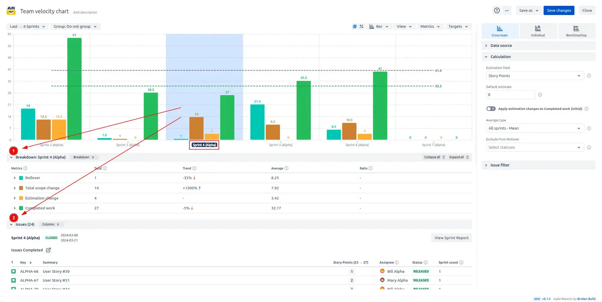
4. Key feature: Breakdown and Issue List
Looking to dive deeper into Jira issues and data for a specific interval? Simply click on any interval in the chart, and two detailed tables will appear.
The Breakdown and Issue List opens when you click an interval and shows the interval’s metric composition plus the exact issues that contributed to those values.
The Breakdown panel (1️⃣) lists each metric’s value for the selected interval and, by default, displays how that value is distributed across boards and issue types.
The Issue List (2️⃣) shows every issue that contributed to the selected interval.
A breakdown options dropdown lets you switch the field values that will be distributed across (for example: board, issue type, assignee, status, project, etc), and the distribution recalculates instantly. When you click a metric in the breakdown, the issue list filters to show only issues that contributed to that metric in the chosen interval.
Breakdown and Issue List for the selected interval
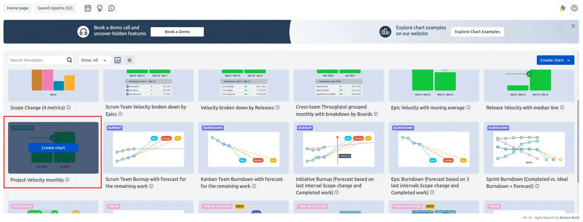
5. Key feature: Project velocity
Explore your project’s velocity at a glance! With the Agile Velocity Chart Gadget plugin, you can select a Project Velocity monthly template to instantly visualize project performance over a chosen interval. The chart allows you to track exactly how much your team delivers each month. By comparing completed work month over month, project managers and team leads can identify trends, spot peaks of productivity, or detect periods where progress slowed down. This historical insight is invaluable for planning future sprints, allocating resources, and setting realistic goals.
How to create Project Velocity monthly template
Additional features of Team velocity chart
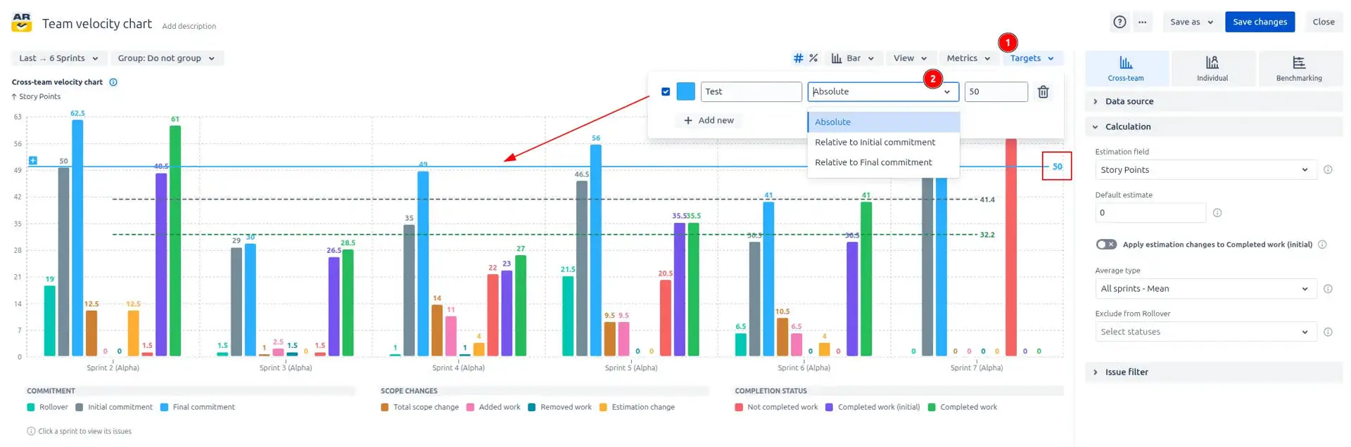
1. Target Lines for key dates
Want to keep your team aligned with key goals? Add a target line for instant visual guidance (1️⃣). The Target Lines feature lets you place horizontal lines directly on your estimating team’s velocity Agile chart, representing specific values or objectives. By marking a target, such as planned completed work or a performance milestone, you create an immediate visual reference that shows how your team’s current progress compares to expectations.
You can adjust each target line to be either absolute, representing a fixed value you input, or relative, calculated in relation to the initial or final commitment for the selected interval (2️⃣). This flexibility allows teams to track static goals or adjust dynamically as project scope evolves, ensuring your visual targets remain meaningful throughout the project.
This feature is perfect for sprint planning, release forecasting, or tracking cumulative goals, as it highlights whether your velocity trends are on track to meet planned outcomes. Target lines make it easy to identify gaps early, so teams can adjust scope, resources, or priorities before deadlines approach. You can add multiple lines to track different targets simultaneously, providing a layered view of objectives versus actual results.
Target lines for important dates
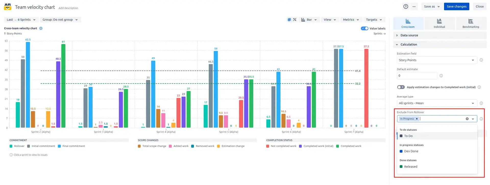
2. Exclude from Rollover
Want to focus your velocity analysis on truly relevant work? Use the Exclude from Rollover feature. This feature allows you to filter out issues with specific statuses from the Rollover metric, ensuring that only meaningful work is counted in your project velocity. Simply select the statuses you want to exclude from the dropdown menu, and the chart automatically adjusts, giving a clearer view of your team’s actual progress.
Ability to filter out issues with specific statuses from the Rollover metric
What about native Jira Team velocity chart
Jira provides a built-in Velocity Chart (inside a Scrum board’s reports) that shows sprint-to-sprint committed vs. completed work and an average velocity.
Importantly, the native Velocity report is limited: it’s tied to a single Scrum board and sprint cadence, relies on the board’s estimation statistic, and doesn’t surface scope or estimation deltas, multi-board aggregation, flexible grouping, custom forecast/target lines, or rich filtering and drill-down needed for program- or portfolio-level capacity planning.
In contrast, the Team velocity chart extends Jira’s basic velocity view into a full planning and forecasting tool, making cross-team capacity forecasting, risk detection, and program planning practical - all as a configurable Jira Dashboard gadget.
Advantages of using Team velocity chart in Jira
Forecast and track team capacity and delivery predictability across one or many Jira boards to get clear, data-driven insights into how much work teams can realistically deliver over any chosen interval.
Compare initial vs. final commitments, rollovers, and completed work in the same view to quickly spot chronic overcommitment, identify capacity bottlenecks, and measure how reliably teams meet their commitments.
Surface scope and estimation changes (added/removed work, estimation deltas) so you can see when scope creep or late re-estimates are impacting velocity and adjust planning, testing, or release timing accordingly.
Advanced forecasting and target tools (average/median metric lines, custom target lines, and projection options) let you produce realistic short-term capacity estimates and run simple “what-if” scenarios for planning conversations.
Multi-board aggregation enables alignment across teams and projects, making it easier to manage complex releases with shared milestones and global delivery goals.
Interactive, drillable intervals and detailed breakdowns let users click into any bar or point to see the exact issues behind a metric, improving transparency and speeding root-cause conversations during retrospectives or planning.
Embedded as a Jira Dashboard gadget with shareable views and exportable data, the Team Velocity Chart brings executive-friendly reporting and day-to-day operational visibility together for faster, better-informed decisions.
Ideal for Scrum Masters, Team Leads, Product/Delivery Managers, Engineering Managers, QA Leads who need reliable capacity forecasting, clearer sprint commitments, and actionable cross-team visibility.
The Agile Reports and Gadgets app includes Team velocity chart functionality, along with many other reports and charts.
Frequently Asked Questions
1. What does the Team velocity report show?
The Team velocity chart is a powerful visualization that tracks a team’s delivery capacity and predictability over time. It shows how much work was initially committed at the start of an interval, how that commitment changed during the interval, and how much work was actually completed by the end. By visualizing these metrics together, the Team velocity chart in Jira dashboard makes it easy to identify overcommitment, scope creep, and trends in delivery performance. It helps teams, managers, and stakeholders understand whether work is being delivered reliably, spot risks early, and make data-driven decisions to improve future planning and capacity forecasting.
2. Is there a way to export the Team velocity chart data for reporting outside of Jira?
Yes, the Agile Velocity Chart Gadget app allows you to export your chart data easily, enabling reporting and analysis beyond Jira. You can choose from multiple formats depending on your needs: CSV for raw data that can be further analyzed in Excel or other spreadsheet tools, PNG for a visual snapshot of your chart suitable for presentations, and PDF for a professional, shareable report. Exporting is straightforward and can be done directly from the chart interface with just a few clicks.
3. What can I use for estimation in the Team velocity chart?
Yes, the Team velocity chart can use any numeric Jira field as the estimation unit, so you can pick the metric that best fits your teams and planning style.
Common options include:
Story Points - standard for Scrum teams focusing on relative sizing.
Issue Count - treats each issue as a single unit (good for throughput-focused teams or when story points aren’t used).
Time estimates - Original Estimate / Remaining Estimate for capacity planning tied to working hours.
Epic points / Custom numeric fields - any custom number field you use for estimation.
4. How does the Team velocity chart help with forecasting?
The Team velocity chart helps you predict future delivery by turning historical performance into clear, data-driven forecasts. You can add an average line for each metric (mean or median) over past intervals to project how much work your team can complete in upcoming sprints or months. Additionally, you can add custom target lines to track progress toward specific goals, like a target velocity or delivery milestone, and instantly see if the team is on track.
Because it factors in scope changes and estimation adjustments, the forecasts remain realistic even when work is added, removed, or re-estimated mid-interval. This makes it easy to plan releases, communicate timelines, and make proactive decisions to keep delivery predictable.
5. How can I see Jira issues that contribute to the Team velocity report?
You can drill down into any interval on the Team velocity report by simply clicking on it. This opens a detailed breakdown showing all metrics for that interval, along with a list of the Jira issues that contributed to it. Each metric is linked to the exact issues behind it, with direct links to their Jira pages. This makes it easy to trace numbers back to real work, investigate scope changes, and understand why commitments were or weren’t met.
6. How to add a Velocity chart for multiple teams to a Jira dashboard?
Jira doesn’t include a Team velocity chart gadget by default - install our Agile Velocity Chart Gadget Marketplace app to add it.
To add the Team velocity chart to a Jira dashboard:
Ensure the Agile Velocity Chart Gadget app is installed.
Open the Jira Dashboard where you want the gadget, open the gadget search, and search for an Agile Velocity Chart Gadget. Click the “Add button” to add it to the dashboard.
Configure the gadget: select your data source, select the desired interval, choose the estimation field, and any other advanced options.


.svg)


.png)
.png)
