
Thank you! Your submission has been received!
Oops! Something went wrong while submitting the form.


A SAFe cumulative flow diagram shows how Epics or Initiatives progress through the delivery system, helping SAFe teams see where work accumulates and whether flow remains stable across PIs. Showing WIP trends and the balance between incoming and completed items gives a clear picture of flow health at the Portfolio or Program level.
With flexible time ranges, custom status groupings, and support for Projects, Boards, and Initiatives, the Agile Cumulative Flow Charts app provides the visibility SAFe organizations need to improve PI Planning, coordinate work across teams, and deliver value more predictably.
✅ Release Train Engineer (RTE): I use the SAFe CFD to understand whether the ART’s flow is stable across the PI. Arrival and Departure trends show if the scope is growing faster than delivery, while status-level bands reveal cross-team bottlenecks and WIP buildup.
✅ Delivery / Program Manager: I look at the SAFe cumulative flow chart to assess delivery predictability across multiple teams. It helps me understand whether throughput is sufficient to meet PI objectives and where delays originate - scope growth, uneven capacity, or workflow constraints.
✅ Scrum Master / Agile Coach: I use the status-level and percentage views to identify where work queues or stalls across the ART. Persistent Ready or In Progress states signal handoff issues or capacity constraints that need attention.
✅ Lean Portfolio Manager: I use higher-level time grouping to observe long-term flow trends across strategic initiatives. The chart helps me assess whether portfolio demand remains aligned with delivery capacity over multiple PIs.


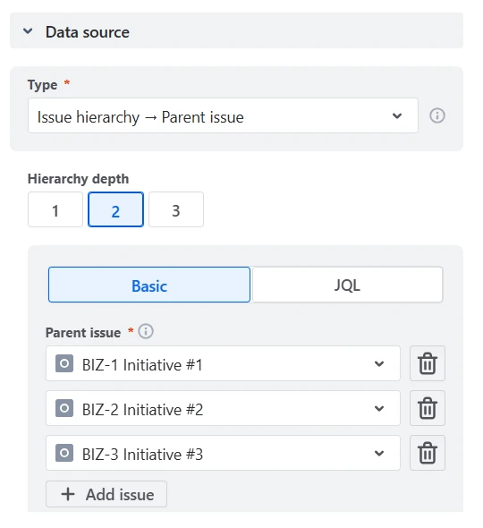
For SAFe organizations, delivery tracking rarely stops at the team or epic level. The SAFe cumulative flow diagram lets you build charts around Initiatives, Features, Solutions, or other entities above epics by selecting issues via parent–child hierarchies or issue links, even when work is distributed across multiple teams and boards.
In the example below, the chart aggregates work items that sit two levels below the parent issues BIZ-1, BIZ-2, and BIZ-3:
✅ Why this is useful:
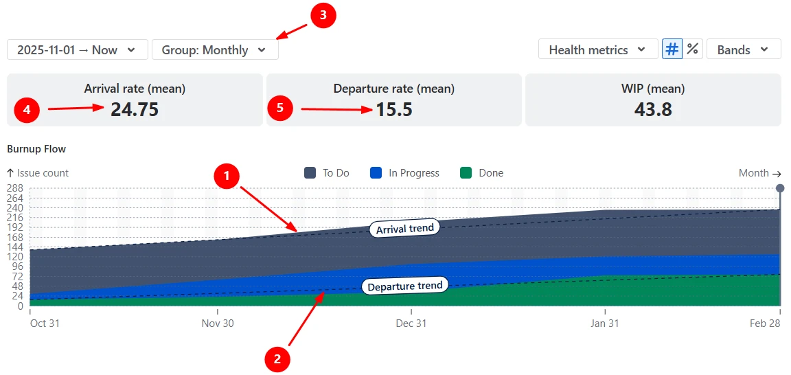
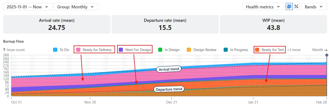
The Burnup Flow view with Arrival and Departure trend lines helps you assess whether work is entering the system faster than it is being completed.
In Example A, the Arrival trend line (1️⃣) is steeper than the Departure trend (2️⃣), indicating that new work is being added at a higher rate than it is finished, an early signal of increasing pressure on the ART.
The chart uses monthly grouping (3️⃣), with an average arrival rate of 24.75 issues per month (4️⃣) and an average departure rate of 15.5 issues per month (5️⃣). You can switch to the quarterly time grouping to smooth short-term fluctuations and gain a more strategic view of delivery trends.
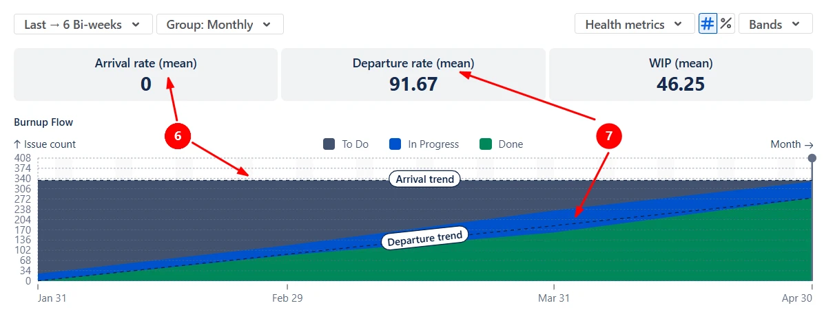
In Example B, the Arrival trend line remains flat with an average Arrival rate of 0 (6️⃣), while the Departure trend line steadily increases with an average Departure rate of 91.67 items per month (7️⃣). This indicates that no new work is entering the selected scope while the team continues to deliver consistently, reducing the total backlog over time. This is a healthy pattern if the team’s goal is to finish a fixed scope - the system is stable and winding down as expected.
✅ Why this is useful:
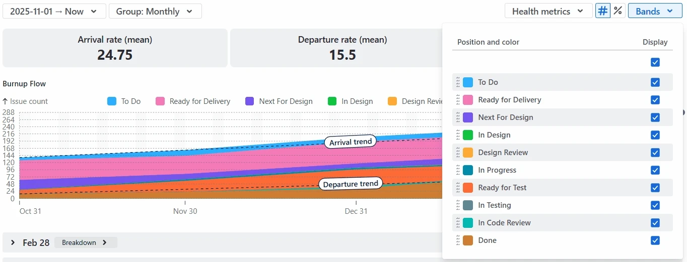
By switching the band foundation from status categories to individual statuses, the chart shows one band per workflow stage, making it easier to see exactly where work accumulates. In the example below, most of the work is concentrated in Ready statuses - such as Ready for Delivery, Next for Design, and Ready for Test. This indicates that work is frequently waiting between active stages, rather than being actively processed, and suggests capacity constraints or handoff delays.
You can further tailor this view by hiding or showing specific statuses, reordering bands, and adjusting their colors to match your workflow and highlight the stages you want to monitor most closely:
✅ Why this is useful:
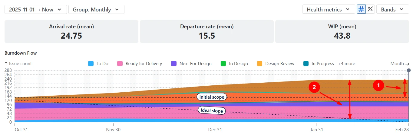
The Burndown Flow view shows how work progresses toward completion compared to two reference lines: the Initial scope and the Ideal slope. The Initial scope line represents the amount of work committed at the start of the selected period, while the Ideal slope indicates the pace required to complete that work by the target date.
In the example below, the scope has grown from 144 issues to around 240 issues (1️⃣), significantly increasing the delivery load. Ideally, the portion of the flow above the Ideal slope line (2️⃣) should be concentrated in Done (or nearly Done) statuses. In this case, a large share of work remains in non-Done statuses, indicating that delivery is falling behind the plan.
✅ Why this is useful:
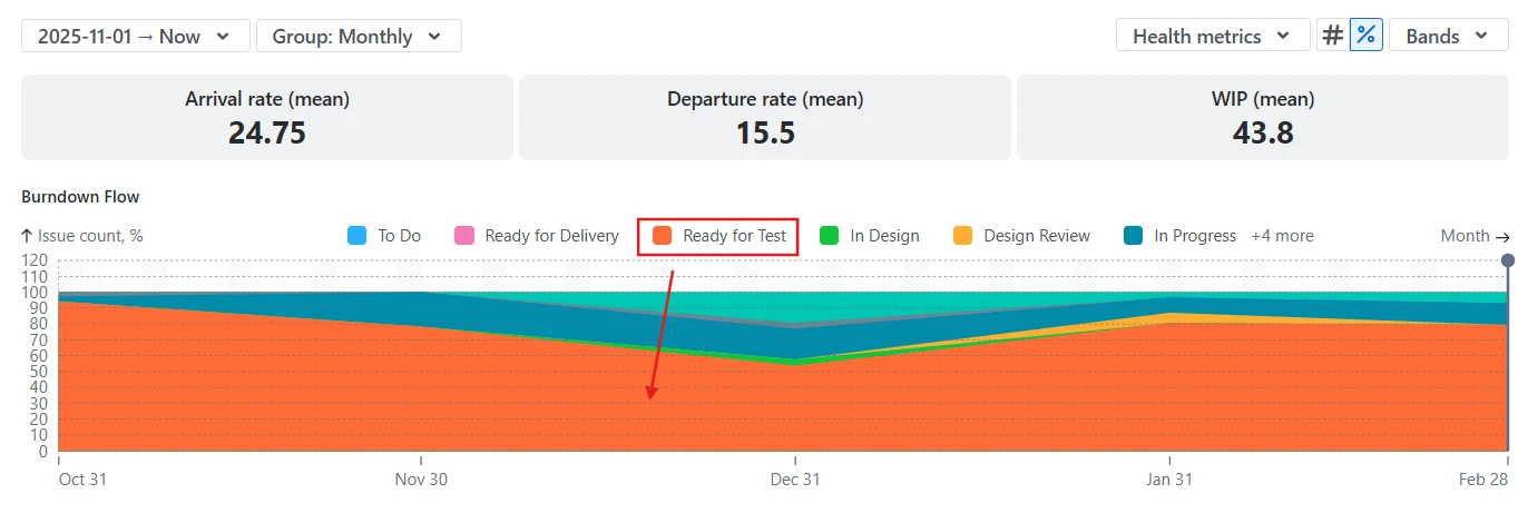
By switching the chart from absolute values to relative values (%), you can see how work is distributed across workflow stages over time, regardless of changes in total scope. Instead of focusing on how many issues exist, this view highlights which part of the system the work occupies at each point in time.
In the example below, the chart visualizes the percentage distribution of In Progress statuses. The Ready for Test status dominates over time, indicating a persistent QA bottleneck.
✅ Why this is useful:
You can tailor the chart to reflect how work is planned, estimated, and delivered in your SAFe organization:
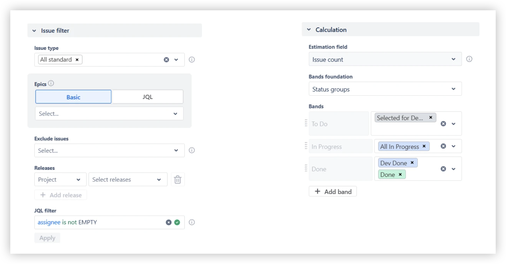
✅ Why this is useful:
The Breakdown and Issue list views let you investigate any pattern you see on the chart by drilling directly into the underlying data. Click a specific area or band in a given interval to see the exact issues that contribute to it. You can then:
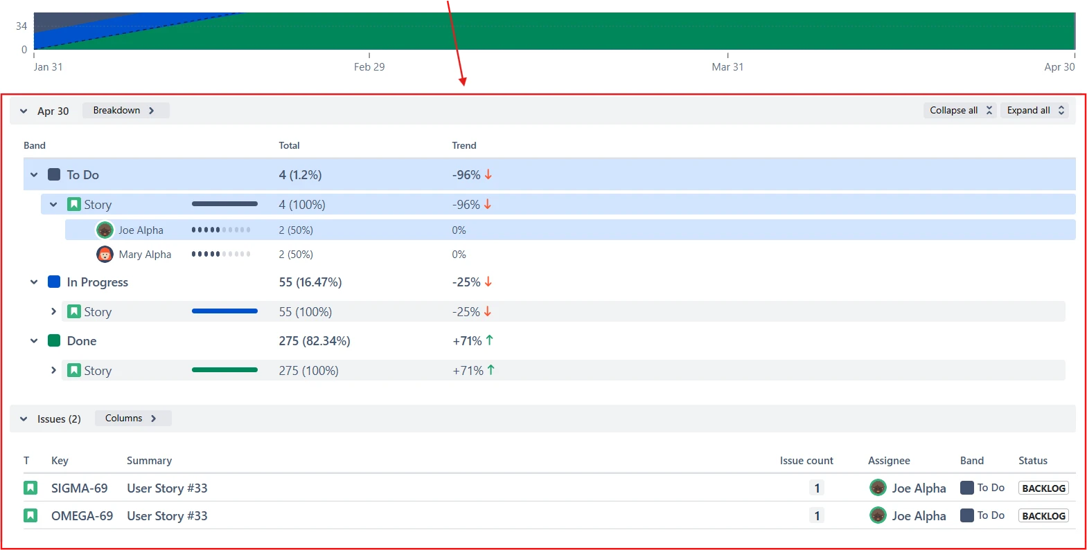
✅ Why this is useful:
Jira provides a basic Cumulative flow diagram for individual boards, but it is primarily designed for single-team execution rather than SAFe-level coordination and decision-making. When used in a SAFe context, several limitations quickly become apparent:
As a result, the native Jira CFD is useful for local team monitoring, but falls short when applied to ART-wide flow analysis and PI-level decision-making.
The Cumulative flow diagram in the Broken Build app is designed to support SAFe organizations by extending flow analysis beyond individual teams and aligning it with ART and portfolio needs:
Use our examples to build your use cases on the Jira Dashboard.
The Jira apps (plugins) used in these examples has a 30-day free trial and are completely free for teams under 10 people:
The Agile Reports and Gadgets app includes SAFe cumulative flow diagram functionality plus a wide range of additional charts and reports.
A SAFe cumulative flow diagram shows how work enters, moves through, and exits the delivery system over time at the ART or portfolio level. It visualizes the balance between incoming work (scope), work in progress, and completed work, helping you understand whether delivery is stable, overloaded, or constrained.
You can build this chart in Agile Cumulative Flow Charts by Broken Build, which supports SAFe-level visualization and configurable workflow stages directly in Jira.
If the scope grows while delivery appears stable, it usually means the system is absorbing additional work without immediately breaking flow. Arrival and Departure trends remain roughly parallel, WIP stays controlled, and completed work continues at a predictable pace. In SAFe terms, this often indicates that teams still have unused capacity, or that new work is being added gradually rather than in disruptive bursts.
However, this state should be monitored closely. Continued scope growth increases future delivery risk, even if the current flow looks healthy.
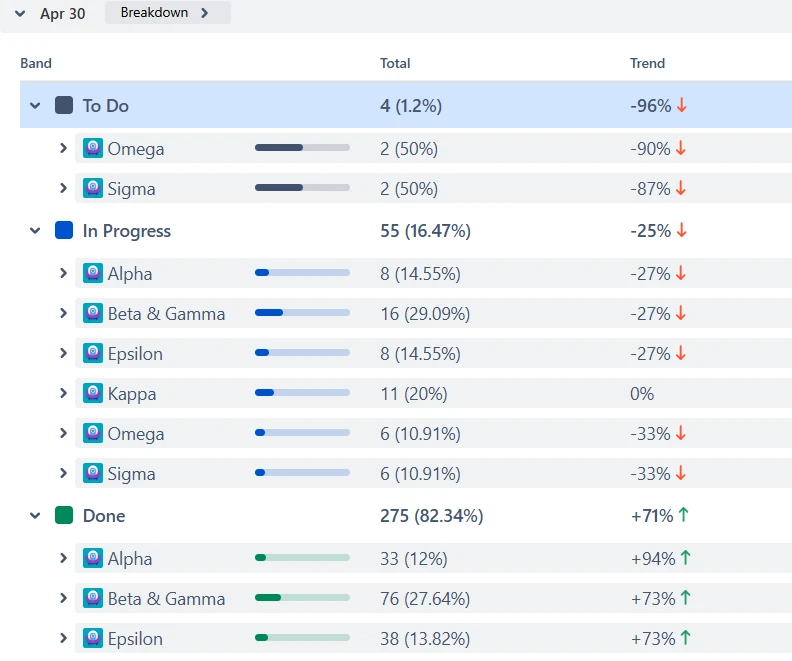
Start by switching the chart to individual status view and identifying the workflow stage where work accumulates most consistently. Next, use the Breakdown and segment the data by team, board, or project. If the accumulation is driven mainly by one team, the bottleneck is likely local, caused by team-specific capacity or process issues. If multiple teams contribute similarly to the same congested status, the constraint is systemic at the ART level.
The SAFe CFD provides a system-level view of flow, helping focus discussions on observable facts rather than assumptions. During ART Syncs, teams can review Arrival, Departure, and WIP trends to assess whether delivery is staying balanced or drifting toward overload, and use status-level views to pinpoint emerging bottlenecks before they impact PI objectives.
In Inspect and Adapt workshops, the chart supports root-cause analysis by showing how scope, WIP, and throughput evolved over the PI. Using Breakdown and Issue list, participants can trace ART-level patterns back to specific teams, workflow stages, or dependencies, helping prioritize improvement actions based on real delivery behavior.


.svg)

.png)
