
Thank you! Your submission has been received!
Oops! Something went wrong while submitting the form.


Dive into detailed examples of the Release progress report:
The Release progress report is designed to give teams and stakeholders a transparent view of how a release is progressing, helping detect scope changes early, forecast realistic completion dates, and ensure alignment with release goals.
You can track real progress against planned scope, monitor target dates vs actual delivery pace, and use velocity-based insights (including median and trend analysis) to understand performance stability. Detailed issue and interval breakdowns reveal what has been completed, what’s still pending, and how the scope has evolved.
Unlike native Jira reports, our Agile Reports and Gadgets combine transparent progress visualization, detailed breakdowns, and forecasting tools directly in the Jira Dashboard.
✅ Product or Delivery Manager: I use the Release progress report to keep track of how the release evolves, monitor scope changes, and forecast realistic delivery dates. This overview helps me set accurate expectations, focus on the most critical releases, and address risks before they impact the roadmap.
✅ Scrum Master / Team Lead: For me, the Release progress chart gadget is essential to see how much progress the team makes against the planned scope and to spot any deviations or emerging blockers quickly. By analyzing velocity patterns and work distribution, I can help the team reprioritize tasks and keep the release on schedule.
✅ Release Train Engineer (RTE): I rely on the Release progress report in Jira to combine progress data from different teams, evaluate consistency in value delivery, and identify potential delays early. This insight ensures that shared milestones remain achievable and supports better coordination across all involved teams.


As a part of the Release progress chart in Jira, the Release scope progress visualization feature helps teams track how much of the planned work is completed and how the remaining scope evolves. This allows them to understand real release progress, detect scope changes early, and maintain transparency for stakeholders.
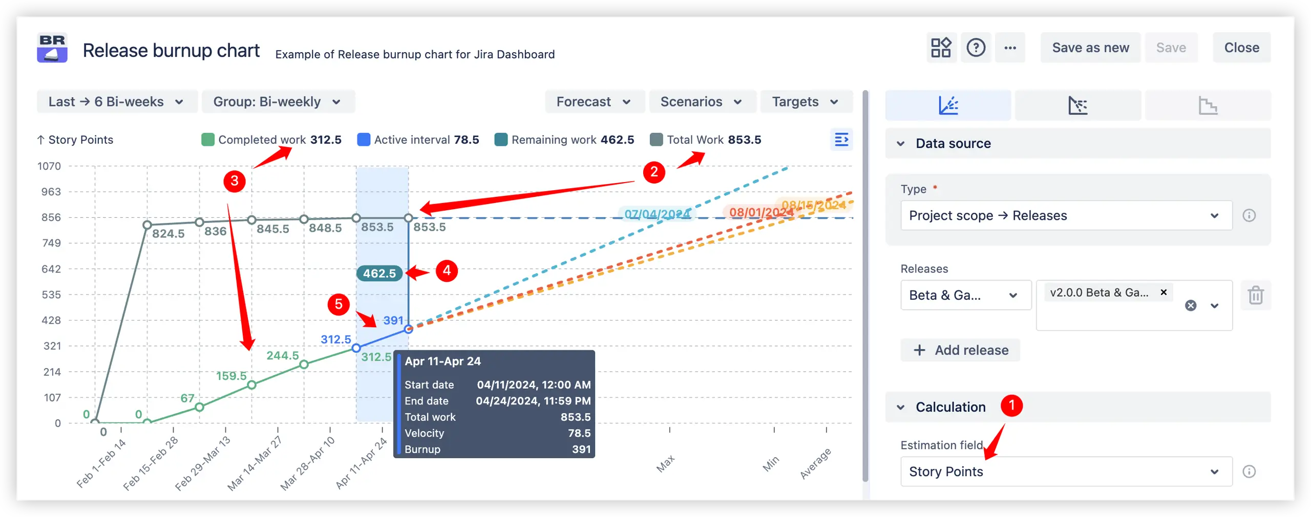
The Release progress report example above, with all calculations based on story points (1️⃣) in this case, displays key historical metrics that help teams understand the current state of the release:
Other estimation options, such as issue count, time spent & remaining time, etc., can also be used depending on the team’s workflow.
📊 You can explore this "Release scope progress visualization" feature in action with an interactive example. Adjust the chart settings and experiment with different configurations to see how scope changes and progress tracking work in real time, providing a clear understanding of release dynamics and supporting informed decision-making.
The Release progress forecast feature provides a clear projection of when the release is likely to be completed, helping to establish realistic timelines and make proactive adjustments if needed.
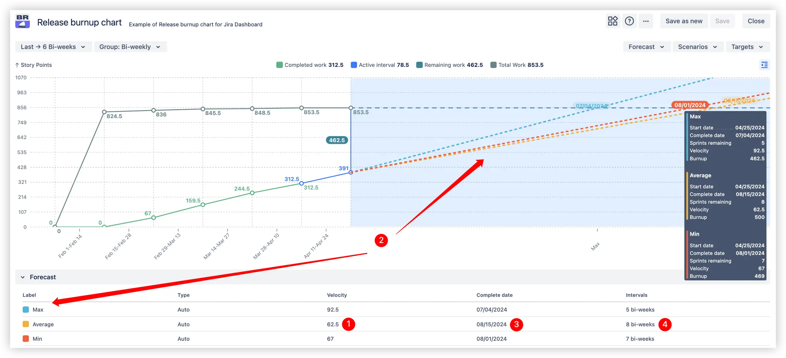
Based on historical velocity (1️⃣)across selected releases, the chart automatically builds three forecast lines (2️⃣):
🔵 Maximum velocity – represents the fastest possible completion pace
🟠 Average velocity – average of velocities from the past intervals
🔴 Minimum velocity – shows the most cautious, conservative value delivery estimate
Additionally, the chart provides:
This feature provides a reliable basis for planning and proactive decision-making, helping to keep releases on track.
📊 You can explore the "Release completion forecast" feature in an interactive, clickable example to see how the forecast works in action.
The feature allows for analyzing release progress by modeling different “what-if” scenarios. You can adjust custom velocity (1️⃣ What-if-velocity) to see how changes in team performance may affect the forecasted delivery date or set a target completion date (2️⃣ What-if-date) to calculate the required velocity for completing the remaining work on time:
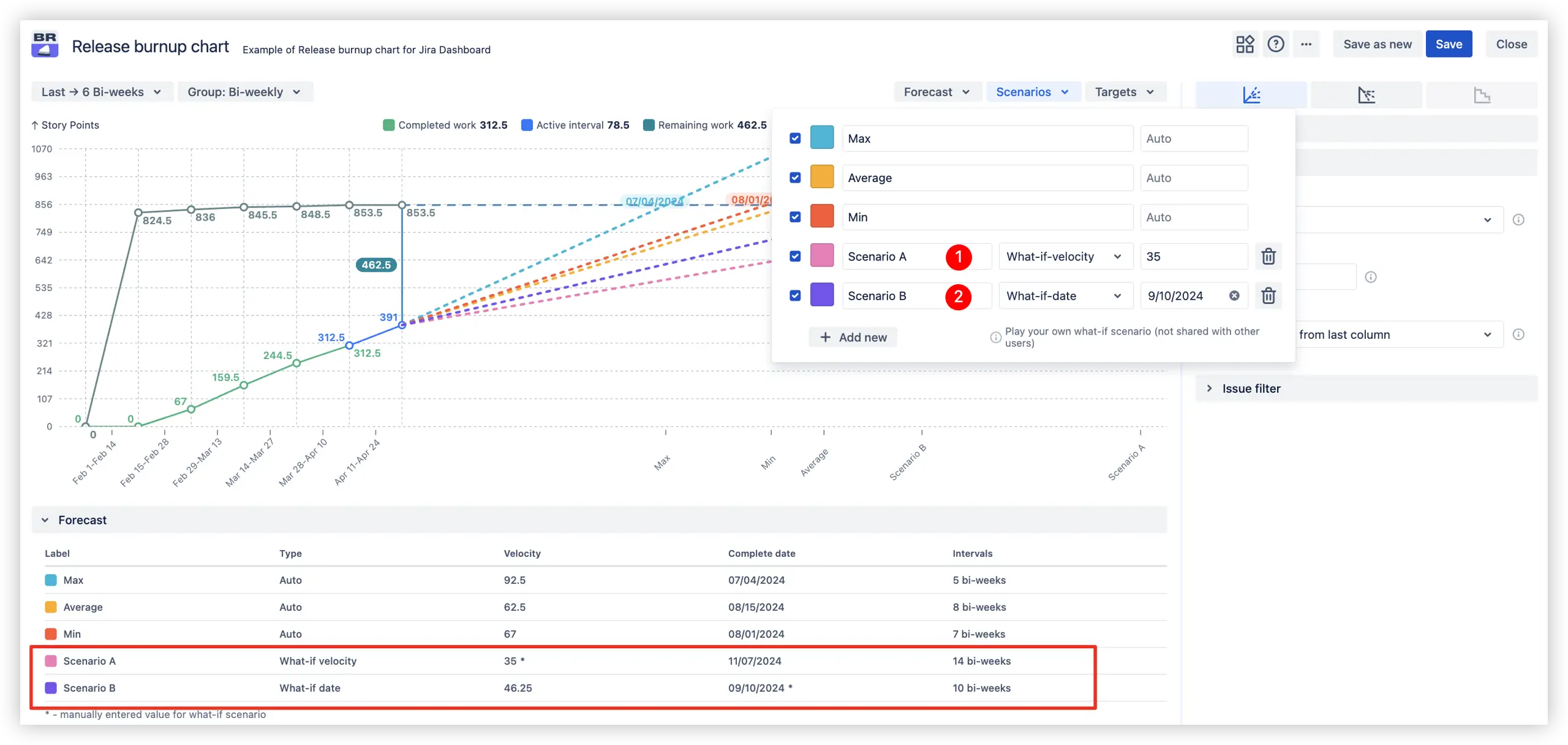
This helps predict potential delivery outcomes, evaluate realistic timelines, and make informed decisions under changing conditions.
📊 Check the interactive example to see how it works in practice
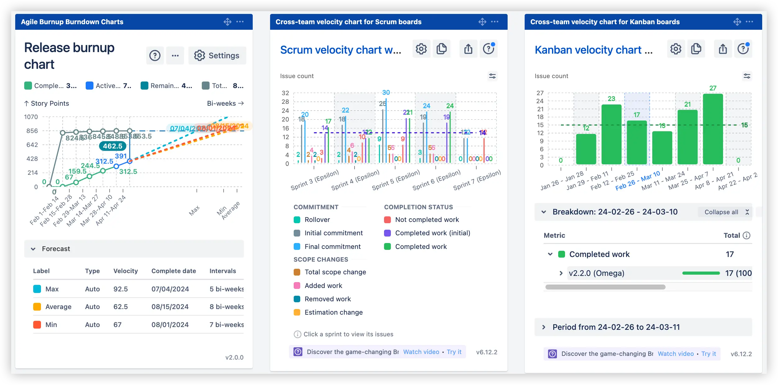
This chart shows how a team’s effort is distributed across releases, helping assess the main focus areas and whether key releases get sufficient attention. It provides clarity on workload allocation, making it easier to ensure alignment with release goals and adjust planning if needed.
✅ Scrum velocity chart breakdown by releases
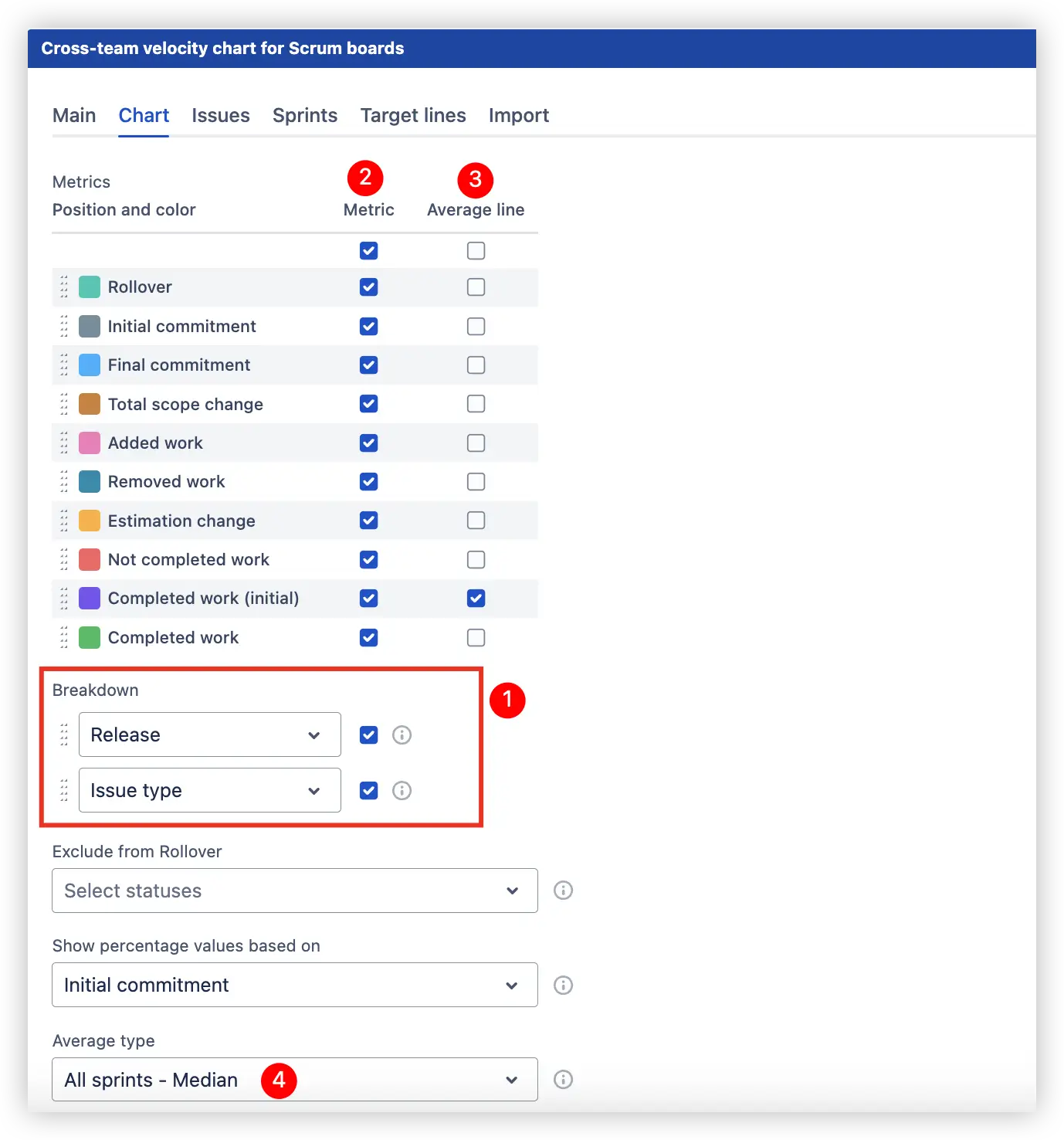
In the Velocity chart for Scrum boards, selecting a breakdown by releases (1️⃣) lets you choose from 10 velocity metrics (2️⃣) (e.g., Rollover, Initial commitment, Completed work) and display them with or without an average line (3️⃣). You can also select the average type (4️⃣) - median in this case - to track focus trends and velocity stability over time easily:
By selecting the desired sprint (1️⃣) for analysis, you can immediately explore a detailed breakdown (2️⃣) of the team’s effort by releases with release progress metrics (3️⃣):
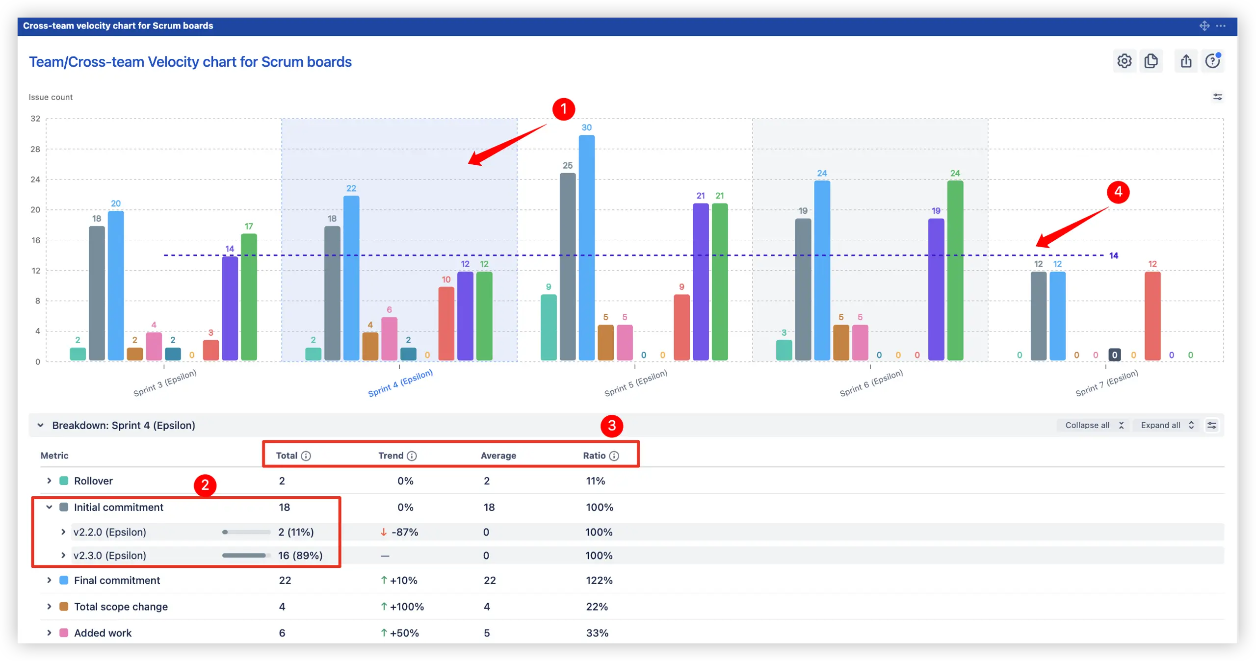
The median line (4️⃣) on the Scrum board helps evaluate whether sprint velocity stays consistent and if the team can reliably meet release commitments.
✅ Kanban velocity chart breakdown by releases
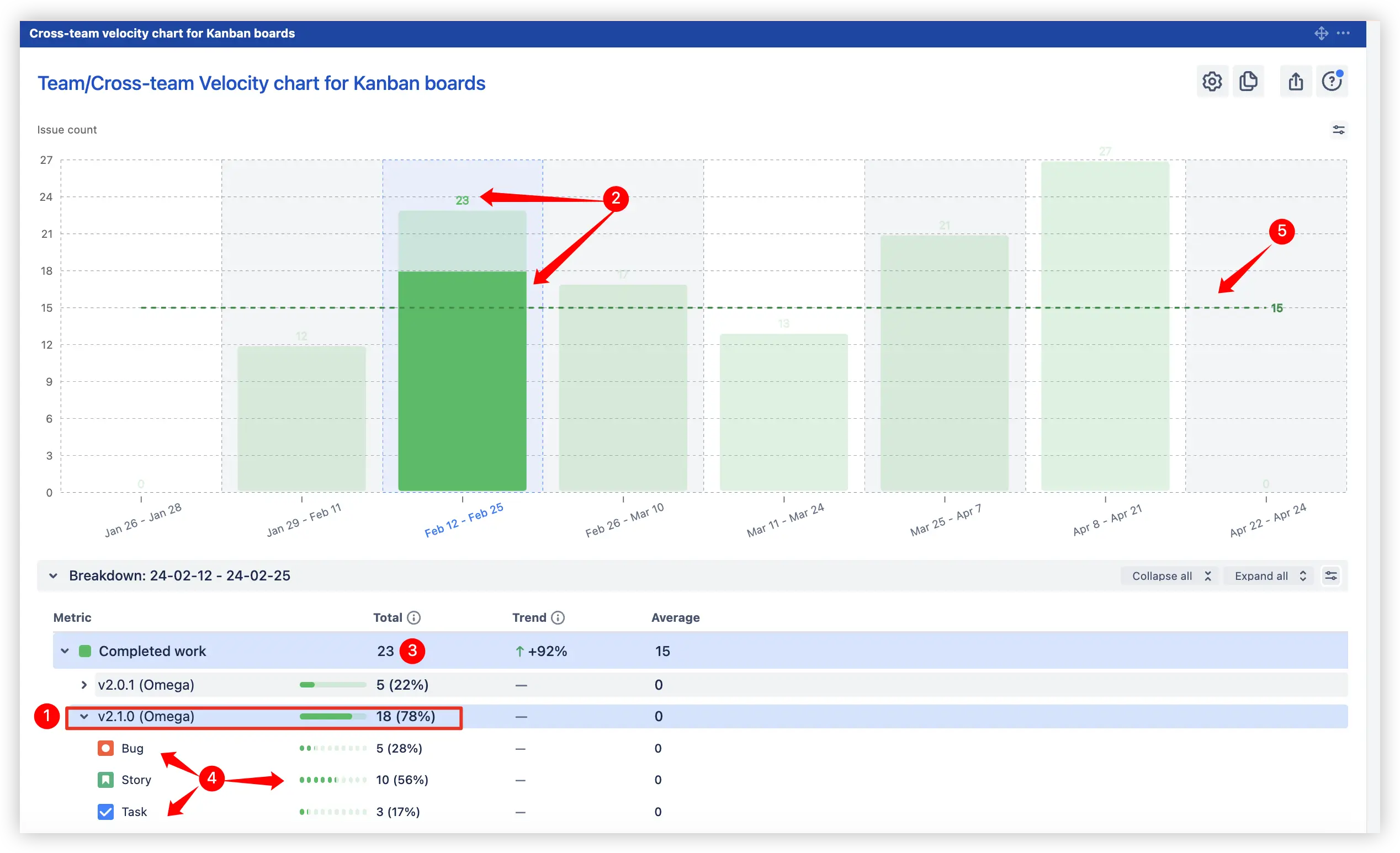
For Kanban boards, the Velocity chart with breakdown by release provides an at-a-glance view of how much completed work has been delivered. It highlights the team’s release focus, showing which releases receive the most attention and how progress aligns with planned work.
Select the desired interval to instantly explore a detailed breakdown of the team’s progress by releases with key metrics, trends, and work item types:
📊 All Kanban velocity report features are available in the example.
As part of the Release progress report, this feature highlights how the actual delivery velocity compares to planned target dates. Teams can quickly see if they’re ahead, on track, or behind schedule, making it easier to adjust forecasts and communicate realistic timelines to stakeholders.
On the Release burnup chart, the target date line (1️⃣) marks the planned completion day, while forecast lines (2️⃣) indicate whether the current pace will meet, exceed, or miss it. This provides a clear view of progress and helps detect potential delays early.
📊 Interactive example of “Release progress against target dates tracking” feature available – try the target date line in action.
With multi-release selection, you can track, forecast, and compare progress across multiple releases simultaneously, ensuring better resource prioritization and early risk detection. This feature helps you:
📊 Check the Interactive example to explore how to forecast and compare multiple releases in action.
This feature helps analyze release performance by selected intervals, providing detailed insights into what was delivered and how the scope evolved, making it easier to optimize the current release flow.
You can:
📊 Check the Interactive example to see the “Zoom in on Release progress” feature in action:
This feature shows how individual velocity influences the overall release progress, helping to detect workload imbalances, identify bottlenecks, and improve delivery efficiency.
The chart visualizes each team member’s 10 velocity metrics (e.g., Rollover, Initial commitment, Final commitment, Completed work) to analyze the contribution to the release progress in detail, with a median line reflecting the typical delivery velocity.
By clicking on the desired interval on the chart (1️⃣), the breakdown table (2️⃣) provides a detailed view of metrics by release and issue types (e.g., Story, Bug, Task), including total values, trends, averages, and completion ratios:
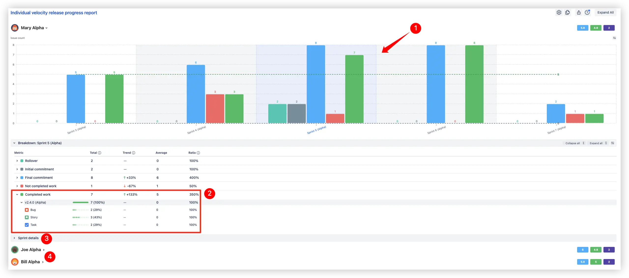
Additionally, the Sprint details (3️⃣) panel shows a full list of issues for the selected sprint, including their type, status, and direct links for deeper investigation. You can also switch to other team members (4️⃣) to view the same detailed breakdown, making it easy to compare individual contributions to the release progress and delivery patterns across the team.
When release progress needs to be analyzed under changing scope conditions, this feature helps simulate how adjustments to remaining work influence delivery timelines.
By modifying custom remaining work, you can instantly see how the total scope impacts the projected completion date, which is useful for testing assumptions or planning for possible scope changes. Additionally, the remaining work growth option models gradual scope increases over time, making forecasts closer to real-world scenarios where scope often evolves.
This simulation helps predict risks caused by scope creep and supports timely corrective actions to keep the release on track.
📊 Check the Interactive example to see the “Custom remaining work & scope growth simulation” feature in action
Native Jira provides only basic tools for tracking release progress, such as the Release burndown and Version report. These reports help monitor whether the version is likely to be released on time, but they are limited to high-level data and lack deeper analytics.
If you need full control over release planning and data-driven decisions, the advanced Release progress report provides far more actionable insights.
Use our examples to build your use cases on the Jira Dashboard.
Both Jira apps (plugins) used in these examples have a 30-day free trial and are completely free for teams under 10 people:
The Agile Reports and Gadgets app is a bundle that includes the features of the other charts.


.png)
.png)
