You can select one or multiple Jira projects and versions, visualize progress, and generate accurate forecasts with velocity-based projection lines (min, max, average). Advanced options allow you to customize forecast scenarios (target dates, velocity changes), simulate scope growth, and manually adjust remaining work values to reflect real project dynamics.
Unlike Jira does not offer native Release burnup visualization and forecasting, our Agile Burnup Burndown Charts gadget provides exactly that, with multi-project support, advanced forecasting, detailed breakdowns, and powerful customization – all directly in the Jira Dashboard for maximum visibility and control.
Release burnup chart” Jira Dashboard gadget for progress tracking and forecasting
How different roles use Release burnup chart in Jira
✅ Product or Delivery Manager: I rely on Release burnup graphs to forecast delivery timelines for upcoming releases across multiple Jira projects and versions. Using multi-project forecasting, scenario simulations, and scope adjustments helps me communicate realistic expectations, prioritize releases effectively, and identify delivery risks early to keep product roadmaps on track.
✅ Marketing Manager: I use Release burnup charts to understand which features and versions are likely to be delivered by fixed deadlines. This visibility helps me plan campaigns, align messaging with product readiness, and adjust timelines proactively when risks to delivery emerge.
✅ Scrum Master / Team Lead: I monitor release progress and scope changes using burnup charts to spot risks like scope creep or missed commitments. When forecast lines shift unexpectedly, it helps me start conversations with product owners and teams to manage scope, adjust priorities, and ensure we stay aligned with release goals.
✅ Release Train Engineer (RTE): I leverage the Release burnup report in Jirato monitor progress across multiple projects contributing to a release or Program Increment (PI). Aggregating data from multiple teams allows me to forecast outcomes accurately, manage dependencies, highlight delivery risks, and ensure alignment with broader PI goals and timelines.
Forecast your releases with confidence using the RELEASE BURNUP CHART
Based on historical velocity across selected Jira projects and versions, the Release Burnup automatically builds three forecast lines:
Minimum velocity – the slowest, most conservative projection
Maximum velocity – the fastest possible delivery pace
Average velocity – the most realistic, data-driven forecast
These forecast lines help to visualize when the remaining work is likely to be completed, supporting more accurate planning and stakeholder communication.
⚙️ Default settings:
Interval: Last 6 bi-weeks (5 closed and 1 active bi-week)
Grouping: bi-weekly
Estimation: Story points
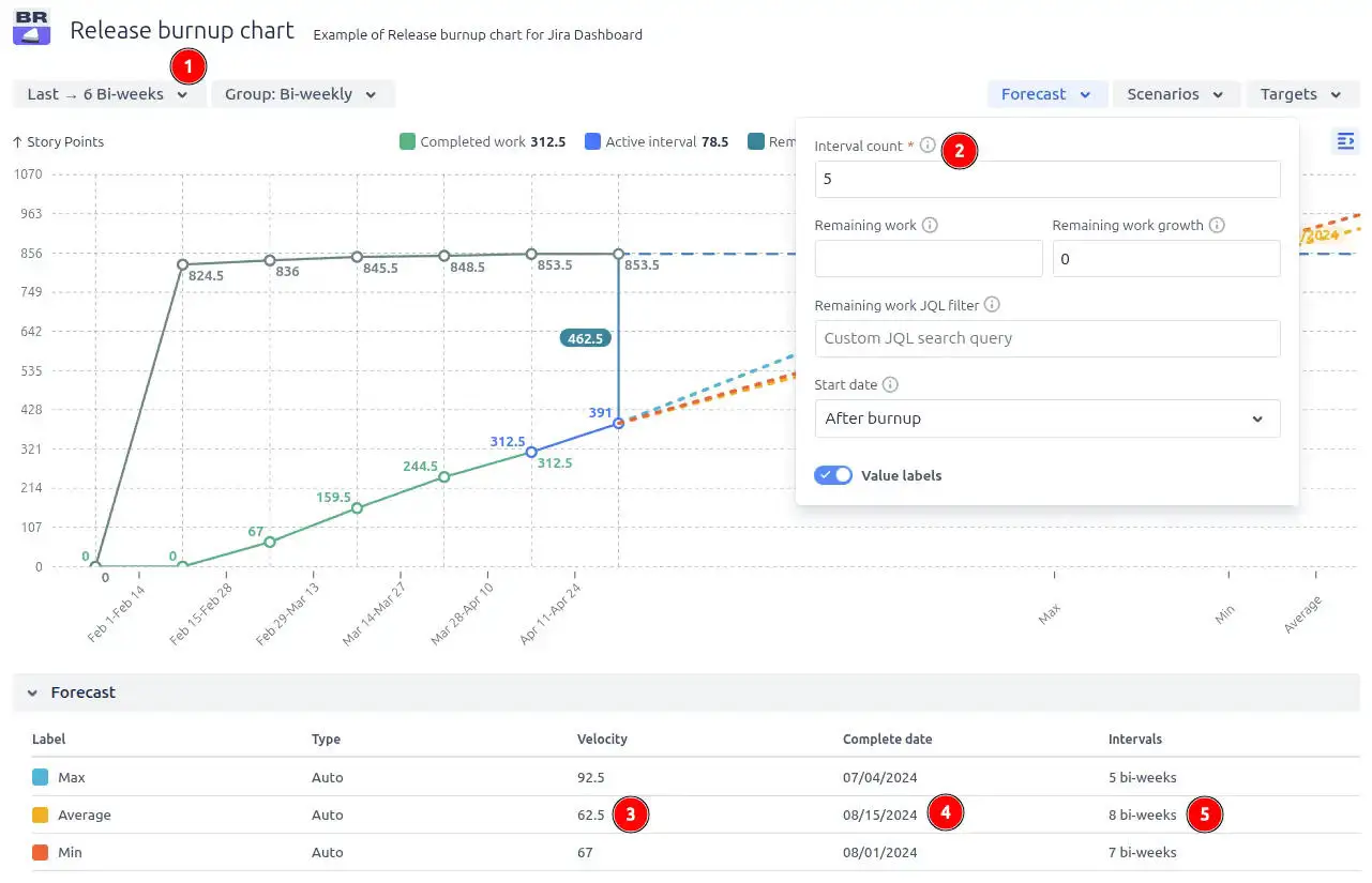
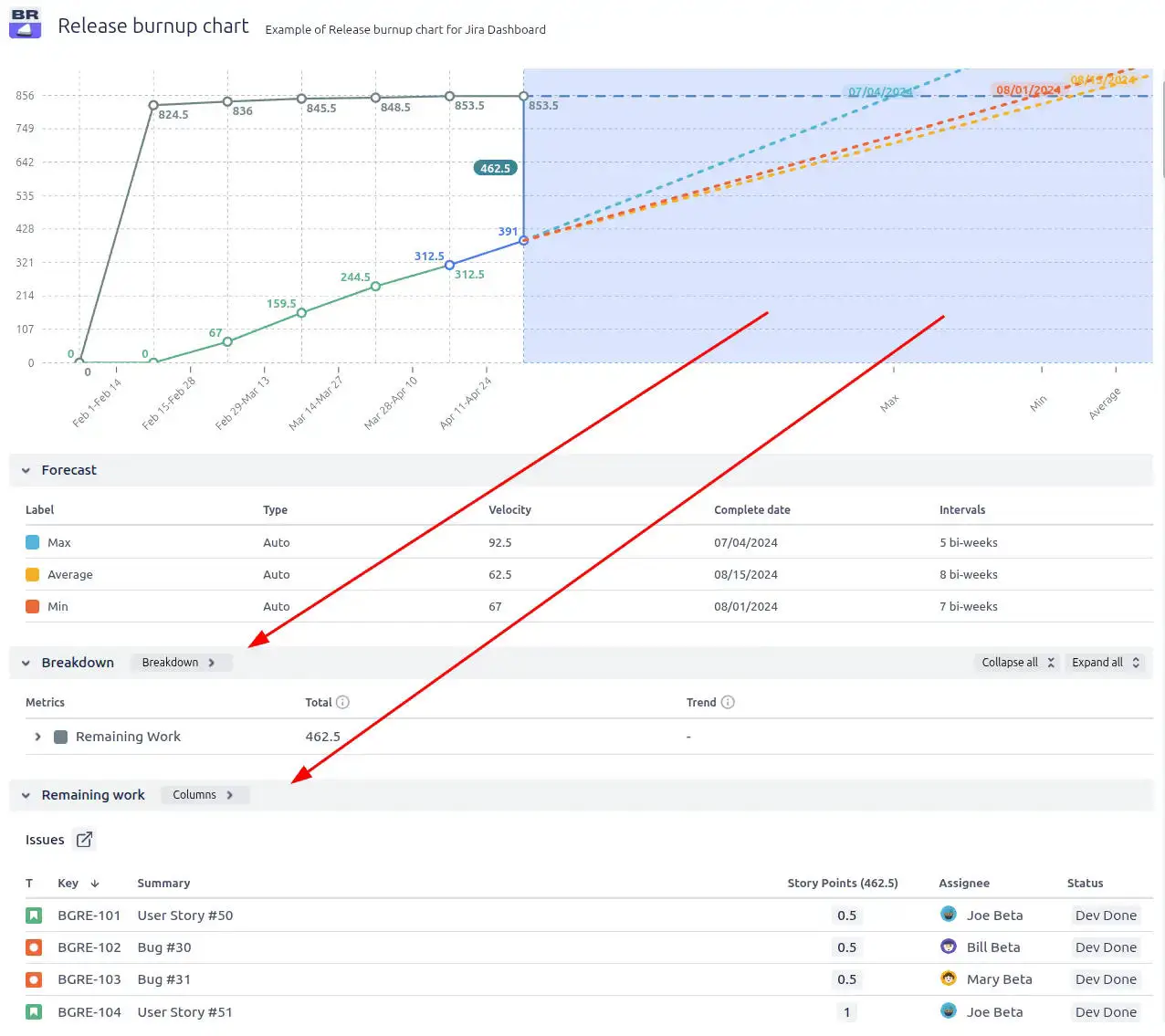
Example of a work completion forecast based on velocity from the last completed sprints
📊 How to read the chart:
The Release burnup chart shown above displays data from the last 6 bi-weekly periods (1️⃣). By default, it generates forecast scenarios using the minimum, maximum, and average velocities calculated from the most recent 5 completed bi-weeks. You can customize the number of bi-weeks considered in the forecast by adjusting the Interval count in the Forecast settings (2️⃣). In this example, the team’s average velocity over the past 5 bi-weeks is 62.5 story points (3️⃣). At this current pace, the forecast estimates the team will need 8 more bi-weeks (5️⃣) to finish the remaining work. So, a projected completion date is 08/15/2024 (4️⃣).
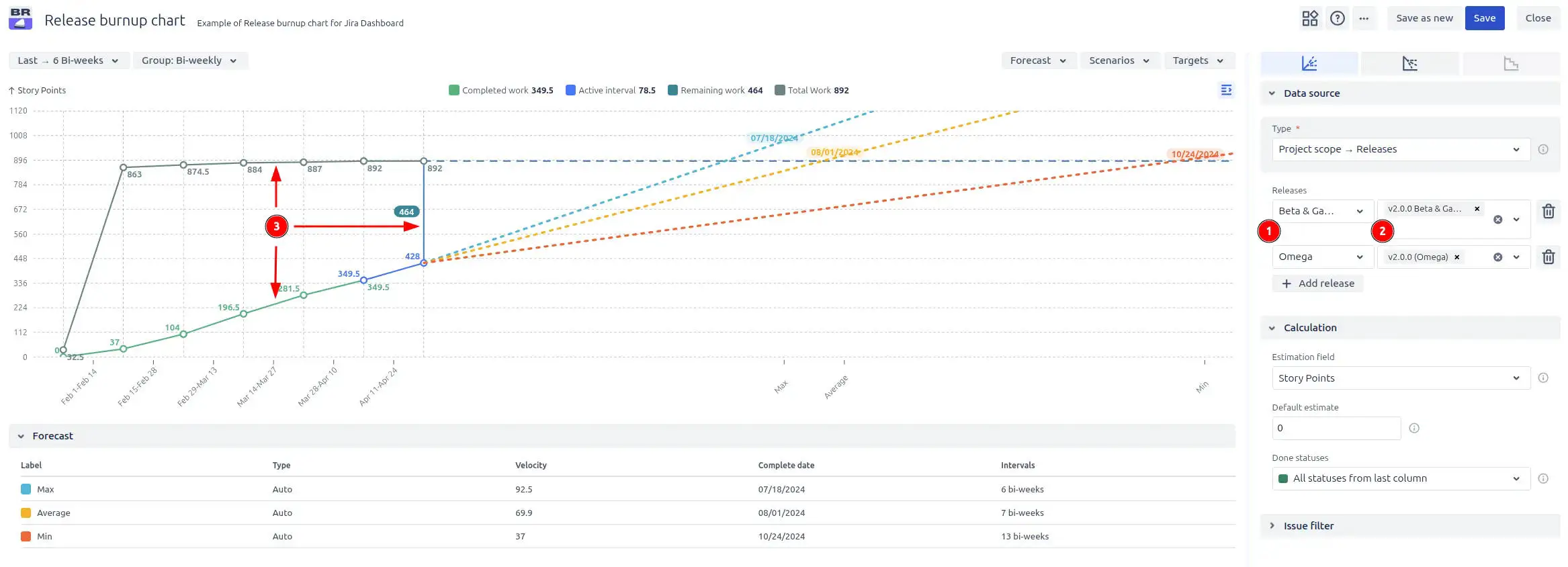
With multi-release selection, you can combine several Jira projects (1️⃣) and several their associated versions (2️⃣) into a single, consolidated forecast view. Instantly see total scope, remaining work, and completed work progress (3️⃣) across multiple releases - ideal for cross-team collaboration and high-level release planning.
Multiple projects and versions selection on the Release burnup report in Jira dashboard example
3. Key feature: Custom forecasting scenarios
Historical velocity is a great starting point, but it’s not always enough, especially when you’re working toward fixed release dates or need to evaluate alternative delivery plans. That’s where custom forecasting scenarios in the Release burnup chart come in.
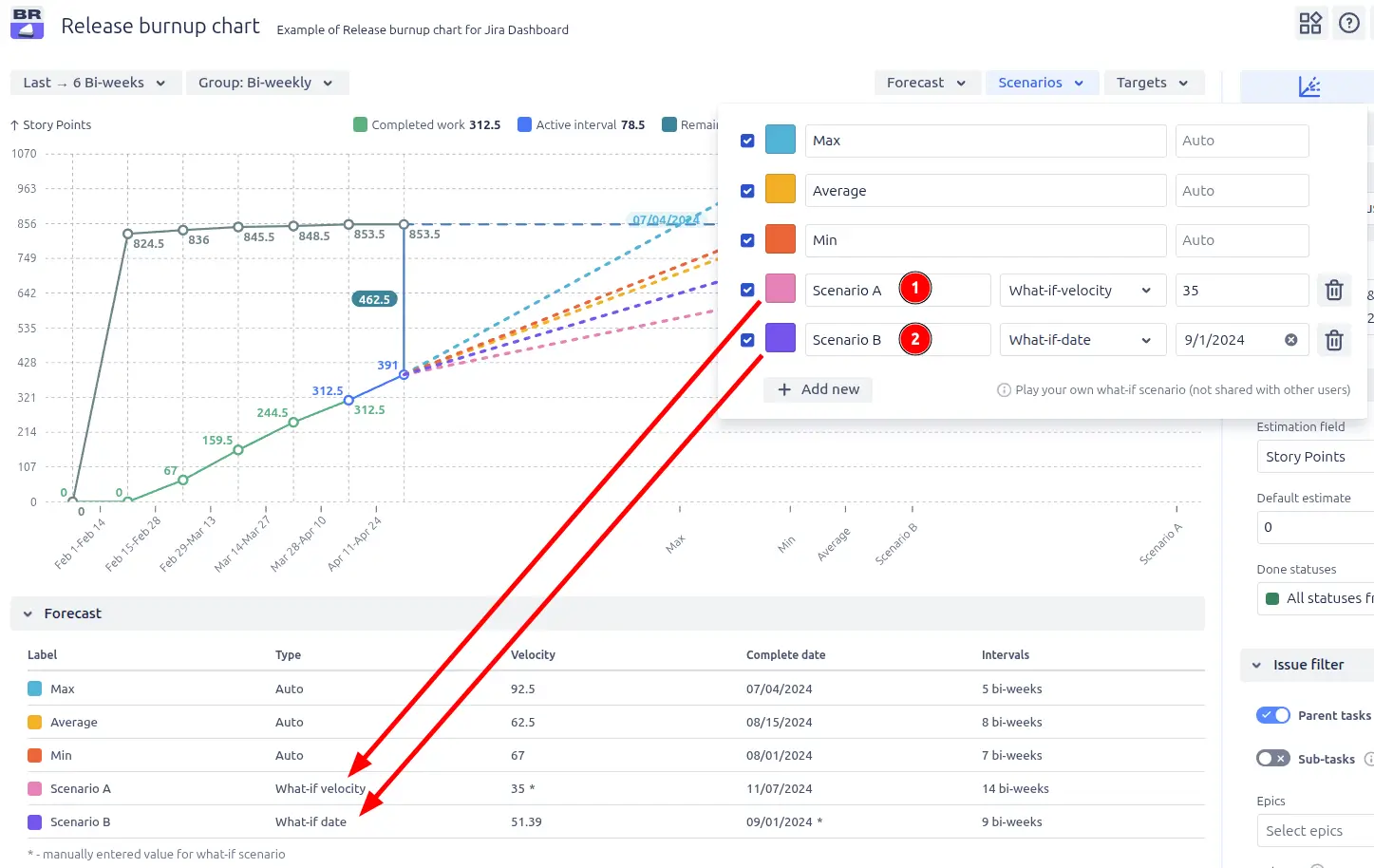
In the Forecast scenarios section, you can build “what-if” scenarios in two ways:
⚡ Custom velocity (What-if-velocity) (1️⃣): You can manually set a custom velocity to see how it impacts the forecasted completion date. This is useful for modeling scenarios where team performance might improve or decrease.
📅 Target completion date (What-if-date) (2️⃣): You can set a fixed delivery date, and the system will calculate the required velocity to complete the remaining work on time. This helps you assess whether a particular deadline is realistic.
Release burnup chart example with custom-built “what-if” scenarios
When this is useful:
✅ You want to verify if hitting a specific deadline is achievable. ✅ You’re planning with new teams or evolving teams without reliable historical data. ✅ You’re exploring what-if scenarios – e.g., what happens if the team speeds up or slows down.
Rather than just observing progress, this feature allows teams to actively experiment, model, and plan, helping teams and stakeholders align around realistic, data-informed expectations.
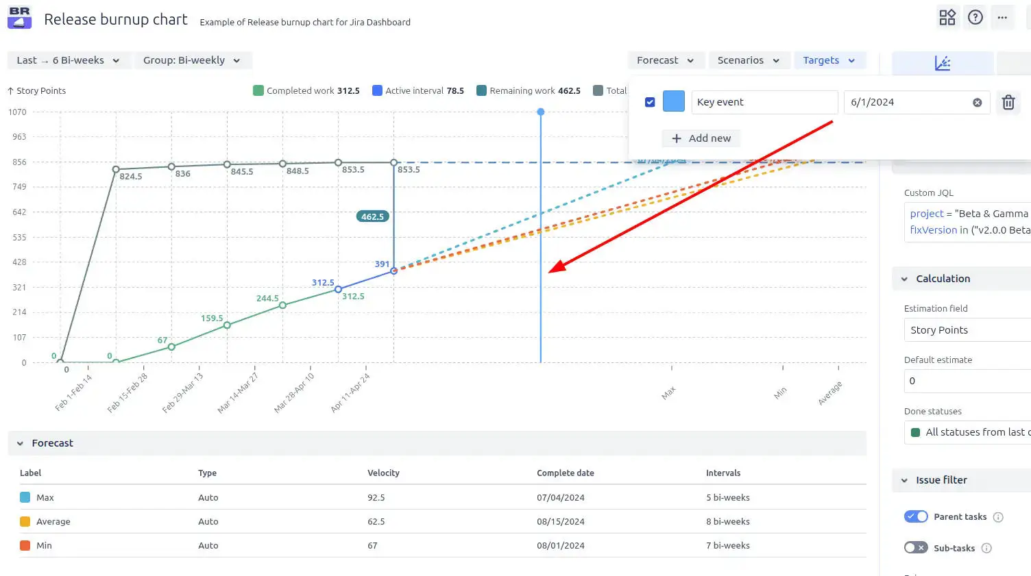
4. Key feature: Target line for important dates
Want to see if your team is on track to meet important dates? Add a target line for instant clarity. The Target date line allows you to mark any specific date on the Release burnup chart. This visual marker helps highlight important milestones, deadlines, or planned delivery dates, making it easy to assess whether your current progress and forecasts align with key objectives.
Target line for a key event date on the Release burnup graph in Jira
When this is useful:
✅ Visualizing upcoming deadlines right on the chart within your Jira dashboard ✅ You need to track progress against external events like marketing campaigns, client commitments, or regulatory dates ✅ Monitoring whether current progress aligns with targets – identifying potential delays or risks early
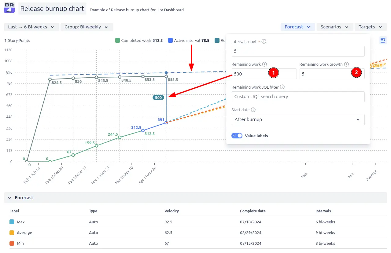
5. Key feature: Custom remaining work & scope growth simulation
In the Forecast settings, you can fine-tune your release forecasts by adjusting two important metrics related to the remaining work:
1️⃣ Custom remaining work – manually set a specific value for the remaining work. This allows you to test how adjusting the total scope affects the projected completion date. It’s perfect for modeling scenarios where scope is likely to change, or for sanity-checking assumptions.
2️⃣ Remaining work growth – simulate dynamic scope changes over time by defining a growth rate per interval. This feature helps visualize how gradual scope increases will impact delivery dates, making it easier to forecast in real-world conditions where scope often evolves.
Custom remaining work and remaining work growth example
Additional features of Release burnup chart
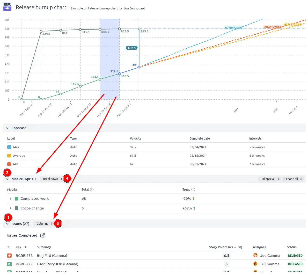
1. Selected interval statistics
Want to explore Jira issues and related data for a specific interval? Just click on the desired interval on the chart, and you’ll see two tables:
A list of all issues included in that period, with detailed information about each issue, such as status, assignee, and a link to the issue in Jira (1️⃣).
An interval breakdown showing completed work details and scope changes (2️⃣).
Statistics of the selected interval on the Release burnup chart example
In the Release burnup chart on the Jira Dashboard, you can customize both the content and the structure of the tables. You can choose which columns to display (3️⃣) and how the data is grouped and broken down (4️⃣).
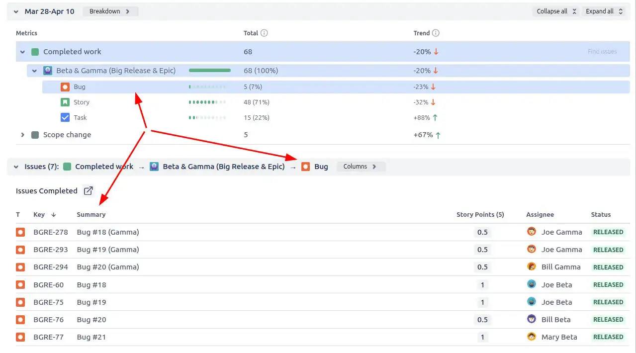
There is also an ability to click on the desired breakdown option to explore all related issues.
Example of exploring issues of a specific breakdown option
2. Remaining work forecast
You can click on the forecast chart area to explore the list of remaining work issues, with the ability to easily drill down whenever you need more details.
Forecast for remaining work in the Release burnup report example
What about native Jira burnup chart
Jira does not provide a built-in Release burnup chart with the advanced functionality needed for effective release tracking and forecasting. It does not offer a proper burnup chart visualization or advanced forecasting tools.
Importantly, there is no native Release burnup report available as a gadget on the Jira Dashboard, which limits visibility and makes it harder for teams and stakeholders to track release progress at a glance.
In contrast, our solution offers advanced release forecasting, multi-board support, detailed issue breakdowns, and powerful scenario modeling.
Advantages of using Release burnup chart gadget
Forecast and track release progress across single or multiple Jira projects for full visibility into cross-team and cross-project delivery timelines.
Advanced forecasting with velocity-based trend lines (min, max, average) provides realistic and data-driven projections for release completion dates.
Multi-board aggregation enables alignment across teams and projects, making it easier to manage complex releases with shared milestones and global delivery goals.
Custom forecast scenarios allow simulation of different delivery outcomes by adjusting velocities, deadlines, and scope changes to support proactive, strategic decision-making.
Scope management tools make it easy to model scope creep or reduction by adjusting remaining work values or adding/removing work items, ensuring forecasts stay relevant as projects evolve.
Powerful filtering options let you focus forecasts on relevant work only, using project, issue type, label, version, and status filters for precise and reliable tracking.
Detailed issue breakdowns through clickable time intervals enhance transparency, helping teams and stakeholders drill down into specific work contributing to release progress.
Ideal for Product managers, Delivery managers, and Program leads who need clear insights into release health, actionable forecasts, and risk mitigation tools to align expectations and drive successful delivery.
The Agile Reports and Gadgets app comes with Release burnup chart functionality, along with other charts and reporting features.
Frequently Asked Questions
1. What is a Jira burnup chart?
A Jira Burnup Chart shows the amount of completed work against the total scope over time. It helps teams track progress, understand how scope changes impact delivery, and identify risks such as scope creep or delays.
In native Jira, the Burnup Chart is available for Scrum boards and provides a basic view of completed work vs. total scope within a sprint. However, it is limited to a single board, cannot be added to dashboards, and offers limited flexibility for filtering, aggregation, or advanced analysis.
With advanced solutions like Agile Burnup Burndown Charts by Broken Build, teams can track progress across multiple projects and teams, apply flexible filtering, and build more accurate forecasts using velocity-based trend lines (min, max, average).
It also supports custom scenarios, scope change modeling, and detailed issue breakdowns, allowing teams to simulate outcomes, adjust plans, and maintain visibility into delivery progress. Combined with dashboard gadgets and advanced configuration, this enables more accurate tracking, better forecasting, and improved decision-making directly in Jira.
2. What is a Release burnup chart?
A Release burnup chart in Agile is a visual tool that shows the progress of completed work toward a specific release over time. It visualizes how much work has been finished versus the total scope planned for the release. It helps teams understand whether they are on track to deliver the release on time, and it also highlights any changes in scope. It typically includes two lines: one for the completed work and one for the total scope, making it easy to track progress and detect scope creep.
3. Can I use something other than story points for estimation in the Release burnup report?
Yes, the Release burnup report supports any numeric Jira field for estimation. Commonly used options include:
Issue count
Epic points
Time tracking estimate
This flexibility allows you to align the chart with your team’s estimation method, whether you track progress by story points, issue count, or time.
4. Can I use custom JQL filters to control what data is shown?
Absolutely! The Agile Burnup Burndown Charts gadget supports custom JQL filters, giving you precise control over which issues are included in your chart and forecast.
You can enter your JQL query directly in the gadget’s settings under the “Issue Filter” section. This lets you filter by any Jira-supported criteria, such as issue types, priorities, labels, components, or custom fields, so you only track the work that matters most to your team or release.
Using custom JQL filters helps you create tailored, relevant reports and improves the accuracy of your forecasts by excluding unrelated work.
5. How does the Release burnup chart help with forecasting?
The Release burnup graph in Jira dashboard includes built-in tools for forecasting release progress. By analyzing historical data and current trends, the gadget can project when a release is likely to be completed based on your team’s actual or custom velocity. The gadget analyzes historical progress trends and also accounts for scope changes, helping you simulate different delivery scenarios and make more informed decisions - all directly within your Jira Dashboard.
6. Who typically uses Release Burnup charts?
Release Burnup charts are useful for a wide range of roles, including product managers, delivery managers, Scrum Masters, and development teams. They provide transparency for stakeholders who want to track progress toward release goals and help teams stay aligned on whether they are on track to deliver as planned.
7. How to add a Release burnup chart to a Jira dashboard?
Jira does not provide a Release burnup chart out of the box, but you can add one using the Agile Burnup Burndown Charts Marketplace app.
To add a burnup chart gadget to your Jira Dashboard:
Ensure the Agile Burnup Burndown Charts app is installed.
Go to your Jira Dashboard and use the gadget search to find “Agile Burnup Burndown Charts.”
Select your data source and instantly generate a burnup chart with a wide range of real-time configuration options.


.svg)


.png)
