The interactive chart is available on larger screens
Please open this page on a desktop to try it out
Key features of Initiative burndown chart
The Initiative burndown chart gives a program-level view of delivery, focusing on the trend of remaining work as the initiative moves toward completion. By selecting the child issues of specific Jira epics as your data source, you can track total scope, completed work, and remaining work across multiple teams and boards in one view.
Built-in forecasting tools provide delivery dates for various scenarios, and flexible filtering lets you focus on the most relevant work, drill into past performance, and visualize milestones directly on the chart.
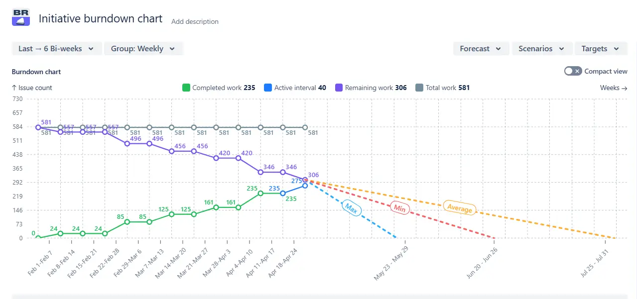
Initiative burndown report in Jira dashboard example
The Initiative burndown chart is available in the Agile Burnup Burndown Charts app. You can add it to your Jira dashboard (just like any other Broken Build gadget) and customize it with a range of filters and breakdown options to match your team’s workflow.
How different roles use Initiative burndown chart
✅ Release Train Engineer (RTE): I use the Burndown chart for initiative to coordinate delivery across several Agile Release Trains, quickly spotting when one train’s delays could impact another’s ability to meet shared PI commitments.
✅ Solution Train Engineer (STE): I get a consolidated view of work from multiple ARTs contributing to a single solution, making it easier to manage large-scale dependencies.
✅ Portfolio Manager: I evaluate the progress of initiatives against business outcomes, using forecast data to adjust funding and capacity allocation where it’s most needed.
✅ Epic Owner: I focus on the initiatives my epics feed into, checking that delivery pace matches the business case and proposing scope adjustments if forecasts slip.
Keep initiatives on track with the INITIATIVE BURNDOWN CHART
Initiative progress burndown chart in Jira dashboard
📊 How to read the chart:
The Initiative burndown report example above shows delivery progress for three initiatives (in Jira hierarchy, child issues of three epics) (1️⃣). Over the last six bi-weeks (2️⃣), the remaining work for these initiatives went from 581 issues (3️⃣) to 306 issues(4️⃣).
The Initiative burndown chart allows you to select the child issues of specific Jira epics as your data source, providing a consolidated view of progress toward large-scale goals. You can track total scope, completed work, and remaining work for the initiative.
✅ When to use it:
Monitoring delivery status for multiple related epics that make up a strategic initiative.
Providing leadership with a single, high-level view of initiative progress.
Spotting delivery risks early when the remaining work is high compared to the forecasted completion.
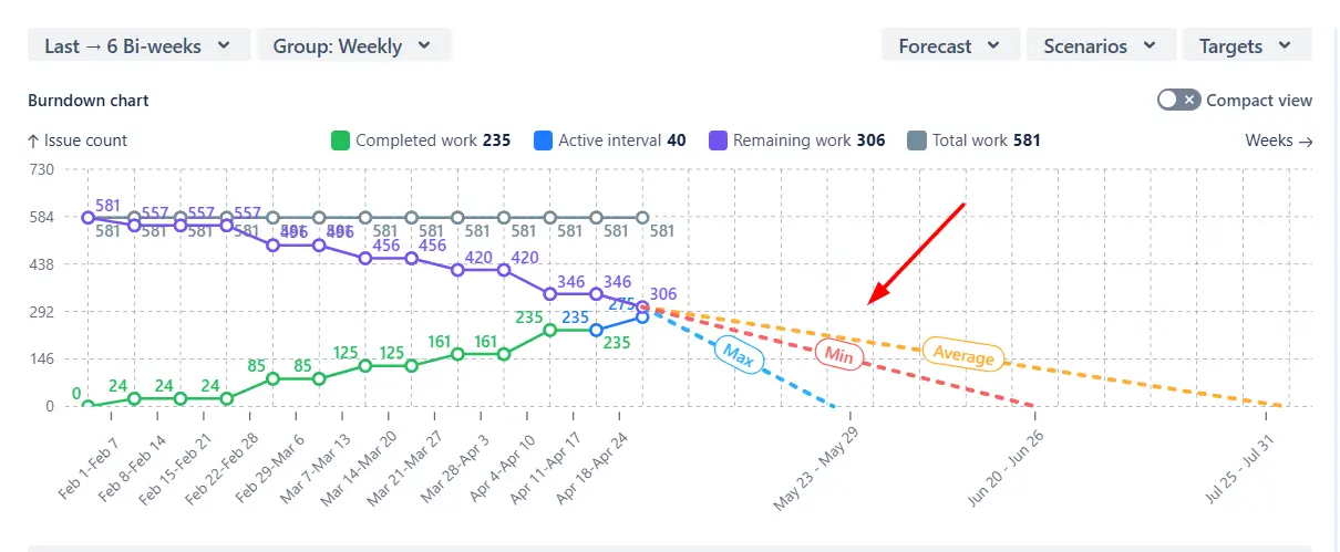
2. Key feature: Delivery forecasts for various scenarios
The chart automatically calculates three forecasts based on your team’s fastest, average, and slowest historical velocities for the selected time interval, giving you optimistic, realistic, and conservative delivery dates.
Delivery forecasts for various scenarios in the Initiative burndown graph in Jira
✅ When to use it:
Comparing best-, worst-, and most-likely completion dates to set realistic expectations.
Building contingency plans for potential slowdowns or capacity changes.
Communicating a range of possible outcomes to stakeholders during planning sessions.
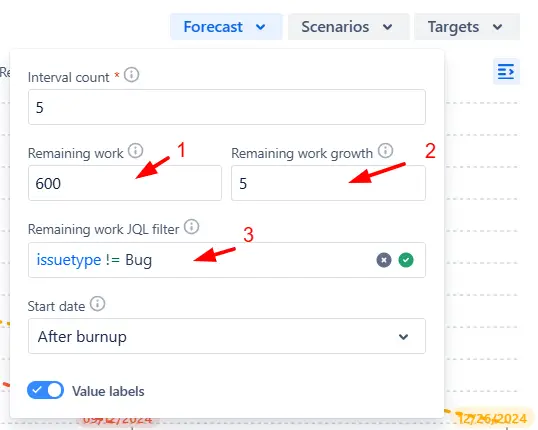
3. Key feature: Delivery changes simulation
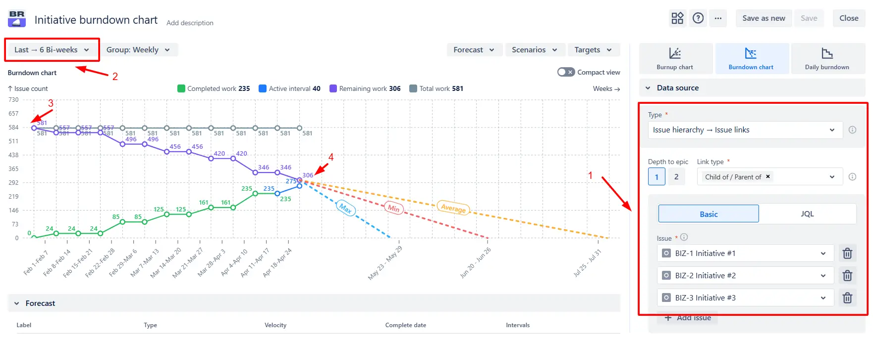
Beyond automatic forecasts, the Initiative burndown chart lets you test hypothetical delivery conditions. You can set a custom remaining work value (1️⃣), model potential scope increases (2️⃣), or filter remaining issues with JQL (3️⃣):
Initiative delivery changes simulation settings on the Jira dashboard
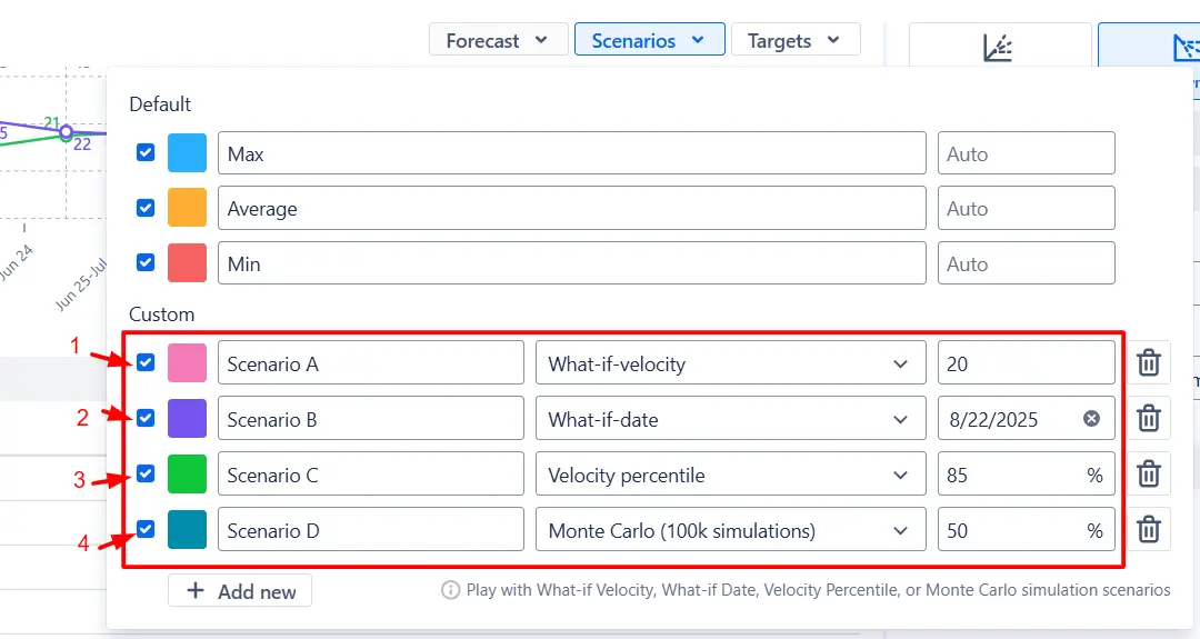
You can also change the target velocity to see how it shifts the completion date (1️⃣), set a fixed deadline to calculate the delivery pace required to meet it (2️⃣), apply a velocity percentile from historical data for more optimistic or conservative projections (3️⃣), or run a Monte Carlo simulation to view the probability of completing the work by different dates (4️⃣).
Delivery changes simulation settings in the Initiative-level burndown chart
✅ When to use it:
Preparing contingency plans for different scopes or capacity scenarios.
Testing how delivery timelines change if the scope grows mid-initiative.
Exploring whether accelerating the work pace could bring key deadlines forward.
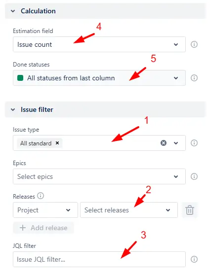
4. Key feature: Defining and filtering the scope
Filter the results by issue type (1️⃣), release (2️⃣), or with custom JQL (3️⃣). It’s also possible to choose relevant Done statuses (4️⃣) and the estimation field (5️⃣) to match your team’s workflow.
Defining and filtering the scope settings in the Initiative burndown report
✅ When to use it:
Focusing on the subset of work most relevant to the initiative’s objectives.
Ensuring progress tracking reflects the team’s actual definition of “done.”
Comparing delivery metrics across different releases or work types.
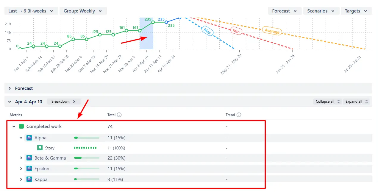
5. Key feature: Drill down into past performance
Click on any interval in the chart to inspect the work completed during that period and see how the scope has changed over time. You can also click within the forecast zone to view detailed statistics on remaining work, helping you understand exactly what’s left to deliver.
Drill down into past performance on the Initiative burndown graph
✅ When to use it:
Identifying periods where the delivery pace accelerated or slowed down.
Understanding how scope changes have impacted timelines.
Pinpointing the specific work remaining to achieve initiative completion.
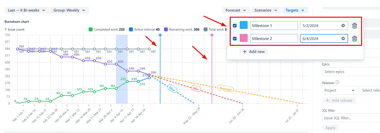
Additional features: Milestones and deadlines visualization
Add one or more target dates directly to the chart to see how forecasted completion lines up with critical milestones, release trains, or PI objectives.
Milestones and deadlines visualization in the Initiative burndown chart gadget
✅ When to use it:
Checking whether the current progress supports the upcoming PI or release goals.
Prioritizing work when several deadlines are approaching.
Highlighting delivery risks early in stakeholder reviews.
What about the native Jira Initiative burndown chart
Jira does not offer a native Burndown chart at the initiative level. The highest level supported in standard Jira reports is usually the epic. This means there’s no built-in way to see combined progress, remaining work, or forecasts for multiple epics contributing to a strategic initiative.
As a result, teams tracking initiatives in Jira often face these challenges:
❌ No single chart that aggregates work from several epics.
❌ No initiative-level forecasts or “what-if” scenario modeling.
❌ No ability to customize the forecast basis or align Done statuses and estimation fields with your workflow.
❌ No ability to visualize milestones against initiative completion.
❌ No initiative-level gadget for Jira dashboards.
Advantages of using the Initiative burndown chart
Track progress for multiple epics that contribute to the same initiative in a single view.
Compare optimistic, realistic, and conservative forecasts to set realistic delivery expectations.
Model “what-if” scenarios for scope growth, reduced capacity, or accelerated delivery.
Filter by issue type, release, label, Done status, or assignee to zero in on the most relevant work.
Identify delivery slowdowns or scope creep before they threaten milestones.
Overlay deadlines or PI objectives directly on the chart for easy stakeholder alignment.
Drill down into specific time periods to see exactly what was delivered and how the scope evolved.
Export to CSV, PNG, or PDF for reporting or further analysis.
The Agile reports and Gadgets app offers Initiative Burndown functionality plus a wide variety of additional charts and reports.
Frequently Asked Questions
1. Does Jira have a native Initiative burndown chart?
No. Jira does not include a native burndown report for initiatives. Its built-in reports only provide an Epic burndown chart for tracking a single epic and a Sprint burndown chart for monitoring work within a sprint. The Initiative burndown chart in Agile Burnup Burndown Charts by Broken Build fills this gap by consolidating data across epics and adding advanced forecasting, filtering, and milestone tracking in a Jira dashboard gadget.
2. What’s the difference between an epic burndown chart and an initiative burndown chart in Jira?
Jira Epic burndown chart tracks progress, scope changes, and forecasts for a single epic. It’s useful for monitoring delivery at the feature level, but doesn’t show how multiple epics contribute to a larger goal.
The Broken Build Initiative burndown chart aggregates work from child issues of one or multiple epics to show delivery progress at the initiative or program level. This makes it ideal for tracking large-scale objectives in SAFe or portfolio management, where several epics need to be delivered in coordination.
3. Can I create an Initiative burndown chart gadget in the Jira dashboard?
Yes, with Agile Burnup Burndown Charts by Broken Build, you can create a gadget in the Jira dashboard. Navigate to the dashboard, click "Add gadget," and then use the gadget wizard to select and configure the desired chart.


.svg)


.png)
