The interactive chart is available on larger screens
Please open this page on a desktop to try it out
Key features of Release lead time report
The Release lead time report helps Agile teams measure the total time it takes for work items, grouped under a release, to go from issue creationto completion (“Done” status). It provides end-to-end visibility into the delivery process, highlighting delays and bottlenecks while supporting data-driven improvements for more predictable, high-quality releases.
💡 What it helps you do:
Measure end-to-end delivery times from issue creation to completion
Identify delays and bottlenecks in the release process that slow down delivery
Compare lead times across releases to gauge performance differences
Track how release performance varies between multiple teams or projects
Track delivery consistency and variability to spot outliers and at-risk items early
Analyze lead time trends across releases to evaluate delivery improvements
Break down the release lead time by workflow stages to identify where delivery slows down
Use historical lead time data to define SLA targets and track team-level release KPIs
The Release lead time report, which includes the Release lead time histogram, Time in status, and Trend chart, is available as part of the Agile Cycle Time Chart app. You can add it to your Jira dashboard (just like other Broken Build gadgets) and customize it using flexible filters and breakdowns to match your workflow.
How different roles use Release lead time chart
✅ Scrum Master: As a Scrum Master, I use the Release lead time histogram to monitor how long it takes for work to move from backlog to completion. It helps me spot disruptions in the workflow and bring data-driven insights to retrospectives for improving delivery consistency.
✅ Product Manager: As a Product Manager, I rely on the trend view in the Release lead time chart to observe shifts in delivery timelines across releases. It helps me assess how scope changes or team dynamics affect release speed and communicate more accurate timelines to stakeholders.
✅ Release Train Engineer (SAFe): As a Release Train Engineer, I use the Time in Status report to see where items accumulate or get delayed within the release process. I focus on blockers in review or approval stages so I can escalate issues early and help teams deliver smoothly across the train.
✅ Support Lead: As a Support Lead, I use the release lead time data to measure how quickly we move from bug report to released fix. I combine histogram and trend views to stay aligned with SLA expectations and ensure we prioritize and escalate critical issues before they impact users.
Track every step from release issue creation to completion, with full visibility from the RELEASE LEAD TIME REPORT!
1. Key feature: Release lead time analysis across multiple projects
When managing multiple projects – whether delivering separate products or operating within a larger Agile Release Train – it’s useful to add multiple projects' release lead time charts to the same Jira dashboard. This gives you a clear view of how delivery timelines vary between projects, while still allowing for team-level interpretation if each project aligns with a team. The comparative view helps identify which projects are releasing faster or slower, enabling data-driven discussions on process improvements across the organization.
Release lead time chart gadgets on the Jira Dashboard for multiple projects
The release lead time chart example shown above displays data split by 1️⃣ Jira project (used to represent distinct teams or product areas) and 2️⃣ specific release versions. You can apply two-level breakdowns using any Jira field (e.g. issue type, priority) to tailor the charts to your reporting needs, making it easy to drill down for deeper insights.
2. Key feature: Release lead time distribution
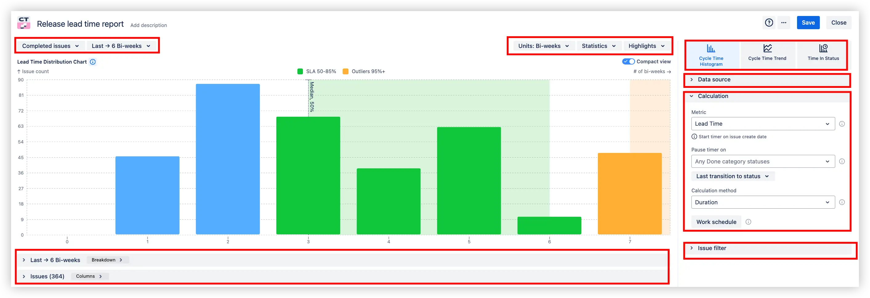
Not all delivery delays happen during development - many begin long before coding starts. The Release lead time distribution chart shows how much time typically passes from issue creation to “Done”. It goes beyond measuring coding speed, exposing process friction in earlier stages, such as planning, backlog grooming, and approvals, helping you spot where work gets stuck along the delivery journey.
It groups issues into duration bins (e.g. days, weeks, or bi-weekly) to visualize how lead times vary across the board.
⚙️ Default settings:
Data source: Project scope ➝ Releases
Calculation metric: Lead time
Interval: Last 6 bi-weeks
Units: Bi-weeks
Issues shown: Completed issues
Issue type: all standard (bug, story, task)
Release lead time distribution chart example with SLA and Outliers
📊 How to read the chart:
When selecting the Release lead time histogram (1️⃣), applying the issue filter "Completed issues in the last 6 bi-weeks" (2️⃣) ensures that only work items marked as done during this period are visualized. The green bars (3️⃣) highlight issues delivered within the 50–85% percentile window of release lead times - a typical SLA-compliant range. In contrast, the orange bar (4️⃣) surfaces 95%+ outliers, pointing to exceptional delays. To dig deeper, the detailed issue list (5️⃣) underneath breaks down contributing items by lead time, assignee, status, and number of status changes, offering granular context behind the timeline distribution.
By visualizing how many work items fall into each time bin, you gain insights into your delivery rhythm, spotting anomalies like outliers or extended delays.
In short, this distribution helps you assess releasedelivery efficiency by identifying where time accumulates and how long work items typically take to reach completion.
3. Key feature: Release lead time trend line
The Release lead time trend chart gives Agile teams a clear picture of how delivery speed shifts over time, from the moment a work item is created to when it's released. It highlights the typical time it takes to complete work, using the median (50th percentile) to smooth out anomalies and track true delivery pace.
This trendline becomes especially valuable when you're comparing multiple releases across teams or Jira projects. It shows whether each team is accelerating, slowing down, or delivering at a consistent rate.
By using bi-weekly intervals to group completed work items, the chart reveals performance trends at the release level, making it easier to:
Compare release delivery trends across projects
Identify which releases are falling behind or accelerating
Monitor progress against expected timelines and SLAs
Spot changes in delivery consistency caused by process tweaks or team shifts
Drill into specific releases to understand issue types and breakdowns
Catch early signs of delivery risk or bottlenecks
Share progress insights with stakeholders in a digestible, visual way
Release lead time trend line with breakdown on Jira dashboard
📊 How to read the chart:
When selecting the Release lead time trend (1️⃣), the trend line (2️⃣) displays the median lead time for each period, indicating the time by which 50% of the teams’ backlog was completed in that interval. The breakdown (3️⃣) shows, for example, that the Alpha project’s median lead time is 7 bi-weeks for the current period, a +40% trend improvement over the previous interval, and that the main focus was on release v.2.5.0 (96% of issues).
Whether you’re trying to reduce delays, validate improvements across releases, or anticipate delivery risks, the release lead time trend line turns raw Jira data into an actionable timeline view of your delivery performance, all calculated from the moment each work item is created.
Release lead time report additional features
1. Waiting time analysis across release workflow stages
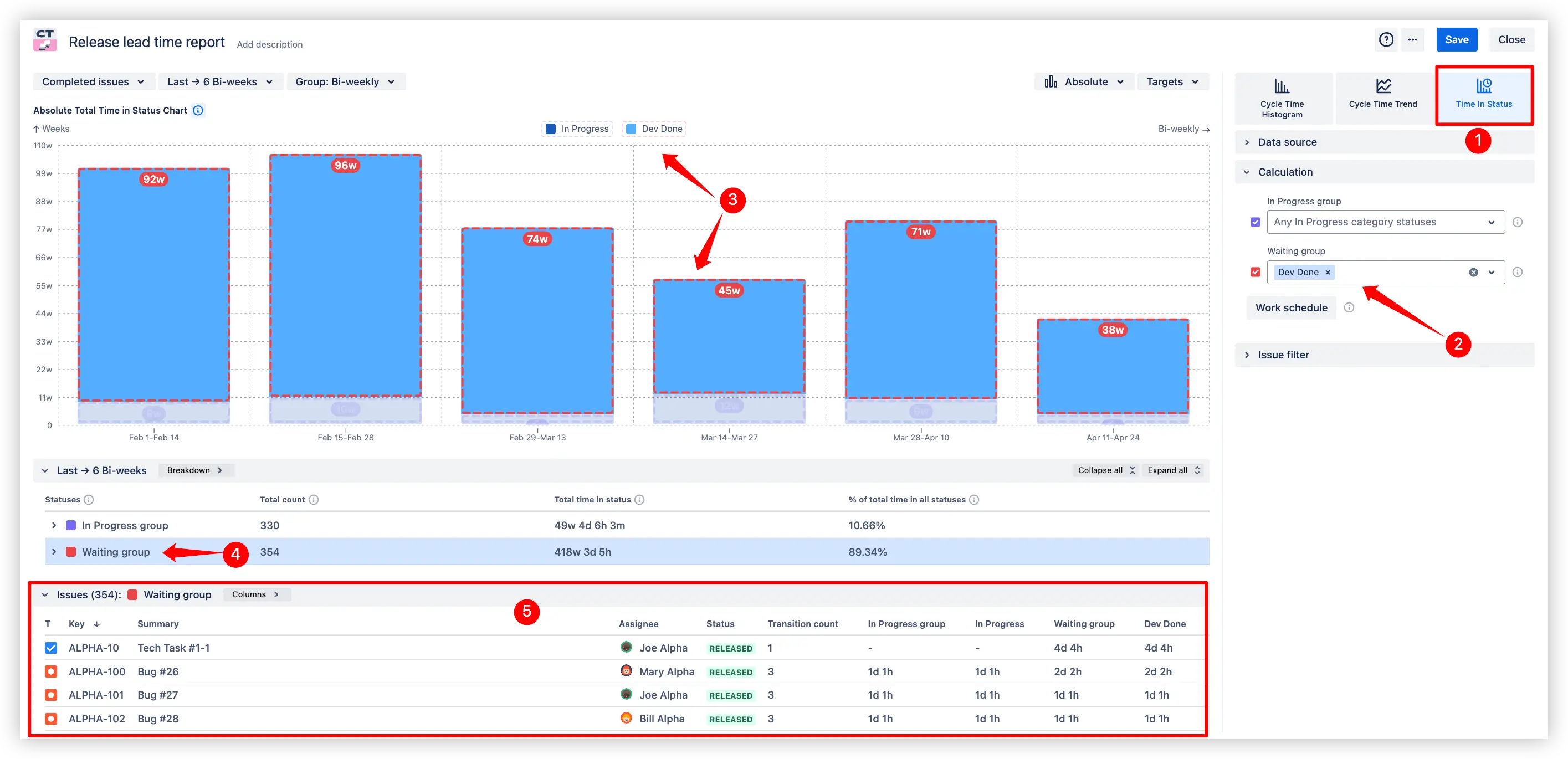
The Release lead time in status chart highlights how long completed work items sit waiting in the final stages of your release process, after development is done but before deployment. It visualizes where tasks get held up between “code complete” and actual release, giving you insight into bottlenecks and slowdowns in your pipeline. By shining a light on these post-development delays, teams can pinpoint inefficiencies and accelerate the path from done to delivered.
Waiting time analysis across release workflow stages on the Jira dashboard
📊 How to read the chart:
When using the Release lead time in status mode (1️⃣), the Waiting group filter (2️⃣) lets you define which statuses represent inactive or post-dev phases, for instance, "Dev Done", where work is completed but still awaiting QA or stakeholder action. The bars (3️⃣) show a clear split between active work (In Progress) and waiting periods, making it easy to compare where time is spent across each bi-weekly interval. The status breakdown section (4️⃣) reveals how much time issues spend in each group. In this case, 89.34% of the total time is spent in waiting statuses, a strong indicator of bottlenecks or inefficient handovers. The issue list (5️⃣) gives a detailed look at each task, including assignee, transition count, and time spent in each group. This helps teams pinpoint blockers and diagnose delays in the release delivery pipeline, even when work appears “done.”
💡 Key benefits:
Uncover hidden delays after development is done - spot where work gets stuck waiting for QA, approval, or deployment.
Find bottlenecks in the release pipeline by analyzing where most waiting time accumulates.
Prioritize stuck work by identifying completed issues that remain unreleased.
Improve release efficiency by using the chart’s insight to streamline hand-offs and eliminate wasted wait time.
2. Release lead time WYSIWYG (What You See Is What You Get) editor
Whether you're adjusting the Release lead time histogram, trend line, or time in status, any configuration you apply is instantly reflected on the chart – no page reloads or tab switching required.
Release lead time WYSIWYG editor example
🛠 Settings panel: All settings are grouped into clear categories: Data source, Calculation, and Issue filter, helping you stay focused while fine-tuning.
📊 Distribution chart updates in real time: As you tweak breakdowns, filters, time units, or highlight rules, the distribution chart instantly responds, making it easy to understand how lead time spreads across bi-weekly intervals and how teams perform against SLAs.
🧱 Work faster: Need more space? Collapse the right-hand panel. Finished editing? Save your chart as a gadget or create a new one without leaving the editor.
What about the native Jira Release lead time chart
Jira doesn’t provide a built-in Release lead time report. Teams usually rely on the Control Chart, which focuses on cycle time and lacks visibility into the full delivery path, from issue creation to production release.
But even with workarounds, native reports are limited:
❌ No grouping by release: You can’t compare lead times across versions or track trends between releases.
❌ No stage-level breakdowns: Jira won’t show how long issues spend in specific statuses like development or QA.
❌ No SLA tracking: There’s no way to highlight when lead times exceed defined thresholds.
❌ No visibility into wait time: Idle stages (like waiting for deployment) are hidden inside total durations.
In contrast, the Agile Cycle Time Chart app from Broken Build offers full Release lead time analytics - including histograms, time-in-status breakdowns, trendlines, and SLA thresholds - giving teams the insights they need to optimize delivery from start to release.
Advantages of using Release lead time report in Jira
Understand delivery timelines across releases to evaluate consistency and detect release-level delays early.
Compare lead time performance across teams or projects using advanced filters to identify improvement areas.
Flag unusual delays and long lead times before they become risks to release plans or stakeholder commitments.
Dissect lead time into workflow stages to see how much time is spent actively working vs. waiting.
Define SLA targets and monitor breaches with built-in thresholds and customizable KPI views.
Drill into specific issues to find delivery blockers and investigate historical delays in context.
Track process trends over time to see whether delivery speed is improving or regressing.
Tailor the report to your context with groupings and filters by release, team, or custom JQL.
Combine multiple views (histogram, trend, time-in-status) for a complete picture of your release pipeline.
Use it directly in your Jira dashboard - no external tools or setup needed.
The Agile Reports and Gadgets app includes Release lead time report functionality and a multitude of other reports/charts.
Frequently Asked Questions
1. What is the release lead time in Agile?
Release lead time in Agile refers to the total time it takes for a work item to move from the moment it is created (or added to the backlog) to when it is released to end users. It includes all intermediate steps: development, review, testing, waiting, and deployment. Tracking release lead time helps teams measure their delivery efficiency and improve predictability.
2. What is a release lead time report?
A Release lead time report tracks how long it takes for issues to reach release-ready status, from the moment they’re created to when they’re included in a release. Unlike general lead time charts, this report focuses specifically on completed issues tied to releases, allowing teams to:
visualize delivery time per release window,
compare performance across teams or projects,
monitor delivery trends over time,
identify outliers that breach expected SLAs.
It's a valuable tool for understanding how efficiently your teams move work from idea to production.
3. How is a Release lead time chart generated in Jira?
While Jira doesn't offer native release lead time charts, apps like Agile Cycle Time Chart provide advanced chart types such as histograms, trend lines, and time in status. You can generate a release lead time chart by selecting completed issues, setting the time range (e.g. last 6 bi-weeks), and configuring the Lead Time calculation metric, estimation method, and status transitions. The chart updates in real time using a WYSIWYG editor, showing SLA zones and outlier markers.
4. Can I compare release lead times across different teams or Jira projects?
Yes! The chart allows grouping and filtering by assignee, team, or even across multiple Jira projects. This helps benchmark performance across release delivery streams and spot where delays are concentrated.
5. What’s the difference between the Release lead time histogram and trend view?
The Release lead time histogram shows how many issues fall into each lead time bucket, helping spot delivery variation. The trend line visualizes changes in median lead time across time intervals, useful for evaluating improvements or regressions in performance.
6. How to add a Release lead time chart to a Jira dashboard?
Jira doesn’t include release lead time charts by default, but you can easily add one using the Agile Cycle Time Chart app from the Atlassian Marketplace.
To add a Release lead time chart to your Jira dashboard:
Make sure the Agile Cycle Time Chart app is installed.
Open your Jira Dashboard and search for the gadget: “Agile Cycle Time Chart”.
Select the Release data source, choose the chart type, and instantly generate a Release Lead time chart with a wide range of real-time configuration options.
This way, you can visualize how long it takes to deliver work across releases right from your dashboard.


.svg)


.png)
