
Thank you! Your submission has been received!
Oops! Something went wrong while submitting the form.


The Release cycle time report helps Agile teams and leaders understand how long work takes to move through the delivery pipeline - from development to completion - within and across releases. It highlights bottlenecks, supports continuous improvement, and enables more predictable, high-quality delivery, especially for teams scaling with SAFe.
💡 What it helps you do:
The Agile Cycle Time Chart app lets you add multiple gadgets to your Jira Dashboard, just like other apps from Broken Build.
🧑✈️ Scrum Master
Tracks team delivery rhythm to spot delays and facilitate continuous improvement. Uses release cycle time data in retrospectives to drive process changes and support predictable sprints - crucial for SAFe cadence.
🎯 Agile Coach
Analyzes release cycle time trends across multiple teams to identify bottlenecks, promote best practices, and improve flow consistency.
👩💼 Director of Engineering
Monitors release cycle time benchmarks across teams to ensure consistent, predictable delivery. Uses insights to guide strategic planning and evaluate the impact of process improvements.
🚄 Agile Release Train Engineer (RTE)
Ensures smooth, synchronized releases across teams. Uses release cycle time charts to detect delivery slowdowns, align teams, and maintain a healthy release rhythm essential for SAFe alignment.


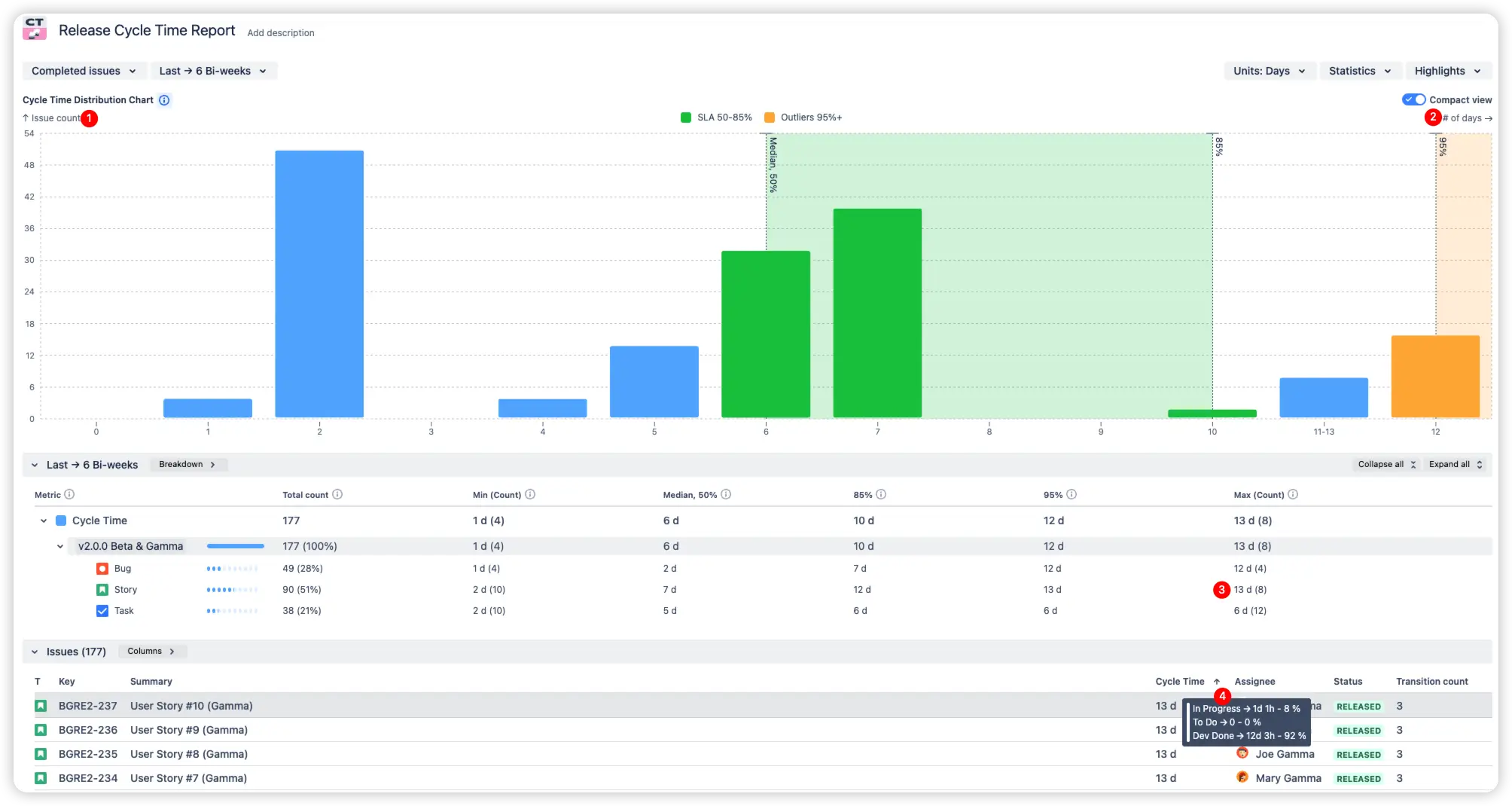
This release-level cycle time report shows how long issues took to move from In Progress to Done within a specific release. It can be used as a health check for a large release, tracking whether everything is progressing as expected or if there are delays.
⚙️ Default settings:
As Doc Norton writes in Escape Velocity:
“Looking at cycle times, we can identify bottlenecks in the flow of work and focus our efforts on finding ways to improve processes that impact the bottleneck. Increase flow through the bottleneck, and we increase flow through the entire system.”
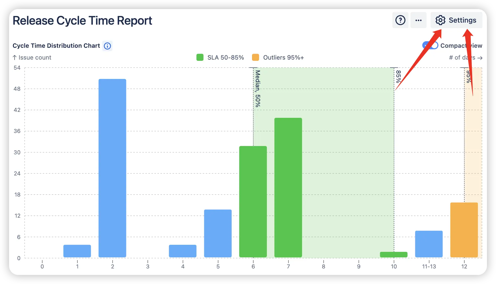
This view allows you to compare cycle times across multiple releases using a breakdown table. You can analyze how long issues took to move from any In Progress to Done categories across different releases (1️⃣) or across projects (2️⃣). This helps you establish reliable internal benchmarks (3️⃣) based on your most stable releases.
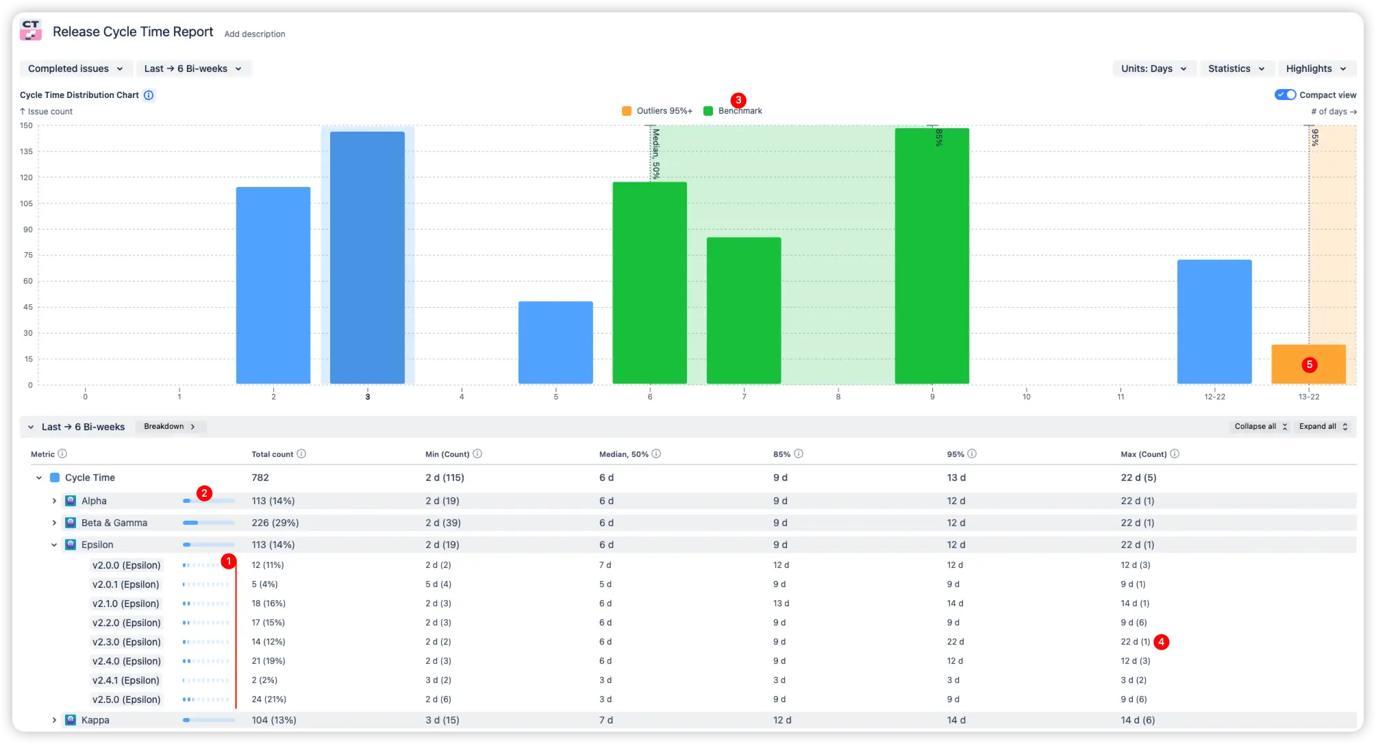
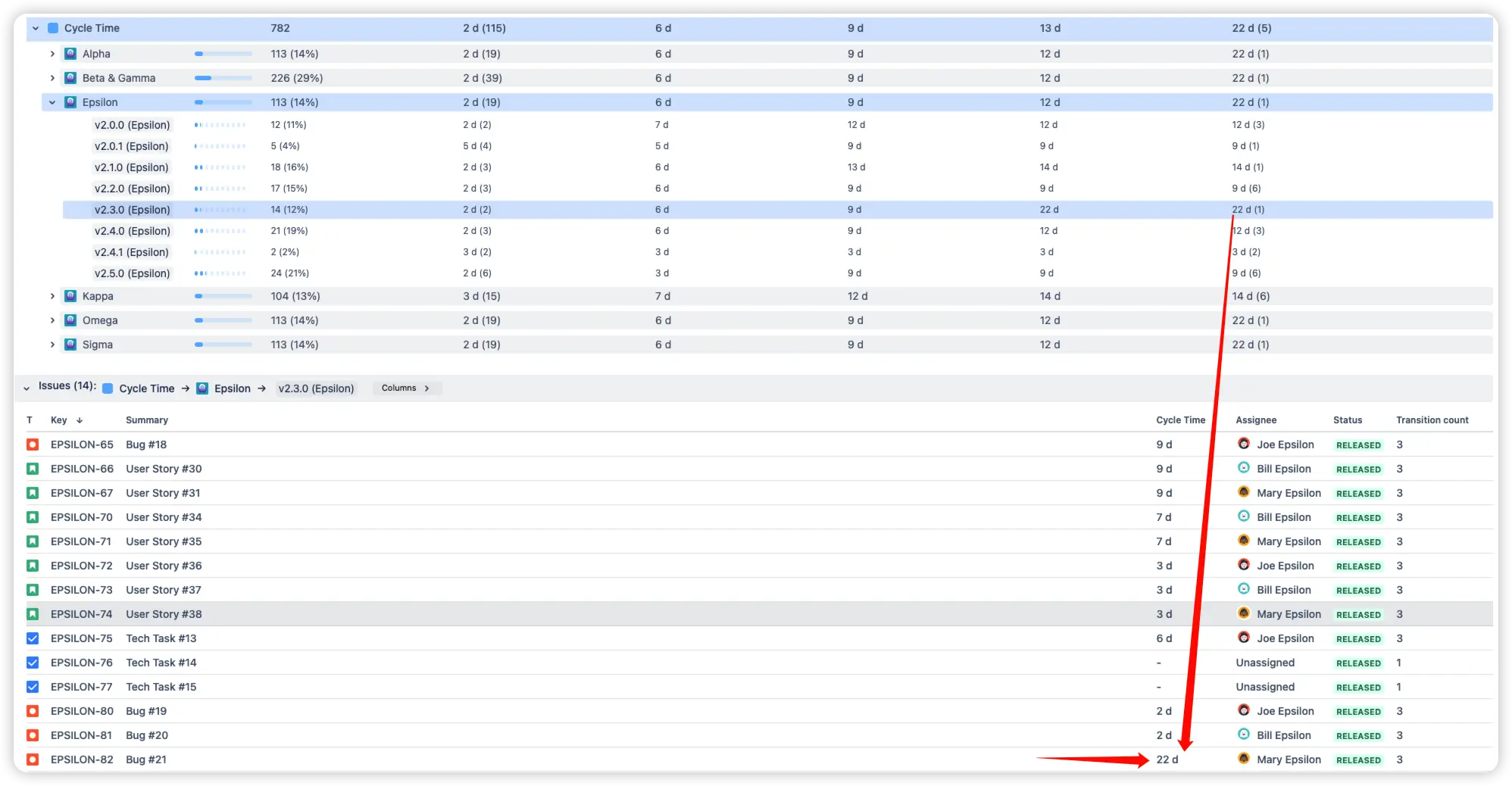
By comparing releases side by side, you can quickly identify outliers (5️⃣), releases that took significantly longer (4️⃣), and run retrospectives to understand the reasons. Was it scope creep? Testing delays? Dependency issues?
You can also drill down into the longest-running issues in each release to investigate blockers and bring them into the retrospective for root-cause analysis. After implementing improvements, continue tracking future releases to see whether the changes lead to faster, smoother delivery.
This Release cycle time gadget shows how long issues took to move from In Progress to Done over time. The x-axis represents time periods (e.g., weeks or sprints), and the y-axis shows the average release cycle time for each period. It’s ideal for tracking delivery speed and changes across or within releases over time.
💡Why it matters:
Release Cycle time trend is a powerful tool for release management and continuous improvement. Whether you're changing team structures, introducing new practices, hiring more developers, or optimizing workflows, this chart shows the real impact of those changes. It helps you visually assess whether your cycle time is improving or regressing.
For teams working at scale, especially in frameworks like SAFe, where predictable, rhythmic releases are key, this chart offers a clear view of progress. It allows you to communicate improvements using real data and highlight positive delivery trends in team or stakeholder meetings.
For example, in the chart below, we see a 25% drop (2️⃣, 3️⃣) in the 85th percentile of cycle time across multiple releases. This can serve as proof of the success of recently adopted process changes.
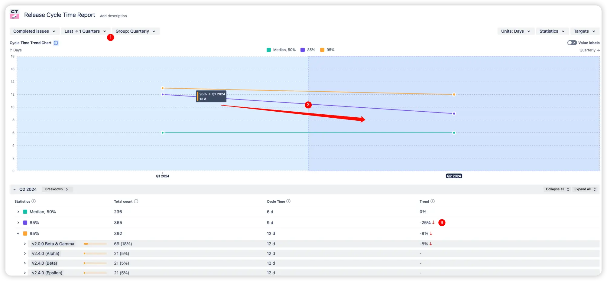
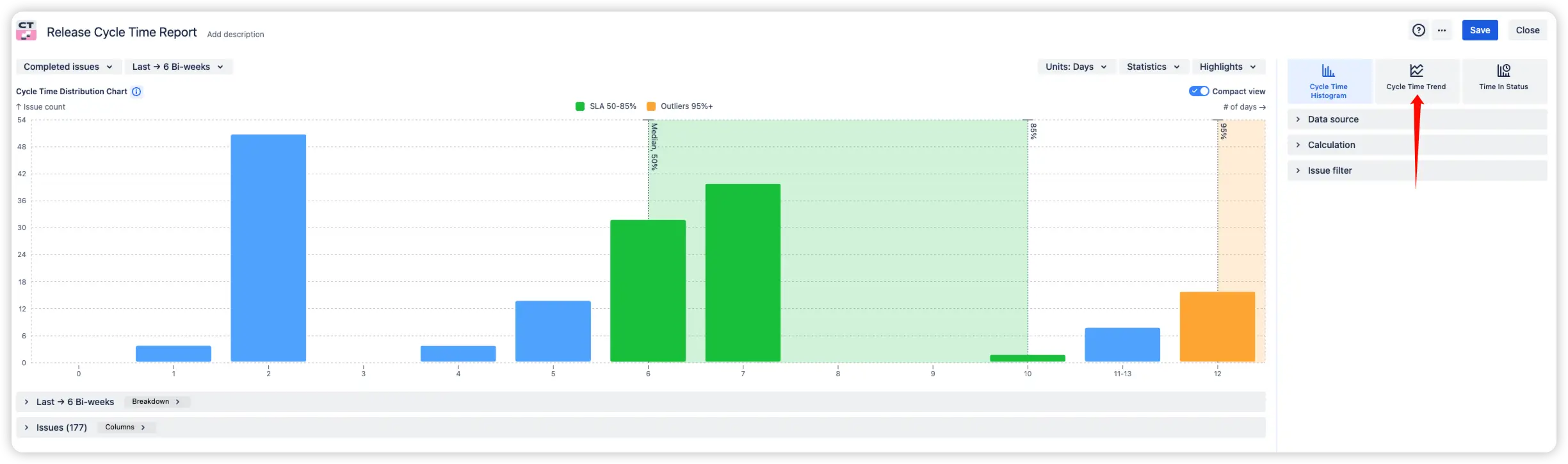
➡️ To explore the Release cycle time trend on an interactive chart, click Settings and select Cycle time trend chart type.
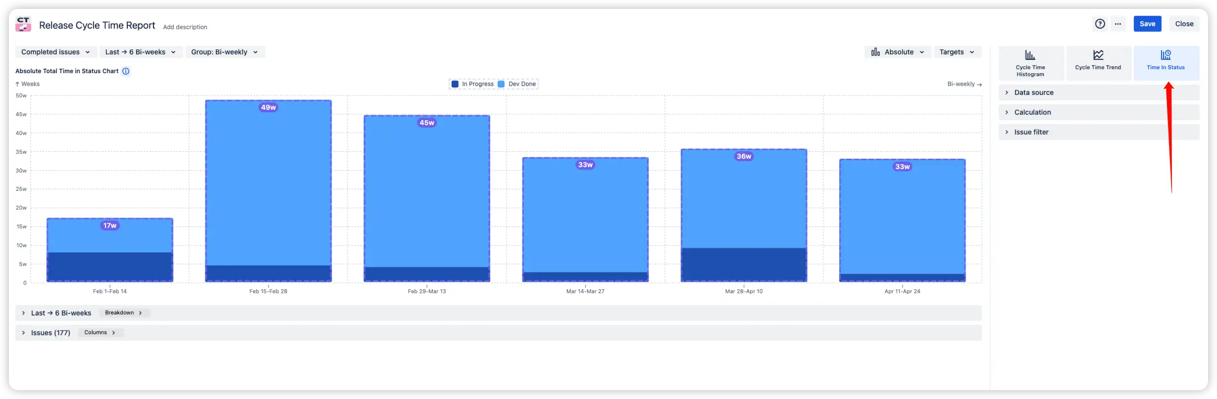
This Release cycle time chart in Jira shows how much time issues spend in each workflow status. The x-axis represents time periods (e.g., by sprint or week), and the y-axis displays the time spent in each status per issue. You can switch between Average, Absolute, and Ratio chart types to gain different perspectives.
💡Why it matters:
Release Time in Status reveals hidden inefficiencies in your process. For example, you may find that issues spend more time waiting for QA or release than being developed. By comparing how long work sits in post-development statuses like Dev Done (2️⃣, 3️⃣) versus active development (1️⃣, 4️⃣), you can pinpoint bottlenecks. Perhaps there are too few testers, delays in stakeholder approvals, or the PM hasn’t prepared release notes. In many cases, the value is already built but simply stuck in the pipeline.
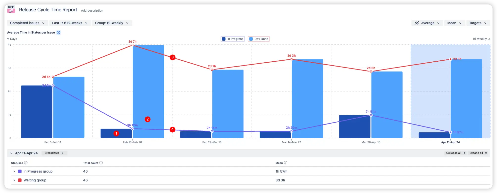
➡️ To explore Release Time in Status chart on an interactive chart, click Settings and select Time in Status chart type.
Jira does not offer native, built-in capabilities to track Cycle time by release, visualize Release Cycle time histograms, or analyze detailed breakdowns by Time in status. These advanced views are essential for Agile teams to monitor workflow health, compare performance across releases, and continuously improve delivery processes.
While Jira provides a Control Chart, its functionality is limited:
In summary, Jira’s native Control Chart offers a basic snapshot of issue durations but does not provide the depth, flexibility, or release-focused insights needed for comprehensive process optimization and release management.
Use our examples to build your use cases on the Jira Dashboard.
Both Jira apps (plugins) used in these examples have a 30-day free trial and are completely free for teams under 10 people:
The Agile Reports and Gadgets app includes Release cycle time report functionality and a multitude of other reports/charts.


.svg)


.png)
