
Thank you! Your submission has been received!
Oops! Something went wrong while submitting the form.


To deliver releases on time, teams need to track progress toward goals, manage scope changes, forecast, and spot delivery risks early. The Release Burndown Chart enables this by combining clear tracking of completed, remaining, and total work with powerful forecasting - from automatic min/avg/max velocity projections to advanced “what-if” scenarios.
Managers can benchmark team performance and monitor predictability vs. plan, while coaches track delivery pace, identify velocity fluctuations, and make timely adjustments to keep the release on track.
Since Jira does not include a native Release burndown chart, the Agile Burnup Burndown Charts gadget delivers exactly that - with multi-project support, advanced forecasting capabilities, detailed breakdowns, and flexible customization - all inside your Jira Dashboard for maximum visibility and control.
✅ Product Managers: Use the release burndown to align product delivery with roadmap milestones. Track progress toward release goals, assess the impact of scope changes, and use forecasting to set realistic launch dates for stakeholders.
✅ Delivery Managers: Rely on the Release burndown chart in Agile to coordinate work across multiple teams. Benchmark delivery performance, monitor predictability vs. plan, and detect risks early to keep releases on schedule.
✅ Program Managers / Release Train Engineers (RTEs): Gain a cross-team, program-level view of release health. Use multi-project release burndowns and “what-if” scenarios to manage dependencies, prioritize scope, and ensure on-time delivery of strategic initiatives.
✅ Agile Coaches: Focus on team-level processes and growth. Break down burndown data by epic, issue type, or assignee to gain individual-level visibility, spot outliers, and provide targeted support for improving predictability.


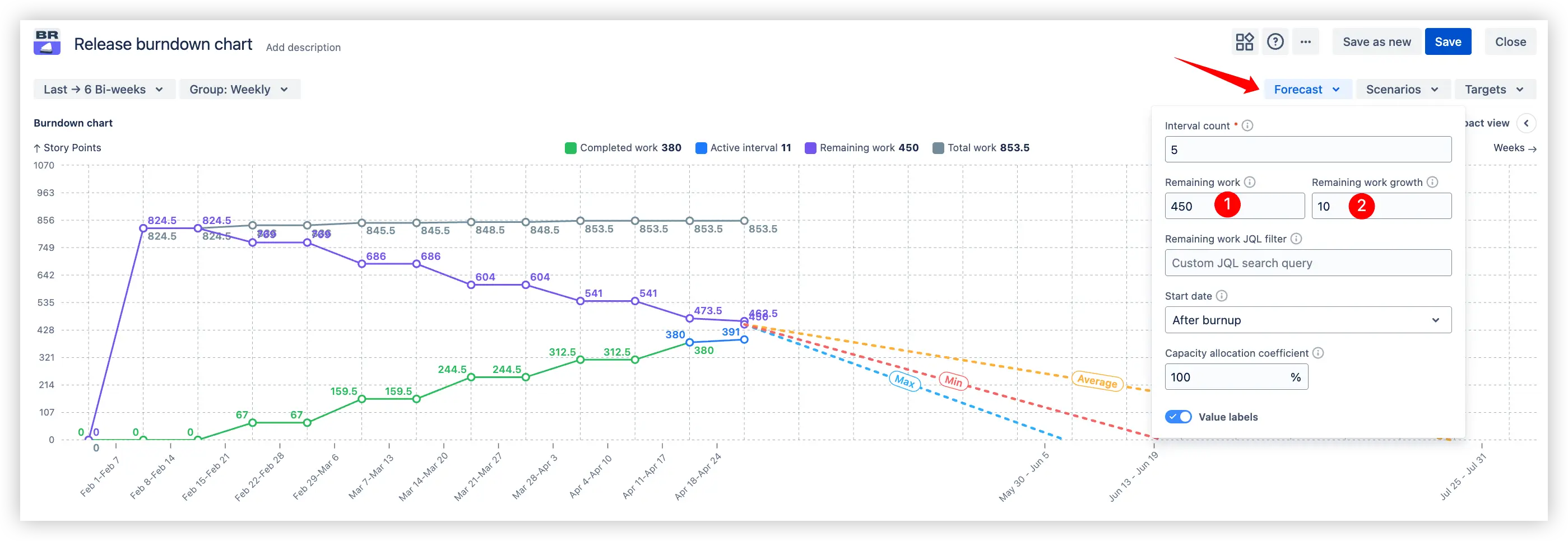
One of the most powerful features of the Release Burndown Chart is its automatic forecasting. The chart calculates your team’s historical velocity and projects three possible release completion trajectories:
🔴 Minimum velocity – a conservative forecast using the slowest past delivery pace.
🟠 Average velocity – a realistic forecast based on typical velocity.
🔵 Maximum velocity – an optimistic forecast if the team moves at its fastest pace.
These velocity-based projection lines are drawn from the current status down to the zero-work line, indicating when the release would be completed under each scenario. This gives a quick visual of best-case, worst-case, and likely completion dates, helping set realistic expectations with stakeholders. The forecasts update automatically after each interval, so you can see if you’re trending to finish early or if a release might slip, based on actual performance.
⚙️ Default settings:
✅ Why this is useful: This multi-interval forecasting is invaluable for planning upcoming iterations and identifying whether the team is ahead or behind the ideal schedule.
Many releases span multiple teams or projects. The Release burndown chart supports multi-release, multi-project tracking and forecasting, so you can view an entire release in one chart, even if the work is spread across several Jira projects or boards. Using the gadget’s settings, you can select any combination of projects and their corresponding release versions to build a consolidated burndown. The chart will then show the total scope of work, the aggregate progress (completed/remaining across all teams), and forecasts for the combined velocity.
✅ Why this is useful:
By seeing the unified release burndown of work across the board, managers and release leaders can make informed decisions, ensuring on-time delivery of strategic initiatives.
Historical velocity is a great starting point, but what if you need to hit a specific deadline or explore different probability-based outcomes? The Release burndown chart lets you create what-if scenarios to model a variety of forecasting approaches and see how they affect your projected release completion date.
You can choose from several scenario types:
1️⃣ What-if velocity – Manually set a hypothetical velocity (story points per interval). The chart recalculates to show when the release would finish if the team delivered at that pace going forward.
2️⃣ What-if date – Set a desired release completion date, and the chart computes the required velocity needed each time interval to meet that date. This answers questions like: “We must finish by the end of Q3 – how fast do we need to go?”
3️⃣ Velocity percentile – The set of past velocities is sorted in ascending order to identify the value below which a desired percentage (e.g., 85%) of the velocities fall. This is useful when you want a forecast based on a conservative, probability-driven threshold rather than minimum, average, or maximum.
4️⃣ Monte Carlo (100k simulations) – Uses a set of past velocities to run 100,000 simulations of possible future interval velocities. You can choose a probability (like 85%) to see the date by which work is most likely to be completed. This provides a statistically robust projection that accounts for historical variability and randomness in delivery pace.
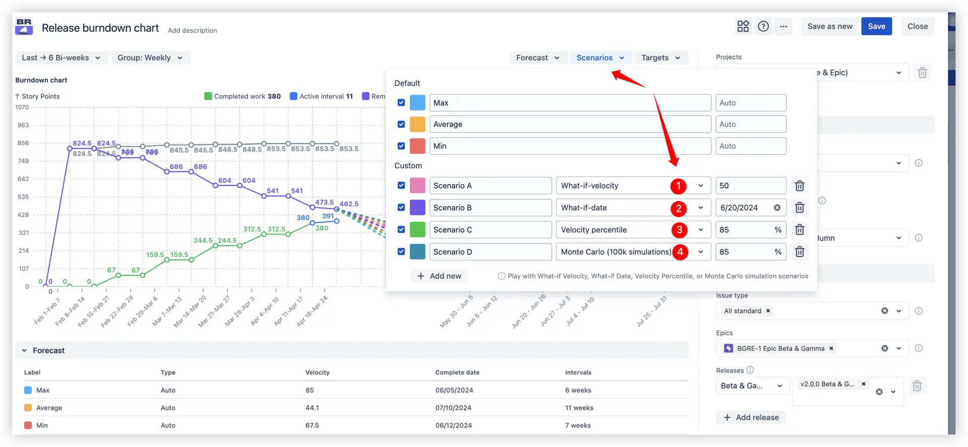
Each scenario is visualized on the chart with its own trend line, so you can compare multiple possibilities side-by-side:
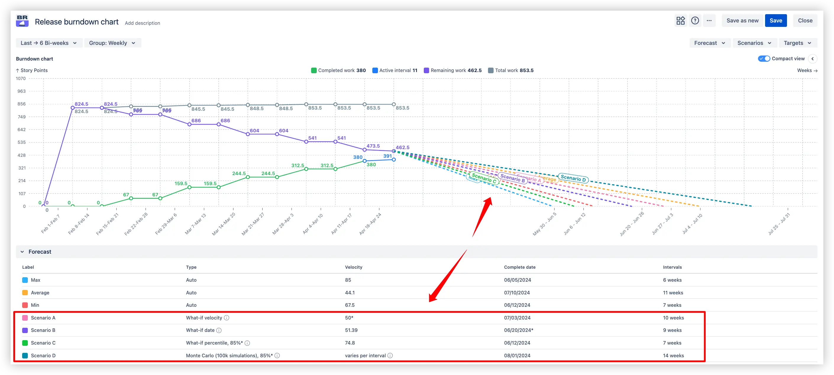
✅ Why this is useful: This empowers both managers and coaches to play with assumptions, evaluate risks, and make data-informed adjustments to scope, capacity, or timelines before committing to a plan.
Releases often have important dates attached – a market launch, a client commitment, or a regulatory deadline. The Release Burndown Chart allows you to add a target date line on the chart for any such milestone. This is a simple, straight line vertically marking the calendar date by which you aim to complete the release.
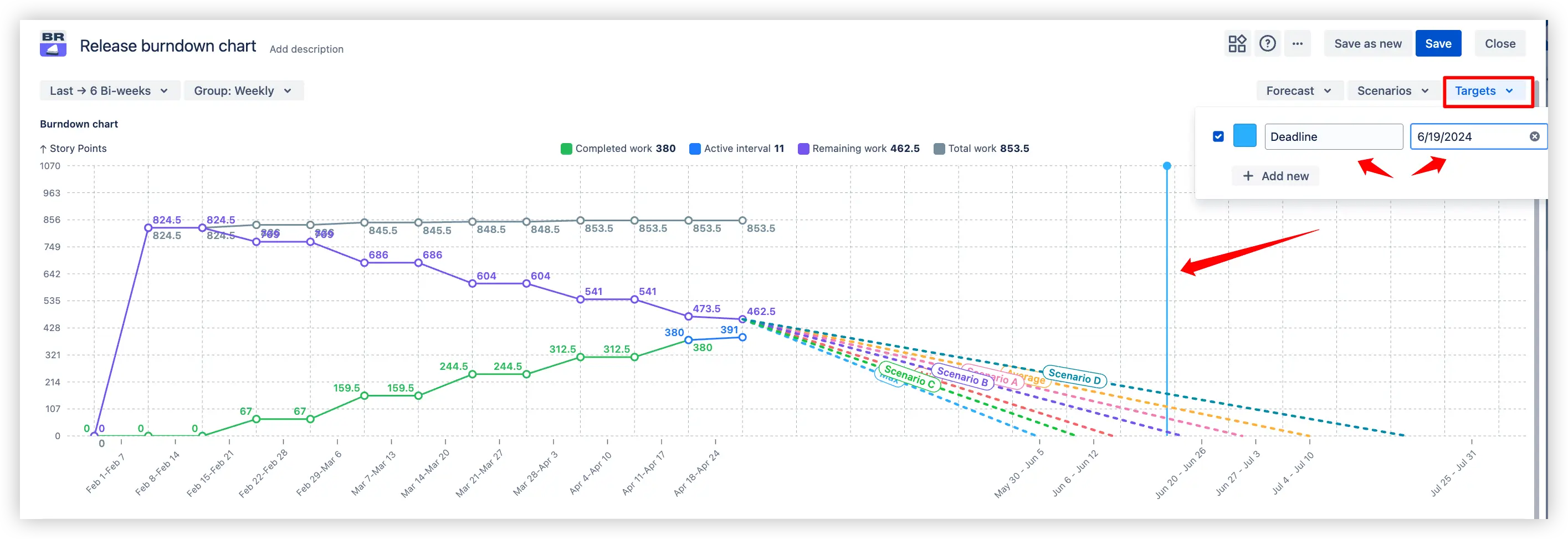
✅ Why this is useful:
Scope isn’t static – requirements might grow or shrink as you progress toward a release completion. The Release burndown chart provides the possibility to model scope changes so your forecasts remain accurate even when the goalposts move. In the Forecast Settings, you can adjust two key parameters related to scope:
This is useful if you know of scope changes that haven’t been fully reflected in Jira yet, or if you want to see “what if we cut scope down to X points?”. By setting a custom remaining story point total, the chart will recalculate the burndown and forecast based on that new scope size.
The chart will then assume that each future interval and adjust the forecast accordingly. This gives a more realistic projection in environments where new requirements keep coming. For example, if historically each interval introduces a few new stories, you can model that to see if you’ll still finish on time.
✅ Why this is useful: Using these features, you can answer questions like “If the backlog grows by X% each interval, can we still make the release?” or “What if we drop X story points of scope – when would we finish then?”. It brings a proactive, analytical approach to scope management: instead of scope changes derailing your plan unexpectedly, you can anticipate and plan for them in the burndown.
🎯 Purpose:
Adjust velocity-based forecasts to reflect real team availability and planned capacity allocation.
🔍 Example:
If only 70% of the team’s capacity is available for the project (due to holidays, support work, or other commitments), set the coefficient to 70%. The forecast will automatically recalculate delivery timelines based on reduced velocity.
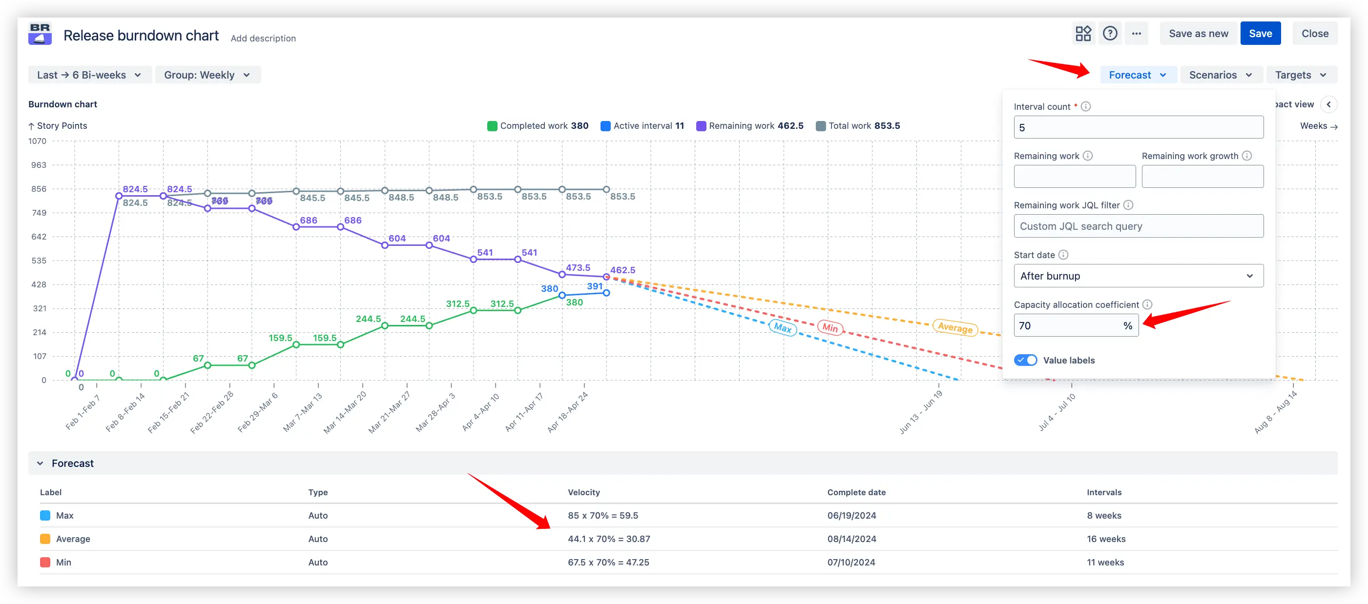
✨ Benefit:
Ensures forecast accuracy by incorporating realistic capacity constraints, helping teams set achievable deadlines and manage stakeholder expectations.
🎯 Purpose:
Provide detailed statistics for the specific time period selected on the burndown chart.
🔍 Example:
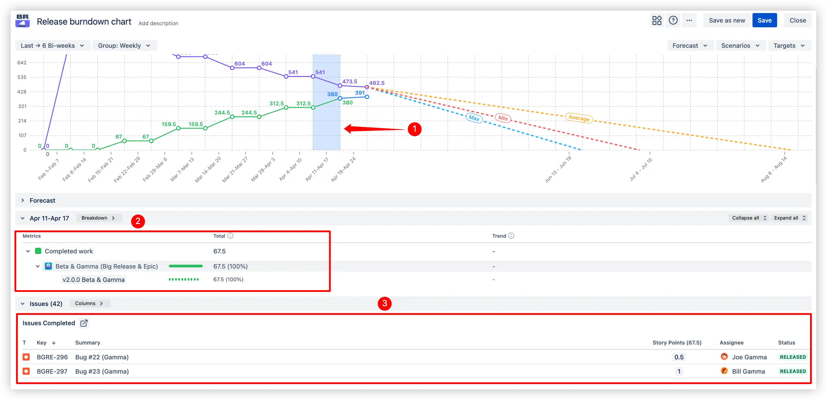
✨ Benefit:
Transforms the chart into an interactive analysis tool, allowing you to investigate anomalies and trace trends back to concrete Jira data.
🎯 Purpose:
Give users the flexibility to tailor the release burndown view to their exact needs without creating separate boards or projects.
🔍 Example:
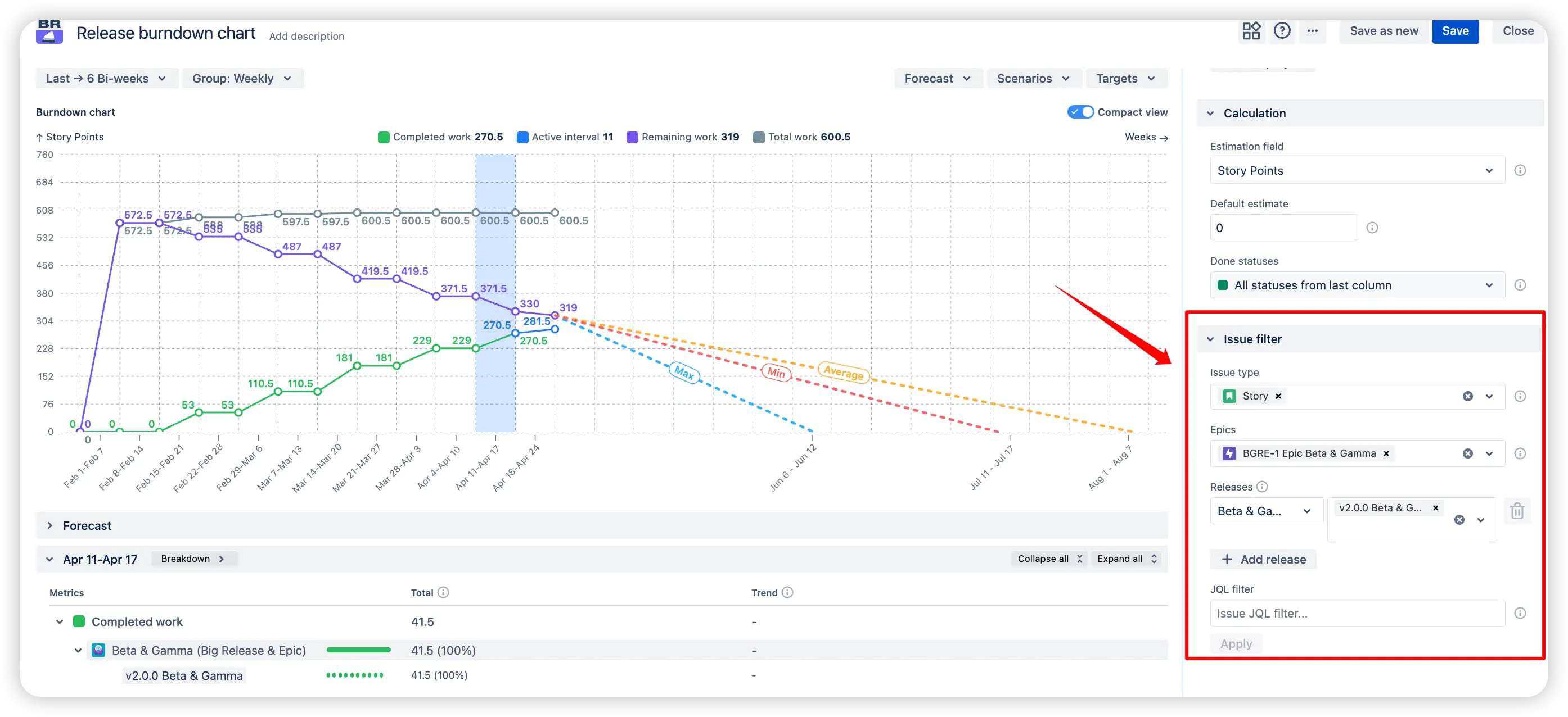
✨ Benefit:
Allows you to analyze exactly the scope of work that matters most, making the chart highly adaptable for different reporting and decision-making needs.
Does Jira offer something similar out-of-the-box? Native Jira provides a Release Burndown report for Scrum projects, which shows how a given version’s scope changed and burned down across each sprint. However, Jira’s native report is quite limited compared to the Broken Build’s Release burndown chart:
❌ Single-team only: It works only for one board’s version at a time, so you can’t combine multiple projects or teams in one view. There’s no multi-release aggregation like our chart offers.
❌ No dashboard gadget: Jira’s report is confined to the project reports section; you cannot pin it on a Jira Dashboard for all stakeholders to see at a glance. Our Release burndown is a gadget, so you can add it alongside other metrics on your dashboards.
❌ Basic forecasting: Jira’s release burndown predicts the number of sprints to finish a release based on the last few sprints’ velocity, but it’s simplistic. By default, it doesn’t account for scope change in velocity calculations, and there are no custom scenario capabilities – you can’t ask “what if” questions in Jira’s report.
❌ Limited filtering: Jira’s report includes all issues in the version; you can’t easily filter by issue type or component, nor adjust scope on the fly. In contrast, our gadget lets you apply filters or focus on specific issue types/epics as needed.
In short, while Jira’s native Release Burndown gives a basic picture for a single team’s release, the Broken Build's Release burndown chart provides a far more advanced and flexible tool. It brings cross-team release tracking, richer forecasting, and interactive analysis that Jira alone doesn’t offer.
Use our examples to build your use cases on the Jira Dashboard.
Both Jira apps (plugins) used in these examples have a 30-day free trial and are completely free for teams under 10 people:
The Agile reports and Gadgets app includes Release burndown chart functionality and a multitude of other reports/charts.


.svg)


.png)
