Thank you! Your submission has been received!
Oops! Something went wrong while submitting the form.
Thank you! Your submission has been received!
Oops! Something went wrong while submitting the form.
In this example

Planned vs actual chart

Interactive сhart example
info
The interactive chart is available on larger screens
Please open this page on a desktop to try it out

Key features of the Planned vs actual chart

The Planned vs actual chart helps teams and leaders assess commitment reliability - the say/do ratio. Instead of only comparing committed vs. completed work, it tracks how commitments evolved during the sprint, how much scope changed, and what was ultimately delivered.

With percentage-based metrics, filters, breakdowns, and targets, the Agile Velocity Chart Gadget app gives a clear, configurable view of whether missed goals were caused by unstable scope or execution gaps.

How different roles use the Planned vs actual graph

Team Lead: I use the Planned vs actual report to monitor how reliably my team delivers on sprint commitments. It helps me identify whether missed goals come from scope creep or from execution gaps, so I can guide the team toward improvement.

Agile Coach: The Plan vs actual chart gives me a transparent view of commitment reliability across multiple teams. I use it in retrospectives and workshops to highlight trends in the say/do ratio and coach teams on sustainable delivery practices.

Release Train Engineer (RTE): I rely on the Planned vs actual graph to track scope stability and commitment reliability across the ART. When I see repeated shortfalls, I can raise them in ART syncs and PI planning to adjust expectations or address systemic issues.

Delivery Manager: I use the Planned vs actual chart in Jira to compare planned vs. delivered work across multiple teams and projects. It helps me spot risks early, align teams with business priorities, and ensure that delivery commitments are realistic and achievable.

Portfolio Manager: This Agile Planned vs actual report helps me understand whether delivery risks come from overcommitting or unstable scope. That insight shapes portfolio-level planning and investment decisions, ensuring resources are allocated realistically.

Uncover why commitments are met, missed, or shifted with PLANNED VS ACTUAL CHART

1. Key feature: Analyze the say/do ratio with commitment metrics

The Planned vs actual chart helps you measure how reliably teams deliver on their sprint commitments by tracking four core metrics:

  • Initial commitment – the scope planned at the start of the sprint.
  • Final commitment – the scope at the end of the sprint, after mid-sprint changes.
  • Total scope change – how much work was added, removed, or re-estimated during the sprint.
  • Completed work – the total completed scope, including any items added during the sprint.
Planned vs actual graph example in Jira Dashboard

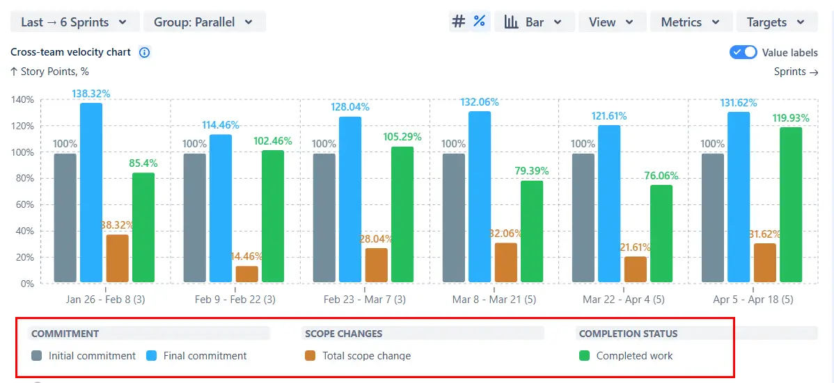
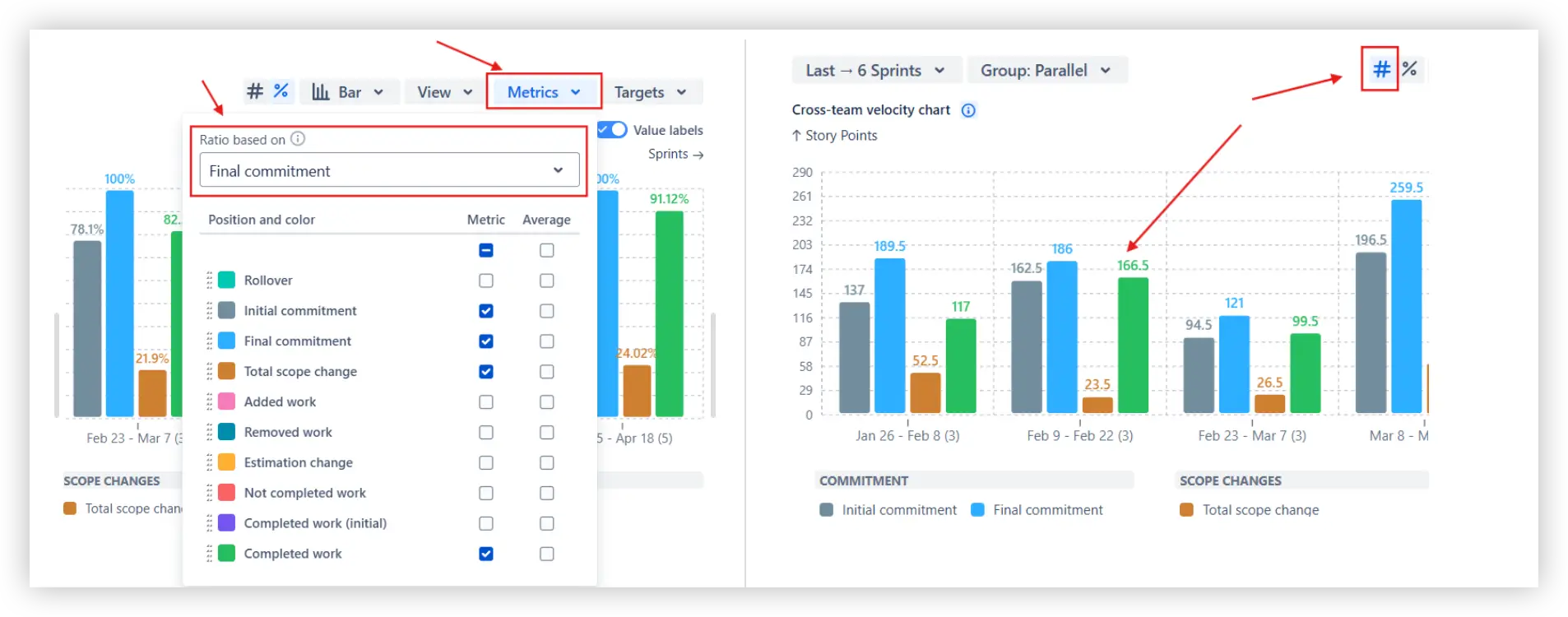
Usually, values are shown as percentages relative to the initial commitment. You can also switch the ratio basis to the final commitment or display absolute values instead:

Ratio-based setting and absolute values in the Planned vs actual chart in Jira

This feature is helpful for:

  • Assessing commitment reliability at the team or ART level.
  • Identifying whether missed goals are caused by scope creep or low throughput.
  • Driving accountability by making commitments and results transparent.

2. Key feature: Track commitments with target lines

Add target lines to the Planned vs actual chart in Jira to benchmark commitment reliability against predefined thresholds. Targets can be absolute values or percentages relative to the initial or final commitment. For example, you can set a line at 90% of the initial commitment to visualize whether teams consistently deliver on their planned scope:

Target lines on the Jira Planned vs actual report

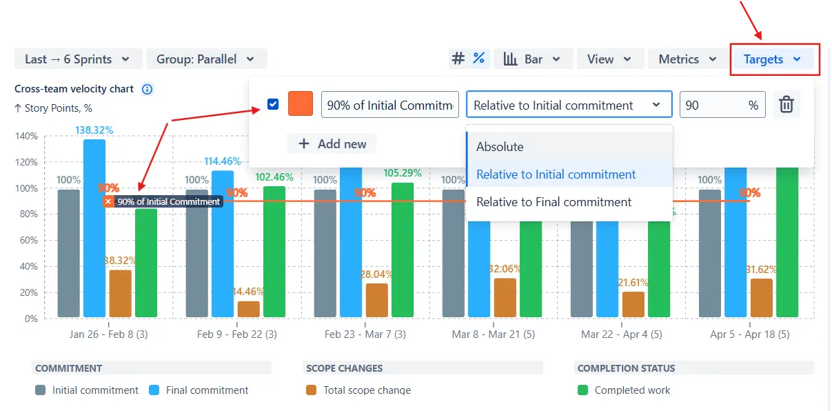
Targets are fully customizable: you can adjust the value, choose the ratio basis, and assign colors or labels for clarity.

This feature is helpful for:

  • Defining clear delivery expectations (e.g., “at least 90% of committed work should be delivered”).
  • Spotting when execution falls below the acceptable corridor.
  • Aligning teams and stakeholders on shared benchmarks for commitment reliability.

3. Key feature: Customize what counts as “Done”

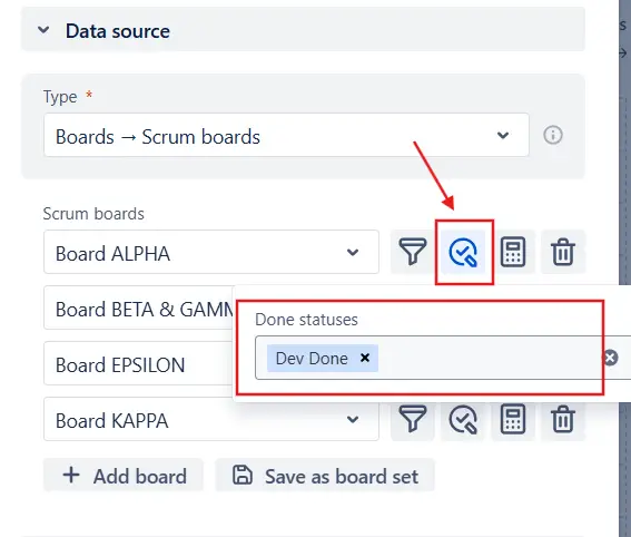
Different teams often use different workflows - one may count work as “Dev Done,” while another only considers it “Done” once it’s released. The Plan vs actual report lets you configure Done statuses separately for each board, so every team’s results reflect its actual definition of done.

You can stick with the default option (all statuses in the last column) or select specific statuses per board to align with your reporting needs:

Custom Done statuses in Planned vs actual chart in Jira dashboard

This feature is helpful for:

  • Making sure each team’s commitments and completions are reported accurately.
  • Respecting differences in workflows across multiple boards while keeping results comparable.
  • Standardizing done criteria at the ART or program level without forcing one-size-fits-all workflows.

4. Key feature: Drill into details with breakdowns

The Planned vs actual graph goes beyond high-level metrics by letting you open the Breakdown table for any sprint or interval (1️⃣). For each metric (Initial commitment, Final commitment, Total scope change, Completed work), you can see:

  • Ratio – percentage relative to the ratio basis (initial or final commitment).
  • Trend – how the metric changed compared to the previous sprint/interval.
  • Average – the historical benchmark for that metric.
  • Total – the absolute value.
Metrics details in the Planned vs actual graph in Jira dashboard

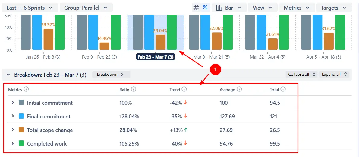
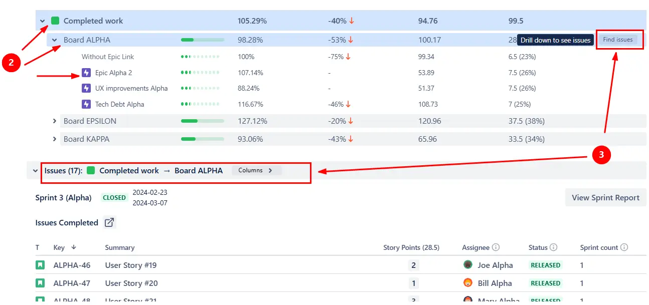
You can expand results into two configurable levels of nesting - for example, by board → epic → issue type (2️⃣) - and then explore the issue list to trace metrics back to individual items and team contributions (3️⃣):

Breakdown and issue list in Planned vs actual report

This feature is helpful for:

  • Identifying which boards, epics, or issue types drive commitment gaps.
  • Spotting systemic issues by comparing trends across multiple teams.
  • Driving accountability by tracing metrics down to individual work items and assignees.

5. Key feature: Compare delivery with stacked bar view

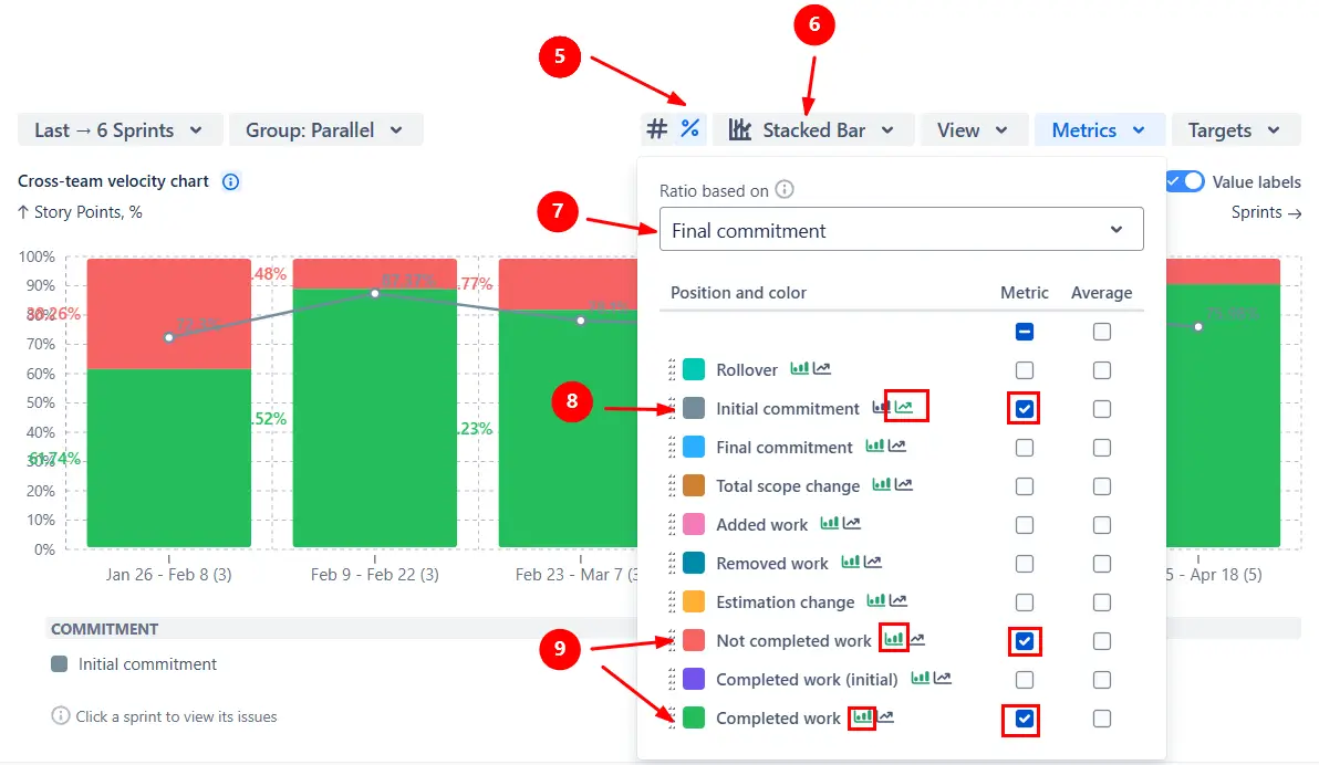
Switch the Planned vs actual chart to the Stacked bar view (1️⃣) to get a more intuitive picture of delivery. In this mode, you decide in the Metrics menu which metrics appear as stacked bars (2️⃣) and which are displayed as lines on top of them (3️⃣). The strength of stacked bars is that you can combine metrics that always add up to 100% (4️⃣), making them easy to compare visually:

Planned vs actual chart as a stacked bar

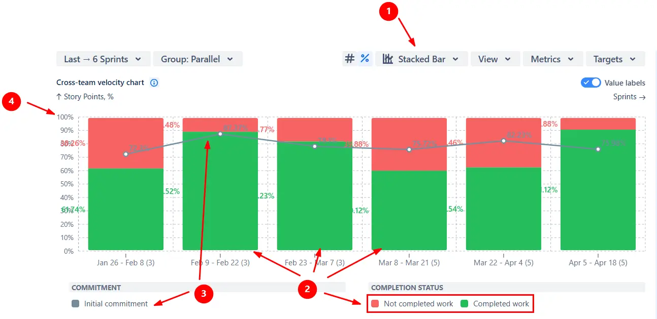
⚙️ Settings of the chart in this example:

  • View: Percentages (5️⃣)
  • Chart type: Stacked bar (6️⃣)
  • Ratio basis: Final commitment (7️⃣)
  • Metric as a line: Initial commitment (8️⃣)
  • Metrics in stacked bar: Completed work + Not completed work (9️⃣)
Planned vs actual stacked bar chart settings

This feature is helpful for:

  • Showing stakeholders a clear, visual “planned vs delivered” comparison.
  • Highlighting the share of completed vs. uncompleted work in each sprint.
  • Keeping the commitment baseline visible while analyzing actual outcomes.

Additional features of Planned vs actual chart in Jira

1. Adjust the reporting period

Choose exactly which sprints or time periods the Planned vs actual graph should display. By default, the chart shows the last six sprints for Scrum boards, but you can fully customize this:

  • Last – show a set number of past sprints or a time-based interval (days, weeks, months, quarters).
  • Since – include all sprints starting or ending after a specific date.
  • Fixed – define a custom start and end range.

You can also refine the display with advanced options:
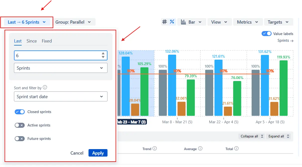
  • Decide whether the chart should use the sprint start date or the sprint end date for filtering.
  • Include or exclude closed, active, or future sprints.
Interval configuration in the Planned vs actual chart

This feature is helpful for:

  • Focusing on the most recent sprints to evaluate short-term trends.
  • Reviewing longer historical windows to assess improvements over time.
  • Comparing results across boards by standardizing the displayed intervals.

2. Focus the chart with issue filters

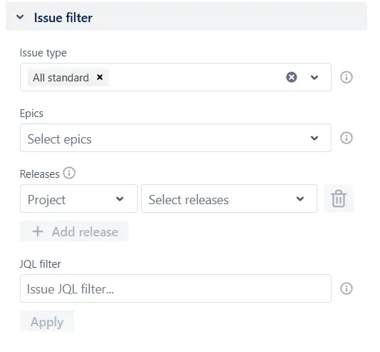
Narrow the Planned vs actual report to only the issues that matter for your analysis. You can filter by:

  • Issue type – stories, bugs, tasks, sub-tasks, or any custom type.
  • Epics – include only the direct child issues of selected epics.
  • Releases – select fix versions from one or multiple projects.
  • Custom JQL – apply flexible queries, including advanced JQL functions from apps like ScriptRunner.

This makes it easy to zoom in on a specific scope, such as user stories for a Program Increment, urgent bug fixes, or issues tied to a release.

Issue filter in Planned vs actual report in Jira dashboard

This feature is helpful for:

  • Analyzing commitments and delivery for a single epic, release, or PI.
  • Filtering out noise (like technical tasks or low-priority bugs).
  • Running advanced queries to tailor the report for custom workflows.

What about the native Jira Planned vs actual report

Jira does not include a Planned vs actual chart. The closest built-in option is the Velocity report, which only shows two metrics: initial commitment and completed work. While this gives a basic view of how much was promised versus delivered, it lacks almost all of the functionality needed to analyze commitment reliability:

  • ❌ Shows only totals, not percentages relative to commitment.
  • ❌ Restricted to a single team - you can’t combine multiple boards or teams in one view.
  • ❌ Does not display final commitment or track how the scope changed during the sprint.
  • ❌ No visibility into what contributed to scope changes (added, removed, or re-estimated work).
  • ❌ No ability to set targets or benchmark the say/do ratio.
  • ❌ No option to configure the number of sprints or adjust the analysis interval.
  • ❌ No drill-downs, filters, or customization to adapt the report to your teams.

Advantages of using the Planned vs actual chart

  • Track not just commitment vs. delivery, but also final commitment and scope changes that explain why goals were met or missed.
  • Compare results fairly across sprints and teams of different sizes using the percentage view.
  • Combine several boards in one chart to assess commitment reliability across an ART or program.
  • Add target lines to make expectations explicit and easy to track.
  • Configure how many sprints to display or define custom time ranges.
  • Segment results by board, epic, issue type, or other Jira fields, and connect metrics back to individual issues.
  • Define which statuses count as completed work per board, respecting different workflows while keeping results comparable.
  • Focus on specific issue types, epics, releases, or JQL-defined scopes.
  • Use a default estimate to avoid skewed ratios when issues lack story points.
  • Highlight mean, median, or moving averages to spot trends in commitment reliability over time.
Explore the interactive chart, no setup, no risk
TRY THE CHART
Chart embeded

Apps used in this Planned vs actual chart example

Use our examples to build your use cases on the Jira Dashboard.

Both Jira apps (plugins) used in these examples have a 30-day free trial and are completely free for teams under 10 people:

The Agile Reports and Gadgets app also includes Planned vs actual graph functionality and a multitude of other reports/charts.

Frequently Asked Questions

1. Can the Planned vs actual report be combined with other metrics for deeper analysis?

Yes. In the Metrics menu, you can add additional metrics to the Planned vs actual chart to enrich your analysis. For example:

  • Completed work (initial: shows how much of the original sprint commitment was delivered.
  • Not completed work: highlights the portion of the commitment that wasn’t finished.
  • Rollover: tracks how much unfinished work moved into the next sprint.
Adding metrics in the Planned vs actual chart

By combining these metrics with the core say/do ratio, you get a fuller picture of whether delivery gaps are caused by overcommitment, under-delivery, or unstable scope.

2. How can I understand what contributed to the scope change?

Use the Breakdown and Issue list features to analyze the Total scope change metric. You can segment it by issue type, team, epic, or other Jira fields to see what contributed most, and drill down to the exact issues. For a deeper analysis, we recommend the dedicated Scope change report in the same Agile Velocity Chart Gadget app, which shows how much scope was added, removed, or re-estimated.

3. How to track planned vs actual in Jira?

Use the Agile Velocity Chart Gadget app to create a Planned vs actual chart and save it as a dashboard gadget. You can:

  • Start from the Getting Started page, pick a template or create a chart from scratch, then save it to a dashboard.
  • Create it from a Jira project, using the project as the data source.
  • Add it directly from a Jira dashboard via the gadget directory.

This way, you can track commitments, scope changes, and delivery side by side on your Jira dashboard.

4. Can I export the Planned vs actual data for reporting outside Jira?

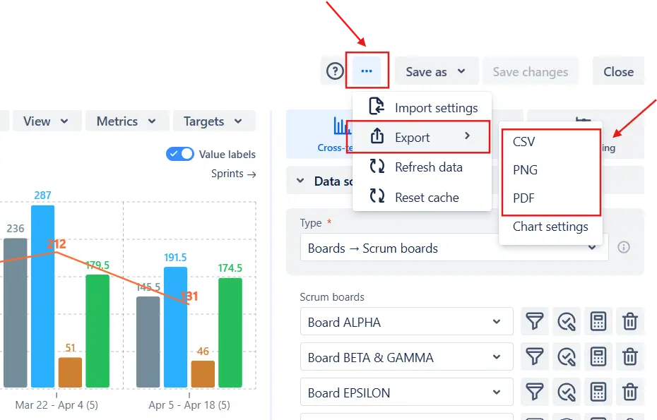
Yes. You can export the Planned vs actual chart in multiple formats:

  • CSV – for further analysis in Excel, Google Sheets, or BI tools.
  • PNG or PDF – for sharing snapshots in presentations or reports.

To export, click the (More) menu in the top-right corner of the chart, select Export, and choose the desired format (CSV, PNG, or PDF):

Export settings in the Planned vs actual report

Why trust Broken Build apps?

Gold Marketplace Partner
apps