The interactive chart is available on larger screens
Please open this page on a desktop to try it out
Key features of Kanban burnup chart
A Kanban burnup chart offers a clear view of project progress, aids in forecasting when work will be completed, manages evolving scope, and highlights potential delivery risks early on.
Users can select one or more boards for forecasting, tailor forecast scenarios with specific target dates and velocities, and refine accuracy by enhancing historical data. It's also possible to simulate scope increases, define custom values for remaining work, and add target date markers to support detailed planning.
Although Jira doesn’t offer a built-in burnup chart for Kanban teams to monitor progress, our Agile Burnup Burndown Charts gadget provides robust and adaptable forecasting designed specifically for practical Kanban workflows and scaled agile environments.
Burnup chart gadget for Kanban progress tracking and forecasting in Jira Dashboards
How various team roles leverage Kanban burnup chart workflows
✅ Product or Delivery Manager: I use Kanban burnup charts to build accurate delivery forecasts grounded in team velocity. With tools like multi-board forecasting, scenario adjustments, and scope growth simulations, I can set realistic stakeholder expectations, prioritize effectively, and flag delivery risks early, ensuring steady project momentum.
✅ Marketing Manager: Kanban burnup charts help me assess which features are likely to launch by specific deadlines. This insight guides campaign scheduling and supports the timely coordination of messaging, making it easier to adapt plans when potential delivery issues arise.
✅ Scrum Master: I track remaining work through burnup charts to catch signs of scope creep or changing commitments. When forecasts shift, it signals possible risks and prompts alignment discussions with product owners, keeping the team focused and scope under control.
✅ Program Manager: In scaled agile environments, I use burnup charts across several teams and projects via a unified dashboard. This comprehensive view enables me to manage dependencies, track progress, and coordinate delivery efforts across the organization efficiently.
✅ Release Train Engineer (RTE): I leverage Kanban burnup charts to oversee progress across multiple Agile Release Trains, combining team velocities for precise Program Increment forecasting. These visuals help me identify risks, align teams, and manage cross-train dependencies to meet PI goals and timelines.
Confidently meet your goals using the KANBAN BURNUP CHART!
Using the team’s historical weekly velocity, the Kanban burnup report generates three automated forecast lines:
Minimum velocity – represents the most cautious delivery estimate
Maximum velocity – reflects the fastest likely completion rate
Average velocity – offers the most balanced and realistic projection
These dynamic forecast lines provide a clear view of when the remaining work may be finished under varying conditions, similar to the functionality offered in our Kanban burndown chart example.
⚙️ Default settings:
Interval - last 6 bi-weeks
Grouping - weekly
Estimation - issue count (you can switch to story points)
Work completion forecasting using velocity data from recent completed intervals
📊 How to read the chart:
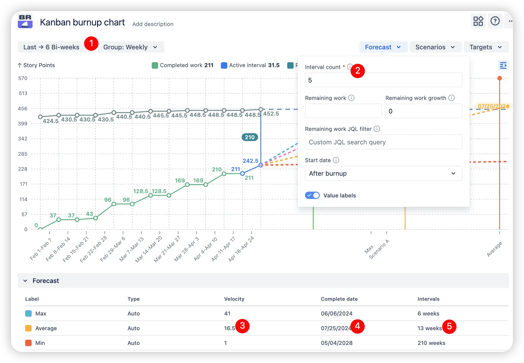
The Kanban burnup chart shown above displays data from the past 6 bi-weekly intervals (1️⃣). By default, it generates forecast scenarios using the minimum, maximum, and average velocities from the most recent 5 completed weeks. You can modify the number of intervals used in forecasting by updating the Interval Count in the Forecast setting (2️⃣). In this example, the team's average velocity over the last 5 completed weeks is 16.5 story points (3️⃣). At that rate, the team is projected to require 13 more weeks (5️⃣) to finish the remaining work, with an estimated completion date of 07/25/2024 (4️⃣).
2. Key feature: Forecasting across multiple boards with customization options
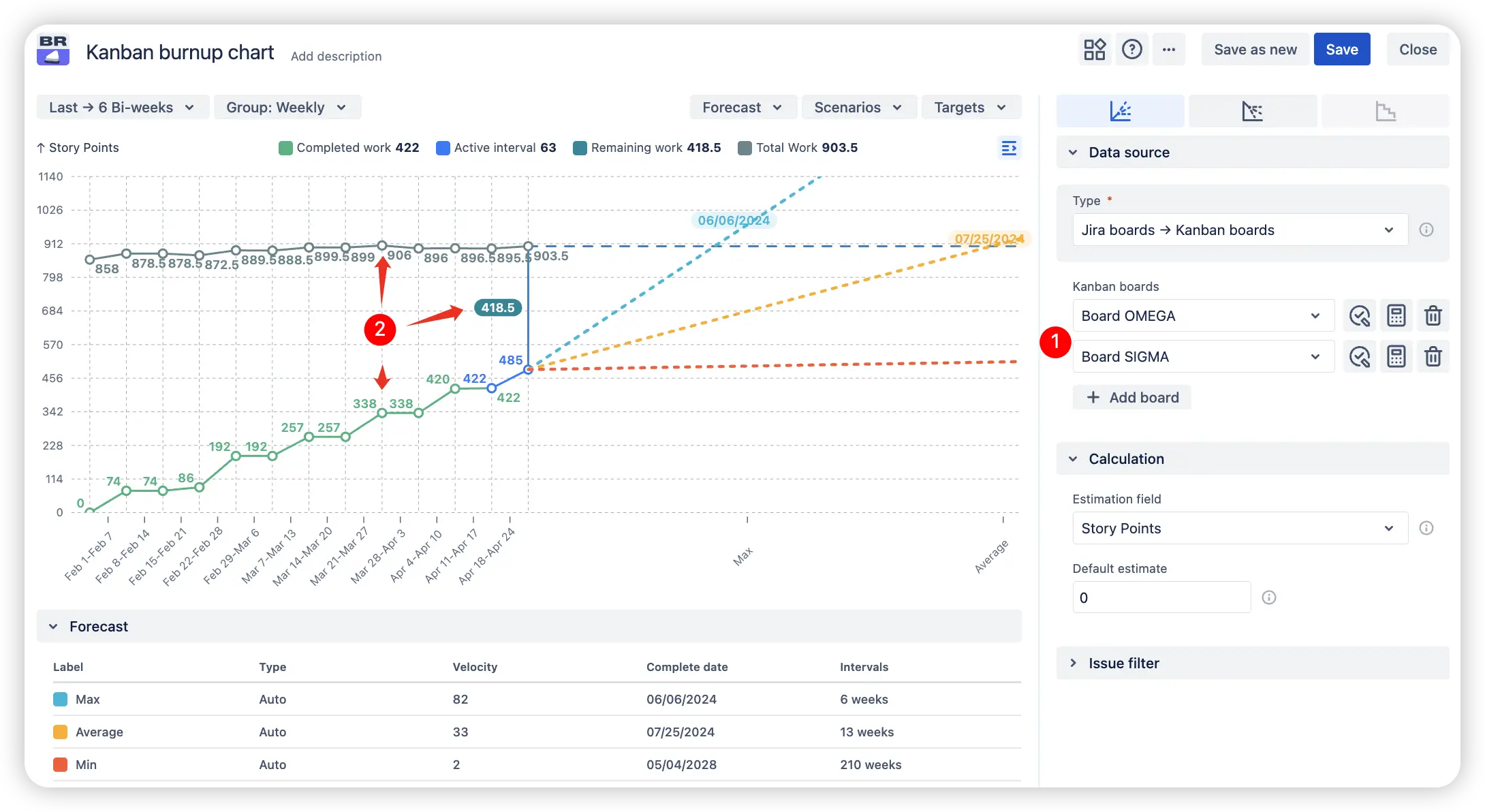
By selecting multiple boards, you can merge several Kanban boards (1️⃣) into one unified forecast view. This allows you to track total scope, remaining effort immediately, and completed work (2️⃣) across various teams - ideal for cross-team collaboration and strategic delivery planning.
Multiple boards displaying shared metrics and consolidated forecasts on a single Kanban burnup chart
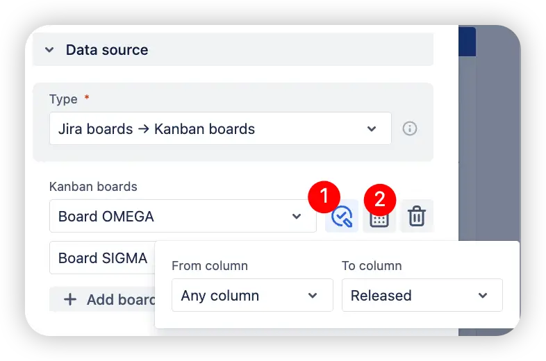
For advanced customization, each board allows:
✅ Defining custom "From-to column" ranges (1️⃣)
📐 Selecting a custom estimation field for story point tracking (2️⃣)
Board-specific customization of From-to columns and estimation fields
This allows complete flexibility to tailor forecasts to each team's specific workflow, whether they estimate using story points, time, or any other numeric field.
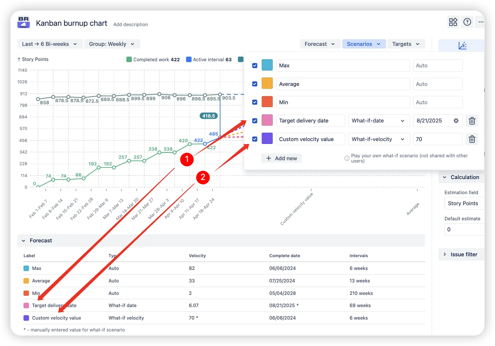
3. Key feature: Tailored forecast scenarios
Historical velocity isn’t always sufficient, especially when aiming for fixed deadlines. That’s where the custom forecast scenarios in the Kanban burnup chart gadget become essential.
This feature lets you manually set:
📅 A target delivery date (1️⃣) – and the system will calculate the required velocity to meet it.
⚡ A custom velocity value (2️⃣) – and the system will estimate the completion date based on that input.
Custom forecast scenario with user-defined velocity and target delivery date
This feature is especially valuable when:
You're evaluating whether a particular deadline is achievable.
You're planning with new or changing teams that lack a stable velocity history.
You're running what-if scenarios (e.g., how outcomes change if velocity increases or decreases).
Rather than passively reviewing forecasts, you can actively test, model, and plan more strategically, enabling better alignment between teams and stakeholders through data-driven insights.
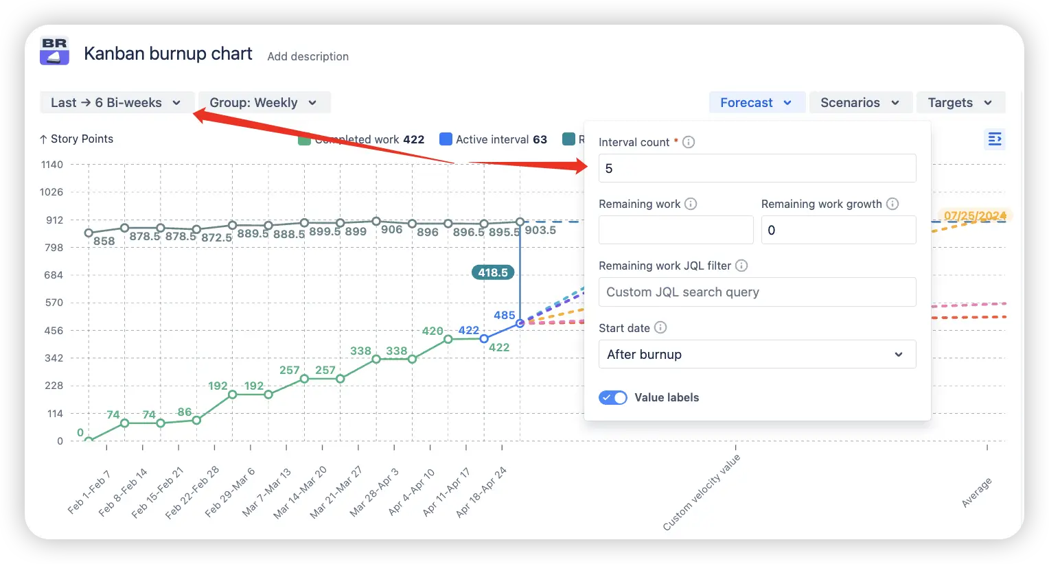
4. Key feature: Enhanced forecast accuracy control
The accuracy of any forecast depends on the quality and relevance of the data it's based on. That’s why these settings of the Kanban burnup chart in Jira let you fine-tune how your forecast is generated:
🧮 Adjust velocity history
By modifying the Interval Count and selecting a custom date range, you can control how many past intervals (e.g., weeks) are used to calculate the minimum, maximum, and averagevelocities. Using more historical data can help smooth out outliers and produce a more reliable forecast, especially useful for mature teams with steady performance trends.
Adjustable forecasting based on a customizable number of past intervals
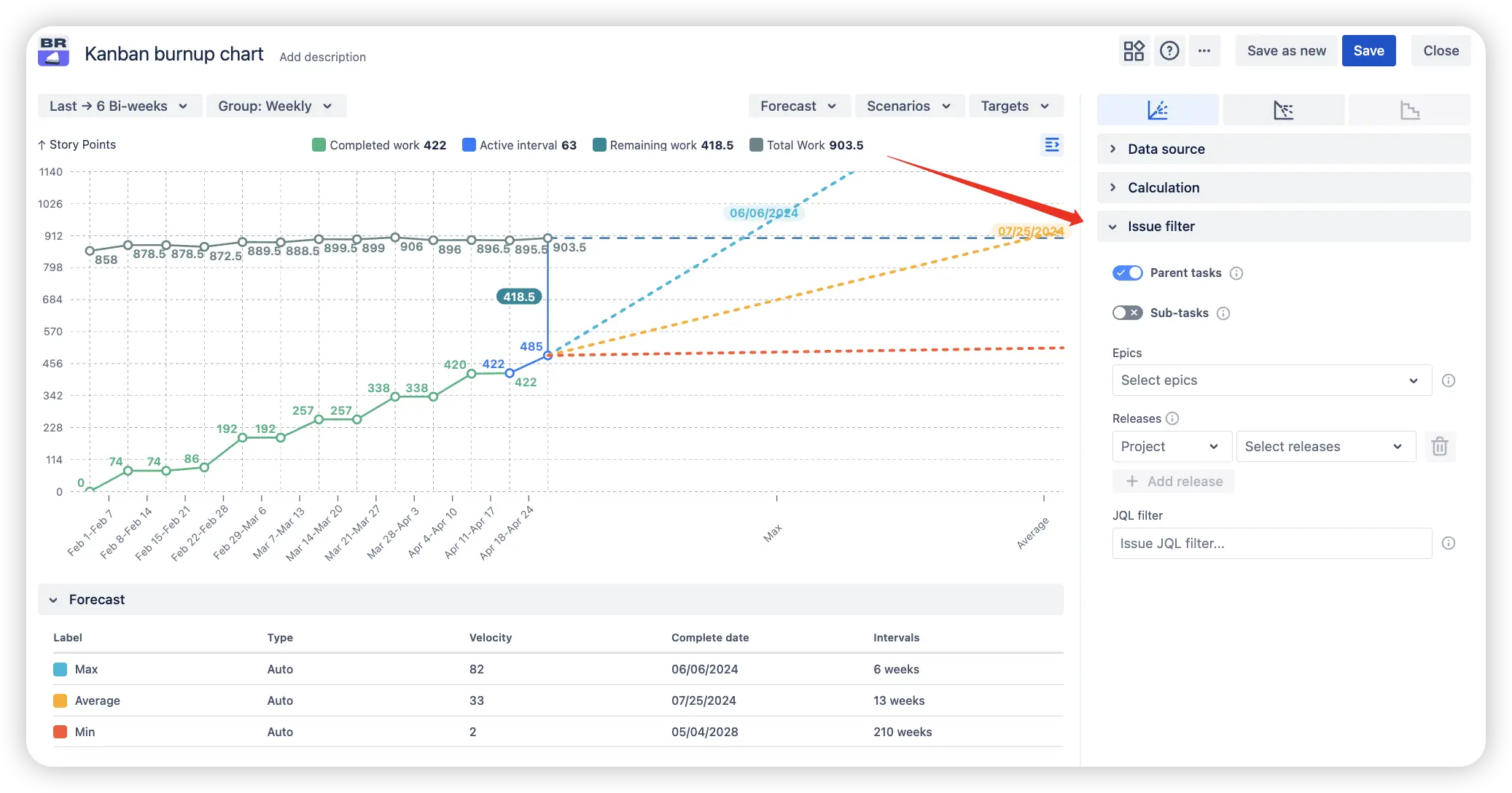
⚖️ Refining forecast inputs
With the advanced issue filter, you can narrow your dataset to specific issue types, epics, or releases, ensuring your forecast is based solely on relevant work.
This degree of control in the Kanban burnup chart helps eliminate misleading projections and supports planning grounded in accurate, meaningful historical trends.
Issue filter to exclude outliers and irrelevant data from forecasting
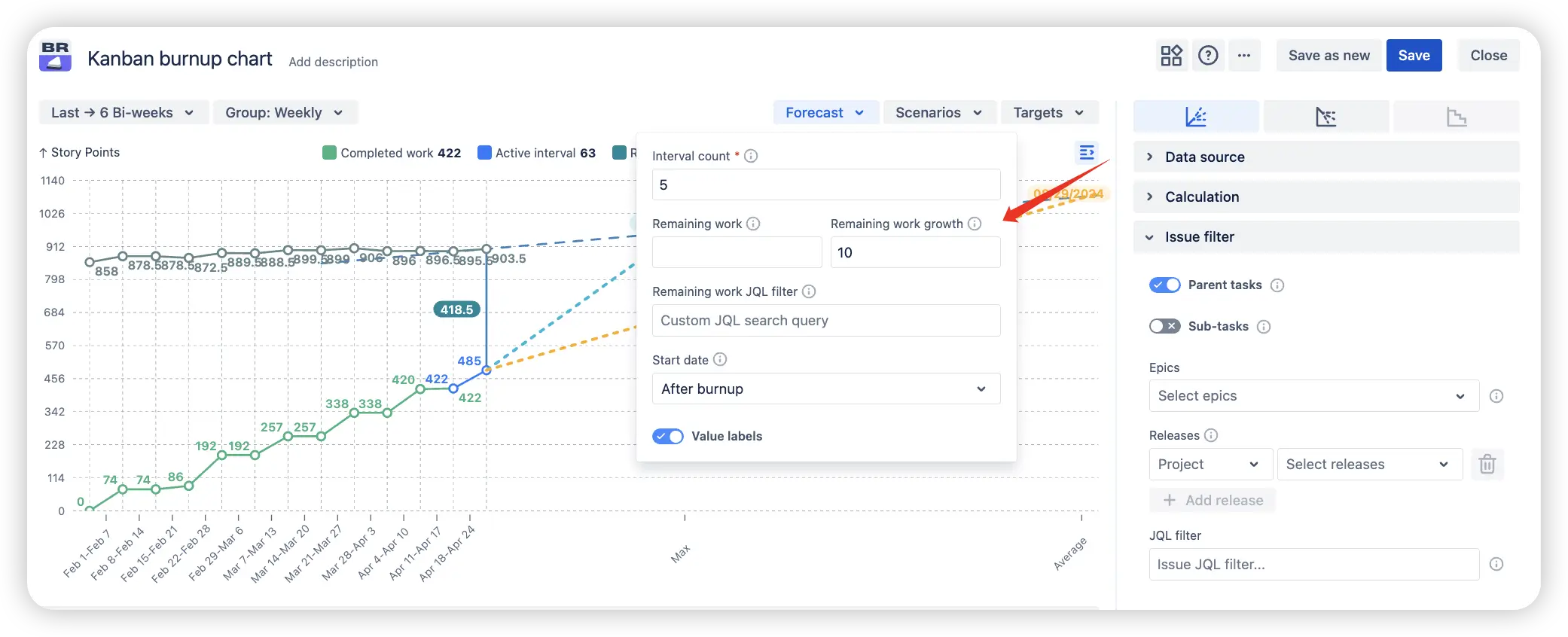
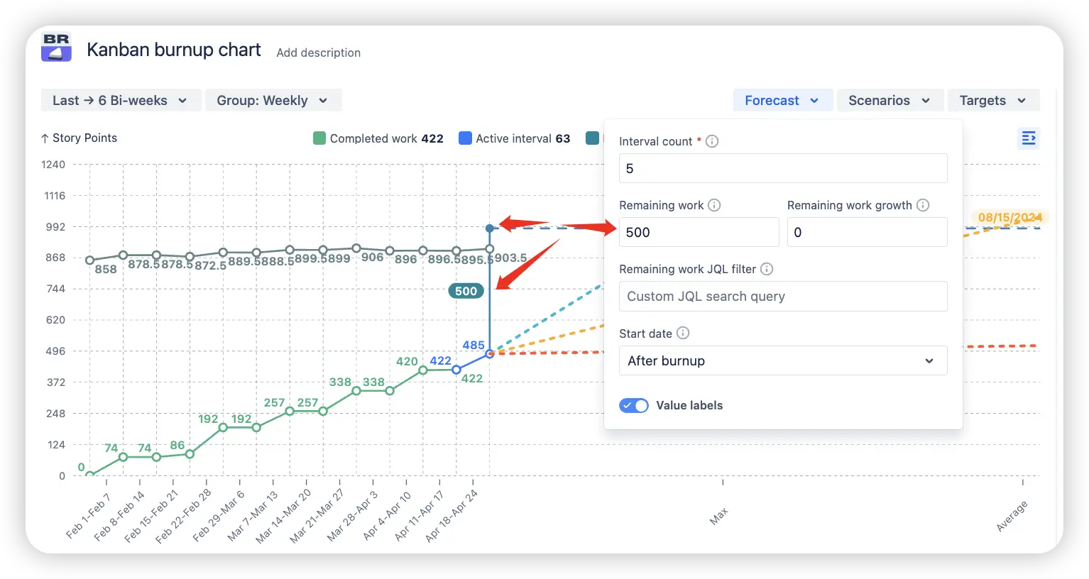
5. Key feature: Simulation of remaining work increase
Alongside custom forecast scenarios, the Kanban burnup report in Jira dashboard also lets you simulate how changes in remaining work affect delivery timelines. This capability allows you to model scope growth over time, offering a more accurate representation of real-world project dynamics.
Scope increase simulation over time by applying a custom value to the remaining work growth
The Remaining work growth field offers three configuration modes:
No scope change (default, 0) – keeps the remaining work constant throughout the forecast.
Custom growth value – allows you to manually specify how much the scope should increase per interval.
Historical growth-based forecast (leave the field empty) – automatically calculates scope growth based on trends from a defined historical period.
This functionality in the Kanban burnup chart gadget on your Jira dashboard helps visualize the impact of changing requirements, scope creep, or added backlog items. It enables you to stress-test your forecasts and make more informed, adaptive planning decisions.
Extra capabilities of Kanban burnup chart
1. Custom remaining work value
Although the Kanban burnup report in Jira automatically calculates remaining work based on your current backlog and progress, you have the option to manually override this value. This lets you explore how changes in remaining work could impact the projected delivery timeline.
Remaining work modification from the actual calculated value to a custom input
This feature is especially helpful when:
You expect scope changes that haven’t yet been added to the backlog
You want to model the effects of potential task additions or removals
You need to test planning assumptions before making official backlog updates
You’re running what-if scenarios to prepare for uncertainty
Using custom remaining work values allows you to better understand how changes in scope could affect delivery timelines, supporting more informed, flexible planning.
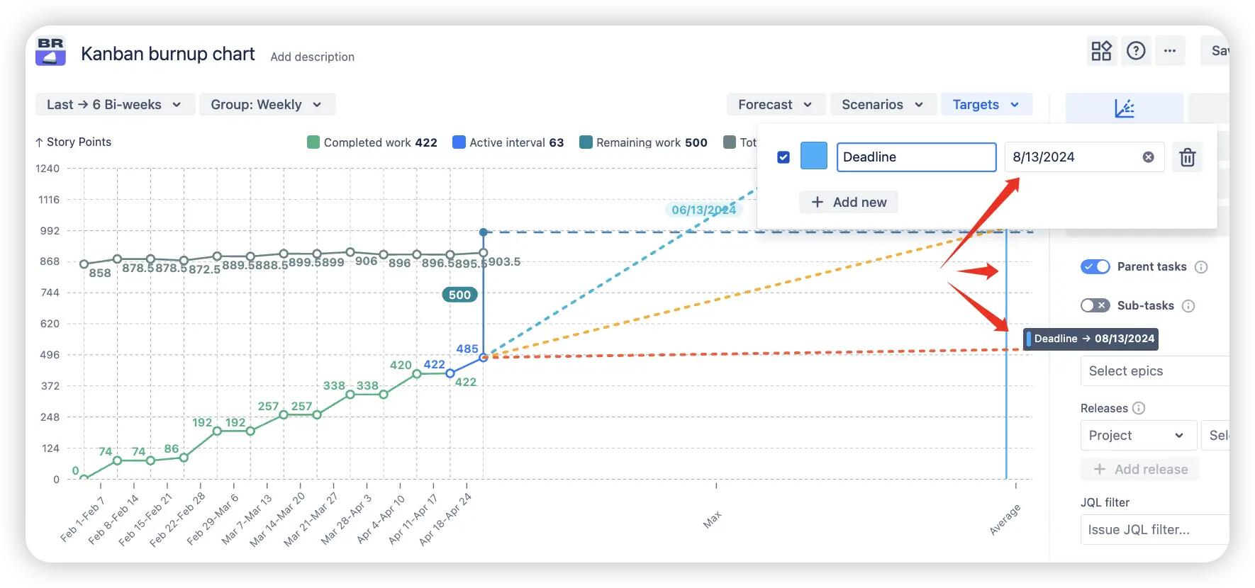
2. Target line for key dates or milestones
You can place a target line on the Kanban burnup report to highlight important dates, such as a planned completion milestone. This visual reference helps teams and stakeholders quickly assess how actual progress and forecasted timelines align with critical deadlines.
Example of a Scrum burnup report with a target line indicating the delivery deadline
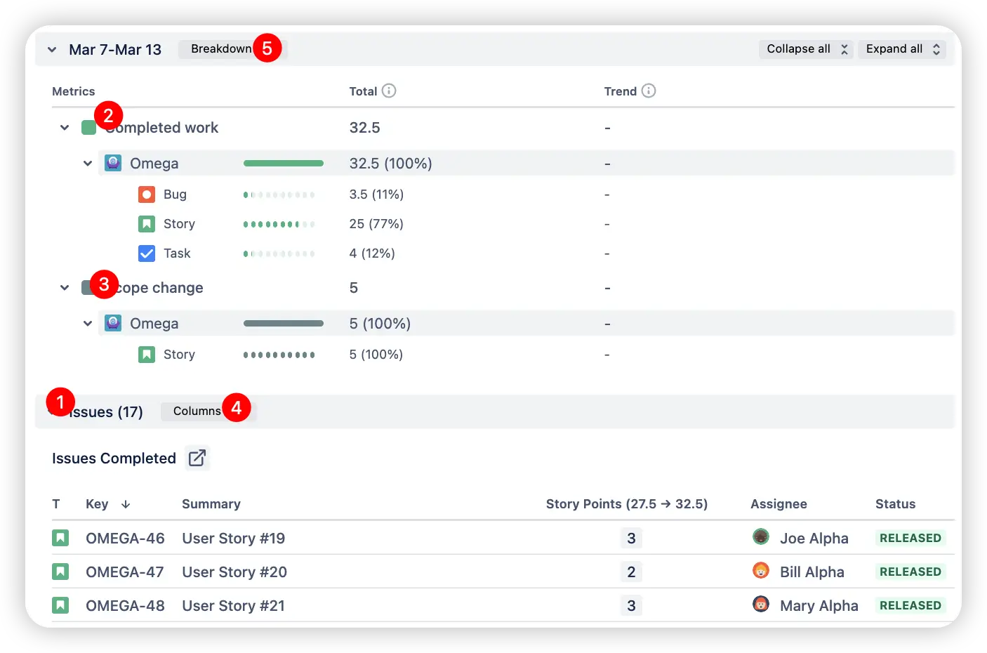
3. Data deep dive
Curious about the exact data powering your Kanban burnup chart in Jira dashboard? You can easily review detailed issue lists and breakdowns by board, project, status, and more.
Clicking on any sprint interval reveals in-depth tables displaying:
Issues included in that specific time frame (1️⃣)
Details of completed work during the interval (2️⃣)
Scope changes that occurred (3️⃣)
This transparency helps validate the forecast and better understand delivery dynamics.
Tables and controls to customize data display based on specific reporting needs
In the Kanban burnup report on the Jira dashboard, you can fully customize the data tables, choosing which columns to display (4️⃣) and selecting how the information is broken down (5️⃣). This flexible setup offers complete transparency and control over the data, enabling deeper analysis and more informed decision-making.
Additionally, you can click directly on the forecast chart area to instantly view the list of issues representing the remaining work behind the forecast, making it easy to drill down for detailed insights whenever needed.
Tables with detailed remaining work data, including issue lists and breakdowns by board(s)
By using different breakdown options, you can assess backlog health from multiple perspectives.
Is there a built-in Jira Kanban burnup chart?
Jira lacks a built-in Kanban burnup chart with the advanced capabilities required for effective Kanban forecasting.
By contrast, our solution delivers robust customization options, supports multiple boards, provides in-depth issue breakdowns, and includes powerful scenario modeling features, giving teams the tools they need for accurate planning and progress tracking.
Benefits of using Kanban burnup chart
Track and forecast progress across one or multiple Kanban boards to support comprehensive cross-team delivery planning.
Velocity-based forecast lines (minimum, maximum, average) provide realistic and actionable completion estimates.
Multi-board aggregation enables effective coordination and helps establish global timelines across teams.
Custom forecast scenarios allow strategic planning by modeling specific deadlines and variations in team velocity.
Scope growth simulation and custom remaining work inputs help reflect evolving project dynamics with greater accuracy.
Advanced issue and sprint filters let you focus on relevant work, improving forecast precision and reliability.
Clickable intervals reveal detailed issue-level breakdowns, boosting data transparency and insight.
Valuable for Product Managers, Scrum Masters, and Program Leads, helping them manage scope, mitigate delivery risks, and align stakeholders around realistic plans.
The Agile Reports and Gadgets app includes Kanban burnup chart functionality, along with many other reports and charts.
Frequently Asked Questions
1. What is a Burnup chart in Kanban?
A Kanban burnup chart is a visual tracking tool that shows how much work has been completed over time compared to the total planned scope for a project or sprint. It helps teams monitor progress toward their objectives and quickly identify any changes in scope. Typically, the chart features two lines - one for completed work and another for total scope, making it easy to see how close the team is to finishing all planned tasks.
2. What’s the difference between a burndown and a burnup chart?
Both charts track progress over time, but they present the data differently:
A Burndown chart visualizes the amount of remaining work, with the line trending downward as tasks are completed.
A Burnup chart shows the amount of work completed, with the line rising toward the total scope.
You can build and customize both chart types using the Broken Build – Agile Burnup Burndown Charts app for Jira.
3. What are Burnup charts used for in Kanban?
Burnup charts in Kanban are used to track progress toward completing a time period or project. They allow teams to visualize the amount of work finished compared to the total planned scope, making it easier to:
Monitor progress continuously
Identify scope changes, such as added or removed tasks
Communicate project status effectively to stakeholders
Support ongoing forecasting and planning throughout the project or release
By displaying both completed work and total scope, burnup charts offer a transparent view of whether the team is on track to achieve its goals.
4. Can I use estimation units other than story points in the Kanban burnup report?
Yes, the Kanban burnup chart can use any numeric Jira field as the estimation unit. Common options include:
Issue count
Story points
Epic points
Time estimates
This flexibility lets you customize the chart to fit your team’s preferred method of estimation.
5. How does the Kanban burnup chart work?
The chart displays completed work (such as story points) alongside the total scope over time. As tasks are finished, the completed work line “burns up” toward the overall planned workload, making it simple to monitor progress and detect any scope changes.
6. Can a Kanban board burnup chart be used for delivery forecasting?
Yes. Using Agile Burnup Burndown Charts by Broken Build, you can model delivery scenarios and predict completion dates based on real or custom team velocity, while factoring in scope changes.
7. How to add a Kanban burnup report to a Jira dashboard?
Jira doesn’t include a built-in Kanban burnup chart, but you can easily add one using the Agile Burnup Burndown Charts app from the Marketplace.
To add the burnup chart gadget to your Jira dashboard:


.webp)


.svg)


.png)
