The interactive chart is available on larger screens
Please open this page on a desktop to try it out
Key features of Epic burnup chart
Large epics often come with complex planning, shifting scope, and cross-team dependencies. The Epic burnup chart provides a clear view of how work is being completed over time and how long it’s likely to take to finish.
Generate projections based on historical team throughput, simulate scope changes, and model what-if scenarios. Interval breakdowns and flexible grouping options reveal which teams or contributors are driving delivery and where risks might emerge.
Unlike native Jira reports, the Epic burnup chart gadget from the Agile Burnup Burndown Chartsapp offers real-time and configurable burnup visualizations tailored to scaled delivery needs.
How different roles use Epic burnup chart gadget
✅ Product Manager: The Burnup chart by epic helps me visualize epic scope in the burnup chart to make informed decisions about prioritization, roadmap adjustments, and release planning. By modeling different velocity scenarios and simulating scope growth, I can forecast realistic completion dates for the Epic.
✅ Release Train Engineer (RTE): I rely on the epic-level burnup chart to visualize how the ART is progressing toward completing large cross-team epics. By breaking down the data by project or team, I can identify if one team is falling behind or contributing less to the epic and bring it up during ART syncs.
✅ Delivery Manager: I use the Jira dashboard gadget for epic burnup to track progress across teams and ensure we’re on pace to deliver the epic by our target milestones. If remaining work grows faster than expected, or if we’re trending toward a late delivery, I can initiate corrective actions early.
Track epic progress and model delivery scenarios with EPIC BURNUP CHART!
The Epic burndown chart automatically forecasts when the remaining work will be completed. It generates three projection lines based on the past delivery pace:
Minimum velocity - the most conservative estimate
Average velocity - the most realistic pace based on historical data
Maximum velocity - the best-case scenario
Forecasts include the estimated completion date and the number of future intervals (customizable as days, weeks, bi-weeks, months, or quarters) needed to finish the work.
⚙️ Default settings:
Interval - last 6 bi-weeks
Grouping - weekly
Interval count for average velocity - 5 weeks
Estimation field - issue count
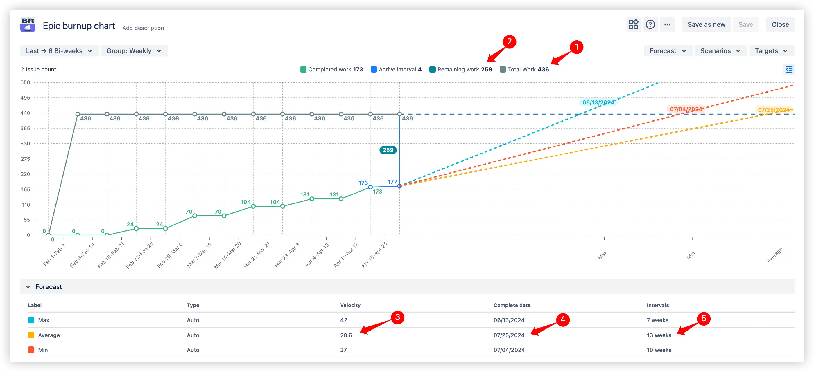
Automatic forecasts in the Epic burnup report example
📊 How to read the chart:
In the Epic burnup chart example above, the epic contains 436 issues in total (1️⃣), with 259 still remaining (2️⃣). Based on the last 5 weekly intervals, the team’s average velocity (throughput) is 20.6 issues per week (3️⃣). If the team continues at this pace, the epic will be completed by 07/25/2024 (4️⃣), requiring 13 more weeks (5️⃣) to finish all remaining work.
💡The “Automatic forecasts” feature is useful for:
Tracking long-term progress across multiple teams working under a shared epic
Planning epic delivery timelines based on real historical performance
Aligning expectations with stakeholders by showing realistic, optimistic, and conservative forecasts
2. Key feature: Custom what-if scenarios
Need to answer “What if our team speeds up?” or “What velocity (throughput) do we need to finish by this date?”
The Epic burndown chart lets you test different planning assumptions by entering:
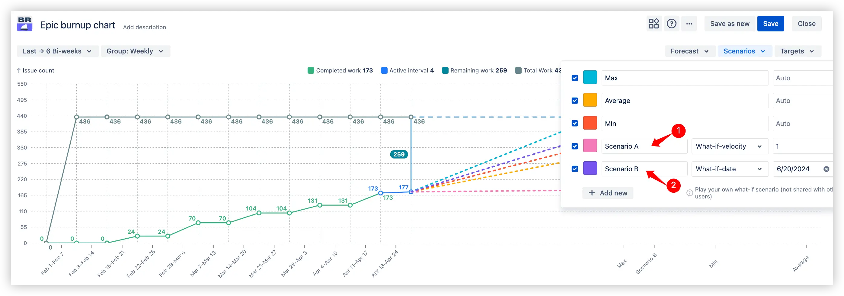
Custom what-if scenarios in the Epic burnup report in Jira dashboard
What-if velocity (1️⃣) - simulate how a change in delivery pace would shift the projected completion date
What-if date (2️⃣) - set a target delivery date and calculate the velocity (throughput) needed to meet it
The results appear instantly on the chart, so you can evaluate different outcomes side by side with your default forecast.
💡The “What-if scenarios” feature is useful for:
Supporting planning conversations with stakeholders through modeled delivery scenarios rather than speculation
Validating delivery commitments before aligning with fixed deadlines
Planning resource allocation or rebalancing across teams
3. Key feature: Scope modeling
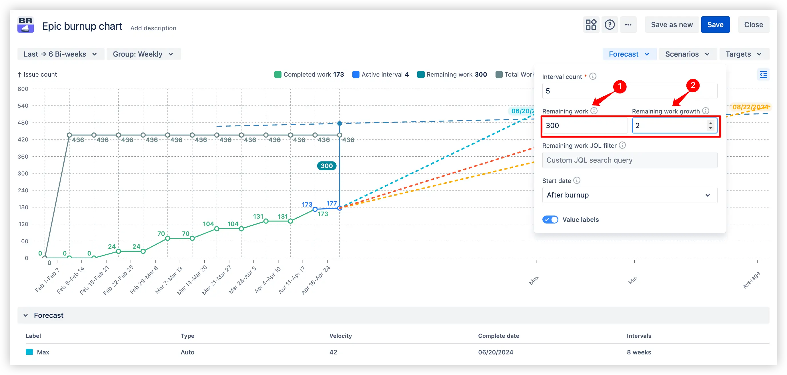
By default, the Epic burnup chart uses your current backlog to determine the remaining scope. But when planning ahead, you can:
Set a custom remaining work value(1️⃣) to test how changing the scope affects delivery
Simulate scope growth (2️⃣) by defining how much additional work (e.g. issues or story points) will be added per interval
Scope modeling example in Epic burnup chart in Jira
💡The “Scope modeling” feature is useful for:
Forecasting epics where the full scope isn’t known yet
Modeling dynamic backlogs that grow over time
Identifying delivery risks early when the scope is expected to expand
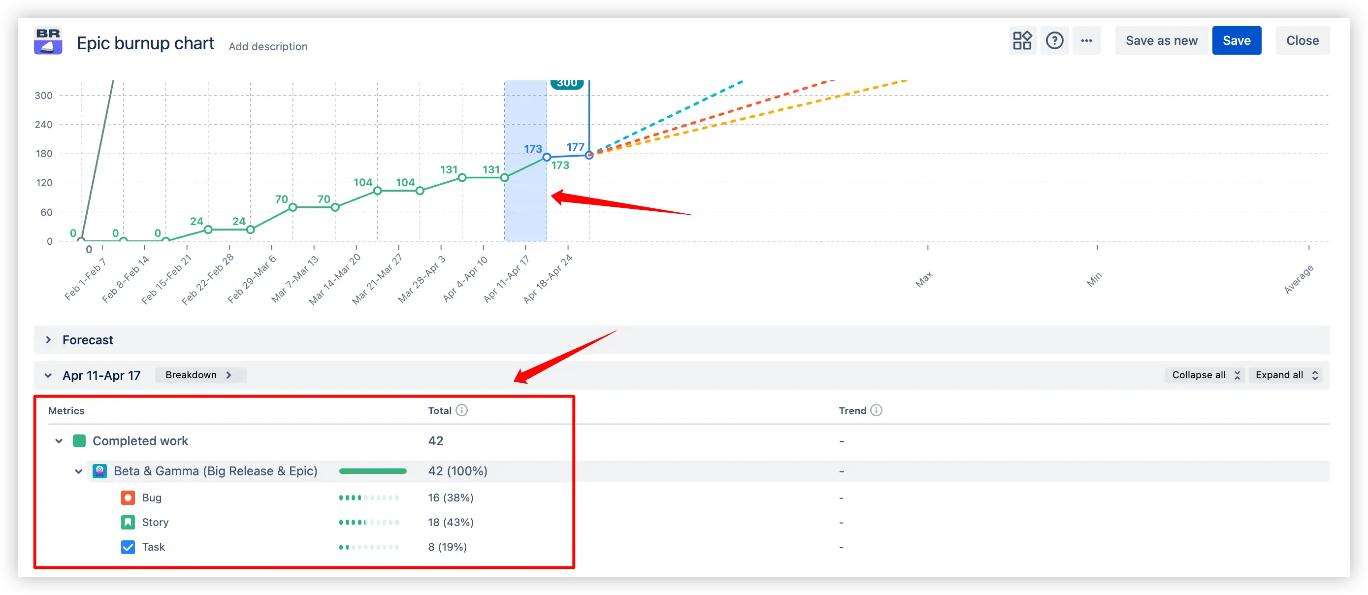
4. Key feature: Interval breakdowns with issue-level details
Click on any time interval in the Epic burnup report in Jira, whether it's a completed period or part of the forecast zone, to explore detailed insights about the issues relevant to that point in time.
The chart reveals a breakdown of completedor remaining work (depending on the interval) and scope change, with the possibility to group by project, issue type, assignee, status, or other Jira fields.
Interval breakdowns with issue-level details example in Epic burnup chart in Jira dashboard
💡The “Interval breakdowns” feature is useful for:
Investigating what was completed in a given week or sprint
Analyzing the main drivers behind scope changes
Planning ahead based on the remaining work
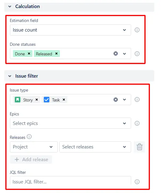
Additional features: Customization
The Epic burnup chart gives you full control over how work is calculated and which issues are included in the scope. Use the “Calculation” and “Issue filter” sections on the right panel to fine-tune your chart setup:
Estimation field - choose how progress is measured: issue count, story points, or time spent.
Done statuses - define which statuses should be treated as “completed” to align the chart with your workflow.
Issue type filter - include only the relevant issue types such as Story, Task, or Bug.
Release filter - focus the chart on specific fix versions linked to your delivery milestones.
Custom JQL filter - apply advanced Jira queries to include exactly the issues that matter for your epic
Epic burnup graph customization example
These options help reduce noise and tailor the burnup chart to your team’s structure.
What about the native Jira Epic burnup chart
Jira’s native Epic Burnup Report only displays basic information about the total scope and completed issues.
Limitations of the native Jira Epic burnup report:
❌ No forecasts unless the epic includes three or more active sprints
❌ No custom “what-if” planning scenarios
❌ No support for multiple epic selection
❌ No issue-level breakdown into remaining work and scope change
❌ No configuration of estimation field, Done statuses, or time intervals
❌ No burnup chart by epic, only burndown available
❌No possibility to add the chart as a gadget to the Jira Dashboard
Advantages of using the Epic burnup chart
Forecast completion dates even when the current epic has limited history, using the board’s velocity as a baseline.
Select multiple epics from the list or by using a custom JQL filter.
Test different velocities or target dates to evaluate possible outcomes and support informed planning conversations.
Simulate how backlog expansion affects delivery timelines.
Explore which issues were completed in a given timeframe and group data by project, issue type, assignee, or other fields.
Customize the estimation field, statuses to count as Done, and issues to take into account.
Track progress across multiple teams contributing to the same epic, identify bottlenecks, and monitor team contribution over time.
💡 The Agile Reports and Gadgets app includes Epic burnup chart capabilities, along with a variety of additional charts and reports.
Frequently Asked Questions
1. What’s the difference between burnup and burndown for tracking epic progress?
Both charts track progress, but they visualize it differently.
An epic burndown chart shows how much work remains over time. The ideal outcome is a line that goes down to zero.
An epic burnup chart shows how much work has been completed compared to the total scope. It consists of two lines: one for completed work and one for total scope.
2. Can I simulate different delivery scenarios or scope growth with the Jira Epic burnup graph?
Yes. By default, the burnup chart for epics provides three projections: average, minimum, and maximum velocity based on your team’s recent delivery history.
To go further, you can:
Click Forecast to set a custom remaining work value or define remaining work growth per interval, simulating how scope creep might affect delivery.
Use the Scenarios section to add custom forecasts by setting a fixed velocity or target completion date.
3. How can I analyze team contribution to an epic?
To evaluate how different teams or individuals contribute to an epic, simply click any interval on the Epic burnup chart.
You’ll see a detailed breakdown of issues relevant to that period. Use grouping options like project, assignee, or issue type, and choose what additional fields to display, such as priority, fix version, or status.
4. How can I see what issues haven’t been completed?
Yes. Click the forecast zone of the chart to drill down into the remaining work.
You can choose how to group the data - by issue type, project, or assignee - and select which fields to display for deeper insights. Click Find issues to view the exact list of remaining tasks with direct Jira links.
5. Can I see what most affected the scope change of the epic?
With the interactive Epic burnup graph shown in this example, you can click any time interval to view a list of issues added during that period. Use the breakdown options to group and display the information most relevant to your needs.


.svg)


.png)
