
Thank you! Your submission has been received!
Oops! Something went wrong while submitting the form.


The Epic burndown chart gives you a clear view of progress toward completing one or more epics, while providing flexible forecasting tools to plan ahead.
You can compare multiple delivery scenarios, refine how forecasts are calculated, and add milestone markers to track against release dates.
The Epic burndown chart is part of the Agile Burnup Burndown Charts app. You can place it directly on your Jira dashboard (like any other Broken Build gadget) and tailor it with flexible filters and breakdown options to align with your team’s workflow.
✅ Program Manager: I need to forecast completion for strategic epics tied to a Program Increment so I can adjust priorities and communicate realistic delivery dates to stakeholders.
✅ Release Train Engineer (RTE): I want to track multiple epics in one view to spot risks, manage dependencies, and keep the Agile Release Train aligned with PI objectives.
✅ Scrum Master: I use the chart to monitor whether sprint-level progress supports epic completion goals and to facilitate discussions when timelines are slipping.
✅ System Architect: I need to confirm that enabler epics are progressing on schedule so dependent feature work won’t be blocked in future increments.


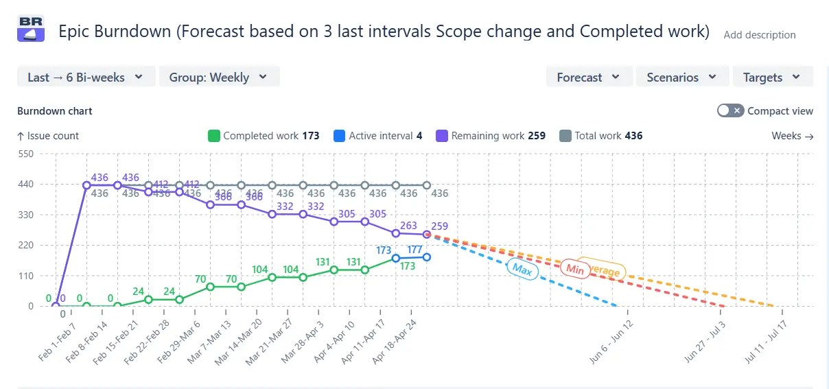
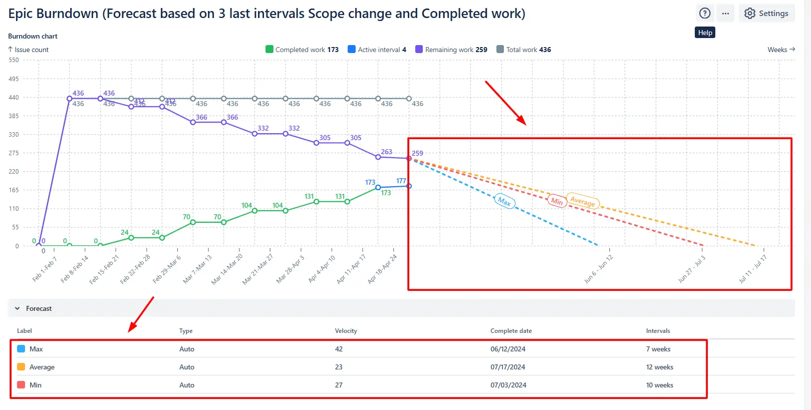
The Epic burndown chart goes beyond Jira’s native report, which relies solely on an average past velocity. It automatically generates three projections using your team’s minimum, average, and maximum delivery pace, allowing you to compare optimistic, realistic, and conservative outcomes at a glance.
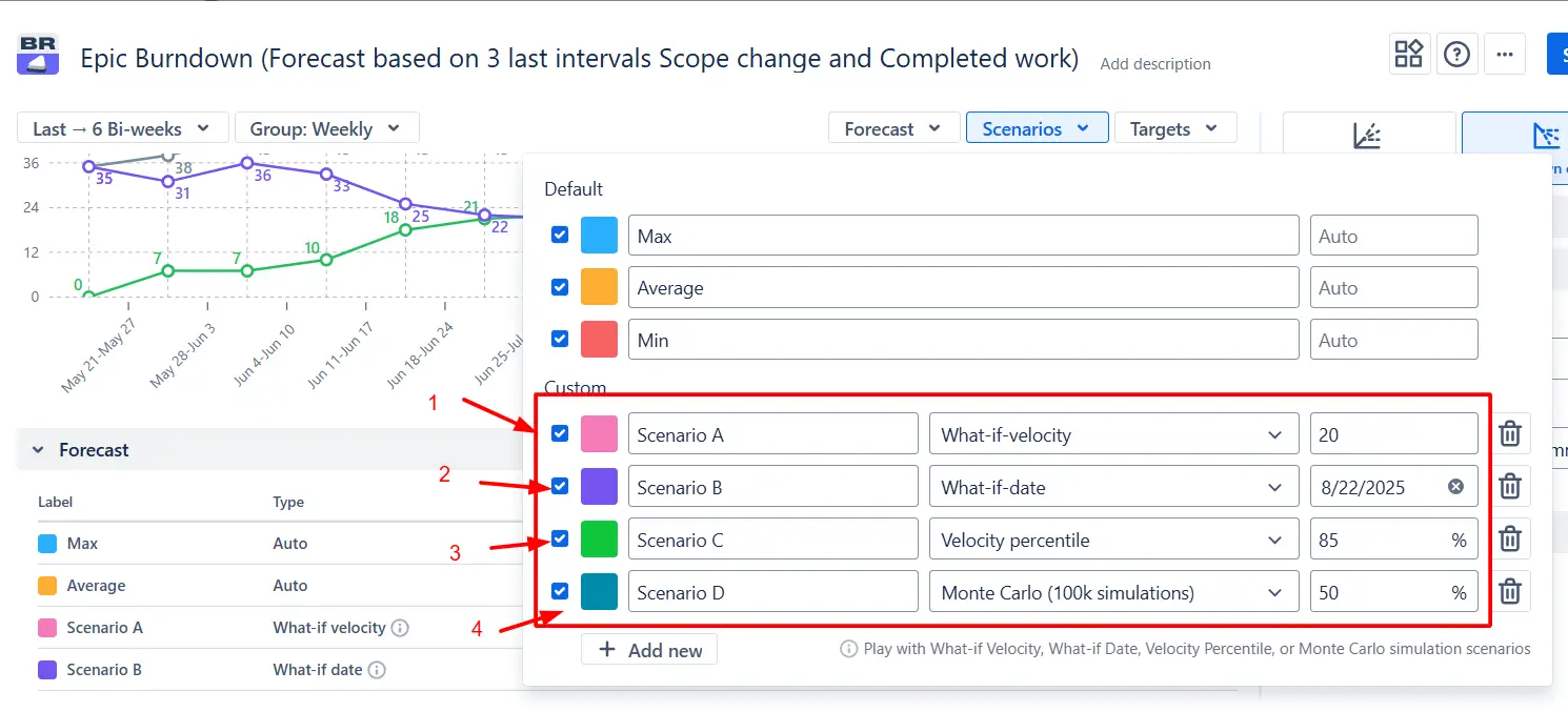
For even more control, you can model custom scenarios:
✅ When to use it:
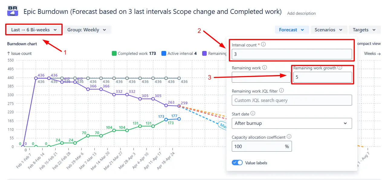
The Epic burndown chart lets you choose exactly how the forecast is built. You can define the number of past intervals that should influence the projection and add a scope growth factor.
✅ When to use it:
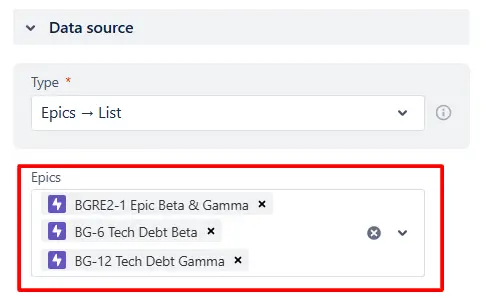
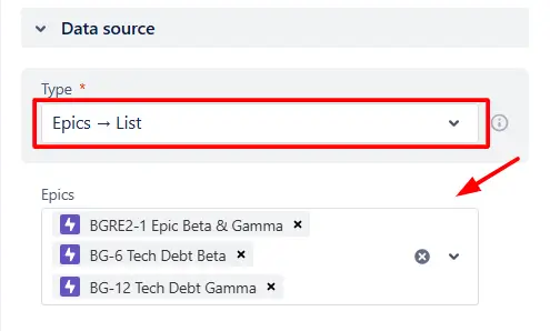
With the Epic burndown graph, you can track progress across several epics in one view. Choose epics directly from a list or apply a custom JQL filter to include exactly the ones you need.
✅ When to use it:
Add one or more target deadlines directly to the Epic burndown chart to see how your forecasted completion dates align with planned milestones:
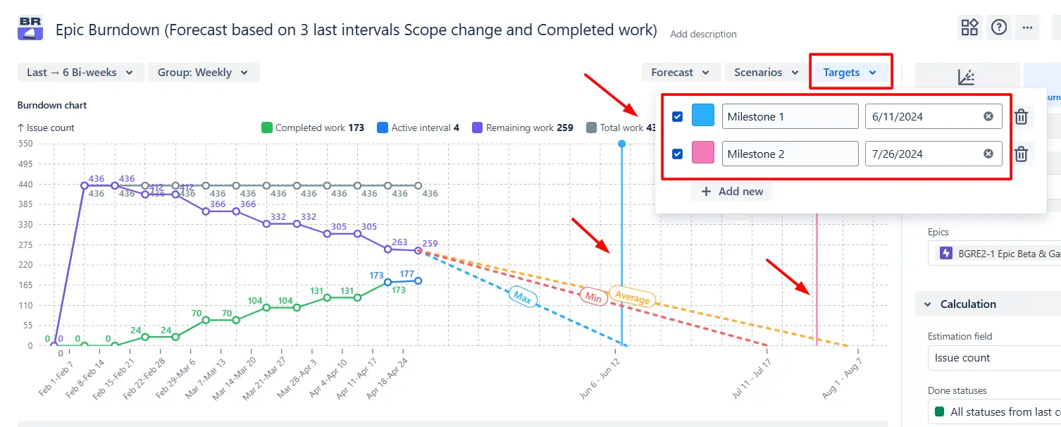
✅ When to use it:
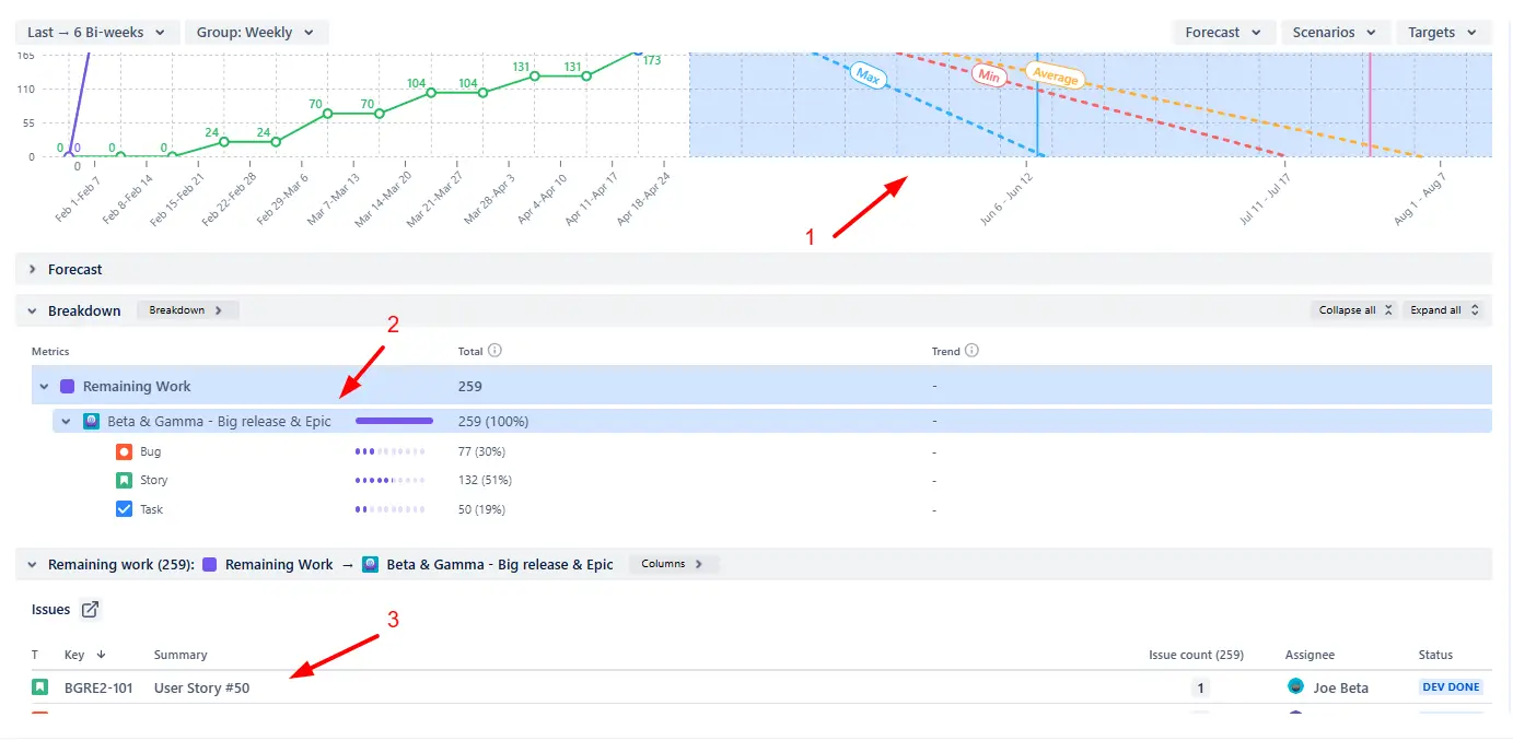
Click anywhere in the forecast area (1️⃣) to drill down into the epic’s remaining work. You can group the issues by release, issue type, project, or other fields to see how the outstanding scope is distributed (2️⃣). Clicking the row takes you directly to the issue list linked to Jira tickets (3️⃣) for further review or action.
✅ When to use it:
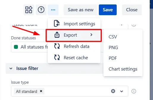
You can export the Epic burndown chart in CSV, PNG, or PDF format for deeper analysis outside Jira, or to share a snapshot of the chart with stakeholders or include it in reports and presentations:
✅ When to use it:
Jira’s built-in Epic burndown report can give you a basic sense of progress, but it’s not designed for advanced forecasting or multi-epic tracking. It only generates a forecast if the epic spans three or more active sprints, and it doesn’t allow you to model custom scenarios or fine-tune the data behind the projection.
You also can’t:
❌ View multiple epics in the same chart.
❌ Break down progress into remaining work vs scope changes.
❌ Configure estimation fields, Done statuses, or reporting intervals.
❌ Add the chart as a gadget to your Jira dashboard.
❌ Filter by individual team members to see personal contributions.
Use these examples to create your own Epic burndown chart use cases on the Jira Dashboard.
Both Jira apps (plugins) featured here offer a 30-day free trial and are completely free for teams of up to 10 users:
The Agile reports and Gadgets app includes Epic burndown functionality plus a wide range of additional charts and reports.
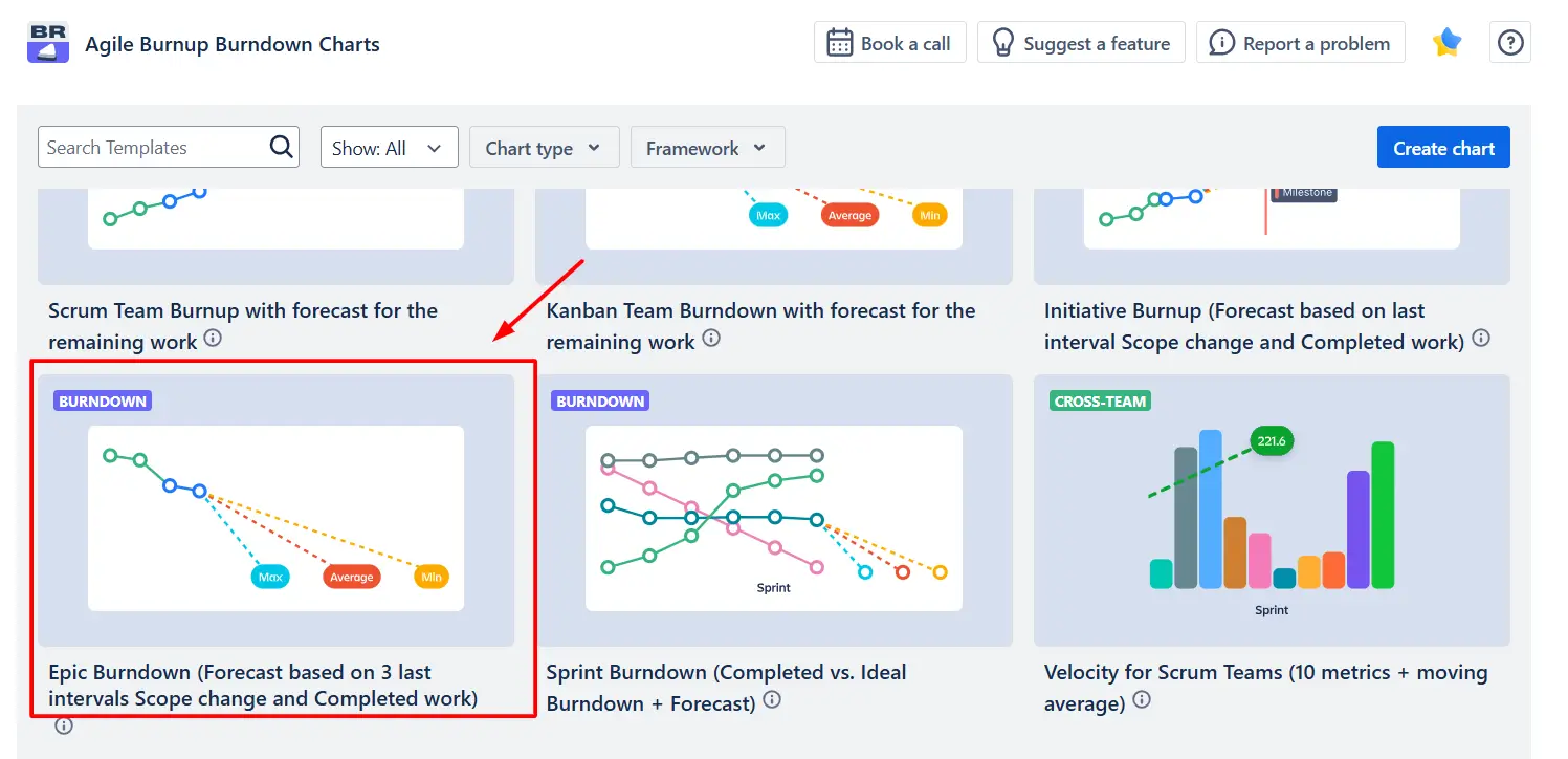
Jira’s native Epic burndown doesn’t support custom forecasting, but the Agile Burnup Burndown Charts app by Broken Build does. Simply choose the Epic Burndown (Forecast based on last 3 intervals, Scope change, and Completed work) template, select the relevant epics as your data source, and adjust the settings to match your needs.
The Epic burndown chart calculates forecasts using your team’s historical delivery pace (velocity) over a selected number of past intervals, such as sprints, weeks, or bi-weeks. By default, it generates three projections based on the minimum, average, and maximum velocities from that period.
You can refine the forecast by adjusting the lookback window or adding a scope growth factor, and you can also create custom “what-if” scenarios to model different target dates or velocities.
Go to the Data source section and either select the epics from the list or use a custom JQL filter to include exactly the ones you need:
Yes. You can choose to display the chart by days, weeks, bi-weeks, months, or quarters, and group the data accordingly:
![]()


.svg)


.png)
