

Every standup has the same unspoken question: which work items have been in progress too long? The scrum master scans the board, tries to add up how many days each item has spent in development, code review, and testing, and guesses whether the total has crossed a threshold that signals trouble.
The problem is that "too long" is relative. A work item in code review for three days might be normal. But if that same work item also spent four days in development and two days waiting for test – nine days total against a seven-day 85th percentile – it has already aged past the point where most similar work finishes.
This is the core distinction between per-status time and cumulative in-progress age. One tells you where time is accumulating. The other tells you whether the total has crossed a line that matters. Agile WIP Charts 1.1.0 tackles both gaps – cumulative aging with percentile benchmarks and workflow-ordered columns. Here is the problem and what changes.
Two questions your standup asks
A WIP aging chart that breaks each in-progress item into per-status columns – how long in "In Development," how long in "Code Review," how long in "Ready for Test" – answers one essential question: where is time accumulating right now? That per-status view is how you diagnose which stage is the bottleneck.
But standup asks a second question just as often: is this work item taking too long overall? That is a different question. The first requires per-status granularity. The second requires a single cumulative number compared against a benchmark.
Yuval Yeret frames this distinction clearly:
"If Cycle Time is a lagging indicator only relevant for finished items, Work Item Age is a leading indicator only relevant for non-finished items."
– Yuval Yeret, 4 Key Flow Metrics and How to Use Them in Scrum's Events, Scrum.org
Cycle time tells you what happened after an item finishes. Work item age tells you what is happening right now – while you can still act. Daniel Vacanti, co-author of the Kanban Guide for Scrum Teams, goes further:
"Age is by far the most important of all the flow metrics to track."
– Daniel Vacanti, The Kanban Pocket Guide: Chapter 6
The reason is that age is the only metric that gives you actionable information about items that have not finished yet. Throughput, cycle time, and WIP count are all retrospective or aggregate. Age is specific and current.
Without a cumulative view, the standup workaround is mental arithmetic: add up the per-status bars for each item, compare the sum against a remembered cycle time number, and decide whether to raise the flag. That works for three items. It does not work for twenty-six items in code review – which is exactly the kind of real-world WIP load the chart needs to handle.
Column order matters more than you think
Even when a WIP aging chart shows useful data, the column arrangement can undermine the visual signal teams rely on.
A well-ordered aging chart produces a recognisable pattern: items in early workflow stages cluster in the bottom-left (low age), and items in later stages appear further right with progressively higher age. Outliers that break this diagonal – items with high age in early stages – are the ones that deserve attention. The diagonal itself is the signal that work is flowing normally.
- Workflow order – diagonal pattern intact, outliers visible at a glance.
- Alphabetical order – "Code Review" before "In Development," "Testing" after "Ready for Test." Pattern scrambled, teams fall back to inspecting items one by one.
This friction is well-documented across the Jira ecosystem – teams have long asked for control over status ordering in boards and charts, because the default alphabetical sort does not reflect how work actually moves through a process.
Cumulative age with cycle time benchmarks
Agile WIP Charts 1.1.0 adds the Aging Cumulative chart. Instead of breaking each item into per-status bars, this view plots total in-progress time across all selected WIP statuses on a single vertical axis.
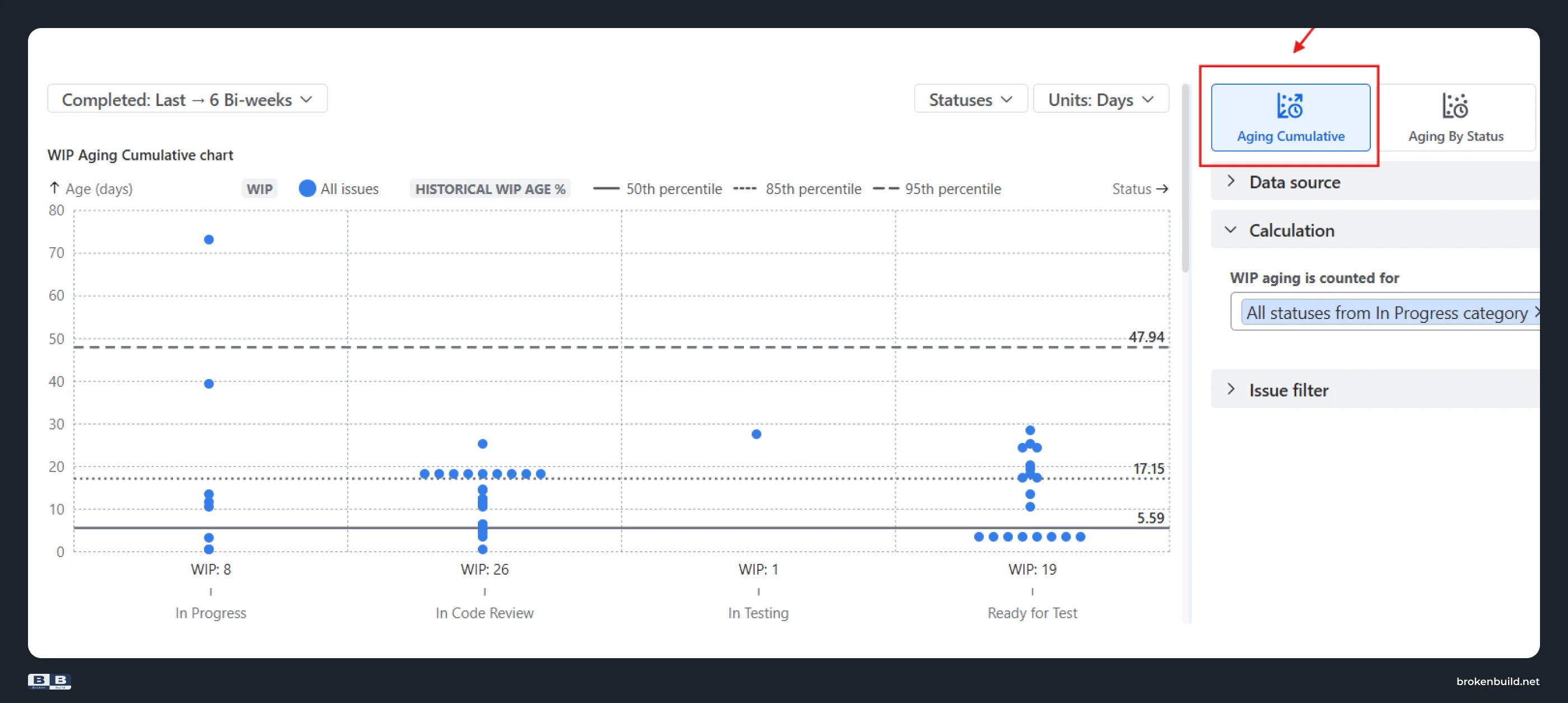
Three horizontal reference lines mark the 50th, 85th, and 95th percentiles of the team's historical cycle time, each labelled with the actual value in the selected time unit. In the example above, the 50th percentile sits at 5.59 days, the 85th at 17.15 days, and the 95th at 47.94 days.
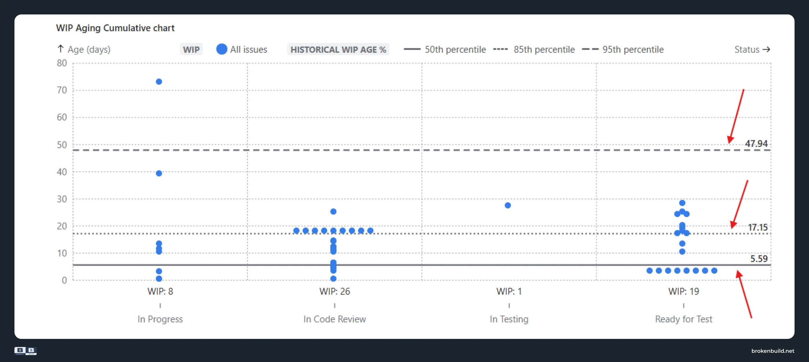
- Below the 50th percentile – flowing within normal bounds. No action needed.
- Between the 85th and 95th percentile – aging beyond where most completed work finishes. Worth discussing.
- Above the 95th percentile – in progress longer than nearly all historically completed items. Needs immediate attention.
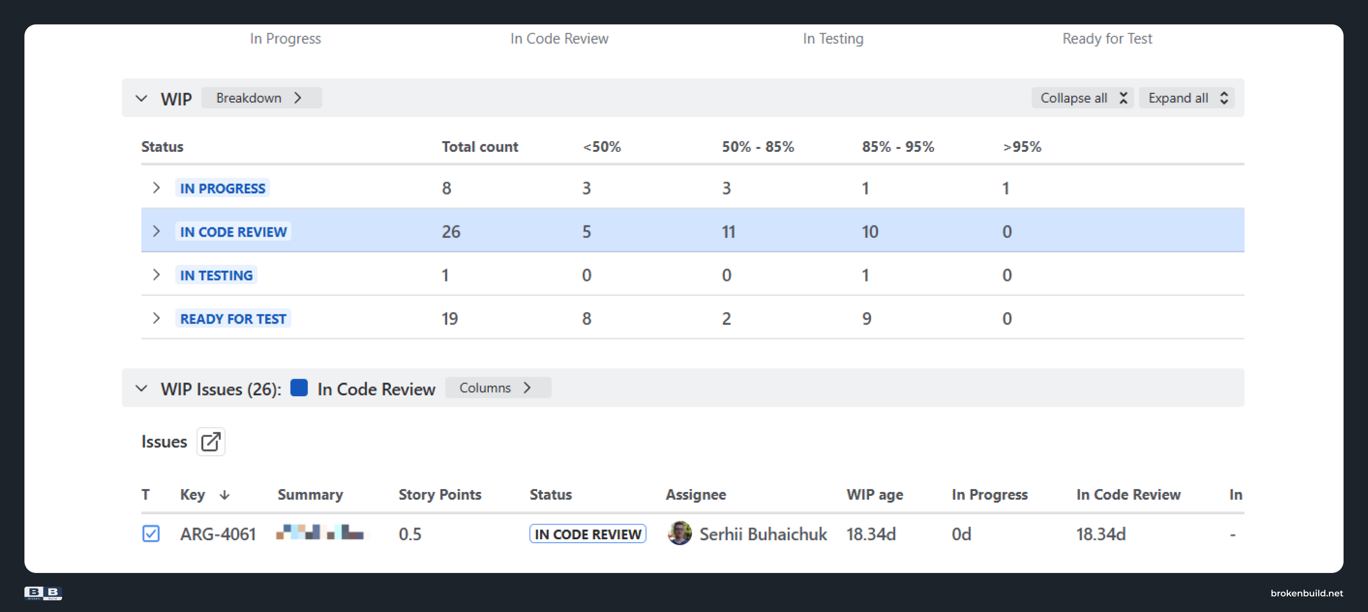
Below the chart, the Breakdown groups items by risk zone – under 50%, 50–85%, 85–95%, and above 95% of historical cycle time – so you can see at a glance how many work items sit in each band. Click into a zone to expand the list with key, summary, assignee, WIP age, and per-status time.
A chart type selector above the chart lets you switch between Aging Cumulative and Aging By Status without reconfiguring data source or filters. The By Status view remains available for diagnosing which specific stage is causing the delay once you have identified the outliers.
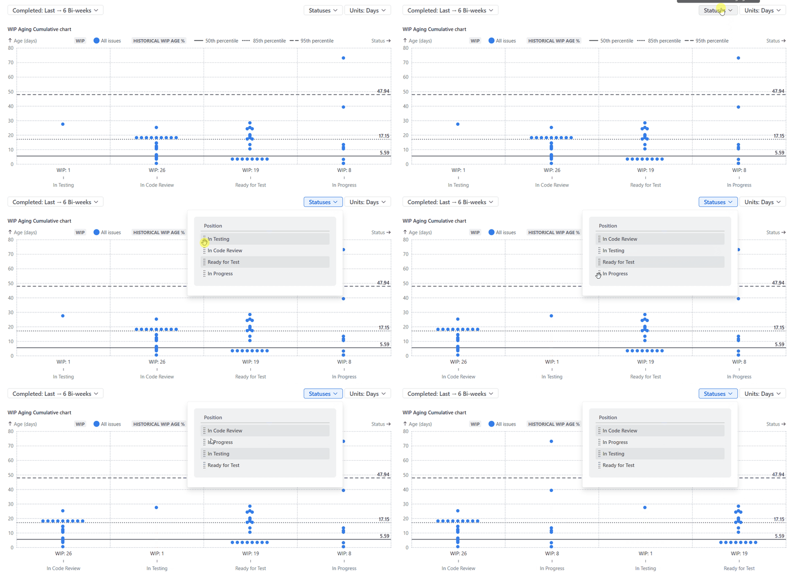
The same release adds drag-and-drop status reordering. Open the Statuses menu, drag columns into your team's actual workflow sequence, and the chart updates to display statuses left to right in the order work moves through your process.
Practical playbook: standup triage with the Aging Cumulative chart
Here is how to put cumulative aging to work in your next standup or daily triage session:
- Open the WIP Aging chart and switch to Aging Cumulative using the chart type selector. The view shows every in-progress item's total age on a single axis, grouped by current workflow status.
- Set column order to match your workflow. If your process runs In Progress, In Code Review, In Testing, Ready for Test – open the Statuses menu and drag columns into that sequence. The chart should read left to right, matching the direction work actually flows.
- Scan for items above the 85th percentile line. These work items have been in progress longer than 85% of your team's historically completed items. They are the ones to discuss first – not because they are necessarily blocked, but because the probability of them finishing within normal bounds is dropping with each day.
- Use the percentile zones to prioritise the conversation. Items below the 50th percentile are on track. Items between the 50th and 85th are worth monitoring. Items between the 85th and 95th need active discussion. Items above the 95th need a decision today – reassign, pair, unblock, split, or escalate.
- Switch to Aging By Status for root cause. Once you have identified the outliers in cumulative view, flip to the per-status chart to see where the time is concentrating. A work item aging above the 95th percentile that has spent most of its time in code review tells a different story from one stuck in testing.
- Act while the item is still in progress. The value of a leading indicator is the window it gives you to intervene before the sprint or cycle closes. As Aktia Solutions notes, "in a stable system, percentile 85% of lead time and percentile 85% of aging should be similar" (Kanban Metrics) – when aging consistently exceeds your lead time benchmarks, that is a signal to investigate flow health, not just individual work items.



From mental arithmetic to a 10-second visual scan
Standup triage shouldn't require mental addition across five status columns for every in-progress item. With cumulative aging, you get one number per item – total time in progress – compared against your team's own percentile benchmarks. Items that need attention surface the moment you open the chart: above the 85th percentile line, worth discussing; above the 95th, needs a decision today.
Add workflow-ordered columns, and the chart's left-to-right diagonal tells you whether work is flowing normally before you read a single data point. Two capabilities, one shared screen, and the standup conversation starts exactly where it should.
Agile WIP Charts brings both to Jira Cloud as a standalone app focused on WIP aging analysis. If your team also needs cycle time analytics, throughput trends, cumulative flow diagrams, and Jira dashboard gadgets in one place, Agile Reports and Gadgets bundles WIP Charts with the full reporting suite – version 9.3.0 includes the Aging Cumulative chart and status reordering alongside the rest of the chart library.




.png)