

Native Jira gives you two reports for lead time – the Resolution Time Report's mean bars and the Control Chart's rolling-average scatterplot – and neither can produce the SLA percentile you'd actually commit to. Agile Cycle Time Charts gives you lead time as the exact percentile that matches your SLA – with the working-schedule, distribution view, and drill-down that make the number both honest and actionable.
What is lead time?
Lead time is the elapsed time between identifying a requirement and fulfilling it. The term originates from Lean manufacturing (Toyota Production System) and measures the interval from when an order is placed until the product is delivered.
In software development, lead time represents the time between formulating a user story and deploying that feature to production for actual users.
"Lead time measures how long it takes for a request to be fulfilled, starting from the moment of request and ending when the value is delivered to the end user."
– Scrum Alliance
Teams using Kanban methodology favour lead time as their primary metric over velocity. Why? Because lead time captures the end-to-end delivery experience – the full wait from "I need this" to "I have this" – while velocity only tells you how much got done inside a sprint.
Lead time vs cycle time – when to use which
Lead time and cycle time both measure how long work takes, but from different perspectives. For a deeper dive, see Lead time vs cycle time – why both matter in Agile environments.
Lead time starts when the request is created and ends when the value is delivered. It captures the requestor perspective – the full wait time including any backlog queue.
Cycle time starts when work begins and ends when work is complete. It captures the team perspective – only the active work period.
Cycle time is always a subset of lead time. Lead time includes any waiting time before work starts – the backlog queue, triage time, prioritisation delays.
When to use which:
- SLA tracking – use lead time. Stakeholders don't care when you started working – they care when the work was delivered.
- Bottleneck detection – use cycle time (or Time in Status). When work is active but slow, cycle time surfaces the problem.
- Both – Agile Cycle Time Charts lets you toggle between lead time and cycle time as first-class metrics, so you can answer either question from the same chart.
How to find lead time in native Jira
Native Jira offers two reports that touch on lead time.
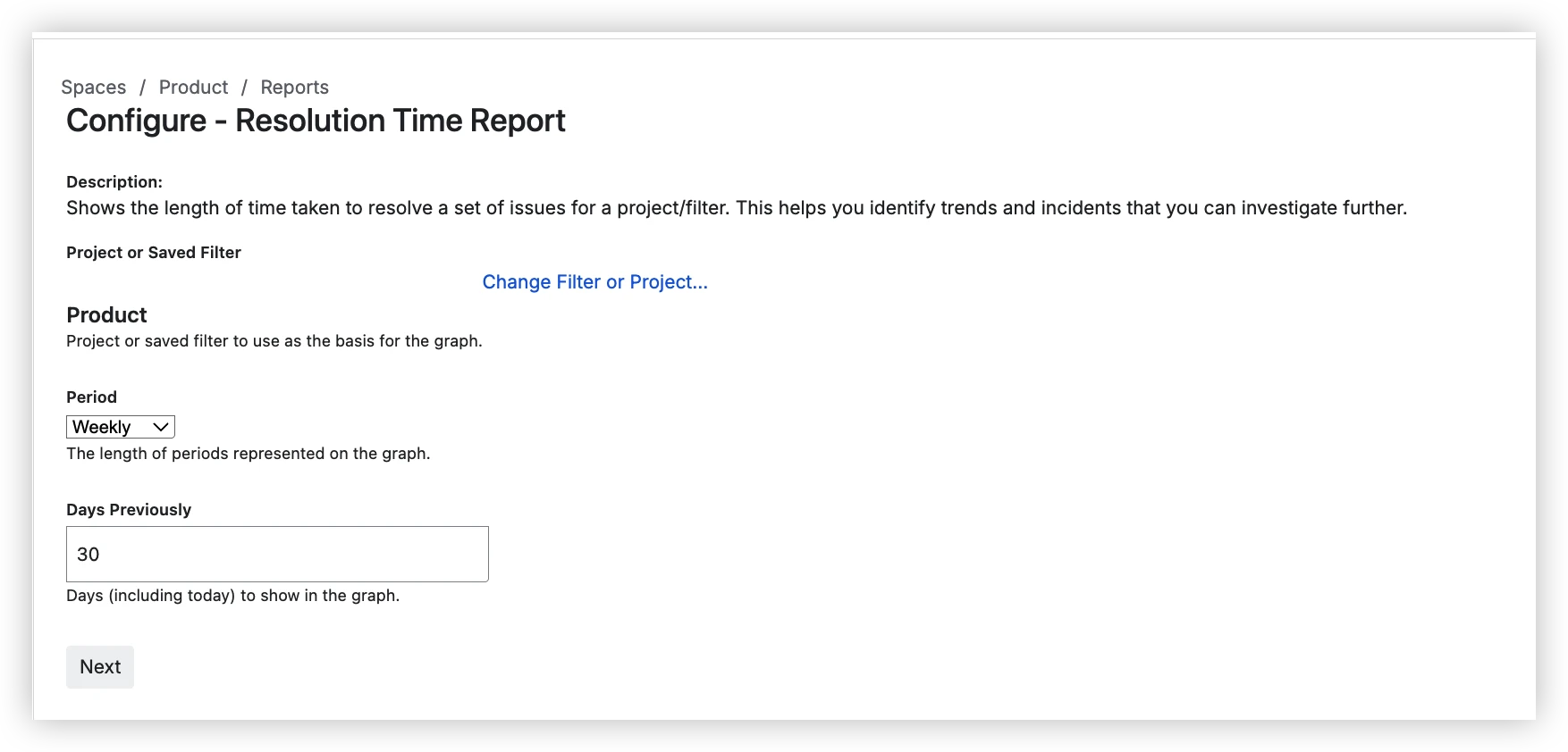
Resolution Time Report
Location: Project → Reports → Resolution Time Report
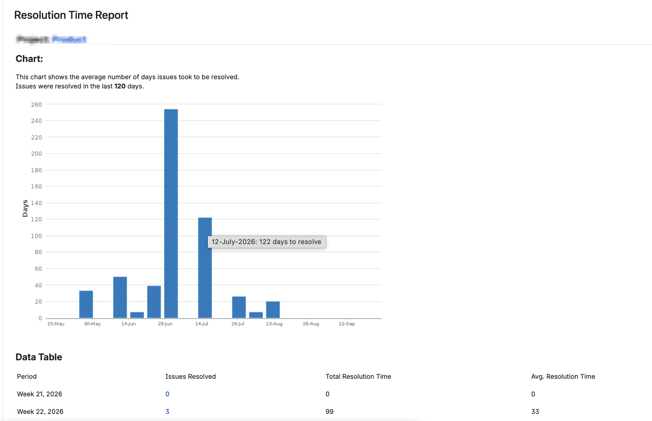
The Resolution Time Report shows the average resolution time per period for work items resolved in a project or saved filter. Each bar is the arithmetic mean of all tickets that closed in that period.
Configuration options:
- Project or Saved Filter – scope to a project or a single saved filter
- Period – Hourly, Daily, Weekly, Monthly, Quarterly, or Yearly grouping
- Days Previously – how many days to show (default 30)
Limitations:
- No percentile statistics – only arithmetic mean
- No drill-down to individual work items behind a bar
- No breakdown by epic, assignee, or work item type
- Calendar time only – weekends and holidays inflate the numbers
Control Chart
Location: Board → Reports → Control Chart
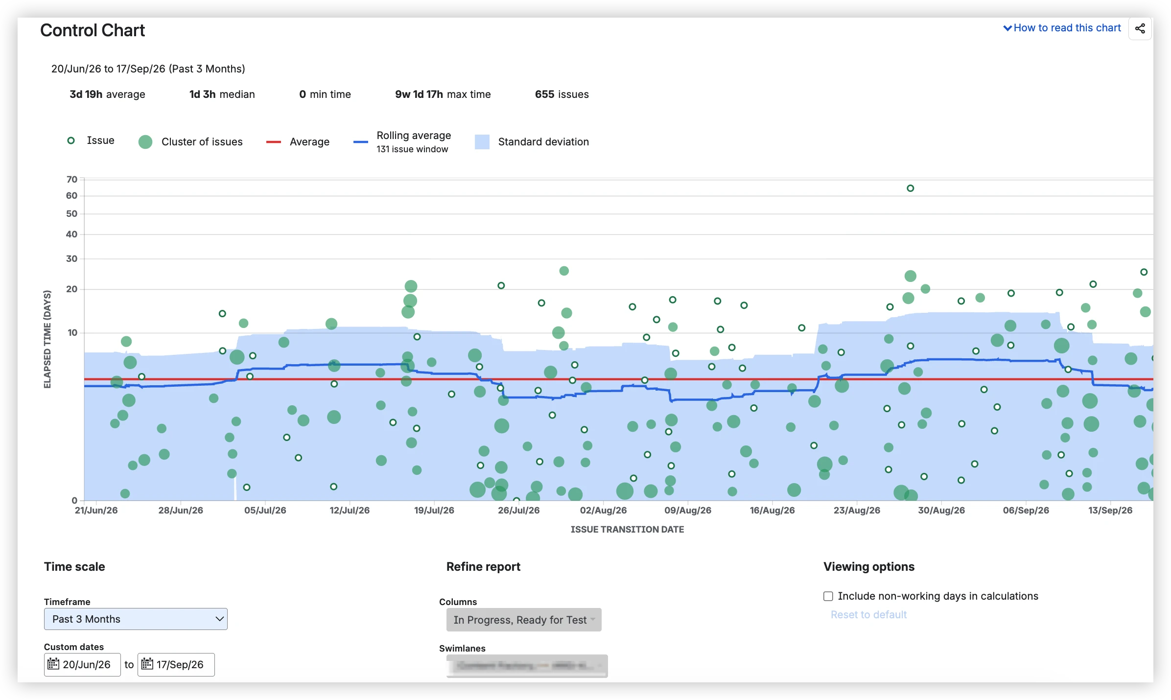
The Control Chart shows a scatterplot of individual work items and clusters with Average (red line), Rolling average (blue line), and a standard-deviation band. The chart calculates duration based on the board columns you select – include backlog columns for a lead-time view, or start from an In Progress column for cycle time.
What it shows:
- Issue (hollow dot) – one completed work item
- Cluster of issues (filled green dot) – multiple items with similar cycle time
- Average (red line) – overall average cycle time
- Rolling average (blue line) – calculated over a sliding window of items
- Standard deviation band – narrow band indicates predictable delivery
Configuration options:
- Timeframe – preset ranges (Past 3 Months, etc.) or Custom dates
- Columns – select which board columns to include in the cycle time calculation
- Swimlanes – filter by swimlane
- Include non-working days in calculations – checkbox to include/exclude non-working days
Limitations:
- Board-scoped only – can't aggregate across boards or projects
- Company-managed spaces only – team-managed projects get no Control Chart
- No percentile statistics – only Average and Rolling average
- No per-status breakdown – can't see which workflow stage is slow
- Basic non-working days toggle – no working hours, no holidays
Where the Resolution Time Report and Control Chart fall short on lead time
Both native reports show average resolution time – the Resolution Time Report as period bars, the Control Chart as a scatterplot with rolling average. Neither has percentiles, neither has per-status breakdown, neither has working-schedule configuration, and neither lets you drill down to find the specific outlier.
What Agile Cycle Time Charts offers
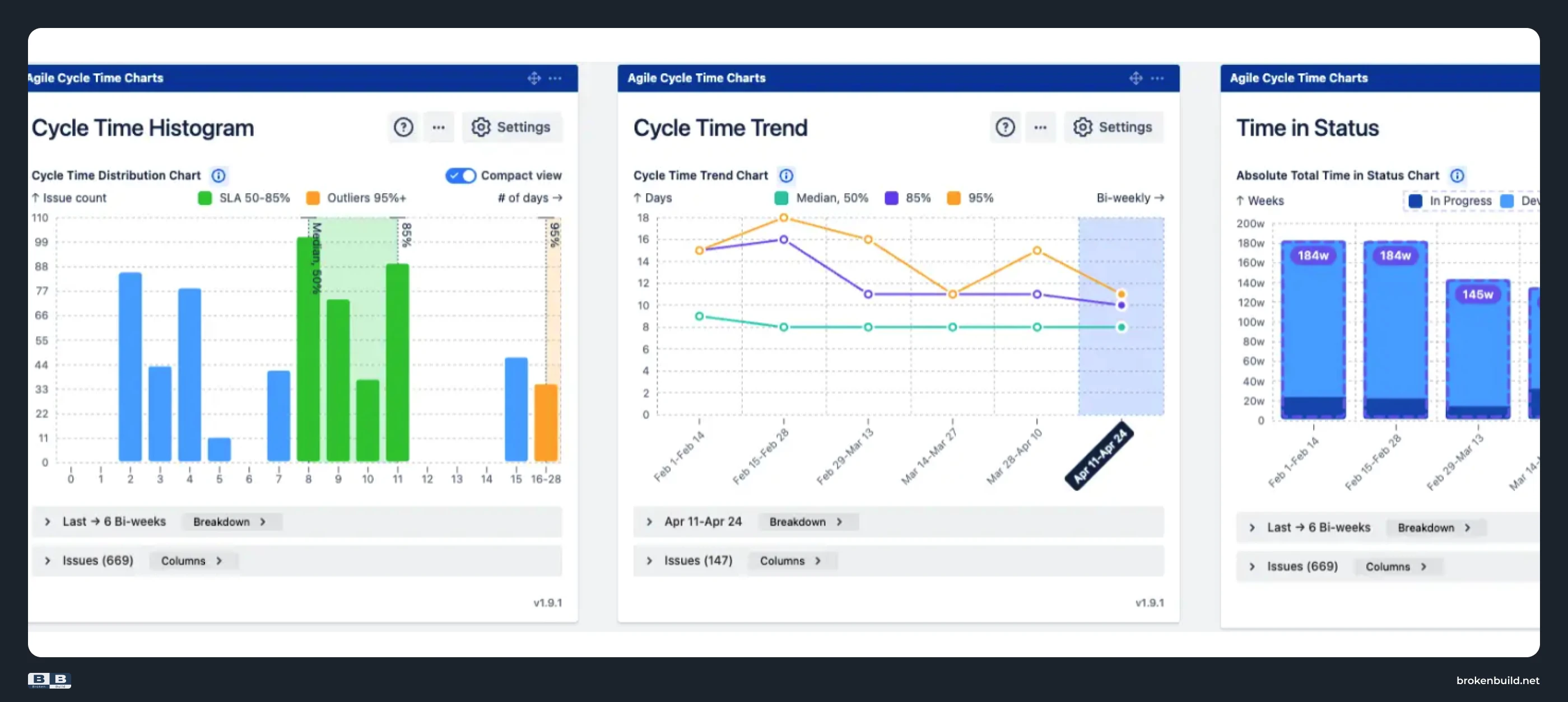
Three chart types, each answering a different question:
- Cycle Time Histogram – distribution shape (long tail? bimodal?)
- Cycle Time Trend – P50/P85/P95 over time (is the SLA-relevant number improving?)
- Time in Status – which workflow stage the lead time is being spent in
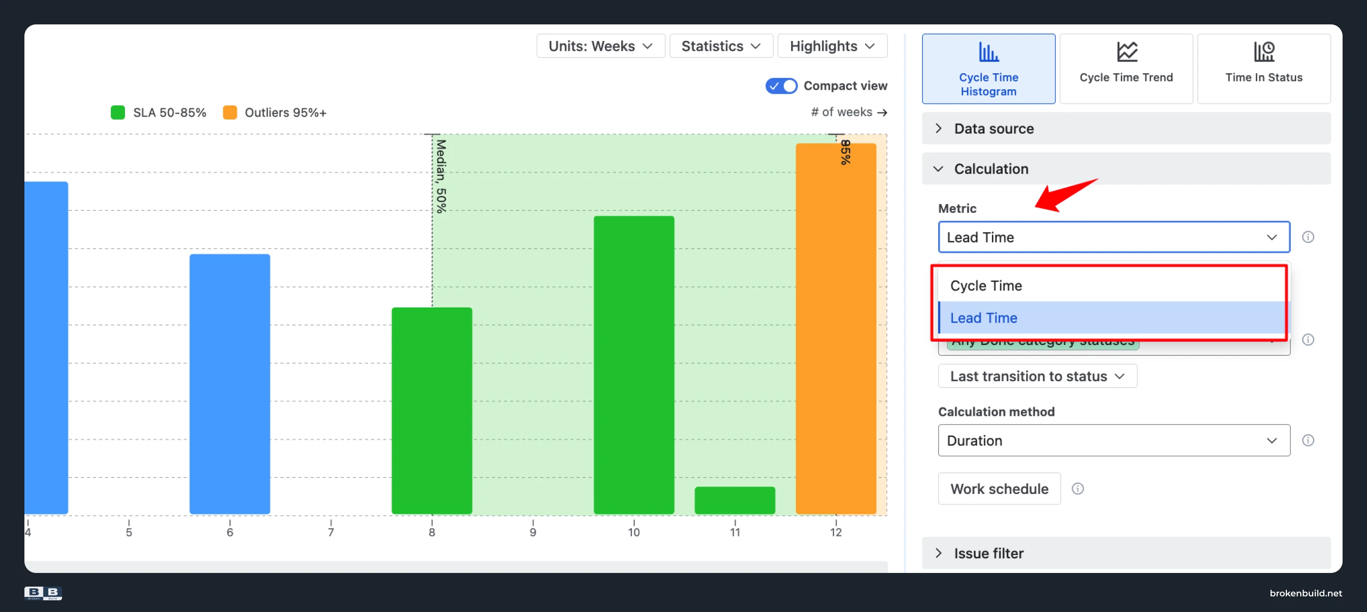
Lead time and cycle time as first-class metrics. In Cycle Time Histogram and Cycle Time Trend, one toggle switches between lead time (creation → Done) and cycle time (In Progress → Done) – not a workflow reconfiguration or a switch between reports.
Here are seven gaps the three chart types fill.
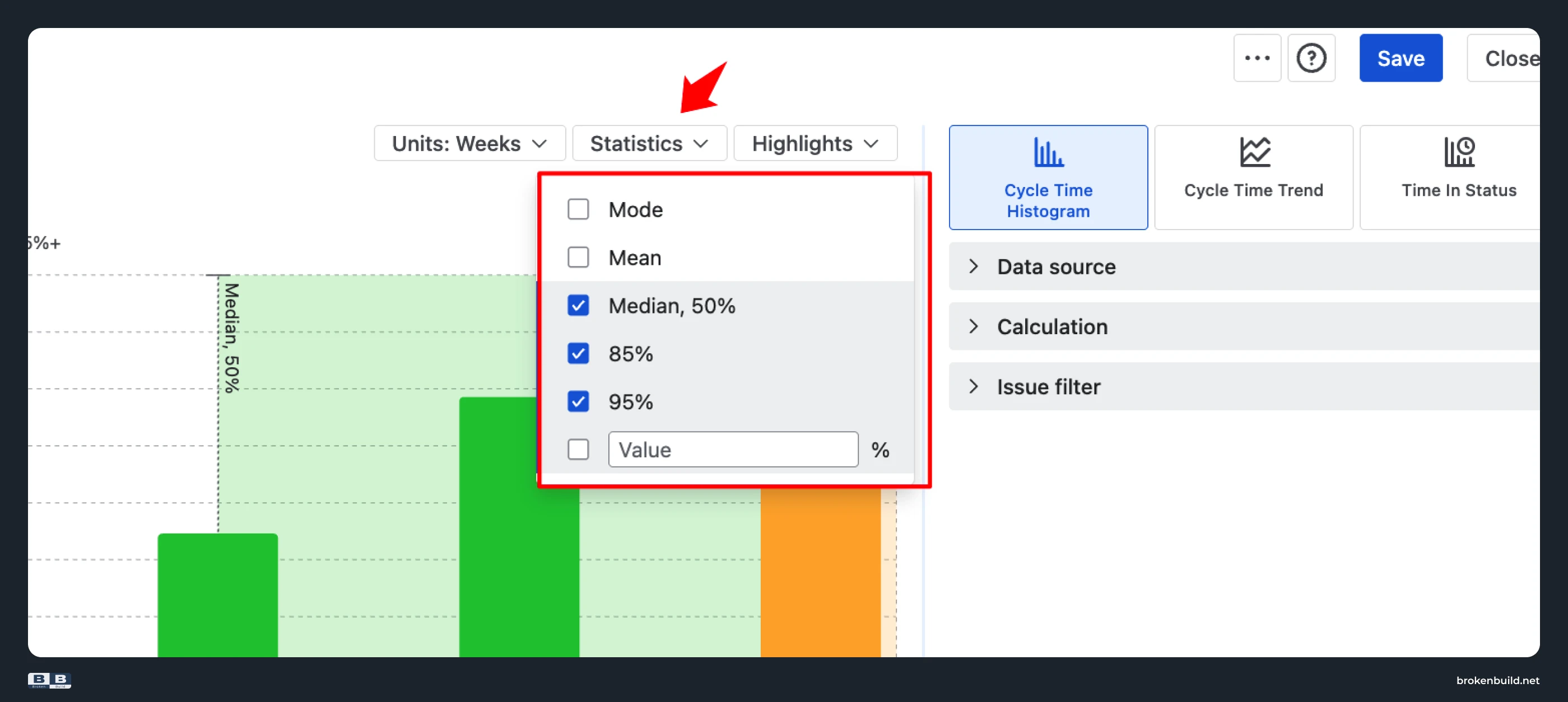
1️⃣ Average or rolling average only → SLA-grade percentiles
Native Resolution Time Report: Arithmetic average per period (daily, weekly, monthly, etc.). One 240-day legacy ticket clearing sends that period's bar into the stratosphere.
Native Control Chart: Average (red line) and Rolling average (blue line) – but both are central-tendency numbers easily dominated by outliers.
Neither report offers percentiles. You can't ask "What's our P85 lead time?" – the number you'd actually commit to in an SLA.
Agile Cycle Time Charts by Broken Build: Mode, Mean, Median, P85, P95, or a custom percentile – all available as reference lines and plotted trends. P85 and P95 are the SLA numbers that survive outliers.
2️⃣ Calendar time only → working schedule
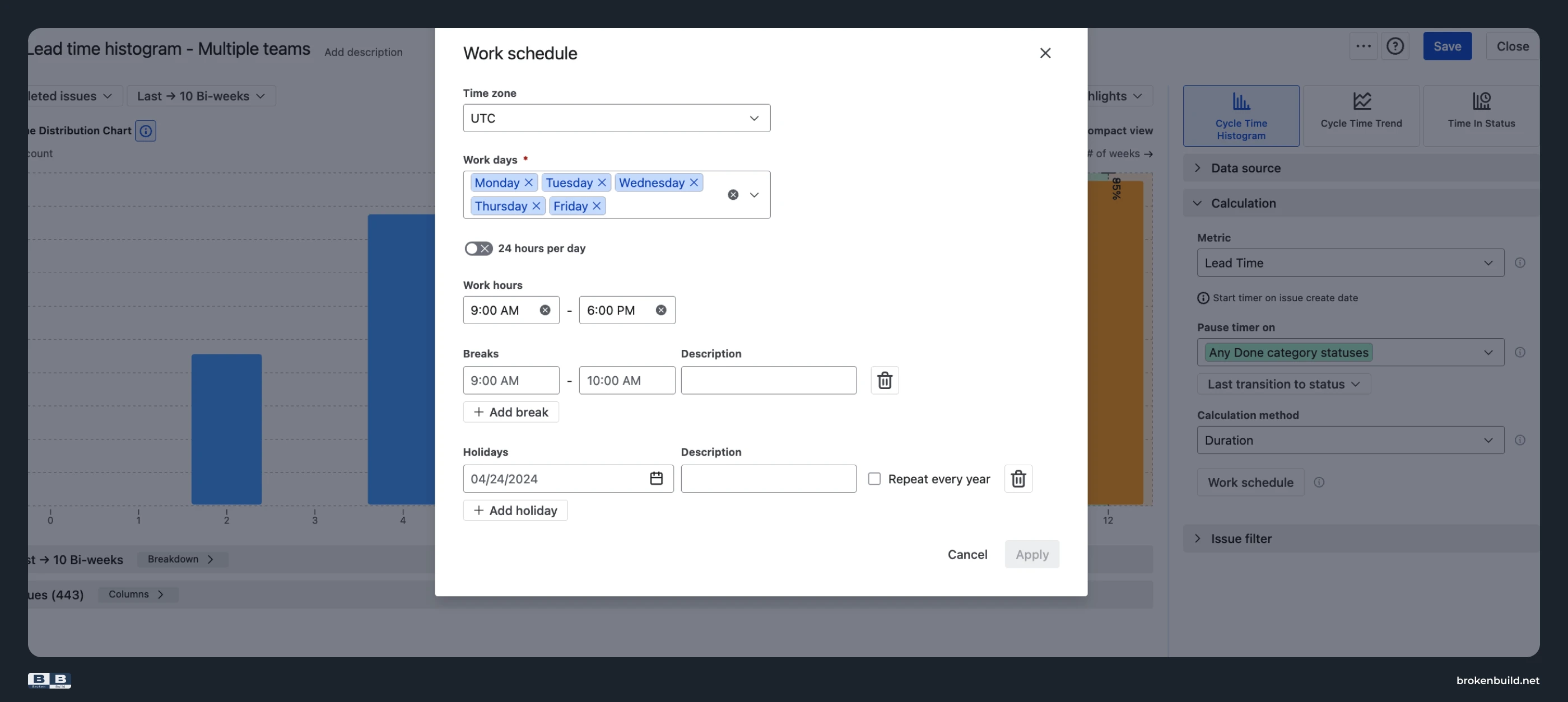
Native Resolution Time Report: Counts calendar days.
Native Control Chart: Has a non-working days toggle, but no working hours and no holiday calendar.
A ticket that sat over a weekend shows 2 extra days. A two-week holiday inflates every number by 14 days. An SLA measured in business hours can't be tracked honestly.
Agile Cycle Time Charts by Broken Build: Configure time zone, working days, working hours, breaks, and recurring holidays. A ticket that sat over a weekend produces a smaller Duration figure than one that sat through the work week.
3️⃣ Hard-coded timer → custom definitions
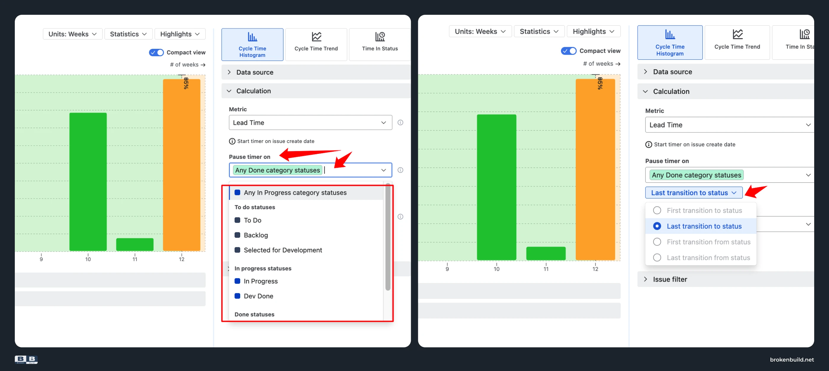
Native Resolution Time Report: Hard-coded to creation → resolution date.
Native Control Chart: Tied to board columns.
If your process starts before ticket creation or ends after Jira's resolution field, native can't measure it.
Agile Cycle Time Charts by Broken Build: Timer configuration by status or transition. Define exactly what "lead time" means for your team – "request submitted" → "delivered", or any other combination.
4️⃣ No visual markers → SLA and outlier highlights
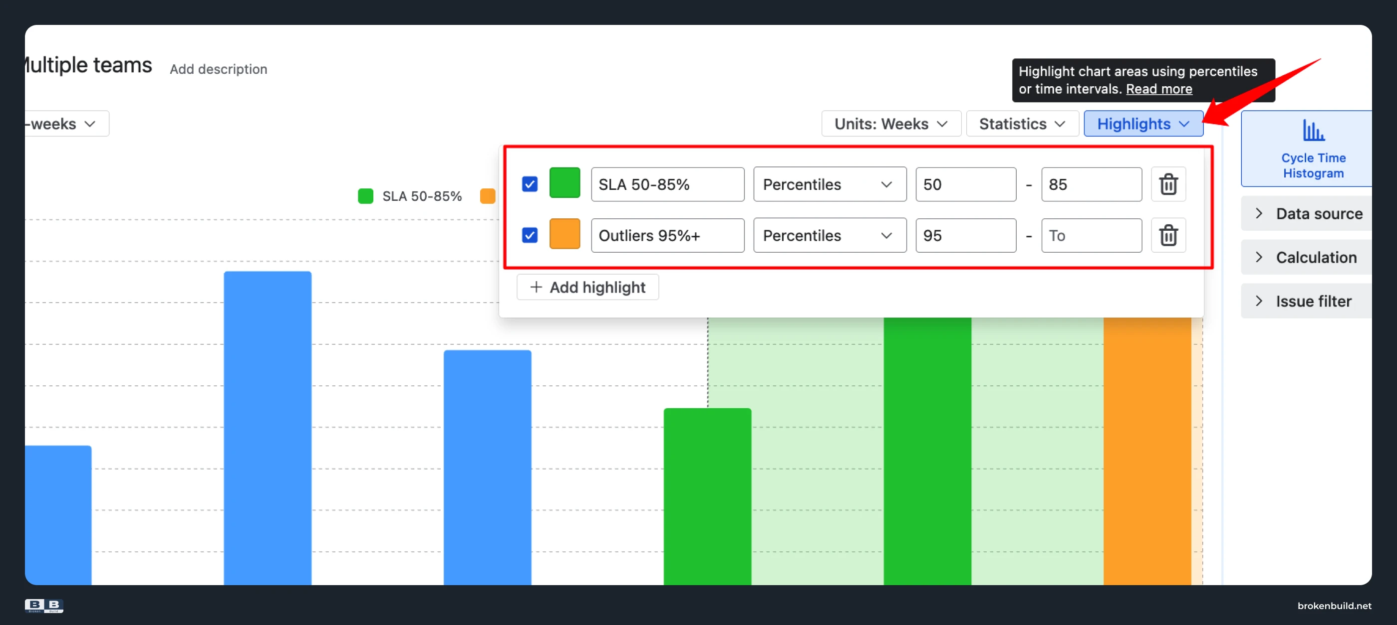
Native Resolution Time Report & Native Control Chart: Raw data only.
You spot outliers by eye – there's no visual marker for "this is in the SLA zone" or "this is an outlier."
Agile Cycle Time Charts by Broken Build: Highlights mark SLA (50-85%) and Outliers (95%+) as coloured zones directly on the chart. Risk is visible at a glance.
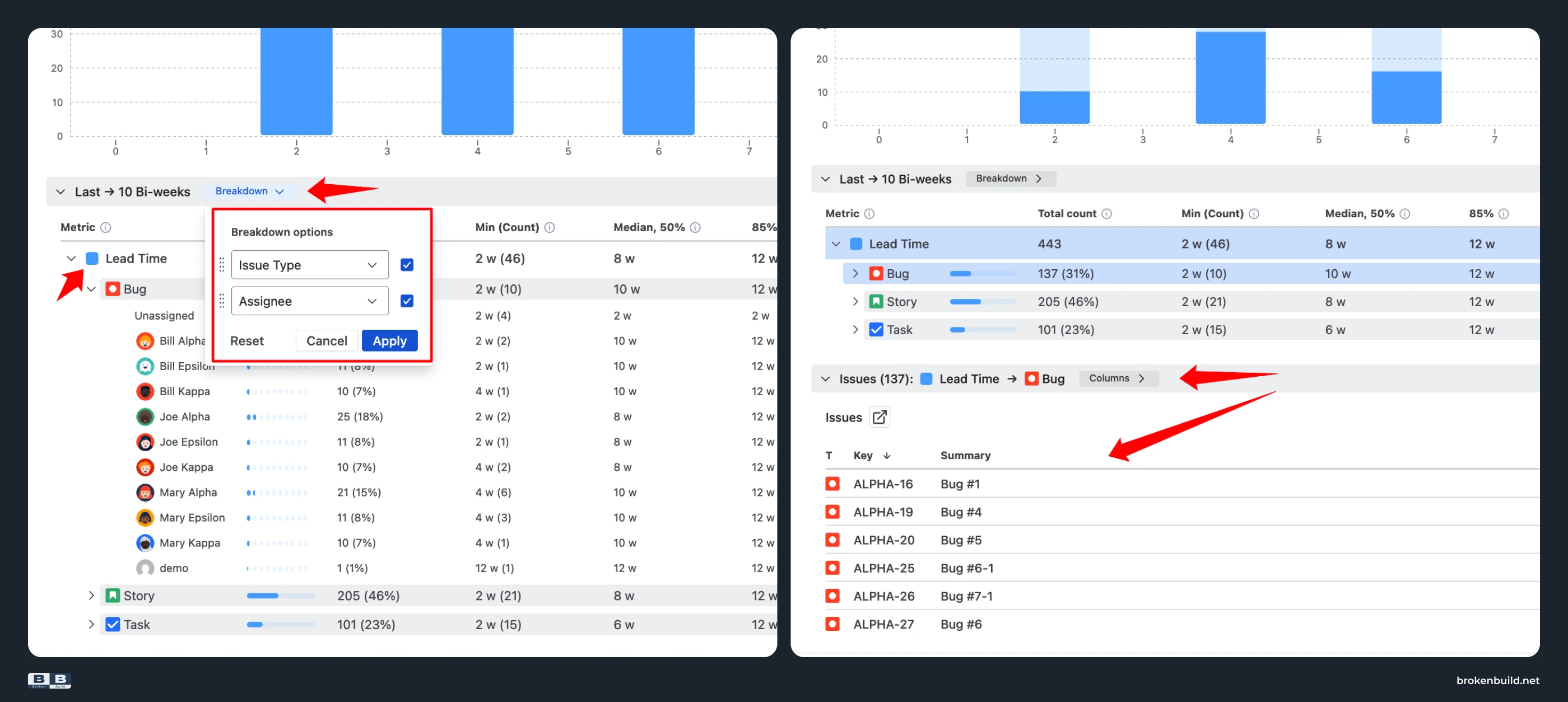
5️⃣ No drill-down → breakdown + issue list
Native Resolution Time Report: No breakdown, no issue list. You see a 240-day bar but can't click to find which ticket.
Native Control Chart: Can click individual dots, but no breakdown by dimension.
Agile Cycle Time Charts by Broken Build: Breakdown on any Jira field (up to two nesting levels) – "which work item types resolve slowest?", "which epic dragged the average up?", "is one assignee markedly slower?" – plus an issue list with click-through to Jira.
6️⃣ Scope-locked → any scope
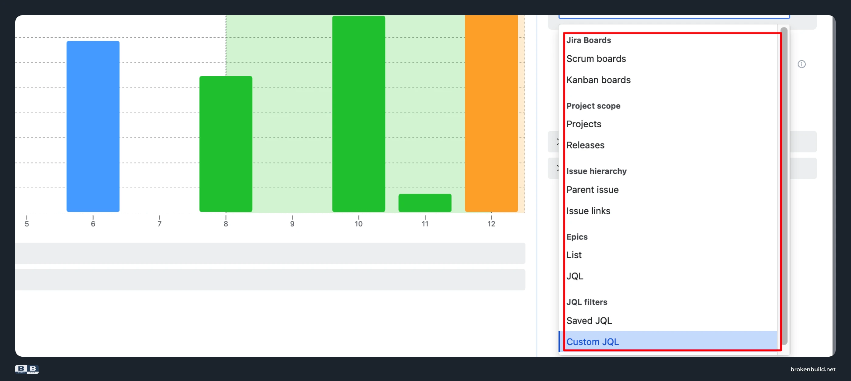
Native Resolution Time Report: Project or single saved filter.
Native Control Chart: Board-scoped – and company-managed only.
Agile Cycle Time Charts by Broken Build: Any scope – Scrum boards, Kanban boards, projects, releases, initiatives, epics, saved filters, custom JQL – and combinations. Works in both company-managed and team-managed spaces.
7️⃣ Reports tab only → dashboard and Confluence
Native Resolution Time Report: Reports tab.
Native Control Chart: Reports tab.
Neither report can be added to a dashboard or embedded in Confluence.
Agile Cycle Time Charts by Broken Build: Dashboard gadget plus Confluence Smart Link embed. Filters, grouping, and calculations stay editable inside Confluence.
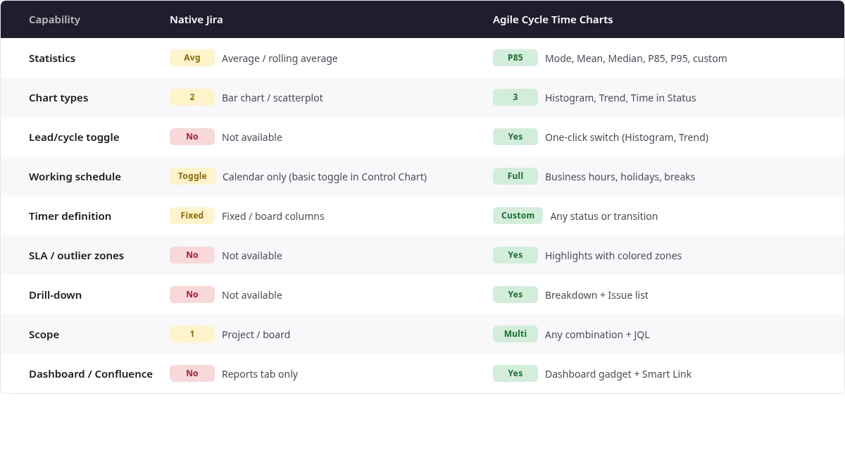
Jira lead time – native vs Agile Cycle Time Charts at a glance
Do you need more than native?
- Does your SLA specify a percentile (P85, P95) rather than an average?
- Do you need to exclude weekends and holidays from lead time?
- Do you need to know which workflow stage is causing delays?
- Do you need to aggregate lead time across multiple boards or projects?
- Do you need lead time visible on a dashboard or Confluence page?
If yes to any, native can't help.


Why not other alternatives?
Other Jira reporting apps offer some of these capabilities but lack others. Some have percentile statistics but no working-schedule awareness. Some support multi-board scope but miss the Time in Status breakdown. Agile Cycle Time Charts is the only solution that combines SLA-grade percentiles, three chart types, working-schedule support, and flexible scope in one package.
Part of Agile Charts and Gadgets
Agile Cycle Time Charts is also available as part of Agile Reports and Gadgets – a suite that includes Velocity Charts, Burnup/Burndown Charts, Throughput Charts, WIP Charts, and Cumulative Flow Charts for teams that need broader analytics.
Try Agile Cycle Time Charts in action
See the app working with real data – no installation needed.
When native reports are enough – and when lead time needs Agile Cycle Time Charts
Native's Resolution Time Report works if you only need a rough daily average for one project, don't care about percentiles, and don't need to act on outliers. The Control Chart adds a scatterplot view with standard deviation, but shares the same fundamental limits.
But the moment you need to commit to an SLA percentile, exclude weekends from the calculation, diagnose which workflow stage is dragging, or roll up multiple boards – native stops.
Agile Cycle Time Charts picks up where the Resolution Time Report and Control Chart end.




.png)