

Native Jira's Velocity Chart shows planned (Commitment) and actual (Completed) as two absolute bars per sprint – but leaves the gap to eyeball, never publishes a ratio, and gives you no way to configure what "planned" and "actual" actually mean. Broken Build's Agile Velocity Charts turns planned vs actual into a fully configurable ratio you can trend, target, benchmark side by side across teams, and drill into.
What is planned vs actual in Jira?
Planned work is what a team commits to at sprint start – measured in story points, work item count, or time. Actual work is what the team delivers by sprint end. The gap between them answers the question every stakeholder eventually asks: did we do what we said we would?
Jira has no dedicated planned-vs-actual chart. The closest native report is the Velocity Chart, available on Scrum boards only. It plots two bars per sprint – Commitment (planned) and Completed (actual) – plus a horizontal Average line. The gap between the bars is left for your eye to estimate. Native Jira never calculates this ratio as a number.
How to see planned vs actual in native Jira
Open any Scrum board in Jira Cloud and navigate to Board → Reports → Velocity Chart. The Velocity Chart is available only on Scrum boards. Kanban teams have no native equivalent.
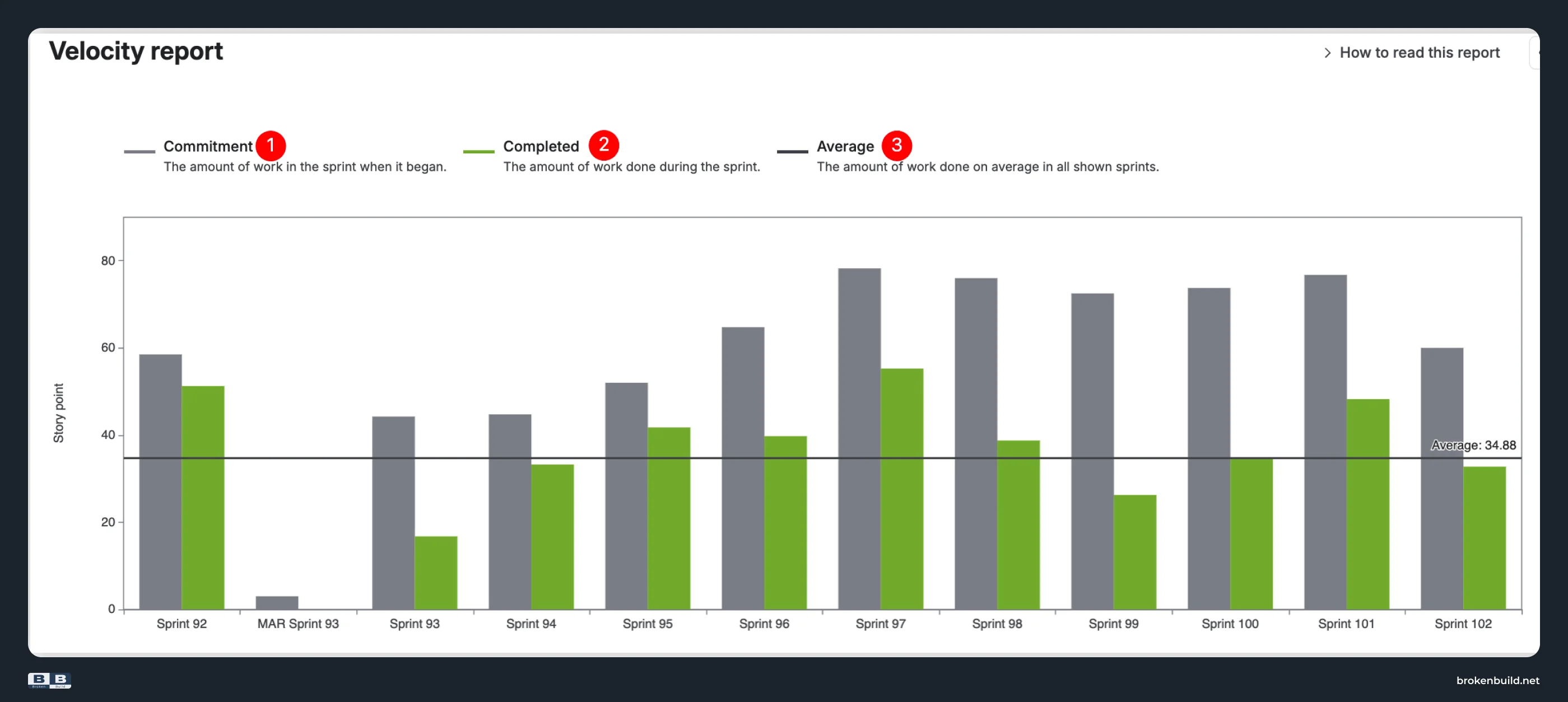
The chart plots three elements per sprint:
- Commitment (gray bar) – work in the sprint when it began. This is the initial plan, fixed at sprint start.
- Completed (green bar) – work moved to Done by sprint end. Everything delivered, regardless of when it entered the sprint.
- Average (horizontal line) – arithmetic mean of Completed values across displayed sprints. Not a ratio – just the average of absolute completed work.
For a detailed walkthrough of these three elements and why they are not enough to diagnose a sprint miss, see the Jira sprint velocity article.
Where native satisfies – and where it falls short
Native Velocity Chart shows the outcome (did we hit it?) but never the cause (why not?). If a sprint misses, native can't tell you whether it was scope creep, rollover from a previous sprint, estimation drift, or mid-sprint additions. Broken Build's Agile Velocity Charts app adds the metrics, views, and configurability to turn planned vs actual into a real KPI. Eight capabilities make the difference.
1️⃣ Fixed "planned" metric → configurable commitment
Native Velocity Chart: Commitment is fixed to initial scope at sprint start. If 20 points were added mid-sprint and 15 of them were completed, native counts that toward Completed but not toward Commitment – inflating the ratio you would mentally calculate.
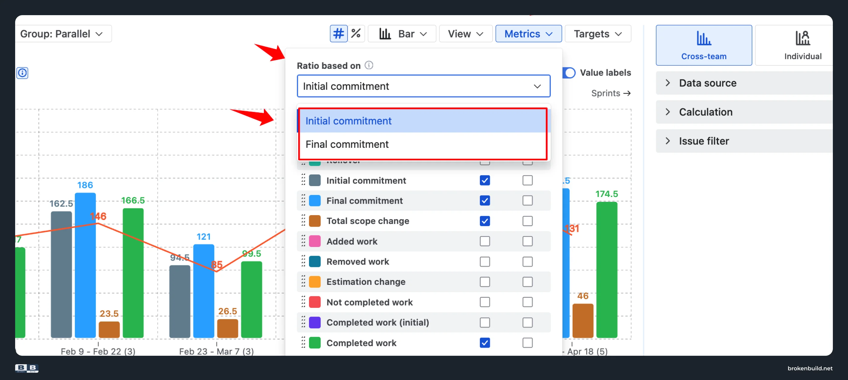
Agile Velocity Charts by Broken Build: Choose your "planned" metric: Initial commitment (planning-time accuracy – did we deliver what we said we would at sprint start?) or Final commitment (execution accuracy – did we deliver what we ended up committing to after mid-sprint changes?). Two subtly different KPIs, both first-class.
2️⃣ Fixed "delivered" metric → configurable completed + done status
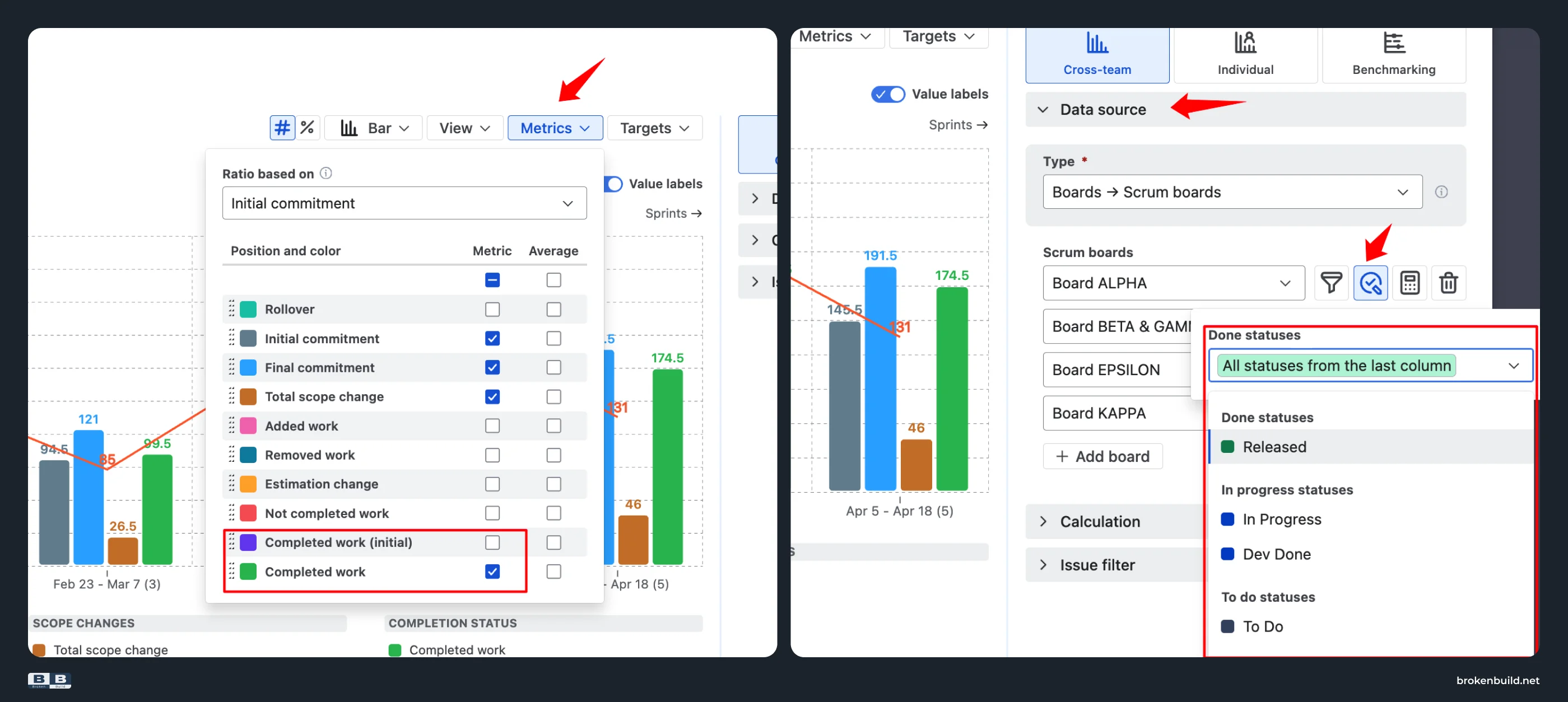
Native Velocity Chart: Completed is one bar with no distinction between original scope and mid-sprint additions. Native also decides a work item is "Done" based on your board's rightmost column – so if your team considers work delivered at "In Review" or "QA Passed", the ratio looks artificially low.
Agile Velocity Charts by Broken Build: Choose your "delivered" metric: Completed work (everything delivered, including mid-sprint additions) or Completed work (initial) (only what was delivered from the original commitment). Plus, configure Custom done statuses – mark any workflow statuses as "completed", matching how your team actually finishes work.
3️⃣ Absolute values only → percentage view with ratio KPI
Native Velocity Chart: Only absolute story-point values. The Average line is the arithmetic mean of completed work – not the average planning-accuracy ratio.
Agile Velocity Charts by Broken Build: Switch between absolute values and a normalized percentage view, calculated against either initial or final commitment. In percentage mode, the Average line becomes the average planned-vs-actual ratio across sprints – a single-number KPI you can quote to leadership ("our team averages 87% delivery accuracy"). Compare planning accuracy across sprints on a normalized axis – even when team size or estimation scale drifts.
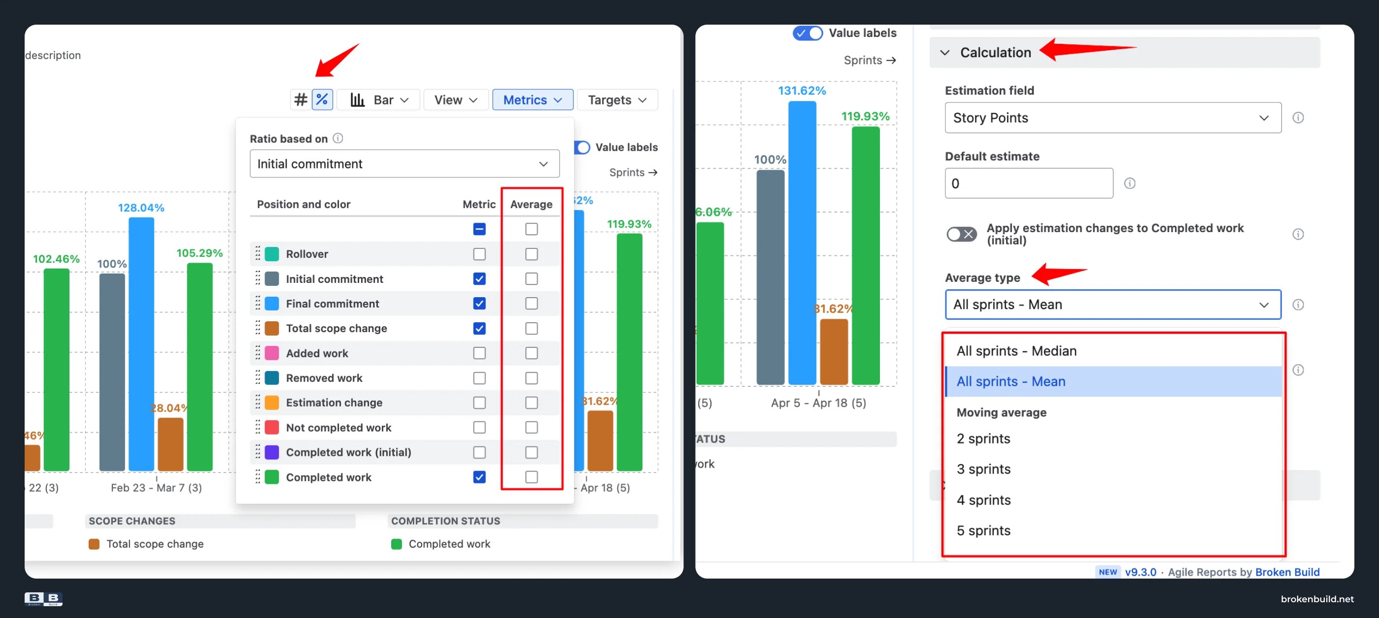
4️⃣ Two metrics → ten sprint metrics (4 core + 6 diagnostic)
Native Velocity Chart: Two metrics – Commitment, Completed. A 30% miss could be scope creep, rollover, estimation drift, or removed work. Native cannot tell you which.
Agile Velocity Charts by Broken Build: Ten sprint metrics instead of three.
Four core metrics for the planned vs actual:
- Initial commitment – the scope planned at the start of the sprint
- Final commitment – the scope at the end of the sprint, after mid-sprint changes
- Total scope change – how much work was added, removed, or re-estimated during the sprint
- Completed work – the total completed scope, including any items added during the sprint
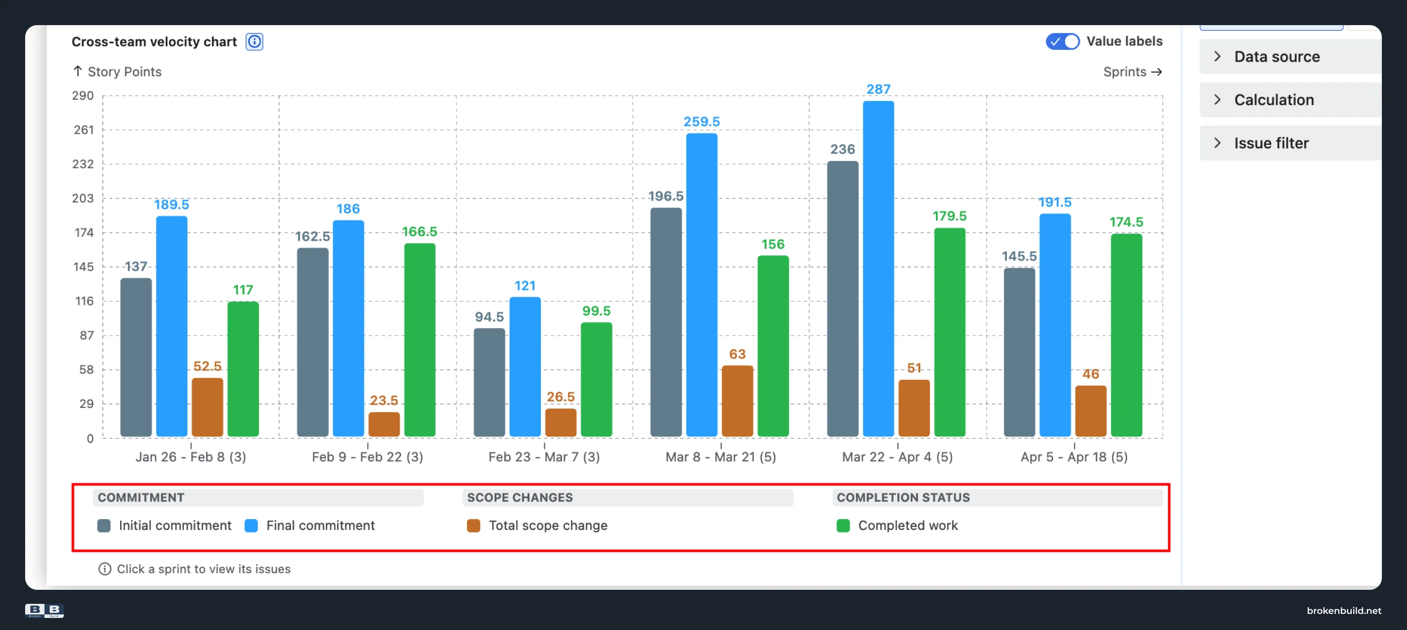
Six diagnostic metrics to explain why the ratio missed:
- Rollover – unfinished work carried from prior sprints
- Added work – work added after sprint start
- Removed work – work removed after sprint start
- Estimation change – re-estimations of existing items
- Not completed work – work that did not finish
- Completed work (initial) – delivered from the original commitment only
A 60% ratio decomposes into "20% scope creep, 15% rollover, 5% removed work" – not just "we missed."
5️⃣ No targets → targets with flexible calculation
Native Velocity Chart: Only the Average line, which is the arithmetic mean of completed – not a goal.
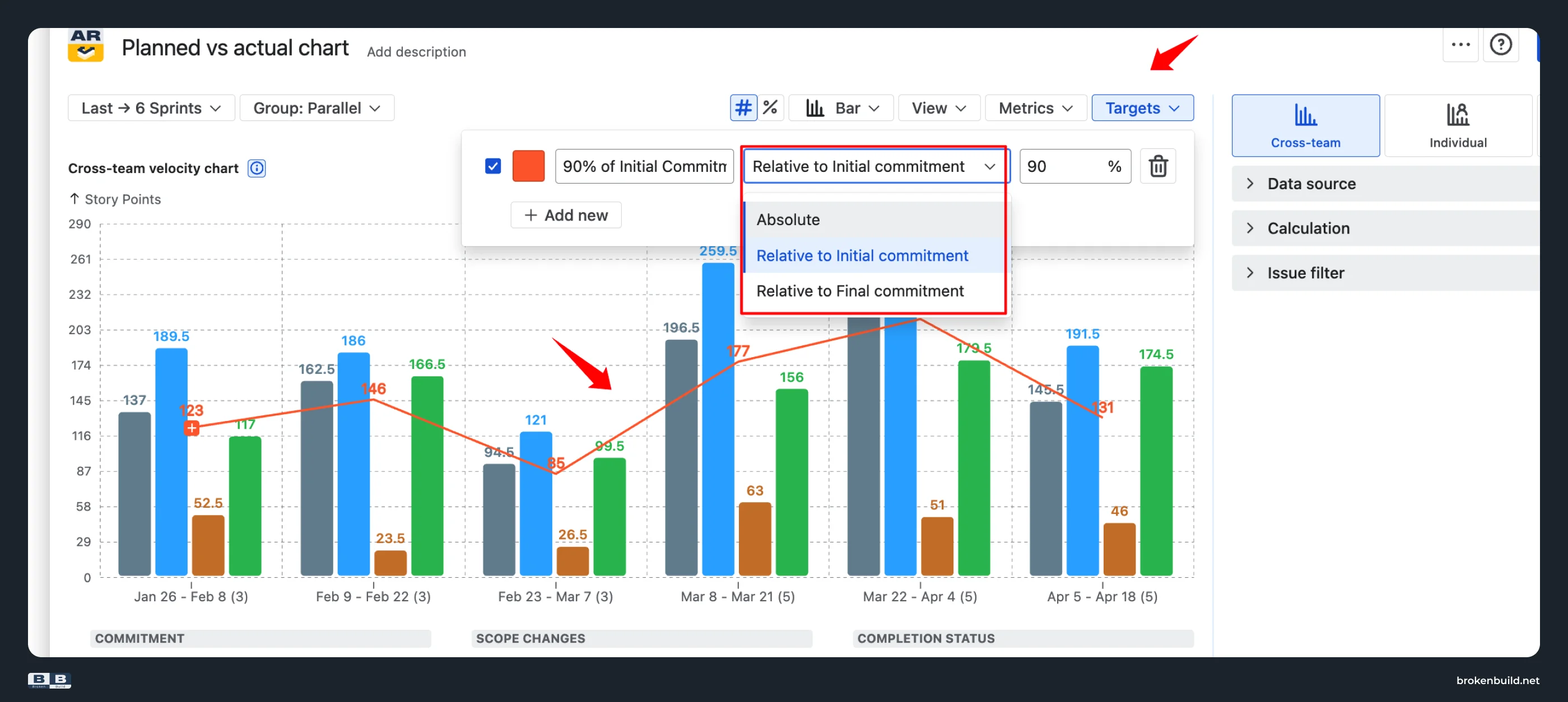
Agile Velocity Charts by Broken Build: Overlay target lines directly on the chart with three calculation options: Absolute (fixed story-point value), Relative to Initial commitment (e.g. 90% of what was planned at sprint start), or Relative to Final commitment (90% of what the sprint contained after mid-sprint changes). "We aim for ≥ 90% delivery accuracy" becomes a visible goal you can track across sprints.
6️⃣ One board only → cross-team comparison and roll-up
Native Velocity Chart: Locked to one Scrum board. No cross-board, cross-project, or cross-team view. Program leads cannot compare Team A's ratio to Team B's in the same chart.
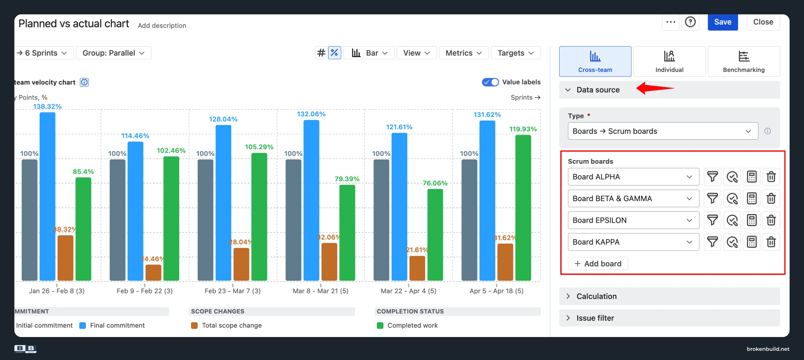
Agile Velocity Charts by Broken Build: Two views for program leads. The Cross-team velocity chart aggregates multiple teams into one program-level planned-vs-actual view.
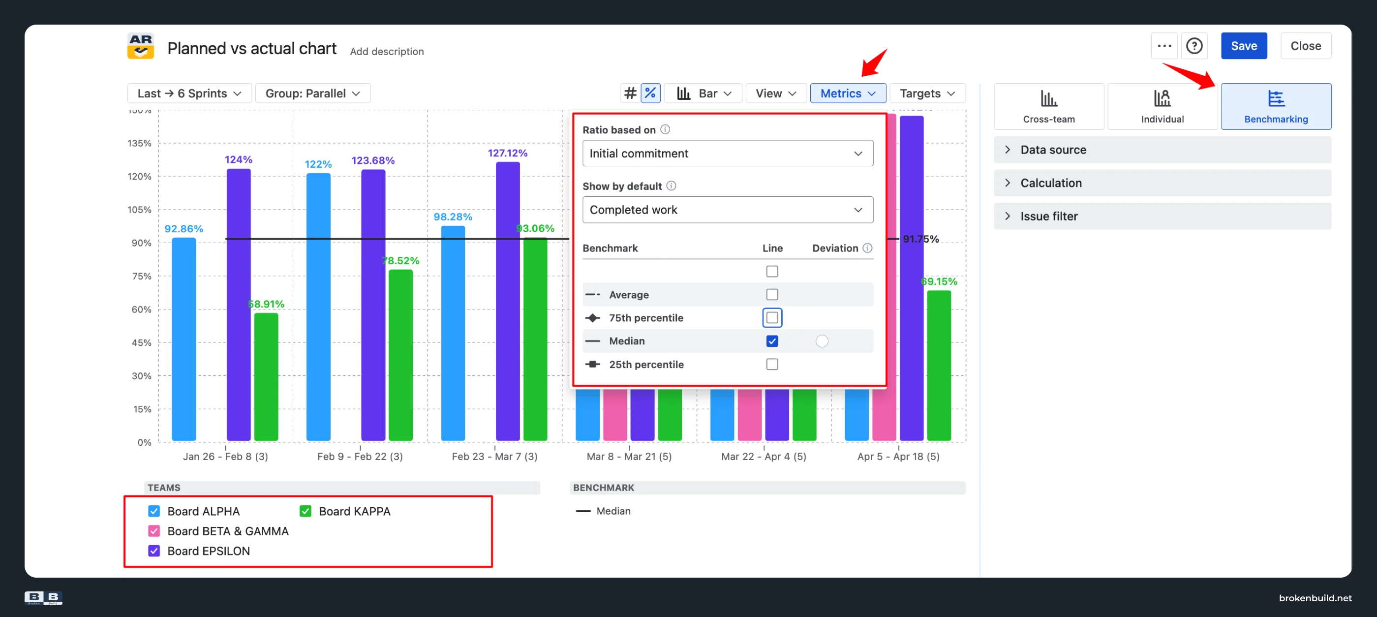
The Benchmarking view compares one team's velocity against other teams as reference lines, or against historical averages, medians, and percentiles (25th, 75th) – answers "is our velocity typical for our size and workflow, or is it an outlier?"
7️⃣ No drill-down → breakdown that answers "why?"
Native Velocity Chart: Cannot click a sprint to see which work items drove the gap. No breakdown by epic, work item type, assignee, or any Jira field.
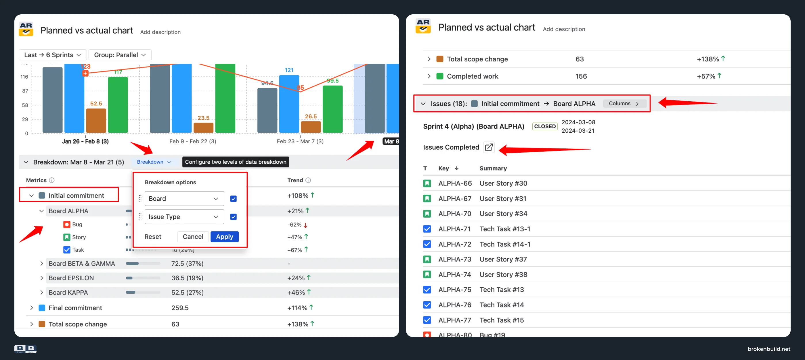
Agile Velocity Charts by Broken Build: Click any sprint to open a Breakdown by any Jira field (up to two nesting levels) and an integrated work item list linked back to Jira. See exactly which epic, work item type, or assignee drove this sprint's rollover, scope creep, or shortfall.
8️⃣ Scrum boards only → any scope including Kanban
Native Velocity Chart: Tied to one Scrum board at a time. Kanban teams have no equivalent report.
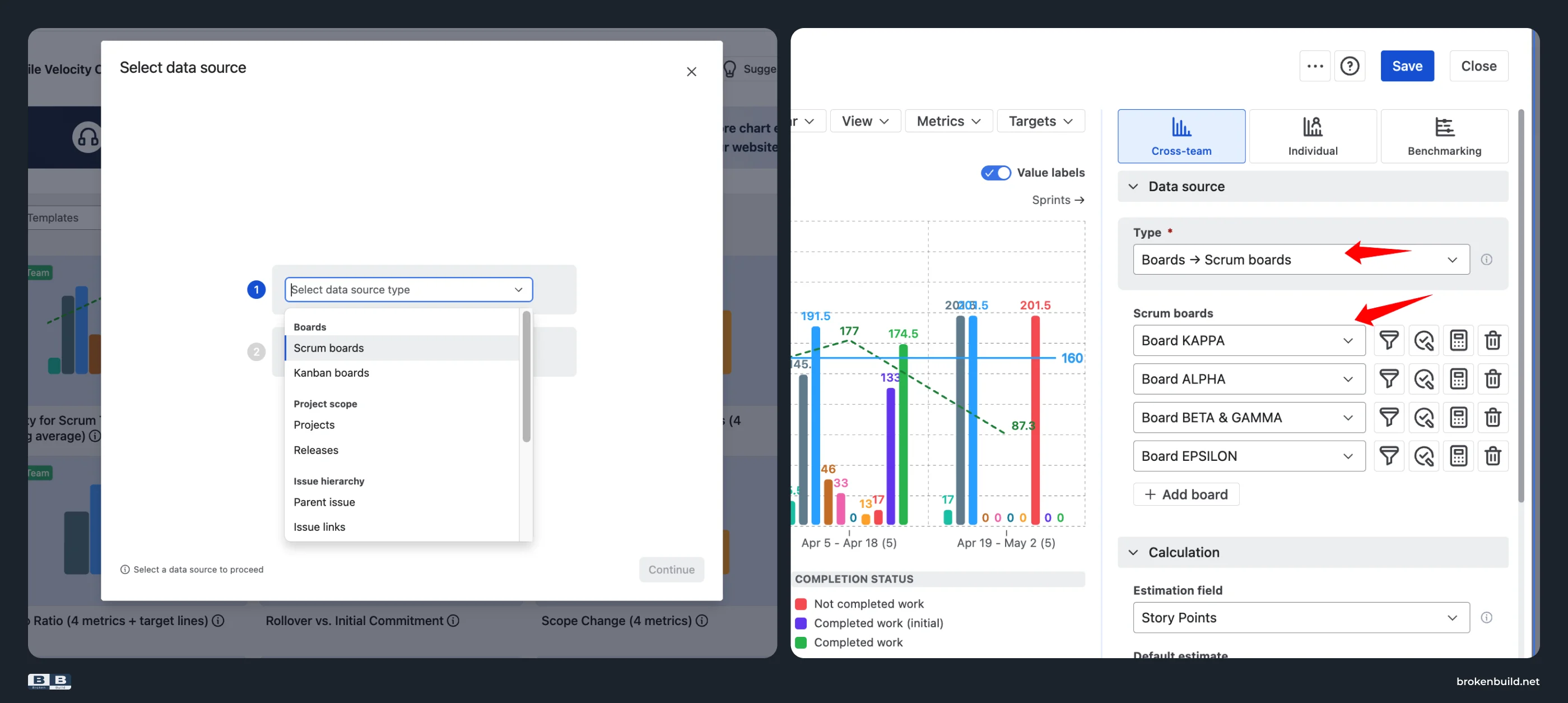
Agile Velocity Charts by Broken Build: Works on Scrum boards, Kanban boards (using time intervals instead of sprints), projects, releases, initiatives, epics, saved filters, and custom JQL – and combinations of them.
Additional flexibility
Beyond the eight core capabilities above, Agile Velocity Charts offers:
- Configurable time frame – set sprint count, use a custom date range, include/exclude closed/active/future sprints, group by sprint or by time interval. "Since the reorg" or "last quarter" become real queries.
- Flexible estimation – story points, time, work item count, or any custom numeric field. Native's Y-axis is locked to story points.
- Flexible work item filter – filter by work item types, specific epics, releases, or custom JQL. Track planned-vs-actual per work stream, not just per board.
- Dashboard and Confluence – add as a gadget on any Jira dashboard, embed interactively in Confluence via Smart Links (filters and grouping stay editable inside Confluence), and export to CSV, PNG, or PDF. Native's chart is trapped on the project's Reports tab.
For detailed coverage of these and other Velocity Charts capabilities, see the Jira sprint velocity article.
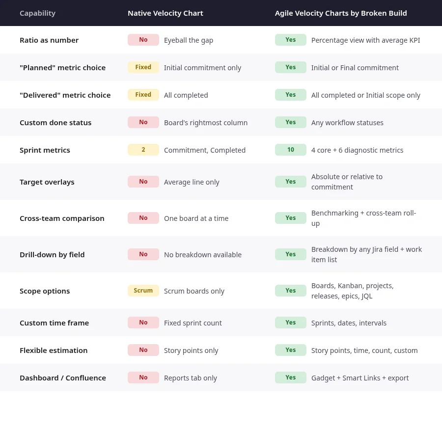
Jira planned vs actual chart - Native vs Broken Build at a glance
Do you need more than native?
If you answer yes to any of these, the native Velocity Chart cannot help:
- Do you need the planned-vs-actual ratio as a number, not an eyeballed gap?
- Do you need to choose what "planned" and "delivered" actually mean?
- Do you need to compare your team's ratio to other teams?
- Do you need to know why a sprint missed – scope creep, rollover, or estimation drift?
- Do you need to click a sprint and see which work items drove the miss?
Why not another approach?
For teams whose sprint miss can be explained by a single glance at Commitment vs Completed, the native Velocity Chart is enough. For any team that needs the cause of the miss, the decomposition has to come from somewhere. Manual spreadsheet export is one path. A dedicated app is another. Agile Velocity Charts puts all eight core capabilities, ten metrics, three chart views, targets, benchmarks, drill-down, dashboards, and Confluence embedding into one Marketplace app: the fastest path from "we missed" to "here's exactly why."



Need more than planned-vs-actual? Grab the bundle
Agile Velocity Charts works as a standalone app and covers everything in this article on its own. If your team also needs other reports (throughput, cycle time, cumulative flow, WIP aging, created-vs-resolved), Velocity Charts is also part of the Agile Reports and Gadgets bundle. If you only need planned-vs-actual, install the standalone. If you want the wider toolkit, install the bundle.
Try the interactive examples
See Agile Velocity Charts in action – no installation needed.
- Planned vs Actual chart – percentage view with configurable planned/delivered metrics
- Sprint velocity chart – full 10-metric breakdown per sprint
- Benchmarking velocity chart – compare multiple teams side by side
How to set up your first planned-vs-actual chart
Follow along – install Agile Velocity Charts free →
- Install Agile Velocity Charts from the Atlassian Marketplace. Free trial available.
- Open any Jira board and go to Reports → Velocity Charts.
- Select your data source – board, project, multiple boards, or JQL filter.
- Choose estimation: Story points, Time, or Work item count.
- Enable percentage view and select your planned/delivered metrics.
- Add a target line (e.g. 85%) to visualize the KPI.
- Switch to benchmarking view if comparing multiple teams.
- Click any sprint to see breakdown by epic, assignee, or work item type.
- Save to dashboard or embed in Confluence via Smart Link.
The ratio native hides – and how to surface it
Native Velocity Chart works for a single Scrum team that only needs a rough visual check of Commitment vs Completed each sprint. No percentage, no drill-down, no cross-team comparison, no historical trend.
It stops working when you need to answer: What is our delivery accuracy ratio? Is planning accuracy improving or degrading? Which team is most predictable? What caused the gap? Which epic drove the miss?
Agile Velocity Charts picks up exactly where native stops – configurable ratio, ten-metric breakdown, cross-team benchmarking, target overlays, and drill-down to the work item level.




.png)