

Native Jira's team-performance story is a Velocity Report, a Control Chart, and a Sprint Report – each showing one dimension for one team on one board, with no drill-down and no way to compare teams. Agile Reports and Gadgets turn team performance into a multi-dimensional analytic – velocity, cycle time, throughput, WIP, and flow efficiency – each with cross-team benchmarking, individual drill-down, percentile statistics, and diagnostic breakdown to explain what's actually changing.
What makes a complete picture of team performance?
Scrum.org warns that "velocity is a terrible metric to measure success of Scrum or performance of the team." Velocity answers "how much did we ship?" – but not "how fast?", "how predictable?", or "where do we get stuck?"
DORA research frames elite software delivery around two dimensions: throughput (how fast) and stability (how reliably). Neither velocity nor cycle time alone covers both.
A complete picture needs multiple metrics:
- Velocity / Throughput – How much do we ship?
- Cycle time – How fast do we ship?
- WIP aging – What's stuck in progress?
- Flow efficiency – How much time is waiting vs. working?
- Say/do ratio – Are we predictable?
Native Jira scatters these across three reports – each locked to one board, with no connection between them.
Native Jira's team performance reports
Open any Scrum board and navigate to Board → Reports. Three reports touch team performance.
Velocity Report
Location: Board → Reports → Velocity Report
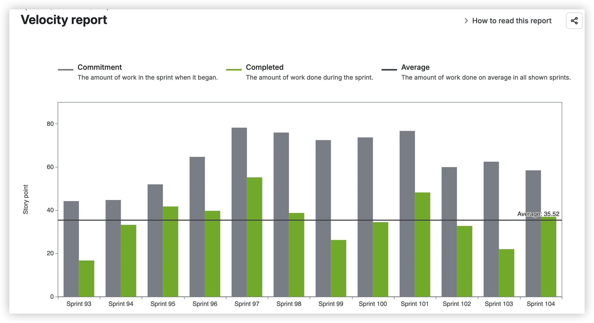
The Velocity Report tracks "the average amount of work a Scrum team completes during a sprint." It plots three elements:
- Commitment (gray bar) – total estimate of all work items when the sprint begins
- Completed (green bar) – total completed estimates when the sprint ends
- Average (line) – average completed work across all shown sprints
The Velocity Report has no user-configurable options on the report itself – the estimation statistic (story points, time, or issue count) is set at board level in Board settings → Estimation.
What the Velocity Report can't do:
The Velocity Report is Scrum-only – Kanban teams have no equivalent. It's locked to one board, so you can't aggregate multiple teams. It shows three metrics only (Commitment, Completed, Average), so you can't distinguish rollover from scope creep from estimation drift. There's no breakdown by epic, assignee, or work item type – and no per-user view to see individual contributions.
Control Chart
Location: Board → Reports → Control Chart
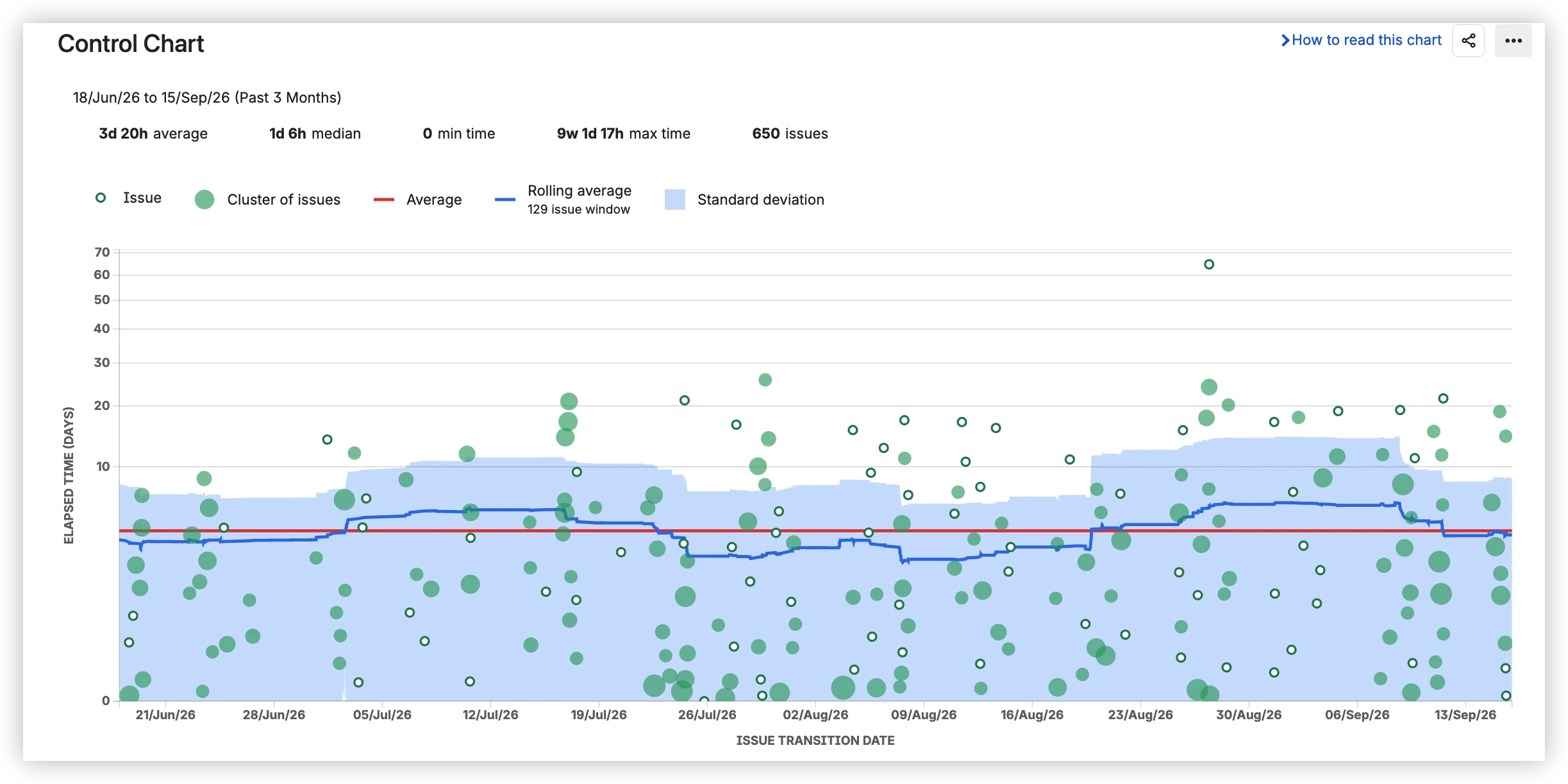
The Control Chart shows cycle time as a scatterplot with Average (red line), Rolling average (blue line), and a standard-deviation band.
What it shows:
- Issue (hollow dot) – one completed work item
- Cluster of issues (filled green dot) – multiple items with similar cycle time
- Average (red line) – overall average cycle time
- Rolling average (blue line) – calculated over a sliding window of items
- Standard deviation band – narrow band indicates predictable delivery
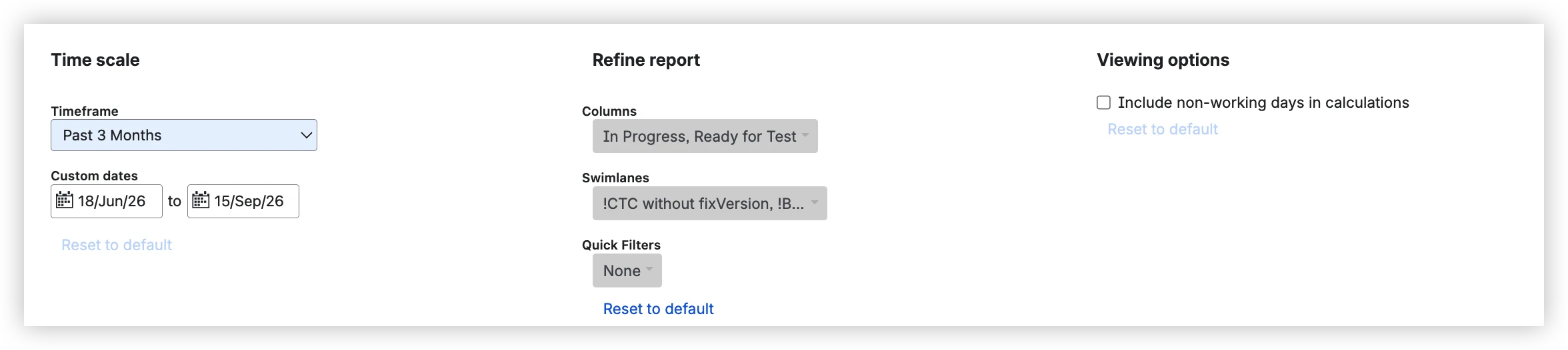
Configuration options:
- Timeframe – preset (Past 3 Months) or custom date range
- Columns – select which board columns to include in the cycle time calculation
- Swimlanes / Quick Filters – narrow to specific swimlanes or work item types
- Include non-working days – checkbox to include or exclude weekends
What the Control Chart can't do:
The Control Chart is company-managed only – team-managed projects get no cycle-time analysis at all. It shows Average and Rolling average only, not percentiles (P50, P85, P95) – so you can't commit to SLA-grade numbers. There's no per-status breakdown, so when cycle time spikes you can't see which workflow stage caused it. Working schedule is a simple on/off toggle for non-working days – no configuration for which days count, no working hours, no holidays. The timer is tied to board columns, not statuses or transitions.
Sprint Report
Location: Board → Reports → Sprint Report
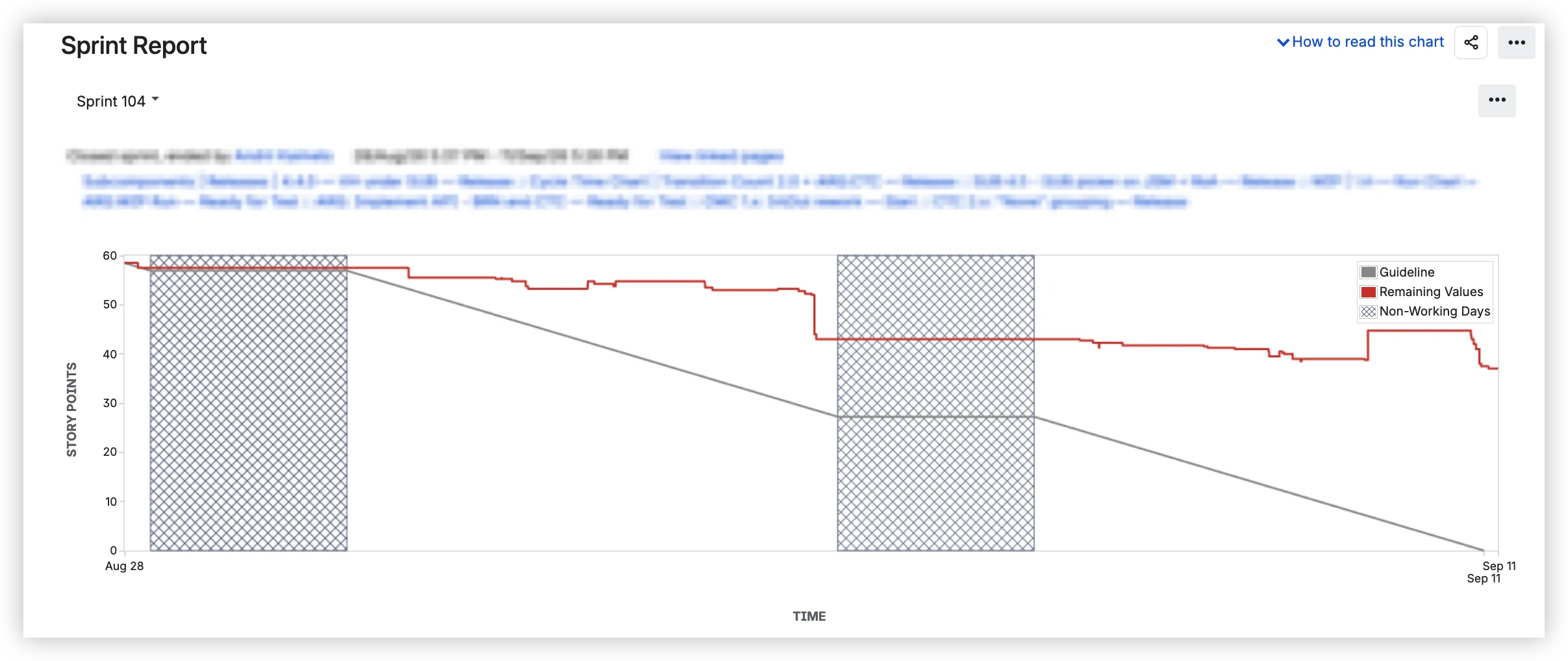
The Sprint Report shows remaining work during a sprint with a Guideline showing ideal burn.
What it shows:
- Remaining Values (red line) – total remaining estimate over the sprint
- Guideline (gray line) – straight line from start to zero
- Non-Working Days (hatched zones) – weekends and non-working days shaded
Below the chart, the Status Report shows:
- Completed Issues – work items finished in the sprint
- Issues Removed From Sprint – work items removed mid-sprint
- Asterisk (*) next to issue key = "added to sprint after start time"
Configuration options:
- Sprint – select which completed or active sprint to view
The estimation statistic (story points, issue count, or hours) is set at board level in Board settings → Estimation – not configurable on the report itself.
What the Sprint Report can't do:
The Sprint Report is Scrum-only – Kanban teams get no equivalent. It shows one sprint at a time, with no multi-sprint historical trends. The Guideline is a straight line – it doesn't use the team's velocity, so it's not a real forecast. There's no breakdown by epic or assignee, and no health tiles for a quick read on Completed %, scope change, or unestimated work.
What's missing from native Jira for full team performance visibility
Each native report covers basics. Beyond that, they stop. Here are twelve gaps – mapped to the key differentiators in Agile Reports and Gadgets.
1️⃣ One dimension each → multiple dimensions of team performance
Velocity Report shows volume. Control Chart shows duration. Sprint Report shows sprint outcome. Each answers one question – none connects them.
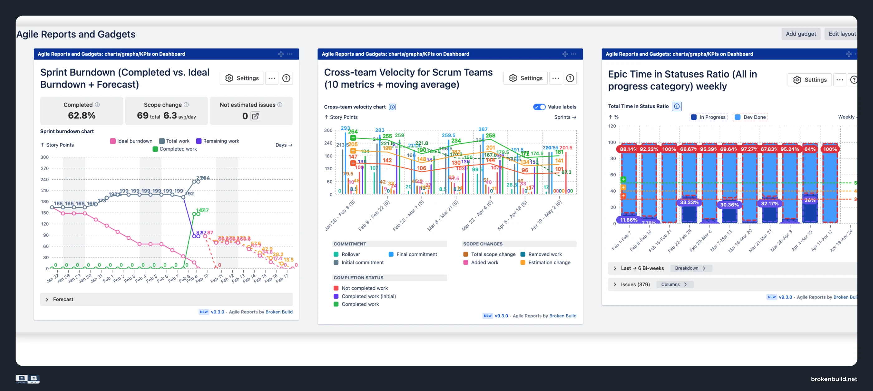
Agile Reports and Gadgets: Velocity, say/do ratio, cycle time, lead time, time in status, throughput, WIP levels, WIP aging, flow efficiency – each with its own dedicated chart type in one bundle.
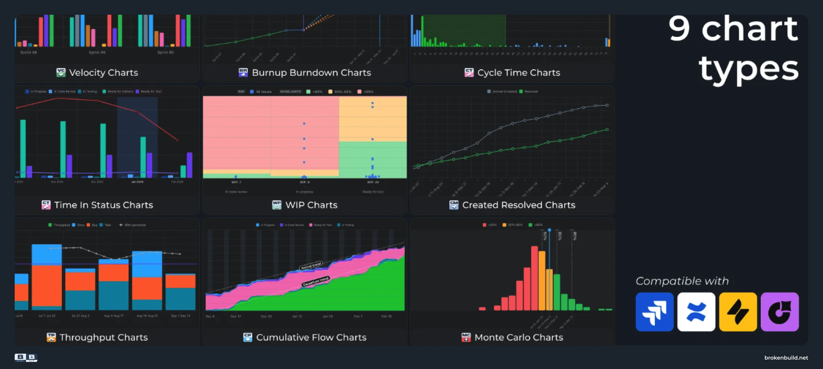
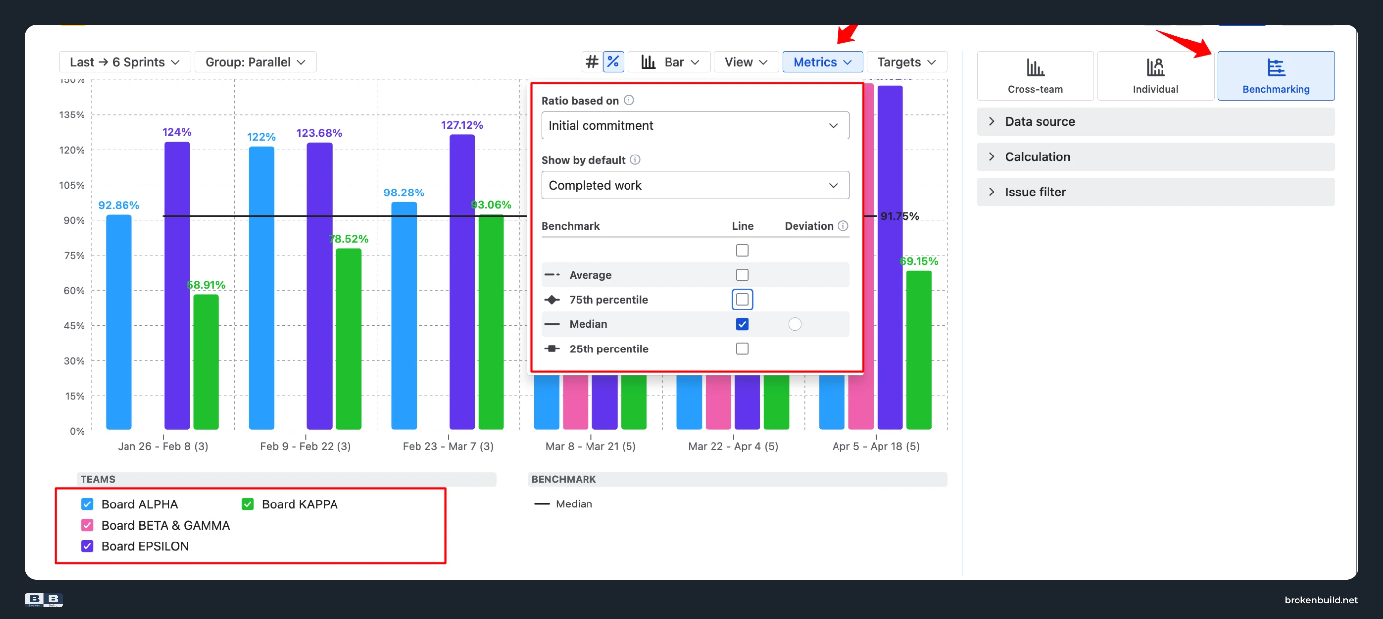
2️⃣ One team at a time → cross-team benchmarking
Every native report is locked to one board. To see another team, switch boards. To see all teams together – you can't.
Agile Reports and Gadgets – Velocity Charts: Benchmarking view lays multiple teams on the same chart with percentile reference lines.
3️⃣ No per-user view → individual velocity
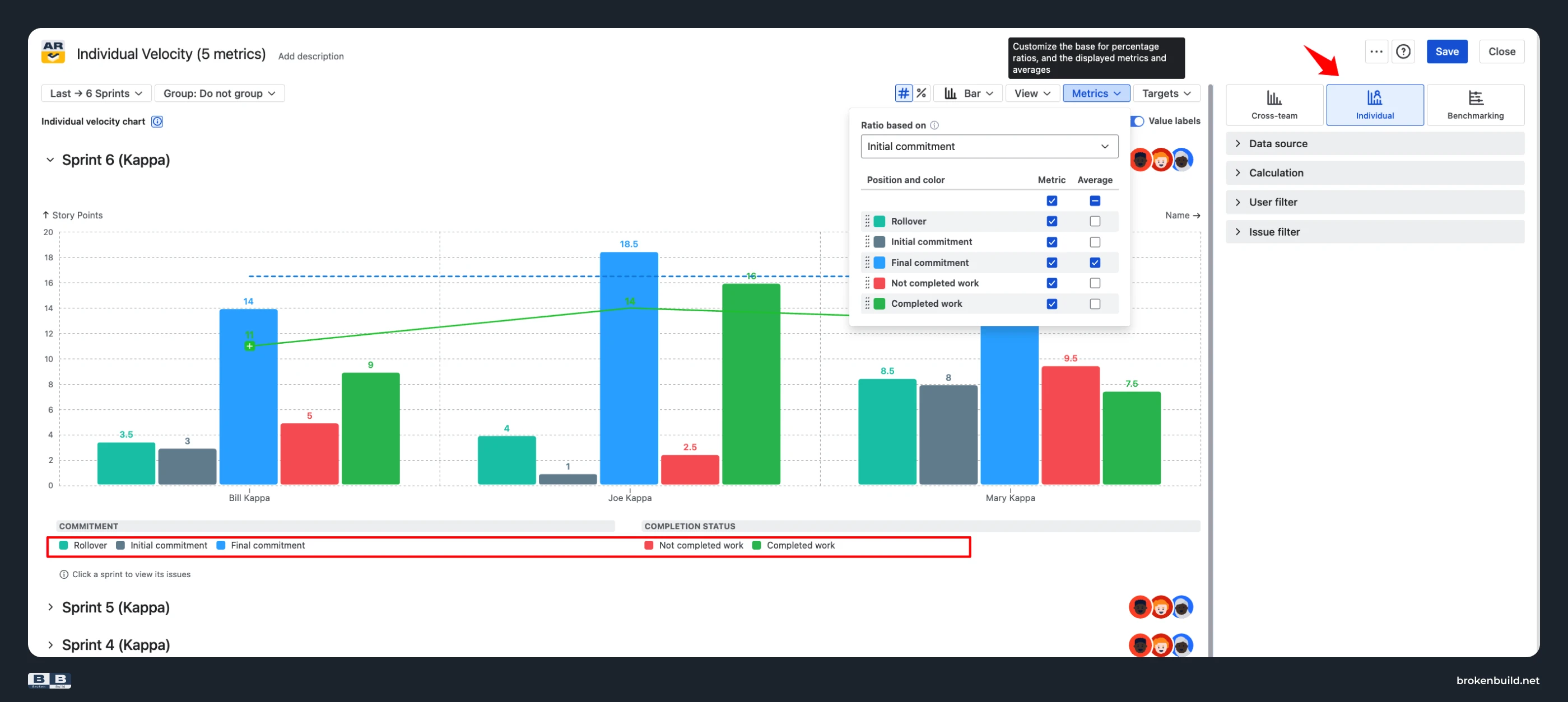
Native has no way to see who committed what, who finished what, who rolled over what.
Agile Reports and Gadgets – Velocity Charts (Individual view): Per-person contributions with five-metric breakdown (rollover, initial commitment, final commitment, not completed, completed).
4️⃣ Rolling average or average only → percentile statistics
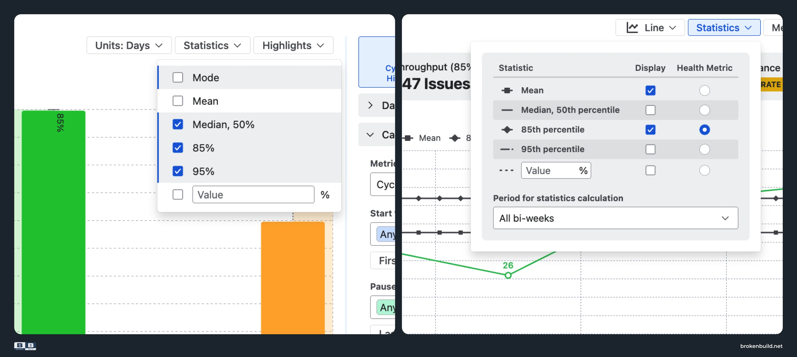
Control Chart shows Average (red line) and Rolling average (blue line) – but both are central-tendency numbers easily dominated by outliers. No way to ask "What's our P85?"
alt: Control Chart showing Average (red) and Rolling average (blue) lines with outliers pulling both statistics up
Agile Reports and Gadgets: Cycle Time Charts show Mode, Mean, Median, P85, P95, or custom percentile. Throughput Charts and WIP Charts show Mean, Median, P85, P95, or custom percentile – SLA-grade numbers.
5️⃣ No breakdown → diagnostic drill-down
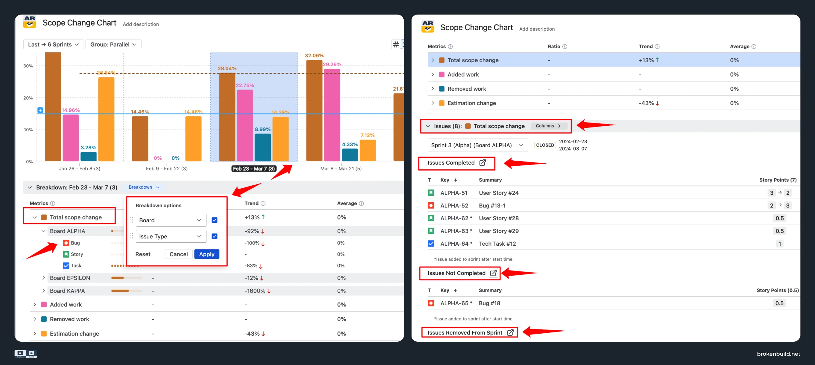
When a number changes, native can't tell you why. No breakdown by epic, assignee, or work item type.
Agile Reports and Gadgets: Every chart has Breakdown (up to two nesting levels) + Issue list with click-through.
6️⃣ Hard-coded definitions → configurable per team's workflow
Native ties metrics to board columns and resolution dates – can't redefine what "done" or "cycle time" means.
Agile Reports and Gadgets: Custom "Done" statuses, custom timer boundaries, custom WIP status inclusion – measured against your actual process.
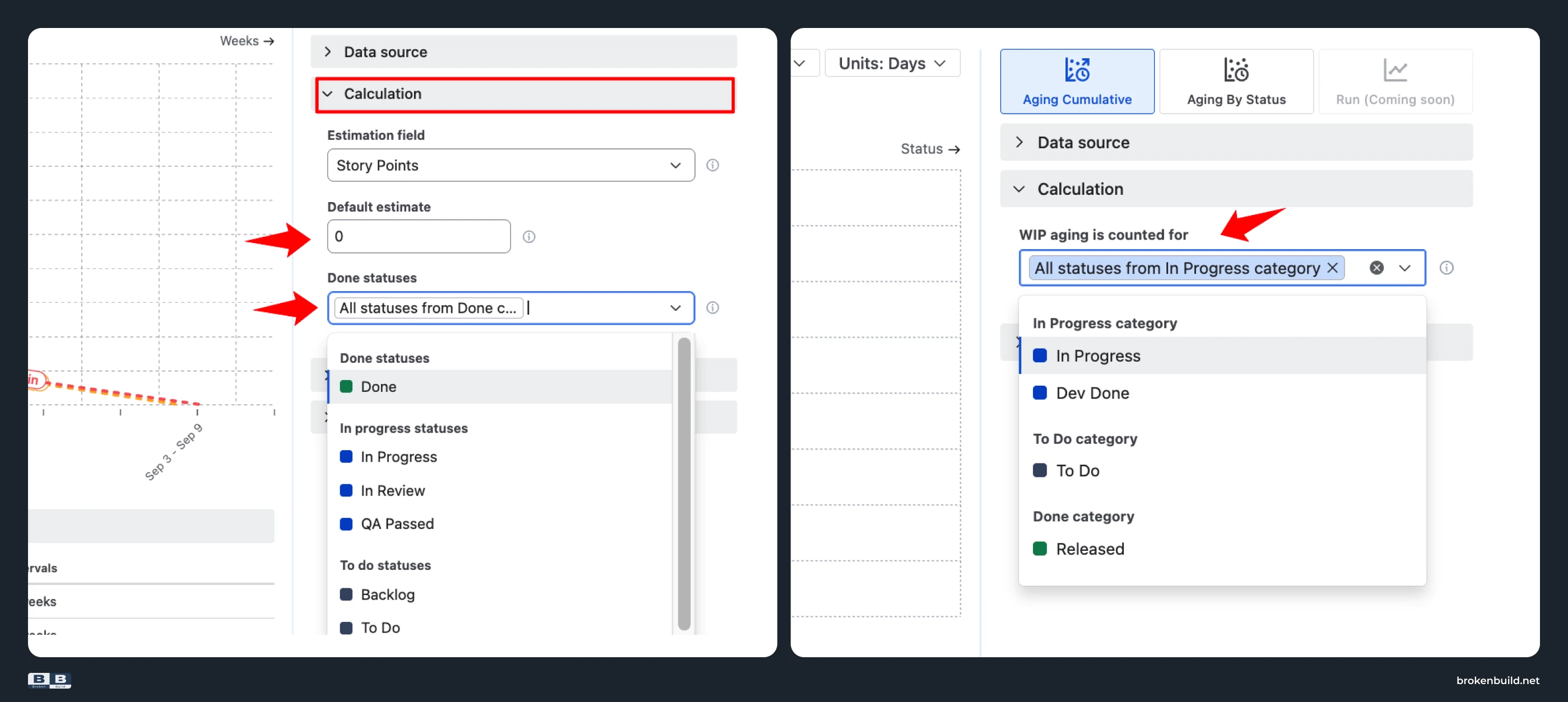
7️⃣ Basic non-working days toggle → full working-schedule configuration
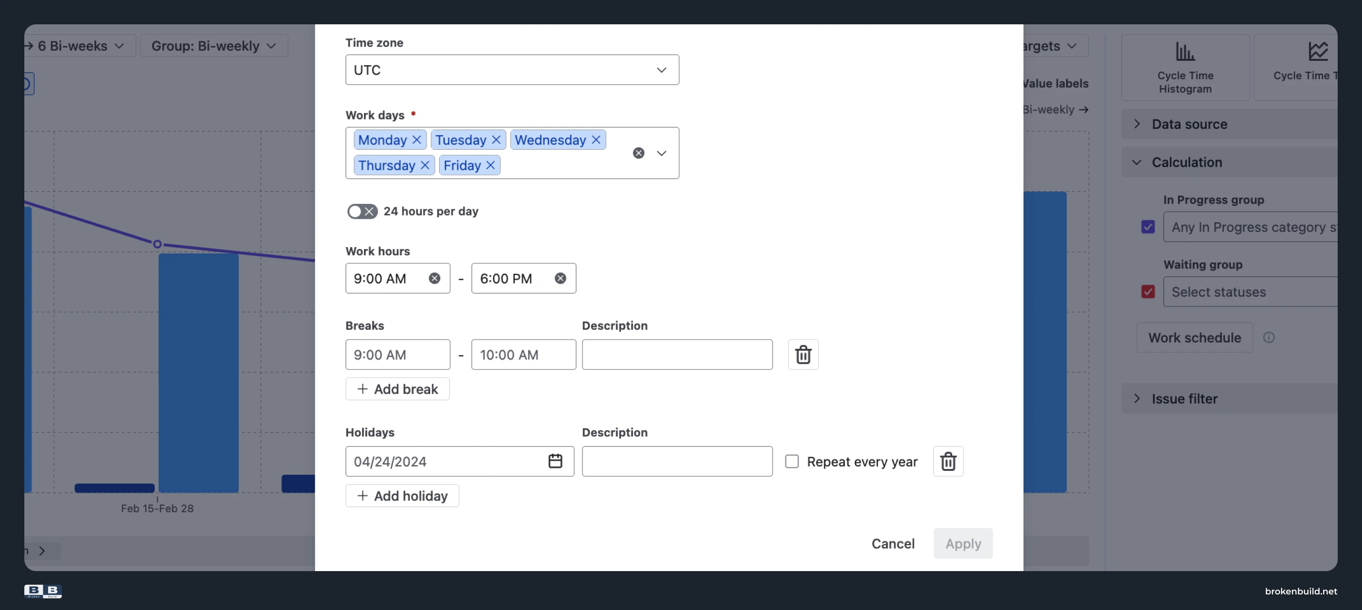
Control Chart has a checkbox to include or exclude non-working days – but no way to define which days are non-working, no working hours, no breaks, no holidays.
Agile Reports and Gadgets: Full working-schedule configuration – time zone, which days are working (not just Sat/Sun), working hours, breaks, recurring holidays – or 24/7 for follow-the-sun teams.
8️⃣ One board only → multi-team rollups
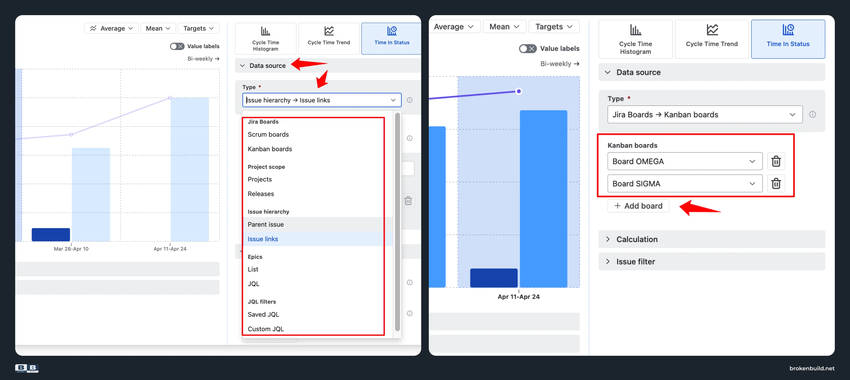
Can't aggregate across boards, projects, or teams.
Agile Reports and Gadgets: Single-team scope, multi-team rollups, cross-project views, JQL-based filtering – all supported.
9️⃣ No targets → health tiles and targets
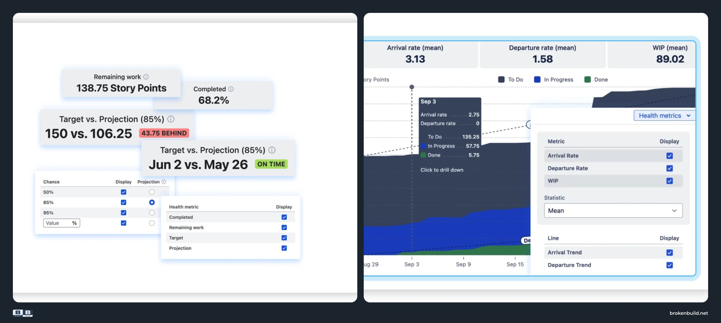
Native offers one Average line. No target corridors, no benchmark reference.
Agile Reports and Gadgets: Health metric tiles on Burnup Burndown Charts, Cycle Time Charts, Throughput Charts, and WIP Charts (completion %, scope change, WIP, stalled items). Target lines and benchmark reference lines on all charts.
🔟 Limited time controls → trends across any time frame
Control Chart has a Timeframe dropdown and custom date picker. Velocity Report shows a fixed sprint count. Sprint Report shows one sprint. But none lets you query "since the reorg", compare quarters, or group by custom intervals.
Agile Reports and Gadgets: Custom date ranges, sprint count, include/exclude closed/active/future sprints, group by sprint or interval.
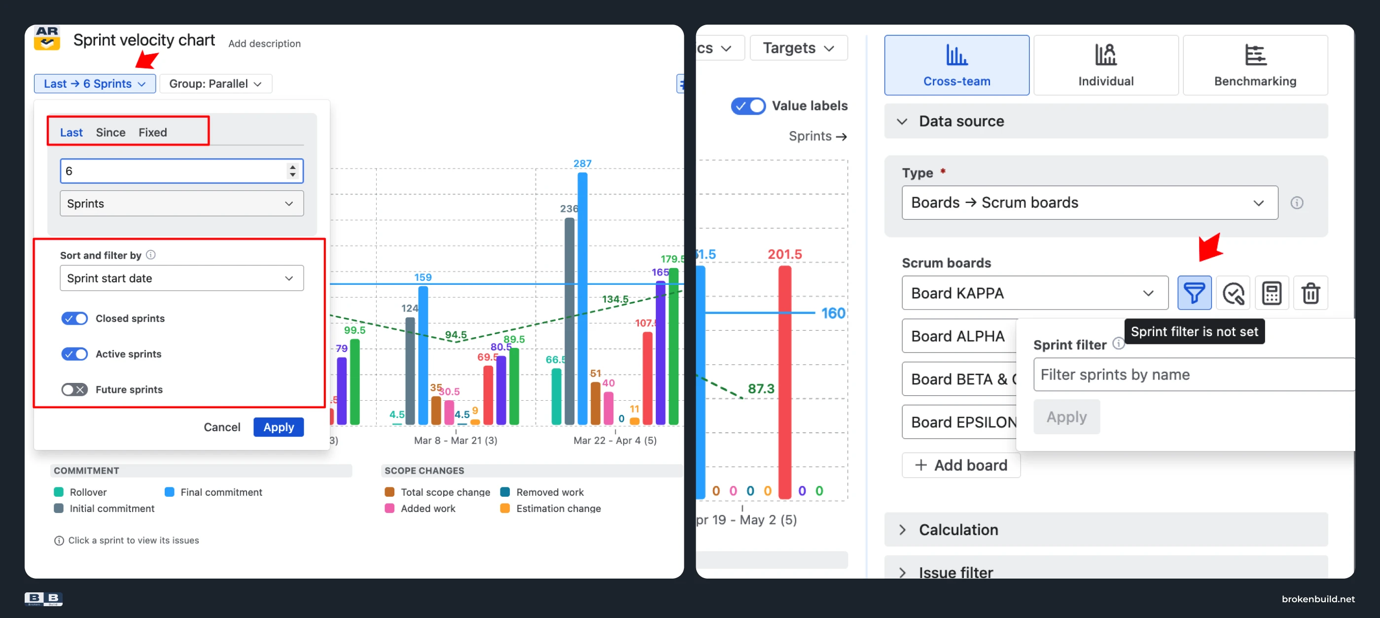
1️⃣1️⃣ Company-managed only → works in both project types
Control Chart is company-managed only – team-managed teams get no cycle-time analysis.
Agile Reports and Gadgets: Every chart works in both company-managed and team-managed spaces.
1️⃣2️⃣ Reports tab only → lives where the team works
Native reports are trapped on the Reports tab. No dashboard gadgets, no Confluence embed.
Agile Reports and Gadgets: Every chart is a dashboard gadget and Confluence Smart Link embed.


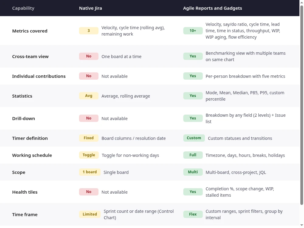
Jira team performance: Native reports vs Agile Reports and Gadgets
See Broken Build’s Jira team performance charts in action
Before installing, explore the interactive examples to see how Agile Reports and Gadgets handle team performance analytics.
- Team velocity chart
- Benchmarking chart
- Individual velocity chart
- Cycle time chart
- Time in status chart
- Throughput run chart
- WIP aging chart
- Cumulative flow chart
When native Jira team performance reports are enough – and when they're not
Native works if you track one team on one board, care only about sprint-to-sprint velocity, and never need to explain why a number changed. The Velocity Report shows committed vs. completed. The Sprint Report shows remaining work. The Control Chart shows rolling-average cycle time in company-managed projects.
But the moment you need multi-team comparison, per-status breakdown, percentile cycle time, WIP aging, or a drill-down that answers "why?" – native stops.
Agile Reports and Gadgets picks up where native ends.




.png)