


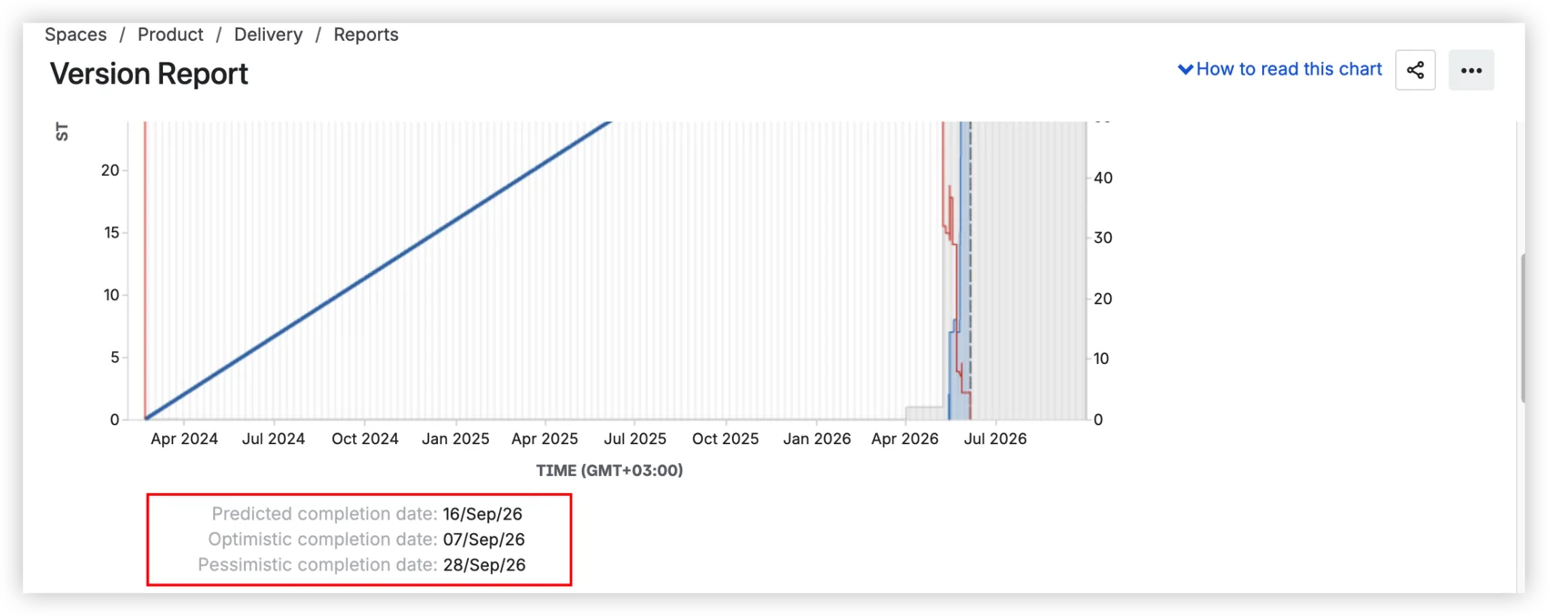
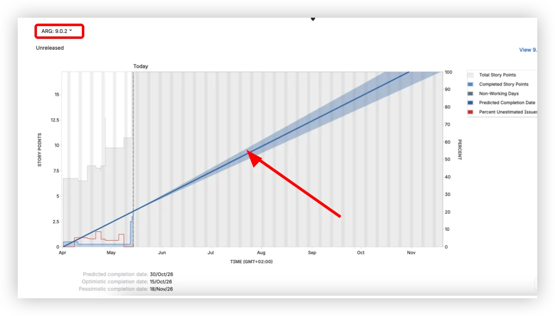
Predicted: September 16. Optimistic: September 7. Pessimistic: September 28. That's what your Jira version report shows: three dates calculated from average daily velocity ±10%. It looks like a forecast with a confidence range. It's not. All three come from the same formula: one number with a fixed band around it. The moment your scope shifts or your team splits capacity, all three move together, because they were never independent.
The Jira version report is a release tracking view, not a forecasting tool. It was never built to answer "when will this ship with 80% confidence?" The question isn't whether the report is broken. It's whether a ±10% band qualifies as a forecast.
What is a Jira version report, and how to read it
Before we talk about what the version report can't do, let's be precise about what it does.
A version in Jira is a logical container that groups issues planned to ship together. It has a name, a planned release date, and a status: unreleased, released, or archived. The fixVersion field on a Jira issue points to a version, and an issue can have more than one fixVersion. A release is the act of marking a version as released, which freezes its scope.
The version report lives in Jira's Reports section. To access it: open your Scrum board → Reports → Version Report → select a version.
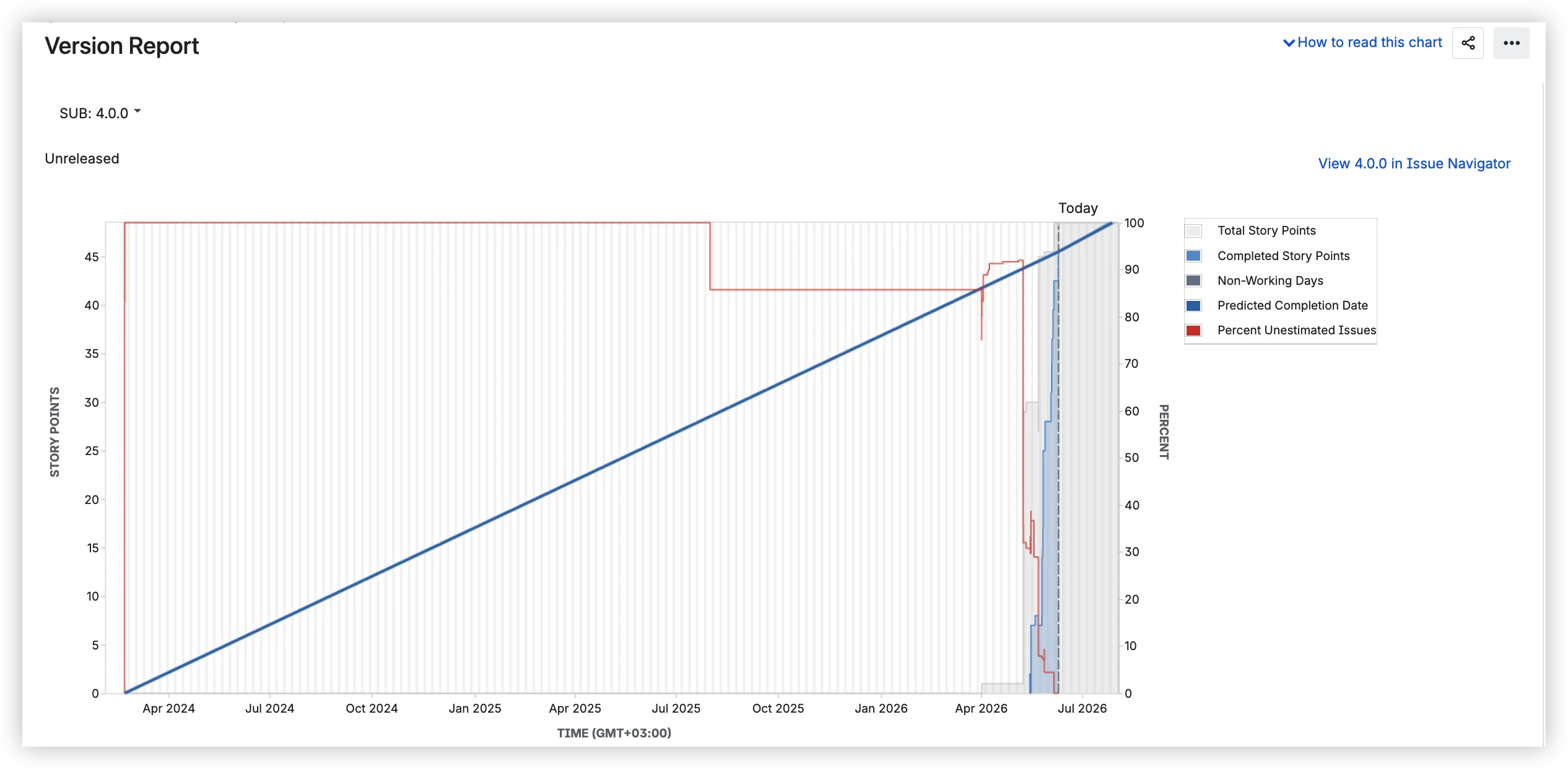
The chart shows several elements over time. The gray area represents the total estimated work for the version (story points, issue count, or original time estimate, depending on how your board is configured). When this area grows, the scope was added. The blue line is completed work, accumulating upward. The red line tracks the percentage of unestimated issues. And the blue band is the predicted completion date range.
Below the chart, three dates:
- Predicted completion date – based on average daily velocity since the version start date.
- Optimistic – adds 10% to that velocity.
- Pessimistic – subtracts 10%.
Below the dates, three tables: Completed Issues, Incomplete Issues, and Incomplete Unestimated Issues, each with issue type, priority, status, and estimation values.
Worth noting what the version report is not: it's only available on company-managed Scrum boards, not in team-managed projects or on Kanban boards. It can't be embedded on a Confluence page. And there is no dashboard gadget to pin it to a Jira dashboard.
Where it breaks down for real releases
Here's the scenario I see play out again and again. You open the version report, see a predicted date, and share it in your PI planning session. A few weeks later, the date has shifted by a month. Your leadership team starts asking uncomfortable questions. You start wondering if the tool is broken.
It's not broken. It's doing exactly what it was built to do, and that's the problem.
The ±10% formula
The prediction takes your average daily velocity since the version start date, projects forward at that rate, and draws three lines: one at that average, one 10% faster, and one 10% slower. That's it. No sampling from actual sprint-to-sprint variation. No probability distribution. Just a single number ±10%.
If your team's velocity varies sprint to sprint meaningfully, and it almost always does, then a fixed ±10% band tells you nothing about the actual range of outcomes. A common example: a team with 28 story points remaining and a velocity of 29 per sprint sees a predicted date two months out. Why? Because the version was created months before work started, and all those zero-velocity days dragged the average to the floor.
Scrum.org draws a clear line: if you have historical delivery data, you can forecast; without it, you're still estimating. The version report doesn't forecast. It extrapolates from a diluted average.
Where it breaks down
Beyond the formula, the version report has structural limitations that become visible the moment you use it for real release forecasting:
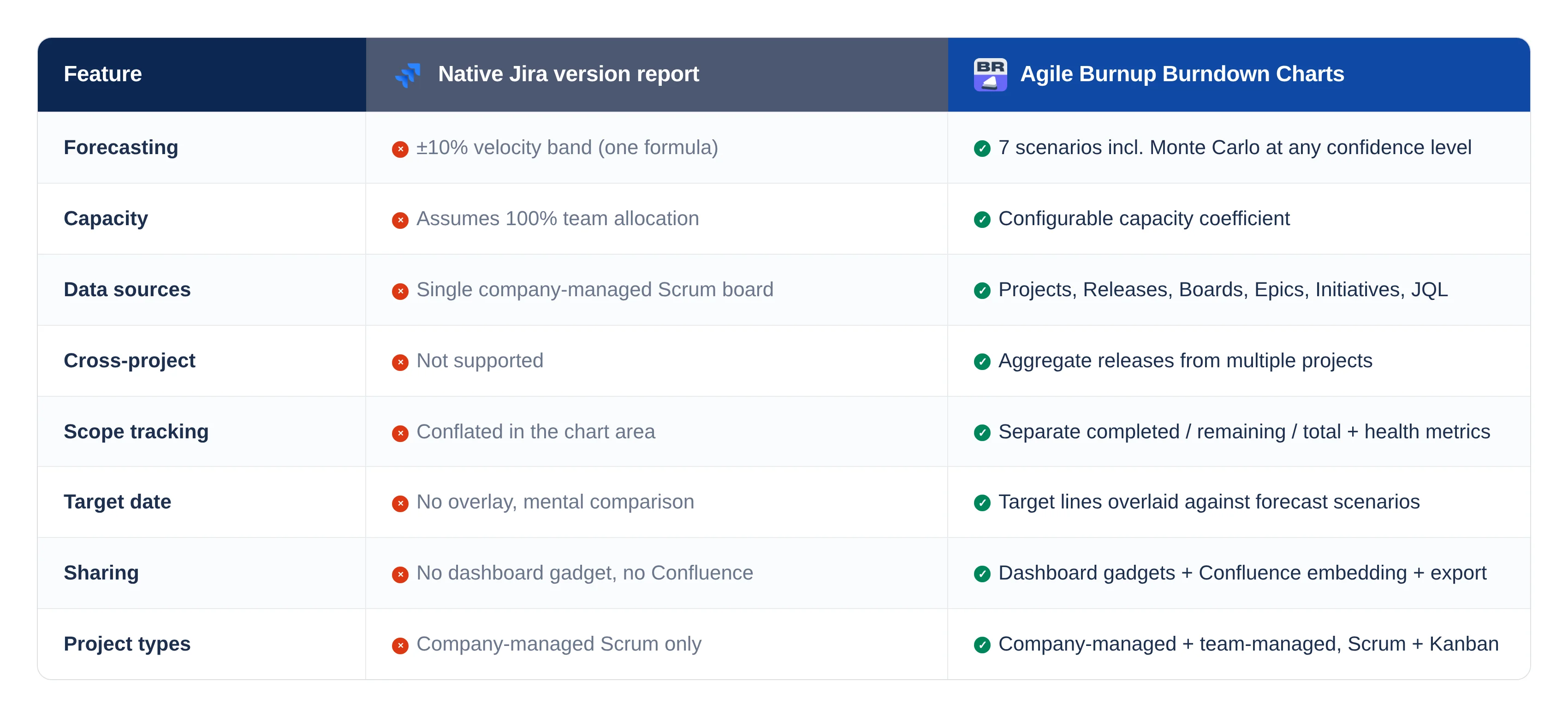
One formula, no scenarios. The ±10% band is the only projection the report offers. You can't model "what if velocity drops?" or "what if we hit the deadline at P80?" There's no way to compare multiple forecasting approaches side by side.
No capacity model. The report assumes 100% of your team works on this version. Real teams split time across releases, epics, and support rotations. There is no way to tell the report "this team is 30% allocated here."
Single project, single board. The version report cannot combine versions across Jira projects. If your release spans backend, frontend, and infrastructure, you're aggregating manually.
Scope changes are invisible. The gray area shifts when the scope changes, but the report doesn't separate additions from remaining work. You see, total story points grew. You don't see what was added, when, by whom, or whether anyone approved it. In regulated environments, that's a governance gap, not a reporting inconvenience.
No target date comparison. The report gives you a predicted date. You have a deadline. It's up to you to hold both in your head and assess the risk. There's no deadline marker on the chart, no overlay, no "will we make it?" at a glance.
No sharing beyond screenshots. The dashboard gadget is no longer available. Confluence embedding doesn't exist. Stakeholders who don't open Jira Reports can't see version progress unless someone takes a screenshot and pastes it.
Company-managed Scrum only. No team-managed projects, no Kanban boards. Teams that moved to team-managed or use Kanban have no native version report at all.
Common pitfalls worth knowing
Even within its limitations, the version report trips people up in predictable ways:
- Meaningless start date. Set the version's start date to when work actually began, not when someone created the version six months ago.
- The 10% threshold. No prediction appears until 10% of estimated work is completed. There's no explanation of why the prediction is missing. The chart just doesn't show one.
- Subtask exclusion. Issues that don't match the board's saved filter are excluded. If your team works on subtasks, the numbers will look wrong.
The reframe
The version report was designed as a simple release-tracking view: total scope vs. completed work, with a velocity projection on top. For a short release with fixed scope and a fully allocated team, a ±10% band around average velocity might be adequate. For a multi-month release with evolving scope, shared capacity, and regulatory deadlines (the kind of releases Agile Coaches in financial services spend their days managing), it structurally cannot produce a forecast.
This isn't an argument against the tool. It's an argument for matching the tool to the problem.
What the industry says a release forecast should look like
If the version report's ±10% band isn't a forecast, what is?
Probability ranges, not single dates
Scrum.org has been clear on this: a probabilistic forecast has two components: a range and a probability. "We expect to complete this work between June 12 and June 19 with 85% confidence" is a forecast. "We'll ship on June 12" is a guess. The version report gives you three guesses of varying optimism.
SAFe's PI Predictability Measure looks at actual vs planned business value. It expects cross-team, cross-project aggregation at the ART level, exactly the thing a single-project version report cannot provide.
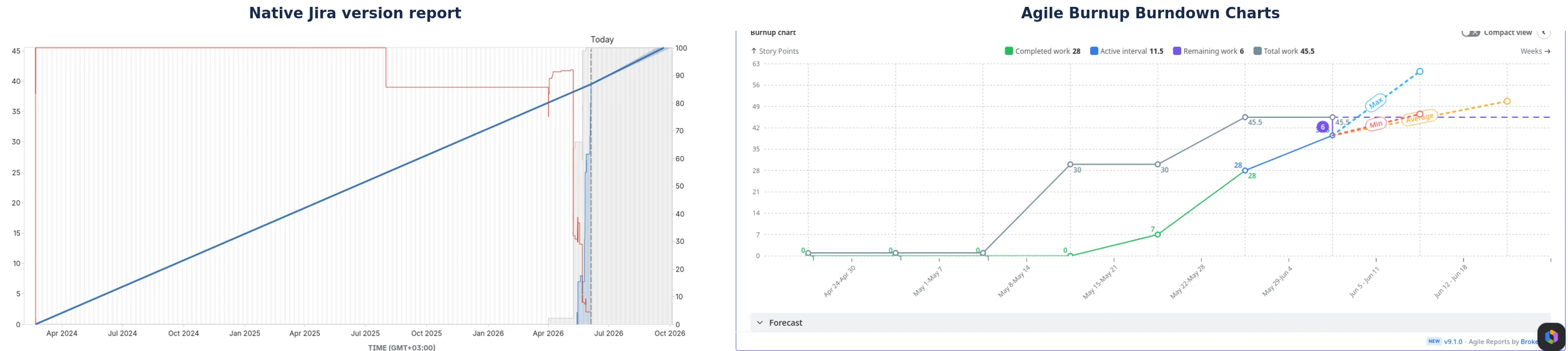
The official Jira documentation on burnup charts recommends them for release tracking because they make scope changes visible through separate lines for total scope and completed work. The version report is a burnup chart, but it conflates scope and completed work into a single visual, which defeats the purpose.
Why this matters more in regulated environments
If you coach in financial services, the stakes are different. Four regulatory frameworks – FFIEC (US), DORA (EU), APRA CPS 230 (Australia), and MAS TRM (Singapore) – require that production changes be documented, approved, tested, and auditable. The FCA (UK) approaches the same territory through operational resilience, requiring firms to ensure that critical business services can withstand disruption, which includes robust change management.
DORA Article 9 requires that all ICT changes be "recorded, tested, assessed, approved, implemented, and verified." The FFIEC expects that every production change can be traced through a documented approval chain. APRA flagged configuration management as "especially problematic in the financial sector with aging core legacy platforms and old code mixed with modern apps and software."
A version report that shows a burnup line without documenting scope changes, approval gates, or governance evidence is invisible to a regulatory examiner. Not non-compliant – just invisible. Which, in practice, amounts to the same thing.
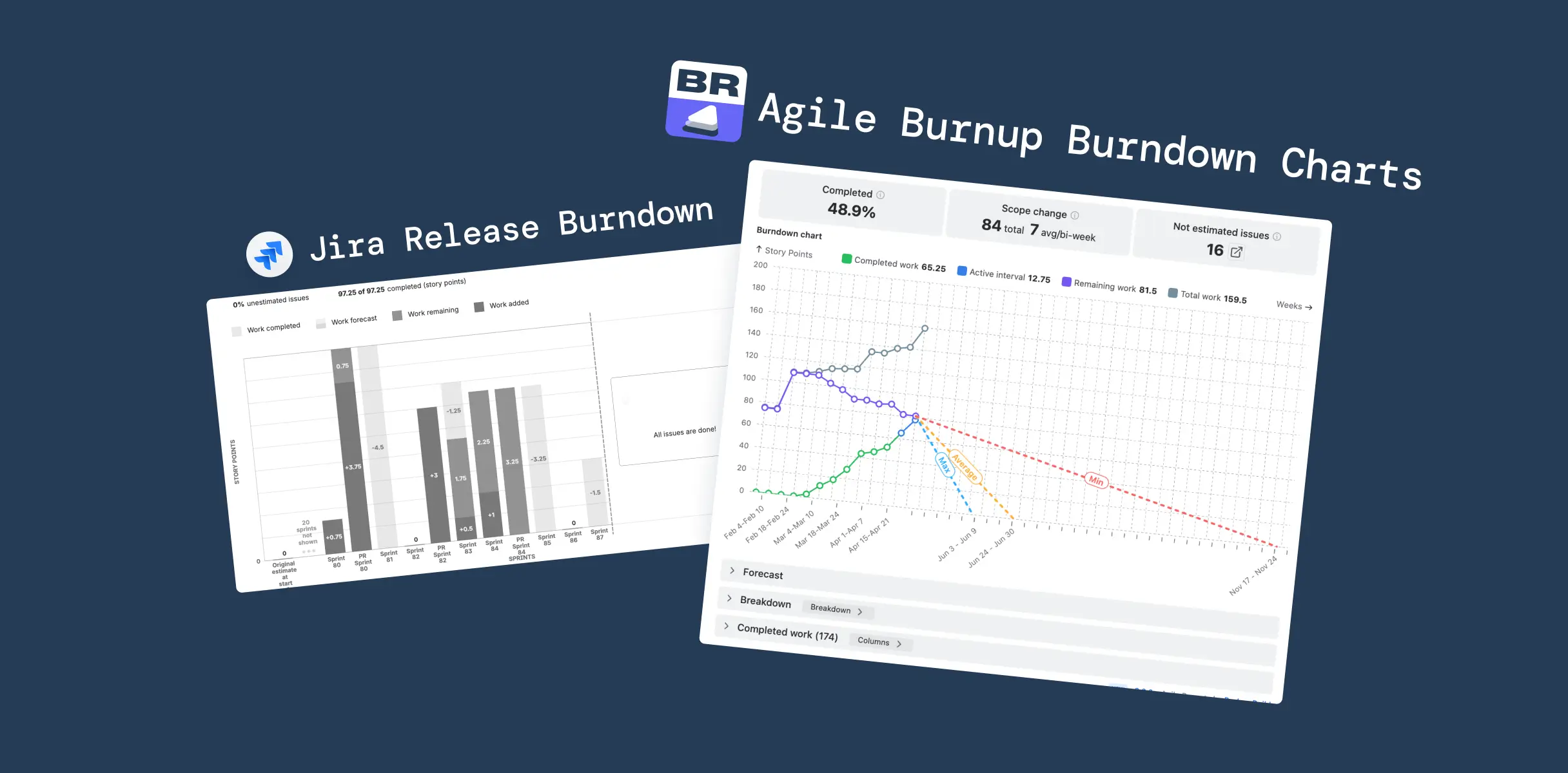
Agile Burnup Burndown Charts: What changes when you replace the formula
Agile Burnup Burndown Charts by Broken Build treats scope, capacity, and throughput as three independent variables, the way Scrum.org and SAFe say they should be treated. Here's what that looks like in practice.
Seven forecast scenarios instead of one formula
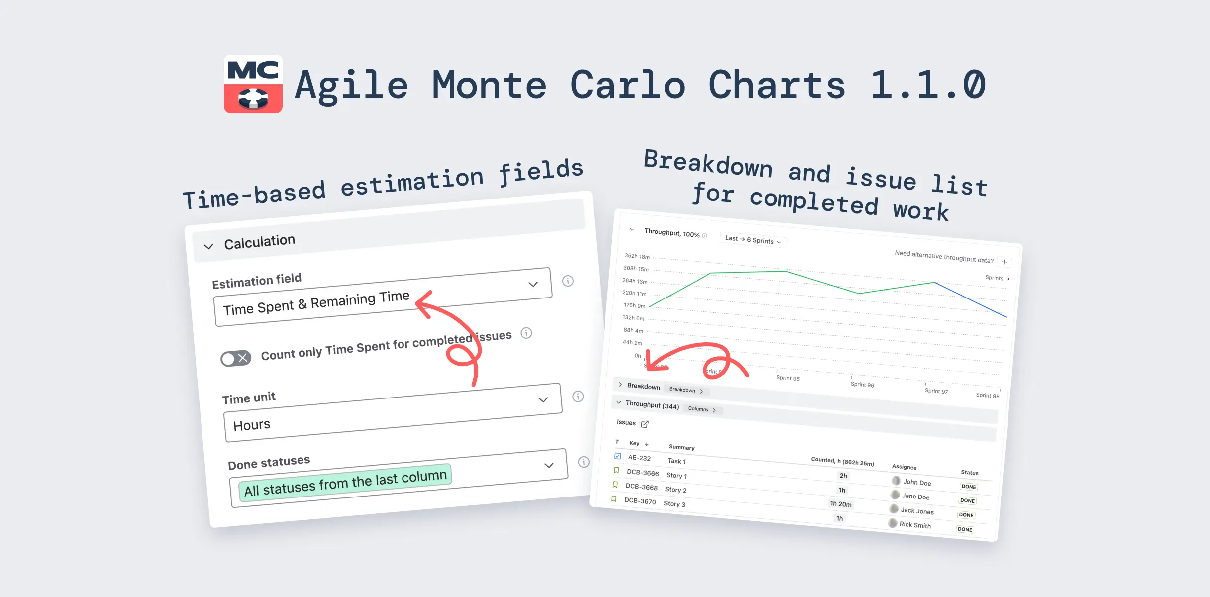
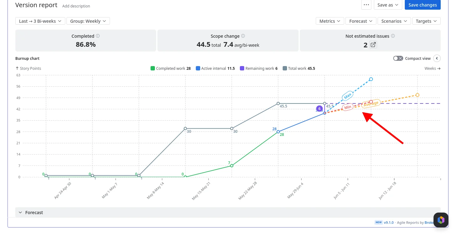
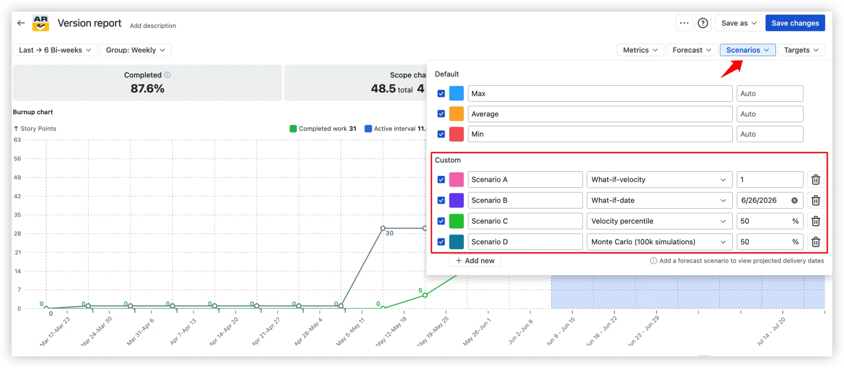
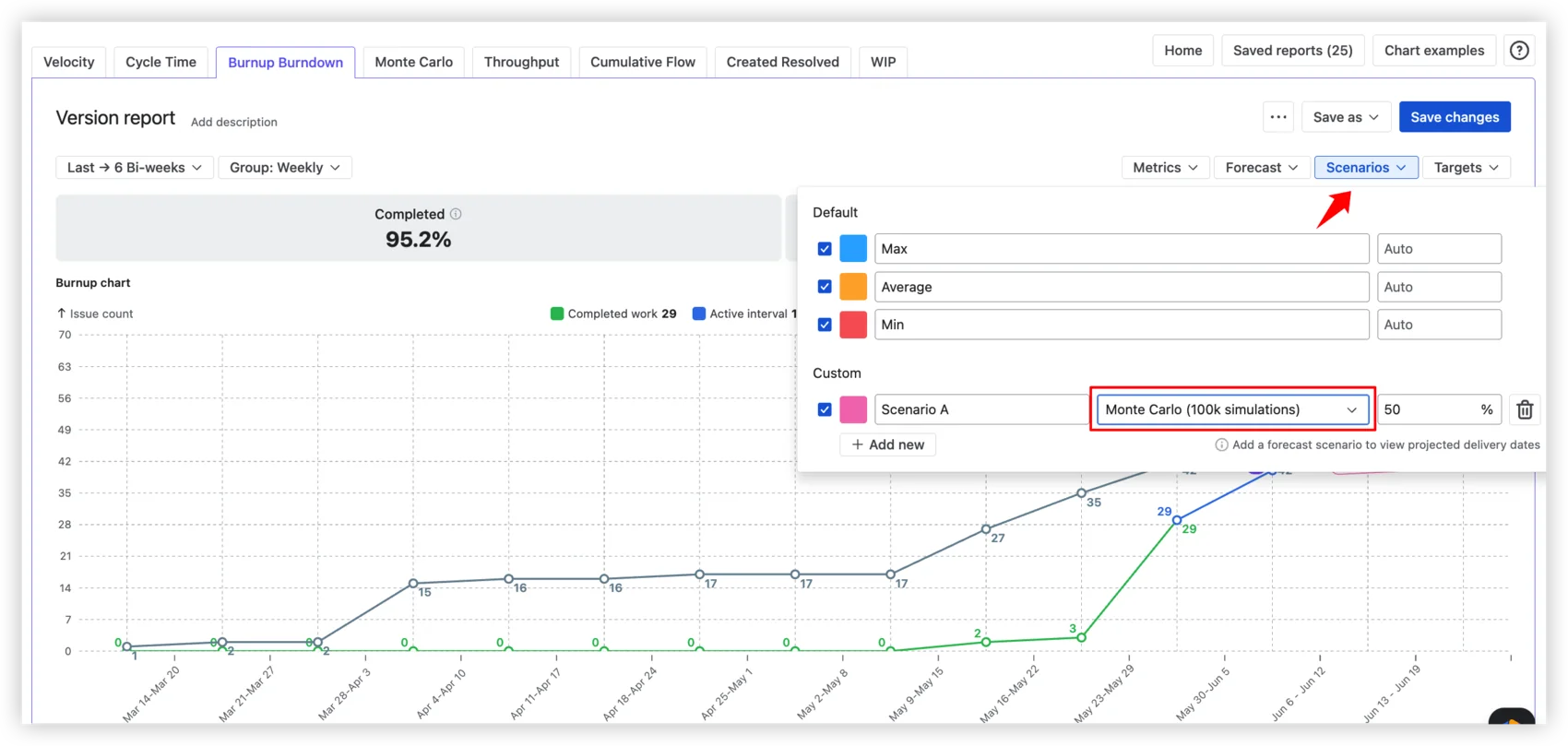
The Burnup Chart ships with three default projections and four custom scenario types you can add and combine:
Default scenarios: Min, Average, and Max: three projection lines based on your actual historical velocity. And "historical" means whatever window matches how your team actually works – the native report is locked to average daily velocity, while here you choose the interval: last 10 days, 3 sprints, 5 weeks, or any range that reflects current capacity.
Custom scenarios: What-if-velocity (forecast at a specific velocity you set), What-if-date (what's achievable by a fixed deadline), Velocity percentile (forecast using the Nth percentile of past velocities), and Monte Carlo (100,000 simulations producing a probability-based date).
The Monte Carlo scenario answers "When will this release be done at a given confidence level?" Each simulation randomly samples from actual sprint velocities, producing a distribution of outcomes, not a point estimate. You choose the probability: P50, P80, P95, or any value.
For the full Monte Carlo experience – both "When will it be done?" and "How many items can we deliver by a given date?" with P50/P80/P95 and any custom probability – Broken Build also offers Agile Monte Carlo Charts, available standalone or as part of the Agile Reports and Gadgets bundle.
Capacity allocation
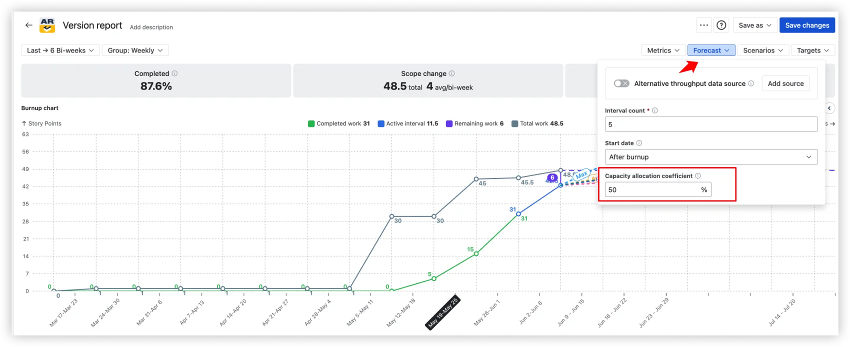
Set a coefficient. 50% means the forecast reflects a team splitting time across two efforts. This single input is the difference between a wishful projection and a believable one, and it's something no native Jira report can model.
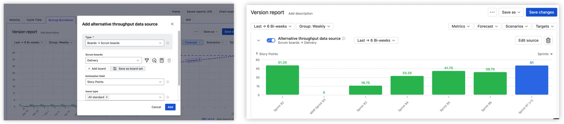
Alternative throughput, or how to avoid false confidence
Here's a difference that matters, and it's the clearest example of what separates a release tracker from a forecasting tool.
Take a release with little delivery history of its own. The same version, the same release, in both tools. The native version report still draws its prediction line: it borrows the board's full sprint history and projects a date regardless of whether this release has any meaningful throughput behind it. It looks confident. That confidence is fake. (And if the release has zero completed work, the native chart shows nothing at all – no forecast, no guidance, no way to move the conversation forward.)
Agile Burnup Burndown Charts, looking at the same release, refuse to fake it. When the release doesn't have enough throughput of its own, it says so, instead of drawing a line that means nothing.
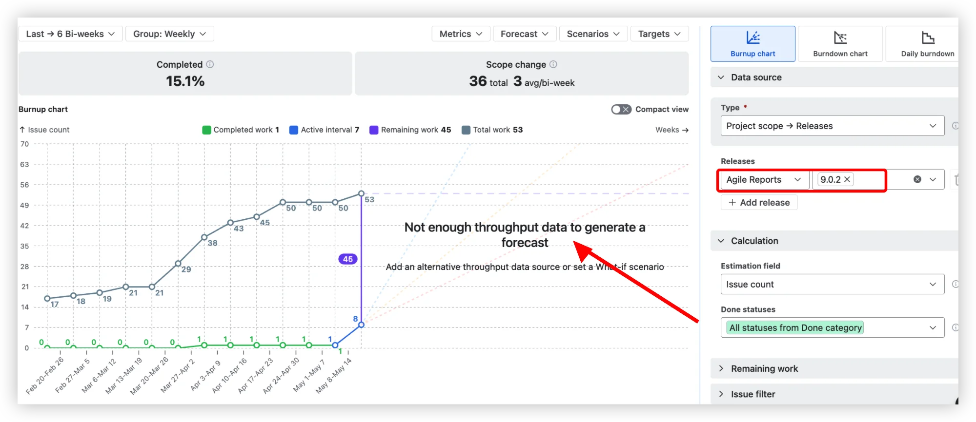
That honesty isn't a dead end, it's the start of a better forecast. Add an alternative throughput data source – a comparable board, project, release, epic, initiative, or custom JQL – and the forecast recalculates from velocity that actually reflects how your team delivers.
Cross-project releases
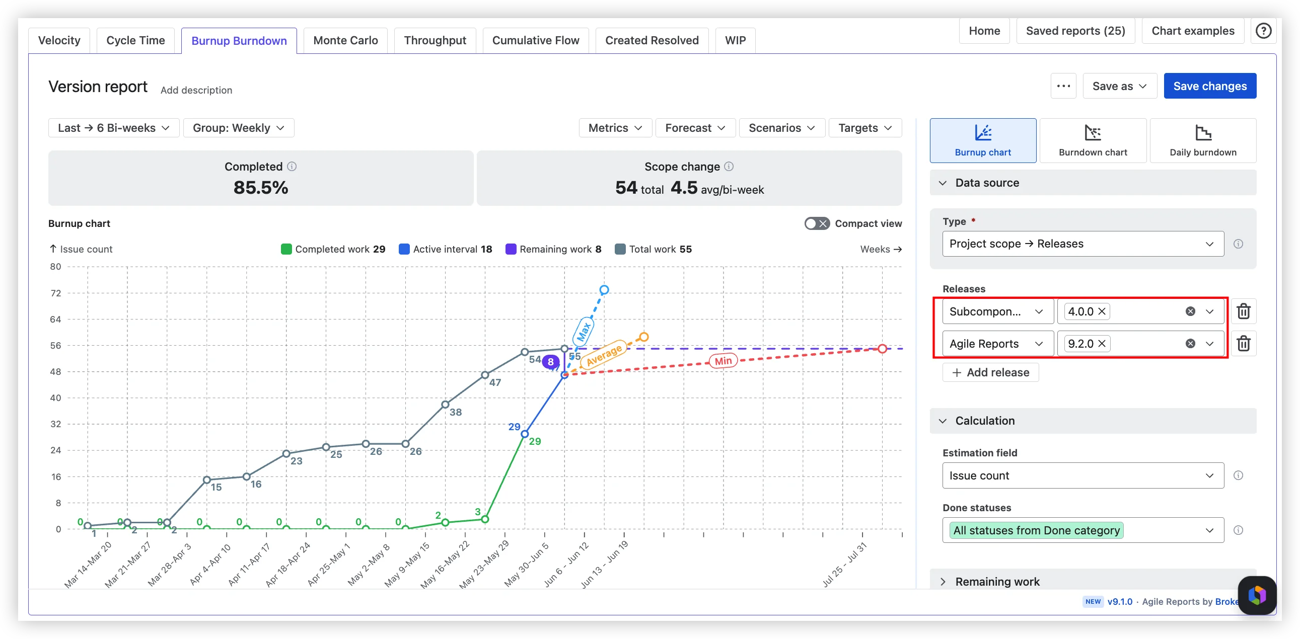
Select versions from multiple Jira projects. See one consolidated forecast. No spreadsheets, no manual aggregation, no "let me pull the numbers from three different reports and hope I didn't miss a project."
Health metrics at a glance
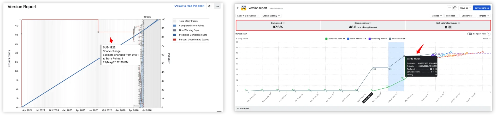
Every chart shows Completed %, Scope change (total and per interval), and Not estimated issues at the top: a quick read on progress, scope stability, and data quality.
Hover an interval, and you get aggregated metrics – total work, completed work, velocity – not the individual issue event that the native chart surfaces. Compare the two:
Target dates and forecast comparison
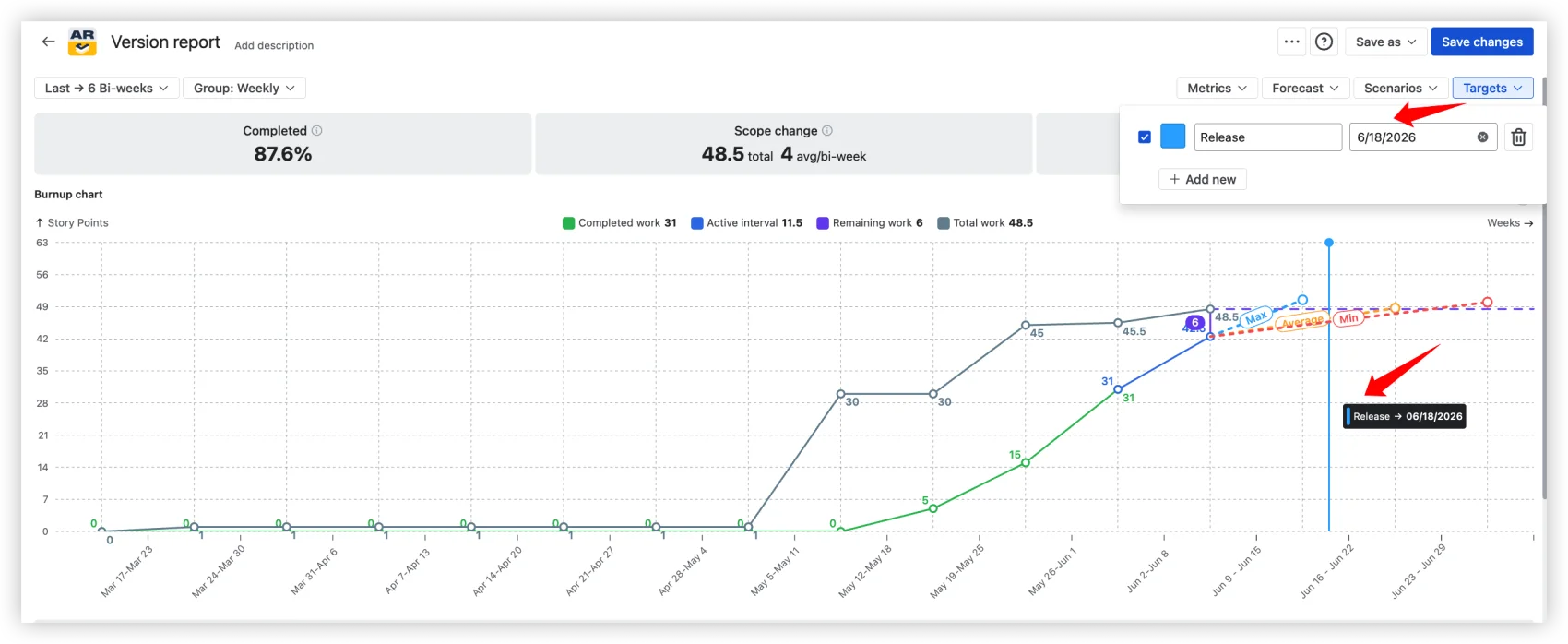
Add your deadlines as Targets: labeled vertical lines on the chart for release dates, customer commitments, or PI objectives. Compare them against your forecast scenarios and see immediately whether your Monte Carlo P80 lands before or after the deadline. Risk exposure, visualized. No mental math.
All data sources, all project types
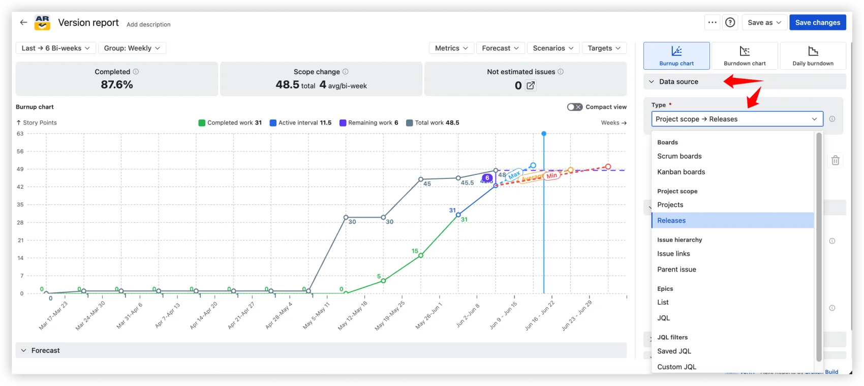
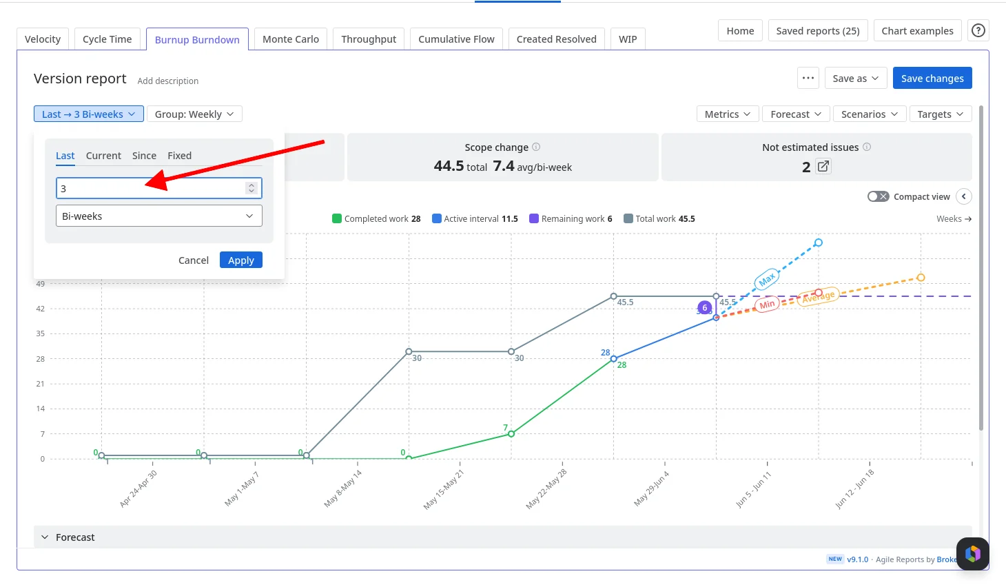
Projects, Releases, Boards (Scrum and Kanban), Epics, Initiatives, JQL. Company-managed and team-managed. Any data source can also be filtered down to one or more releases, so you can use a board or epic as the throughput basis and still scope the forecast to a specific release. Time periods configurable – Days, Weeks, Bi-weeks, Months, Quarters – with Last, Current, Since, or Fixed range selection.
Sharing that doesn't involve screenshots
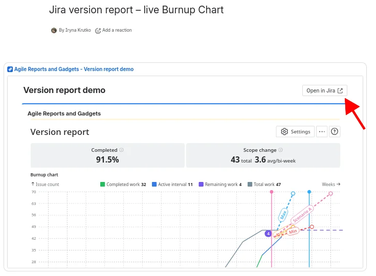
Embed on a Confluence page as a gadget. Pin to a Jira dashboard. Export as CSV, PNG, or PDF.
Do you need this?
Five questions I ask teams when they bring me a version report problem:
- Are you forecasting more than 3 weeks out?
- Does the release span more than one Jira project?
- Do your stakeholders read Confluence, not Jira Reports?
- Is your team's capacity split across initiatives?
- Is this a new release with little delivery history?
If the answer to any of these is yes, the native version report is not the right tool. Not because it's bad, but because it was built for a different problem.
Why not Excel or BI tools? Excel goes stale the moment Jira changes. Tableau and Power BI require ETL pipelines and force you to re-implement Jira concepts outside Jira. Agile Burnup Burndown Charts run on live Jira data with no sync, no export, and no infrastructure to maintain.
See how it works in action: interactive Release burnup chart example
A forecast you can defend, in one step (plus the refinements that earn trust)
Here's the setup I walk teams through. Step 1 is the only one that's truly mandatory: finish it, and you already have a working Min/Avg/Max forecast on screen. Everything below is a refinement – add the ones the stakeholder conversation actually calls for, and save when you're done.
1. Pick the release. Open Agile Burnup Burndown Charts. Set the data source to Releases. Select your project and the version you've been tracking. That's it – the Min/Avg/Max forecast is already drawn.
Set capacity allocation. Open Forecast settings. If your team splits 50/50 between this release and another initiative, set the coefficient to 50%.
Add a probability scenario for the stakeholder commitment. Add a custom Monte Carlo scenario and select P80 – the date by which the work completes in 80% of 100,000 simulated futures.
Drop a target date. Add a marker for your release deadline. The chart now shows your forecast scenarios alongside the deadline. Risk exposure at a glance.
Run what-if scenarios. What if velocity increases? What if the scope grows? Add custom What-if-velocity or What-if-date scenarios to model different futures without changing your actual data.
Drill into the data. Click a chart interval to see the detailed issue list for that period: what was completed, what was added to scope, and what was removed. Use the breakdown selector to slice by Epic, Issue Type, Assignee, or any other Jira field.
Save and share. Save the chart and add it to a Jira dashboard as a gadget, or embed it on a Confluence page. Stakeholders see live data, no screenshot updates.
What this looks like in practice
Here's a scenario based on a common pattern we see. An Agile Coach at a mid-size financial services company manages a regulatory-deadline release: a new transaction monitoring module that must ship before the next DORA compliance assessment. Three Jira projects (backend, frontend, infrastructure), a fixed deadline in ten weeks, and a team that also handles production support.
With the native version report, she can see one project at a time. The predicted date shows four months out because the version was created six months ago. There's no way to tell the CFO whether the team will hit the deadline.
She sets up the Burnup Chart with Releases as the data source, selects versions from all three projects, sets capacity to 60%, adds a Monte Carlo scenario at P80, and drops a target date on the compliance deadline. P80 lands two weeks before. Manageable, with discipline.
When the scope grows by 12 story points in week four (a new regulatory requirement surfaces), the health metrics flag it immediately. The scope change total jumps from 45 to 57. The Monte Carlo P80 shifts by four days but still clears the deadline. She embeds the chart on the Confluence page the compliance team reviews weekly.
One chart. Three projects. A probability, not a guess. The kind of evidence a regulatory examiner can actually look at.
Beyond the Burnup Chart
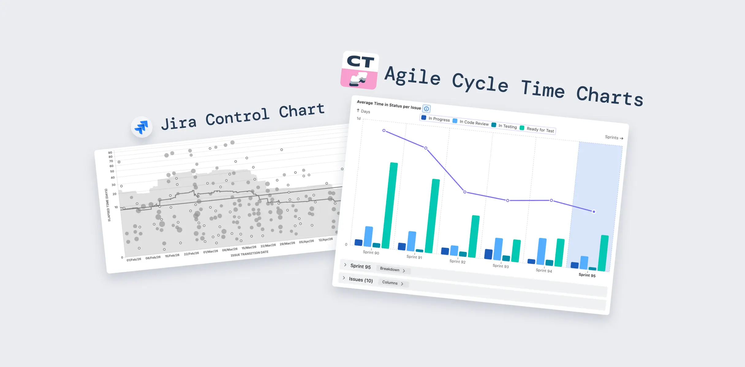
Agile Burnup Burndown Charts app is available as a standalone app on the Jira Marketplace. For teams that need more than release forecasting, it's also part of Agile Reports and Gadgets, a bundle with 9 chart types (Velocity, Cycle Time, Time in Status, Burnup Burndown, Monte Carlo, Throughput, Cumulative Flow, Created Resolved, WIP) and 38 ready-to-use templates.
Native Jira version report vs Agile Burnup Burndown Charts
Wrapping up
The Jira version report does what it was built to do. It shows you how much work is done and projects a completion date from average velocity. For a quick glance, that's enough.
But the moment you need to commit a date to stakeholders, model a capacity split, track scope changes across projects, or show a regulator evidence of delivery governance, the report gives you nothing to work with. Three dates from one formula, and no way to tell anyone how confident you are.
Agile Coaches don't need a better version report. They need a forecasting tool that speaks in probabilities, models real-world constraints, and produces evidence that their stakeholders can trust. That's what the Burnup Chart was built for, and it takes five minutes to see the difference.


.png)