


A delivery manager opens the quarterly review with a Monte Carlo chart on the screen. There is an 85% chance the work lands by week 11, a 50% chance by week 8. The stakeholders nod, then ask the one question every probabilistic forecast eventually meets: which items are you counting, exactly?
That question is where most Monte Carlo conversations get awkward. The math is rigorous; the inputs are usually opaque. And for teams that don't estimate in story points to begin with – the ones who plan in hours and days because that's what the work actually looks like – the Monte Carlo curve has often been off-limits entirely. Two different walls, both wearing down trust in the same forecast.
The Agile Monte Carlo Charts 1.1 release brings down both walls. This post is about why those walls existed in the first place – and what changes when a forecast can be planned in time and audited by anyone in the room.
Forecasts for teams that plan in hours, not points
The dominant agile-estimation orthodoxy, articulated most famously by Mike Cohn at Mountain Goat Software, is that story points are completely unrelated to time. The position has merit: it isolates effort from calendar pressure and makes velocity comparisons across people more honest.
It is also, for a non-trivial number of real teams, simply not how they work.
A 20-person team running two-week sprints often estimates in hours and days. Not because they failed to read Cohn – because:
- Their planning conversations are denominated that way.
- The PM scopes work in hours because customer commitments are scoped that way.
- Leads track velocity in hours because that's the basis on which they negotiate sprint capacity.
Vasco Duarte's #NoEstimates work sits closer to that instinct than to Cohn's points: predictability comes from task-size stability, not from the unit you call them.
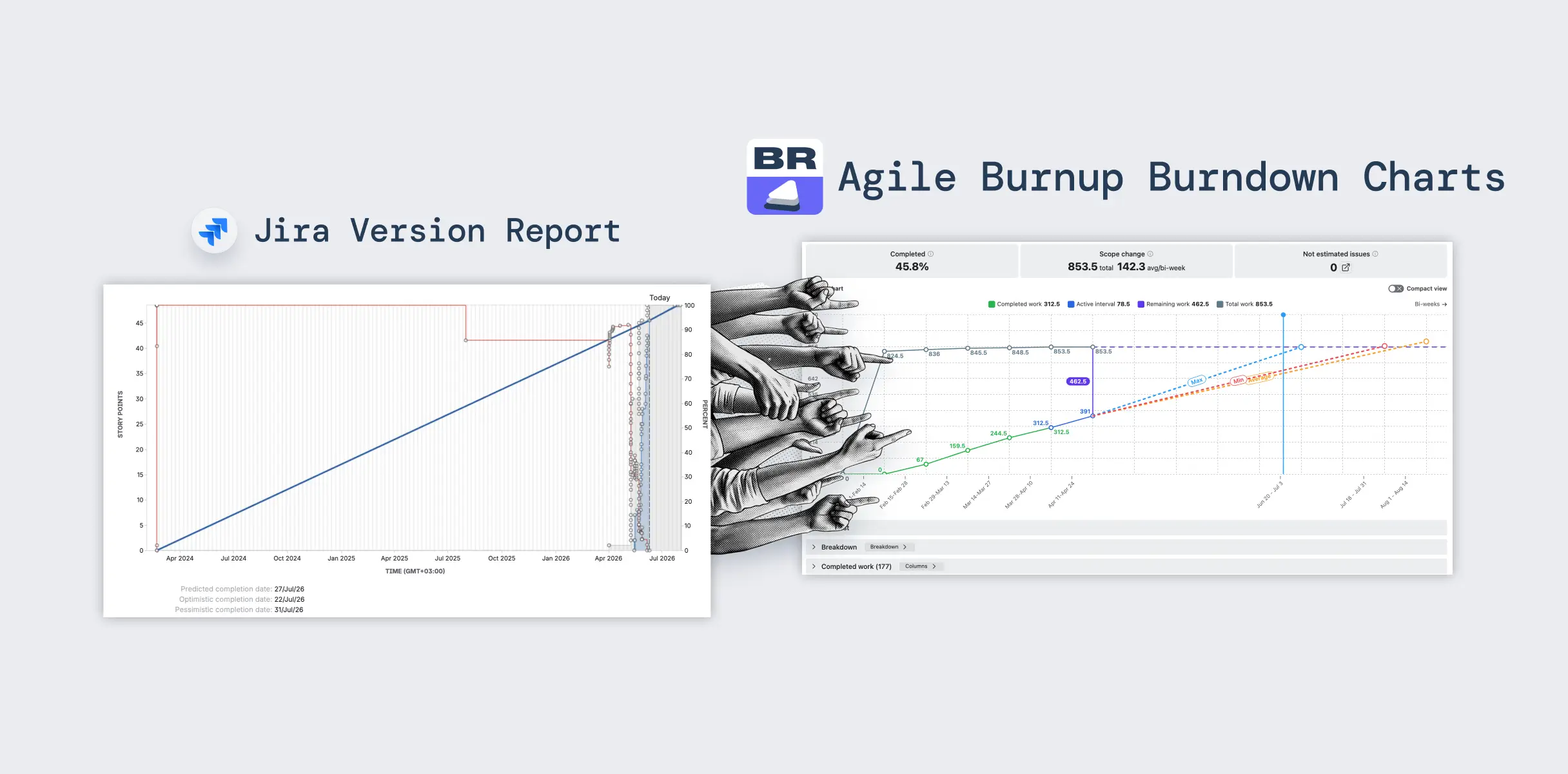
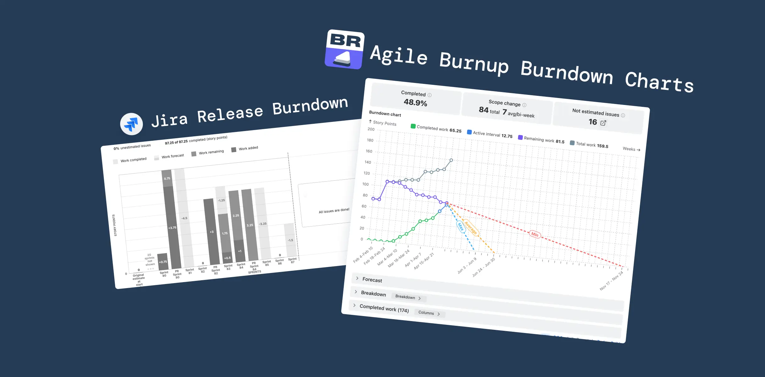
For teams in that camp, our Agile Velocity Charts and Agile Burnup Burndown Charts have long accepted Time spent & remaining as an estimation field – the combined Jira field that integrates logged time with remaining estimate. Velocity in hours, burndown in hours, planning entirely consistent with how they worked. But the moment they wanted a probabilistic forecast, Agile Monte Carlo Charts effectively forced them back to story points: pretend, translate, or skip the forecast. That's not a pedantic UX inconsistency – it's a small product asking a real team to maintain two parallel estimation systems for the benefit of one chart.
How the Agile Monte Carlo Charts app handles this
The 1.1 release closes that gap. Agile Monte Carlo Charts app now accepts Time spent & remaining as an estimation field, on the same pattern as Agile Velocity Charts and Agile Burnup Burndown Charts. All three apps are also available together in the Agile Reports and Gadgets bundle.
The field combines original estimate, time spent (logged work), and remaining time into a single basis for the forecast. The exact mix per issue depends on the issue's status:
- To Do uses Time remaining;
- In Progress uses Time spent + Time remaining;
- Done uses the Original estimate (with an optional override to count only actual logged time).
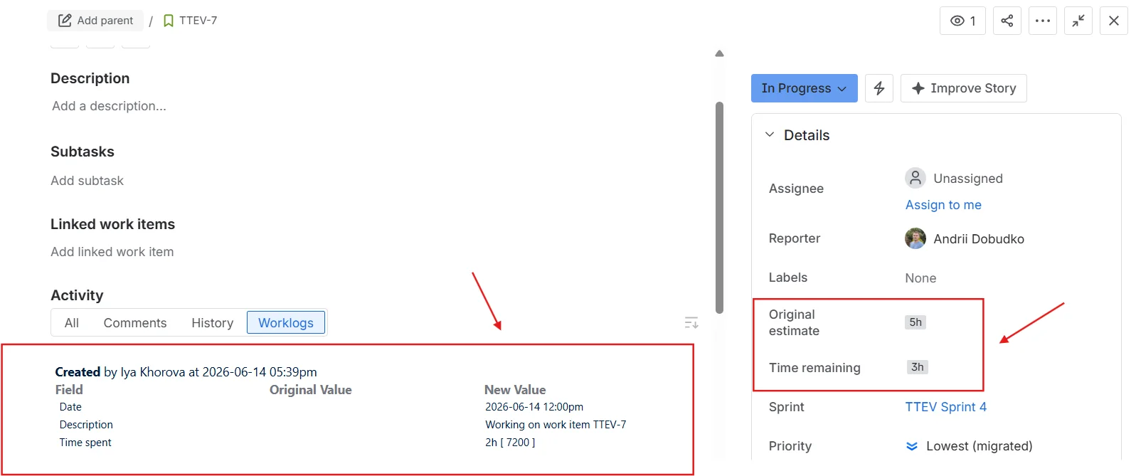
A team that runs in hours can now run Agile Velocity Charts, Agile Burnup Burndown Charts, and Agile Monte Carlo Charts on one consistent unit – no story-point translation, no parallel estimation system to maintain just to humour a forecasting chart.
It's worth being explicit about what this is and isn't. It is not an endorsement of hours-over-points as the right model for every team; the agile-estimation debate is genuine, and good engineers disagree. It is the recognition that Monte Carlo's value – running a real distribution against real historical throughput – should be available to a team regardless of which estimation unit their planning conversation already runs in. The forecast should adapt to the team's basis, not demand that the team adapt to the forecast.
Probabilistic forecasting was supposed to be the honest one
The probabilistic-forecasting school sells itself on one core idea: stop pretending you know the date, model the distribution.
The canonical voices in this tradition all land in roughly the same place:
- Daniel Vacanti, in When Will It Be Done?, frames probabilistic forecasts as embracing variability and uncertainty – a realistic range of outcomes rather than a fixed, single date.
- Troy Magennis makes the case mechanically: feed the simulator real throughput, run it ten thousand times, read off the curve.
- Industrial Logic, in "Reckoning with Reality with Probabilistic Forecasting", captures the practice in operating-procedure terms.
Engineering organizations have taken the message seriously. Expedia's engineering team wrote up its adoption story publicly – a marker of the practice graduating from conference talks to delivery operations.
Where the honesty stops
The pitch is appealing because it is honest: don't pretend to certainty you don't have. But honesty is a two-sided promise. The forecast embraces uncertainty about the future, fine. What about the inputs?
If a chart tells a delivery manager that the 85th percentile completion date is week 11, and the delivery manager cannot answer "which items, which sprints, which definition of done" – the forecast hasn't replaced one black box with a more honest one. It has replaced a date with a curve and left the box intact.
That gap is exactly where most adoption stalls. In our own product research, the single most common Monte Carlo objection wasn't about the math – it was a sentence we heard, almost verbatim, in conversation after conversation: “Forecasting is powerful but feels 'black box' and hard to operationalise. Which data exactly are you using for this forecast?”
Two enterprise customers – one a global logistics firm, one a UK retail bank – kept pressing on throughput logic for months in support tickets, not because they doubted the formula but because they couldn't see what was inside it.
Inside the throughput: a breakdown and issue list
Until this release, the throughput inputs that drove a Monte Carlo curve in Agile Monte Carlo Charts behaved like the inputs in most probabilistic-forecasting tools: a number you trusted because the chart said so. From the 1.1 release onwards, each throughput input – both the primary throughput and any alternative throughput configured for an A/B comparison – is expandable.
Click one open and you see two things:
- A breakdown that segments completed items by up to two levels of any Jira field you choose – board, issue type, project, priority, assignee, epic, fix version, label, or any custom field. You configure the levels via the Breakdown button; drag to reorder. Nested levels show both the absolute value and the percentage of the parent total, with sparkbars for quick visual comparison.
- The issue list itself: every completed item that fed the throughput sample, with key, summary, and completion date. The proof behind the numbers.
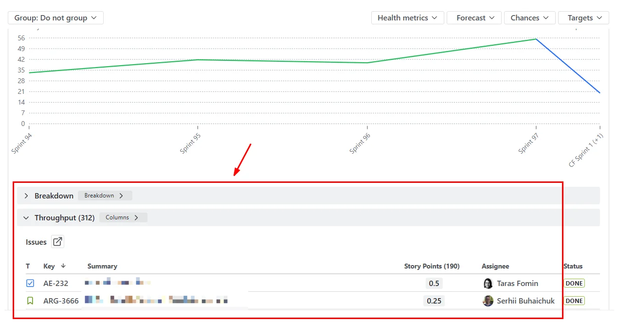
Both panels are collapsed by default. The executive on a steering-committee call wants the headline (85% by week 11); the delivery manager, defending it five minutes later, wants the receipts. One product, two reading modes. The chart view stays clean. The audit view is one click away.
The result is small in surface area and significant in posture. The forecast no longer asks for blind trust. It shows its work – in the same UI, no export step, no separate dashboard. When the next stakeholder asks, "Which items are you counting?" the answer is on screen.
A practical playbook for the next sprint review
If you're picking up this version with an existing chart configured, here's the minimum-effort path to use both features in your next forecast:
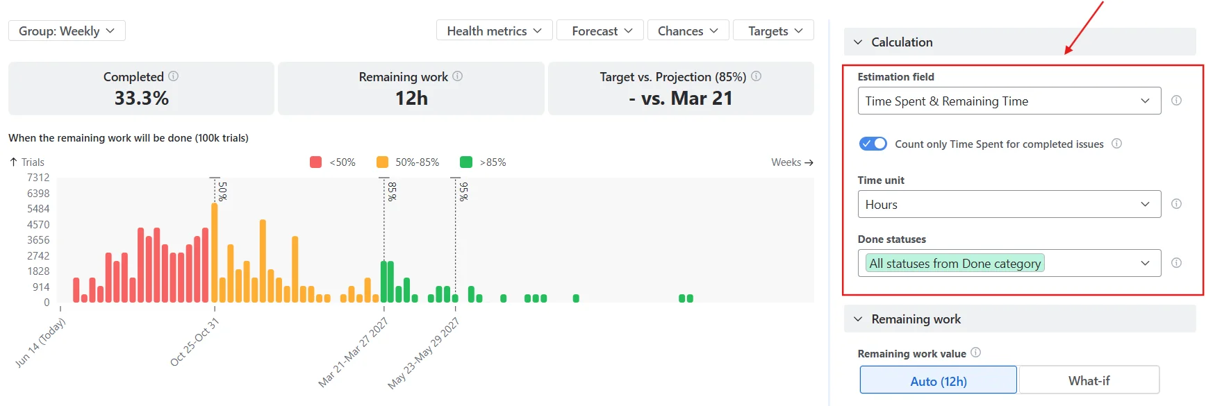
- Pick the estimation basis that matches your planning conversation. Open the chart's calculation settings; under the Estimation field, choose
Time spent & remainingif your team plans in hours. The chart will recompute throughput on the new basis. If you're a story-points team, leave it as is – the change is opt-in. - Configure the breakdown levels. Scroll below the chart to the Breakdown panel and click the Breakdown button. Select up to two levels of nesting from any Jira field – for example, Issue type as the first level and Project as the second. Drag to reorder. The breakdown will use those levels when you expand a throughput input, with percentages and sparkbars at each nesting level.
- Expand a throughput input and sanity-check. Click a throughput bar to reveal the breakdown and issue list underneath. Verify the issue sample – sprints included, statuses filtered, the count matches what your delivery records say. This is the trust-building step; do it once before you present.
- Lead the stakeholder conversation with the curve, follow with the drill-down. Open on the percentile dates as you normally would. When the inevitable "which items?" question lands, expand the input in front of the room. The answer is in the same chart, not a separate spreadsheet.
- For multi-team setups, add an alternative throughput data source (a different board, project, or JQL filter) to run an A/B comparison. Both the primary and alternative throughput inputs are expandable with their own breakdown and issue list, so portfolio leads can audit two teams' samples side by side.
A small note on filtering: if your existing JQL excludes certain issue types or labels, the breakdown will reflect those exclusions. Confirm the JQL still matches what you mean by "completed work" before relying on the issue list as audit evidence – easy to forget, easy to surface in the issue list when it's wrong.
See it in action without installing anything
If you'd rather get a feel for the chart before configuring anything in your own Jira, two interactive examples on the Broken Build site run the same forecasting logic against sample datasets:
- Kanban Monte Carlo simulation – the no-sprint case: continuous flow, throughput sampled per day, the curve answers "when will the backlog clear" rather than "when will the sprint commitment land."
- Monte Carlo forecasting for Scrum – the sprint-cadence case: throughput sampled per sprint, percentile dates lining up to sprint boundaries, the shape a Scrum team would actually present at planning.
Both run in the browser. Same simulator, same percentile output, no installation.


Honest forecasts deserve honest inputs
The probabilistic-forecasting movement made the case, more than a decade ago, that the agile world should stop pretending it knew the date. The argument won – sort of. The math is more widely understood, the conferences are still going, and the case studies keep landing. Where the practice stalls in real product orgs isn't the math – it's the gap between "embrace uncertainty" as a slogan and a forecast a delivery manager can actually defend in a quarterly review.
Closing that gap turns out to be more about UI honesty than about model sophistication. Let the team forecast on the unit they already plan in. Let any stakeholder see what's inside the throughput. Neither change is dramatic. Together, they move the chart from trust the math to here's the math, audit it yourself.
The Agile Monte Carlo Charts app handles the forecasting side. Agile Velocity Charts and Agile Burnup Burndown Charts cover velocity and progress tracking on the same estimation field options – or get all three plus Cycle time, Time in Status, Cumulative flow, Throughput, Created vs Resolved, and WIP charts in the Agile Reports and Gadgets bundle.


.png)