

Native Jira's Velocity Chart is Scrum-only – Kanban teams get no equivalent view of their delivery rate at all. Broken Build's Agile Reports and Gadgets gives Kanban teams two ways to see it: Velocity Charts for a per-interval Completed-work trend, and Throughput Charts for full statistical delivery-rate analysis with allocation and predictability views. Both are available as standalone apps or as part of the Agile Reports and Gadgets bundle.
What is velocity in Kanban?
The Agile Alliance defines velocity as "the amount of work completed during an iteration." In Scrum, that means story points finished per sprint. Kanban has no sprints – so velocity in Kanban means completed work per time interval: per day, per week, per month. The Kanban Guide calls this throughput – "the exact count of work items finished per unit of time" – and lists it as one of four mandatory flow metrics.
In practice, teams use "Kanban velocity" and "Kanban throughput" interchangeably. The distinction: velocity usually implies a volume (story points per week), throughput usually implies a count (issues per day). Both are delivery-rate metrics. If your team estimates, start with Velocity Charts. If your team skips estimation or needs statistical delivery analysis, start with Throughput Charts.
How to read the Velocity Chart in Jira
Open any Scrum board in Jira Cloud and navigate to Board → Reports → Velocity Chart. The chart is available on Scrum boards only.
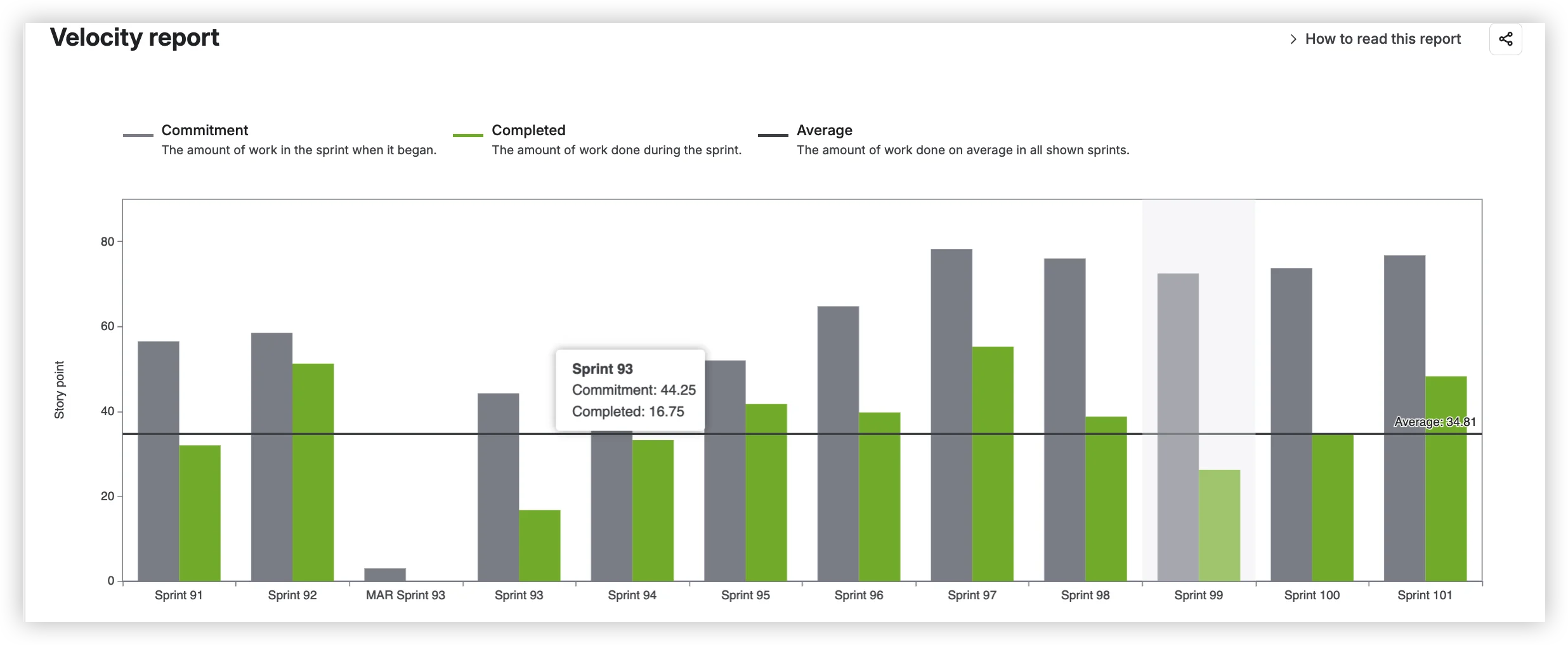
According to Atlassian's documentation, the chart tracks "the average amount of work a scrum team completes during a sprint" and plots three elements:
- Commitment – "the total estimate of all work items in the sprint when it begins."
- Completed – "the total completed estimates when the sprint ends."
- Average – "the amount of work completed on average across all the shown sprints."
Kanban teams have no access to this chart. There is no velocity chart, no throughput chart, and no delivery-rate report of any kind on a Kanban board. Native Jira simply does not offer Kanban teams a way to see how much they deliver over time.
What Agile Reports and Gadgets gives Kanban teams
Native Jira has no delivery-rate chart for Kanban boards. Not a limited version – literally nothing. Everything below is what Agile Reports and Gadgets adds.
1️⃣ Two delivery-rate charts – the Kanban equivalent of Scrum velocity
Velocity Charts (part of Agile Reports and Gadgets) shows per-interval Completed-work bars, grouped by day, week, month, or a custom interval. This is the direct Kanban analog of Scrum sprint velocity. Select one or multiple Kanban boards as the data source, and the chart shows the delivery trend that Scrum teams take for granted – applied to continuous flow.
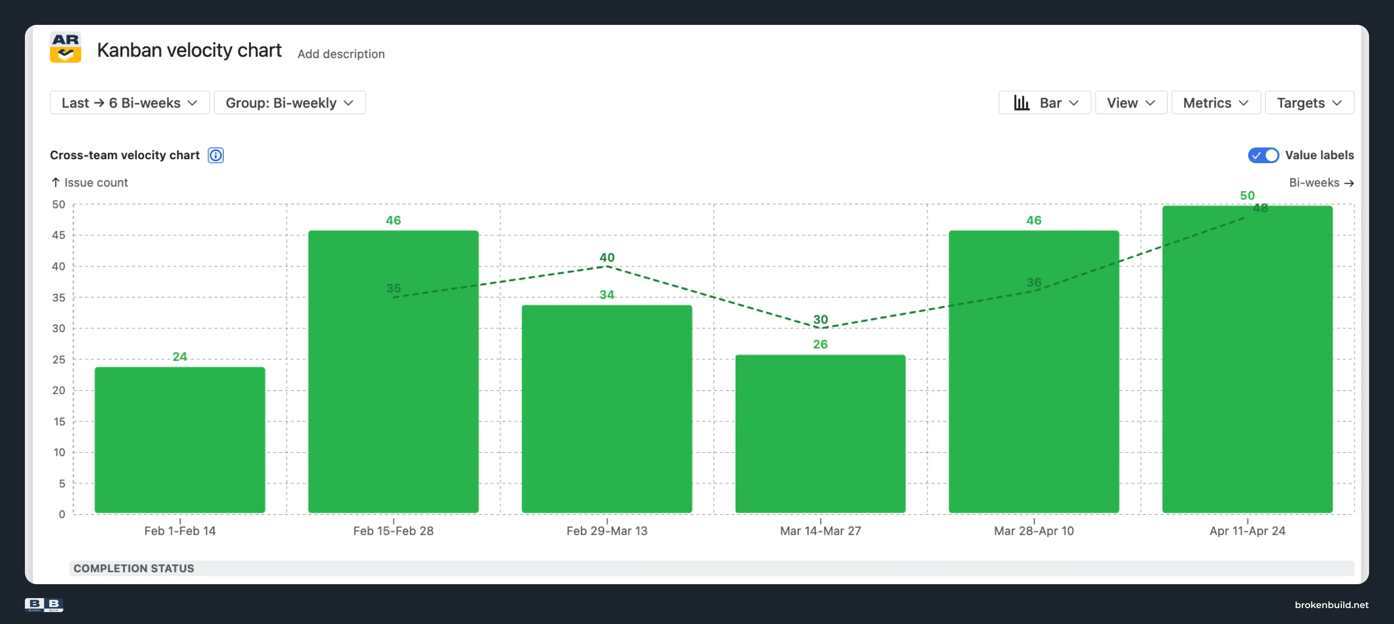
👉 See the interactive Kanban velocity report example
Throughput Charts (also part of Agile Reports and Gadgets) is the dedicated Kanban throughput tool. The Run chart shows delivery rate per interval, and the Throughput Histogram adds distribution analysis for predictability. Where Velocity Charts answers "how much did we deliver?", Throughput Charts adds "how predictable are we?" and "what is our delivery made of?"
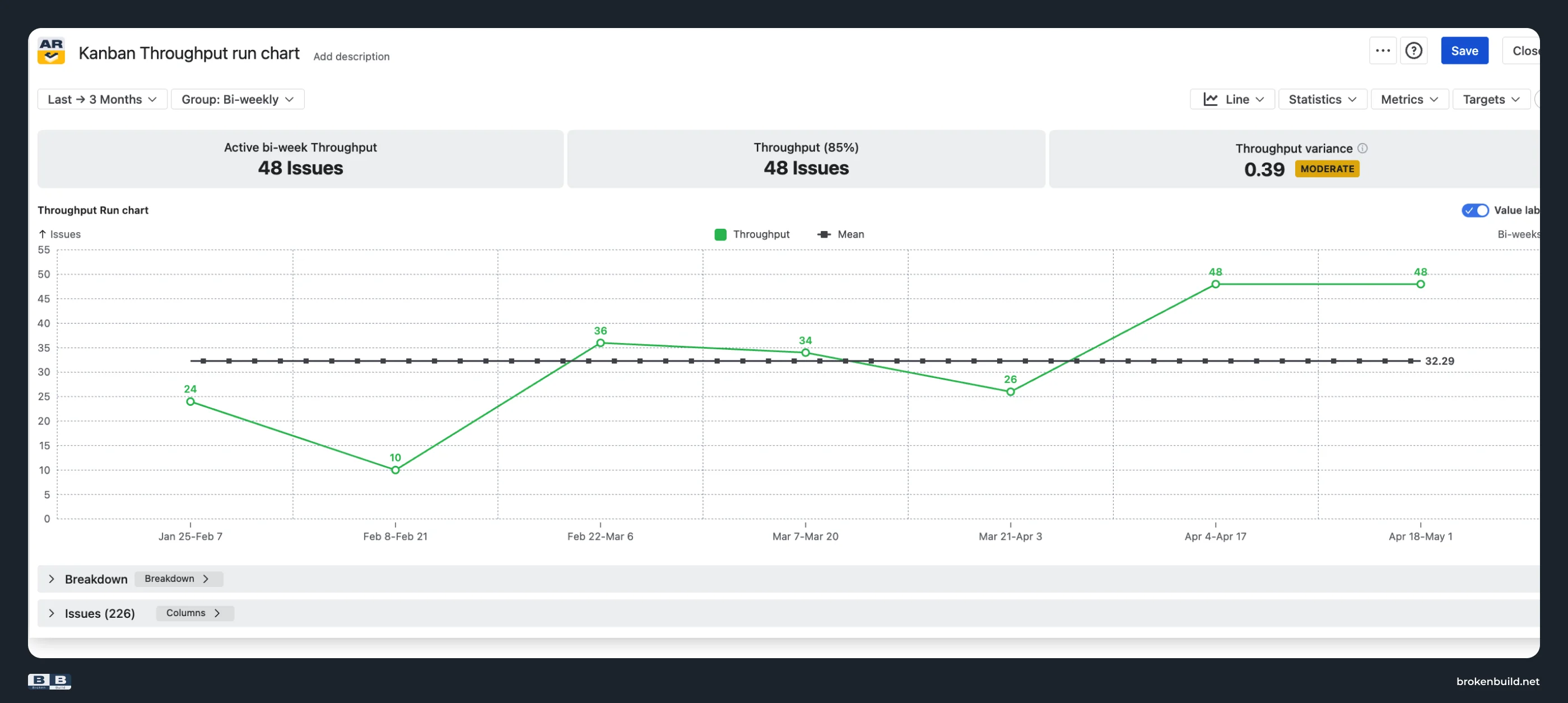
👉 See the interactive Kanban throughput run chart example.
2️⃣ Stacked-bar allocation – what throughput is made of
Was last week's output mostly features, or mostly bugs? Throughput Charts' stacked-bar view segments each period by issue type, epic, team, priority, or any Jira field. A higher week is not worth celebrating if it is all bugs – the allocation view turns a number into a diagnostic.
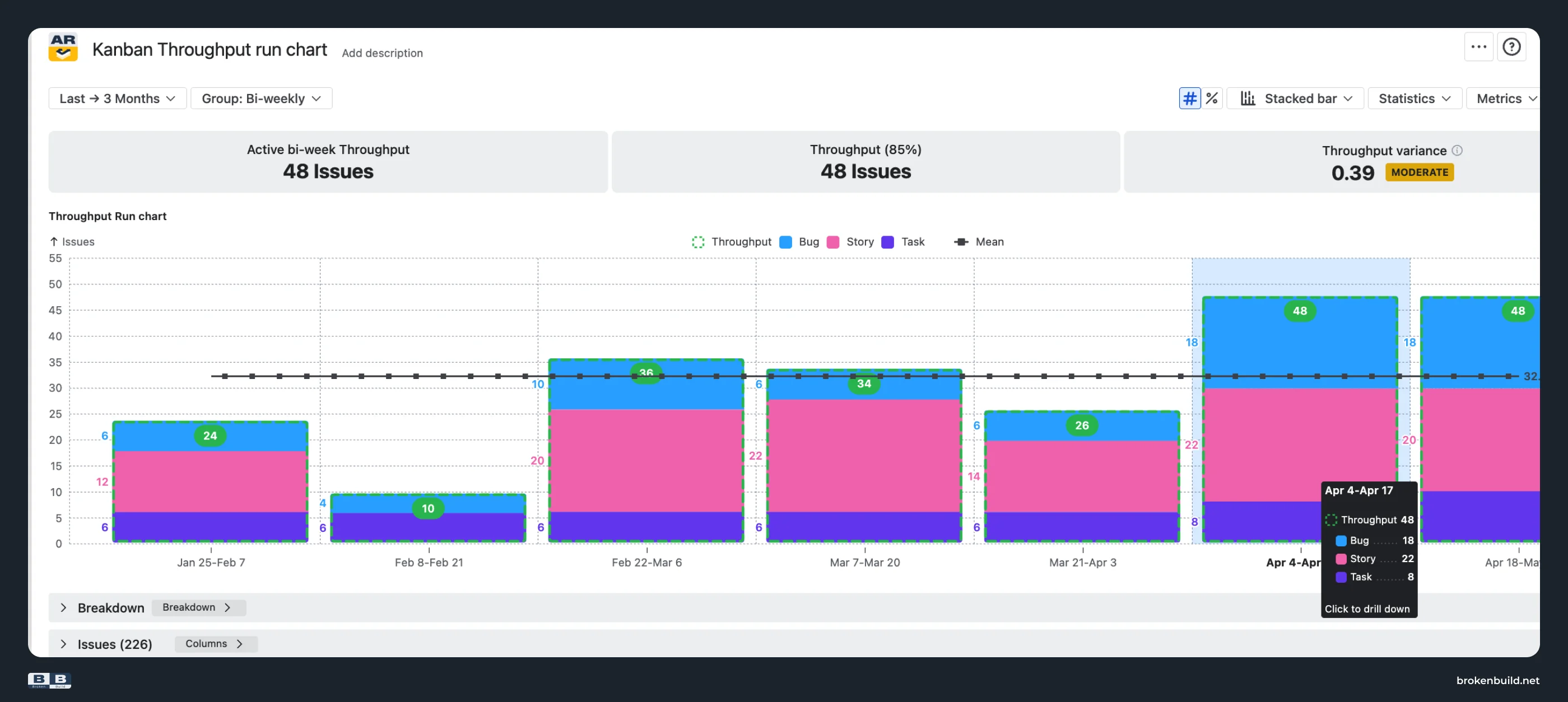
3️⃣ Throughput Histogram – predictability as a real number
The Throughput Histogram plots how often different throughput values have occurred. Overlay percentile reference lines – Mean, Median, P85, P95, or custom – and "at 85% confidence, we deliver at least 14 items per week" becomes a defensible commitment, not a guess.
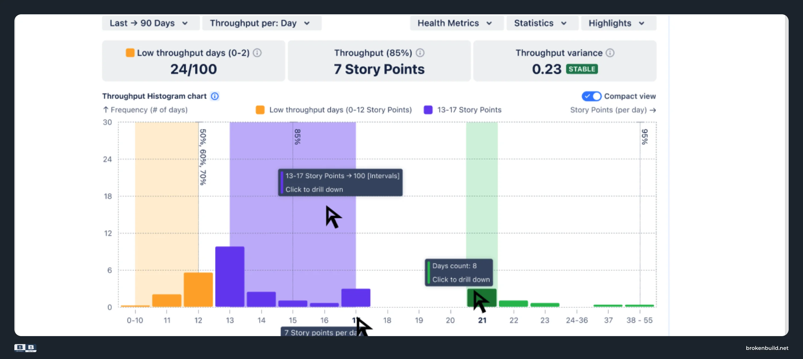
The same percentile statistics appear on the Run chart too – so the trend view and the distribution view use the same reference lines.
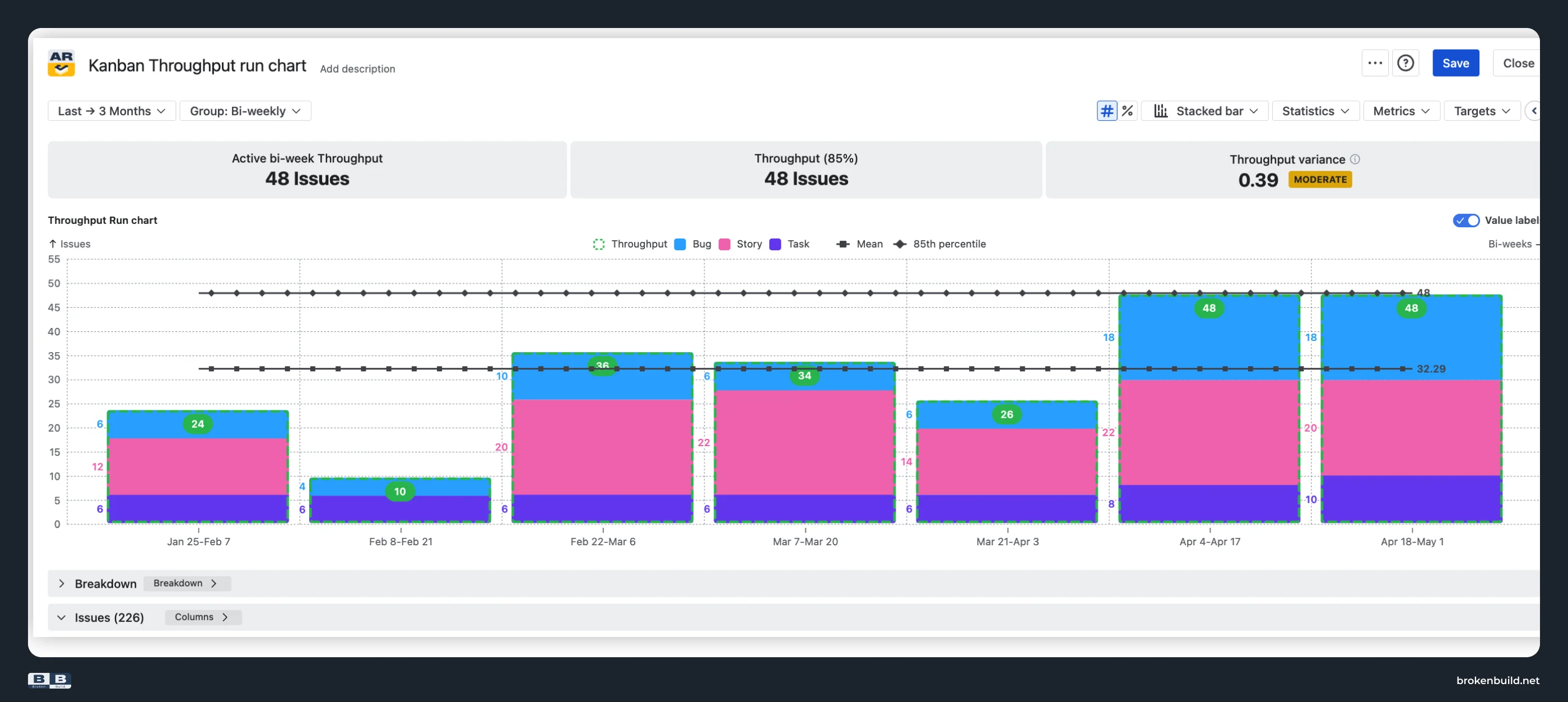
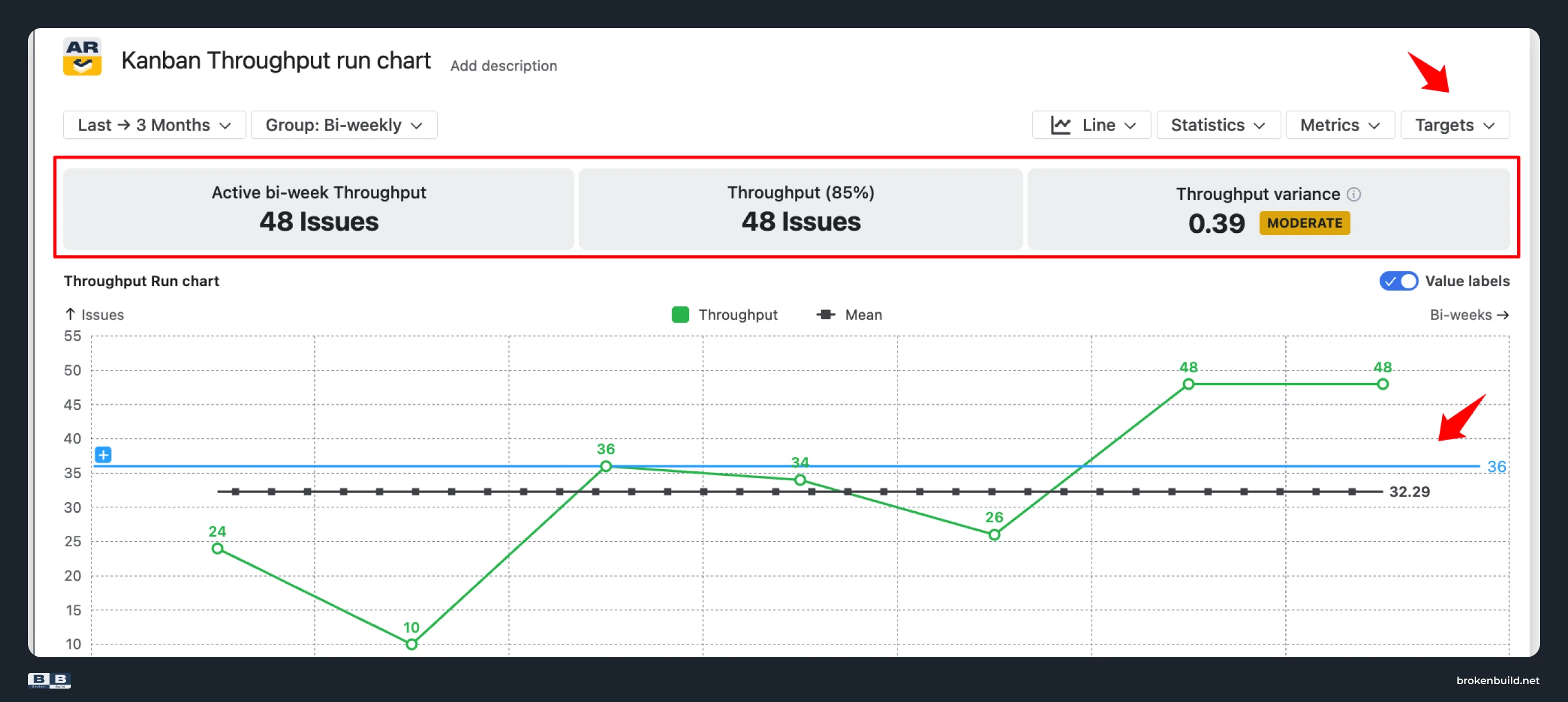
4️⃣ Targets and health tiles – KPI tracking for delivery rate
Overlay target lines on the Run chart – delivery goals, capacity targets, SLA thresholds. Health tiles above the chart flag low throughput, high variance, or custom conditions. On the Histogram, percentile ranges (low/typical/SLA-compliant) are drawn directly as visual zones.
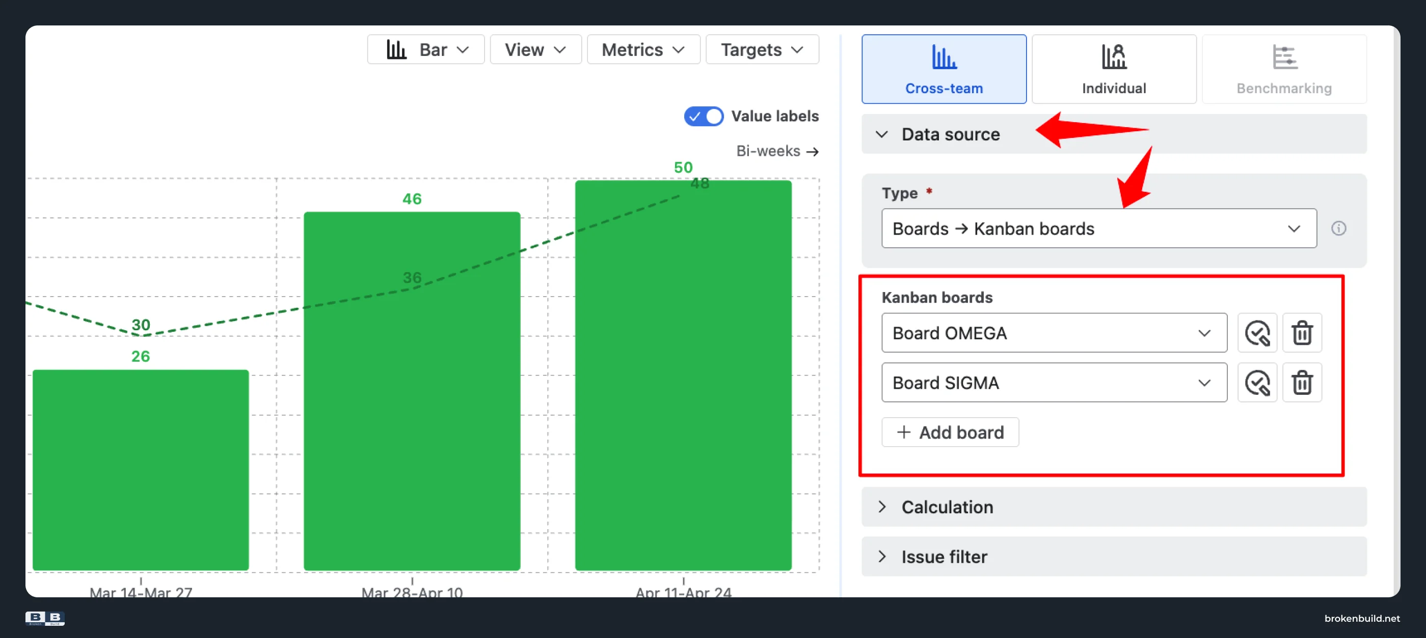
5️⃣ Any scope, not just one board – cross-team and cross-project
Both charts in Agile Reports and Gadgets support multi-board, cross-project scope: releases, initiatives, epics, filters, JQL – and combinations. Roll up "all Kanban teams under this program" or narrow to "one epic on one board." Filter further by issue types, specific epics, releases, or custom JQL to decide what counts.
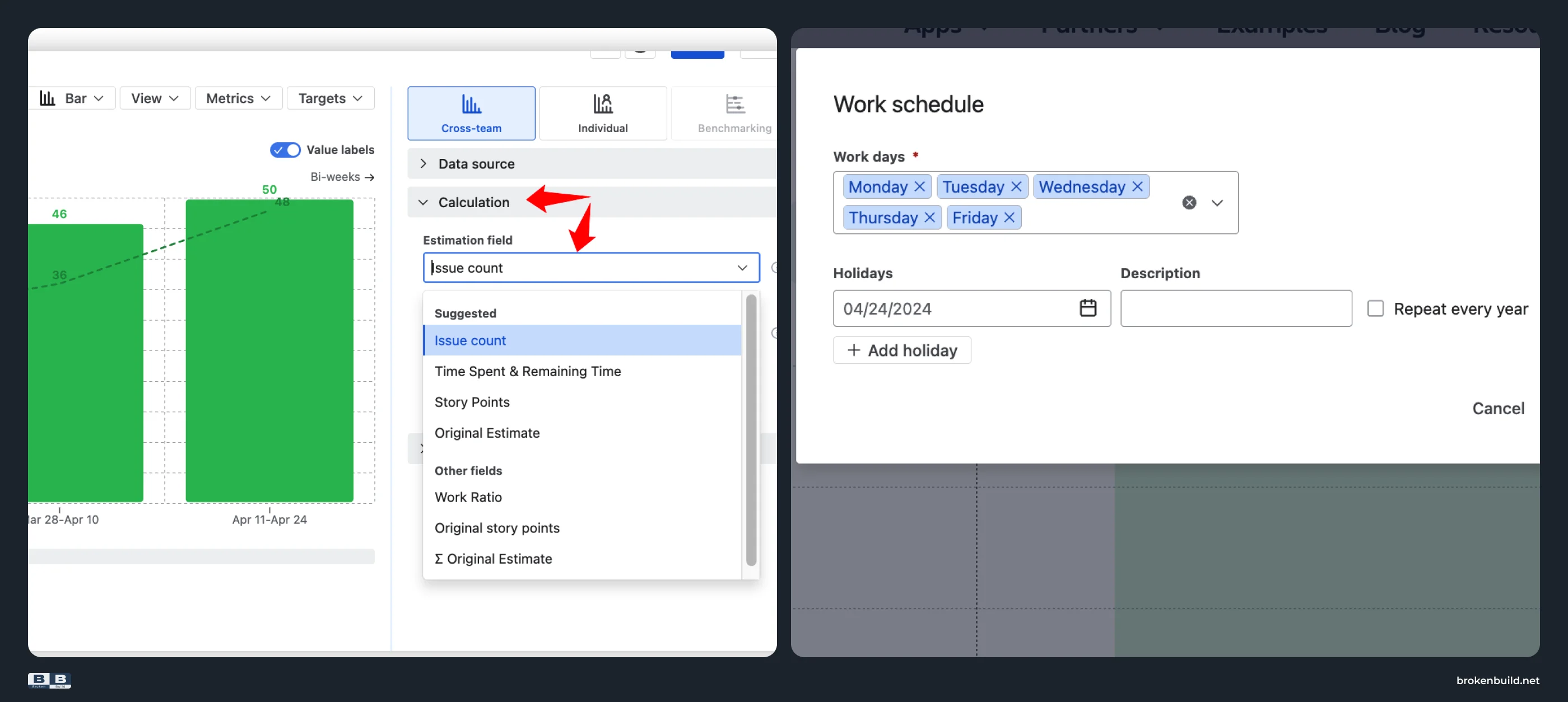
6️⃣ Configurable unit, interval, and working schedule
Count issues, sum story points, sum time, or any custom numeric field. Bucket delivery per day, week, month, or a custom period. Throughput Charts' daily bucketing respects your work schedule – time zone, working days, working hours, breaks, holidays – so a public holiday does not distort the distribution.
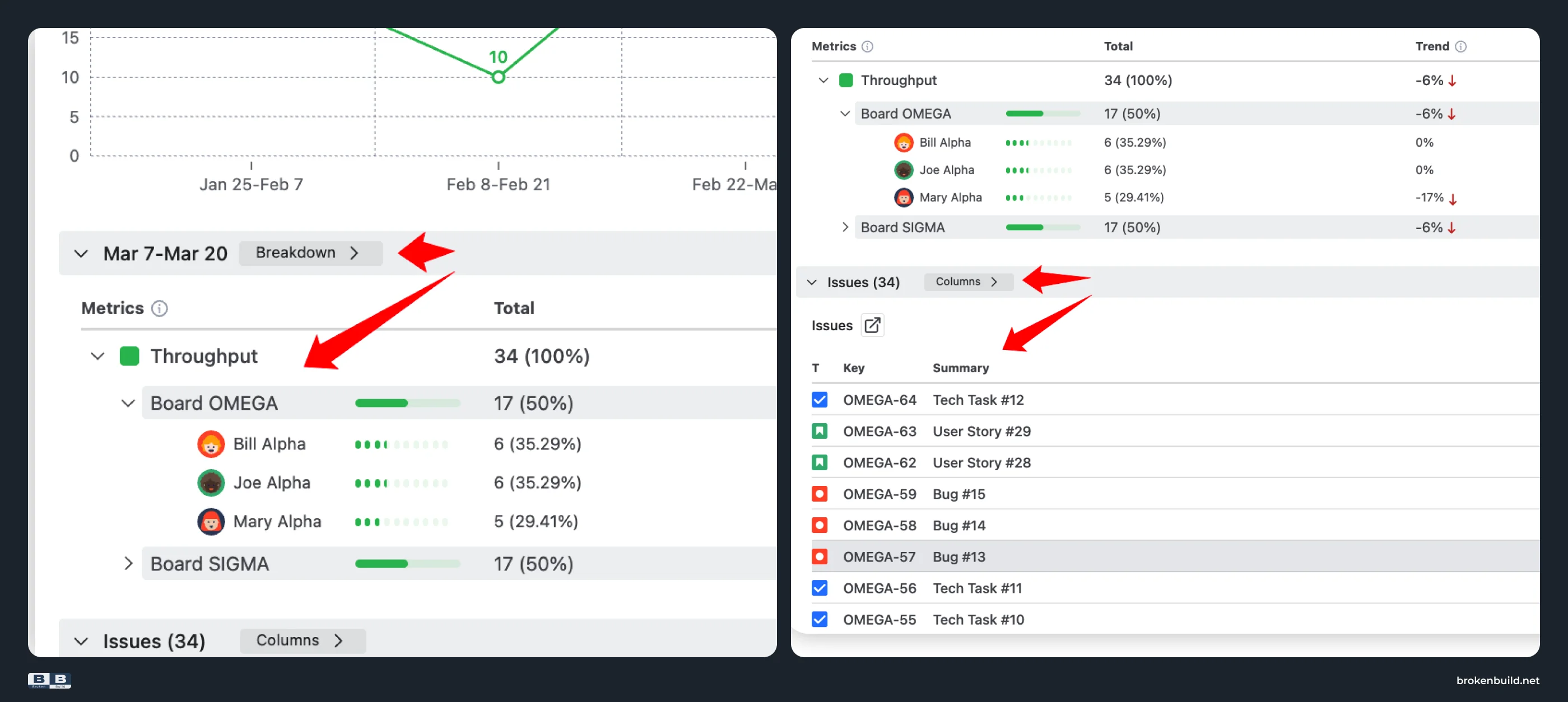
7️⃣ Drill-down that answers "why?"
Click any bar or interval to open a Breakdown by any Jira field (up to two nesting levels) and an integrated Issue list with click-through to Jira. See which epic, issue type, or assignee drove this period's throughput – so a dip or spike becomes a diagnosis, not a mystery.
8️⃣ Dashboard and Confluence – delivery data where stakeholders look
Both charts work as Jira dashboard gadgets and embed interactively in Confluence via Smart Links – settings, filters, and grouping remain editable inside Confluence. CSV, PNG, and PDF export for slide decks and spreadsheets.
Standalone apps or bundle
Both Agile Velocity Charts and Agile Throughput Charts are available as standalone apps – install only what you need. They are also part of Agile Reports and Gadgets – a bundle of nine agile charts covering velocity, throughput, cycle time, cumulative flow, and more. If your team needs Kanban reporting beyond delivery rate, the bundle is the faster path.
Try the interactive examples
See the charts in action on live datasets – no installation needed. Each example opens a fully interactive chart.
- Kanban velocity report – measure completed work pace, compare velocity across teams, and reveal delivery trends for Kanban boards.
- Kanban throughput run chart – analyze delivery pace, track completed work over time, and understand capacity distribution.



How to set up Agile Reports and Gadgets for Kanban
Follow along – install Agile Reports and Gadgets free →
- Install Agile Reports and Gadgets from Atlassian Marketplace. Free for teams up to 10.
- Open the chart: go to any Jira dashboard → Add gadget → Agile Velocity Charts (or Agile Throughput Charts).
- Select a data source – pick one or multiple Kanban boards.
- Choose the estimation unit – story points, issue count, time, or a custom numeric field.
- Set the interval – daily, weekly, bi-weekly, monthly, or custom. Weekly is the most common starting point for Kanban teams.
- Add statistics – toggle Mean, P85, P95 reference lines on the chart.
- Set a target – overlay a target line for your minimum acceptable throughput.
- Open Breakdown – segment data by issue type, epic, or assignee to see where capacity goes.
- Share – add the chart to a Jira dashboard as a gadget, or embed in Confluence via Smart Links.
What happens when your Kanban team finally sees the numbers
Native Jira has no delivery-rate chart for Kanban boards – not a limited one, none at all. The Kanban Guide makes throughput a mandatory flow metric, but native Jira gives Kanban teams no way to track it.
Agile Reports and Gadgets fills the gap with two complementary charts: Velocity Charts for interval-based delivery trends, and Throughput Charts for statistical analysis with allocation, histogram, and percentile views – on dashboards and in Confluence.
The teams that measure delivery don't just report faster – they deliver faster. And it starts with a chart that native Jira never gave them.




.png)