

Native Jira lets you see your average cycle time, but never averages the time spent in each workflow stage. Broken Build's Agile Cycle Time Chart averages time in every status - and trends each average over time - so you can pinpoint the bottleneck driving cycle time up and see whether your improvement effort is actually working.
Native Jira can smooth cycle time into a rolling average across the whole workflow, but it can't tell you the average time spent in any specific status - not Code Review, not QA, not Waiting on Customer. So when cycle time drifts, native gives you no way to see which stage is drifting with it. Broken Build's Cycle Time Charts' Time in Status chart plots the average (or median, or P85, or any percentile you pick) time spent in every workflow stage - as a single-period snapshot, as a proportional breakdown, or as a trend line over time - with working-schedule-aware duration, drill-down, and multi-source scope. Improvement effort becomes measurable per stage, not just as a rollup.
What is Average Time in Status?
Average Time in Status measures how long work items spend, on average, in each individual workflow status – Code Review, QA, Waiting on Customer, or any other stage your team defines. It is the per-stage complement to cycle time: where cycle time gives you one number for the whole trip, average time in status tells you how long each leg of the journey took.
The Kanban Guide defines cycle time as "the elapsed time between when a work item started and when it finished." That single number is valuable – it tells you how fast the system delivers. But when cycle time drifts upward, it cannot tell you why. Was it Code Review that doubled, or did QA become the new queue? Average time in status decomposes the total into its constituent stages, making the drift diagnosable.
Teams track this metric for one reason: bottleneck identification. A 10-day cycle time could mean 2 days in development and 8 days stuck in a review queue – or it could mean time is evenly distributed. Without the per-status breakdown, you are guessing where to improve.
Jira Cloud has no native report that shows average time in status. The Reports tab includes the Control Chart (total cycle time), the Average Age Report (age of unresolved issues – a different metric), and the Resolution Time Report (time to resolve) – none of which breaks time down by individual workflow status.
Cycle time vs Time in Status – what each metric tells you
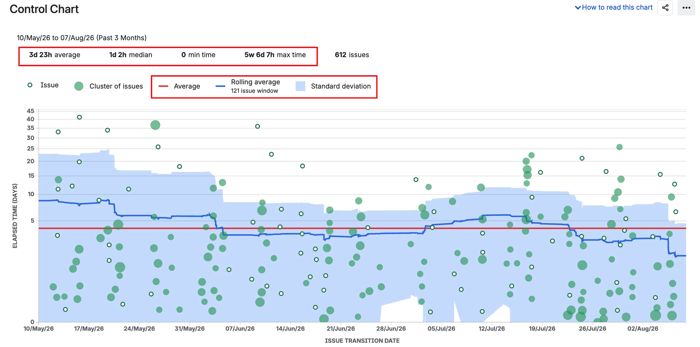
Cycle time is the total elapsed time from the moment work starts until it finishes. The Control Chart in Jira shows this as a scatterplot – one dot per work item, one number per dot. It answers: how long did this take?
Time in status is the time spent in each individual workflow status within that cycle. It answers: where did the time go?
The difference matters when you need to act, not just measure. Cycle time tells you the flight took 10 hours. Time in status tells you 6 hours were airborne, and 4 were waiting at the gate. If you want to shorten the flight, you need to know which part to fix.
When cycle time alone is enough: the workflow has few stages, delivery speed is the only question, and you trust that the bottleneck is obvious. For single-stage Kanban boards or small teams with a simple To Do → In Progress → Done flow, total cycle time may be all you need.
When you need time in status: cycle time is drifting, and you need to know which stage is responsible. The SAFe framework puts it directly: "Kanban systems provide a rich data set that can identify bottlenecks and improve flow." Time in status is the data that makes that identification possible.
A related distinction: lead time (creation → done) vs cycle time (first in-progress → done). Both describe total elapsed time at different boundaries. Neither breaks that total into per-status segments – for that, you need a time in status view.
The ProKanban SLE concept uses percentiles of cycle time – "85% of work items will be completed in 10 days or less." But when a team violates its SLE, diagnosing the cause requires the per-status breakdown. The SLE tells you the patient has a fever; time in status tells you which organ is inflamed.
How to read the Control Chart in Jira
Open any company-managed board in Jira Cloud and navigate to Reports → Control Chart. Per Atlassian's documentation: "Shows the cycle time for your product, version or sprint."
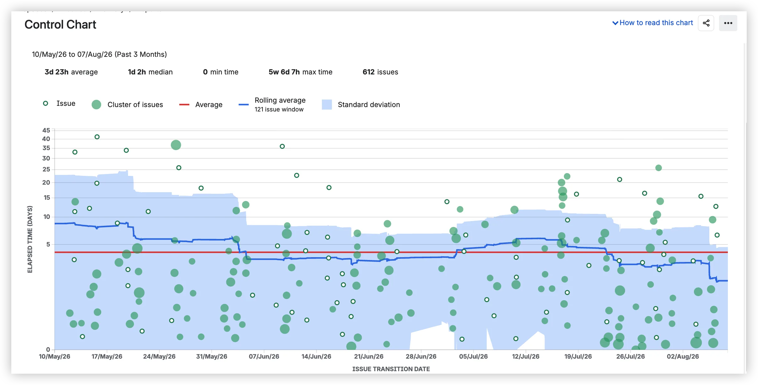
The chart plots seven elements:
- Scatterplot – each dot is a completed work item. The vertical position shows cycle time; the horizontal position shows the completion date.
- Average (red line) – the arithmetic mean of all displayed cycle times.
- Median – displayed in the summary stats bar at the top. Not mentioned in Atlassian's official documentation, but present in the current UI.
- Rolling average (blue line) – work-based, not time-based, calculated over 20% of displayed items (minimum 5).
- Standard deviation (blue shaded area) – the variance from the rolling average. A narrow band means predictable delivery.
- Min / Max – displayed in the summary stats bar.
- Issue count – total work items shown.
Patterns to watch for:
- Outliers above the band – individual tickets that took much longer. Click to investigate.
- Narrowing band – the team is becoming more predictable.
- Decreasing rolling average – process is getting faster.
- Widening band with rising average – something is degrading. But what?
That last question is where the Control Chart stops. All the statistics at the top apply to total cycle time across all statuses. A 10-day average could be 1 day in development and 9 days stuck in Code Review. The chart cannot distinguish.
Caveats:
- Company-managed spaces only – "This page applies to company-managed spaces only."
- Timer is tied to board columns, not workflow statuses.
- No working hours or business calendar.
Where native Jira falls short on Average Time in Status – and what to use instead
The Control Chart covers total cycle time well enough for a single board. But the moment you need to know which status is eating the days, it stops. Each subsection below pairs a confirmed native limitation with the corresponding capability in Agile Cycle Time Chart by Broken Build.
1️⃣ Total cycle time only → time in every status
→ Native Jira Control Chart: Jira Cloud has no report, chart, or gadget that shows the average time spent in each individual workflow status. The Control Chart shows total cycle time – one number per work item.
→ Agile Cycle Time Chart by Broken Build: The Time in Status chart plots time spent in every workflow stage, with three complementary views:
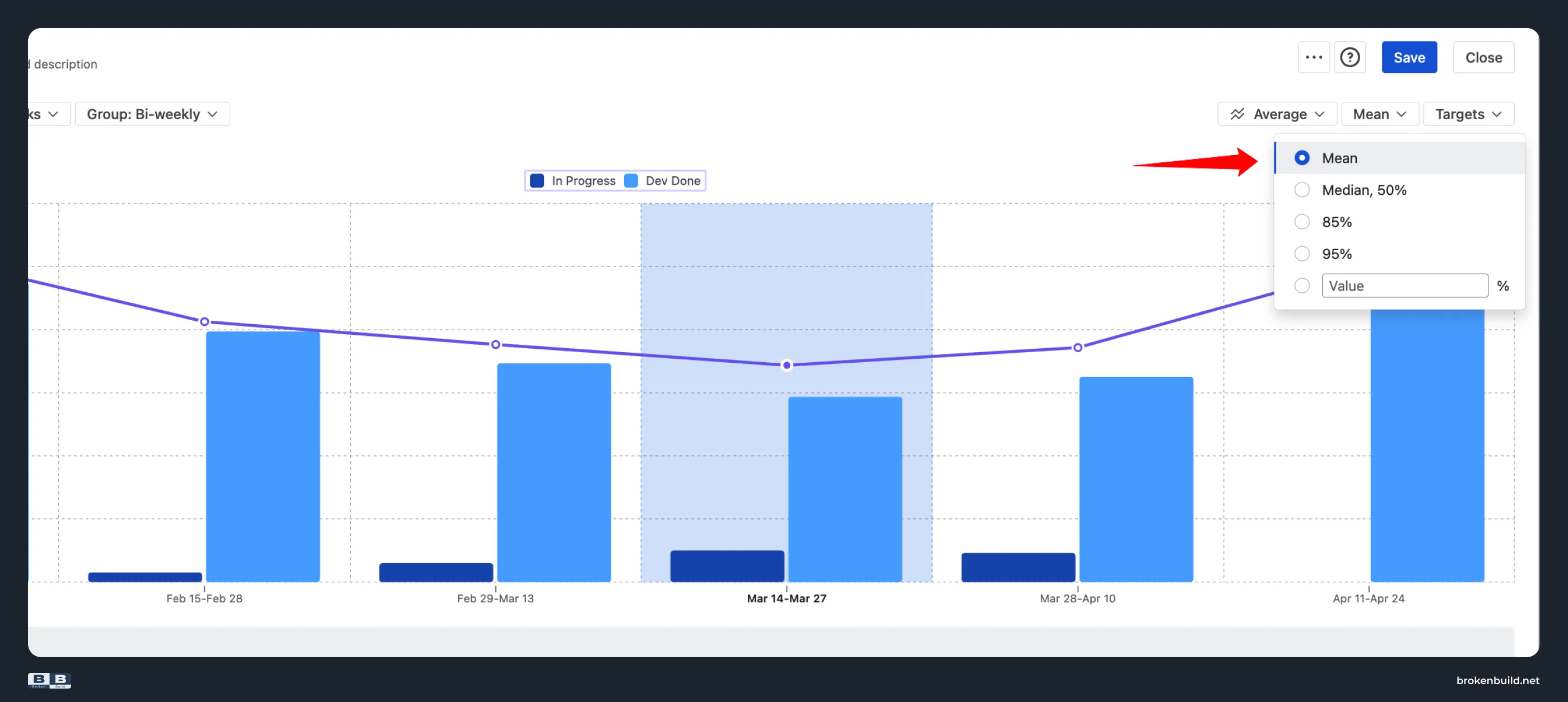
- Average view – showing how long, on average, an issue spends in each workflow status per sprint or interval. The line represents mean values for the In Progress group. This view helps teams monitor trends in average waiting time and verify whether recent process changes are improving flow efficiency.
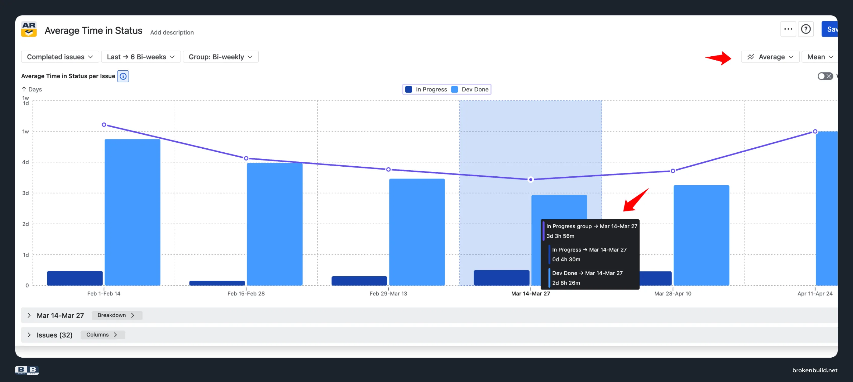
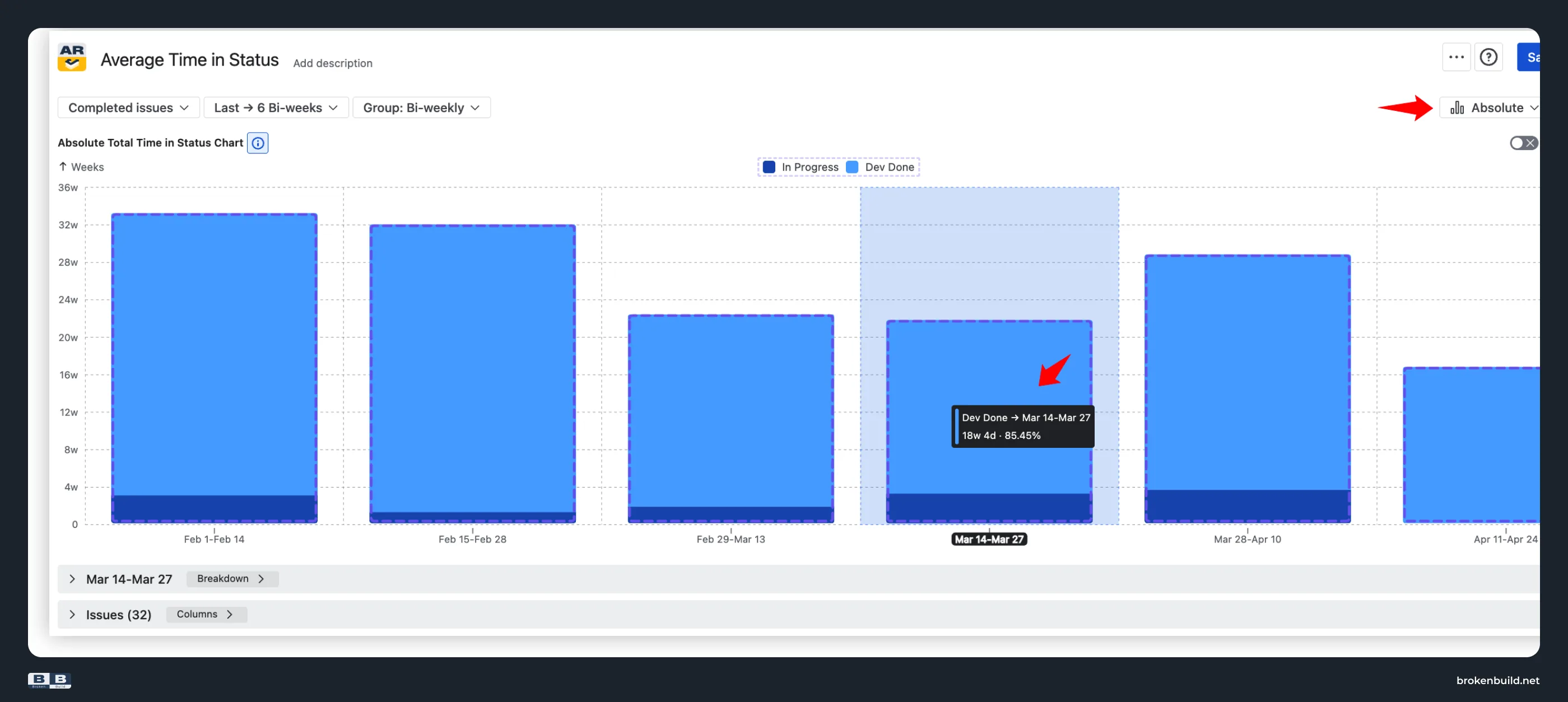
- Absolute stacked bars – each stacked bar represents the sum of time issues stayed “In Progress” and “Dev Done”. The chart shows that most time is consistently spent in “Dev Done”, indicating that the status occupies most of each interval’s total cycle time.
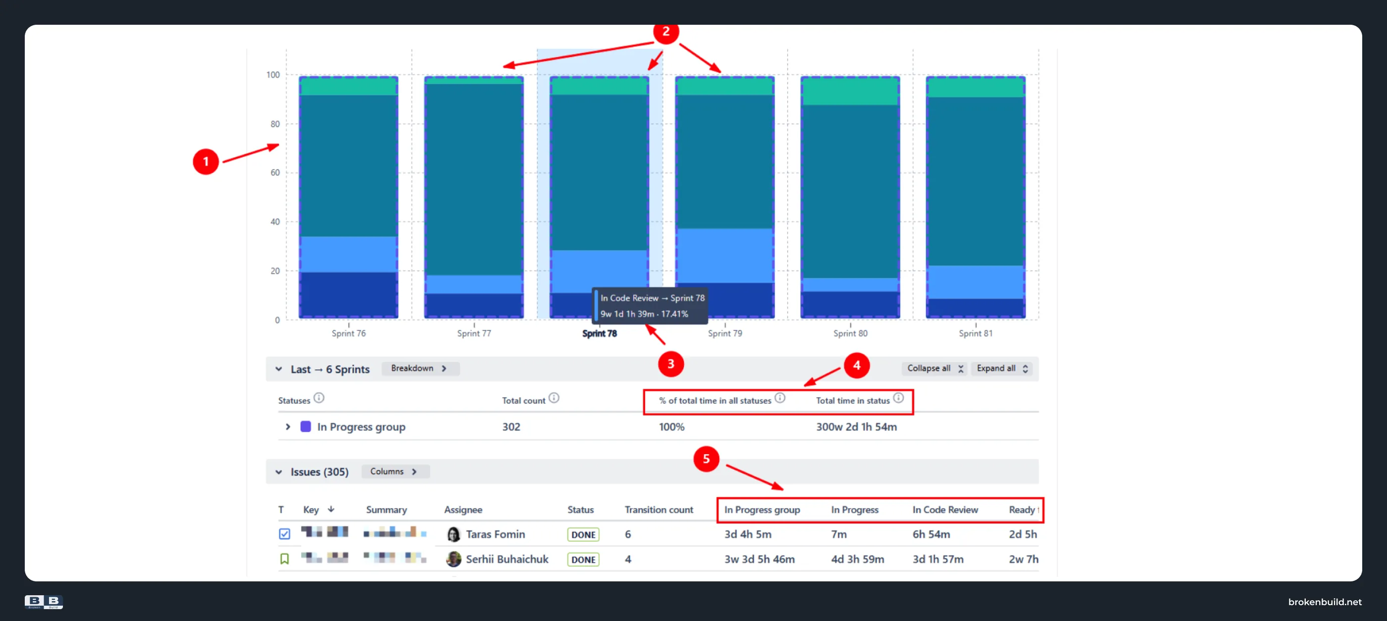
- Ratio stacked bars – in this view, the Y-axis displays percentages (0 – 100 %) (1️⃣). Each stacked bar has equal height but shows relative time proportions between statuses (2️⃣).Hovering (3️⃣), Breakdown (4️⃣), and Issue list (5️⃣) reveal the same details as in the Absolute view:
- the total time all issues spent in each status,
- the percentage this time represents out of the total across all statuses, and
- how much time each individual work item spent in every status.
2️⃣ Average and median for total cycle time → any statistic for each status
→ Native Jira Control Chart: The Control Chart shows average, median, min, max, rolling average, and standard deviation – but all for total cycle time. No P85, P95, or custom percentile.
→ Agile Cycle Time Chart by Broken Build: Switch between Mean, Median, P85, P95, or a custom percentile for the per-status time.
3️⃣ Calendar time only → working-schedule-aware averages
→ Native Jira Control Chart: Cycle time measured in elapsed calendar time. No time zone, working days, working hours, holidays, or breaks configuration.
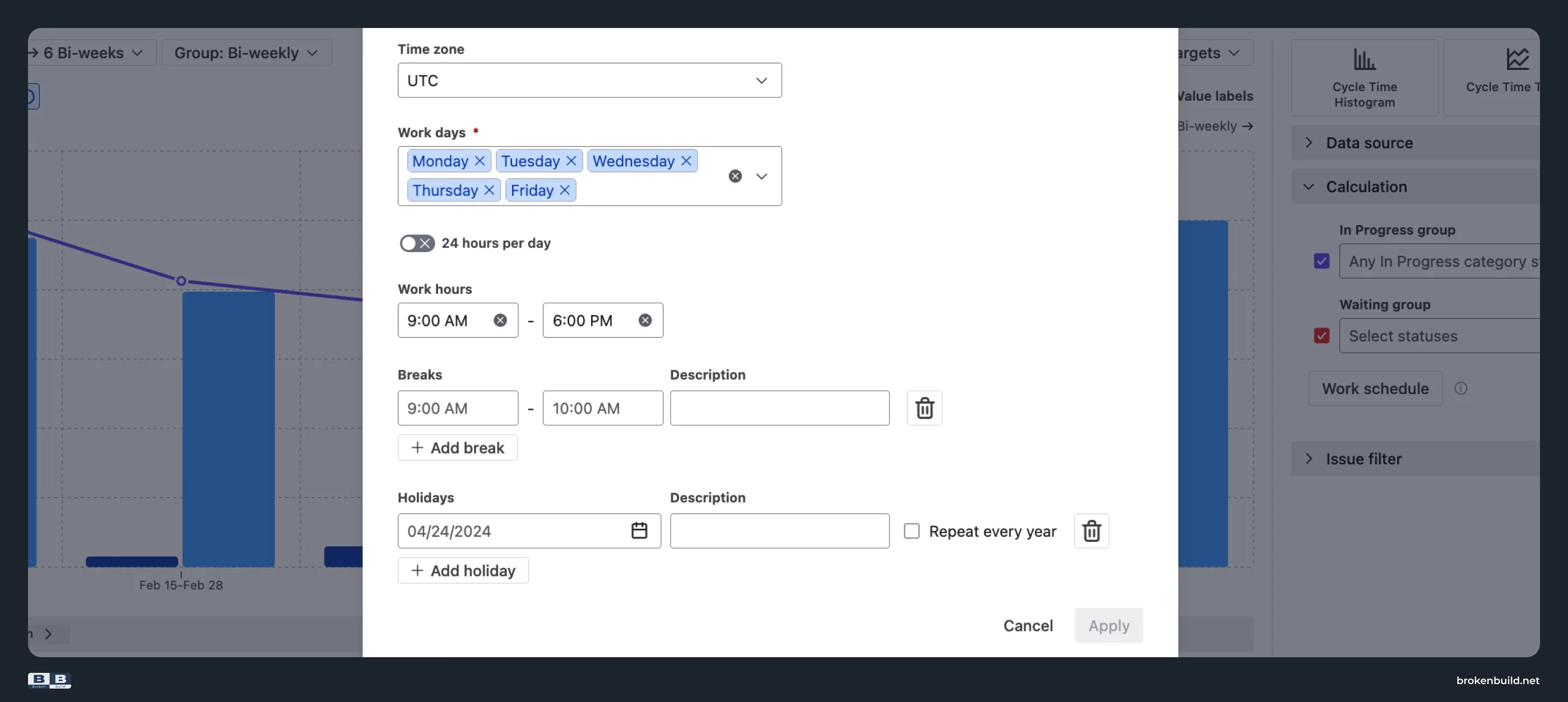
→ Agile Cycle Time Chart by Broken Build: Configure time zone, working days, working hours, breaks, and recurring holidays – or 24/7 for follow-the-sun teams.
4️⃣ No drill-down → breakdown that answers "why?"
→ Native Jira Control Chart: No breakdown by epic, assignee, issue type, or any other Jira field.
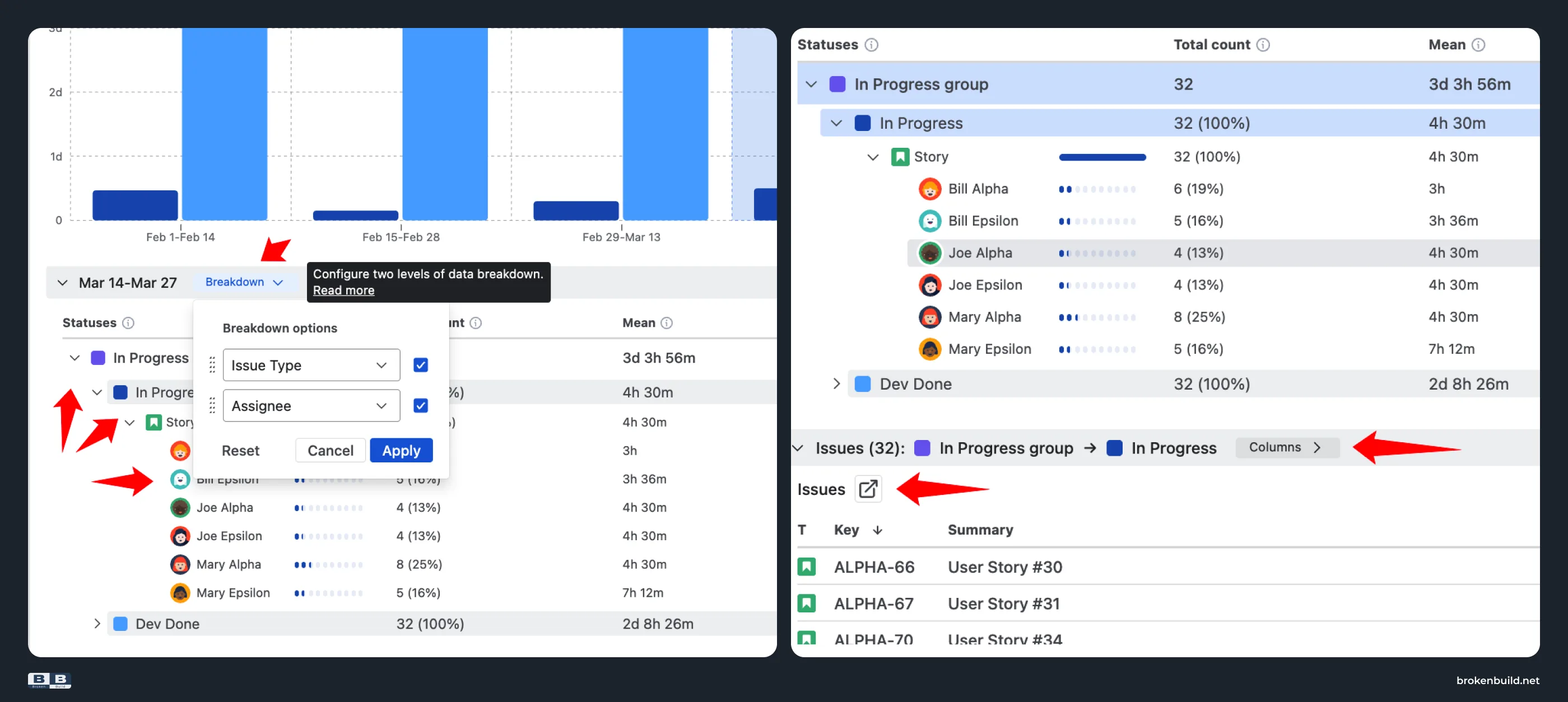
→ Agile Cycle Time Chart by Broken Build: Break the average down by any Jira field – up to two nesting levels – and click through to the specific work items.
5️⃣ Board-locked, company-managed only → any scope, any project type
→ Native Jira Control Chart: Control Chart is board-scoped, company-managed spaces only. Team-managed teams get nothing.
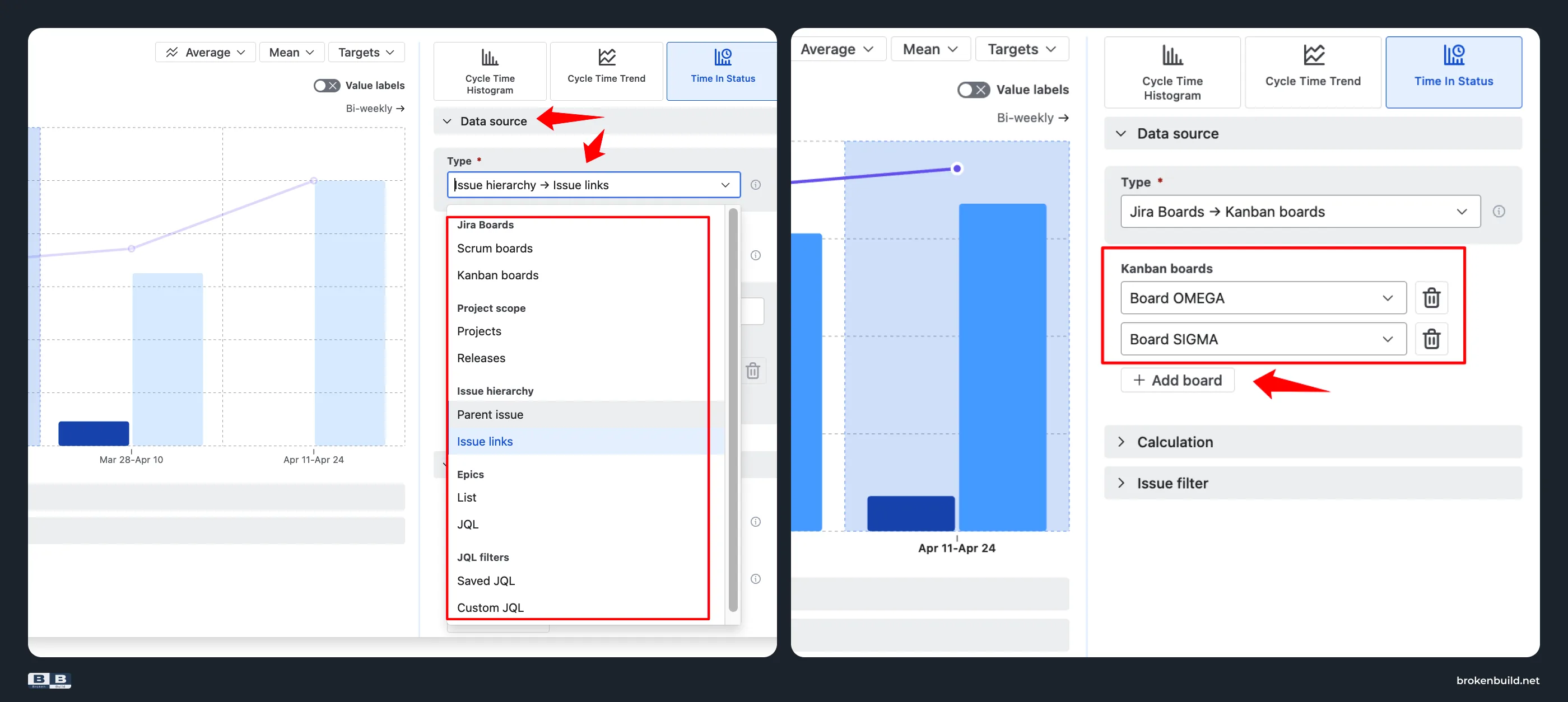
→ Agile Cycle Time Chart by Broken Build: Multi-board, cross-project, releases, initiatives, epics, saved filters, custom JQL. Works with both company-managed and team-managed spaces.
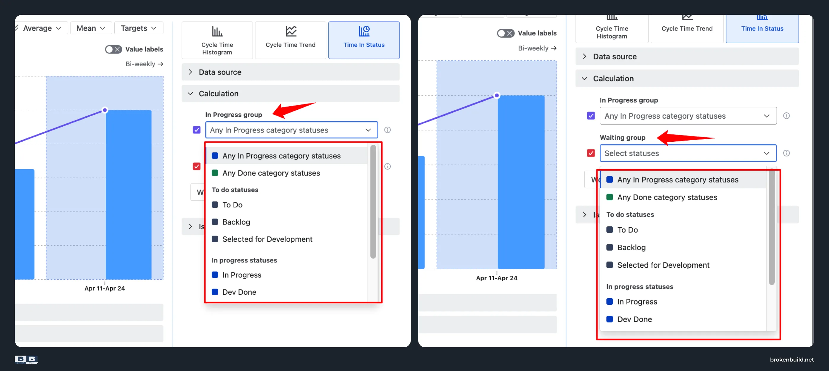
6️⃣ Board columns → In Progress vs. Waiting groups
→ Native Jira Control Chart: Select board columns to define which workflow stages count toward cycle time. Their time is combined into a single elapsed-time value – there’s no separation between active work and waiting time.
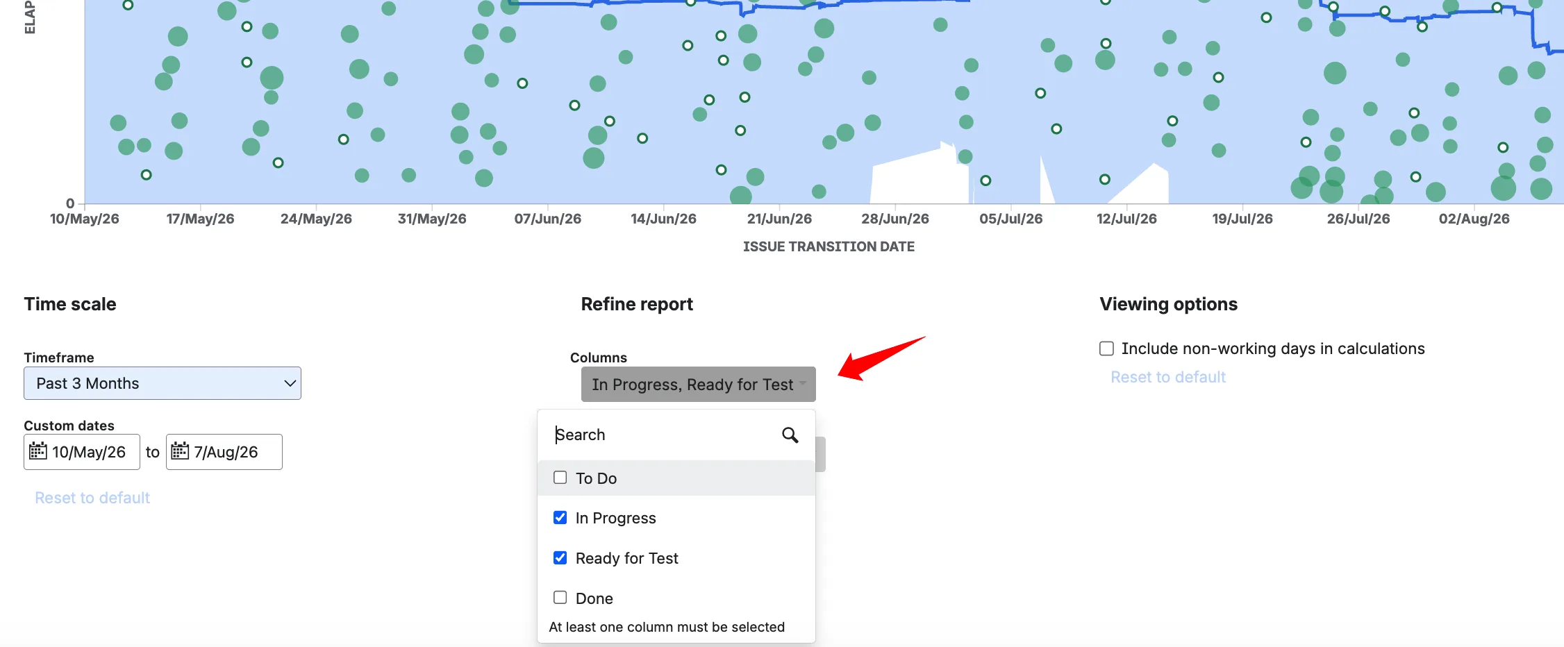
→ Agile Cycle Time Chart by Broken Build: Group any workflow statuses into custom In Progress and Waiting groups to separate active work from idle or blocked time and see where delivery is actually slowing down.
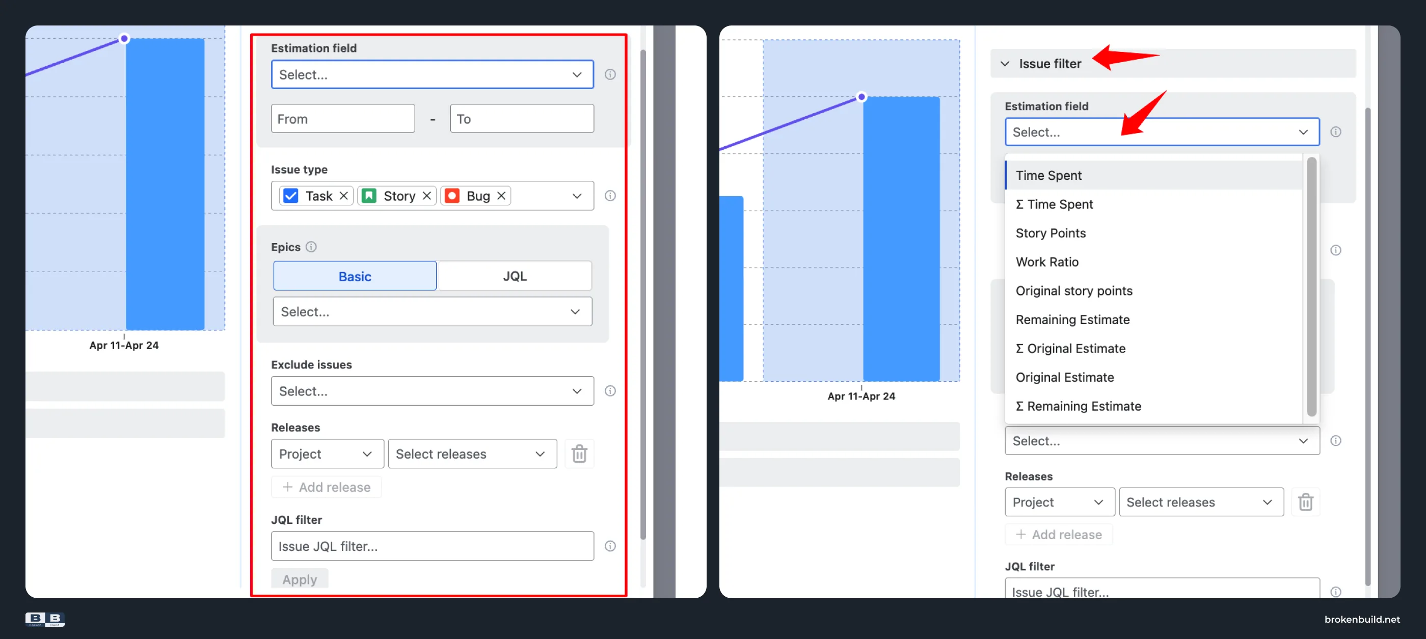
7️⃣ Board Quick Filters → flexible issue filtering
→ Native Jira Control Chart: Filter the report using Quick Filters configured for the board. Custom JQL-based analysis requires creating or updating a board Quick Filter first.
→ Agile Cycle Time Chart by Broken Build: Filter issues directly by estimation field and value range, issue types, epics, releases, or custom JQL – for example, to compare cycle time for differently sized work – without configuring board Quick Filters.
8️⃣ Trapped on Reports tab → dashboards and Confluence
→ Native Jira Control Chart: The Control Chart lives only on the Reports tab. No dashboard gadget. No Confluence embed.
→ Agile Cycle Time Chart by Broken Build: Embeds interactively into Jira dashboards and Confluence pages via Smart Links.
Do you need more than native?
If you answer yes to any of these, the Control Chart cannot help:
- Do you need to know which workflow status is driving cycle time up?
- Do you need per-status averages that use business hours, not calendar time?
- Do you need P85 or P95 for per-status time – the numbers you would promise a customer?
- Do you need cycle time analytics on a dashboard or in Confluence?
- Does your team use a team-managed project?
Agile Reports and Gadgets bundle
Agile Cycle Time Chart is part of Agile Reports and Gadgets – a bundle of eight charts covering velocity, cycle time, burnup/burndown, cumulative flow, throughput, created vs resolved, and WIP.
Try the interactive examples
- Time in status report – configure the chart to reflect your workflow and detect tasks with long stays in waiting statuses.
- Epic time in status chart – per-status breakdown at the epic level.


When native is enough – and when it is not
The Control Chart does one job well: showing total cycle time as a scatterplot with a rolling average on a single board. If your team needs one number – "our average cycle time is 3 days 23 hours" – native works. The scatterplot visualization – one dot per work item, clickable – is a genuine strength that lets you spot and investigate individual outliers at a glance.
The moment you need to answer harder questions – which status is driving cycle time up, what is the P85 per-status time in business hours, how does Code Review compare to QA over the last quarter, how does this look on a dashboard or in Confluence – native stops.
Agile Cycle Time Chart picks up where native stops: per-status breakdown in three views, any statistic including P85 and P95, working-schedule-aware duration, drill-down by any field, flexible scope, and interactive embedding in dashboards and Confluence pages.




.png)