


Releases live or die on one simple question: Are we going to make it? A reliable release burndown turns that nervous question into a clear, data-backed answer your team and stakeholders can actually trust.
In this guide, we'll walk through what a Jira release burndown is, how to set up the native report, where it falls short, and how the Agile Burnup Burndown Charts app by Broken Build extends it into a full release-tracking and forecasting toolkit.
What is a Jira release burndown?
A Jira release burndown is a chart that shows how much work remains in a release compared to the total scope, plotted over time. It helps Agile teams answer the questions that matter most:
- 📉 How much work still remains?
- ⚡ Are we reducing remaining work fast enough?
- 🔄 How is the remaining work affected by scope changes?
- 🎯 When is the remaining work likely to reach zero?
Unlike a sprint burndown, which focuses on a single short cycle, a release burndown stretches across multiple sprints and tracks progress toward a specific fix version in Jira.
Think of it as your release-level GPS: not just where you are, but where you're heading and how fast.
Why a release burndown report matters
Releases are rarely just about coding. They're about commitments – to customers, leadership, marketing, and other teams waiting on dependencies.
A solid release burndown report gives you:
- ✅ Real-time visibility into release health
- ✅ Early warning signals when delivery is slipping
- ✅ Scope change transparency so stakeholders see why timelines move
- ✅ A shared source of truth that replaces gut feel with data
Without it, release planning quickly turns into educated guessing – and educated guessing has a habit of turning into uncomfortable status meetings.
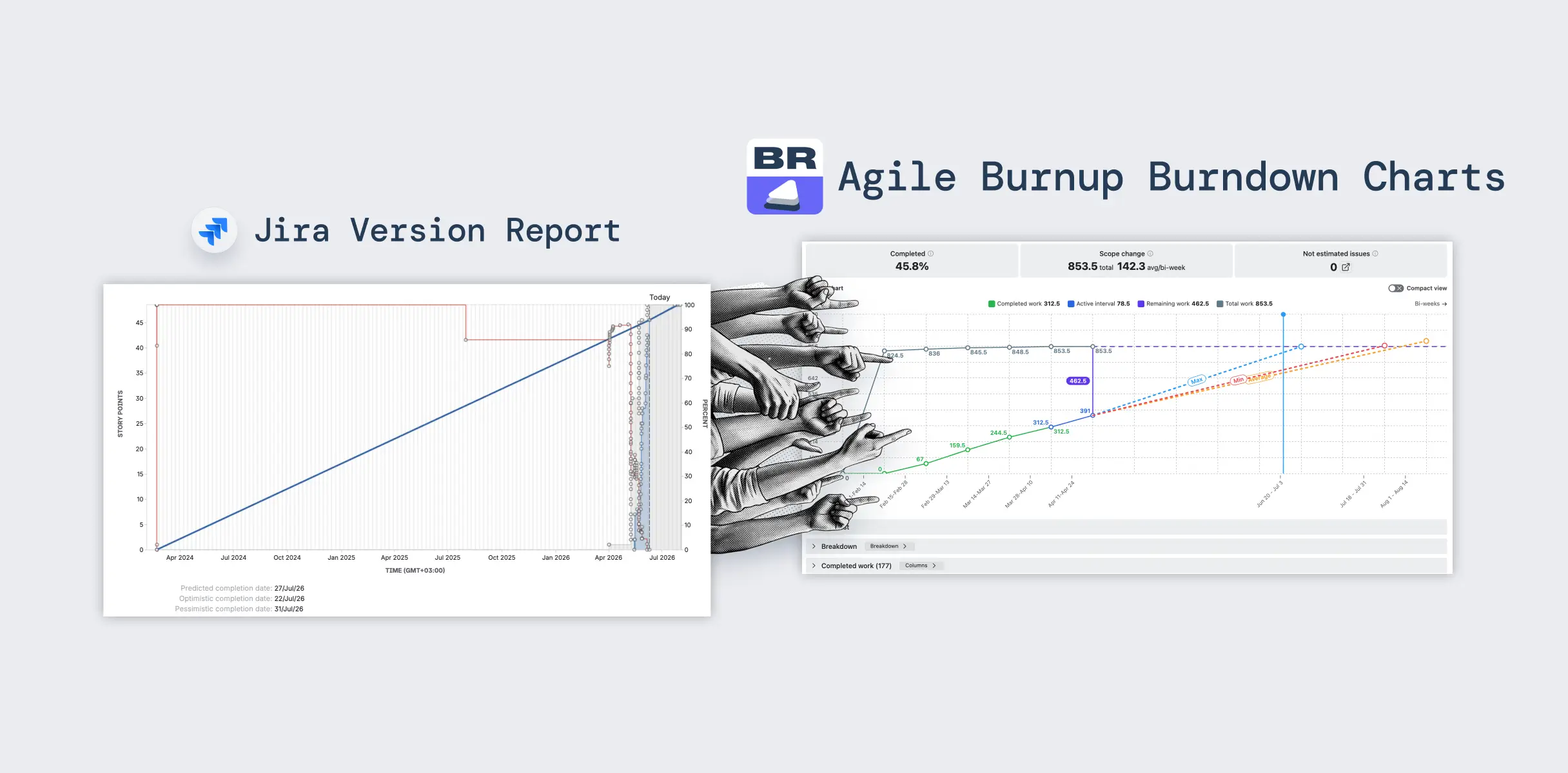
Setting up a Release burndown report in Jira
Native Jira ships with a Release Burndown report inside Jira Software, scoped to a single board and a single version. Here's the basic flow:
- Open your Scrum project in Jira.
- Navigate to Reports in the project sidebar.
- Select Release Burndown.
- Choose the fix version (release) you want to track.
Jira will then plot the work completed across sprints, scope changes, and how much is left to deliver before the version is shipped.
How to read the Jira release burndown

The native Release Burndown shows one stacked bar per sprint, and each color tells a different part of the story.
What the sprint bars mean
- Light green – work completed during the sprint
- Light blue – work still remaining in the version
- Dark blue – work added mid-sprint (scope change)
- Grey – predicted sprints based on recent velocity
How Jira predicts what's left
Predicted (grey) sprints use your team's average velocity from the last three sprints. Scope change is excluded from the velocity calculation but counted in the remaining work.
For example, if 28 points were delivered across the previous three sprints (≈ 9 per sprint) and 10 points remain, Jira will project about 2 more sprints to finish.
Signals worth catching early
- 🚩 Over 30% unestimated issues – Jira flags this in red because forecasts ignore unestimated work and become overly optimistic.
- 🚩 Growing dark blue segments – scope creep, not pace, is pushing the deadline.
- 🚩 Predicted sprints stretching out – the release is slipping; time to cut scope or reset expectations.
A single noisy sprint isn't a problem – the trend across several sprints is what really matters.
That's the whole picture from the native chart. For multi-release tracking, scope modeling, target dates, and probabilistic forecasts, you'll need to look beyond it – which is exactly what the next section covers.
When Jira's native release burndown isn't enough
For small, single-team releases, the native report does the job. But the moment your release grows in complexity, the cracks start to show.
Common limitations teams run into:
- 🚫 One release at a time – no way to combine multiple versions into one view
- 🚫 One project at a time – cross-team releases require manual stitching
- 🚫 No real forecasting – the chart projects future sprints using a simple average of your last three sprints, with no scenario modeling or risk ranges
- 🚫 No forecasting for new releases – projections only work after at least three completed sprints, because the chart depends on historical velocity data
- 🚫 No target dates on the chart – deadlines live in your head, not the visual
- 🚫 No scope-change modeling – you can't ask "what if the backlog keeps growing?"
- 🚫 No capacity adjustments – holidays and support work skew the projection
- 🚫 Limited drill-down – you can't easily inspect the issues behind the numbers
If any of those sound painfully familiar, you're ready for the next step.


Meet the advanced release burndown by Broken Build
The Agile Burnup Burndown Charts app by Broken Build (an Atlassian Gold Marketplace Partner, Cloud Fortified) fills the gaps in native Jira. It's available as a standalone app or as part of the Agile Reports and Gadgets bundle.
Instead of being locked to a single board and a single version, the app lets you build a release burndown from any combination of projects, releases, or even custom JQL – and layer on advanced forecasting on top of it.
Let's look at what makes the advanced release burndown in Jira genuinely useful day to day.
🔁 Multi-release and multi-project tracking
Native Jira doesn't offer a true multi-release view. Broken Build does.

- Pick Project scope > Releases, choose a project, then select one or more releases.
- Get a single, consolidated chart showing total scope, aggregate progress, and forecasts across teams.
Why it matters:
- Cross-team coordination – keep multiple teams aligned on shared goals
- Program-level visibility – track release health across projects in one place
- Large releases & PIs – instantly spot if any team is adding scope or falling behind
- Early risk detection – catch dependency and bottleneck issues before they hurt
📊 Advanced and flexible forecasts
By default, the chart projects three velocity-based scenarios using your team's recent throughput:
- 🔴 Min – worst-case, conservative pace
- 🟠 Average – realistic, expected pace
- 🔵 Max – best-case, optimistic pace

These lines extend from your current status to the zero-work axis, so you can see when the release would finish under each scenario – and they update automatically after every interval.
🎲 Custom "what-if" scenarios
Beyond defaults, you can model your own scenarios via Scenarios > Add new:
- What-if velocity – set a target velocity and see when the release would finish.
- What-if date – set a target date, and the chart calculates the velocity required to hit it.
- Velocity percentile – forecast based on the 50th, 75th, or 85th percentile of past velocity.
- Monte Carlo simulation – run 100,000 simulations and pick a probability (e.g., 85%) for a statistically robust delivery date.
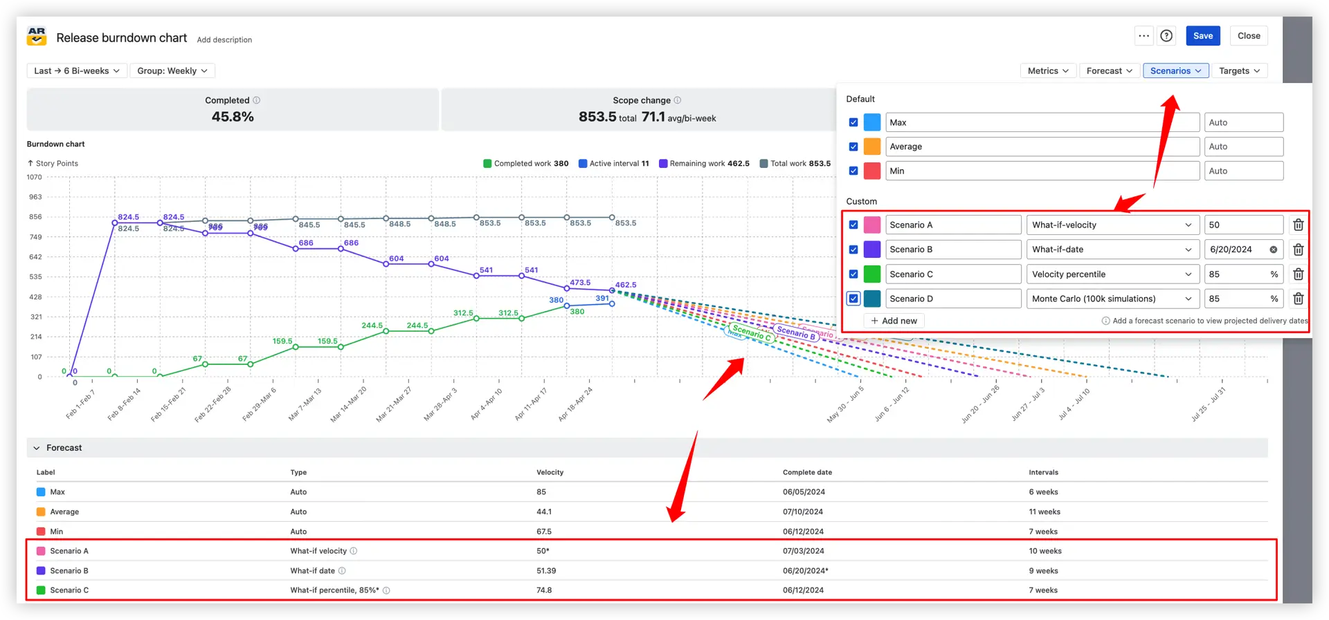
This is gold for pre-commitment planning – you walk into stakeholder meetings with modeled outcomes instead of vibes.
📦 Release scope change modeling
Scope rarely stays still – and the Remaining work panel turns scope into a lever you can actually pull. Inside the panel, you control three things: the remaining work value, an optional JQL filter, and the growth pattern.

1️⃣ Remaining work value – choose how the chart calculates what's left:
- Auto (default) – uses the current remaining work pulled directly from Jira (e.g., Auto (462.5) in the example).
- What-if – manually override the remaining work total. Perfect for "what if we cut scope down to 300 points?" or for reflecting scope changes that haven't landed in Jira yet.
- Epic Estimate – use the parent epic's estimate field as the source of remaining work, instead of summing up child issues.
2️⃣ Remaining work JQL filter – narrow which issues count toward remaining work using a saved or custom JQL query. Useful when you want forecasts that only count must-have items and ignore stretch goals or noise.
3️⃣ Remaining work growth – model what happens if the scope keeps creeping in:
- None (default) – assume no further scope changes from here.
- Average – apply the average historical growth rate calculated from your own data (e.g., Average (1.6) per interval), so the forecast mirrors what's actually been happening sprint after sprint.
- What-if – set your own growth rate (e.g., +10 story points per interval) to stress-test a worst-case backlog or a more disciplined scope plan.
💡 Together, these settings answer the questions every release planner ends up asking: "If the backlog keeps growing at the current pace, can we still make it?" and "What happens if we cut X points of scope?" – before you have to make the call.
⚙️ Capacity allocation coefficient
Real teams rarely operate at 100% capacity – holidays, support rotations, and side commitments eat into delivery time.
- Open Forecast settings
- Set the capacity coefficient (e.g., 70% or 80%)
- The forecast velocity is multiplied by that value
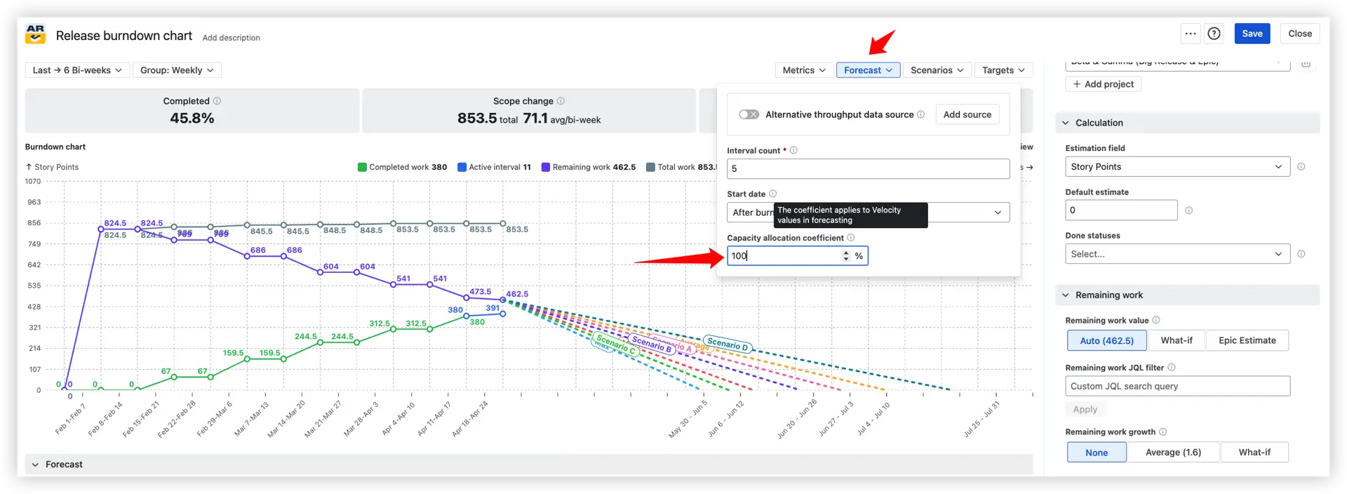
Example: A team that delivers 22 story points per sprint at full capacity will be forecast at 17.6 points when only 80% capacity is allocated. The result: realistic deadlines and far fewer awkward "we missed it" conversations.
🔀 Alternative data source for forecasting
When your current source has a thin or messy history, you can borrow throughput from a more representative source.

- Use a different board, project, release, epic, initiative, or custom JQL just for forecasting.
- Progress metrics (completed, remaining) stay tied to the original source.
Helpful when:
- The release is brand-new with no historical velocity
- The team has recently been reshuffled
- A comparable epic or initiative already has solid data to lean on
🎯 Target lines for important release dates
Deadlines deserve to be on the chart, not buried in a roadmap doc.
Open Targets above the chart and add as many milestone lines as you need – each shows up as a vertical marker with a hoverable name and date.
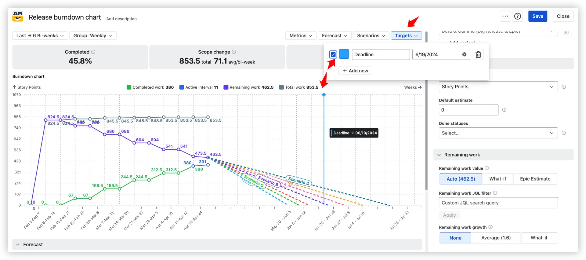
Use them to:
- Compare forecasted completion against fixed deadlines at a glance
- Track interim release milestones, not just the final date
- Keep the team visually anchored to commitments
- Cut down on extra schedule-tracking tools
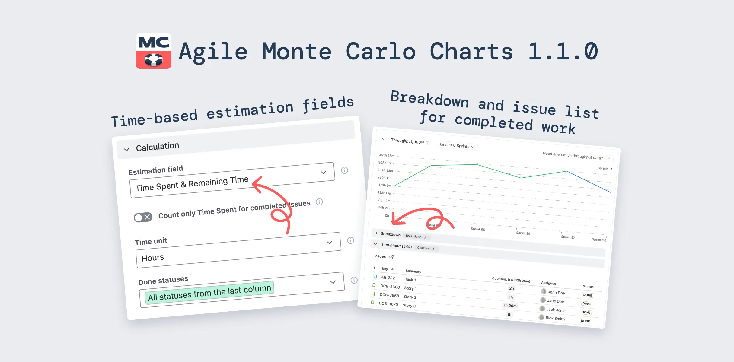
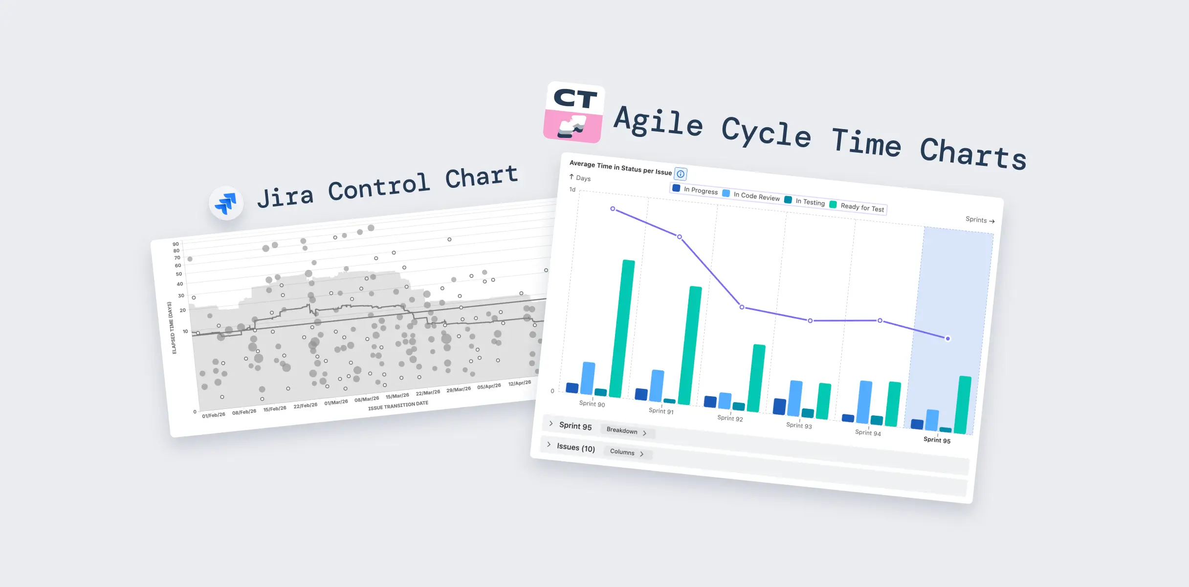
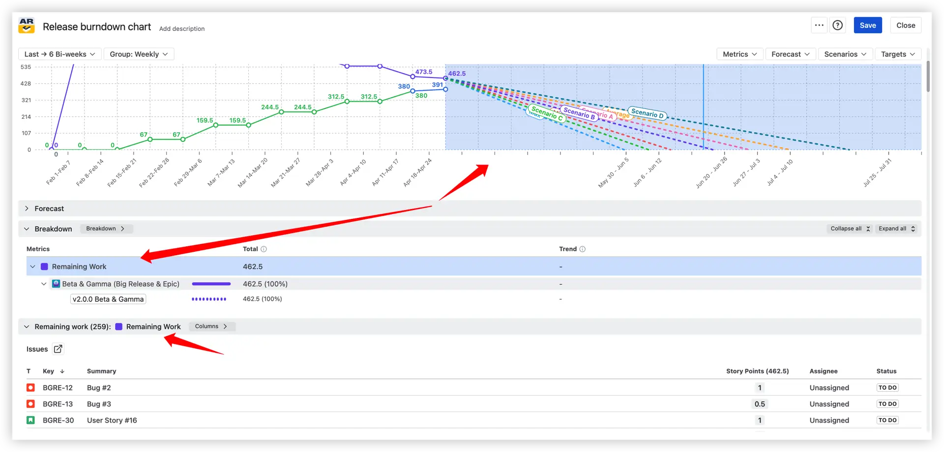
🔍 Insights for the chosen interval – breakdown and issue list
A chart becomes far more valuable when you can explore the exact data behind every interval.
Select any chart section 1️⃣ – whether it’s a historical interval or the forecast zone – to instantly open detailed interval insights below. The Breakdown panel 2️⃣ lets you analyze how the selected metric is distributed across boards, projects, issue types, assignees, statuses, releases, and other Jira fields.
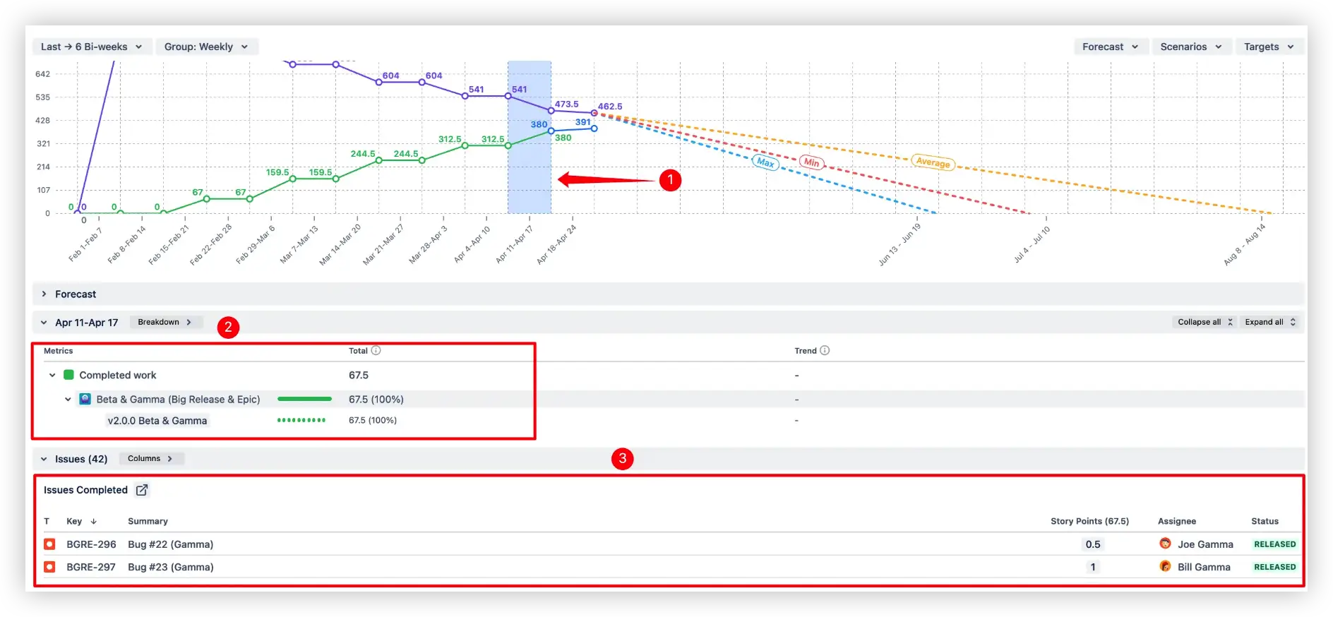
You also get an Issue List 3️⃣ with the exact Jira issues related to that segment, including sortable columns, filtering options, and direct navigation back to Jira.
When this saves the day:
- Investigating what really got done in a specific week
- Tracing the source of unexpected scope changes
- Building a clear plan for what's left
🛠️ Customization that fits real workflows
Not every team uses Jira the same way – so the chart adapts.

1️⃣ Default estimate
- Found under Right panel > Calculation > Default estimate
- Apply a default value to unestimated issues so they don't silently count as zero
- Especially useful when story points or hours are inconsistent across the backlog
You can also switch the estimation field (2️⃣) – story points, issue count, time-based estimates, or any numeric custom field – without rebuilding the chart.
3️⃣ Custom Done statuses
- Treat statuses like Ready for Release or Deployed as Done
- Configure multiple Done statuses per board, with deduplication built in
- For Kanban, define custom from-to columns to mark completed work
4️⃣ Issue filter

Refine the chart scope to exactly the issues that matter:
- Issue types (1️⃣) – stories, bugs, tasks, sub-tasks, or any custom type
- Epics (2️⃣)– static selection or JQL-based dynamic lists
- Custom JQL (3️⃣) – combine saved filters and ad-hoc queries
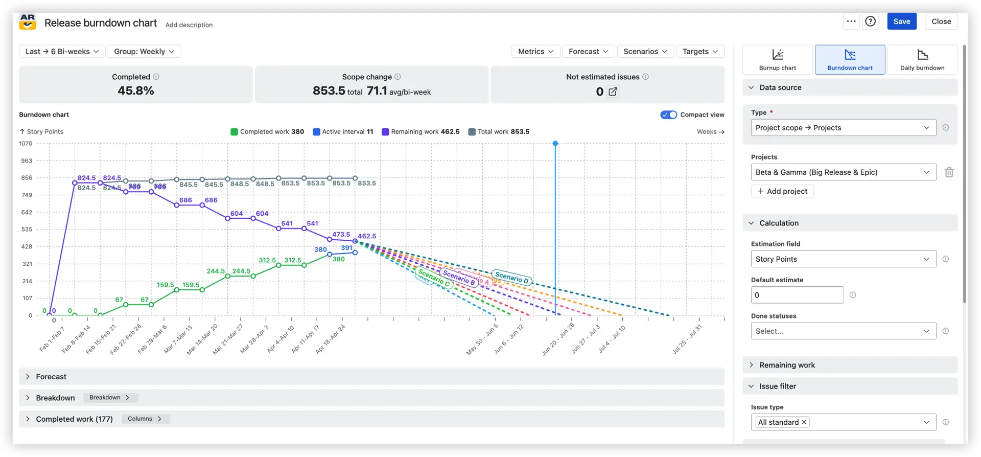
What else is the chart telling you

- Top-line health metrics – your 3-second pulse check
Before you even look at the chart, three numbers across the top tell you the state of the release:
- 🟢 Completed (e.g., 45.8%) – percentage of total scope delivered so far.
- 🔁 Scope change (e.g., 853.5 total, 71.1 avg/bi-week) – work added or removed across the interval, with an average per interval. A consistently high average means the scope is unstable.
- 🔢 Not estimated issues – issues with no estimate quietly distort the forecast. Anything above zero deserves a closer look.
- The chart lines – four colors, four stories
- 🟢 Completed work (e.g., 380 story points) – cumulative work delivered. Should climb steadily.
- 🔵 Active interval (e.g., 11 story points) – work in progress in the current interval.
- 🟣 Remaining work (e.g., 462.5 story points) – scope still to deliver, declining toward zero.
- ⚫ Total work (e.g., 853.5 story points) – the full scope line. A flat top is healthy; a rising top means scope is growing.
- Past & Active vs Future interval drill in
Click anywhere on the chart and the panels below light up – with what you see depending on whether you click a past or future interval:
- 📊 Past and Active intervals – click a completed or active interval to see a breakdown of completed work (by epic, project, assignee, status) and the issues list of exactly what was delivered.

- 🔮 Future intervals (forecast area) – click into the projected zone to see a breakdown of remaining work and the issues list of what's still ahead.
Each issue links back to Jira, so anomalies and outliers are one click away from explanation.
📌 Dashboard gadget – live release health, in one place
The chart isn't just a standalone view. It plugs straight into your Jira Dashboard as a gadget.
To add it:
- Open the Dashboards menu in Jira
- Create or edit a dashboard
- Click Add a gadget
- Search for "Agile Burnup Burndown Charts" and click Add
- Pick a template or build the chart from scratch

A few extras worth knowing:
- The gadget is visible to anyone with dashboard access
- It can be embedded into Confluence via Smart Links – no extra plugins, always live
- Share dashboards via the three-dot menu in the top-right corner
From theory to practice – interactive example
The fastest way to understand the difference is to see it.
👉 Release Burndown Chart – live example
Open one in another tab and try clicking on the chart – you'll see the breakdown and issue list update in real time.
Benefits over the native Jira release burndown
Side by side, here's where the advanced release burndown in Jira pulls ahead:
- ✅ Multi-project and multi-release tracking in one chart
- ✅ Min / avg / max velocity forecasts, updated automatically
- ✅ Custom what-if scenarios (velocity, date, percentile, Monte Carlo)
- ✅ 100,000-run Monte Carlo simulations for probabilistic forecasts
- ✅ Target date lines drawn directly on the chart
- ✅ Scope change modeling (custom remaining work, growth rates)
- ✅ Capacity allocation coefficient for realistic forecasts
- ✅ Alternative throughput data for new or noisy initiatives
- ✅ Advanced issue filtering (issue type, epic, release, custom JQL)
- ✅ Interactive breakdown and drill-down to Jira issues
A smarter way to track releases
A release burndown is more than a chart – it's the heartbeat of your release. Native Jira gives you the basics, and that's plenty for simple, single-team releases.
But if you're managing multiple teams, multiple releases, fixed deadlines, shifting scope, or fluctuating capacity, the native report quickly hits its ceiling. The advanced release burndown by Broken Build picks up where Jira leaves off – with multi-release tracking, scenario forecasting, scope modeling, and interactive drill-down, all sitting on your Jira dashboard.
Better data leads to better decisions. Better decisions lead to releases that actually land on time.
Try the Agile Burnup Burndown Charts app free on the Atlassian Marketplace and see how much sharper your release planning gets in a single sprint.


.png)