


Every sprint tells a story – and the Jira Sprint Report is how your team reads it.
Whether you're a Scrum Master running a retrospective, a Product Owner questioning scope decisions, or a Delivery Manager tracking delivery reliability across multiple teams, sprint reports are the lens through which performance becomes visible.
But here's the thing: native Jira gives you a starting point, not the full picture. Out of the box, Jira's Sprint Report answers basic questions – what did we complete? What's left? – but stops well short of answering the harder ones: Why are we consistently missing targets? Which team is trending better? How realistic is our current forecast?
This guide covers everything you need to know:
- 📖 What Jira Sprint Reports are and how to read them
- 🔍 The types of native sprint reports available in Jira
- ⚠️ Where native reporting falls short
- 🚀 How advanced tools like Agile Reports and Gadgets by Broken Build fill the gaps
Let's get into it.
What are Jira Sprint Reports?
A Jira Sprint Report is a visual representation of what happened (or is happening) inside a sprint. It gives Scrum teams a live view of their progress: what's been delivered, what's still in flight, and how the burndown is trending against the ideal pace.
A few things to keep in mind about sprint reports in Jira:
- 📌 Sprint reports are board-specific – they only pull data from issues captured by that board's saved filters
- 📌 They apply exclusively to Scrum boards (not Kanban)
- 📌 Issues are tracked through their workflow statuses until the full scope of work is done
- 📌 The report uses the board’s estimation field (story points, issue count, or time tracking)
Sprint reports aren't just a progress snapshot. They're a team conversation starter – the data behind your stand-ups, your mid-sprint gut-checks, and your retrospectives.
Why do you need Jira Sprint Reports?
Sprint reports are more than a management artifact. Here's why Agile teams rely on them:
🤝 They build whole-team ownership
Sprint reports shift accountability from individuals to the team as a whole. When everyone can see the same burndown, the same scope changes, and the same incomplete priorities, conversations about why naturally follow. That shared visibility drives shared responsibility.
🧠 They support better decision-making
Mid-sprint, a sprint report reveals whether you're ahead, behind, or tracking perfectly. It helps Product Owners decide whether to add or remove scope, and helps Scrum Masters spot blockers before they become sprint-killers.
🔄 They improve sprints over time
Retrospectives without data are guesswork. Sprint reports give teams a factual record of what happened: what rolled over, where scope crept in, and whether the burndown had a suspicious straight-line drop at the end (a sign everything landed in QA at the last minute). Over time, these insights sharpen planning and delivery consistency.
Types of native Jira reports for sprint analysis
Jira includes several built-in reports relevant to Scrum teams. Here's a quick-reference breakdown:
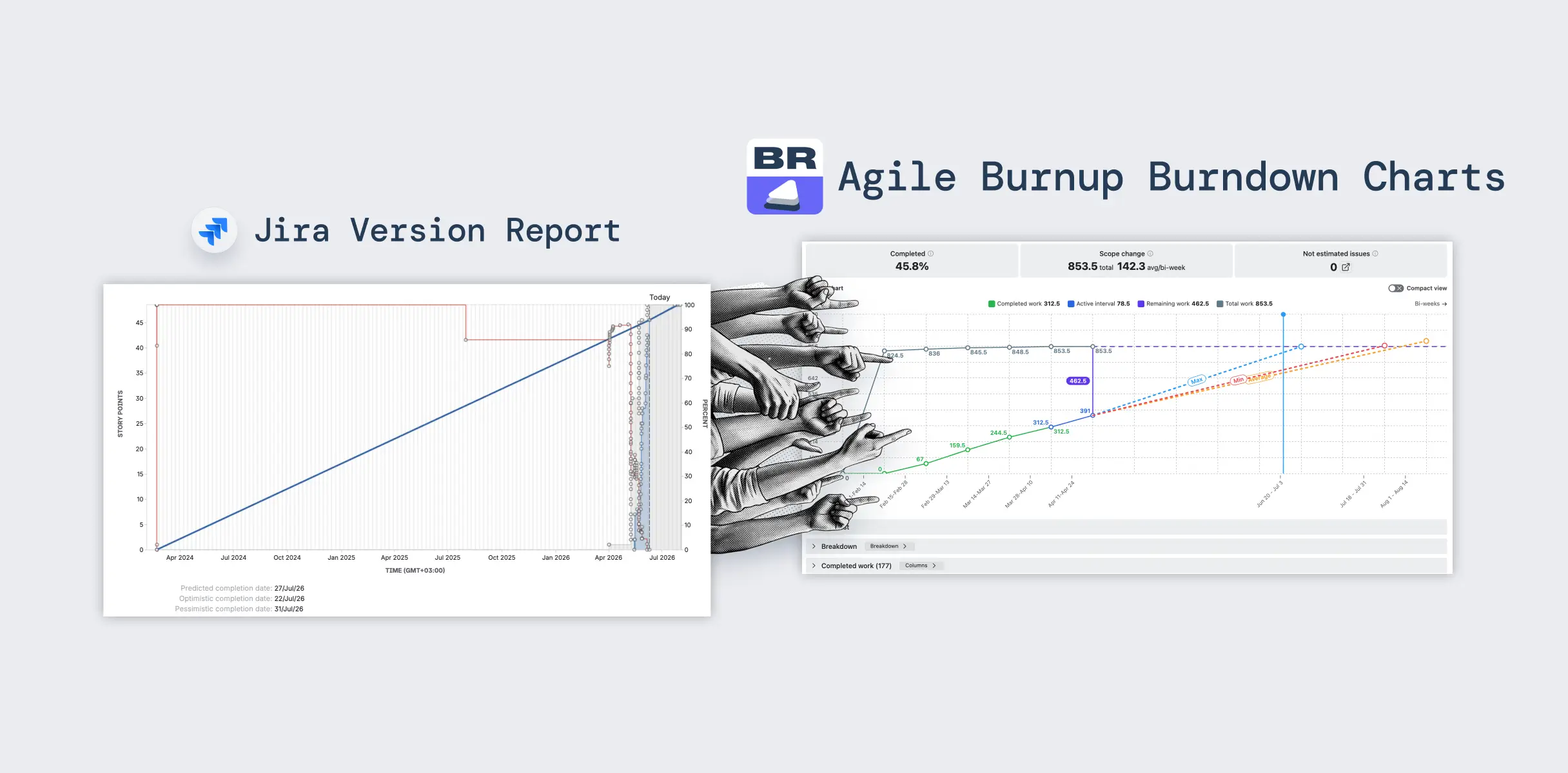
📊 Sprint Report
The Sprint Report is Jira's go-to view for monitoring an active or closed sprint. It is a burndown chart that tracks remaining work over time against the ideal line, while highlighting non-working days.
Used in daily stand-ups and mid-sprint check-ins to quickly assess progress and risks.

Where to find it: Board → Reports → Sprint Report → Select sprint from dropdown.
What to watch: The asterisk (*) next to issues – it indicates mid-sprint scope changes. A sudden vertical drop in the burndown line often signals late-stage QA handoffs.
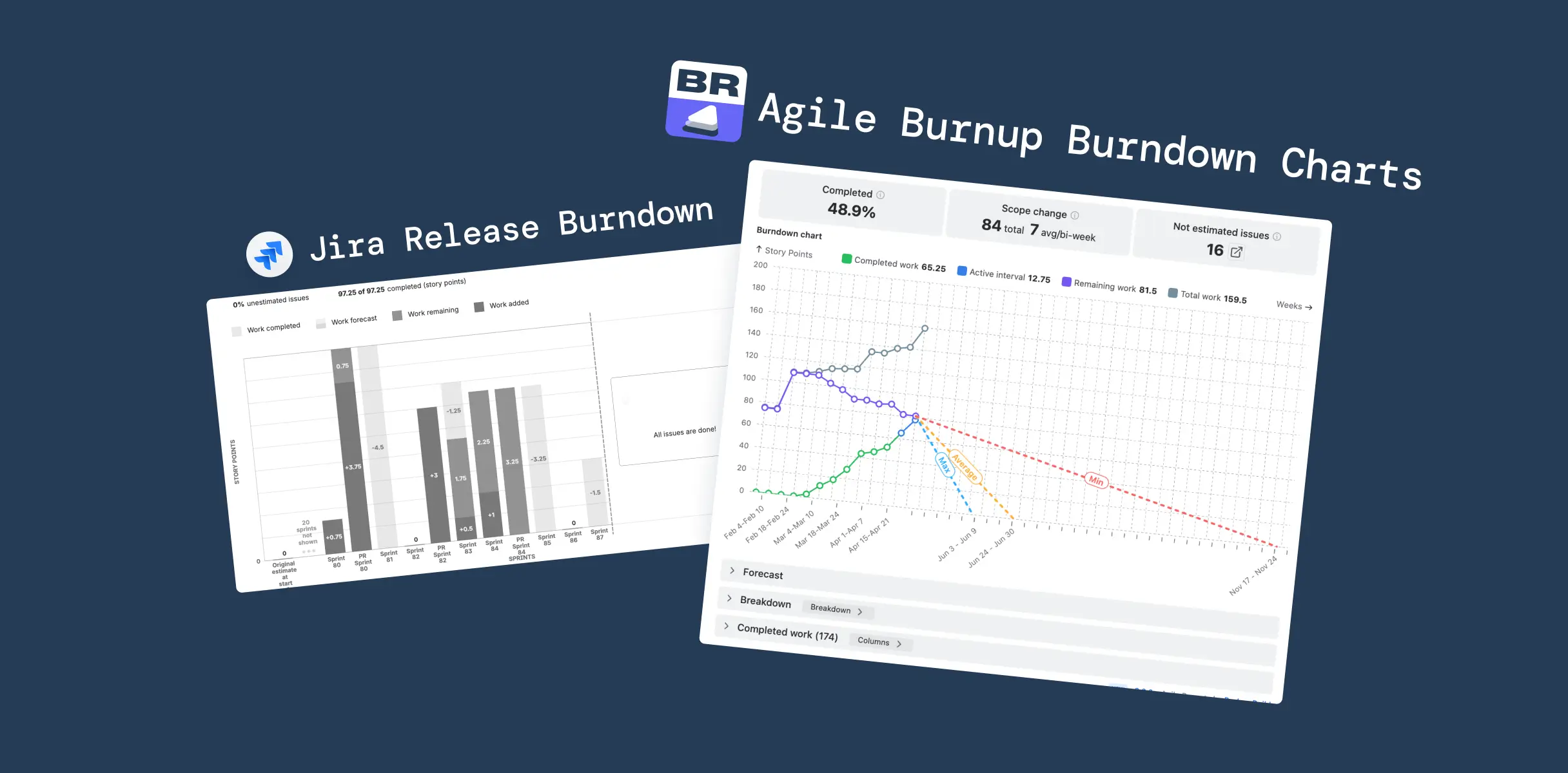
⚡ Velocity Report
The Velocity Report shows committed vs. completed work for each sprint, along with an average line across all sprints. The bars highlight how much work was planned and actually delivered, while the average line provides a baseline for future planning.
By comparing these values, teams can quickly spot gaps between commitment and delivery and identify patterns in performance over time.

Where to find it: Board → Reports → Velocity Chart.
What to watch: Consistent gaps between the grey (committed) and green (completed) bars indicate repeated over-commitment or scope creep.
🌊 Cumulative Flow Diagram
The CFD shows how many issues sit in each workflow status on any given day, stacked as color bands over time. When flow is healthy, the bands stay roughly parallel. When one widens, work is accumulating at that stage – a bottleneck signal.
It's the go-to chart for understanding where the process is breaking down, not just whether it is.
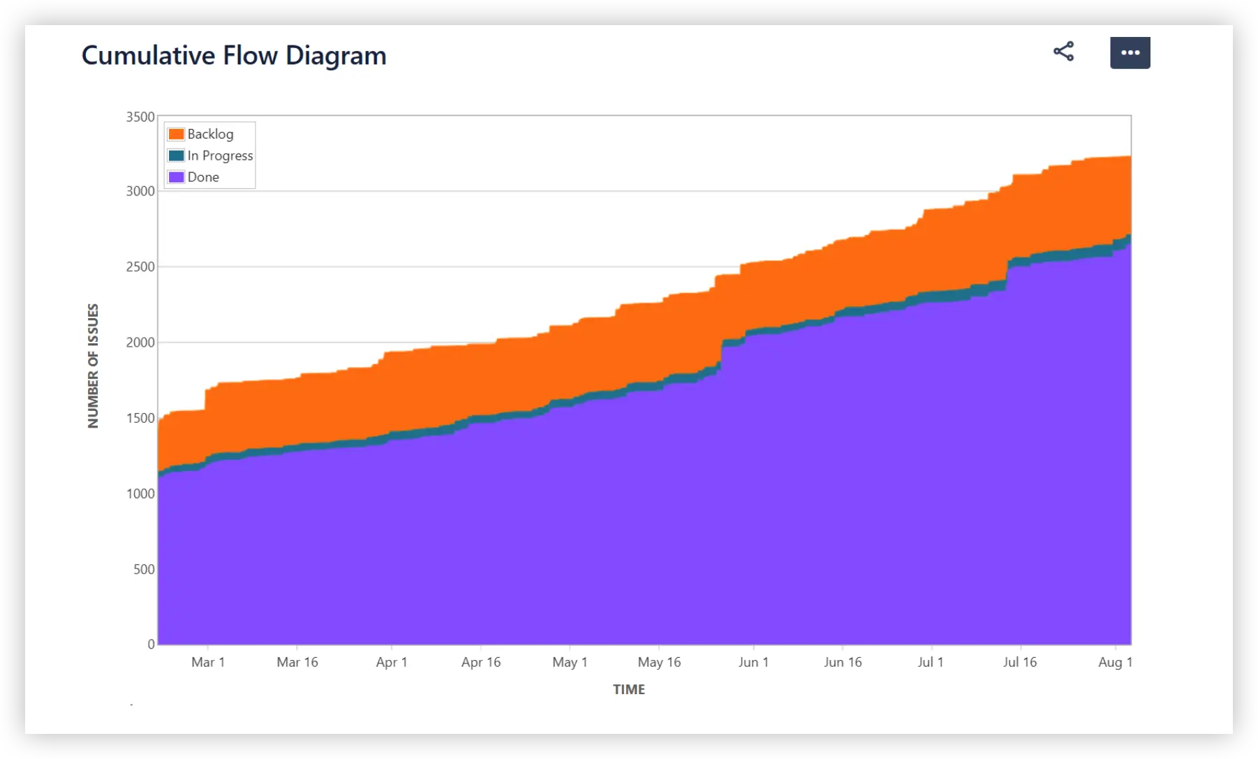
Where to find it: Board → Reports → Cumulative Flow Diagram.
What to watch: Any status band that widens significantly signals a bottleneck – work is piling up at that stage.
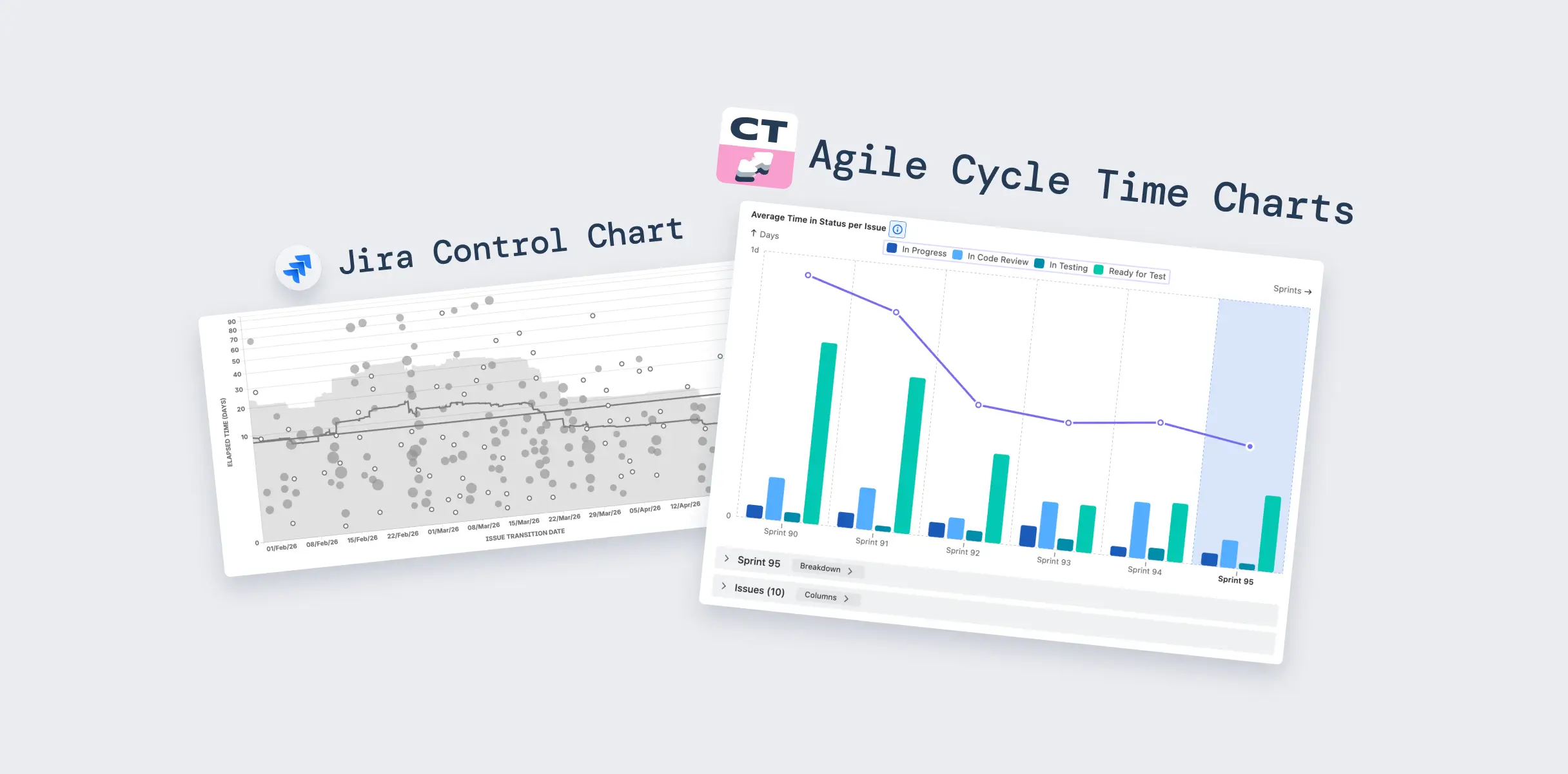
📐 Control Chart
The Control Chart is Jira's answer to cycle time analysis. It plots each completed issue on a timeline and shows how long it spent moving through the workflow – from the moment work started to the moment it was marked Done.
Alongside individual data points, the chart displays an average line, a rolling average, and a standard deviation band. The tighter the band, the more consistent and predictable the team's delivery speed. High variance is a signal that your workflow has unpredictable elements – dependencies, rework, unclear definitions of done – that are worth investigating before using historical averages for future planning.

Where to find it: Board → Reports → Control Chart.
What to watch: High variance in the standard deviation band (grey area) means your cycle times are unpredictable. Aim for tighter clustering around the average.
Native Jira Sprint reporting limitations
Native Jira reports do the basics well. But the moment your team asks more complex questions, the built-in tools hit a wall.
Here's what's missing out of the box:

For small, stable teams running simple sprints, native reports may be enough. For everyone else – Scrum Masters managing complexity, Program Managers tracking across teams, or coaches trying to improve delivery reliability – native Jira leaves a lot on the table.


Advanced Sprint Reports in Jira with Broken Build
This is where Agile Reports and Gadgets by Broken Build comes in.
Rather than offering a single "sprint report," Broken Build takes a different approach: each chart type is a separate lens on your sprint data. Together, they form a complete sprint reporting ecosystem – one that covers everything from sprint velocity to probabilistic multi-sprint forecasting.
⚡ Sprint Velocity Chart
Native Jira's Velocity Report shows two bars per sprint: committed and completed. Broken Build's Sprint Velocity Chart shows 10 metrics – and that difference changes what questions your team can actually answer.
The chart delivers real-time insights that reflect Jira updates instantly, giving Scrum teams, Agile Coaches, and Delivery Managers a far richer picture of how each sprint actually played out.
10 velocity metrics across three categories

- 📌 Commitment: Initial commitment, Final commitment, Rollover
- 🔄 Scope changes: Added work, Removed work, Estimation change, Total scope change
- ✅ Completion: Completed work, Completed work (initial), Not completed work
Cross-team and multi-board tracking
Compare results across one or multiple Scrum teams on a single chart. Aggregate data from multiple boards for ART-level or program-level visibility – without leaving your Jira Dashboard.
👉 Explore the interactive example: Sprint velocity chart
Individual velocity
The Individual Velocity Chart breaks down sprint performance by team member, tracking five metrics per person: Initial Commitment, Final Commitment, Rollover, Not Completed Work, and Completed Work. Useful for spotting workload imbalances and understanding individual delivery patterns without turning data into a performance review tool.

👉 Explore the interactive example: Individual velocity chart
Benchmarking
Visualize sprint metrics of different teams side by side and add statistical reference lines – average, median, 25th, and 75th percentiles – calculated from all included teams. Toggle teams on or off to simplify comparisons or focus on specific boards during reviews.

👉 Explore the interactive example: Benchmarking velocity chart
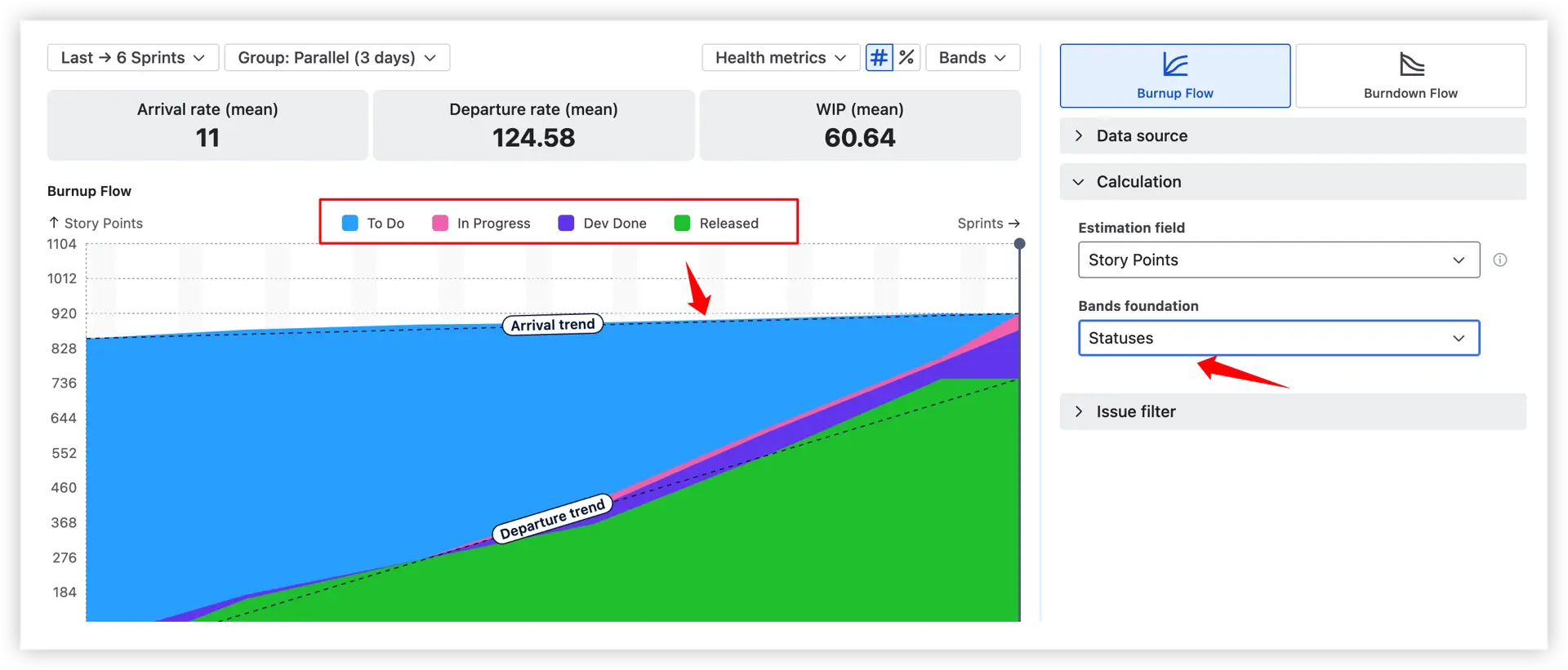
🌊 Sprint Cumulative Flow Diagram (CFD)
The Cumulative Flow Diagram shows how work moves through the sprint workflow over time. Each coloured band represents a stage – To Do, In Progress, Done – and its thickness shows how many items are in that stage on any given day.
By watching how bands expand or contract, you can understand whether the team delivers at a steady pace, where scope is creeping in, and exactly where work is getting stuck.
Active sprint usage

The Active Sprint CFD acts as an enhanced version of the traditional sprint burndown chart. Instead of showing only remaining work, it visualises how the To Do, In Progress, and Done areas change throughout the sprint in real time.
- The To Do band gradually shrinks as work is started; the Done band grows as items are completed.
- The Ideal Slope line benchmarks on-track delivery – the zone above it should ideally turn green (Done) by the sprint end.
- Any area expanding above the Initial scope line represents mid-sprint scope additions, made visible without digging through issue logs.
Status categories vs. separate statuses
Two display modes give you different levels of granularity:
- Category view – uses Jira's three standard status categories (To Do, In Progress, Done) as bands. Fast, high-level overview.

You can also map any status to any band – for example, mapping Dev Done to the Done band even if Jira classifies it as In Progress – or create custom bands (e.g., a separate Waiting band for statuses like Blocked or Ready for Test).
- Status view – displays a separate band for each individual workflow status (e.g., Code Review, QA, Ready for Test). Pinpoints exactly which stage is accumulating work.
👉 Explore the interactive examples:
⏱️ Cycle Time Charts
Cycle Time Charts answer one of the most practical questions in Agile delivery: how long does it actually take to finish a piece of work? Three distinct views give teams a layered understanding of delivery speed, consistency, and where time is being lost.
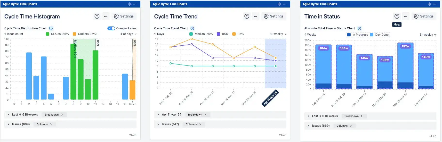
Cycle Time Histogram – delivery distribution
The Histogram groups completed issues by how long they took – from In progress to Done – and plots the distribution as time-based columns. It's the fastest way to understand whether your team delivers consistently or unpredictably.

Percentile color coding:
- 🟢 Green bars (50–85%) – issues within the expected delivery range
- 🟠 Orange bars (95%+) – outliers that warrant investigation
What it helps you do:
- See the big picture – spot whether most work clusters in a tight range or scatter widely
- Find outliers – which issues took far longer, and why?
- Set realistic SLAs – use P50, P85, and P95 percentiles based on real team data, not guesswork
👉 Explore the interactive example: Cycle time histogram
Cycle Time Trend – delivery speed over time
The Trend chart tracks how cycle time changes across sprints or time intervals, making it possible to see whether your team is getting faster, slower, or holding steady.
Percentile trend lines available:
- Median (P50) – your typical delivery time
- P85 – 85% of issues completed within this threshold
- P95 – the upper bound; anything beyond is an outlier risk

Multiple percentile lines together reveal whether improvement is broad-based – or whether the average is improving while outliers are getting worse.
👉 Explore the interactive example: Cycle time trend chart
Time in status – workflow bottleneck analysis
Time in Status answers a more specific question: not just how long issues take, but where that time is actually spent. It presents a stacked bar for each sprint or interval, with each color segment representing time accumulated in a specific workflow status.

Custom status grouping: Define your own groups – for example, an In Progress group (active work statuses) and a Waiting group (statuses like Dev Done or Blocked where work sits idle). This mirrors your real-world process rather than forcing Jira's default status categories.
👉 Explore the interactive example: Time in Status report
🎲 Monte Carlo Charts
Traditional sprint forecasting relies on average velocity – a single number that ignores the natural variability in team output. Monte Carlo Charts replace that single estimate with a probability distribution built from thousands of simulated scenarios.
Every simulation samples from the team's real historical sprint throughput. Run 100,000 trials, and you get not just a delivery date, but a range of outcomes with associated confidence levels.
"How many" forecasting – scope prediction for a sprint
The "How Many" chart answers: how much work can we realistically commit to in the next sprint?

- The x-axis (1️⃣) shows delivery amounts (e.g., story points); the y-axis (2️⃣) shows how many simulations produced each outcome.
- P85 forecast of ~37.5 story points (3️⃣) means there's an 85% probability the team delivers at least that amount. Committing above this level carries progressively higher delivery risk.
- Use this before sprint planning to anchor scope commitments in evidence, not optimism.
Alternative throughput mode
When a board does not yet contain enough historical delivery data (e.g., a new initiative, a recently created Scrum board, or an early-stage epic), you can use throughput data from another board or project as the forecasting baseline.
Instead of relying only on the current dataset, the simulation samples delivery patterns from the selected alternative source to generate more stable and realistic forecasts. This helps reduce volatility when the available history is too limited or inconsistent for reliable Monte Carlo analysis.

👉 Explore the interactive example: Monte Carlo forecasting chart for Scrum
📦 Throughput Charts - Stacked bar view
Break throughput down by issue type – stories, bugs, tasks. Total output may look stable, but a growing bug share signals hidden quality issues or an unplanned capacity drain. The stacked bar makes that shift immediately visible.
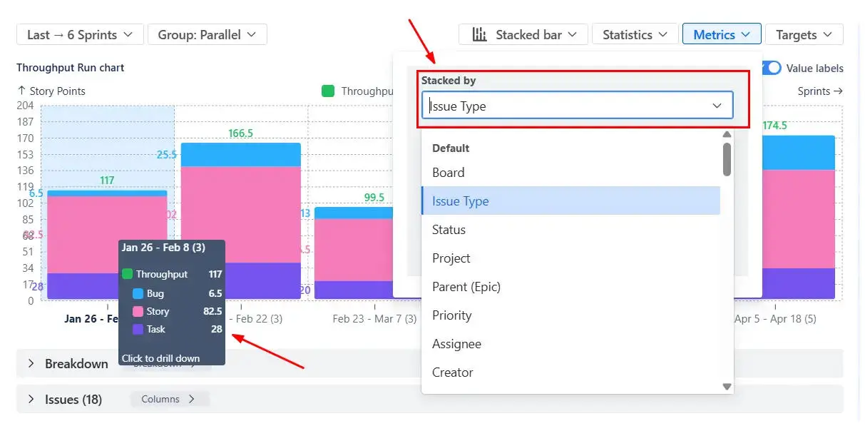
Add median and percentile reference lines and moving averages to separate genuine output shifts from normal sprint-to-sprint noise.
👉 Explore the interactive example: Scrum Throughput run chart
🚦 WIP Charts
The WIP Aging Chart shows how long individual items have been sitting in each workflow stage right now. Each column = a stage (1️⃣); each dot = a work item (2️⃣); items higher on the chart have been waiting longer.

Stalled vs. aging work
Aging = any item in progress for a period of time (normal). Stalled = items exceeding a defined per-stage threshold – likely blocked and requiring immediate action.
Stalled items health metric:
- Identifies issues that have been sitting in an active status without movement for a configurable period
- Surfaces hidden blockers before they impact the sprint outcome

👉 Explore the interactive example: WIP Aging chart
Additional features of advanced Sprint reports in Jira by Broken Build
These capabilities apply across all Broken Build charts and add significant day-to-day value:
🔍 Interval drill-down with issue-level details – Click any metric of any sprint to open a detailed issue list with customisable columns (assignee, epic, status, sprint count, and more). Breakdowns by issue type, epic, release, or JQL are available inline.
📊 Jira Dashboard gadgets – Every chart in the suite is available as a Jira Dashboard gadget. This means your sprint reports live alongside your backlog, project overview, and team metrics – no context-switching to a separate reports section. All data is real-time.
📤 Flexible export – Export to CSV for deeper analysis, or PNG and PDF for clean stakeholder presentations – no more screenshots.
How to build Sprint Reports with Broken Build
Getting started takes just a few minutes. Here's how to go from zero to your first sprint report on a Jira Dashboard.
Step 1 – Install the app from the Atlassian Marketplace
Head to the Atlassian Marketplace and install Agile Reports and Gadgets. A free trial is available – no commitment required. All individual apps (Velocity, Burndown, CFD, Cycle Time, Monte Carlo, Throughput, WIP) are included in the bundle.
Step 2 – Open your Jira Dashboard and add a gadget
Navigate to your Jira Dashboard (or create a new one). Click Add gadget, search for the chart you want – Velocity Chart, Cumulative Flow Diagram, Monte Carlo, and so on – and add it to the board. Each app is available as a dedicated real-time gadget.
Step 3 – Start from a template or build from scratch
Not sure where to begin? Broken Build offers ready-to-use dashboard templates – pre-configured sets of gadgets designed for common Agile use cases (sprint review, retrospective, delivery forecasting, and more). Pick a template, connect your board, and your dashboard is ready in seconds.
Step 4 – Configure and explore
Set your interval, estimation unit, and filters. Most charts are readable in under a minute. Click into any sprint to drill down into individual issues, adjust filters on the fly, and export when you need to share results outside Jira.
Step 5 – Share
Share the charts with teammates and stakeholders.
Benefits over Jira native Sprint reports

From sprint snapshots to sprint intelligence
Jira's built-in Sprint Report is a solid foundation. For small teams running straightforward sprints, that may be all you need.
But for teams that care about why delivery patterns look the way they do, how to forecast more reliably, and where to focus improvement energy, native Jira simply isn't built for that depth.
Agile Reports and Gadgets by Broken Build extends sprint reporting into a full analytics ecosystem: a lot of distinct sprint-related chart types, ready-to-use templates, real-time Jira data, multi-board aggregation, probabilistic forecasting, and role-tailored insights – all surfaced directly on your Jira Dashboard.
Whether you're a Scrum Master preparing for a retrospective, a Product Owner aligning stakeholders on scope, or a Delivery Manager tracking progress across teams, there's a chart in the suite built for your questions.


.png)