


What is Jira reporting?
Jira reporting is how teams transform raw issue data into actionable insights. Whether you're running a sprint review, tracking delivery performance, or planning releases, the ability to build effective reports in Jira directly impacts decision-making.
Instead of relying on exports or spreadsheets, modern teams expect real-time visibility. This is why reporting in Jira is no longer just about tracking progress – it’s about enabling continuous, data-driven delivery.
Agile Reports and Gadgets by Broken Build extends native Jira reports with advanced, configurable charts available directly on dashboards. It allows teams to analyze delivery speed, flow efficiency, predictability, and scope changes in one place.
How native Jira reporting works
Jira provides a set of built-in reports designed for Agile teams. These include:
- Burnup/Burndown Charts
- Sprint Report
- Velocity Chart
- Cumulative Flow Diagram
- Control Chart
- Version and Epic reports, etc
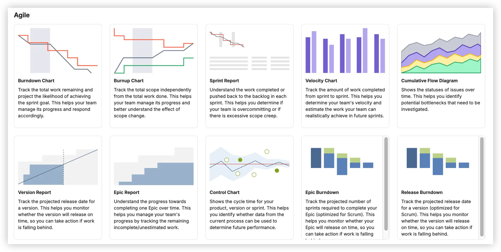
These Jira reports are useful for basic visibility and are often the first step when teams start to create a report in Jira.
However, native reporting focuses on simplicity – and that comes with limitations.
Limitations of native Jira reporting
As teams scale, native reports in Jira often become restrictive.
Common challenges include:
❌ Native Jira reports are restricted to a single board or release – no cross-team or cross-project visibility without manual consolidation.
❌ You can't adjust estimation fields, redefine Done statuses, or apply advanced JQL filters to tailor reports to your actual workflow.
❌ There's no forecasting: native charts show historical data but don't help you predict when a release will complete or how confident you should be.
❌ Built-in charts typically can't group data by issue type, epic, assignee, or other fields – making deeper capacity analysis impossible out of the box.
❌ No target lines, SLA thresholds, or statistical benchmarks mean teams are interpreting charts without context or reference points.
❌ You generally can't click through to the issues behind a data point – so when something looks wrong, investigating means running a separate query.
These gaps often push teams to look for ways to extend how they create a report in Jira without leaving the platform.
Extending Jira reporting with Agile Reports and Gadgets
To move beyond native limitations, teams extend Jira reporting with advanced tools.
Agile Reports and Gadgets provides a complete set of Jira reports in one dashboard-based solution.
Here's what teams gain in practice:
- One gadget covers all nine chart families - Velocity, Burnup/Burndown, Cycle & Lead Time, Time in Status, Throughput, CFD, Created vs Resolved, WIP & Aging, and Monte Carlo in one bundle. One config model, composable on any dashboard.
- Live data, zero manual effort. Charts pull directly from Jira in real time – no exports, no spreadsheets, no stale screenshots shared in Slack the day after they were relevant.
- Cross-team visibility at every level. Combine boards, projects, and initiatives into unified charts for delivery managers, RTEs, and program-level stakeholders who need the full picture.
- Forecasting is built in. Monte Carlo simulations, burn-rate projections, and percentile-based cycle time trends help you answer "Will we hit the deadline?" with data-backed confidence rather than gut feel.
- Reports that match your workflow. Custom status groupings, flexible estimation fields, and JQL support mean every Jira report reflects how your team actually operates.
- Dashboard-first experience. Every chart lives on the Jira Dashboard alongside the team's other tools – no separate app to open, no login required.
These capabilities redefine how teams create a report in Jira – shifting from static views to dynamic, real-time insights.


Key Feature 1: Flexible reporting scope
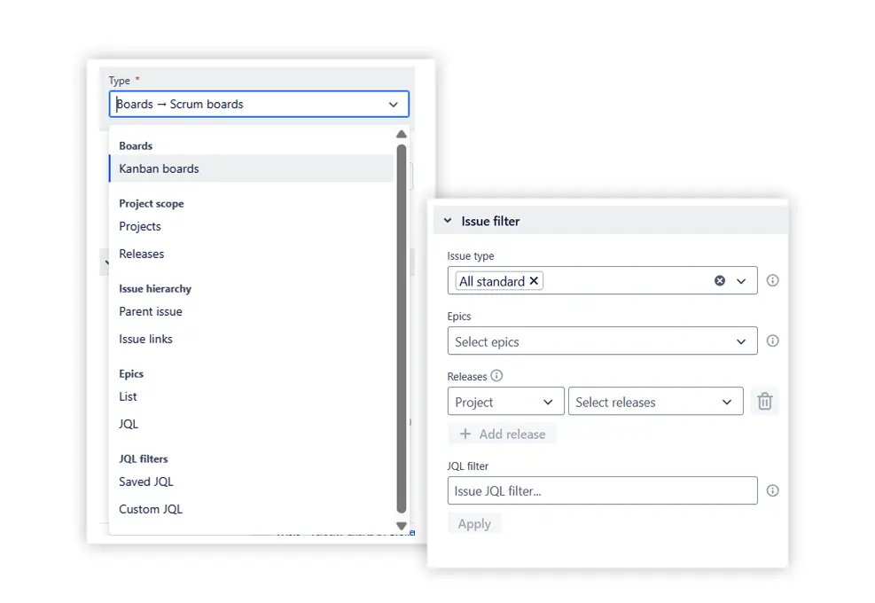
The most significant limitation of native Jira reports is that they're locked to a single board. Agile Reports and Gadgets removes that constraint entirely.
You can combine multiple Scrum boards, Kanban boards, projects, epics, releases, or custom JQL queries as the data source for any chart. An Issue Filter allows you to further refine what's included – by issue type, label, assignee, component, or any custom field.
Key Feature 2: Delivery & sprint metrics
Understanding how much work your team actually delivers – and how consistently – is the foundation of effective Jira reporting. This feature covers two complementary chart sets that together answer the most common sprint and delivery questions.
Agile Velocity Charts show how much work your team delivers over time by comparing velocity metrics across sprints or time intervals. What sets them apart from the native Jira velocity report is the range of views available:
- Cross-team velocity chart – compare delivery across multiple teams in a single view, making it straightforward to spot capacity imbalances or teams consistently over- or undercommitting

- Individual velocity chart – track how each team member delivers against commitments, spot productivity trends, scope changes, and whether work is balanced across the team

- Benchmarking velocity chart – compare sprint metrics across multiple teams in a single view, using shared benchmark lines (e.g., average, median, percentiles) and targets to evaluate how each team’s delivery performs against defined goals and historical norms.

Together, these views let you analyze performance at the right level of detail – whether you're a Scrum Master reviewing one team or a Delivery Manager overseeing several.
📊 You can also dive into live, clickable Velocity Charts examples:
- Team velocity chart
- Individual velocity chart
- Benchmarking velocity chart
- Sprint rollover report
- Say-do ratio report
- Scope change report
Agile Throughput Charts turn raw issue completions into clear, readable insights. Beyond showing how much work is delivered over time, they help you understand where that throughput comes from with the stacked bar view, and how it varies with the throughput histogram. While velocity focuses on story points per sprint, throughput highlights the flow of completed items –making it equally valuable for Kanban teams without sprint boundaries.
Two views are available:
- Throughput run chart – plots completed work over time as a bar or line chart, with mean and percentile reference lines to assess delivery stability at a glance
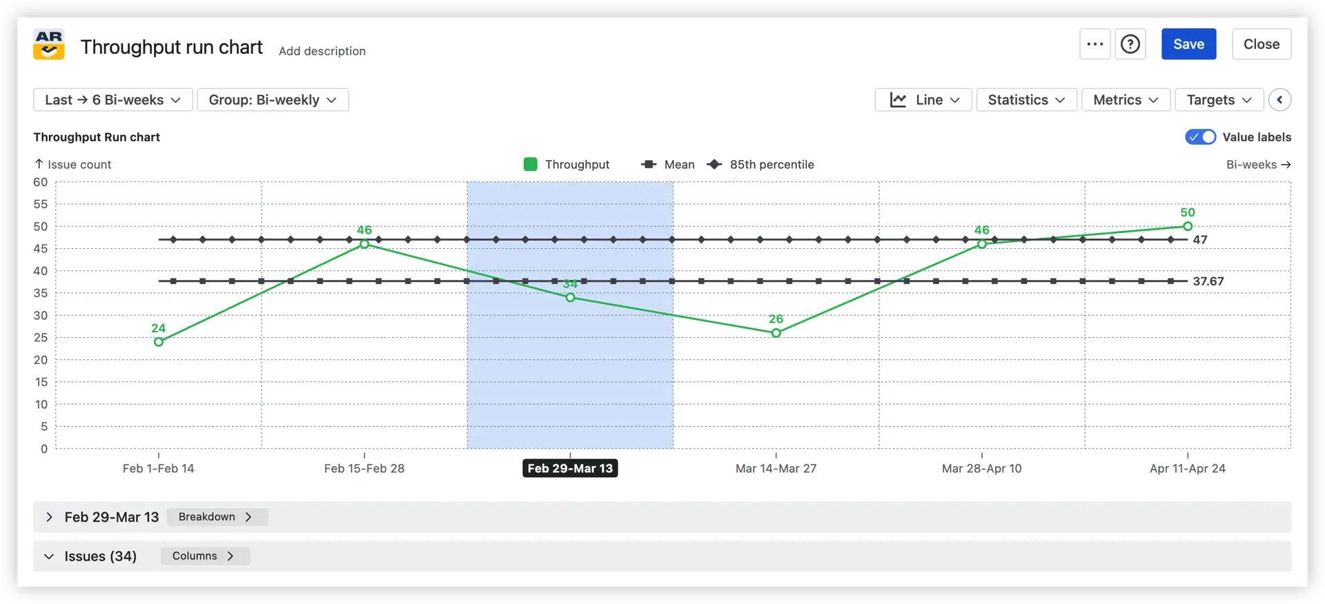
- Throughput histogram – shows the distribution of throughput across periods, helping you understand typical delivery ranges and identify outliers
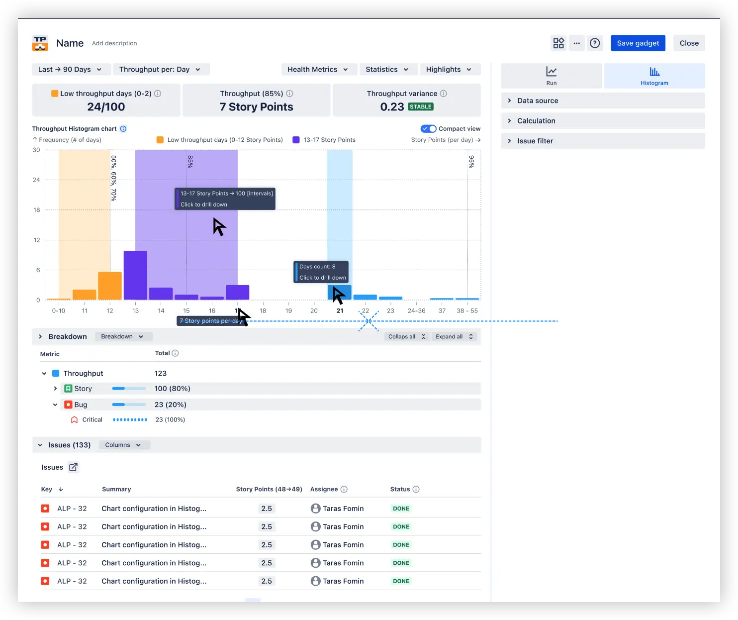
The gadget surfaces helpful statistics, including mean and percentiles, and supports line, bar, and stacked bar views so you can break capacity down by issue type, epic, assignee, or any Jira field.
📊 You can also dive into a live, clickable Throughput Charts example:
Key Feature 3: Forecast delivery with confidence
Knowing what your team has delivered in the past is useful. Knowing what they're likely to deliver next – and how confident you can be – is what drives better planning decisions. Agile Reports and Gadgets include two dedicated forecasting tools that bring that visibility directly into your Jira reporting setup.
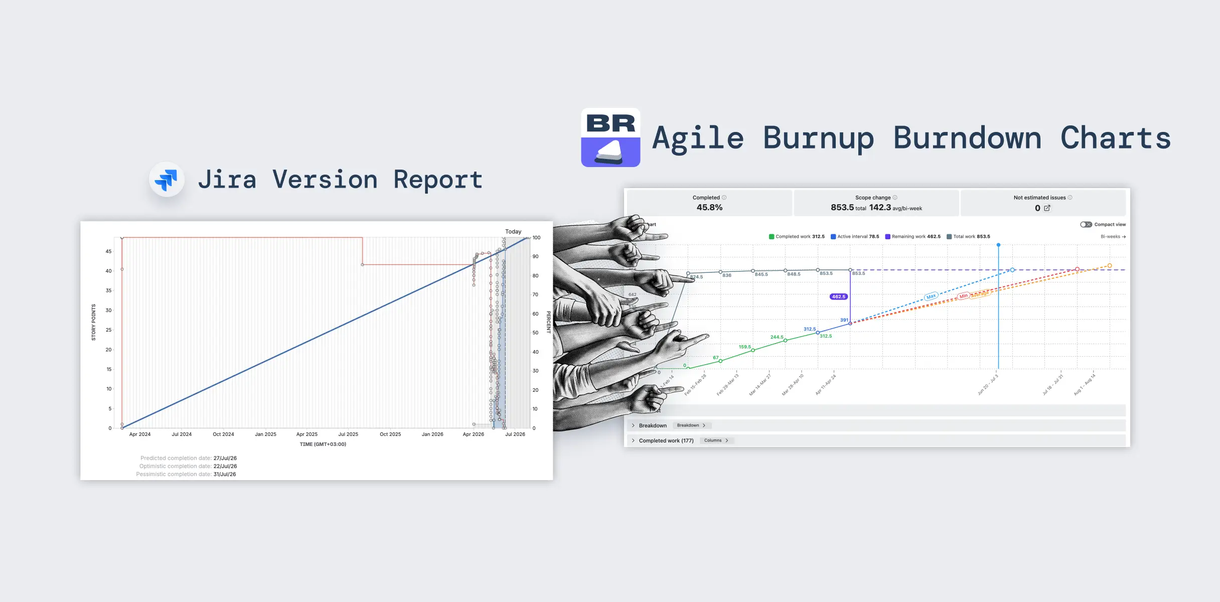
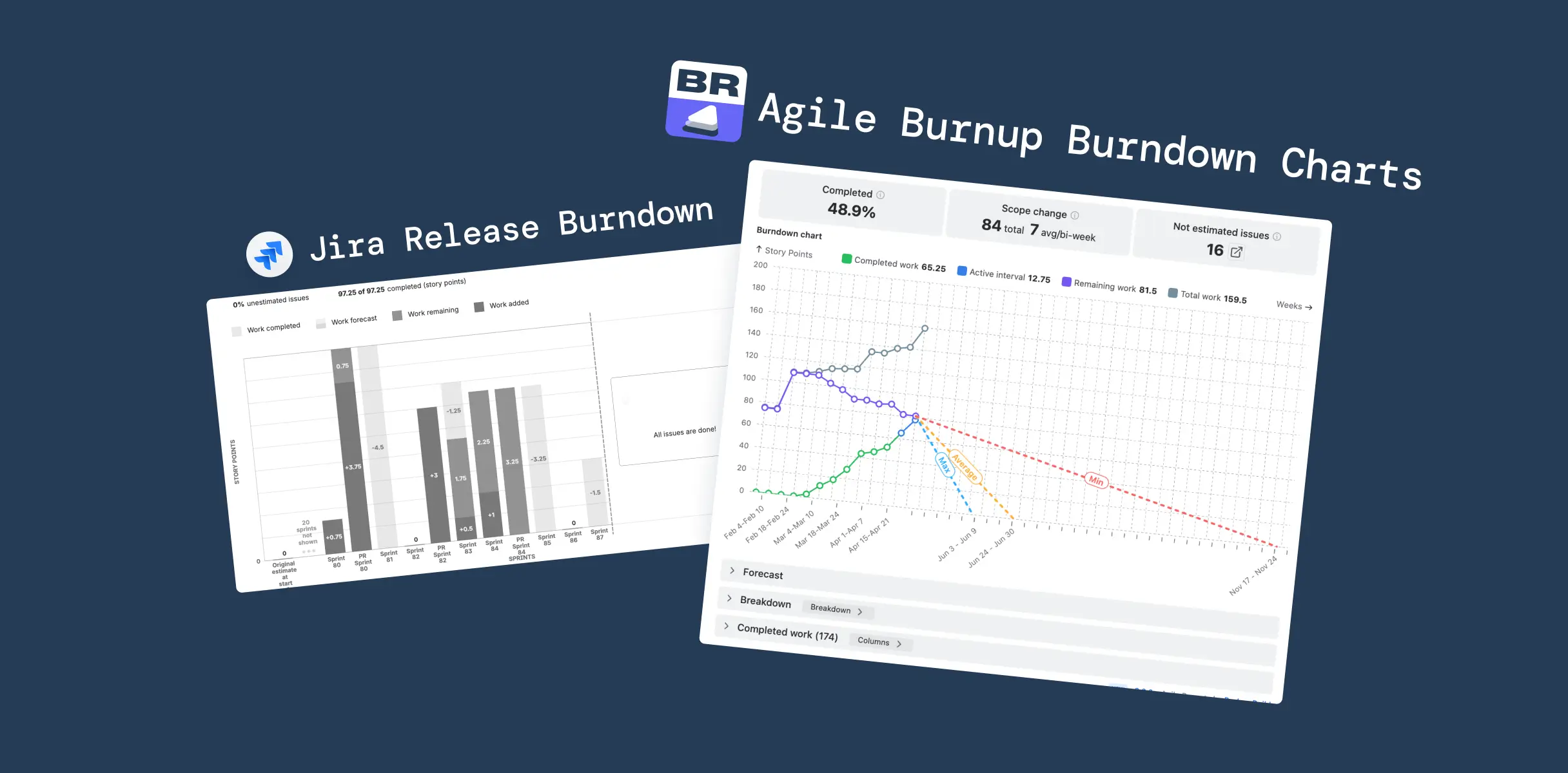
Agile Burnup Burndown Charts show how the scope evolves alongside how quickly the team delivers against it. By switching between burnup and burndown views, you can track progress over time and see exactly where the scope is growing or shrinking. You can also forecast when the remaining work will realistically be done, leveraging powerful, highly customizable forecasting with the ability to model different scenarios, adjust remaining work, and team capacity.
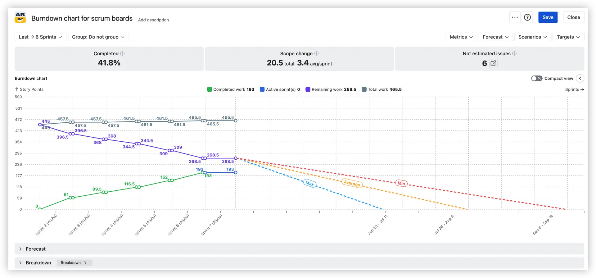
The chart is built to answer three questions every delivery team needs to keep in focus:
- Are we on track?
- Is the scope stable?
- What's the most likely completion date?
When scope changes mid-release – and it usually does – the burnup view makes that visible immediately, so you're never comparing actual delivery against a moving target without realizing it.
📊 You can also dive into live, clickable Burnup Burndown Charts examples:
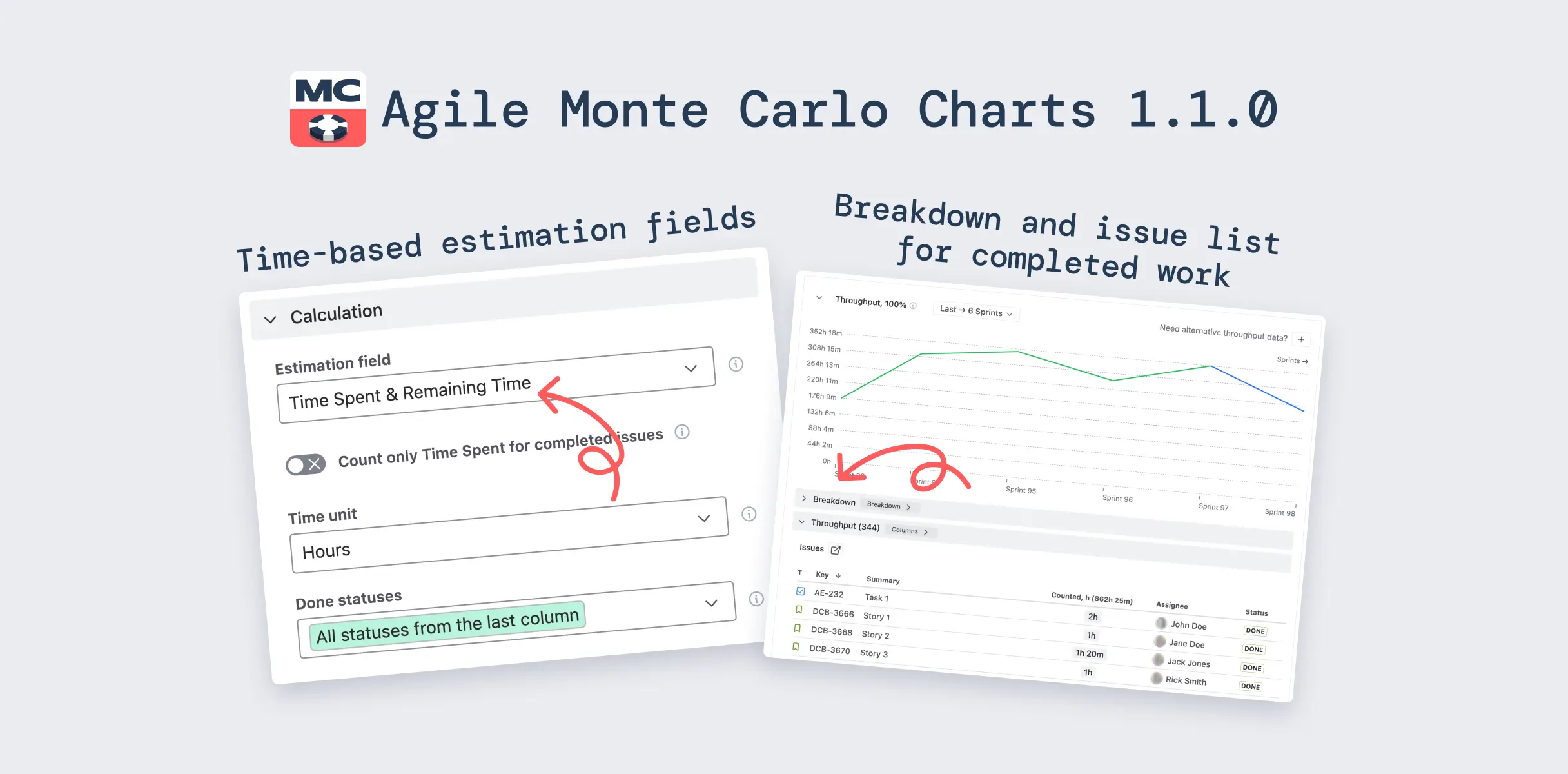
Agile Monte Carlo Charts take your team's historical throughput data and run tens of thousands of simulated delivery scenarios to show how future delivery is likely to unfold. Rather than committing to a single completion date, you get a probabilistic range: there's a 50% chance of finishing by date X, an 85% chance by date Y.
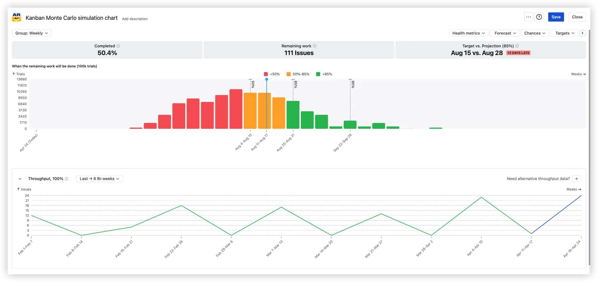
This makes uncertainty visible and measurable, which is far more useful than a confident-sounding estimate that carries no indication of its own risk.
Whether you're planning a near-term sprint commitment or evaluating delivery risk across a full quarter, Monte Carlo forecasting gives you the evidence to set realistic expectations, communicate confidence levels to stakeholders, and make informed tradeoff decisions.
📊 You can also dive into live, clickable Monte Carlo Charts examples:
Key Feature 4: Flow & system health
Delivery metrics tell you how much work is getting done. Flow metrics tell you how well your system is working – whether queues are growing, where work is aging, and whether your team is keeping up with incoming demand. This feature group brings three chart sets into your Jira reporting dashboard to give you that visibility.
Agile Cumulative Flow Charts provide a visual representation of how tasks enter, progress through, and exit your workflow at every stage simultaneously. Rather than focusing on a single metric, a CFD shows the shape of your entire delivery system – making scope changes, expanding queues, and flow instability immediately visible as they develop.
Two views are available:
- Burnup flow chart – tracks how work accumulates in each workflow stage over time, making it easy to see where items are piling up
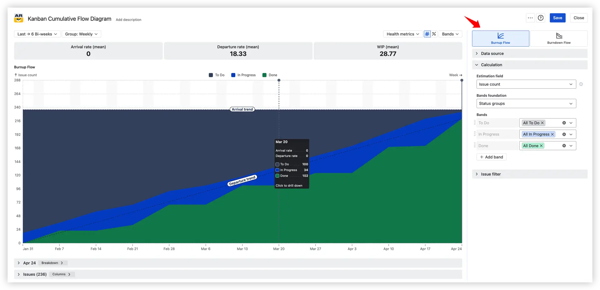
- Burndown flow chart – focuses on remaining work across stages, useful for release-level progress monitoring

Whether you're analyzing a single sprint or tracking long-term trends, Cumulative Flow Charts give you the signals to keep work moving smoothly and predictably – and catch emerging risks before they become delivery problems.
📊 You can also dive into live, clickable Cumulative Flow Charts examples:
- Kanban cumulative flow diagram
- Scrum cumulative flow diagram
- SAFe cumulative flow diagram
- Release cumulative flow diagram
- Active sprint cumulative flow diagram
Agile Created vs. Resolved Charts address one of the most important questions in any delivery system: Are we keeping up with demand?
Two views make this concrete:
- Created vs. Resolved Cumulative chart – shows the running totals of work entering and leaving the system over time. A widening gap between the two lines is an early warning that demand is outpacing capacity
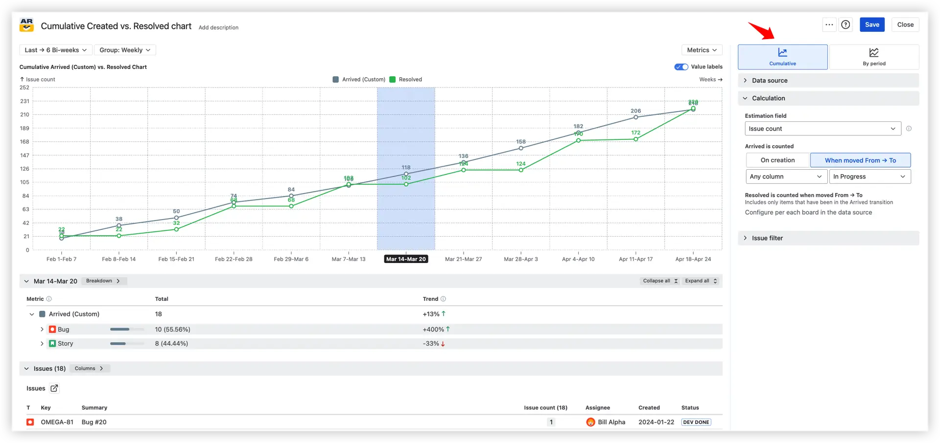
- Created vs. Resolved By-period chart – compares intake and completion within discrete time intervals, making it easier to spot specific periods where the team fell behind or surged ahead

These charts work across Scrum and Kanban teams, service desks, QA stages, and SAFe program levels – anywhere queues need to be monitored and backlogs kept under control.
📊 You can also dive into live, clickable Created vs. Resolved Charts examples:
Agile WIP Charts examine in-progress work from two angles: how long it has been in the system, and how much of it exists at any given time.
- WIP Aging chart – shows how long individual items have been sitting in each workflow stage. Each dot represents a work item, positioned by stage and age, with percentile zones highlighting items that are aging faster than expected. This makes blocked or stalled work impossible to miss
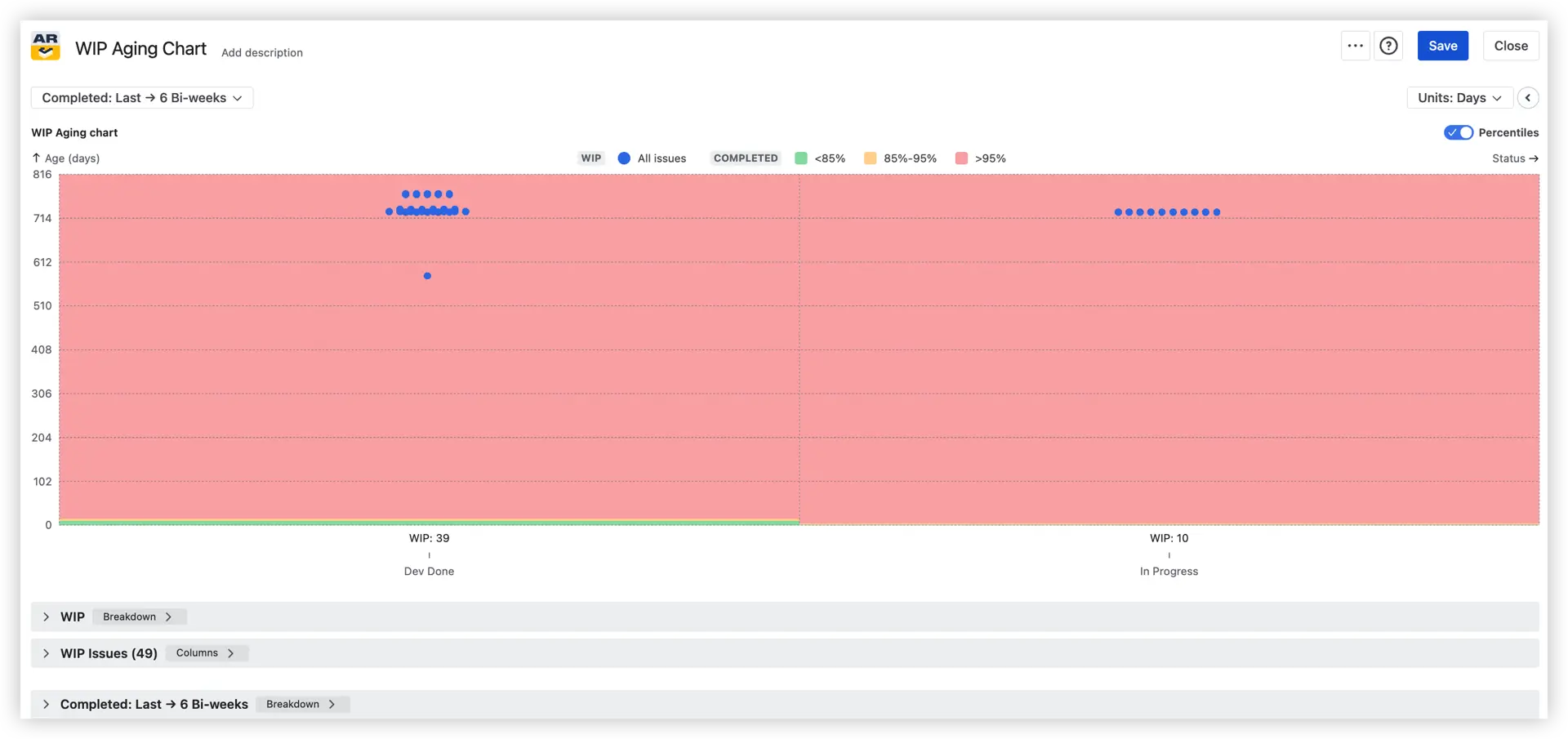
- WIP Run chart – tracks the total volume of in-progress work over time, with statistical lines and trend views to help you assess whether WIP levels are stable or creeping upward
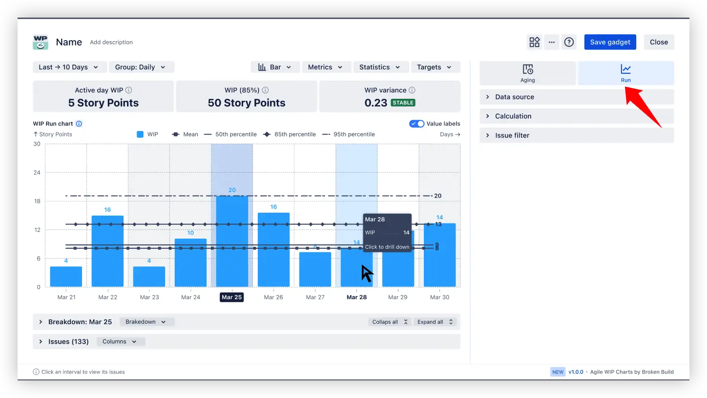
Together, these two charts help teams maintain flow discipline – keeping WIP within healthy limits and surfacing aging items before they silently derail sprint commitments.
📊 You can also dive into live, clickable WIP Charts examples:
Key Feature 5: Flow efficiency & time
Throughput tells you how much work gets done. Flow efficiency charts tell you how fast – and more importantly, where time is being lost along the way.
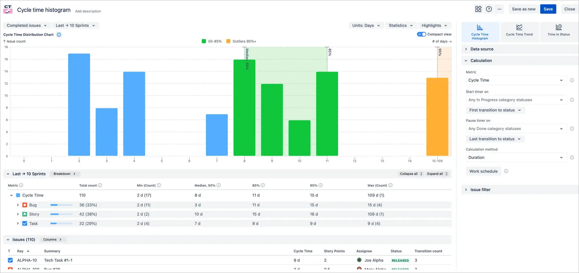
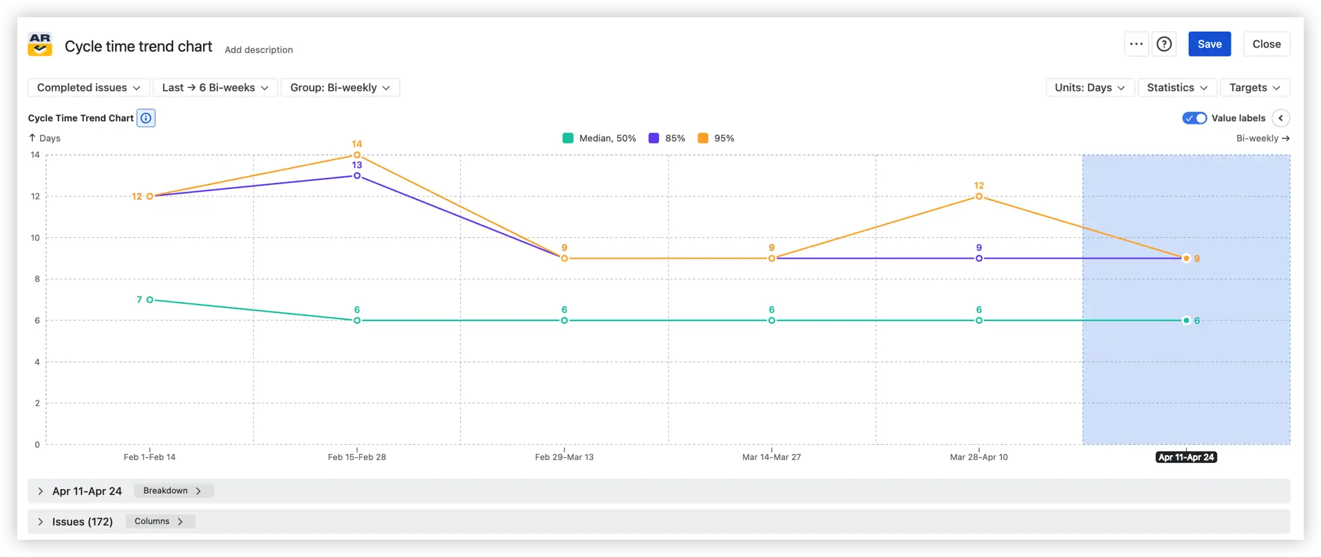
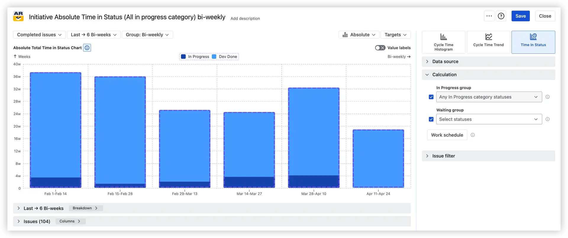
Agile Cycle Time Charts show how long it takes for work to move through your process from start to completion. By visualizing where time accumulates, you can identify bottlenecks, track improvement trends, and make delivery more predictable across teams and releases.
Three views are available:
- Cycle Time Histogram – shows the distribution of completion times across all work items, measuring either from when work started (Cycle time) or from when it was created (Lead time). It helps you answer: What's our typical completion time? How many tasks fall within our SLA? Which outliers are taking significantly longer – and which projects or issue types do they belong to?
- Cycle Time Trend Chart – plots how delivery times shift across sprints or time intervals using percentile lines – Median (50%), 85%, and 95%. It tells you whether your process is getting faster, more stable, or more variable over time, and whether recent workflow or capacity changes are actually having an impact.
- Time in Status Chart – zooms in to show exactly how much time issues spend in each workflow status, from active work stages to waiting queues. It answers the questions that rarely surface in standard Jira reports: Which status accumulates the most waiting time? How much time is spent in active work vs. idle stages like Ready for Test or Waiting for Customer Input?
📊 You can also dive into live, clickable Cycle Time Charts examples:
Key Feature 6: Drill into the data behind any data point
Charts tell you what happened. The Breakdown panel tells you why.
Click any sprint or interval directly on the chart to open a detailed breakdown without leaving the dashboard. You can analyze any metric side by side and drill down into two levels of nested breakdown by any Jira field (such as team, project, or issue type).
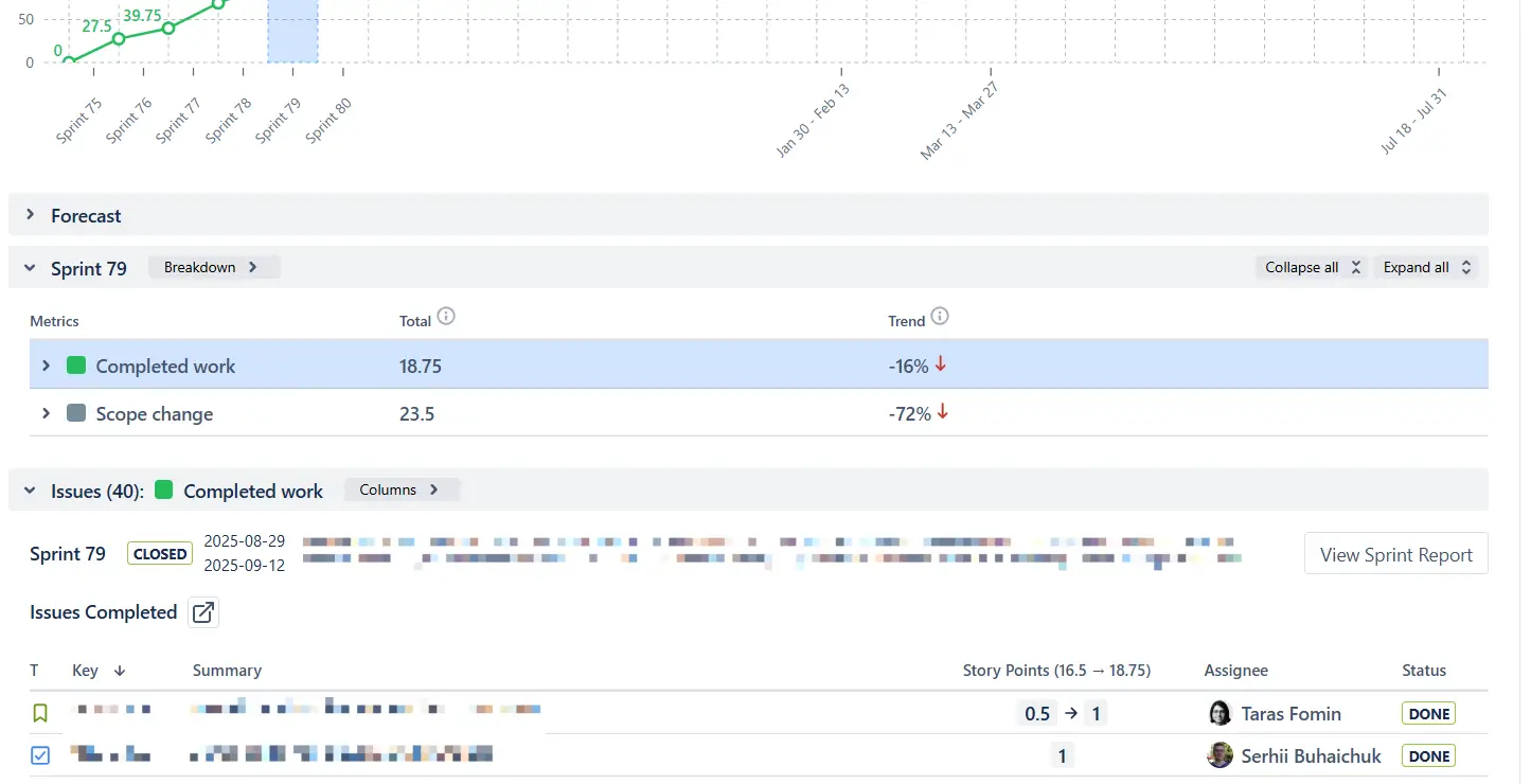
Each level is expandable, letting you explore where the numbers come from in more detail. At each level, you can click Find issues to instantly view the underlying items in the issue list below the chart.

📊 How to read the breakdown
The panel organizes data into two layers. The upper Breakdown section shows aggregated metrics – completed work, scope change, and their trends – so you can assess sprint health in seconds. Below it, the Issue list expands to show every individual ticket that contributed to those numbers, complete with story points, assignee, status, and a direct link back to Jira. You can also group issues by any Jira field – epic, assignee, component, label, or custom fields – to slice the data exactly the way your analysis requires.
How to generate advanced reports in Jira with Agile Reports & Gadgets
Creating advanced Jira reports with Agile Reports & Gadgets is designed to be fast and flexible. You can generate and access reports directly from multiple entry points in Jira – depending on how your team works.
1. Install the app
Start by installing Agile Reports and Gadgets from the Atlassian Marketplace. Once installed, you’ll be able to create and manage reports directly inside Jira.
2. Create and access reports
You can create a report in Jira and access your charts in three main ways:
- From the App Home
Use the central workspace to configure and manage your reports. This is ideal for setting up charts, adjusting data sources, and exploring different reporting scenarios in one place. - From a Jira dashboard
Add charts as gadgets to your dashboard for continuous visibility. This approach is best for sharing reports in Jira with teams and stakeholders in real time. - From a Jira project page
Generate reports directly within a project to analyze delivery performance in context – without switching between views.
3. Configure your report
Once you choose where to create your report, you can:
- Start from one of the 38 ready-to-use templates
- Select data sources (boards, projects, JQL, releases)
- Apply filters and grouping
- Choose chart types (velocity, throughput, burnup, etc.)
- Customize metrics based on your workflow
This flexibility allows you to tailor Jira reporting to your exact delivery process.
4. Analyze and share insights
After creating your report, you can:
- Track delivery trends and performance
- Identify bottlenecks and risks
- Share dashboards across teams
- Support planning and forecasting
With Agile Reports & Gadgets, reporting in Jira becomes a continuous, shared experience – not just a one-time analysis.
How different roles use Jira reporting by Broken Build
✅ Scrum Master – Sprint review without spreadsheet prep: Presents Velocity, Say/Do, Rollover, and Scope Change live from a Jira dashboard. No exports, no slide prep the night before – every metric is already there when the meeting starts.
✅ Team Lead – Daily WIP and aging triage: Opens the WIP Aging chart before stand-up to identify which items have crossed the 85th percentile and need the team to swarm on them before they stall the sprint.
✅ Program Manager – Release-date commitment with evidence: Uses Monte Carlo forecasting to commit to delivery dates with a stated confidence level (P85) rather than a gut-feel estimate – giving stakeholders a probability, not just a promise.
✅ Engineering Director – Flow diagnostics when delivery slips: Drops a CFD with rate lines alongside Cycle and Lead Time charts to locate exactly where work is piling up in the system – turning a vague delivery slowdown into a precise, fixable bottleneck.
✅ Release Train Engineer – SAFe portfolio rollup across many teams: Consolidates Initiative-level progress across multiple ARTs into a single view without needing a warehouse project or manual data stitching.
✅ Agile Coach – Upgrade from native Jira reports: Replaces the limited built-in reports in Jira with filtered, sprint-aware, percentile-driven views that give teams the depth their retrospectives and planning sessions actually require.
Conclusion: Turning Jira into an advanced reporting system
Jira reporting starts with built-in capabilities – but real value comes from extending them.
As complexity grows, teams need:
- Cross-team visibility
- Flexible configuration
- Predictive insights
- Shared dashboards
This is where Agile Reports and Gadgets by Broken Build comes in – extending native Jira reports with advanced charts, flexible data sources, and forecasting capabilities, all in a single dashboard experience.
By improving how you create a report in Jira and extending native functionality with advanced tools, teams can move from simple tracking to data-driven delivery management.


.png)