


Do you often feel that your team is busy, yet progress remains slow? Do your sprints go off track before you even notice? Do you sometimes wonder why throughput fluctuates from one sprint to the next?
Here's what happened last sprint: Your team started with 20 stories. Everyone was busy. But on day 12 of your 14-day sprint, only 4 stories were done. Where did the other 16 go? Five are waiting for code review. Eight are stuck in testing. Three blocked. Two "almost done."
Your burndown chart showed you were behind. But it didn't tell you where the jam was forming.
An Agile Cumulative Flow Diagram changes that. It shows exactly where work piles up and where bottlenecks form before they kill your sprint.
Get Agile Cumulative Flow Charts for Jira and start spotting bottlenecks in under 5 minutes.
What is a Cumulative Flow Diagram?
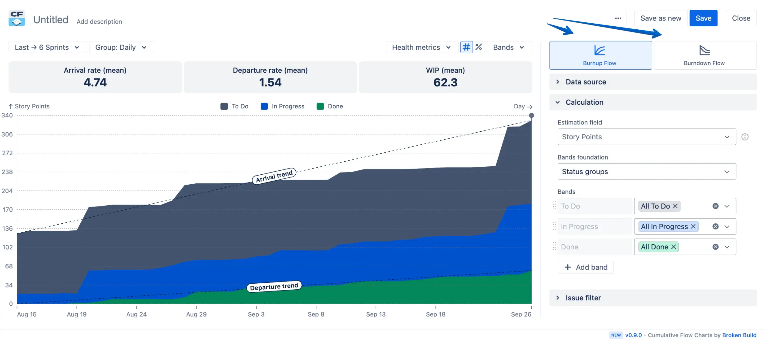
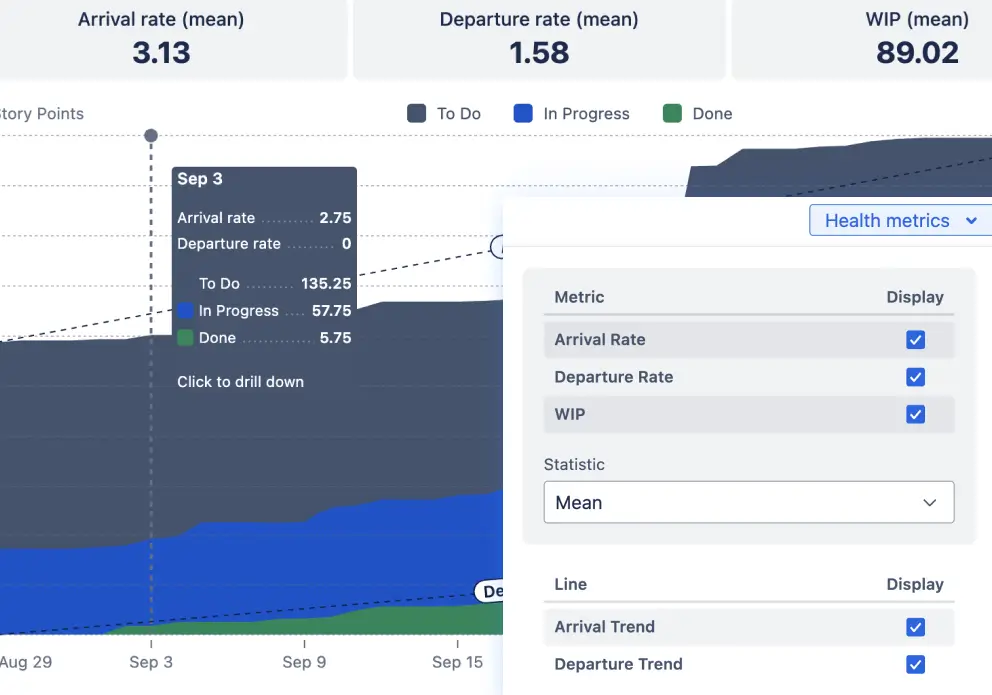
A Cumulative Flow Diagram (CFD) is a stacked area chart with colored bands representing each stage your work passes through: status groups (To Do, In Progress, Done) or specific statuses. As days pass, these bands grow upward. The height of each band shows how much work is in that stage right now.
This Agile flow chart provides a visual snapshot of the three metrics that matter most for understanding your workflow health:
💠 Arrival Rate: How fast work enters your system. Steep upward slope on the chart's top line = work flooding in. When arrival outpaces completion, your backlog grows dangerously.
💠 Departure Rate (Throughput): How fast you actually ship. The slope of your "Done" band answers: "How much work can we complete per sprint?"
💠 Work in Progress (WIP): Everything started, but is not done. The vertical gap between the Arrival trend and Departure trend lines. Too much = context-switching chaos.
Its main purpose is to show you how stable your cumulative flow is and where to focus improvements. Unlike a burndown that just says "we're behind," a CFD chart shows you where you're behind and which stage is backing up. It's an X-ray for your workflow - revealing problems you can't see in standups.


How are CFD charts helpful?
Cumulative Flow Diagrams give you instant clarity into how your work actually flows - not how you think it flows. They help teams spot problems early, keep delivery predictable, and move faster with confidence.
✨ See flow stability at a glance - Quickly tell whether arrivals and departures stay balanced - and catch drift before it becomes a slowdown.
✨ Reveal efficiency without time-tracking - Compare active vs. waiting work to expose hidden waste in seconds.
✨ Find bottlenecks instantly - A widening band shows exactly in what status or status group work is piling up and why. This is the power of cumulative flow diagram bottleneck detection.
✨ Keep WIP under control - Use your continuous flow diagram to see where limits are breached and keep cycle times low.
✨ Track delivery against an ideal pace - Judge progress toward Done by comparing your actual curve with an ideal slope.
To make these insights practical and effortless inside Jira, our Agile Cumulative Flow Charts app gives you a powerful, fully customizable CFD experience.
Key features of Agile Cumulative Flow Charts
Here’s how our app helps you turn flow visibility into real delivery improvements:
1. Actionable flow health metrics
CFD charts aren’t just pretty colors - they’re a real-time pulse check of your delivery system.
With this app, you instantly see:
💠 How arrivals and departures trend over time
💠 Whether WIP is growing faster than work gets completed
💠 How your scope evolves compared to the initial scope line
💠 How your actual pace compares to an ideal delivery slope
In other words, you get a clear view of whether your Cumulative workflow diagram is stable, drifting, or quietly building up future delays.
2. Flexible, fully customizable bands
Every team structures work differently - so your Cumulative flow chart shouldn’t be one-size-fits-all.
This app lets you shape the chart exactly the way your process works:
💠 Build bands using status categories, individual statuses, or custom groups
💠 Reorder or hide segments you don’t want to highlight
💠 Switch between absolute numbers and percentages
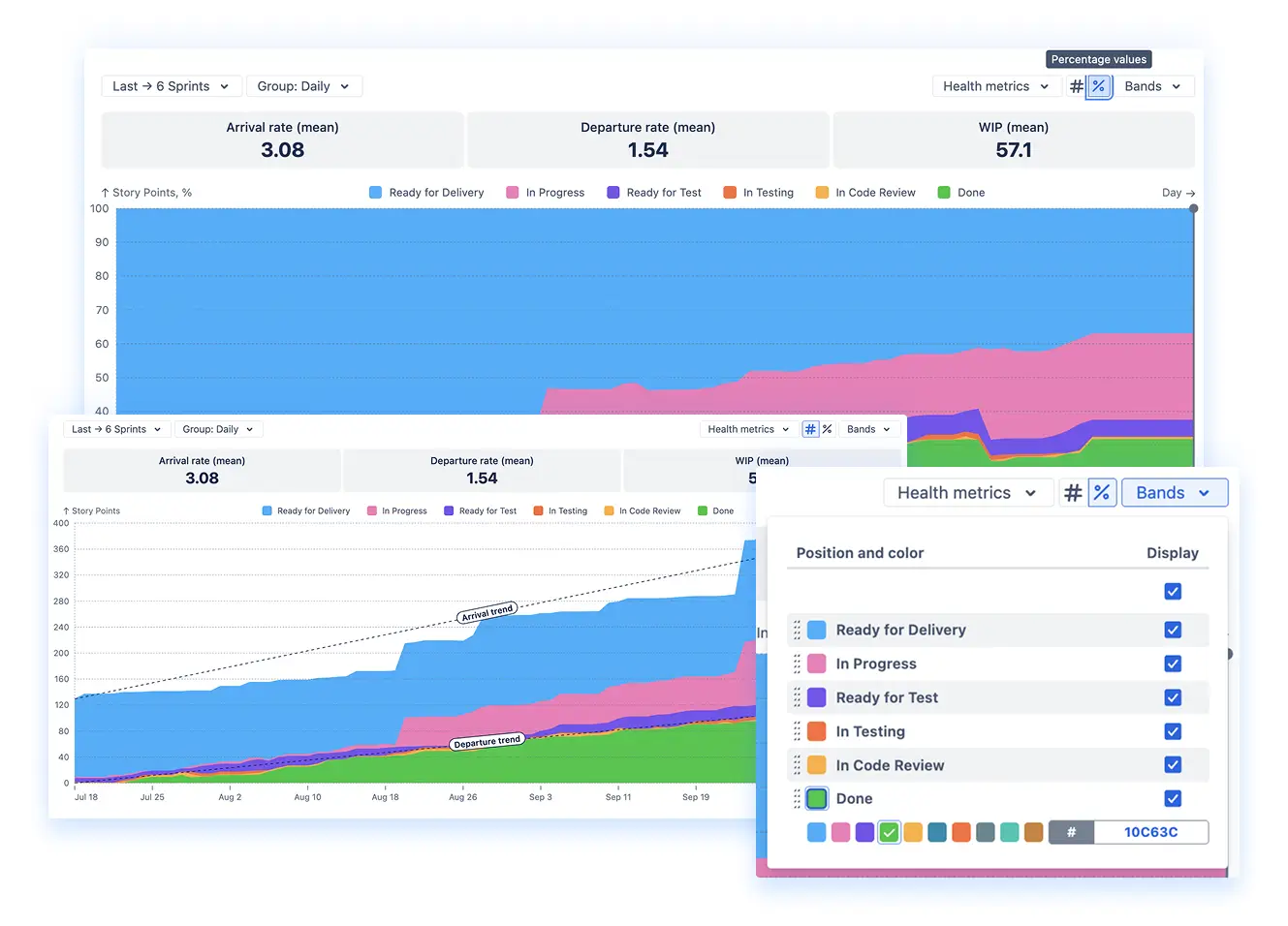
The result? A CFD that reflects your true workflow, not a generic Jira template.
The Cumulative Flow Chart can also act as an analogue to a WIP Run Chart when used with a few simple adjustments:
- Use Statuses as the band foundation
- Display only the statuses from the In Progress category
- Group the data by day
This setup provides a quick, at-a-glance snapshot of your daily WIP.
3. Burnup and Burndown insights in one place
Whether you’re running a Scrum flow diagram or a Kanban process flow diagram, projects, epics, releases, or any Jira issue hierarchy, the chart adapts to your methodology:
💠 Burnup mode shows cumulative progress across all stages – ideal for continuous delivery and flow optimization. It also displays Arrival Trend and Departure Trend lines, helping you see whether incoming work and completed work stay in balance over time.
💠 Burndown mode highlights how the “to-do” segment shrinks over time – perfect for sprints, releases, or epics. You also get an Initial Scope marker to show the starting workload and an Ideal Slope that represents the optimal pace for completing the remaining work.
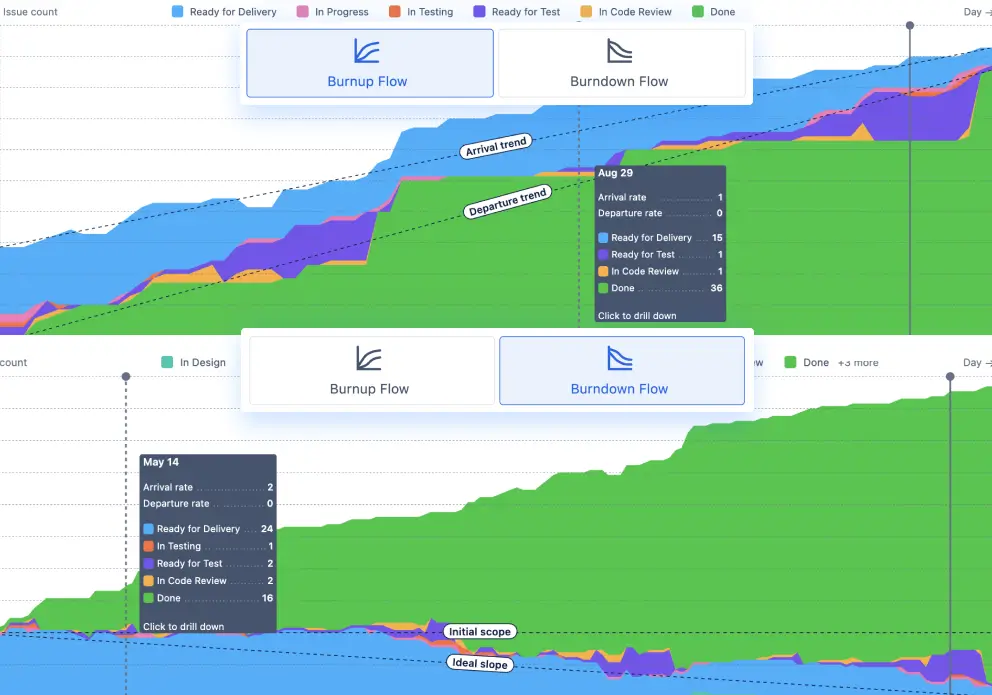
You get both perspectives without switching tools or rebuilding reports - and with trend lines and scope indicators, it becomes much easier to judge flow stability and delivery predictability.
4. Powerful filtering & multi-level drill-down
Your Agile Cumulative flow diagram becomes even more valuable when you can slice the data your way.
You can:
💠 Pull data from multiple boards, projects, epics, or releases
💠 Filter by issue type, assignee, or any JQL expression
💠 Drill into specific bands to see which issues are piling up or slowing down
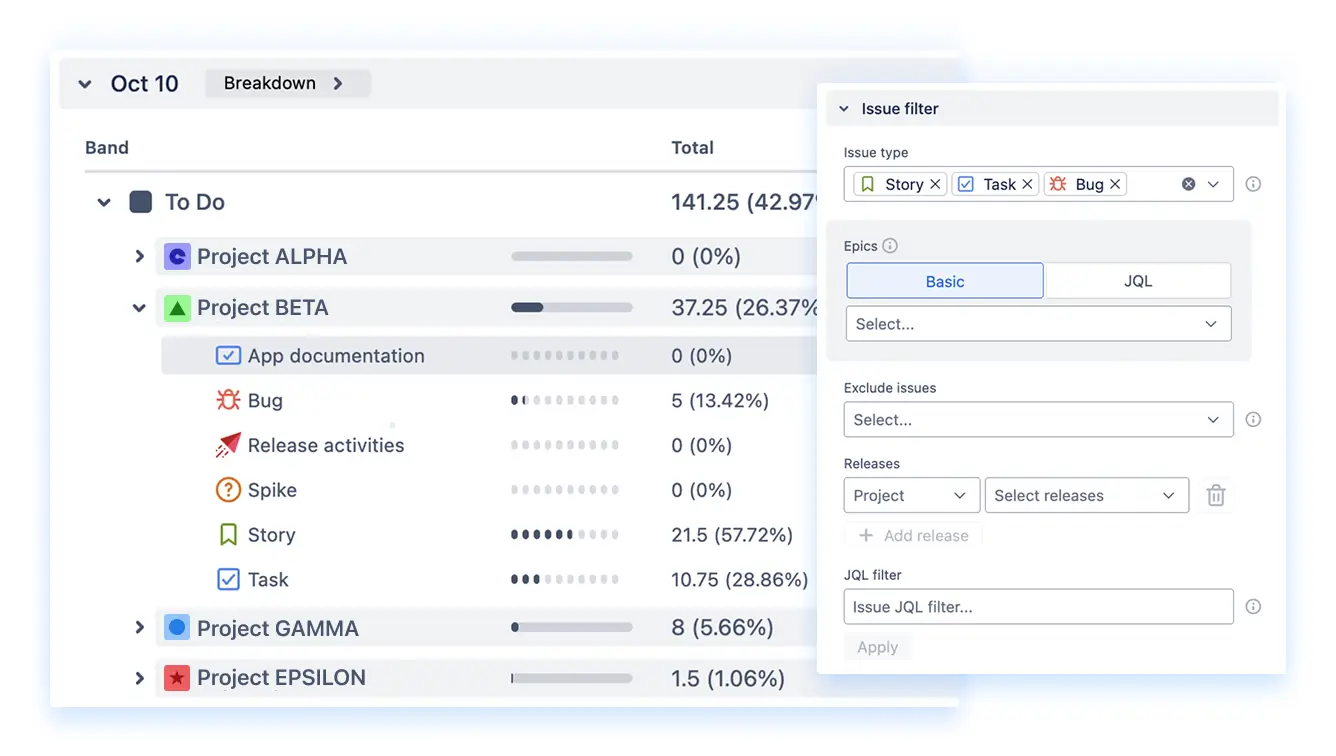
This transforms the chart from a broad overview into a diagnostic tool that explains why flow changes happen.
5. Easy exporting, clean setup & long-range trends
Analytics only matter when they’re easy to share and revisit.
The Agile Cumulative Flow Charts app supports:
💠 exporting charts or raw data to PNG or PDF
💠 simple WYSIWYG configuration - adjust settings and see changes instantly
💠 multiple time ranges (days, weeks, months, quarters) for both short-term and long-term analysis
That means you can use the CFD in sprint reviews, quarterly planning, team retros, or leadership reports - without extra work.
3 ways to understand the data on a CFD chart
A Cumulative Flow Diagram tells a story long before problems become visible on the board. By watching how each band grows, shrinks, or stays in sync with the others, you can immediately understand whether your system is healthy or drifting out of balance.
Here are three patterns every team should recognize:
1. When the bands grow in parallel
This is the picture of a calm, predictable flow. Each band expands at roughly the same pace, meaning tasks enter and leave the workflow at a stable rate. Throughput is consistent, WIP isn’t ballooning, and nothing is silently piling up.
In this scenario, your process is working as intended - you can focus on optimizing cycle time rather than firefighting bottlenecks.
2. When a band starts narrowing
A shrinking band signals an underloaded stage - the team is finishing work faster than new items are arriving. That’s not necessarily a bad thing, but it does mean capacity is mismatched.
Maybe this stage has more people than needed, or upstream work isn’t arriving steadily. Rebalancing capacity can streamline the flow and help avoid idle time or uneven workload distribution.
3. When a band keeps widening
This is the classic sign of a bottleneck. If a band continuously expands, work is entering that stage faster than it leaves. Over time, this leads to longer wait times, rising WIP, and unpredictable delivery.
The cause might be multitasking, blockers, dependencies, or simply too much work being pushed in. The fix often involves tightening WIP limits, reducing context switching, or unblocking downstream steps so the team can finish what’s already in progress.
How to get CFD in the Jira dashboard in 5 minutes
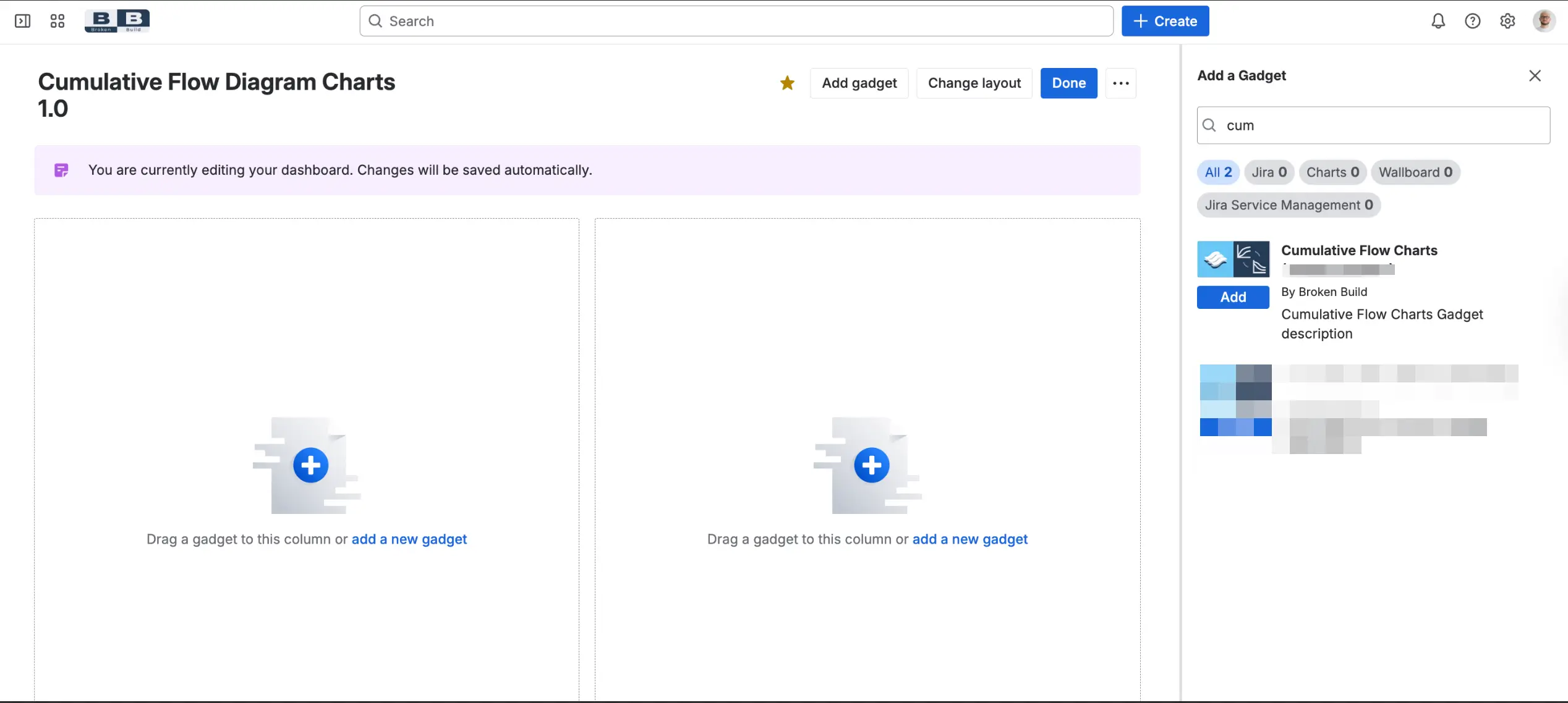
- Step 1: Install Agile Cumulative Flow Charts from Atlassian Marketplace. 30-day free trial, no credit card.
- Step 2: Add a gadget to the Jira dashboard. Click "Add gadget," search "Agile Cumulative Flow Charts," and add it.
- Step 3: Select your data source. Workflow stages load automatically.
- Step 4: Customize - hide unnecessary stages, reorder bands, group similar statuses.
- Step 5: Show your team. Put CFD on screen in the standup. When someone's blocked, point to the widening band. When the flow is smooth, celebrate parallel bands.
Examples of using the Cumulative Flow Diagram
Real Cumulative flow diagram examples from teams who found their bottlenecks and fixed them:
💠 Late-sprint testing crunch: Mobile app team missing 6 of 10 sprint goals. Their Scrum flow diagram showed "Testing" flat until day 10, then spiked. Testing started too late. Fixed: QA joined from day 1, testing began on day 2. Now hitting 9 of 10 sprints.
💠 Invisible scope creep: Product owner insisted "not adding much scope." The Cumulative flow chart showed "To Do" climbing 20% every sprint. Created "Hot Fixes" board, established "one in, one out" rule. Objective proof ended the debate.
💠 Tuesday bottleneck: DevOps team's "Code Review" spiked every Tuesday. Senior architect who approved deployments worked remotely on Tuesdays, didn't check Jira until the afternoon. Cross-trained two more approvers. Tuesday spike disappeared.
📊 You can also dive into live, clickable examples of:
Maximizing efficiency and stability with the Cumulative Flow Diagram
A CFD doesn’t make your team work harder — it shows where work actually gets stuck. Instead of guessing, you finally see the real constraints slowing delivery.
What changes when you use a CFD
❌ Before: “We’re behind schedule.”
✅ After: “Testing is backed up by 8 items - that’s where flow is slowing.”
❌ Before: “Why are we so slow?”
✅ After: “WIP jumped to 20. Let’s finish what’s in progress before starting more.”
❌ Before: “We’ll try to go faster.”
✅ After: “Throughput is steady at 16 items. We can commit to that with confidence.”
The CFD gives you actionable clarity on where to focus improvement efforts. High-performing teams don’t push harder — they remove the right constraints.
See exactly where your workflow gets stuck → Install Agile Cumulative Flow Charts, spot your first bottleneck in 5 minutes.


.png)