


Are your sprints consistently finishing late – even though everyone looks busy? Is your team delivering work, but deadlines still keep slipping?
Here's a scenario that might feel familiar: the sprint started with 40 story points. The team worked hard for two weeks. By the last day, 15 points are still open. The burndown chart showed progress – but not enough of it, and no one saw the warning signs in time.
That's exactly what a well-configured Jira burndown chart is supposed to prevent. The problem? Most teams only scratch the surface of what burndown reporting can actually do.
This guide covers everything from the basics of burndown charts in Jira – including all three native chart types – to more advanced forecasting approaches using Agile Burnup Burndown Charts by Broken Build, helping teams move from reacting to predicting.
What is a Jira burndown chart?
A Jira burndown chart is a visual report that shows how much work remains over time compared to the total scope, most commonly across a sprint. As a team completes work, the remaining work line drops – ideally toward zero by the end of the sprint, release, epic, initiative, etc.
At its core, the chart answers four fundamental questions:
- 📌 How much work is still left to complete?
- 📌 Are we moving fast enough to finish on time?
- 📌 Is the scope growing, shrinking, or staying stable?
- 📌 When is the remaining work likely to reach zero?
Two lines appear on the native Jira burndown chart:
- Guideline – a straight reference line from the total scope at the start to zero at the planned end date.
- Remaining Values – the total work remaining line.

When the actual line runs above the ideal, the team is behind. Below it – ahead. Simple in concept, but powerful in practice.
Why Agile teams rely on burndown charts
Burndown charts aren't just a Scrum formality. They're one of the most actionable signals a team can use during and between sprints.
Here's why they matter:
- 🔍 Catch scope creep early – a flat or rising remaining work line is a red flag that more work is being added than completed.
- 📉 Measure delivery pace – compare how fast the team is actually moving against how fast it needs to move.
- 🗣️ Align the whole team – Scrum Masters, Product Owners, and developers all read the same chart, which keeps sprint conversations grounded in data.
- 📅 Forecast completion – instead of guessing, teams can use velocity trends to project when remaining work will be done.
- 🔁 Fuel better retrospectives – patterns across sprints reveal systemic issues like consistent underestimation or recurring scope additions.
Without a burndown chart, teams are essentially navigating by feel. With one, the data does the talking.
The three native Jira burndown chart types
Most teams know Jira has a burndown chart. Fewer know that native Jira actually offers three distinct burndown chart types, each built for a different scope and purpose.
1. Sprint burndown chart
The sprint burndown is the most commonly used chart – and the one most people picture when they hear "Jira burndown chart."
It shows how remaining work (1️⃣), measured in the selected estimation units (2️⃣)- such as story points, issue count - changes day by day within a single active sprint (3️⃣). The ideal burndown line (4️⃣) gives the team a visual benchmark for where they should be at any given point in the sprint.
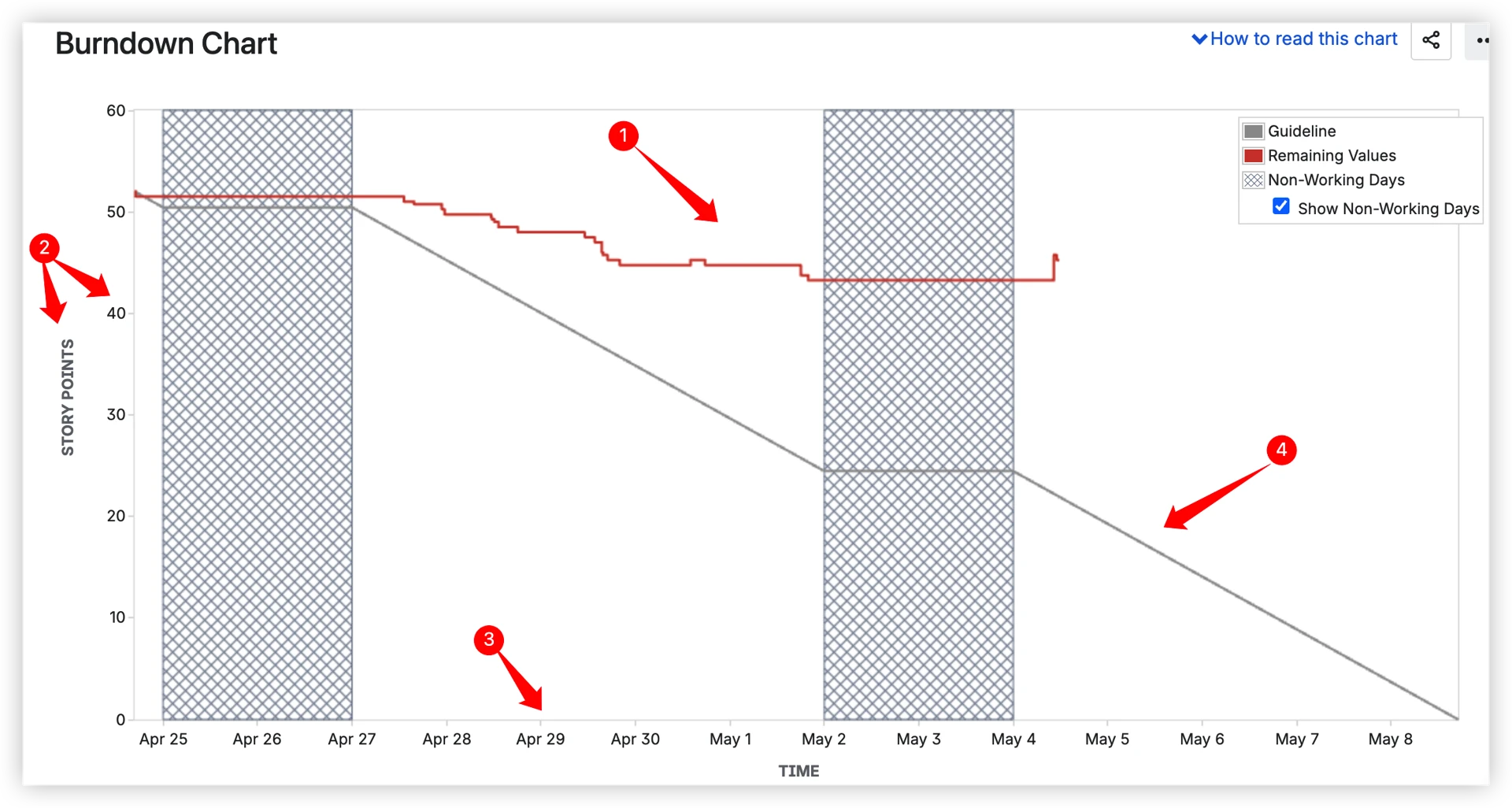
Best for: Daily standups, sprint reviews, and Scrum Master monitoring of in-sprint progress.
Where to find it: Scrum board → Reports → Burndown Chart.
What to watch:
- A line hugging the ideal → team is on track.
- A flat line midway through → work is stalling, possibly blocked.
- A sudden drop on the last day → team may be marking things done at the last minute rather than delivering incrementally.
2. Epic burndown chart
The Epic burndown chart tracks progress toward completing a specific Jira epic – a larger body of work that typically spans multiple sprints.
Instead of daily updates, the chart updates sprint by sprint, showing how many in the selected estimation units within the epic after each sprint concludes.
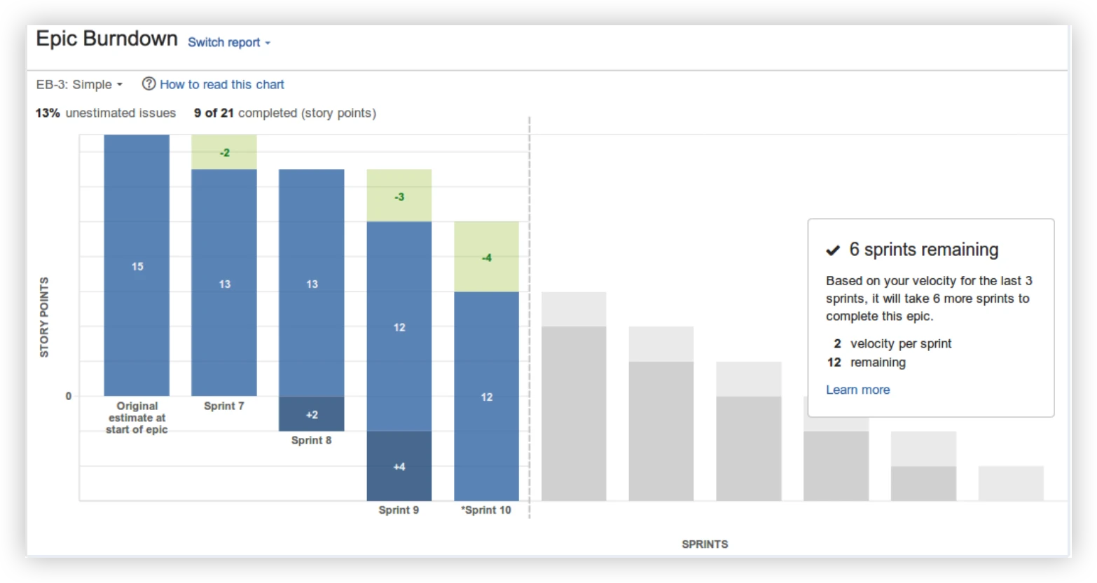
Best for: Product Owners and Engineering Managers tracking multi-sprint feature delivery.
Where to find it: Reports section → Epic Burndown (available in company-managed Scrum projects).
What to watch:
- Scope changes between sprints signal stories being added to the epic mid-delivery.
- A flat or growing line late in the epic's lifecycle is a warning sign for delivery risk.
- The estimated number of sprints remaining is based on the team’s recent velocity and current remaining work – useful but limited.
3. Release burndown chart
The release burndown chart shows progress toward a Jira fix version (release) – tracking all issues assigned to that version across one or more sprints.
Like the epic burndown, it updates sprint by sprint rather than daily. It's designed to answer: "Are we going to deliver everything planned for this release on time?"

Best for: Product Managers and Release Train Engineers managing delivery against release commitments.
Where to find it: Reports → Release Burndown (company-managed Scrum projects with versions configured).
What to watch:
- Scope additions mid-release push estimated completion further out – the chart reflects this immediately.
- Consistent velocity across sprints gives a reliable projected “sprints remaining” estimate.
- Sudden drops in velocity mid-release may indicate blockers or team changes that need attention.
Where the native Jira burndown chart is limited
Jira's three native burndown charts are solid for individual teams working on a single sprint, epic, or release. But as teams scale and delivery complexity increases, the gaps start to show.
Here's what native Jira doesn't offer:
- ❌ No multi-sprint trend view – you can only see one sprint at a time. Spotting velocity trends over time requires manual effort or external tools.
- ❌ No cross-team or multi-board view – Jira burndown charts are limited to a single board, making multi-team tracking complex and unreliable.
- ❌ No burndown for Kanban boards – native Kanban boards in Jira don't include a burndown report.
- ❌ No delivery forecasting – native charts show where you are, not where you're headed. Simplistic forecast – based on average velocity from recent sprints, with no confidence levels or scenario modeling, and unavailable without enough historical data.
- ❌ No scope growth simulation – you can't model what happens if the backlog keeps growing at the current rate.
- ❌ No interval breakdowns with issue-level details – the chart shows the line moving, but you can't click into a sprint or interval to see which issues were completed, added, or carried over.
- ❌ No individual burndown insights – no way to track how a single contributor's delivery evolves over time.
- ❌ No dashboard gadget – native burndown charts are locked inside a board's Reports section. You can't embed them on a Jira Dashboard or build a shared view for stakeholders.
For small, single-team Scrum setups, native Jira often does the job. For everyone else, these limitations add up quickly.
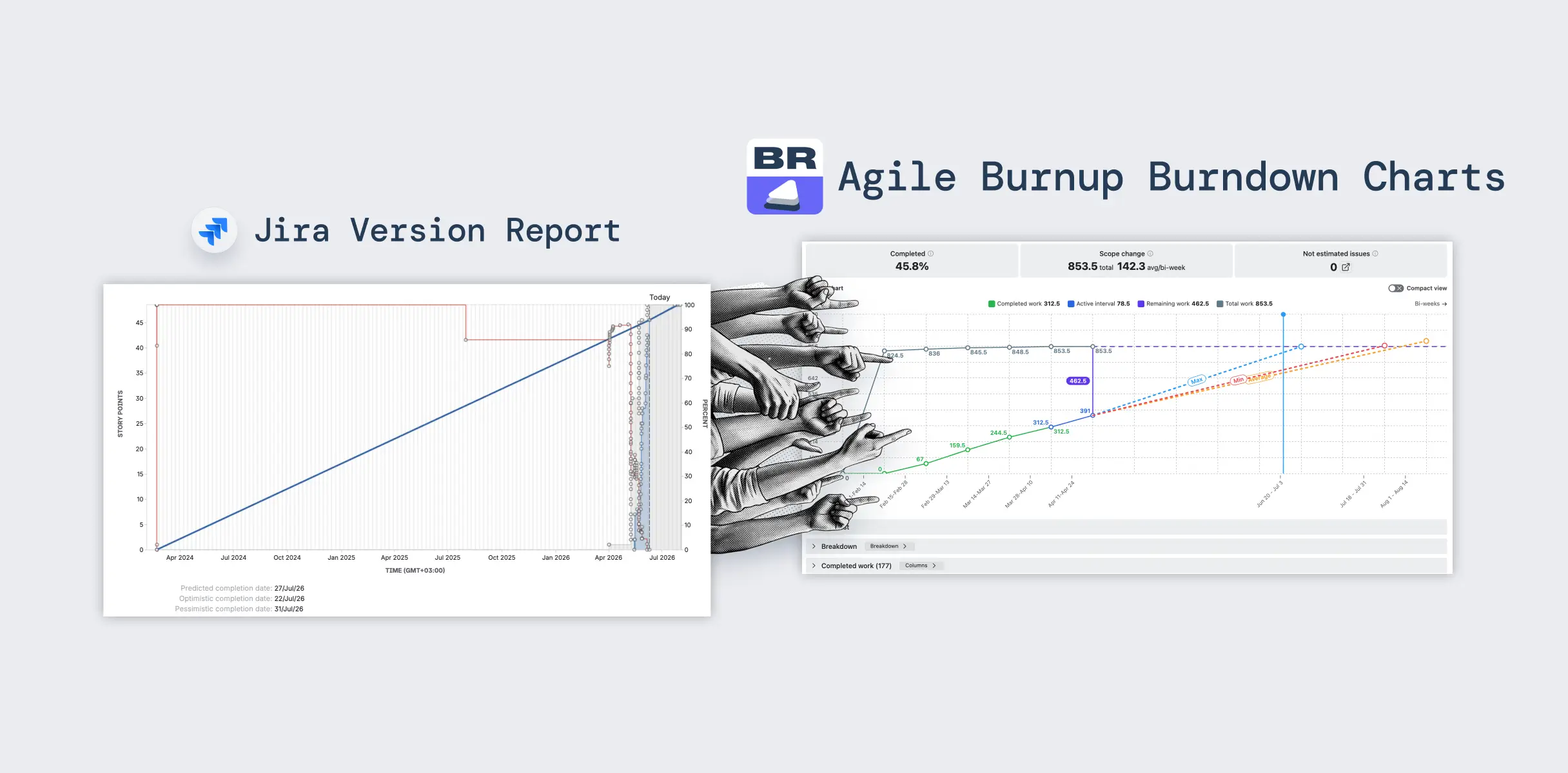
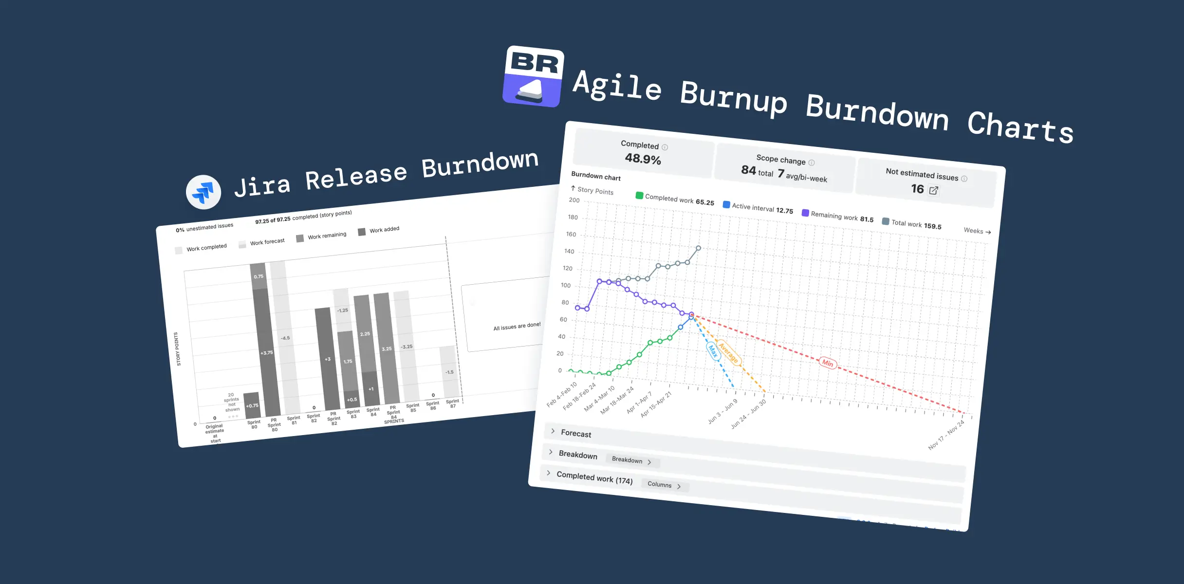
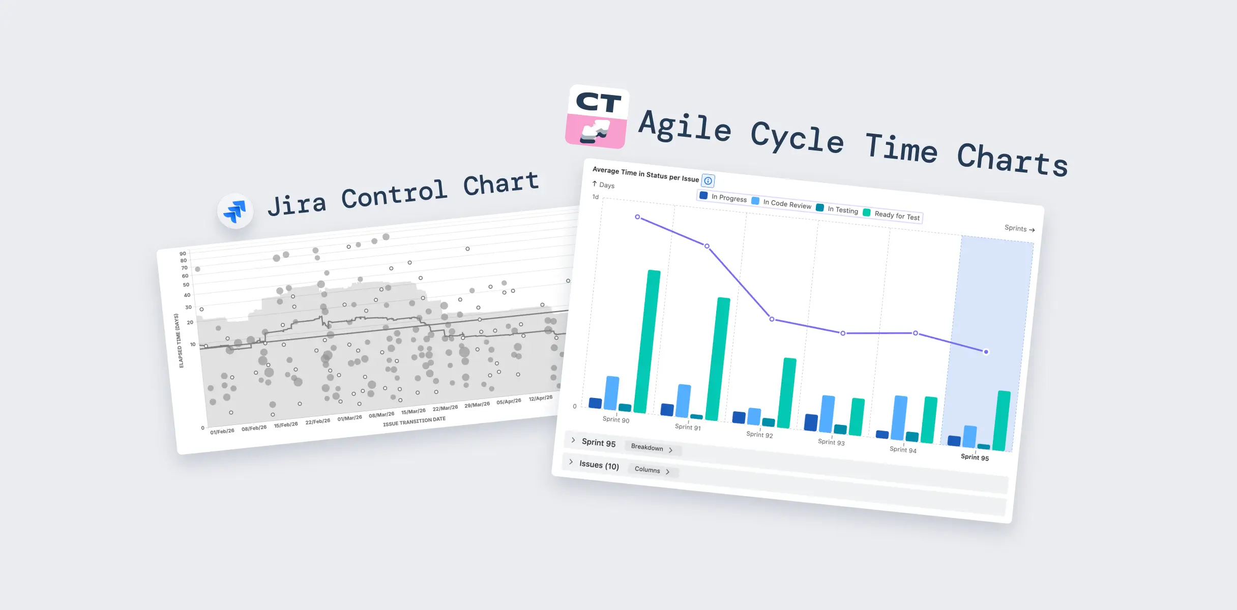
Beyond the basics: Advanced burndown charts by Broken Build
Agile Burnup Burndown Charts by Broken Build is a Jira app built for teams that need more than the native charts can deliver. It's available as a standalone app or as part of the Agile Reports and Gadgets bundle.
It extends Jira's burndown reporting with multi-scope views, advanced forecasting, and the flexibility to work across Scrum, Kanban, releases, epics, and cross-team setups – all in one place.
🗂️ Multiple data sources. Flexible management.
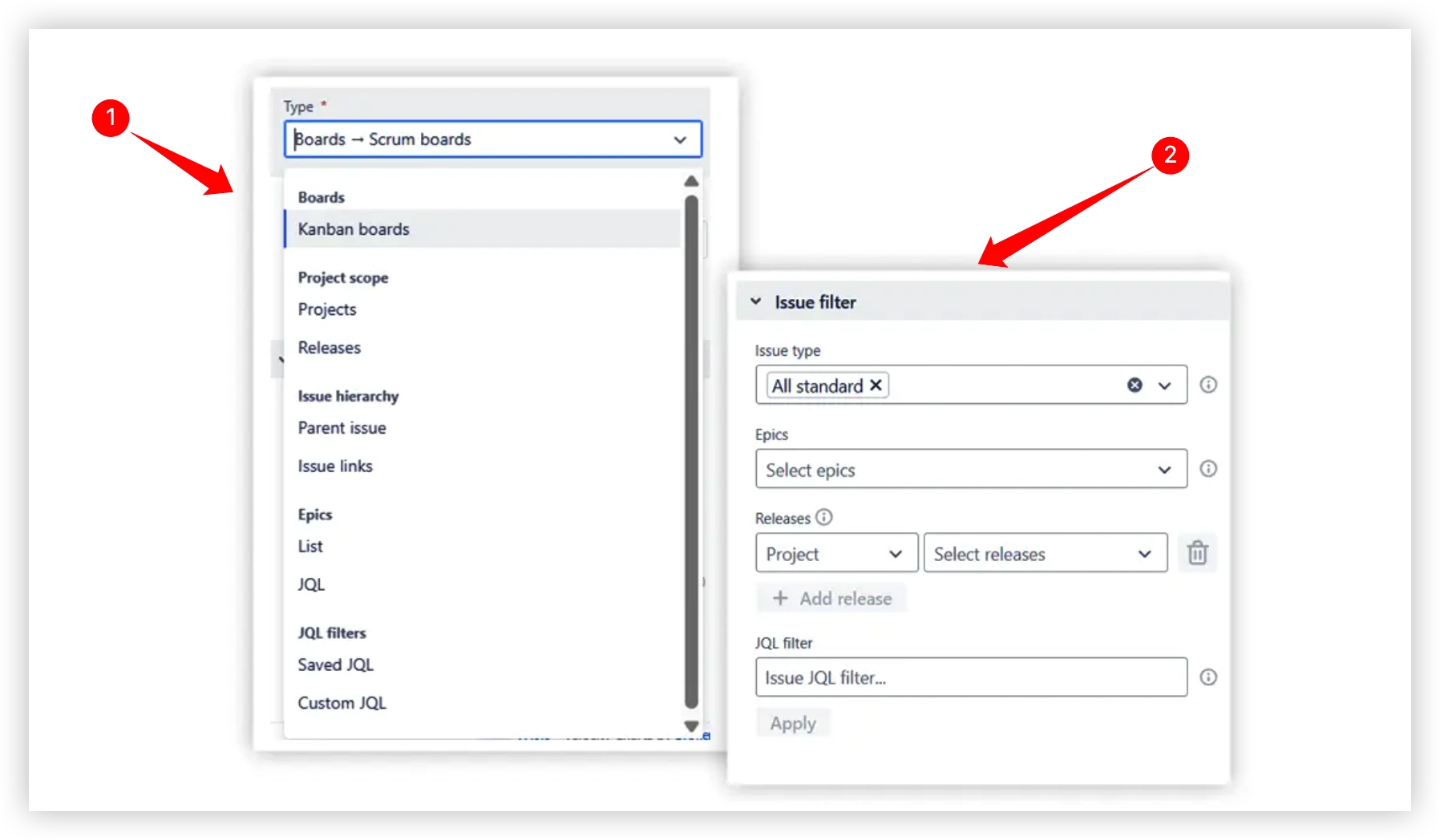
The chart connects to a wide range of data sources (1️⃣), so you're never limited to a single board or project:
- Scrum boards – single or multiple boards combined into one chart.
- Kanban boards – track remaining work across time intervals without sprints.
- Projects, releases, and epics – monitor delivery at any level of your hierarchy.
- Initiatives – program-level tracking across child issues of multiple epics.
- JQL filters – use Jira Query Language (JQL) to define issues for your chart. There are two options: Saved JQL and Custom JQL.
Combine any of these into a single unified view, so cross-team reporting never requires manual data wrangling again.
An Issue Filter (2️⃣) allows you to further refine what's included – by issue type, label, assignee, component, or any custom field.
Forecasting: from "where are we?" to "when will we be done?"
This is where Broken Build's charts go significantly beyond what native Jira offers.
🔮 Automatic velocity-based forecasts
The chart automatically calculates three projection scenarios based on the team's past delivery data:
- Max scenario – assumes the team maintains its highest-ever sprint velocity.
- Average scenario – uses the team's mean velocity across recent sprints.
- Min scenario – assumes the team continues at its lowest recent velocity.
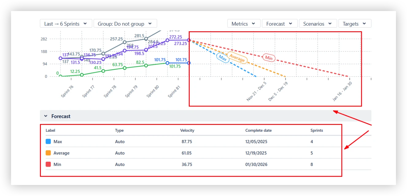
Each scenario projects a line from the current remaining work down to zero, giving teams a realistic range of possible completion dates rather than a single optimistic estimate.
🎛️ Custom "what-if" scenarios
Teams can define additional scenarios to test specific assumptions:
- Target velocity – set a custom delivery speed and see what completion date it produces.
- Target date – set a deadline and see what velocity the team would need to maintain to hit it.
- Velocity percentile – use a specific percentile of historical throughput (e.g., 85th percentile) to avoid relying on extreme best- or worst-case data.
- Monte Carlo simulation – runs 100,000 simulations using random draws from past velocity data to answer: "By what date is there an 80% (or 95%) probability that remaining work will be done?"
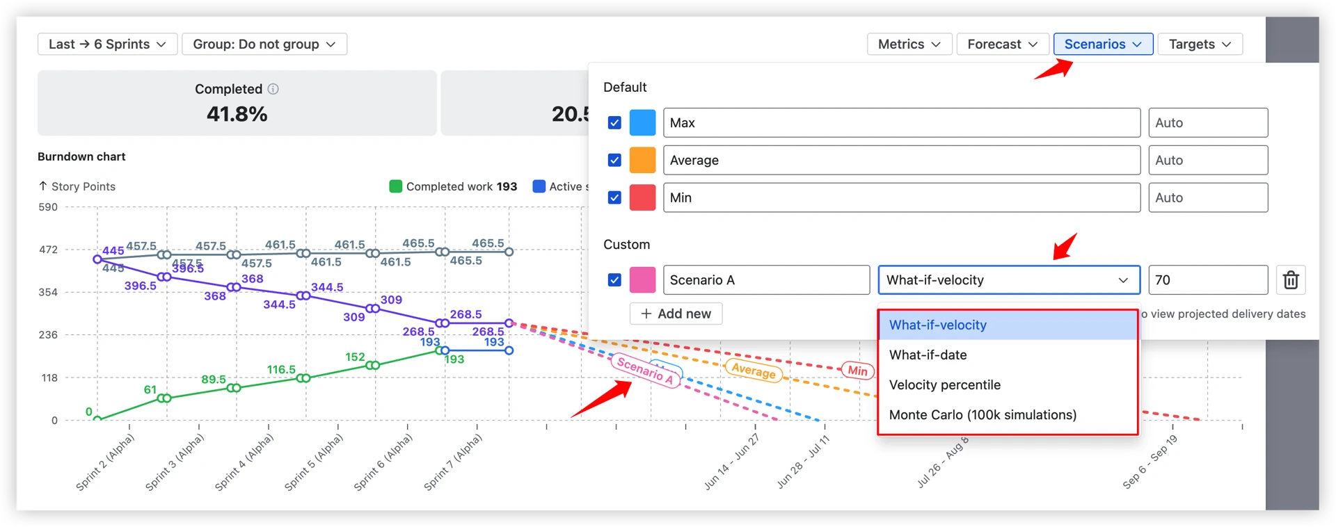
This isn't guesswork – it's probability-based planning grounded in the team's actual history.
⚙️ Forecast fine-tuning

Under the forecast settings panel, teams can adjust:
- Alternative throughput data – base forecasts on another board or project if the current history is too short.
- Sprint count – choose how many past intervals to include in velocity calculations.
- Forecast start date – define exactly when projections should begin.
- Capacity allocation – set a coefficient (e.g., 70%) to account for reduced team availability, holidays, or part-time contributors.
📐 Remaining work modeling
By default, forecasts are calculated based on the current remaining work, assuming no additional scope will be added. You can adjust this to better reflect your actual situation:
- Remaining work value – override the remaining work total manually, useful when scope changes haven't yet been reflected in Jira or for quick what-if scenarios.
- Filter remaining work – apply filters to refine exactly which issues are included in the remaining work calculation, so forecasts only count what's truly in scope.
- Remaining work growth – simulate ongoing scope creep by specifying a growth rate per interval. The chart assumes that the amount of new work arrives in each future period and adjusts the projected completion date accordingly.

This means forecasts aren't just based on what's left today – they can account for the reality that backlogs rarely stay still.
🔎 Interval breakdowns with issue-level details
Every sprint or time interval on the chart is fully clickable – not just a data point, but a window into what actually happened.
The Jira burndown chart example below highlights the following elements:
- Work breakdown (1️⃣) – analyze completed work for the selected sprint by issue type, priority, or any other Jira field. View the total number of issues, each category’s share, and how these metrics have evolved compared to the previous period. You can also switch to alternative breakdown dimensions as needed.
- Issue list (2️⃣) – review completed issues with essential details such as issue key, summary, and count, with the option to include additional fields (e.g., assignee, status). Easily sort columns and apply instant filters by selecting values directly from the work breakdown.
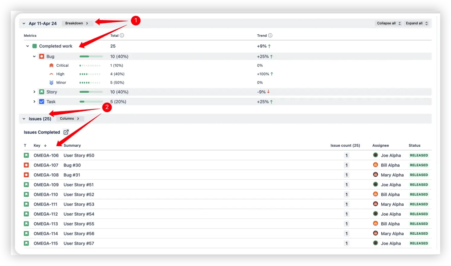
No more guessing why the remaining work line moved. The detail is one click away.
📊 Instant visibility of the key health metrics
Alongside the chart itself, Broken Build's burndown includes a set of health metrics that give teams a quick read on sprint or release status without digging into the chart.
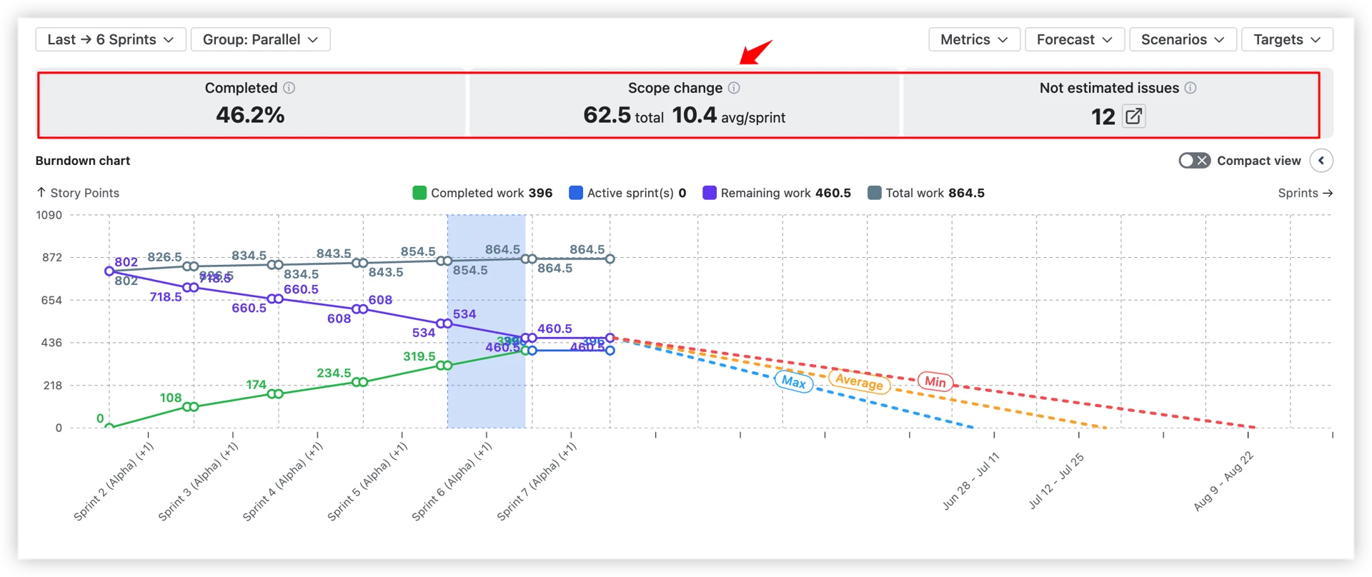
- ✅ Completed (%) – what percentage of the total scope has been delivered so far?
- ⚠️ Scope change – total work added or removed, with an average per sprint. A consistently high scope change per sprint signals backlog instability.
- 🔢 Unestimated issues – how many items in the remaining work have no estimation value? By default, these count as zero, which can significantly distort forecasts. A configurable default estimate prevents this.
🖥️ Jira dashboard gadget
Burndown charts don't have to live buried inside a board's Reports section. With the dashboard gadget, you can:
- Embed charts directly on any Jira Dashboard – shared across the team or org.
- Place multiple charts side by side – compare teams, releases, or epics in one view.
- Keep stakeholders aligned – a live, always-current view without anyone needing to dig through board reports.
Your burndown becomes a central part of how the team communicates progress, not an afterthought.
More ways to get value from your burndown data
👤 Individual burndown: Track how a single contributor's cumulative delivery evolves over time – useful for performance conversations and workload reviews.
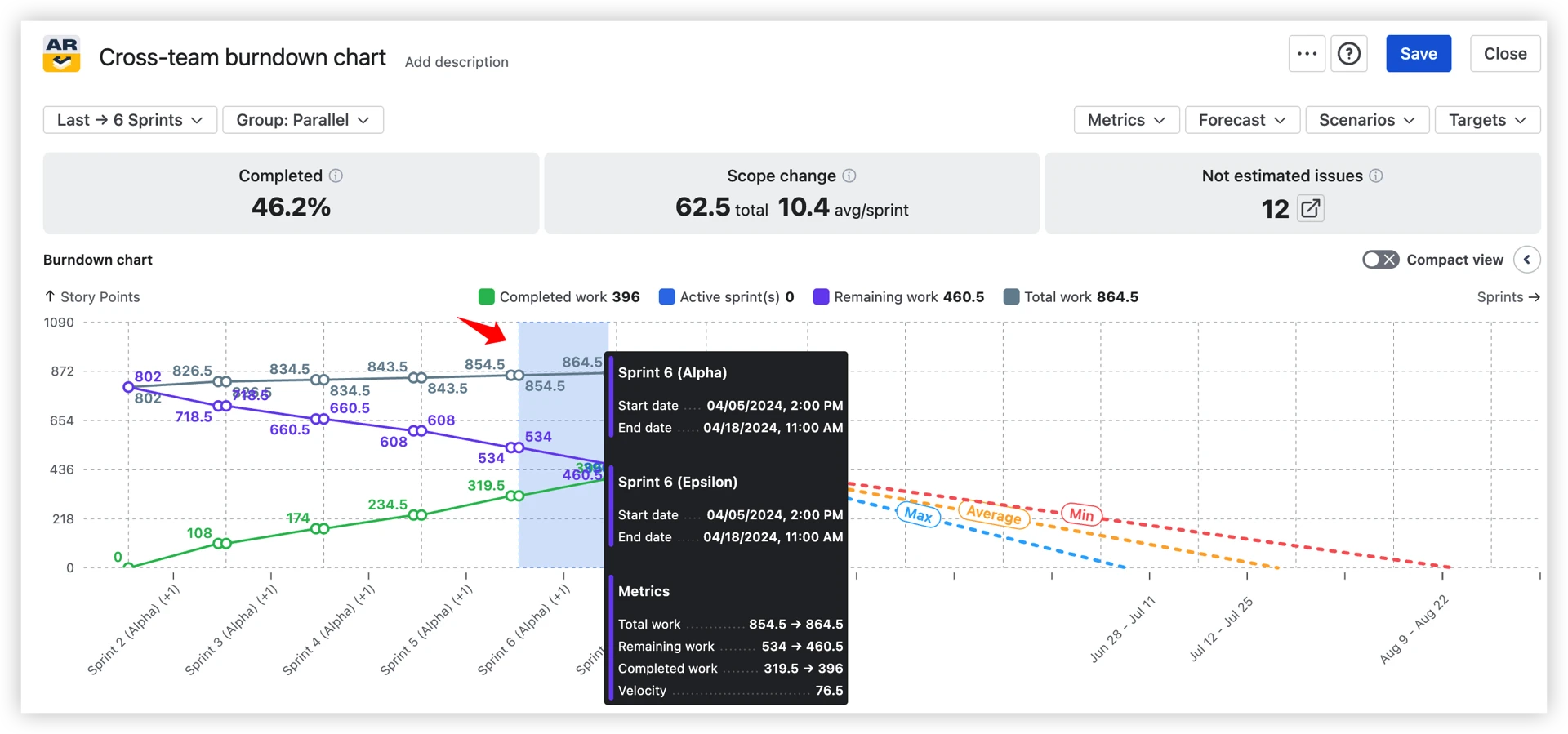
🏢 Cross-team burndown: Aggregate remaining work across multiple boards, projects, and teams into one chart – built for program-level planning and SAFe environments.
⚙️ Deep customization: Default estimates for unestimated issues, custom done statuses, issue filters by epic, assignee, component, or JQL – so the chart reflects how your team actually works, not just Jira defaults.
🎯 Target date lines: Add visual markers for deadlines and milestones directly on the chart to keep the team anchored to what matters.
📤 Flexible export: Export to CSV for deeper analysis, or PNG and PDF for clean stakeholder presentations – no more screenshots.
How to read the Broken Build burndown chart
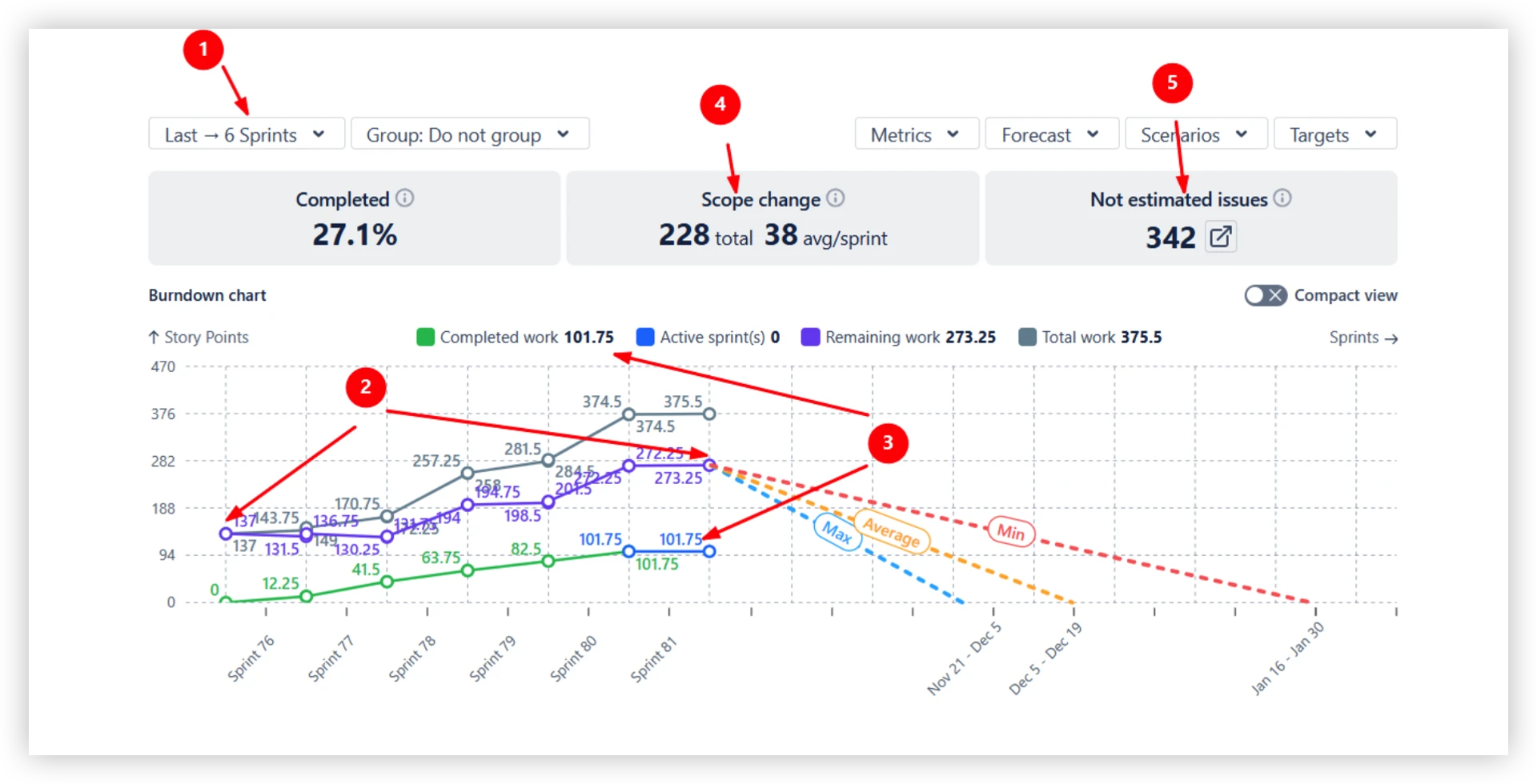
Let's walk through a real example – a burndown covering the last six sprints. Each numbered callout points to a specific element of the chart:
The chart above covers a six-sprint period (1️⃣). Over that time, remaining work grew from 137 to 273.25 story points (2️⃣) – even with 101.75 story points successfully delivered (3️⃣).
The explanation: a scope increase of 228 story points entered the backlog, averaging 38 story points per sprint (4️⃣). On top of that, 342 backlog issues have no estimate and are counted as 0 by default (5️⃣).
💡 You can configure a default estimate in the chart settings to prevent unestimated issues from silently distorting your metrics.
To get back on track, this team needs to focus on two things: controlling scope growth and improving estimation coverage across the backlog.
Based on past velocity, if the scope stays stable from here:
- At the average pace → remaining work would be done by December 19 (5 sprints).
- At the maximum pace → completion could be reached by December 5 (4 sprints).
- At the minimum pace → delivery would slip to January 30 (8 sprints).
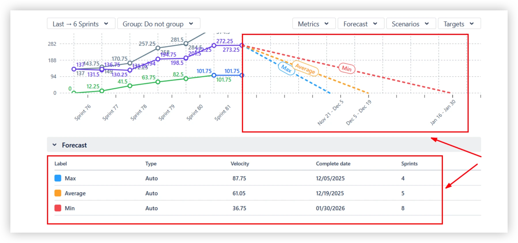
That's not a single optimistic deadline – it's a realistic range that gives teams and stakeholders an honest view of what's possible, and what needs to change to hit the earlier dates.
📊 Want to see Burndown charts in action before committing?
Explore live, clickable Burndown Chart examples built on real Jira data – no login required. Each example is fully interactive, so you can click through intervals, switch metrics, and get a feel for how the chart works in practice.
- Scrum burndown chart
- Sprint burndown chart
- Kanban burndown chart
- Release burndown chart
- Epic burndown chart
- Cross-team burndown chart
- Individual burndown chart
So, is native Jira enough for your team?
Native Jira's three burndown chart types – sprint, epic, and release burndown – cover the fundamentals well for individual Scrum teams. They're easy to access and good enough for straightforward sprint tracking.
But when teams need to:
- Track delivery trends across many sprints
- Forecast completion with real probability ranges
- Monitor Kanban boards or cross-team delivery
- Model scope growth or capacity changes
- Share polished reports with stakeholders
...native reporting hits its ceiling fast.
Agile Burnup Burndown Charts by Broken Build fills exactly those gaps – built for the Jira ecosystem, updated in real time, and designed to make every team's delivery data actually useful.


.png)