


Is your team always busy but still missing deadlines?
Most teams know their sprints feel slow. They see missed deadlines, inconsistent velocity, and that frustrating gut feeling that something is getting stuck somewhere – but they can't pinpoint exactly where.
That's where Jira time in status comes in.
This guide covers everything: what time in status means, what native Jira offers, where it falls short, and how Agile Cycle Time Charts by Broken Build deliver the full analysis your team actually needs.
What is Jira Time in Status?
Time in Status is a workflow metric that measures how long a Jira issue spends in each status before moving to the next one.
Say a ticket moves through "In Progress" → "Code Review" → "Testing" → "Done." Time in status tracks how long the issue sat in each of those stages – individually and in total.
💡 It's one of the most valuable metrics in Agile delivery because it reveals where work gets delayed, not just that it did.
If an issue revisits the same status multiple times, all those durations are added together. The result is a cumulative picture of where time went – regardless of how many transitions occurred along the way.
Why does Time in Status in Jira actually matter?
Without time-in-status data, retrospectives are based on feelings. With it, they're based on facts.
Here's what tracking time in status in Jira helps you answer:
- 🔍 Where is work consistently getting stuck? Spot recurring bottlenecks before they derail delivery.
- ⏱️ How much time is active work vs. idle waiting? Separate productive effort from invisible hand-off delays.
- 📉 Are process improvements actually working? Compare time in status across releases, intervals, or teams to track real change.
- 📋 Which specific issues took the longest – and why? Drill into outliers to understand root causes.
- 🎯 Are we meeting SLA targets? Validate delivery against committed timeframes.
The problem is that most teams don't have easy access to this data inside Jira. Let's look at what's actually available – and what's missing.
How Jira approaches Time in Status natively
Native Jira doesn't include a dedicated Time in Status chart or report. What it does have is the Control chart – and it's worth examining honestly, because many teams turn to it first when they want to understand where time is going.
The Control chart – what it is, and can it give you time-in-status insights?
The Control chart is available for company-managed Scrum and Kanban projects. It's Jira's most analytical built-in report, and at first glance – especially with its status selector – it looks like it might answer time-in-status questions.
How to access it: Go to project → Reports → Control chart.
Configuration: You'll see three configuration panels: Time scale (timeframe and custom date range), Refine report (Columns), and Viewing options (include or exclude non-working days).
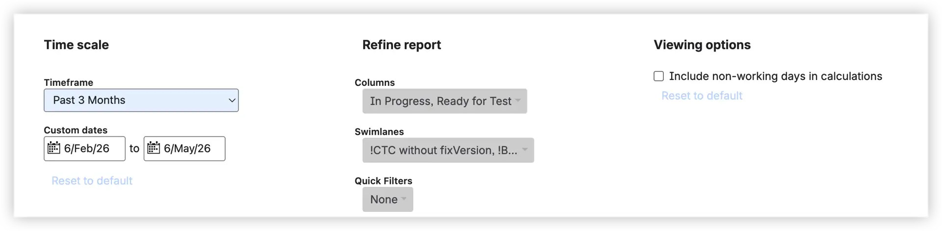
How the Columns selector works:
Under "Refine report," you'll find a multi-select Columns dropdown listing all board columns configured in your workflow. You can select one or several columns – for example, "In Progress" and "Ready for Test." This is the feature that works most similarly to time-in-status filtering, but it’s important to understand that calculations are based on board columns rather than individual Jira statuses.
When multiple columns are selected, the Control Chart calculates the combined elapsed time each issue spent across all chosen board columns – and displays that total as a single dot on the scatter plot. It does not break down time by individual statuses inside those columns. Selecting "In Progress" + "Ready for Test" gives you one aggregated value per issue: the total time spent across both selected columns, treated as a single measurement.
How to read the Jira Control chart
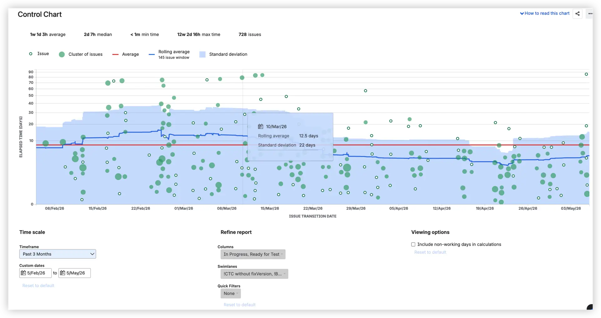
The chart legend shows five elements: Issue (small hollow dot), Cluster of issues (larger filled dot), Average (red line), Rolling average (blue line), and a Standard deviation shaded band.
- Each hollow dot represents one individual completed issue, plotted by completion date on the x-axis and combined elapsed time on the y-axis.
- Larger filled dots (clusters) represent multiple issues with the same or very similar completion dates and elapsed time – they're grouped visually to avoid overplotting. A bigger dot = more issues stacked at that position. This is important for reading density: a cluster near the average line means a lot of issues are completing at a similar, typical pace.
- The red average line shows the mean cycle time across all issues in the selected timeframe.
- The blue rolling average line smooths short-term variation to surface trends over time. The rolling window (e.g., 145 issues) is shown in the legend.
- The shaded band represents standard deviation – a narrow band signals consistent delivery, a wide band signals high variability.
- The header metrics (average, median, min time, max time, total issues) give a quick statistical summary before you dig into the chart.
- Dots – or clusters – far above the band are outliers worth investigating.
- Hover over any point to see the exact date, rolling average, and standard deviation at that moment.
- Click individual dots to see which issue they represent.
Non-working days can be excluded via the Viewing options panel. Swimlanes and Quick Filters are also available to narrow the view further.
So, can it give you time in status insights?
Only partially, and with important caveats:
❌ You can filter only by board columns, not by individual Jira statuses.
❌ Clicking on a ticket lets you see how much time that specific issue spent in each selected column. However, native Jira does not show how much time all issues collectively spent in each selected column.
💡 Bottom line: the Control chart is a useful cycle time tool. With thoughtful column selection, it can tell you roughly how long work takes across a defined slice of your workflow. But it cannot tell you which individual stage is the bottleneck – and that's the core question that time in status is designed to answer.
Where the Control chart falls short for real workflow analysis
The Control chart's Columns selector creates the impression of granular time-in-status control. In practice, once teams start asking the real questions – which status is actually slowing us down? Has "Ready for QA" gotten worse? How does our active work time compare to idle waiting time? – The chart runs out of answers.
There's no way to compare individual statuses in a single view. There's no trend in how time in a specific status has shifted over delivery periods. There's no separation between time actively worked and time spent waiting. And there's no way to see which specific issues are driving delays in a particular stage.
When a release slips or a team underdelivers, the Jira report time in status analysis, you need to understand why it simply isn't available natively.


Jira Time in Status done right – Cycle Time Charts by Broken Build
Agile Cycle Time Charts is a dedicated analytics app built specifically to answer the questions that native Jira can't. One of its primary chart types is the Time in Status chart – a fully interactive, stacked bar visualization that shows exactly how long issues spend in each workflow status, interval by interval.
It's available as a standalone app or as part of the Agile Reports and Gadgets bundle.
Every setting change is reflected instantly in a WYSIWYG editor – no reloads, no tab switching. Choose your data source (Scrum board, Kanban board, project, release, epic, or custom JQL), configure your statuses, and the chart updates in real time.
The Time in Status chart – a closer look
How does it calculate time in status
The chart measures the time an issue spends in each status from entry to exit. If an issue revisits the same status multiple times, all durations are summed together, giving you an accurate cumulative view of how much time that workflow stage consumed. The chart can display both the combined time across a selected group of statuses and the time spent in each status individually.
Calculation respects your configured work schedule: only working hours count. Two calendar days at 8 hours/day equals 16 hours of tracked time, not 48 – so results reflect real team capacity, not the clock on the wall.
By default, the chart covers all statuses in the "In Progress" Jira category, but you can select any combination of statuses used in your workflow.
Separating active work from idle waiting – the key to real bottleneck detection
This is where the Time in Status chart goes beyond anything native Jira can offer.
You can split your workflow statuses into two distinct groups:
- In Progress group – statuses representing active work: "In Progress," "In Code Review," "In Testing"
- Waiting group – statuses representing idle time: "Ready for QA," "Waiting for Approval," "Ready to Deploy"
This separation reveals what most teams don't see: the bottleneck is often not where work is being done – it's where work is waiting.
A Waiting group that consistently dominates the chart tells you the problem isn't developer capacity. It's the hand-off before QA, or the approval queue before release. That's a fundamentally different conversation – and you can't have it without this data.
Three views – three different lenses on the same data
The Time in Status chart offers three views, each suited to a different question:
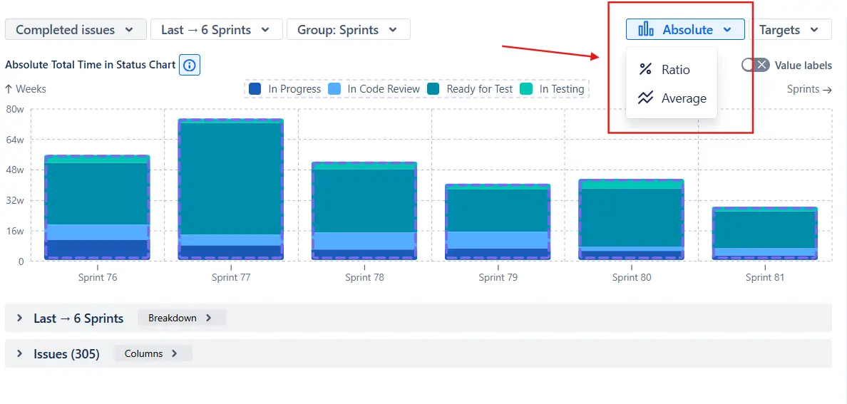
- Absolute view shows time units (hours or days) on the y-axis. Each stacked bar represents the total time all issues spent in each status during that interval. Use this when you want to understand raw volume: how much total time did the team spend in "In Code Review" in the last reporting period?
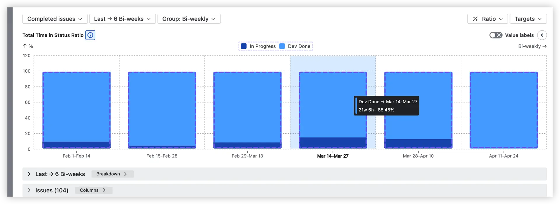
- Ratio view shows percentages from 0 to 100% on the y-axis. Every bar is the same height, showing the relative proportion of time spent in each status. Use this to compare how the time distribution shifts from one interval to the next, or between teams working on different projects.
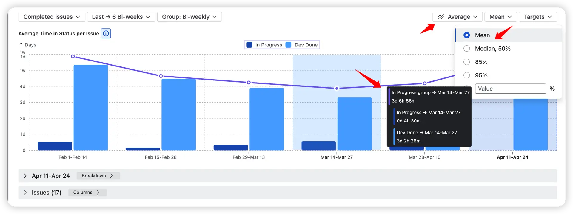
- Average view shows how long, on average, a single issue spends in each status per interval. You choose the statistical measure – Mean, Median (50%), 85th percentile, 95th percentile, or a custom value. This view is particularly useful for setting realistic SLA targets and tracking whether typical stage duration is improving over time.
How to read the Time in Status chart
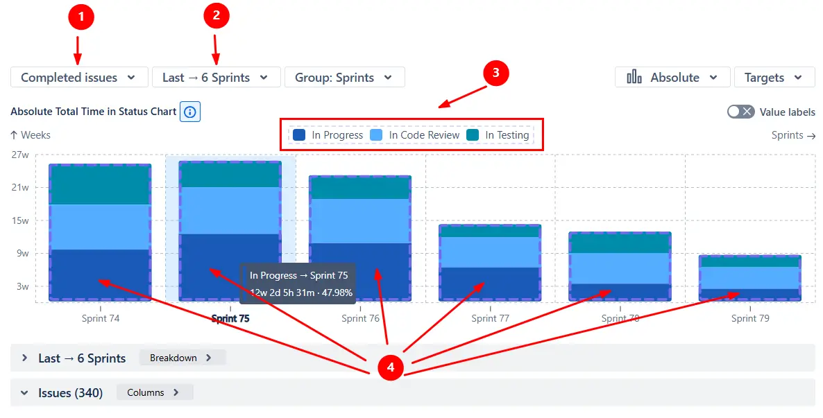
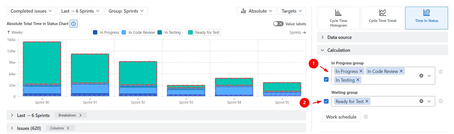
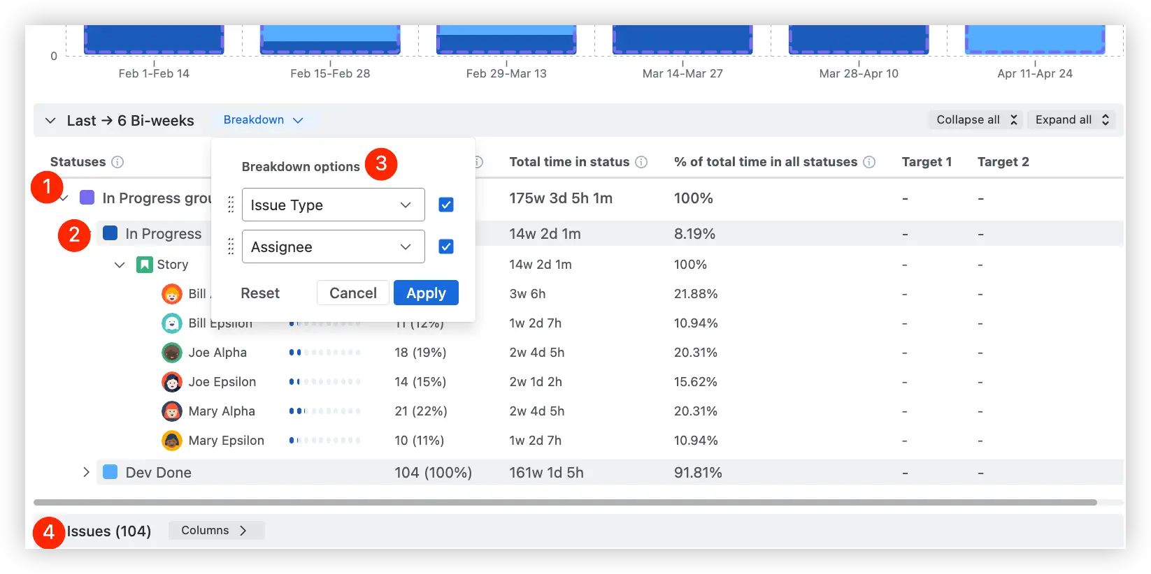
This chart shows how much total time completed issues 1️⃣ spent in each workflow status across the last six sprints 2️⃣, displayed in absolute values.
Each stacked bar combines time spent in statuses like In Progress, In Code Review, and In Testing 3️⃣. In this example, In Progress 4️⃣ consistently occupies the largest share of the workflow cycle.
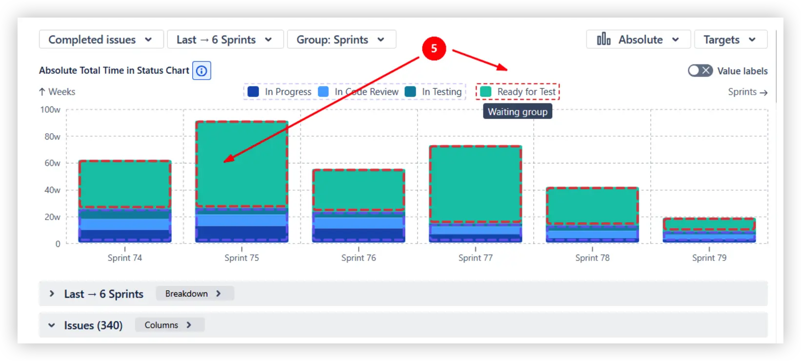
You can also add a dedicated Waiting group to separate blocked or inactive time from active work. Here, the Ready for Test status is highlighted as part of the Waiting group 5️⃣, helping teams identify where delays actually occur.
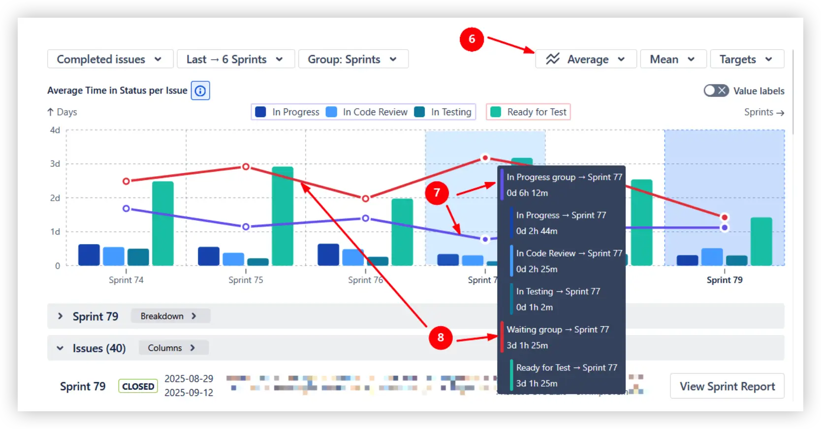
Switching to the Average view 6️⃣ changes the chart from total accumulated time to average time per issue. The trend lines then display average values for the In Progress 7️⃣ and Waiting 8️⃣ groups, making it easier to track workflow efficiency and bottlenecks over time.
Time in Status breakdown and issue-level analysis
Drill down the Time in Status report step by step to understand how workflow time is distributed:
- Start with status groups such as In Progress or Waiting to compare high-level workflow categories (1️⃣)
- Expand groups into individual statuses to identify which exact workflow stages consume the most time (2️⃣)
- Break down the data by any two Jira fields (3️⃣)
- Click any level of the breakdown to instantly open the corresponding Jira issue list (4️⃣)
This hierarchical breakdown helps teams move from broad workflow patterns to detailed operational insights behind delivery delays and bottlenecks.
The issue list expands workflow analysis into detailed issue-level insights:
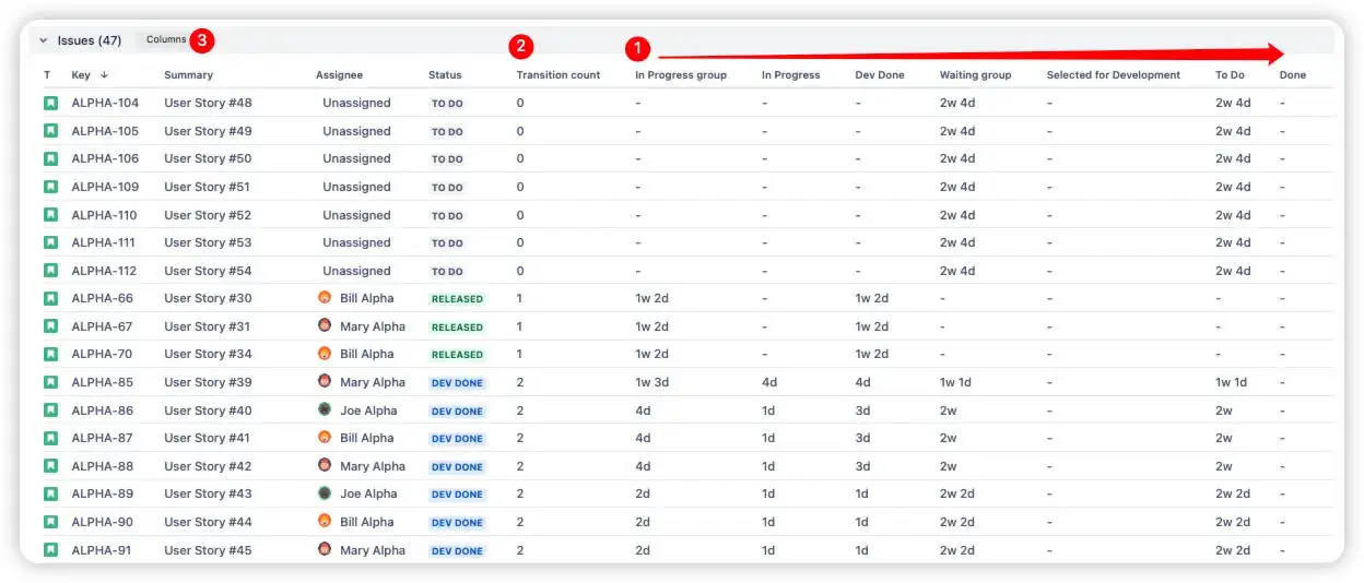
- Review time spent in each status per issue directly in the table (1️⃣)
- Track the number of transitions between statuses to spot rework or unstable workflows (2️⃣)
- Add flexible columns such as epic, project, assignee, priority, or custom fields for deeper analysis (3️⃣)
The issue list makes it easier to investigate individual tickets behind workflow trends and explore delivery data from multiple angles.
Questions the Time in Status chart answers
- How long do issues stay in each workflow status – per interval and over time?
- How much total time is active work vs. idle waiting?
- Which statuses accumulate the most time, and has that shifted across intervals?
- Are workflow changes actually reducing wait times?
- Which specific issues spent the most time in each stage?
What you can do with these insights
- 🔍 Find the real bottleneck – see exactly where work piles up, not just what the total cycle time was.
- 🕳️ Surface hidden wait times – delays invisible in aggregate metrics become obvious here.
- 🔄 Run data-driven retrospectives – bring interval-level status breakdowns to your retro instead of gut-feel discussions.
- 📊 Track process improvements over time – compare average time in status across intervals to validate whether changes are working.
- 🎯 Set SLA targets based on real data – use percentile benchmarks to define realistic delivery expectations.
👉 Explore the interactive example: Jira Time in Status report
WIP Charts – additional visibility for what's happening right now
The Time in Status chart is retrospective – it analyzes completed work. But what about issues that are in progress right now and already showing signs of delay?
Agile WIP Charts (also part of the Agile Reports and Gadgets bundle) is the real-time companion. It monitors active work items to detect aging and stalling before they turn into delivery problems.
This is a complementary view: where the Time in Status chart shows you what happened to finished issues, WIP Charts show you what's happening to active items before it's too late to act on it.
Key concepts
WIP aging measures how long a current in-progress item has been in its stage, in real time. Unlike cycle time (which measures completed work retrospectively), WIP age is proactive: it helps you spot delays before they become delivery failures.
Aged WIP refers to items that have been in progress longer than historical norms suggest they should be. These are more likely delayed and may be hiding blockers or dependency issues.
Stalled work is a subset of aged items that exceed a defined threshold per stage – items that are likely blocked or forgotten. These require immediate attention.
How to read the WIP aging chart
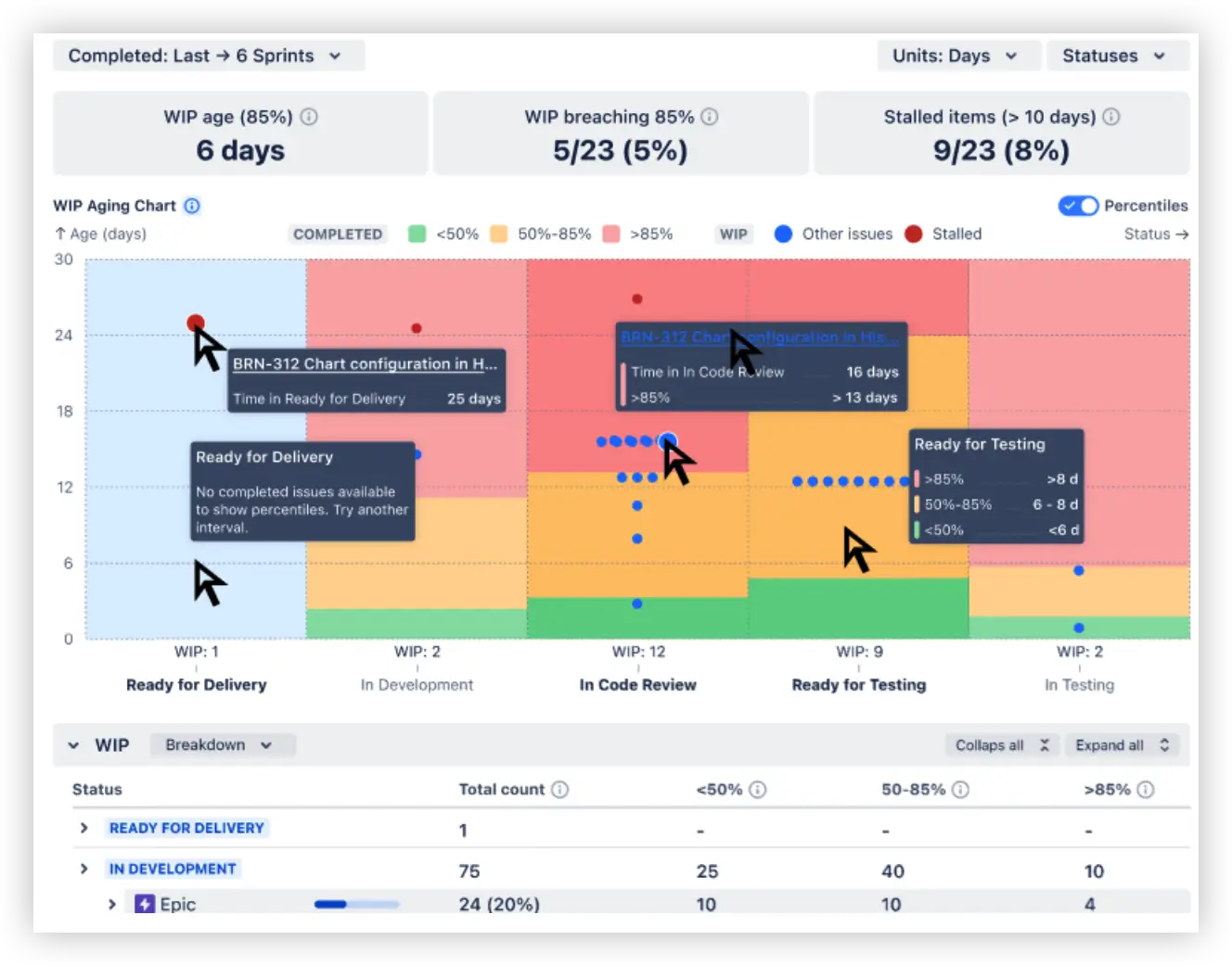
The WIP Aging chart shows how long work items have remained in each active workflow status. The y-axis displays time in the selected unit (days in this example), while the x-axis groups issues by workflow stage.
Each dot represents a single in-progress issue from the selected sprint range. Its vertical position indicates how long the item has been waiting in that status. Hovering over a point reveals detailed issue information, including the exact aging time.
The colored percentile zones help teams quickly identify delivery risks:
- 🟢 under 50% of historical items
- 🟡 between 50–85%
- 🔴 older than 85% of historical items
In this example, the issue BRN-312 has spent 16 days in In Code Review, placing it beyond the 85th percentile threshold and signaling a potential bottleneck.
The health metrics above the chart summarize overall flow conditions, including median WIP age, the number of items breaching percentile thresholds, and stalled issues detected by custom rules.
You can also configure custom stalled-item conditions – for example, highlighting issues that remain too long in statuses like Ready for Testing. Combined with the Breakdown and Issue list views, this makes it easier to investigate aging patterns and identify the exact tickets behind workflow delays.
💡 Example insight: Most items in "In Progress" are relatively new, but several items in "Dev Done" have been sitting significantly longer than the historical norm. That's your bottleneck, visible in real time before it impacts delivery.
What WIP Charts help you do
- 🚦 Spot bottlenecks and waiting stages before they impact delivery
- 🎯 Prioritize work by how long it's been sitting in each stage
- 🔗 Surface hidden dependency issues – items consistently aging in certain stages
- 🔄 Give standups and retrospectives a real-time flow health check
👉 Explore the interactive example: WIP Aging chart
Additional Broken Build apps features worth knowing about
🗂️ Multiple data sources – analyze any way your team works
Every chart in the bundle – Time in Status, WIP Aging, and all others – supports a wide range of data sources out of the box. You're not locked into a single board or project view.
Supported data sources include:
- Scrum/Kanban boards – single or multiple
- Projects – company-managed, team-managed, JSM, Jira Product Discovery
- Releases / Versions – analyze time in status per release or version
- Epics – track workflow performance at the epic level
- Initiatives – parent issues or linked issues for portfolio-level views
- Custom JQL – full flexibility to define exactly which issues appear
📌 Jira dashboard gadgets and Confluence embedding
Any chart can be saved as a Jira dashboard gadget for continuous monitoring alongside other Jira widgets. Build the chart, click Save as gadget, then select an existing dashboard or create a new one. Gadget settings can be adjusted directly on the dashboard without going back to the chart editor.
Confluence embedding is also supported – paste the gadget link into any Confluence page, and it renders as a fully interactive Smart Link. Stakeholders can view, filter, and explore the live chart without leaving Confluence and always see the most up-to-date data.
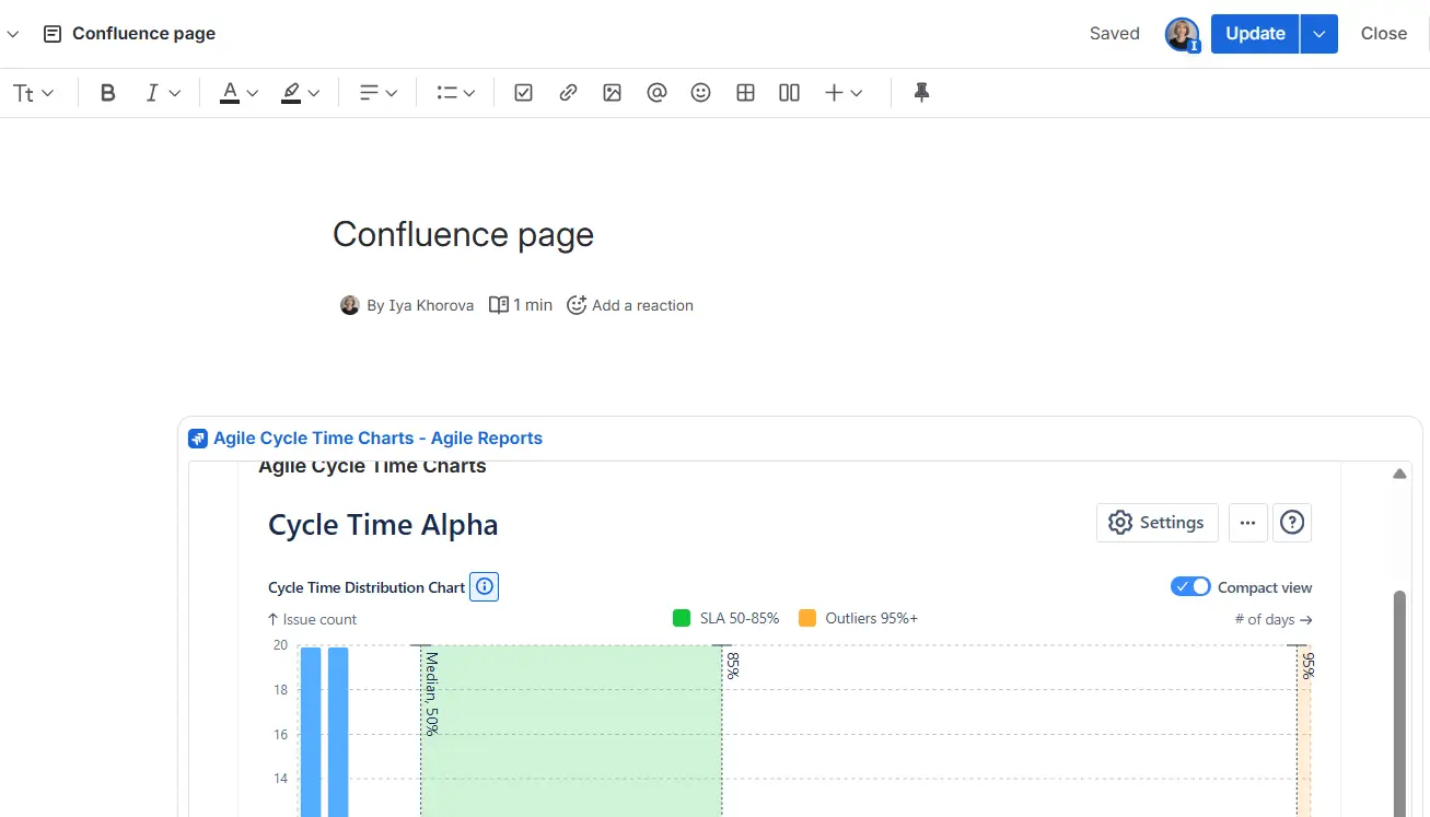
Confluence embedding example
📤 Flexible export options
Three export formats are available from the three-dot menu (⋯) in the upper right corner of any chart.
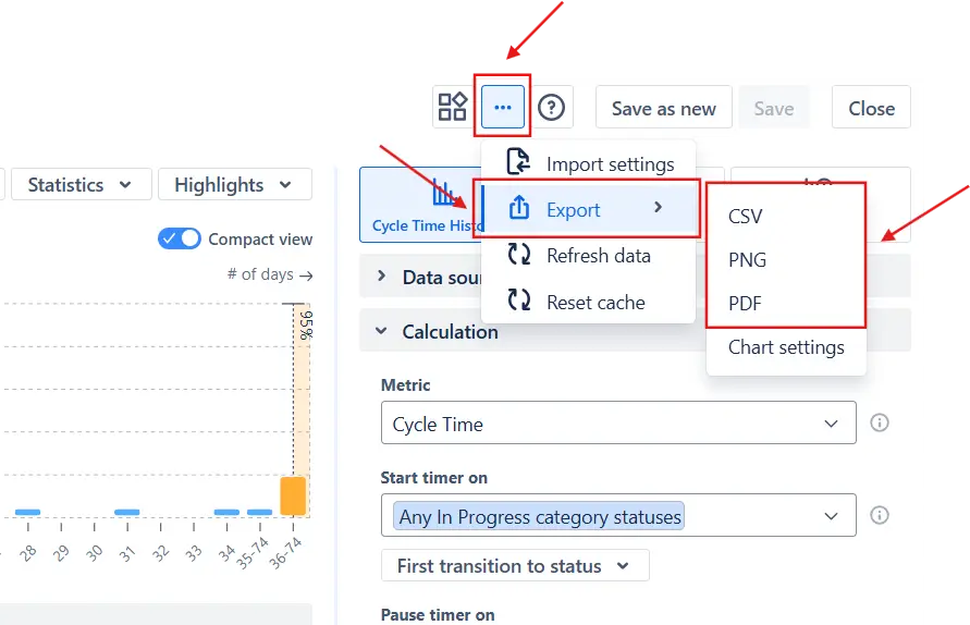
PDF or PNG is useful for adding charts to presentations or sharing a static snapshot with stakeholders who don't have Jira access. Before exporting, click a metric in the Breakdown to highlight the relevant segment – the export captures that focused view.
CSV exports the underlying data for analysis in Excel, Google Sheets, or BI tools – useful for combining chart data with external datasets or archiving historical results outside Jira.
Chart settings export the full chart configuration so you can import it into another chart instantly – useful for standardizing configurations across teams or Jira instances.
How the Time in Status chart compares to native Jira
The Control chart is a solid cycle time tool. But when you need genuine time-in-status analysis – per-status breakdown, interval trends, active vs. waiting split – here's how the Time in Status chart in Agile Cycle Time Charts stacks up:
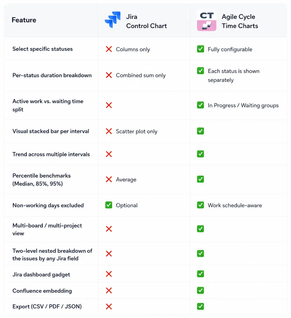
The Control chart answers: how long did delivery take overall? The Time in Status chart answers: where exactly did time go – status by status, interval over interval, with the granularity to act on it.
How to set up Jira Time in Status with Broken Build
Getting set up takes minutes:
- Install Agile Cycle Time Charts from the Atlassian Marketplace – 30-day free trial, no credit card required. Also available as part of the Agile Reports and Gadgets bundle.
- Open your Jira Dashboard and add a gadget
- Start from a template or build from scratch
- Select the Time in Status chart type
- Configure and explore
- Save as a gadget and share
Ready to see what's actually slowing your team down?
Jira Time in Status is one of the most powerful workflow metrics available – but only if you can see it clearly, at the status level, across time.
Native Jira's Control chart gives you a starting point: cycle time distribution, basic status scoping, and optional exclusion of non-working days. But it aggregates everything into one number per issue. You can't see which stage is the problem, how it's changed, or how much time was active work vs. idle waiting.
Agile Cycle Time Charts by Broken Build closes that gap with a dedicated Time in Status chart – stacked bars per interval, In Progress vs. Waiting separation, three view modes, percentile benchmarks, and issue-level drill-down. It's the tool that turns raw Jira transition history into concrete, retrospective-ready workflow intelligence.
And if you want to go further, Agile WIP Charts adds real-time aging visibility to catch delays before they become delivery problems.
Both Agile Cycle Time Charts and WIP Charts are included in the Agile Reports and Gadgets bundle alongside additional chart types for forecasting, throughput analysis, velocity tracking, cumulative flow, created vs. resolved trends, and more.
Whether you're running Scrum, Kanban, SAFe, or other data sources, the data is already in your Jira. The question is whether you have the tools to read it clearly. 👀


.png)