

Native Jira's Velocity Report shows one team's velocity on one board. Broken Build's Agile Velocity Charts lets you aggregate multiple teams into one view, see velocity patterns across teams, and diagnose differences with ten metrics per team – so you can plan at the program level, not just the single-team level.
What is team velocity?
The Agile Alliance defines velocity as "the total effort estimates associated with user stories that were completed during an iteration." In Jira, that translates to the sum of story points (or time estimates, or issue count) that a Scrum team completes per sprint.
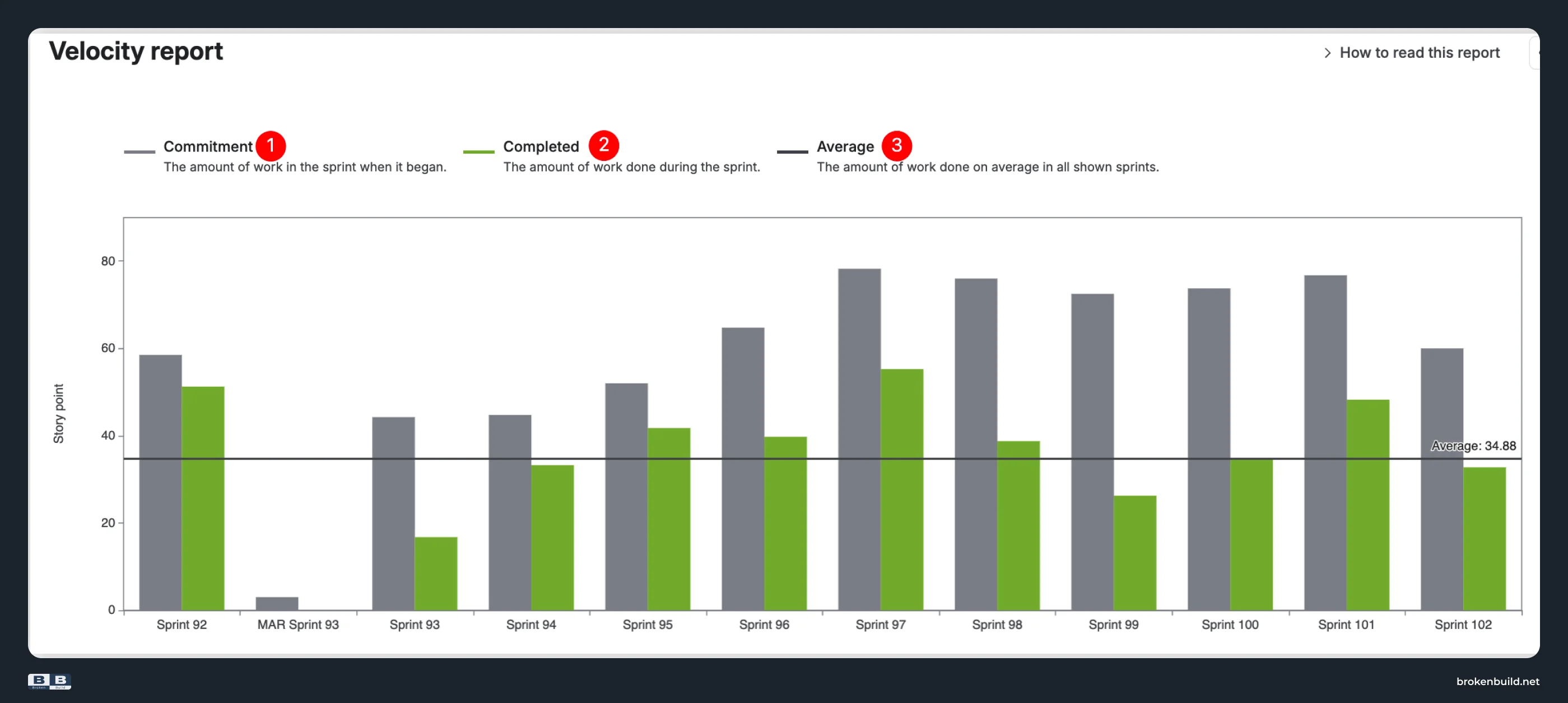
Atlassian's documentation describes the velocity chart as showing "the amount of value delivered in each sprint, enabling you to predict the amount of work the team can get done in future sprints." Three elements appear: Commitment (gray bar), Completed (green bar), and an Average line.
At the single-team level, velocity helps sprint planning. At the program level – when you manage multiple teams – velocity becomes a coordination and benchmarking tool. That's where native Jira stops.
The cross-team visibility problem
Programs need to see all teams together. Delivery leads need combined capacity for roadmap planning. Agile coaches need to spot which teams struggle with rollover vs scope creep. PMO needs aggregated velocity across teams.
Native Jira can't do any of that – it shows one board at a time.
The solution isn't to rank teams by raw velocity numbers (that's meaningless when teams estimate differently). It's to aggregate (combined capacity view), normalize (percentage-based planning accuracy), and diagnose (ten-metric breakdown that explains why patterns differ).
That's the gap Agile Velocity Charts fills.
How to read the velocity chart in Jira
Open any Scrum board and navigate to Board → Reports → Velocity Chart. The chart shows Commitment (gray bar), Completed (green bar), and an Average line across past sprints. For a detailed walkthrough of these three elements, see Jira sprint velocity – why three metrics can't tell you what happened.
What native cannot show when you have multiple teams:
- All teams in one aggregated chart
- Teams side by side to spot variance and stability patterns
- Why one team's velocity pattern differs from another's
- Normalized percentage view to analyze planning accuracy across teams
Where native velocity falls short for multiple teams – and what to use instead
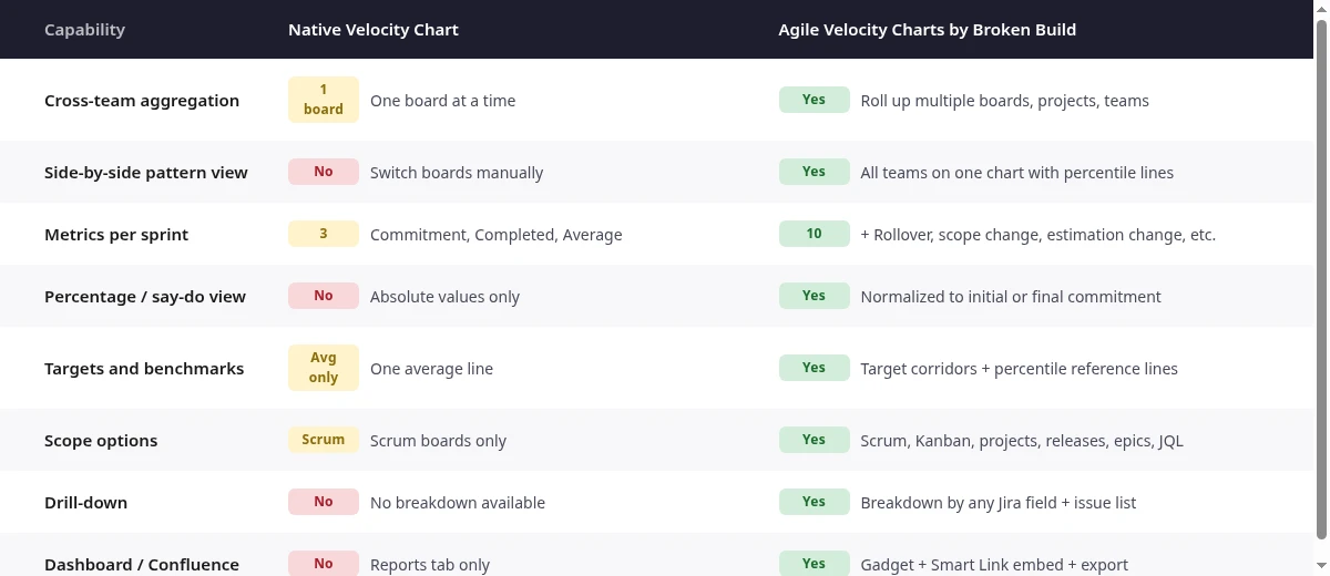
Native Jira's Velocity Chart works for a single team reviewing its own sprints. When you manage multiple teams, it stops. Each subsection below pairs a native limitation with the corresponding capability in Agile Velocity Charts by Broken Build.
1️⃣ One board at a time → cross-team velocity view
Native: The velocity chart is locked to one Scrum board. To see another team, you switch boards. To see all teams together – you can't. No cross-board, cross-project, or cross-team aggregation.
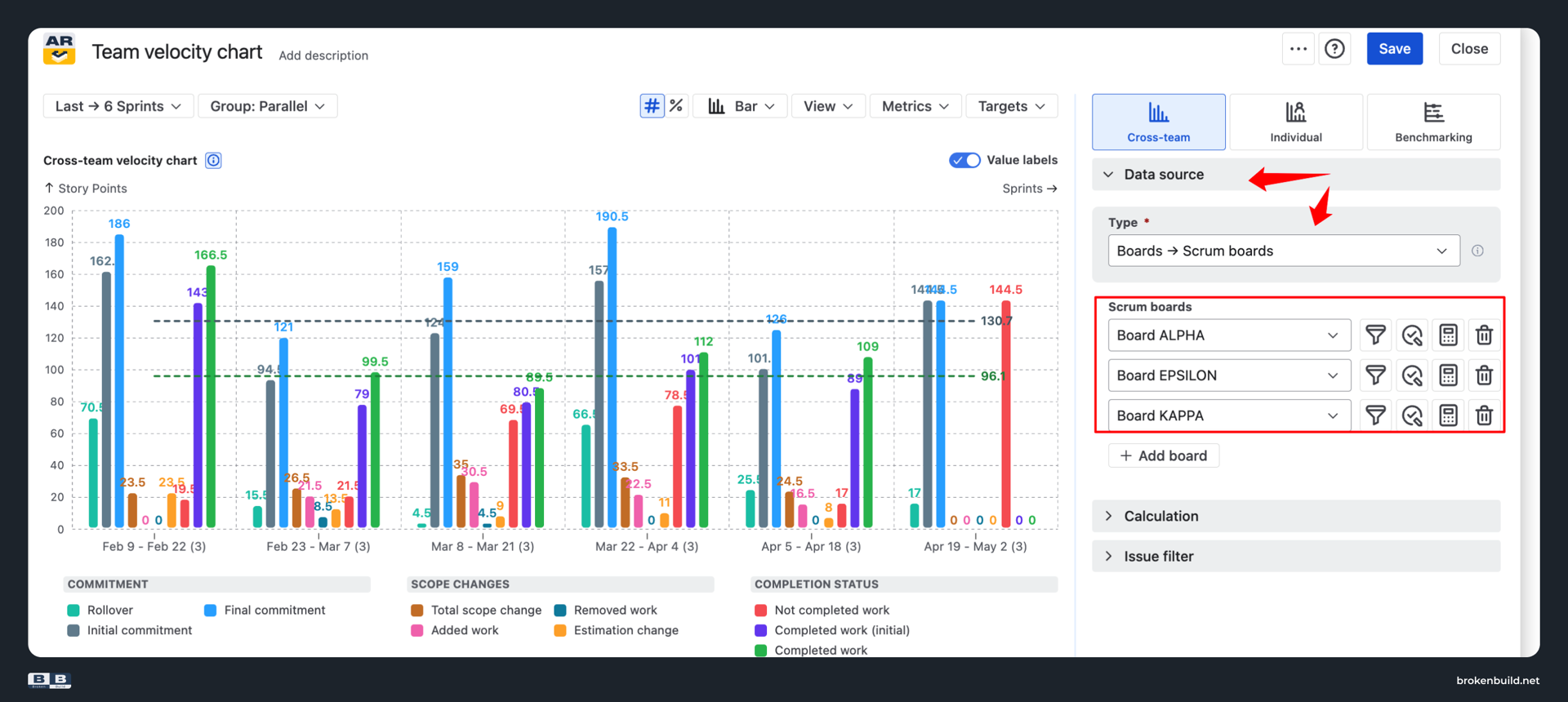
Agile Velocity Charts: Cross-team velocity chart rolls up multiple boards, projects, or teams into one aggregated view. A scaled team, a value stream, or a program-level rollup becomes one chart. Answers "what's our combined delivery velocity?" – a question native can't touch.
2️⃣ No team visibility → benchmarking view
Native: No way to see Team A and Team B velocity patterns in the same chart. No historical percentile reference. No way to spot which team's variance is widest or which trend is most stable.
Agile Velocity Charts: Benchmarking view shows each team's velocity as its own bar next to the others on the same chart. Add reference lines from historical averages, medians, or percentiles (25th, 75th) to see variance and stability patterns across teams.
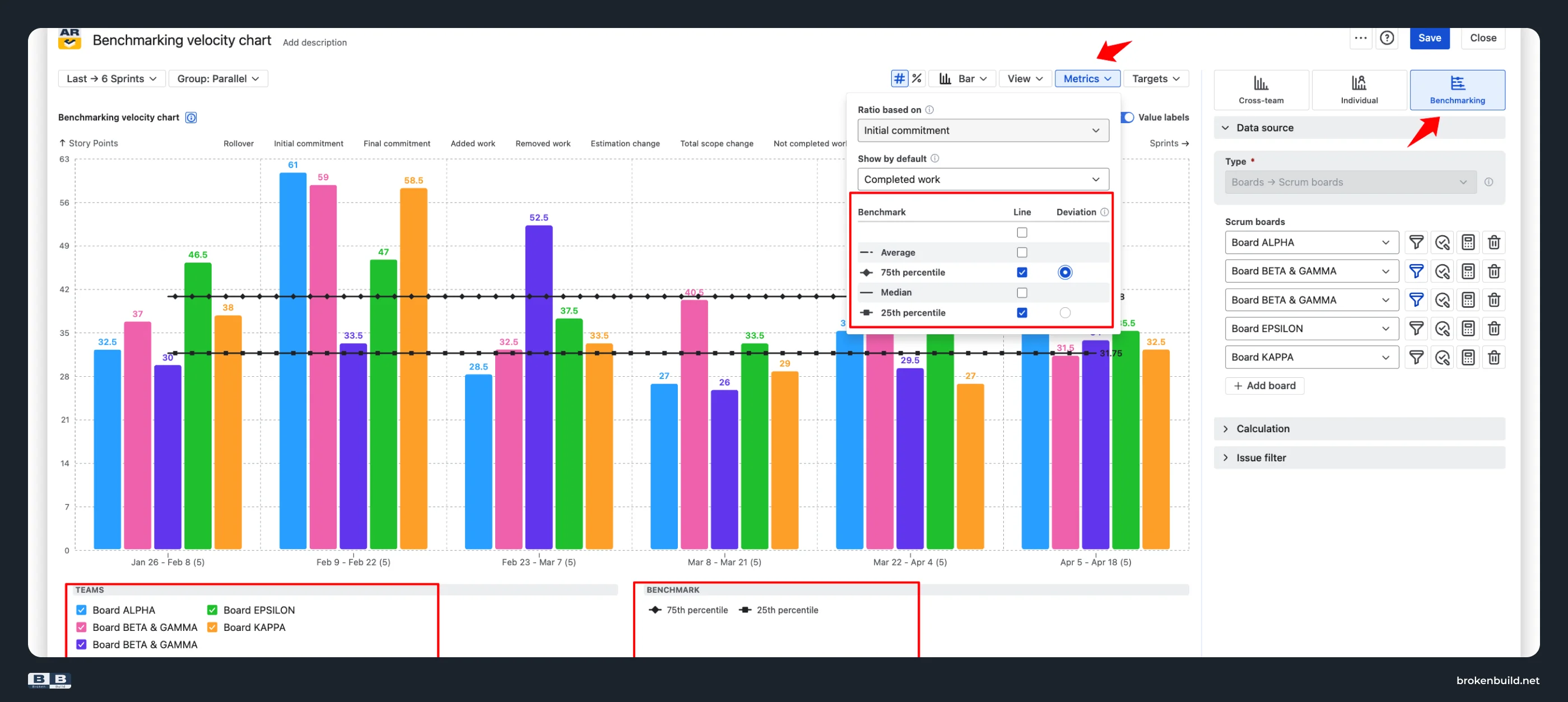
Answers "which team has the most stable velocity?" and "which team's pattern diverges from the rest?" – structural questions, not rankings.
3️⃣ Only 3 metrics → ten metrics that explain team differences
Native: Shows Commitment, Completed, and Average. When Team A's numbers differ from Team B's, native can't tell you why. Is it less rollover? Less scope creep? Different estimation patterns?
Agile Velocity Charts: Ten metrics per sprint: rollover, initial commitment, final commitment, added work, removed work, total scope change, estimation change, not completed work, completed work (initial), completed work.
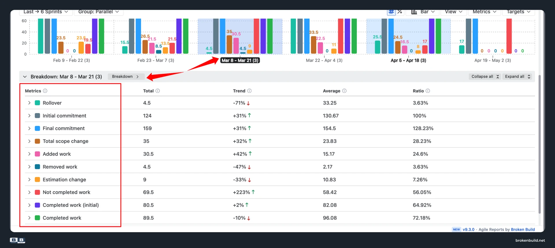
When analyzing teams, the question shifts from "which team is faster" to "why does Team A have less rollover?" or "why does Team B absorb more mid-sprint scope?" That's diagnostic, not ranking.
4️⃣ Absolute values only → percentage / say-do ratio view
Native: Only shows absolute story points. A team completing 50 points looks like it delivered more than a team completing 30 – even if the 50-point team planned 100 (50% say-do) and the 30-point team planned 32 (94% say-do).
Agile Velocity Charts: Percentage view normalizes to initial or final commitment. Analyze planning accuracy across teams on the same axis – even when team sizes or estimation scales differ.
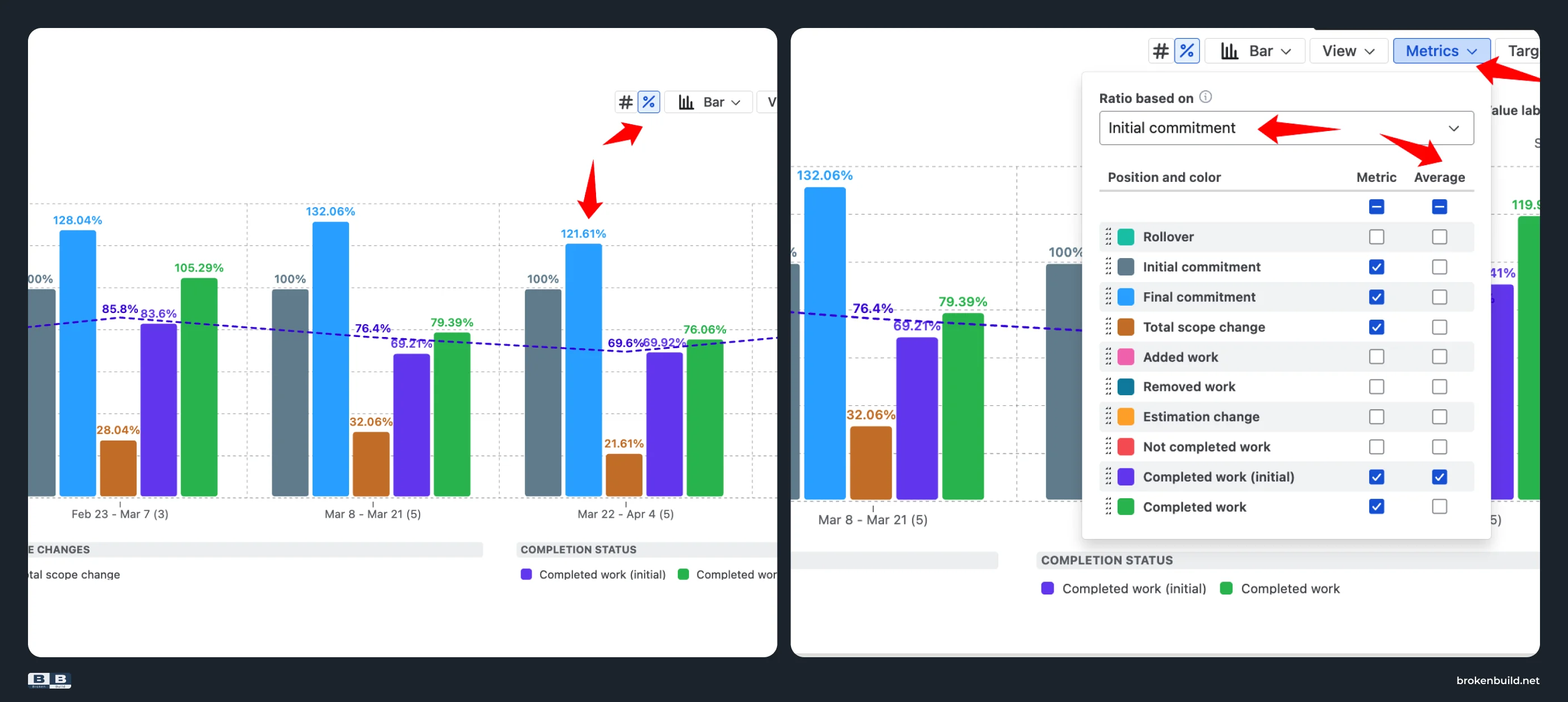
In percentage mode, the Average line becomes the average say/do ratio across sprints – a single-number KPI you can quote across teams.
5️⃣ One average line → targets and percentile benchmarks
Native: Shows only a single Average line across a fixed sprint window. No target corridors. No variance indicators.
Agile Velocity Charts: Overlay absolute or percentage-based target lines. Add benchmark reference lines from historical averages, medians, or percentiles (25th, 75th).
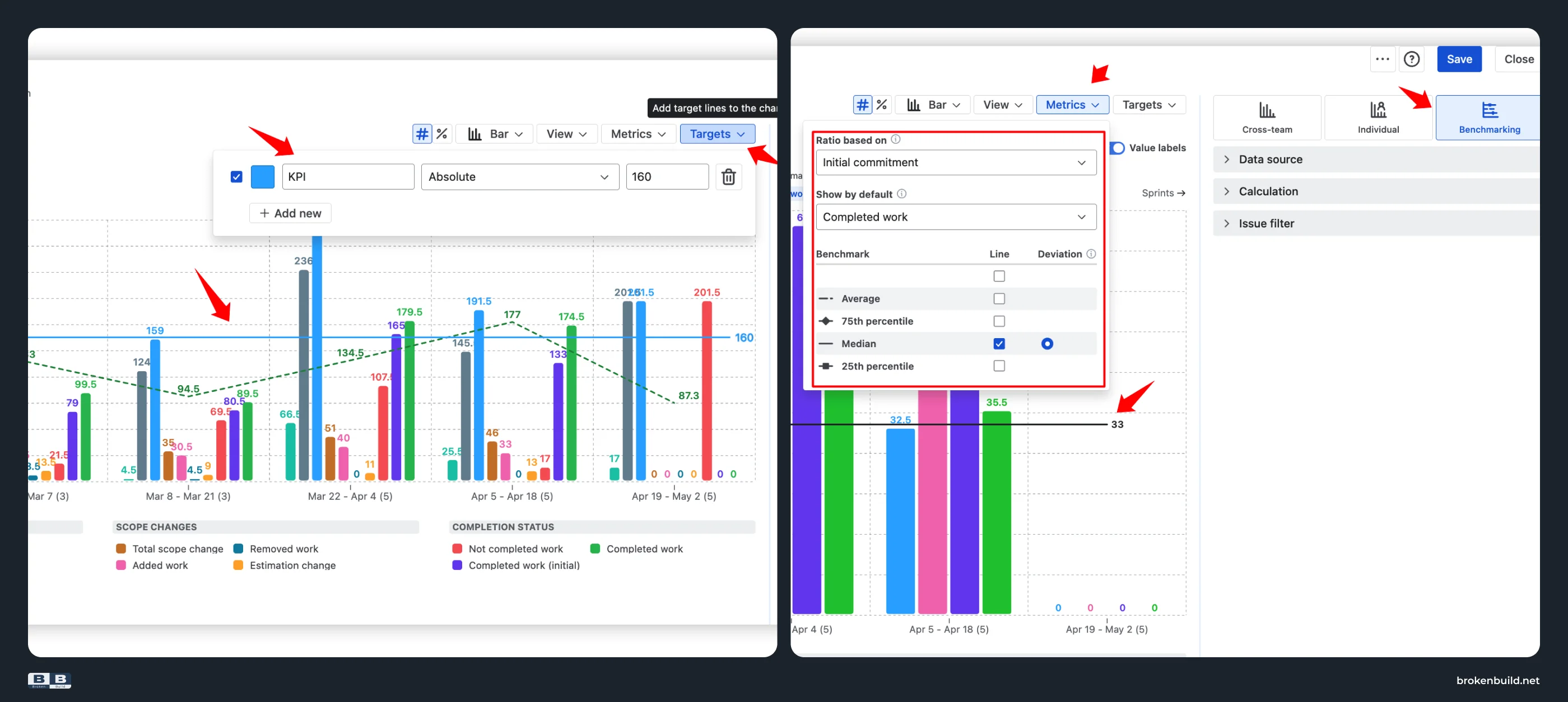
See whether a team's velocity is stable or volatile, whether variance is tightening or widening over time. That's the benchmarking that makes cross-team visibility useful – patterns and stability, not rankings.
6️⃣ Scrum-only → any scope
Native: Velocity chart is Scrum-only. Kanban teams have no equivalent.
Agile Velocity Charts: Works on Scrum boards, Kanban boards, projects, releases, initiatives, epics, saved filters, and custom JQL – and combinations. Roll up the velocity of a scaled team, or narrow to one epic's contribution across teams.
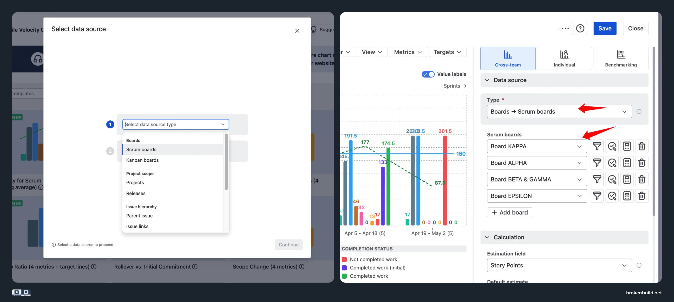
For details on configurable time frames, flexible estimation fields, and issue filters, see Jira sprint velocity – why three metrics can't tell you what happened. This article focuses on cross-team capabilities.
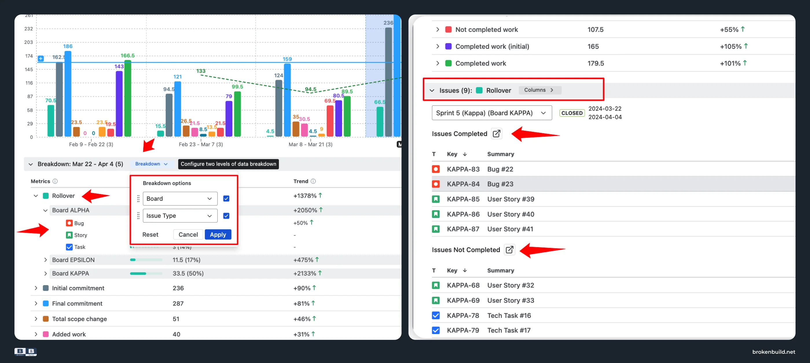
7️⃣ No drill-down → breakdown that answers "why?"
Native: No way to click a sprint and see which tickets contributed. No breakdown by epic, issue type, or assignee.
Agile Velocity Charts: Click any sprint – team-level, cross-team, or per-person – to open a Breakdown by any Jira field. See exactly which epic, issue type, or assignee drove this team's rollover, scope creep, or shortfall.
8️⃣ Trapped on Reports tab → lives where your team works
Native: The velocity chart lives only on the project's Reports tab. No dashboard gadget. No Confluence embed. To share a velocity view, you screenshot it.
Agile Velocity Charts: Add as a gadget on any Jira dashboard. Embed interactively in Confluence via Smart Links – filters and grouping stay editable inside Confluence. Export to CSV, PNG, or PDF.
Native vs Agile Velocity Charts by Broken Build at a glance
Do you need more than native?
Answer yes to any of these, and native can't help:
- Do you manage more than one team and need to see their velocity together?
- Do you need to see teams side by side without switching boards?
- Do you need to understand why one team's velocity pattern differs from another's?
- Do you need a normalized view to analyze planning accuracy across teams?
- Do you need velocity on a Jira dashboard or embedded in Confluence?



Agile Reports and Gadgets bundle
Agile Velocity Charts is available standalone or as part of Agile Reports and Gadgets – a bundle that adds Cycle Time Charts, Throughput Charts, CFD, WIP Aging, Created vs Resolved, and more. If your teams need flow metrics alongside velocity, the bundle covers both.
Try the interactive examples
See Agile Velocity Charts in action – no installation needed.
- Team velocity chart – aggregate multiple teams into one view
- Benchmarking velocity chart – see teams side by side with percentile lines
When native is enough – and when it is not
Native Jira's velocity chart works when you have one team, one board, and only need to see the basic pattern: did we complete more or less than we committed?
It stops when you ask harder questions:
- How does this team's velocity pattern relate to our other teams?
- Which teams have stable velocity vs. volatile patterns?
- Why does Team A's pattern differ from Team B's – is it less rollover, less scope creep, or a different estimation approach?
- What's our combined velocity across the program?
- Where can I see all teams' velocity without switching boards?
Agile Velocity Charts by Broken Build picks up where native stops: cross-team aggregation, side-by-side pattern visibility, ten-metric diagnostic breakdown, percentage views for normalized analysis, and drill-down that answers "why?" – all in a view that lives on your dashboard, not trapped on a Reports tab.




.png)