

Native Jira's Velocity Chart shows sprint velocity as one bar per sprint – initial commitment, completed, and an average line. Broken Build's Agile Velocity Charts turns each sprint bar into a diagnostic and planning tool – with ten metrics that explain the outcome, a normalized say/do view, and targets / benchmarks for sustainable commitments.
Native Jira's Velocity Chart shows three quantities per sprint on one Scrum board: initial Commitment, Completed, and a horizontal Average line across a fixed number of past sprints. If sprint velocity drops, native can't tell you whether it was scope creep, rollover, or estimation drift. If you want to know what velocity you can commit to next sprint, you get one arithmetic average. If you want to compare planning accuracy across sprints of different sizes, native has no normalized view. Broken Build's Agile Velocity Charts turns sprint velocity into a diagnostic and planning tool: ten sprint metrics that break down the outcome, a percentage view for normalized say/do ratio, targets and benchmark reference lines for sustainable commitments, and drill-down to the specific tickets behind every sprint bar.
What is sprint velocity?
Sprint velocity is the amount of work a Scrum team completes in a sprint, typically measured in story points. Formula: velocity = total completed story points ÷ number of sprints. In Jira, the built-in Velocity Chart on Scrum boards calculates it automatically, averaging completed points across a fixed window of past sprints.
One number is a weak forecast. Mike Cohn's Velocity Range Calculator argues that a range (e.g. 18–23) is more accurate than a point estimate (20), because it makes the team's variance visible. That is the frame for the rest of this article: sprint velocity is most useful when you can see why it varies, not just what the average is.
Commitment vs completed, and the sprint miss
Every sprint has three numbers worth knowing: what the team agreed to at planning (initial commitment), what shipped (completed work), and the gap in between. That gap is the sprint miss, or the sprint surplus when Completed exceeds Commitment. The native Velocity Chart draws both bars per sprint and lets you eyeball the difference.
Eyeballing has a problem: it doesn't normalize. A team that committed to 40 points and completed 32 has the same "8-point miss" as a team that committed to 15 and completed 7, but the first team was much closer to plan. The say/do ratio (completed ÷ committed × 100) normalizes the miss. 32/40 = 80% say/do vs 7/15 = 47% say/do. Two very different planning stories that native's absolute bars hide.
Say/do is a useful signal, but only as a diagnostic. Turned into a performance target, it drives teams to sandbag commitments and redefine "done" mid-sprint to protect the number. Paired with the ten-metric decomposition and variance benchmarks below, say/do stays what it is meant to be: a way to see whether planning matches delivery.
How to read the native Velocity Chart in Jira
Open any Scrum board in Jira Cloud and navigate to Scrum board → Reports → Velocity Chart. The Velocity Chart is available only on boards that use the Scrum space template – that is also the first troubleshooting answer. If the Velocity Chart is not showing, missing from your Reports tab, or shows zero, the board is almost certainly Kanban or Team-managed, not Scrum. For Kanban delivery-rate tracking, see the Jira Kanban velocity article.
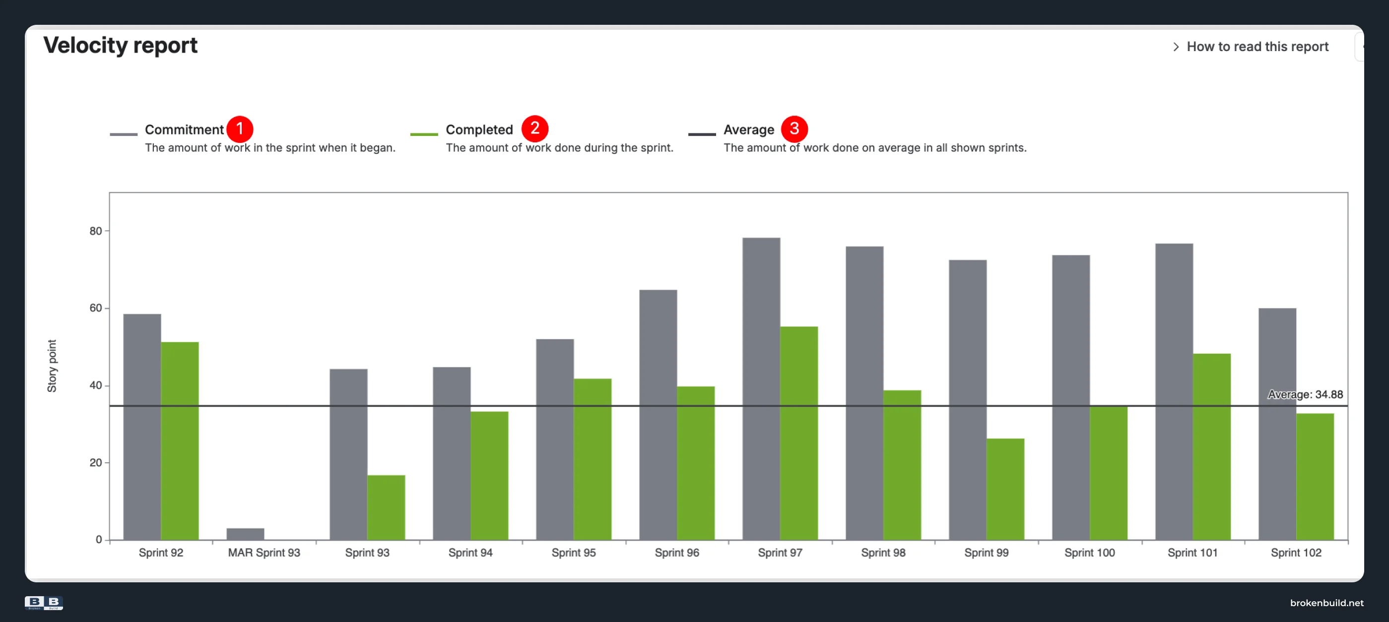
The chart shows three elements per sprint:
- Commitment: the gray bar represents the total estimated effort for all work items in the sprint when it begins. This is initial commitment only. Scope added mid-sprint is not shown as a separate bar.
- Completed: the green bar shows the total number of completed estimates at the end of the sprint.
- Average: the black line is a single arithmetic mean of completed work across the shown sprint window.
Estimation can be story points, original time (minutes/hours/days/weeks), work item count, or any numeric custom field – but the option is set on the board, not on the chart. If a team wants to see Completed in story points and time on the same view, native cannot do it without changing board configuration.
Undocumented gaps worth naming up front. The Velocity Chart shows no drill-down (cannot click a sprint to see which tickets contributed to Commitment or Completed), no breakdown by epic/issue type/assignee, no percentiles other than the single Average line, no targets or benchmark ranges, no dashboard gadget, no Confluence embed, and no way to include more than one Scrum board in the same chart. The rest of this article walks through each of these gaps with the specific view or metric that closes it.
Where native's three metrics stop – and the ten that explain what happened
Native's three metrics (Commitment, Completed, Average) tell you the outcome (did we hit it?) but never the cause (why not?). Broken Build's Agile Velocity Charts add seven more sprint metrics on top of the native three, plus the diagnostic tooling around them: three chart views (Cross-team, Individual, Benchmarking), a percentage / say-do view, targets, benchmarks, drill-down, and dashboard + Confluence placements. Each section below pairs a native limit with the specific capability that closes it.
1️⃣ Three metrics → ten metrics (rollover, added, removed, scope change)
Native Jira: The Velocity Chart tracks only initial Commitment and Completed. When a sprint misses, it cannot tell you whether it was scope creep, rollover from a previous sprint, mid-sprint estimation drift, or mid-sprint additions – none of these are separate metrics.
Agile Velocity Charts by Broken Build: The app tracks ten metrics per sprint on the Cross-team and Benchmarking chart views (five of them on the Individual chart, since scope movement usually happens at team level, not per person):
- Initial commitment: work in the sprint at start (matches native's Commitment).
- Final commitment: what the sprint actually contained after mid-sprint additions and removals.
- Rollover: unfinished work carried from previous sprints.
- Added work: work added to the sprint after it started.
- Removed work: work removed from the sprint after it started.
- Total scope change: net scope change during the sprint.
- Estimation change: re-estimations of existing items.
- Not completed work: work that didn't get done and rolls over.
- Completed work (initial): completed work from the original commitment.
- Completed work: everything completed, including mid-sprint additions (matches native's Completed).
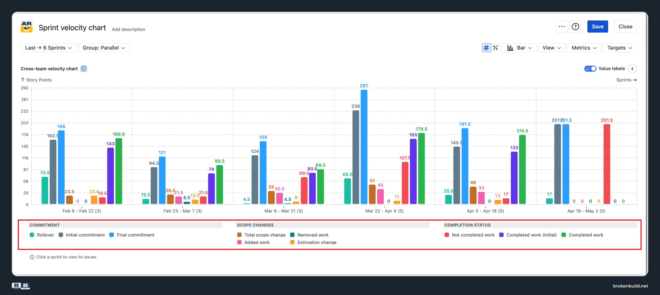
A sprint miss now decomposes. Scope creep vs rollover vs estimation drift vs mid-sprint additions become separate, trendable, targetable values. "Why did we miss?" gets a specific answer instead of "we didn't hit the number" – and each usual suspect (scope added mid-sprint, work rolled over from the prior sprint, items re-estimated once in flight, unfinished work rolling forward again) maps to a specific metric rather than being buried in the Commitment-vs-Completed gap.
2️⃣ Absolute only → percentage / say-do ratio view
Native Jira: The Velocity Chart shows only absolute story-point values. There is no percentage view, no say/do ratio, and no trend of planning accuracy over sprints. Teams with varying commitment sizes (team-size changes, estimation-scale drift, releases with unusual scope) cannot compare planning accuracy across sprints on a normalized axis.
Agile Velocity Charts by Broken Build: Switch between absolute and percentage view, calculated against either initial commitment or final commitment as the ratio basis (per the chart's Metrics settings). Pick the planned metric (initial or final commitment) and the delivered metric (completed work or completed work (initial)) – four combinations, two subtly different KPIs, both first-class.
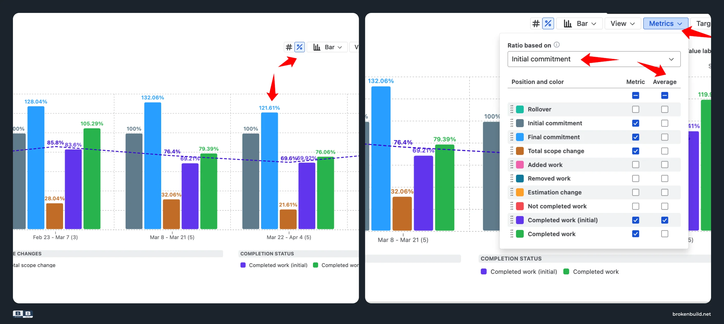
In percentage mode, the Average line becomes the average say/do ratio across sprints: a single-number KPI you can quote to leadership ("our team averages 87% say/do") instead of a mental calculation. Combined with the ten-metric decomposition above, the say/do ratio stays a diagnostic surface used to see planning-accuracy patterns and their causes, not a performance target that incentivizes sandbagging.
3️⃣ Single Average line → targets and benchmark percentiles
Native Jira: The Velocity Chart offers one arithmetic Average line across a fixed sprint window. No target corridor, no percentile references, no way to distinguish "typical" from "outlier."
Agile Velocity Charts by Broken Build: The app adds two overlays that make variance visible:
- Target lines: available on all three chart views (Cross-team, Individual, Benchmarking). On Cross-team and Individual charts, a target can be flat (absolute value) or moving (percentage relative to Initial commitment or Final commitment). On Benchmarking charts, targets are always flat, with the unit following the chart view (absolute vs percentage). Use for KPI tracking or planning caps.
- Benchmark reference lines on the Benchmarking velocity chart specifically. Four options (Average, Median or 50th percentile, 25th percentile, 75th percentile) displayed as horizontal lines across the selected metric. Calculation window is configurable (all sprints in the chart range, or a rolling number of previous sprints).
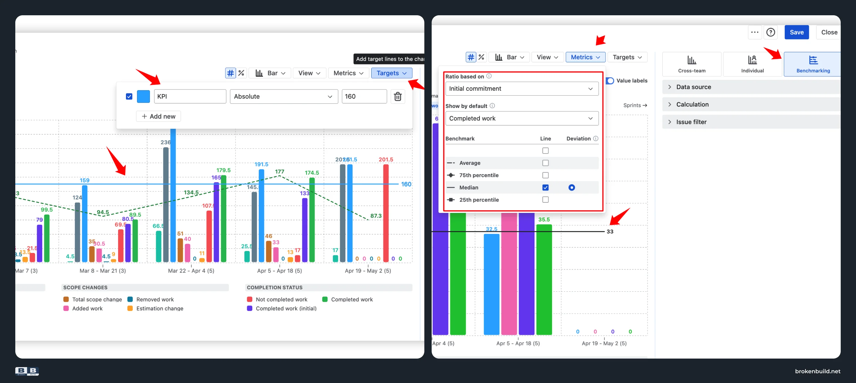
Why variance matters more than magnitude. A single Average line hides how consistent a team really is. Two teams can share the same average sprint velocity and be very different in practice: one delivering steadily between 18 and 23 points sprint after sprint, the other swinging between 8 and 40. Percentile reference lines and target corridors turn that single number into a range that captures both typical outcome and consistency – the shape planning actually needs.
4️⃣ Fixed sprint window → configurable time frame
Native Jira: The Velocity Chart shows a fixed number of past sprints. There is no date-range mode, no group-by-time-interval, and no way to focus on the last three sprints for a recent trend or the last twenty for a long-term picture.
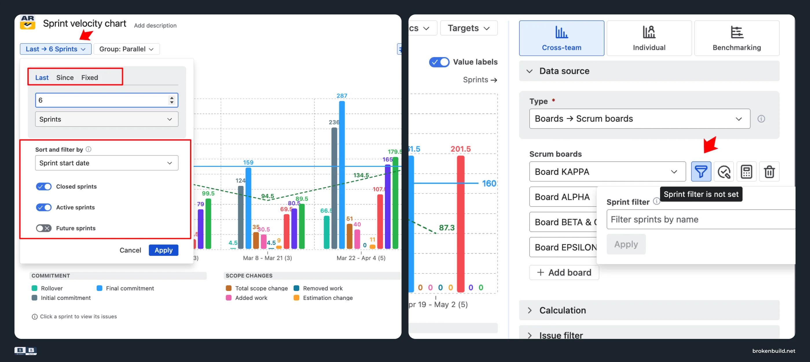
Agile Velocity Charts by Broken Build: Choose from three interval modes for Scrum data: Last (a number of sprints, days, weeks, bi-weeks, months, or quarters); Since (a past date); Fixed (a start–end range). On top of that, include or exclude closed/active/future sprints, and sort by sprint start or end date. A retrospective spanning "the last quarter" or "since the reorg" becomes a real query, not a manual note beside a chart from the wrong window.
5️⃣ One Scrum board → cross-team, benchmarking, and broader scope
Native Jira: The Velocity Chart is locked to one Scrum board at a time. No program-level view, no cross-board or cross-project comparison, and no way to see "Team A's sprint velocity vs Team B's" in the same chart.
Agile Velocity Charts by Broken Build: Any scope, not just one Scrum board. Use Scrum boards, projects, releases, initiatives, epics, saved filters, and custom JQL – alone or in combination.
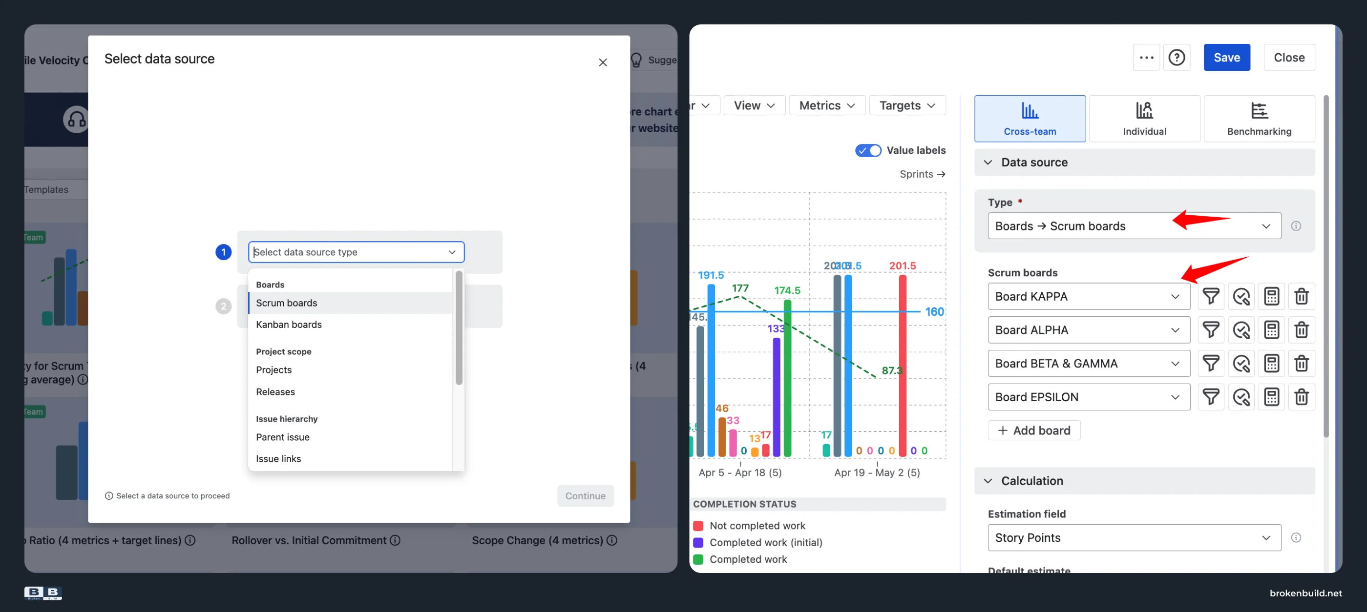
Roll up sprint velocity across a scaled team, or narrow the chart to one epic's contribution across sprints. Then choose the chart view that matches the question:
- Cross-team velocity chart: brings metrics from one or multiple teams or boards into a single view, tracking throughput at program or ART level. Shows the full ten-metric breakdown across sprints.
- Individual velocity chart: see the next section.
- Benchmarking velocity chart: each team as its own bar side-by-side, with shared benchmark lines (Average, Median, 25th, 75th percentiles) so you can see how each team measures up against the group.
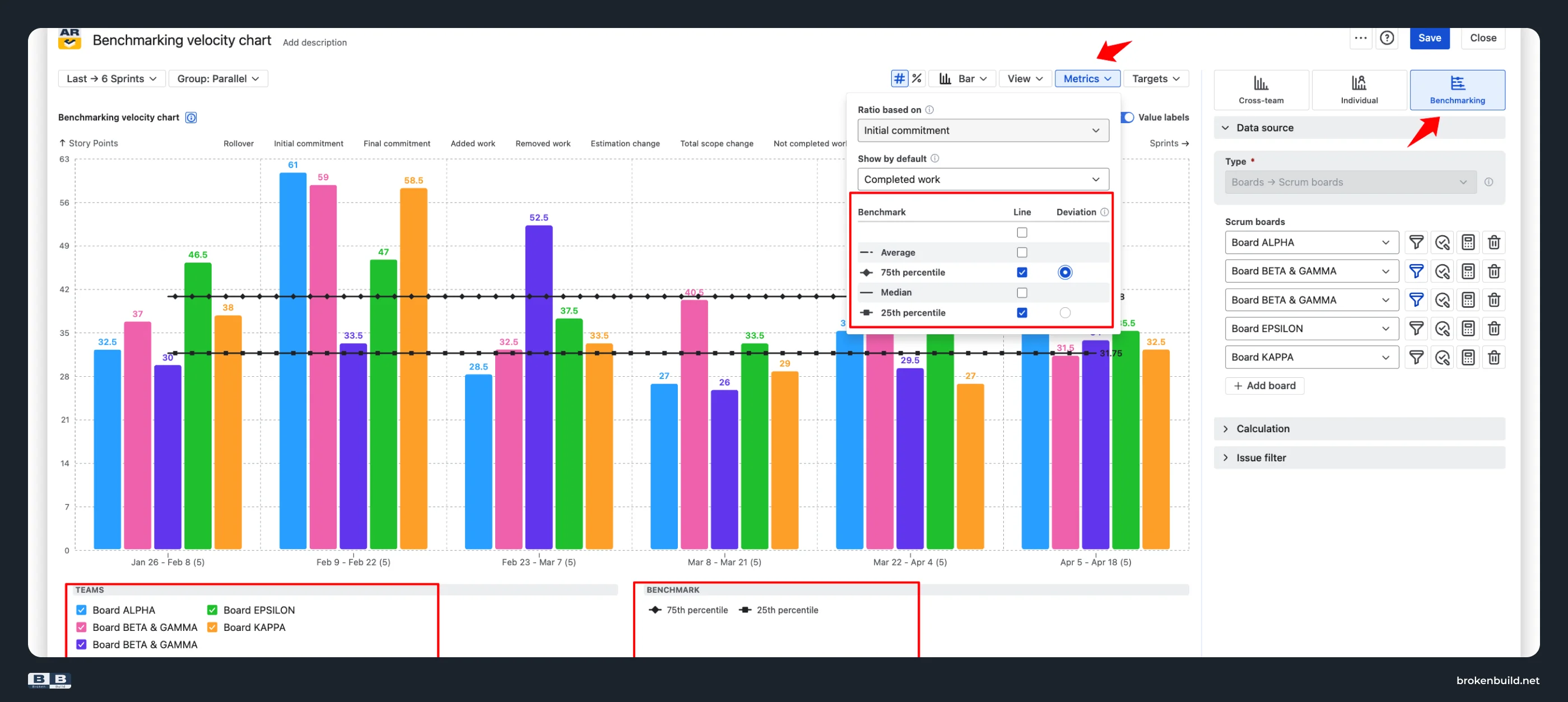
A word of caution on how to read the Benchmarking view. Story-point scale is team-specific (one team's five-point story is another team's eight), so the goal is not to rank teams by velocity magnitude. The Benchmarking view is designed for structural comparison: is any team consistently below the 25th percentile (needs support?), consistently above the 75th (are they overcommitting)? Are all teams tightly clustered (healthy predictability) or spread wide (mixed process maturity)? The percentile band is the point, not the individual bars.
6️⃣ No individual view → per-user velocity
Native Jira: There is no per-user view. You cannot drill from team velocity to individual contributions – useful for coaching, performance reviews with real data, and identifying under-supported team members, all impossible natively.
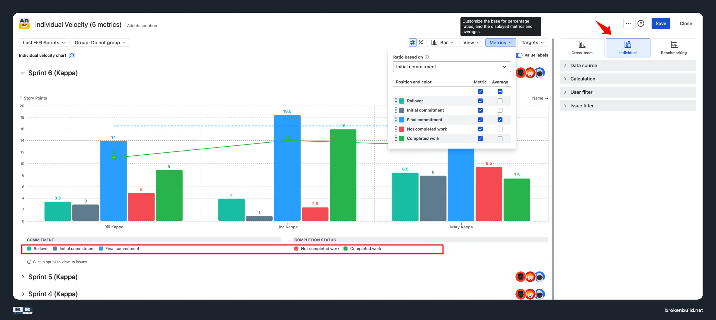
Agile Velocity Charts by Broken Build: The Individual velocity chart breaks the same metrics down by team member. It answers "what is the productivity trend of individual team members?", "how does an individual deliver on their sprint commitment?", "to what extent is scope assigned to a team member subject to change?", and "is work unequally distributed?"
Available metrics per person: Rollover, Initial commitment, Final commitment, Not completed work, and Completed work – five of the ten team-level metrics. Scope-change metrics (Added, Removed, Total scope change, Estimation change) stay at team level, since scope movement usually happens on the sprint, not on an individual.
7️⃣ Board-locked configuration → flexible estimation and filter
Native Jira: The estimation field is set on the board – story points, original time, work item count, or a numeric custom field. The filter is whatever the board's saved filter says. You cannot switch estimation view without changing board configuration; you cannot narrow to just stories, one epic, one release, or one team's contribution within a shared board.
Agile Velocity Charts by Broken Build: Both settings move to the chart:
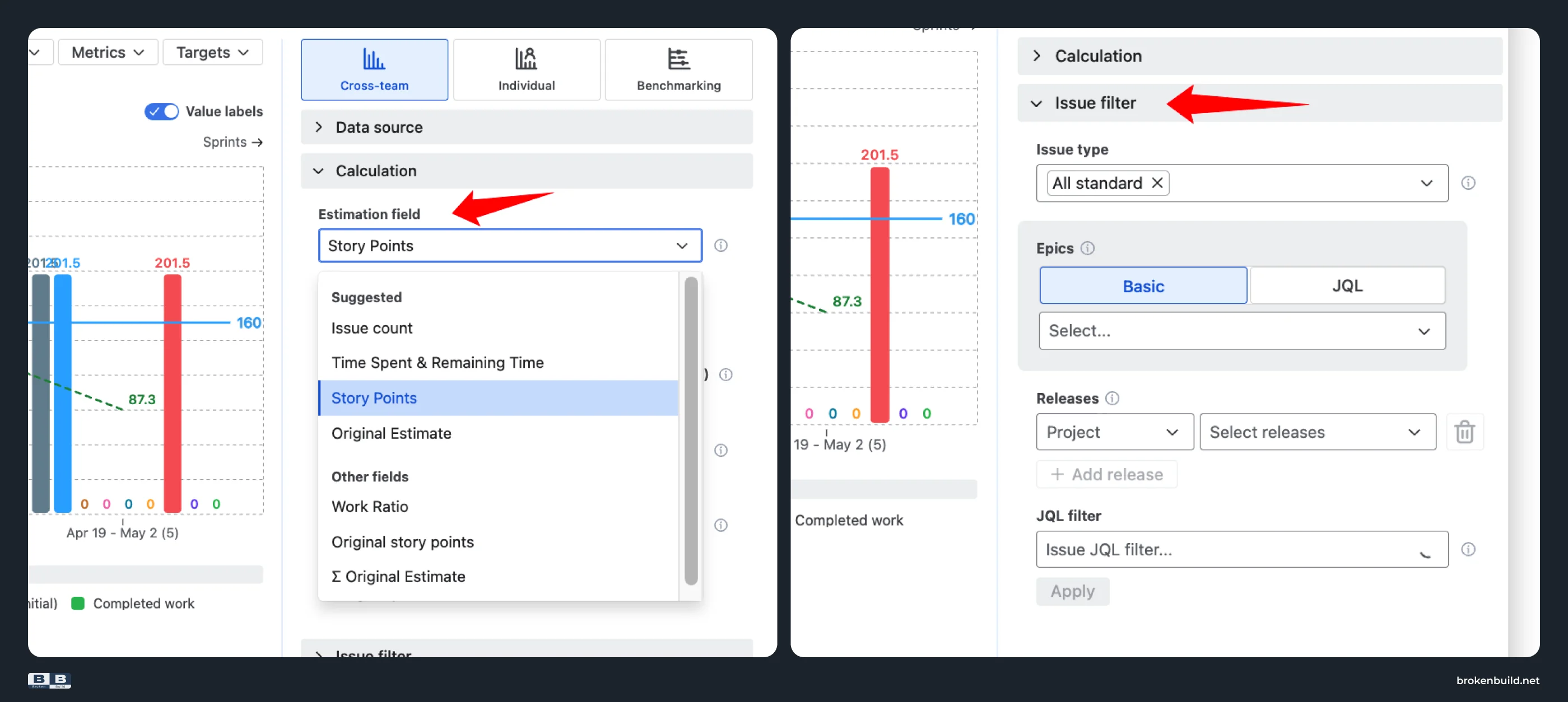
- Flexible estimation at chart level. Set the estimation field in Calculation → Estimation field: Story points, Story point estimate, Original estimate (time), Issue count, Time spent & remaining time, or any numeric custom field.
- Flexible issue filter. Narrow by issue types, specific epics, releases across projects, or custom JQL – including extended JQL functions from apps like ScriptRunner. See sprint velocity for just stories, just a specific release, or just one team's work on a shared board.
8️⃣ No drill-down → breakdown and issue list
Native Jira: There is no drill-down. You cannot click a sprint bar to see which specific tickets contributed to Commitment vs Completed. There is no breakdown by epic, issue type, assignee, or any other field.
Agile Velocity Charts by Broken Build: Clicking a sprint bar opens a two-panel drill-down. Breakdown segments the selected sprint by any Jira field – epic, issue type, assignee, priority, component, label, or a custom field. Issue list shows every item, linked back to Jira for click-through investigation.
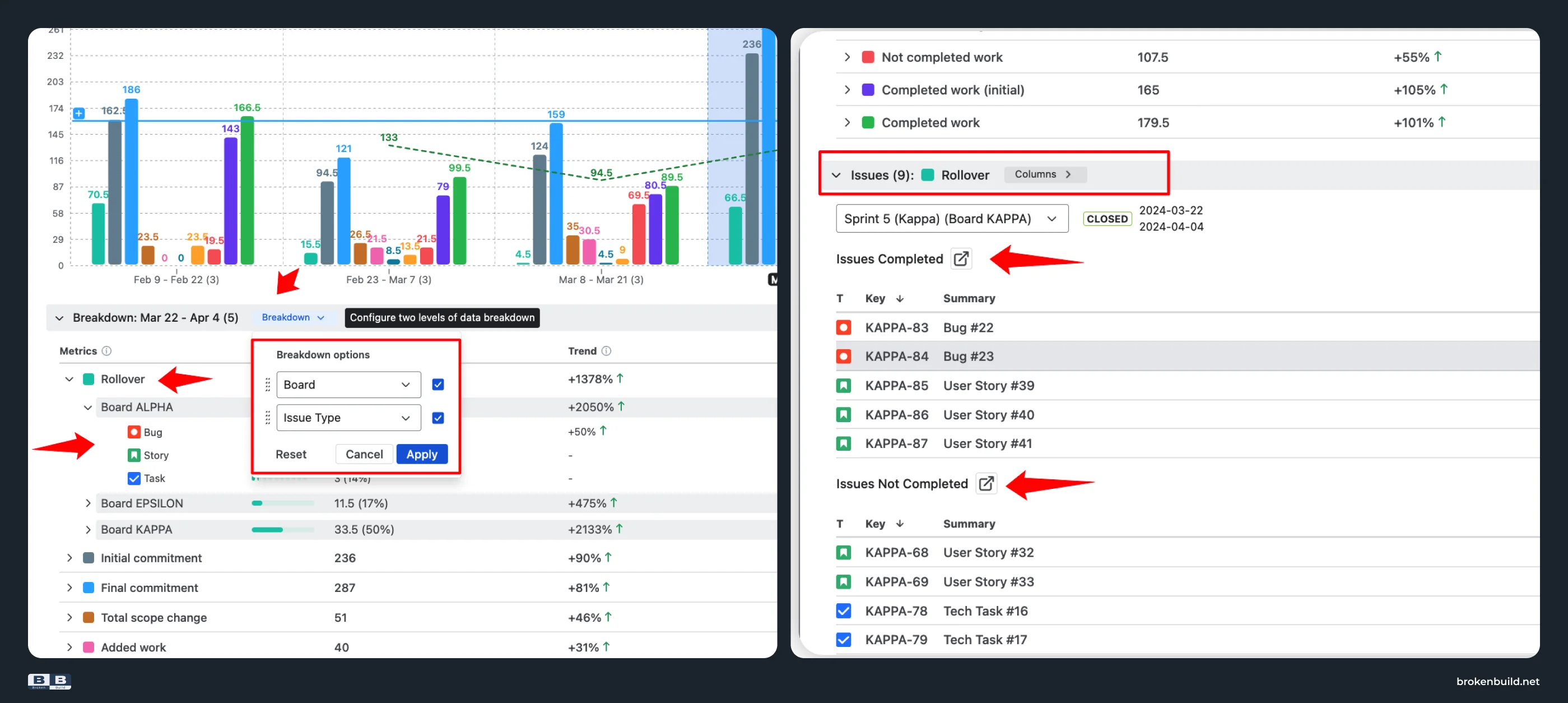
The retrospective conversation shifts from "our velocity dropped" to "our velocity dropped because Epic X's items were re-estimated mid-sprint and pushed out these three stories" – a specific, actionable finding you can bring to the next planning meeting.
9️⃣ Trapped on Reports tab → dashboard, Confluence, and export
Native Jira: The Velocity Chart lives only on the Reports tab. There is no Jira dashboard gadget, no Confluence embed with editable filters, and no CSV / PNG / PDF export.
Agile Velocity Charts by Broken Build: Use three placements for the same live chart:
- Jira dashboard gadget: add on any dashboard alongside other Broken Build charts.
- Confluence embed via Smart Links – fully interactive; filters and grouping stay editable inside Confluence.
- Export: PDF and PNG for slide decks and archived retrospectives; CSV for further analysis in Excel, Google Sheets, or BI tools.
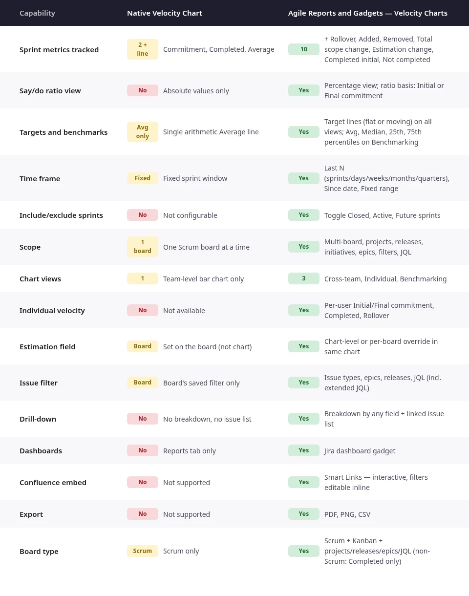
Native Velocity Chart vs Agile Velocity Charts by Broken Build at a glance
Do you need more than native?
If you answer yes to any of these, native Jira's Velocity Chart cannot help:
- Do you need to know why a sprint missed (scope creep, rollover, estimation drift, or mid-sprint additions) as separate numbers, not eyeballed differences?
- Do you need a normalized say/do ratio to compare planning accuracy across sprints of different sizes?
- Do you need target lines or benchmark percentiles to communicate sustainable commitments to leadership?
- Do you manage multiple Scrum teams and need a cross-team or side-by-side benchmarking view?
- Do you need individual velocity for coaching or 1:1 conversations, backed by real per-sprint data?
Why not another approach?
For teams whose sprint miss can be explained by a single glance at Commitment vs Completed, the native Velocity Chart is enough. For any team that needs the cause of the miss (scope change, rollover, estimation drift, mid-sprint additions), the decomposition has to come from somewhere. Manual spreadsheet export is one path; a dedicated tool is another. Agile Velocity Charts puts all ten metrics, three chart views (Cross-team, Individual, Benchmarking), targets, benchmarks, drill-down, dashboards, and Confluence embedding into one Marketplace app: the fastest path from "our velocity dropped" to "here's exactly why."



Need more than sprint velocity? Grab the bundle
Agile Velocity Charts works as a standalone app and covers everything in this article on its own. If your team also needs other reports beyond sprint velocity (throughput run charts and histograms, cycle-time percentiles, cumulative flow diagnostics, WIP aging, created-vs-resolved), Agile Velocity Charts is also part of the Agile Reports and Gadgets bundle: nine agile charts and 30+ metrics for one price. If you only need sprint velocity, install the standalone. If you want the wider toolkit, install the bundle.
Try the interactive examples
See Velocity Charts on live data – no installation needed. Each example is a fully interactive chart with real sprint data behind it.
- Sprint velocity chart
- Team velocity chart
- Individual velocity chart
- Benchmarking velocity chart
- Say/do ratio report
- Sprint rollover report
When native is enough – and when it is not
Native Jira's Velocity Chart is genuinely useful for the simplest case: one Scrum team, one board, one estimation unit, a small set of past sprints, and a retrospective conversation short enough to eyeball Commitment vs Completed. If you never need to explain why a sprint missed with more precision than "we underestimated," and if you never need to compare planning accuracy across sprints of different sizes, native is enough.
The moment the retrospective asks a harder question, native's three metrics stop being enough. "Was the miss scope creep or rollover?" "What's our say/do ratio trend?" "Which epic drove the rollover?" "Are we typical for our size, or an outlier?" "What should our target velocity be next quarter?" A single Average line and two bars per sprint cannot answer any of those.
Improving sprint velocity is not the goal. Velocity is not something to hit – it is something to notice. What improves is planning accuracy and delivery predictability, and both need decomposition. That is what Agile Velocity Charts adds: ten metrics that decompose the outcome, a normalized say/do ratio view, targets and benchmarks that make variance visible, three chart views (Cross-team, Individual, Benchmarking), drill-down to the specific tickets behind every bar, and interactive placements on Jira dashboards and in Confluence.




.png)