


Native Jira's Sprint Report and Burndown Chart show remaining work dropping against a straight Guideline. Broken Build's Agile Burnup Burndown Charts Sprint Burndown chart tells you, throughout the sprint, whether the team will actually hit the goal – and, if not, what it'll take.
What is a sprint burndown chart in Jira
A sprint burndown chart tracks one number: work remaining. A single line falls over time, and if it reaches zero by sprint end, the team delivered the commitment. The Scrum Guide names burndowns alongside burnups and cumulative flows as practices that "exist to forecast progress" – though it also notes that "these do not replace the importance of empiricism."
Jira Cloud offers two native views of sprint burndown data – the Burndown Chart and the Sprint Report – both accessible on Scrum boards only. Both report on a single sprint on a single board.
How to read the sprint burndown chart in Jira
The Burndown Chart view
Open any Scrum board in Jira Cloud and go to Board → Reports → Burndown Chart. This view is Scrum-only – Kanban boards, projects, and releases do not have it.

The chart shows:
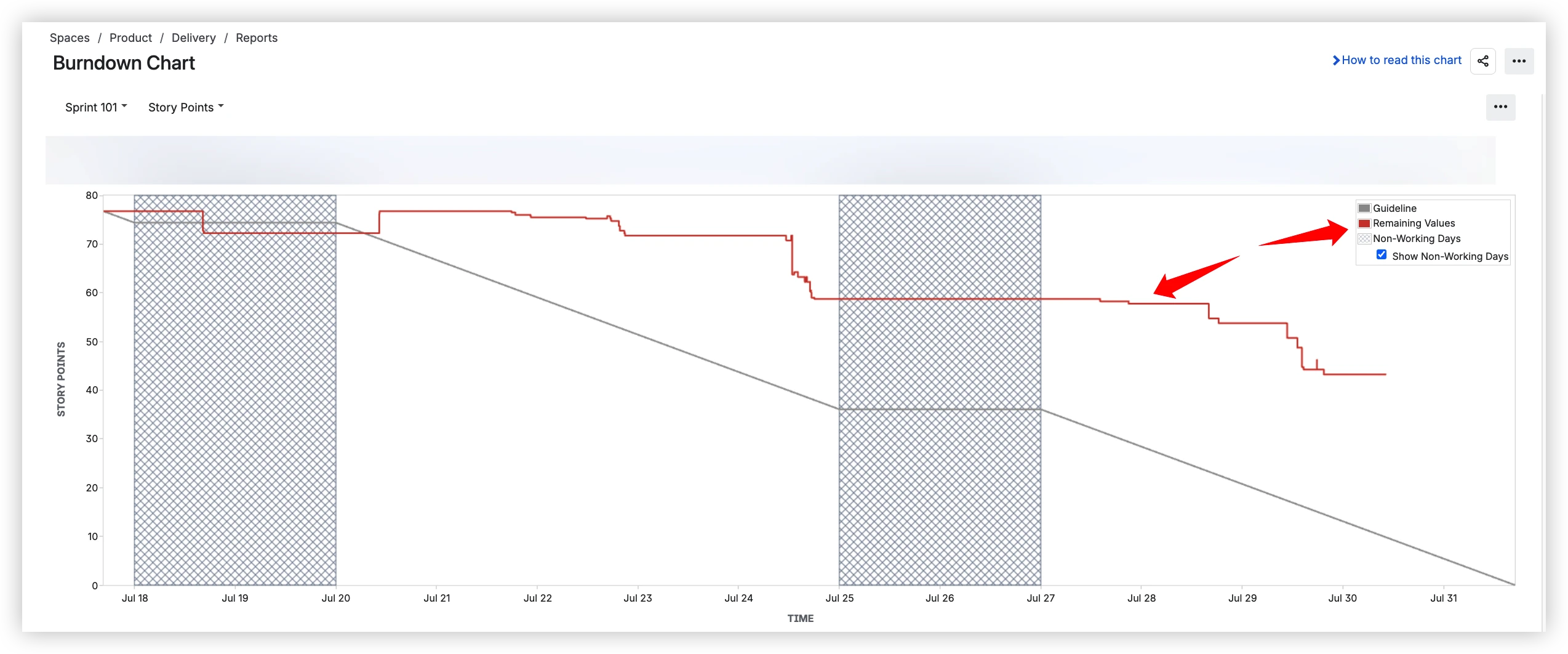
- Remaining Values (red line) – remaining work in the sprint, plotted daily. This is the only data line the chart shows.
- Guideline (grey line) – a straight line from the sprint's starting total to zero at sprint end. Atlassian calls it "ideal pace." It is not based on the team's velocity – it is a linear decline that assumes the same amount of work is completed every day.
- Non-Working Days (hatched areas) – weekends and holidays are displayed as grey hatched bands. A "Show Non-Working Days" toggle lets you turn them on or off. The Guideline runs straight through these bands without flattening – it does not adjust its slope for days the team is not working.
- Estimation statistic – the chart uses whichever estimation field the board is configured with: story points or issue count.
Important caveats from the same documentation:
- Subtask data is excluded: "Story Points on subtasks are not included in the Burndown Chart."
- The chart is board-specific: "it will only include work items that match your board's saved filter."
- Scrum boards only: "only applies to scrum boards."
The Sprint Report view
Navigate to Board → Reports → Sprint Report. The Sprint Report includes the same burndown chart – Remaining Values line plus Guideline – and adds extra context below it.
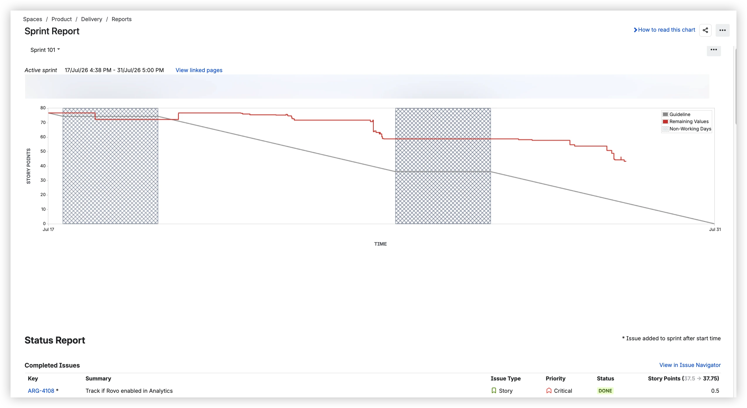
The Sprint Report documentation describes the Guideline as "drawn from the total estimate of the work items at the start of the sprint, to 0 at the end." Below the chart, the report lists:
- Completed work items with their story point values
- Items added after sprint start – marked with an asterisk (*)
- Re-estimated items – displayed as "3 → 3.5"
One detail worth noting: the Sprint Report's Guideline steps around non-working days – it flattens during weekends and holidays. The Burndown Chart's Guideline does not. Same chart, two views, different Guideline behavior.
Patterns to watch for
- Steady decline toward the Guideline – sprint is on track. Delivery pace matches the ideal.
- Flat line – the team is blocked, pulled to other work, or waiting on dependencies.
- Line sitting above the Guideline – behind pace. Risk of not finishing.
- Sudden drop – a batch of issues resolved at once, or items removed from the sprint mid-flight.
- Line rising – scope creep. New work added faster than old work is completed.
Where the native sprint burndown falls short – and what to use instead
Native Jira's Burndown Chart and Sprint Report cover the basics for a single sprint on one Scrum board. Beyond that, they stop. Below, each subsection names one native constraint and the Agile Burnup Burndown Charts feature that removes it.
The Guideline is not a forecast → a whole menu of forecasts
Native: The Guideline is a straight line from the sprint's starting total to zero. It does not use the team's actual velocity and does not reflect past throughput. It cannot answer: when will we finish given our real velocity? What's the probability we hit the deadline? What velocity do we need to land the sprint?

Agile Burnup Burndown Charts: The Sprint Burndown chart keeps an Ideal burndown reference line for Scrum boards – the familiar "on track vs. behind" anchor – and layers real velocity-based projections on top:
- Default – three velocity scenarios (Max / Avg / Min) shown simultaneously
- Target date – what velocity does the team need to hit a chosen deadline?
- Target velocity – at a chosen pace, when does the team finish?
- Velocity percentile – pick a percentile of historical velocities (P50, P75, P85) and project from there
- Monte Carlo – run 100,000 simulations to produce probability-based delivery dates at P50 / P80 / P95
Stack multiple scenarios on one chart – the standup sees the optimistic line, the retro sees the Monte Carlo spread.
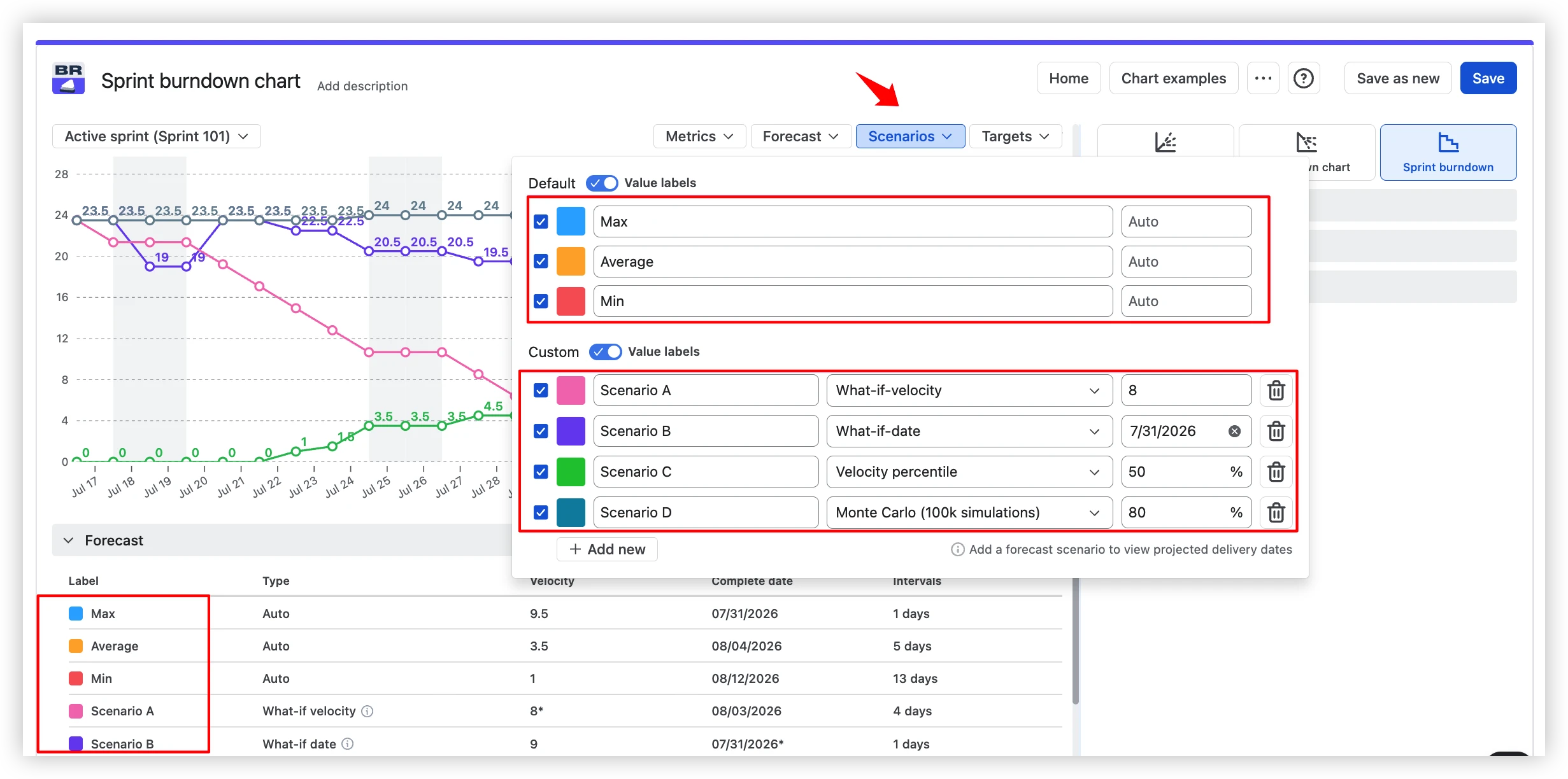
→ Try it live: open an interactive sprint burndown chart on real data – toggle forecasts, adjust data sources, drill into intervals. No installation needed.
Forecast fine-tuning: capacity and scope growth
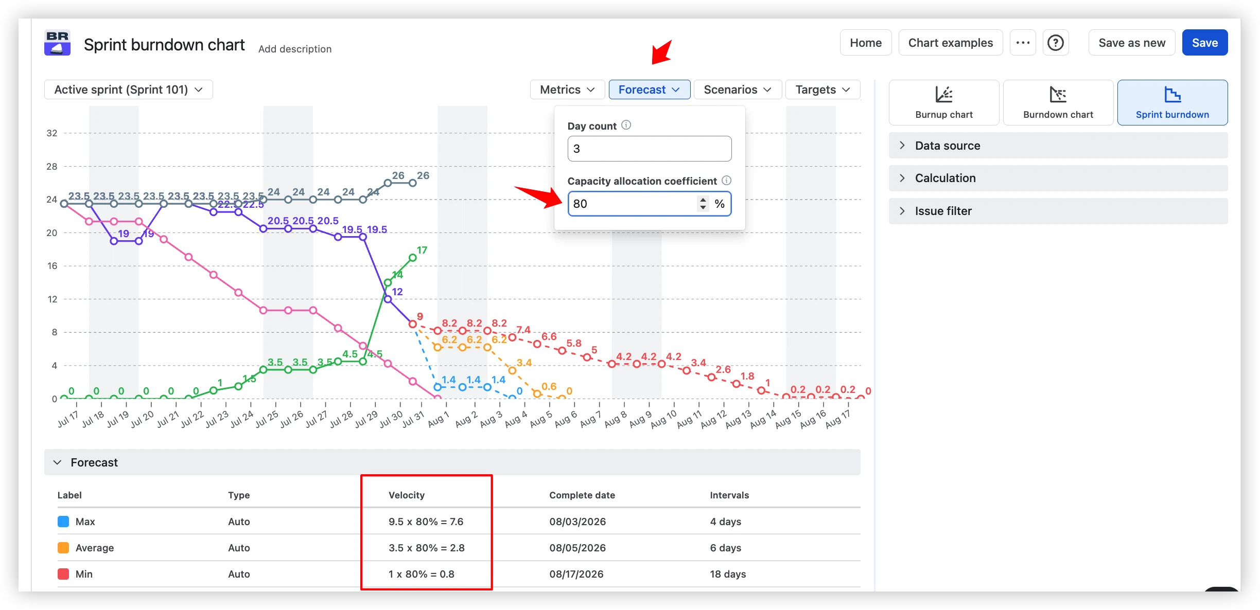
Native Jira's Guideline assumes 100% team capacity and gives you no knobs to turn. Agile Burnup Burndown Charts gives you:
Capacity allocation coefficient. Real teams split time between sprint work, support, and tech debt. Set a coefficient – say 80% – and every forecast scenario adjusts accordingly.
Only the Remaining line → real progress tracking
Native: The chart shows one line – Remaining Values. If the product manager adds 25 story points and the team completes 20, remaining drops by 5 and the chart quietly hides both moves. No Completed line, no Total-work line, no health indicators.
Agile Burnup Burndown Charts: Four lines on the same chart – Ideal Burndown, Completed, Remaining, and Total work – so burn pace and scope change are visible simultaneously. Health tiles above the chart surface the numbers that native's single line quietly buries:
- Completed – percentage of the sprint's scope that's been delivered
- Scope change – how much work was added or removed, with a per-sprint average
- Not estimated – how many issues lack estimates (and skew the chart)

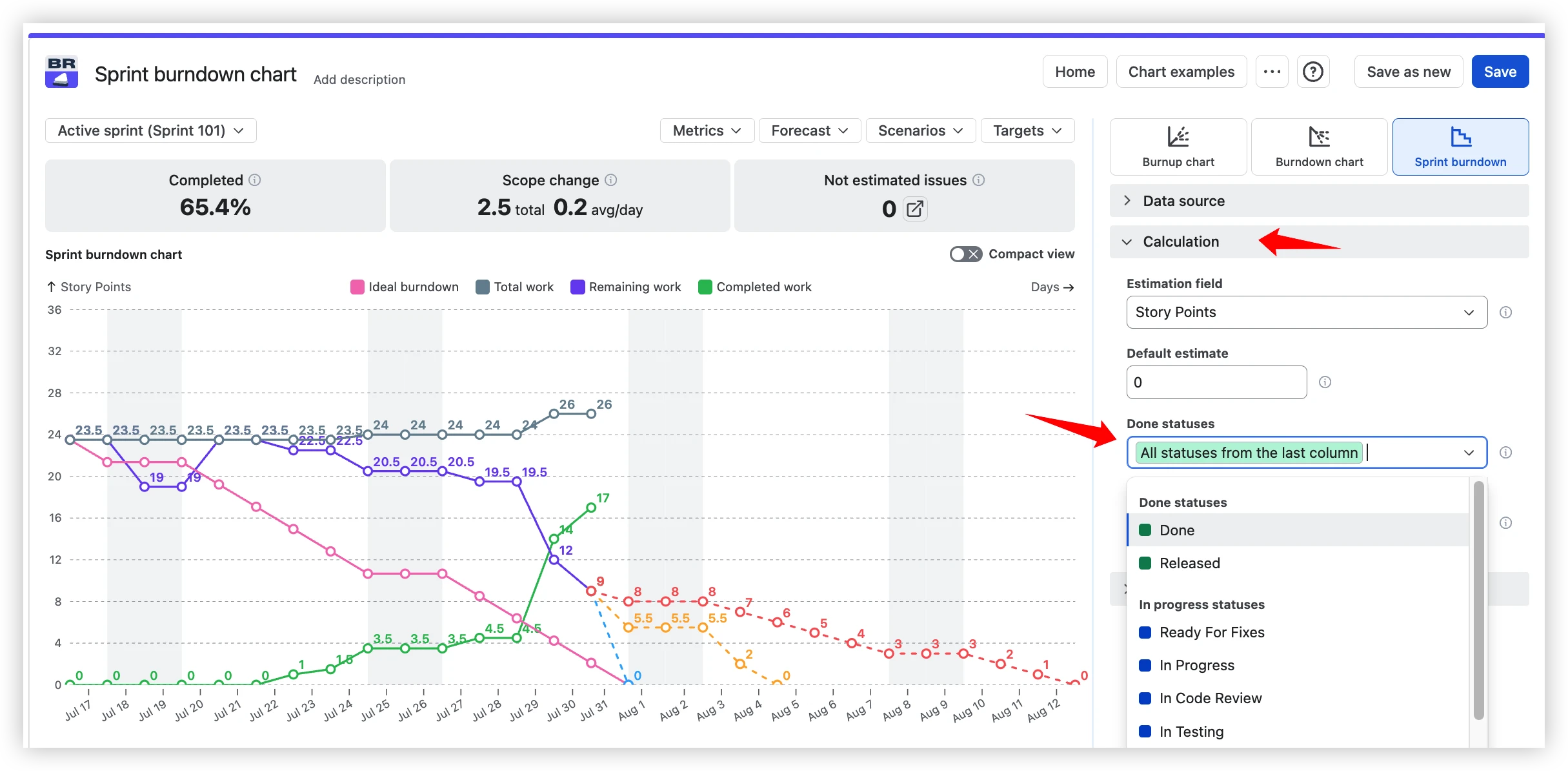
Locked Done definition → configurable statuses
Native: An issue counts as "Done" when it reaches the board's rightmost column. If the team considers work delivered at "In Review" or "QA Passed," the burndown stays stuck until every issue reaches that final column.
Agile Burnup Burndown Charts: Configure any statuses as completed work – match how your team actually finishes, not how the board happens to be mapped.
Board filter only, subtasks excluded → flexible issue filter
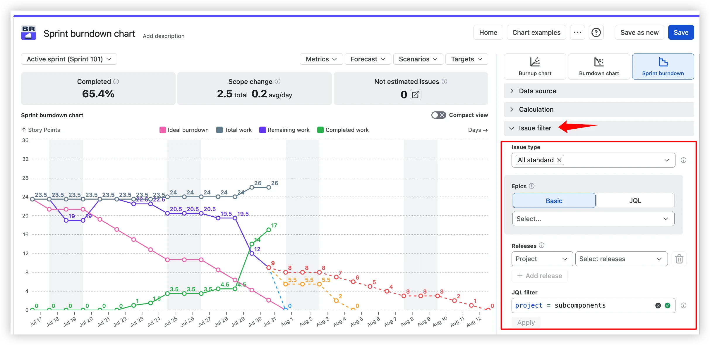
Native: The chart shows only issues matching the board's saved filter. Subtask story points are excluded even when subtasks carry estimates – Atlassian's docs confirm: "Story Points on subtasks are not included."
Agile Burnup Burndown Charts: Filter by issue types , by specific epics, releases across projects, or custom JQL for full expressiveness.
Native Jira Burndown Chart + Sprint Report vs Agile Burnup Burndown Charts
.webp)
Do you need more than native?
If you answer yes to any of these, the native sprint burndown cannot help:
- Do you need to know whether the sprint will land – with a real velocity-based probability?
- Do you need sprint burndown data on a Jira dashboard or in a Confluence retro page?
- Do you need subtask estimates reflected in the sprint burndown?
- Do you need to configure which statuses count as "Done" for the sprint chart?
Why not other alternatives?
Tempo's Custom Charts can render a burndown by time but has no Monte Carlo – you see the trend, not the probability. eazyBI models burndown via MDX queries, but the setup overhead puts it closer to a BI platform than a chart app. StonikByte's Great Gadgets covers sprint burndown with JQL but stops at Yesterday's Weather forecasting. Agile Burnup Burndown Charts sits in the middle: purpose-built for agile charting, with forecasting, and scope flexibility out of the box.



Agile Reports and Gadgets bundle
The app is part of Agile Reports and Gadgets – nine agile charts (velocity, cycle time, cumulative flow, and more) in a single Marketplace install. If your team needs reporting beyond burndown, the bundle covers the full set.
How to set up your first sprint burndown chart
Set up your first sprint burndown in under 5 minutes – install free →
- Install Agile Burnup Burndown Charts from Atlassian Marketplace – free for up to 10 users.
- Open the app from any board or project: Apps → Agile Burnup Burndown Charts.
- Pick your scope – a Scrum board gives you Sprint Burndown; a Kanban board, project, or release gives you Daily Burndown.
- Set the estimation field – story points, issue count, time tracking, or a custom numeric field.
- Customize forecasting – Default shows three velocity lines (Max / Avg / Min); add Monte Carlo for probability spreads.
- Adjust capacity if the team isn't 100% allocated to this sprint.
- Configure Done statuses if the team considers work done before the board's final column.
- Put it where the team looks – add as a Jira dashboard gadget or embed in a Confluence retro page via Smart Links.
When native is enough – and when it is not
The native Jira sprint burndown chart does one job well: showing remaining work dropping toward zero on a single Scrum sprint. If your team runs sprints with frozen scope and only needs to glance at whether the line sits above or below the Guideline, it works.
The moment you need to answer harder questions – will we actually finish, what velocity do we need, how does this look outside the Reports tab – native stops. It cannot forecast with real velocity data, include subtask work, filter by issue type, customize the Done definition, or live on a dashboard or in Confluence.
Agile Burnup Burndown Charts turns the sprint burndown into a forecasting tool: Monte Carlo and four other scenario types replace the Guideline, health tiles surface scope creep and unestimated work, and the chart lives on dashboards and in Confluence – not locked to the Reports tab.




.png)