

Native Jira's project reporting lives inside each project's Reports tab, with a fixed set of reports that can't be scoped beyond one board and can't be pulled together into a project-level dashboard. Broken Build's Agile Reports and Gadgets lets you build a real project dashboard - or a cross-project portfolio view - with consistent metrics, drill-down to the specific tickets, and interactive embeds inside your Confluence project pages.
When teams talk about Jira project reporting, they usually mean one of two things. Sometimes they mean a native report from the Reports tab. Sometimes they mean a Jira dashboard with gadgets and saved filters. Both can help, but they solve different problems.
The gap appears when a team needs one project dashboard that combines progress, forecast, flow, WIP, throughput, and the tickets behind the numbers.
What Jira project reporting means
Jira has more than one way to report on work. Atlassian documents native reports as report pages generated from Jira Software, and it documents Jira dashboards as pages built from gadgets. See Atlassian's guides on generating a report and reports and dashboards.
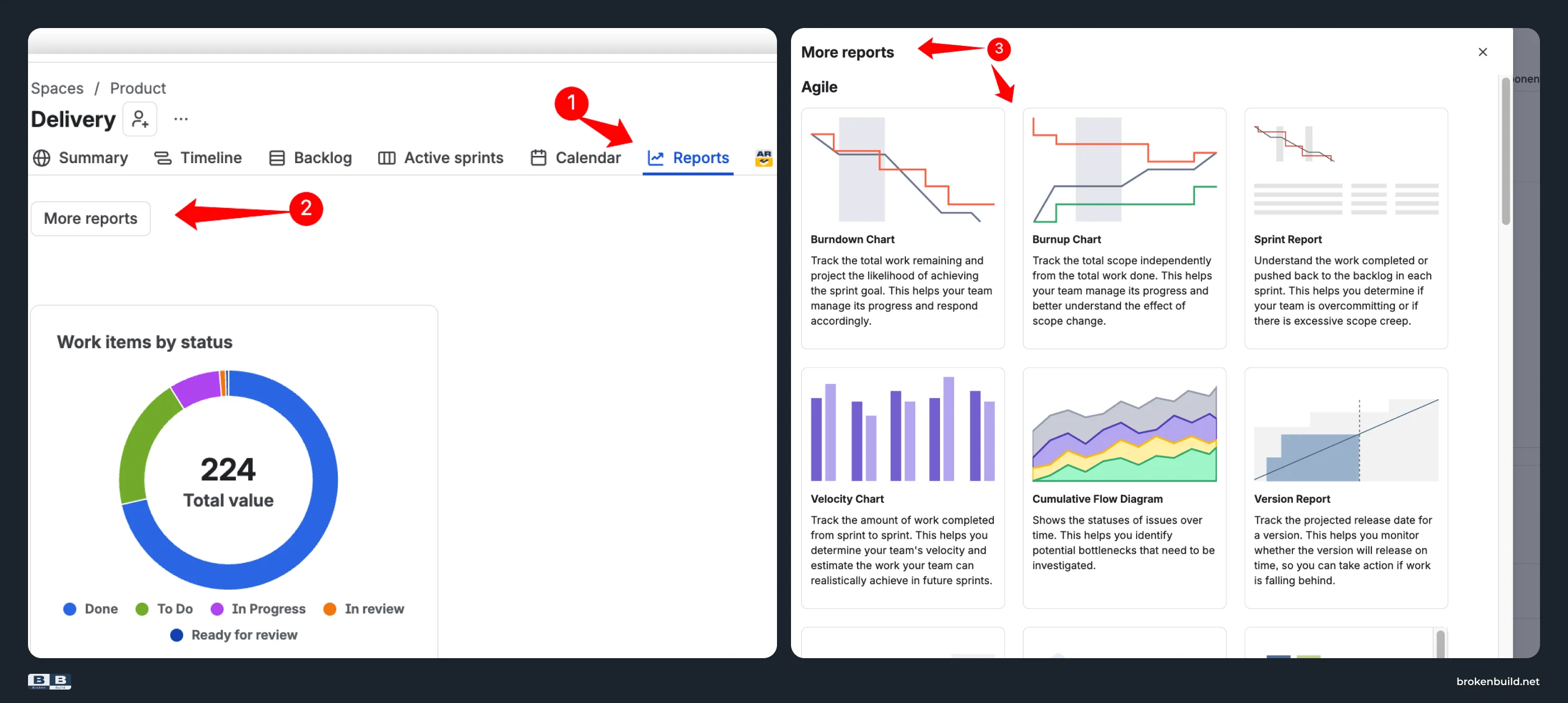
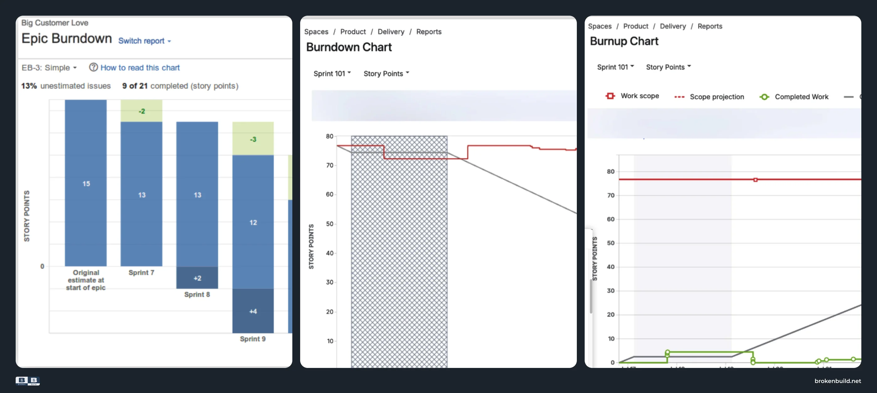
For project reporting, the native starting point is usually the Reports tab. This is where Jira Software exposes report pages such as Epic Report, Version Report, Burnup Chart, Release Burndown, Burndown Chart, Control Chart, Resolution Time Report, and other report-specific views. These reports are useful when the question is narrow: one epic, one release, one sprint, one board, or one issue-statistic view.
Jira dashboards are useful for a different job. A dashboard can show gadgets backed by saved filters. That may be enough for lightweight monitoring, issue lists, assignments, or status summaries. But it is not the same as taking native Reports tab charts and turning them into one project dashboard.
The problem starts when teams need more than visibility. A real project reporting dashboard needs consistent scope, comparable metrics, forecasting, drill-down, and a place stakeholders can read without asking for a manual update.
How native Jira project reports work
A native Jira project report usually starts inside a project or board:
- Open the project or Scrum/Kanban board.
- Go to Reports.
- Select the report that matches the question.
- Choose the available report-specific scope, such as an epic, version, sprint, release, or board.
- Read the chart or work item table in that context.
The broader point is that native project reporting is a set of fixed, report-specific views. Epic Report, Version Report, Burnup Chart, and Release Burndown each answer useful questions, but they do not become one project-level dashboard by themselves.
That is the reporting break point. When the conversation moves from "what does this one report say?" to "is this project healthy across delivery pace, scope movement, forecast risk, cycle time, WIP aging, and throughput?", the team needs a fuller dashboard.
Native reports versus Jira dashboards
Use the Reports tab when the team needs a native answer to a specific Jira question:
- How is this epic progressing?
- What did this sprint burn down?
- What does this version look like?
- How are work items moving through the board?
Use Jira dashboards when the team needs a shared view:
- A project status page for stakeholders.
- A dashboard that combines gadgets or filter-backed views.
- A filter-backed view across more than one project.
- A place for managers or coaches to check lightweight status without opening separate report pages.
Jira dashboards are a valid answer for basic visibility. A saved filter plus a few gadgets can be enough for work item counts, assignments, resolution trends, filter results, or a lightweight project overview.
Atlassian's dashboard gadget documentation documents dashboards as gadget-based pages. That distinction matters: Jira dashboards can support visibility, but they are separate from native Reports tab charts.
The limitation is not that dashboards are useless. The limitation is that a dashboard page does not automatically normalize project reporting. If each project has different board filters, statuses, estimation fields, project types, and definitions of Done, the page can still compare unlike things.
If you came here looking for Jira project management reports, this is the practical distinction: native Jira can give you fixed reports and basic visibility dashboards. A project reporting dashboard needs agreed definitions for pace, forecast, flow, WIP, throughput, and health before the numbers are worth comparing.
What a good project reporting dashboard should answer
A good Jira project reporting dashboard should tell a coherent story, not collect every possible gadget. The useful starting point is the audience and the decision: what does this group need to know before the next project conversation?
The repeated customer questions point to the same need: users do not only want a chart. They want a project-status system that can answer "how do I report across projects?", "what is the difference between reports and dashboards?", and "can stakeholders see the project view outside Jira?"
For an Agile coach, the core questions are:
- Are we delivering at the expected pace?
- Is the scope stable, growing, or shrinking?
- Is the likely completion date still defensible?
- Where is work slowing down?
- Is WIP aging into risk?
- Is throughput stable enough to plan from?
- Can we explain the status through the actual tickets behind the metric?
- Can stakeholders see the same view without asking the team for a manual update?
That is the difference between a report page and a project reporting dashboard. A report page answers one metric question. A dashboard helps the team decide what to do next.
Where the native Reports tab falls short - and what to use instead
Native Jira project reporting covers fixed report pages for specific questions. Beyond that, the Reports tab starts to strain.
Each comparison below follows the same pattern: what the native Reports tab can show, then what a project dashboard needs when the question gets broader. The point is not that every team needs all of this on day one; it is to show when a useful Jira report stops being enough for project reporting.
1️⃣ Separate report pages → real project-level dashboards
Native: The Reports tab gives separate report pages. That works when one report answers the question, but it does not give the team one project dashboard that combines delivery pace, release forecast, cycle time, WIP aging, throughput, and health indicators.
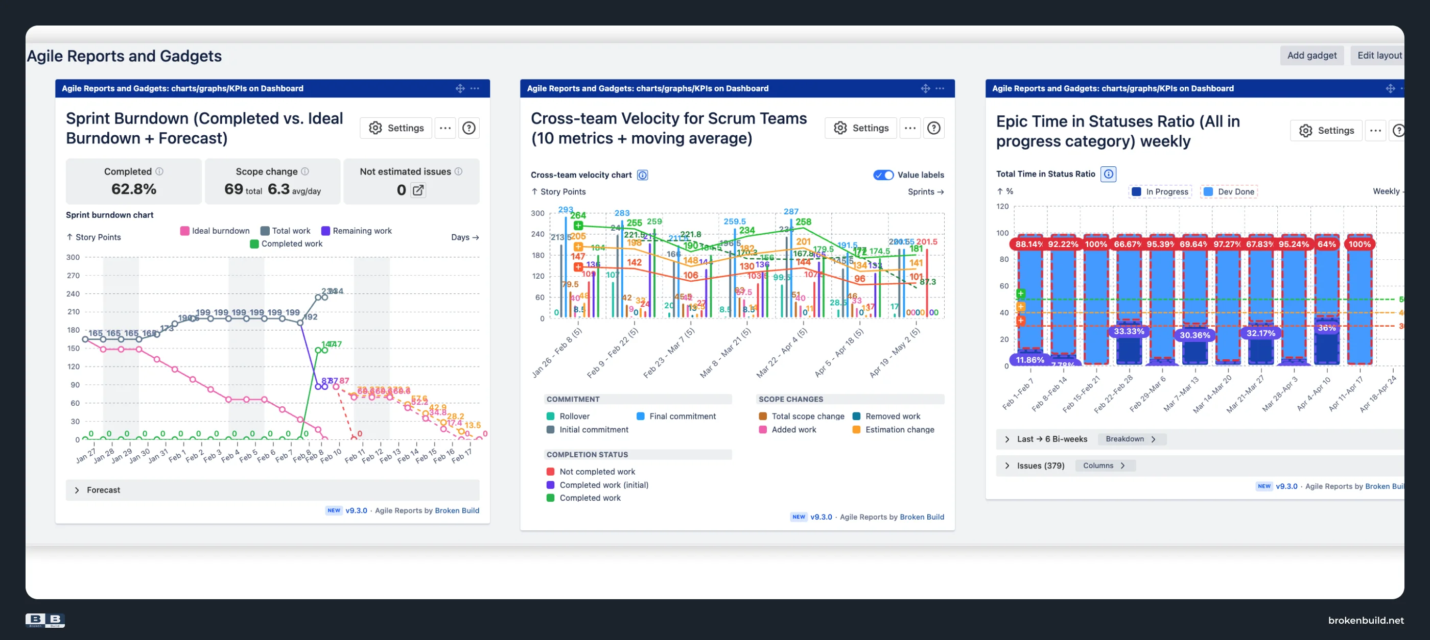
Agile Reports and Gadgets: Build a real project dashboard from consistent chart views. Velocity shows pace. Burnup Burndown and Monte Carlo support forecasting. Cycle Time and WIP expose flow risk. Throughput shows delivery stability. The point is not to demo six charts; it is to put the project status story on one page.
2️⃣ One-board context → cross-project and portfolio rollups
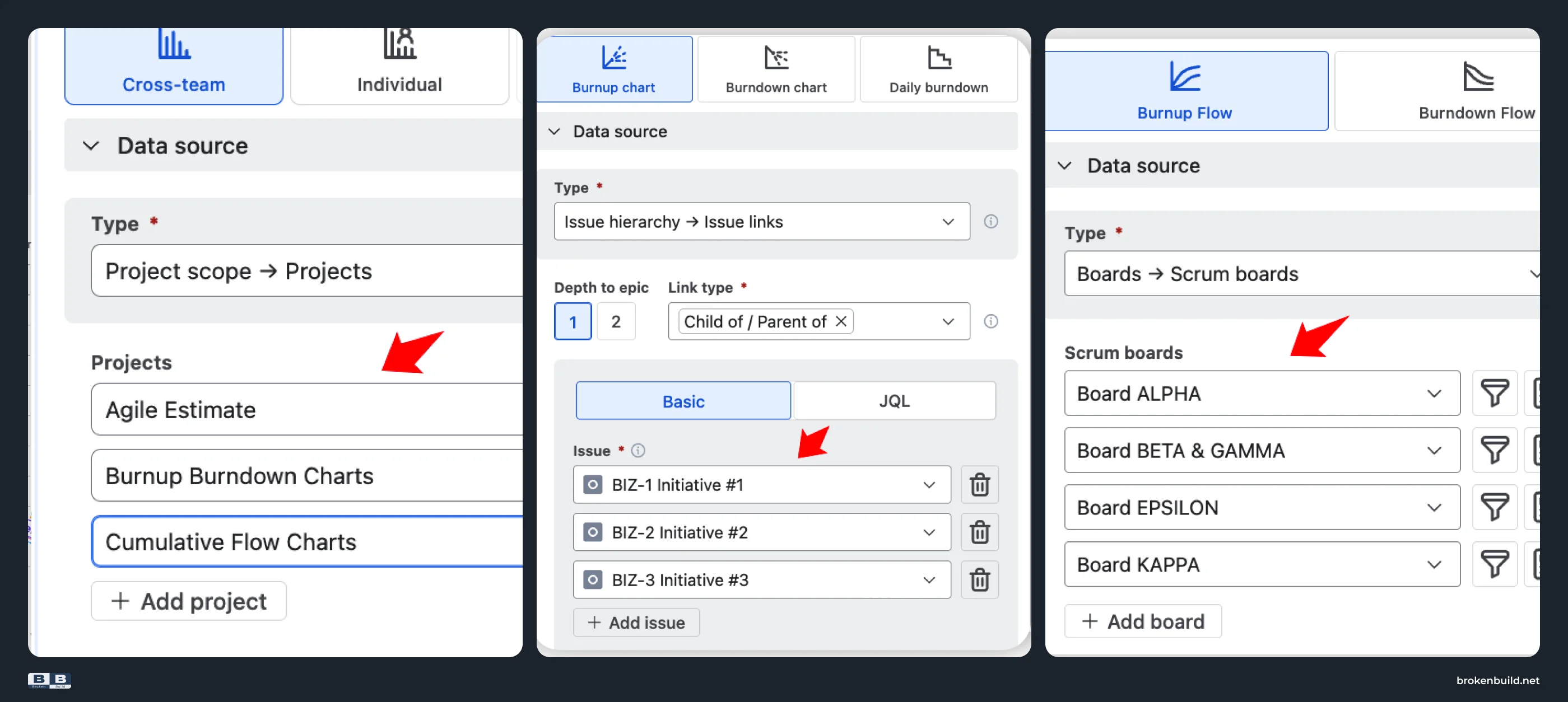
Native: Native reports are tied to their report context: one board, project, sprint, release, epic, or saved filter depending on the report. Jira dashboards and filters can create some visibility across projects, but that is a separate setup from the Reports tab.
Agile Reports and Gadgets: Use project and JQL scopes to build multi-project reporting for a program, portfolio, or value stream. The relevant question becomes: can the report roll up the work stakeholders actually need to see without forcing every team into a separate report page?
3️⃣ Same screen, different definitions → consistent metrics across projects
Native: The Reports tab uses the definitions and configuration of each project or board. A Jira dashboard can put several views on one page, but cross-project comparison is only meaningful if the underlying definitions are comparable. If teams use different Done statuses, estimation fields, filters, or time windows, the page can look tidy while comparing different things.
Agile Reports and Gadgets: Use shared chart configuration for data source, calculation settings, issue filters, time frame, grouping, estimation, and visualization. This turns the dashboard into one reporting layer, not just a collection of charts.
4️⃣ Report-specific forecasts → real project forecasting
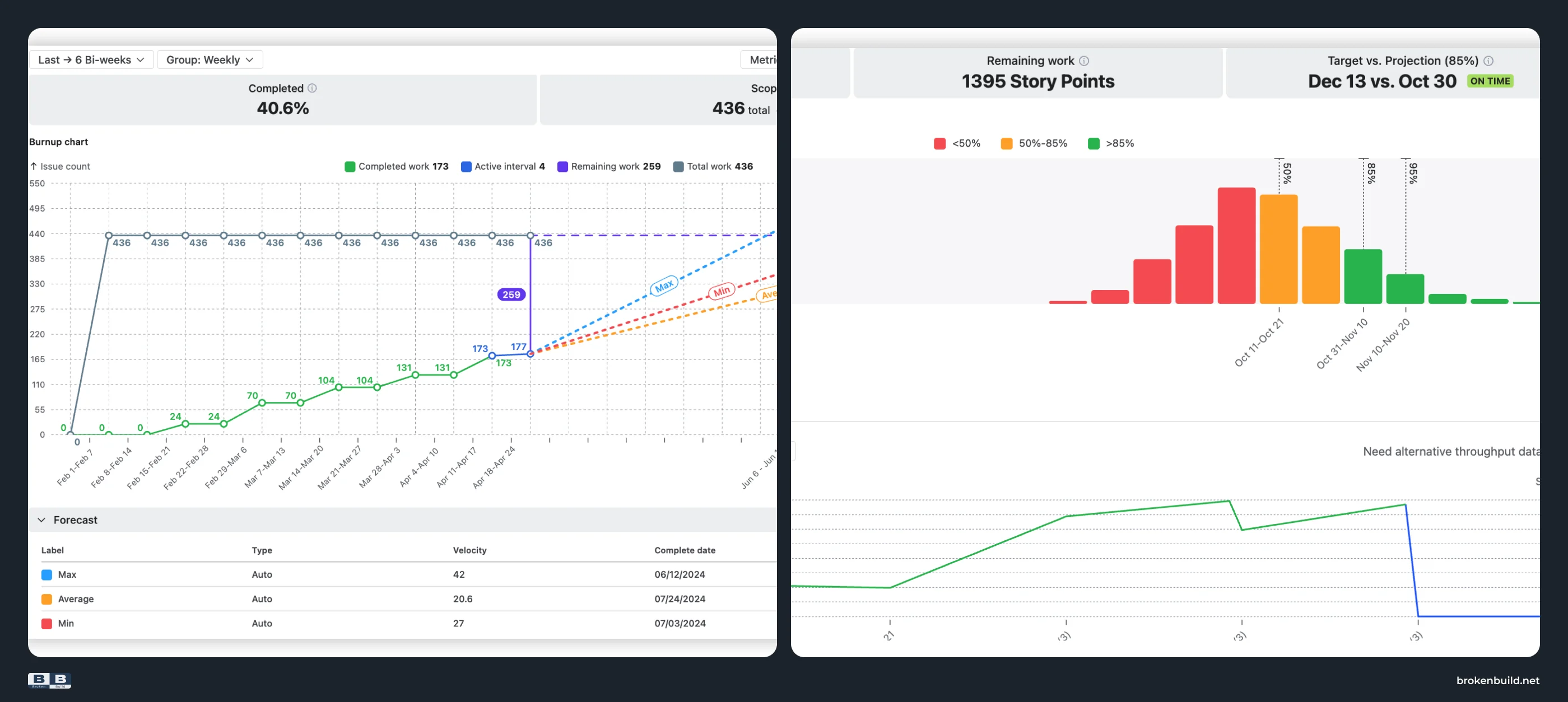
Native: Jira has useful release-, sprint-, and report-specific views, but project reporting needs a forecast that can survive stakeholder questions: what is the expected finish, what confidence do we have, what changed in the scope, and what assumptions are behind the date?
Agile Reports and Gadgets: Burnup Burndown and Monte Carlo support that forecast conversation. Burnup Burndown shows progress and scope movement. Monte Carlo adds probability-based forecasting when a single date is too brittle.
5️⃣ Summary outputs → project health metrics
Native: Native report pages show report outputs. They do not operate as a project health layer that surfaces the signals a coach or delivery lead checks before a status conversation.
Agile Reports and Gadgets: Use health metrics such as completed percentage, scope change, WIP, arrival and departure rates, unestimated work, low throughput, stalled items, and WIP variance. If scope change is high, talk about intake. If WIP is aging, talk about flow. If throughput is unstable, talk about predictability. The value is not the tile itself; it is the decision the tile makes easier.
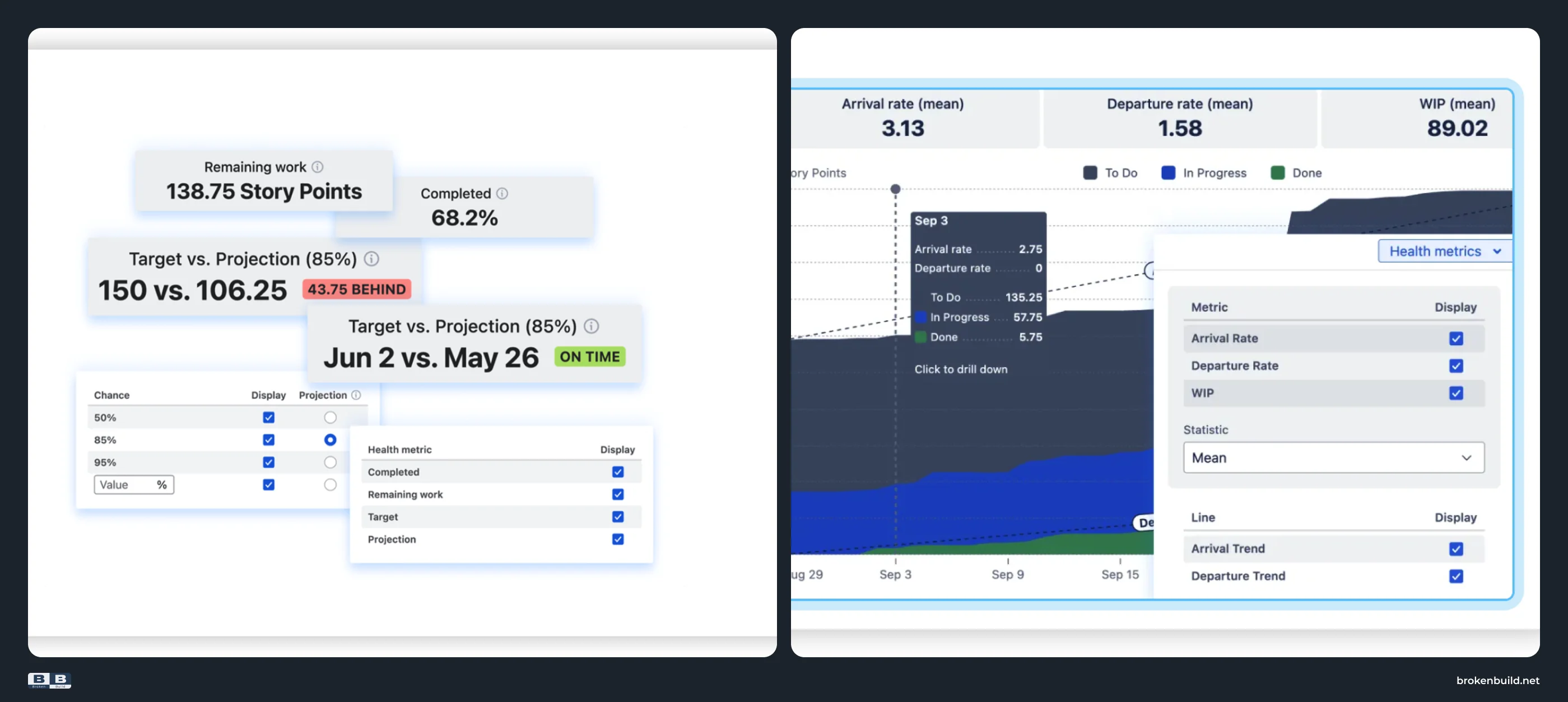
6️⃣ Status without cause → drill-down that answers why
Native: A project status like "scope grew" or "WIP is aging" is not actionable until the team can see the tickets behind it. Native report pages are limited as a drill-down system for explaining the cause behind a project change.
Agile Reports and Gadgets: Breakdown and Issue list let the same chart move from a metric to the Jira work items that caused it. If a Burnup shows scope growth, Breakdown and Issue list can show which issues were added and how they group by epic, project, issue type, status, or another Jira field.
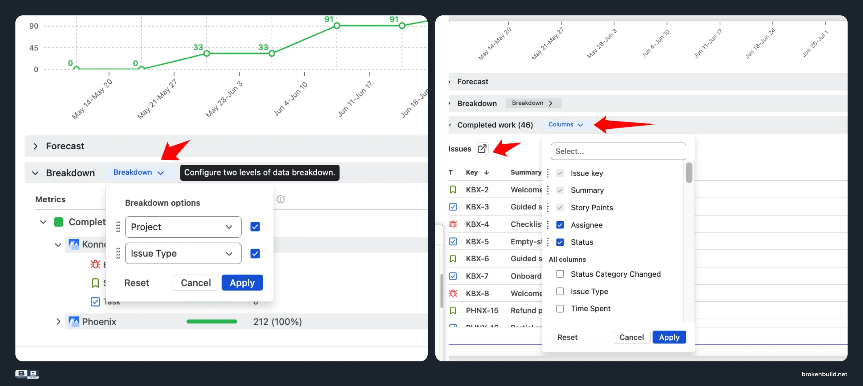
7️⃣ Locked axes → flexible scope, estimation, time frame, grouping, and issue filters
Native: Project reporting rarely stays in one tidy shape. One audience wants issue count. Another wants story points. One project needs a release view. Another needs a custom JQL scope. One dashboard needs grouping by project; another needs grouping by epic, issue type, status, or assignee. Native reports lock many of those choices to the report and board/project context.
Agile Reports and Gadgets: Configure scope, estimation, time frame, grouping, and issue filters across the project-reporting views. That is why the same product can support a Scrum team, a Kanban team, or a mixed program without turning every report into a new one-off setup.
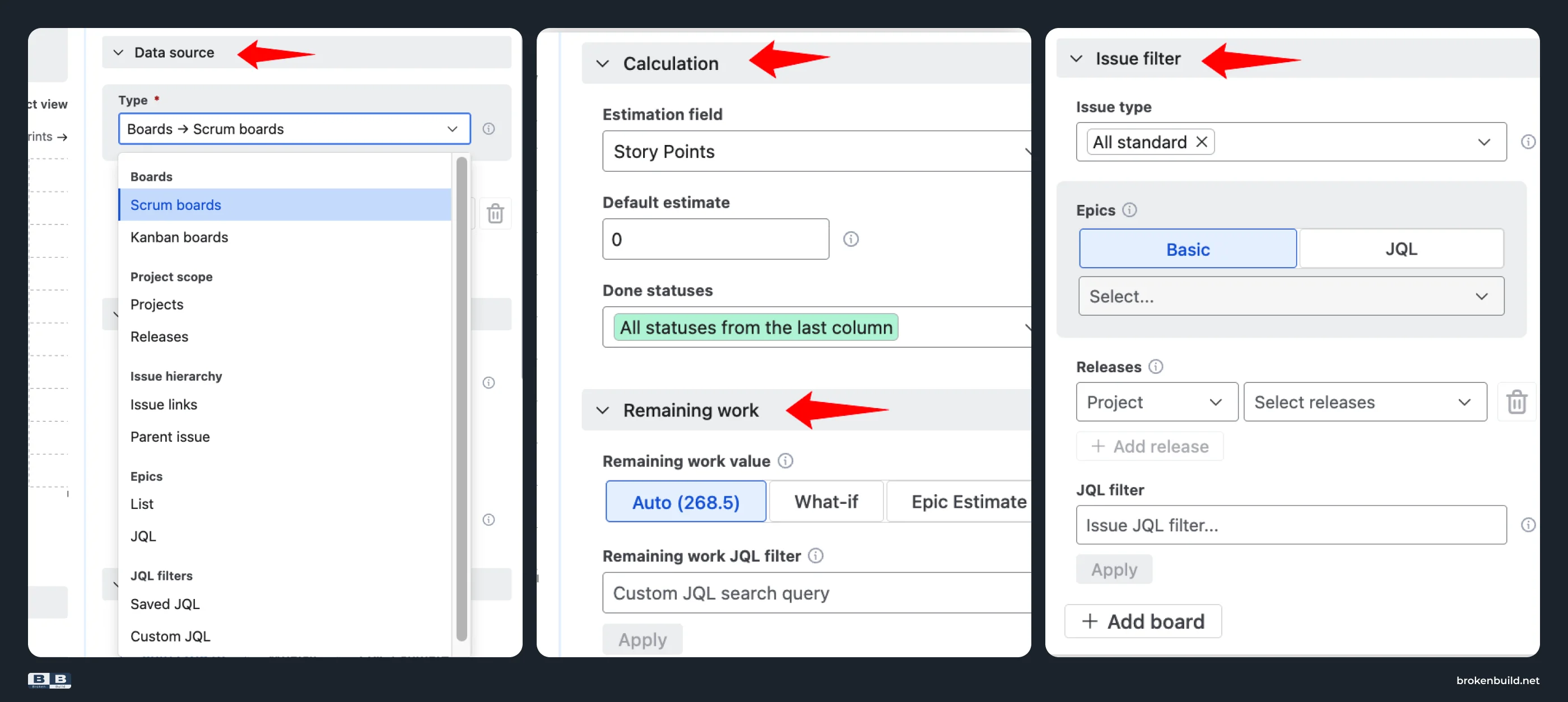
8️⃣ Reports trapped in Jira → live Confluence project pages
Native: Project reporting is often read by stakeholders in Confluence, not by delivery teams inside Jira. If the project page becomes a pasted screenshot or a manually copied status table, it loses freshness and interactivity.
Agile Reports and Gadgets: Embed charts into Confluence through Smart Links, so the project page stays connected to the dashboard instead of becoming a static screenshot.
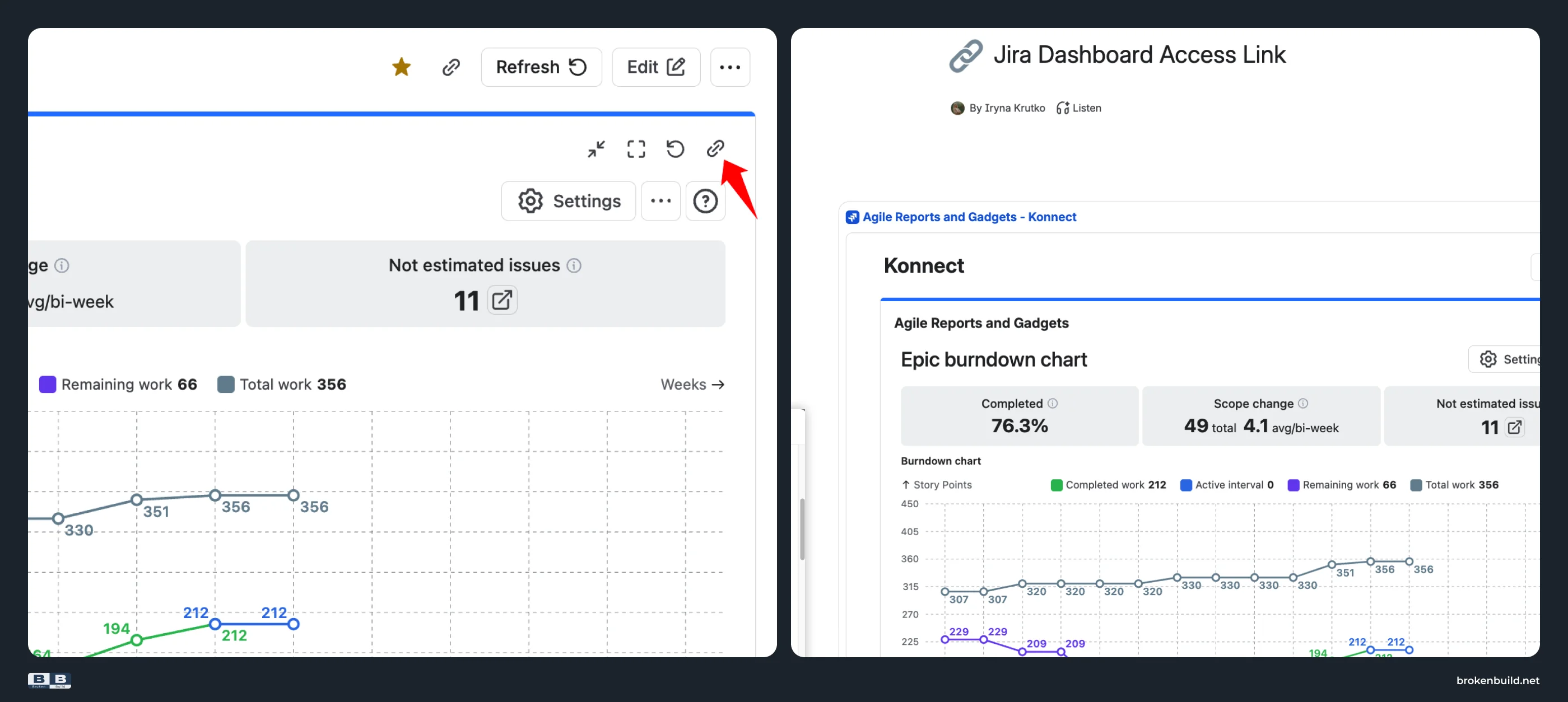
9️⃣ Mixed project types → one reporting layer
Native: Mixed Jira environments often include company-managed and team-managed projects. If the reporting approach only works for one project type or one board setup, the organization gets fragmented reporting.
Agile Reports and Gadgets: Use one consistent reporting layer across company-managed and team-managed project types.
Native Jira versus Agile Reports and Gadgets at glance
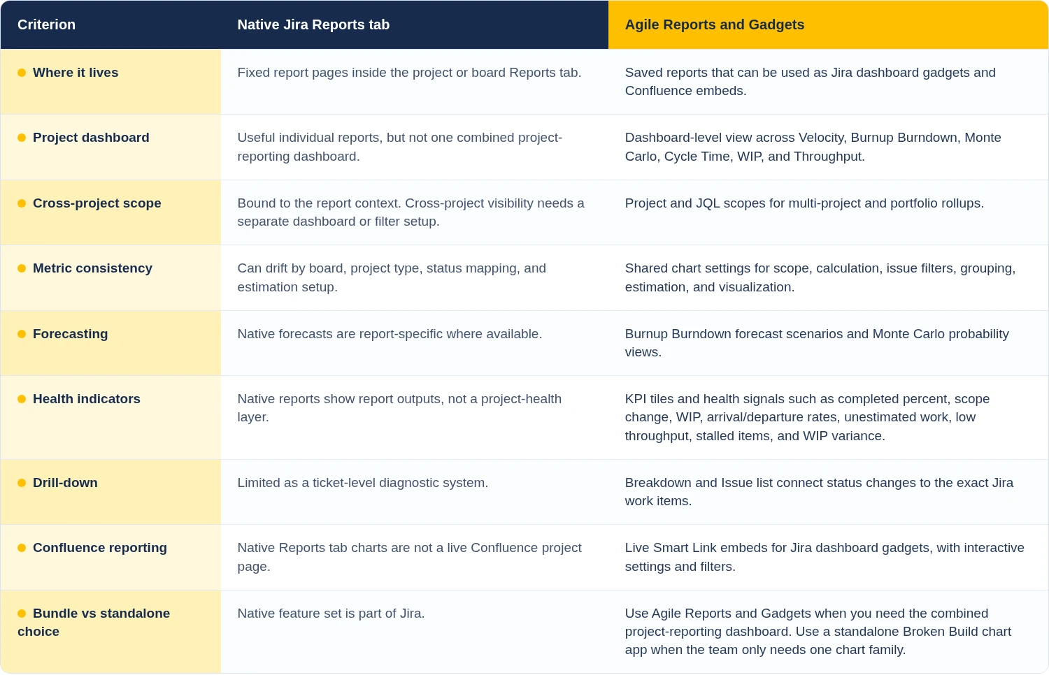
Try the interactive examples
See Agile Reports and Gadgets on live datasets before installing anything. Each example opens as an interactive chart, so you can test the reporting pattern instead of only reading about it.
- Release burnup chart - track project or release progress, scope movement, and forecast scenarios.
- Cross-team burnup chart - roll up work across multiple boards or teams.
- Team velocity chart - compare delivery pace and completed work over time.
- Cycle time chart - see how long work takes and where flow slows down.
- WIP aging chart - find work that is getting stuck before it becomes a delivery risk.
- Throughput run chart - track completed work trends and delivery stability.


Playbook: turn separate Jira reports into a project dashboard
Use any native report as the starting point: Epic Report, Version Report, Burnup Chart, Release Burndown, or another report that matches the project question. Jira Epic Report is a useful example when the project conversation is organized around one epic, but the workflow below is about project reporting as a whole.
Step 1: read the native report
Open the project or board, go to Reports, and choose the native report that answers the immediate question. If the question is epic progress, use Jira Epic Report. If the question is release progress, use a version or burnup/burndown report. This is a fair native starting point: one report, one context, one useful question.
Step 2: name the larger project questions
Before adding tools, write the questions the report does not answer on its own:
- Is the whole project still predictable?
- Is scope changing faster than the team is finishing work?
- Is WIP aging in a way that creates delivery risk?
- Is cycle time improving, stable, or getting worse?
- Is throughput steady enough to use for planning?
- Can stakeholders see this without waiting for a manually prepared update?
Step 3: rebuild the view in Agile Reports and Gadgets
In Agile Reports and Gadgets, build the project dashboard around the reporting questions rather than around one chart type.
Add a Burnup Burndown chart for scope movement and expected completion. Add Monte Carlo when the conversation needs probability instead of a single forecast. Add Velocity to ground the pace conversation. Add Cycle Time and WIP to show where work is waiting or aging. Add Throughput to show whether delivery output is stable enough to trust as a planning input.
Then use shared settings deliberately: project or JQL scope, issue filters, estimation field, Done definition, time frame, and grouping. This is where a dashboard becomes more than a set of visuals. It becomes a consistent way to read several projects.
Step 4: add drill-down before the review meeting
Do not stop at the chart. Open Breakdown and Issue list for the metric that will create the hardest conversation. If scope grew, identify the tickets that were added. If WIP aged, identify which work items are stuck and where. If throughput changed, check whether the change is concentrated in one project, issue type, status, or assignee.
That is the coaching move: the report stops being a scorecard and becomes a way to choose the next intervention.
Step 5: put the live view where stakeholders already read
If the project update lives in Confluence, embed the relevant Agile Reports and Gadgets charts through Smart Links. Keep the view live and interactive instead of pasting static screenshots into a status page.
→ Follow the playbook in Agile Reports and Gadgets
When native Jira is enough
Stay with native Jira when the reporting need is narrow, and the audience is close to the work.
Native Jira is usually enough when:
- One report answers the question.
- The team is reporting inside one project or board context.
- Stakeholders only need a lightweight visibility page from a dashboard or saved filter.
- Cross-project comparison is not important.
- Forecasting does not need probability, confidence ranges, or scope-growth modeling.
- The team can explain exceptions without chart drill-down.
This is not a maturity test. Simple reporting should stay simple. The upgrade path matters when the reporting conversation becomes broader than one native report.
When you need a Jira Project reporting app
Move beyond native Jira when two or more of these are true:
- You need one project dashboard rather than separate report pages.
- You report across multiple projects, teams, programs, or a portfolio.
- You need consistent metrics across company-managed and team-managed project setups.
- Stakeholders need live project reporting in Confluence.
- Forecasts need confidence, scenarios, or probability.
- Project health needs more than one status number.
- The team needs to drill from a chart into the tickets behind the change.
That is the point where a Jira project tracking dashboard becomes a project-reporting layer. Agile Reports and Gadgets is built for that layer: status, trend, forecast, risk, cause, and next action in one reporting workspace.




.png)