

Agile Burnup Burndown Charts by Broken Build gives you the same epic view with a real forecast, on any board type, on any epic set, with the "Done" definition your team actually uses.
Native Jira's Epic Report is Scrum-only, single-epic-only, and tied to your board's column mapping – "Done" is whatever sits in the rightmost column, whether or not that matches how your team really finishes work. It shows total and completed story points (or issue count) over time, but it has no forecast, no drill-down beyond a "View in Issue Navigator" link, and no way to look at multiple epics together.
Agile Burnup Burndown Charts by Broken Build (used with epic scope) turns the epic report into a real forecasting and delivery-tracking tool: a full menu of customizable forecasts, real progress tracking, drill-down that answers "why?", and the ability to run all of it on any epic set on any board type, with a "Done" definition you control.
Try Agile Burnup Burndown Charts free | See an interactive epic report example
What is the Jira Epic Report
What is an epic?
An epic is a large body of work that groups multiple stories or tasks under a shared outcome. In Jira, it sits one level above Story in the issue hierarchy. The Scrum Guide does not mention epics; SAFe treats them as investment vehicles with Lean business cases. Most teams use epics to bundle related work and track progress toward a goal.
What the Jira Epic Report shows
The native Epic Report (Board > Reports > Epic Report) displays completed, incomplete, and unestimated work items in a single epic – story points or issue count, toggled in report settings. A chart view plots these over time; a list view is also available.
Three constraints are baked into the report:
- Available only on company-managed Scrum boards. Kanban boards and team-managed projects have no epic-specific reports.
- Shows one epic at a time. No multi-epic view, no cross-project rollup.
- "Done" equals whatever the board's rightmost column mapping says. Not configurable per report.
How to access the Epic Report
- Open a company-managed Scrum project.
- Go to the board, then the Reports tab.

- Select "Epic Report" from the report list.

- Pick an epic from the dropdown.

If the epic is not in the dropdown, it is either completed (hidden by design), has no child issues on this board, or the project is team-managed (the report does not exist there).
You opened the Epic Report, saw 252 completed story points out of 334, shared the screenshot in Slack, and your PM replied: "But what about the other two epics? When will all three be done? And which of these 252 'done' points are actually done – and which are still in Code Review?"
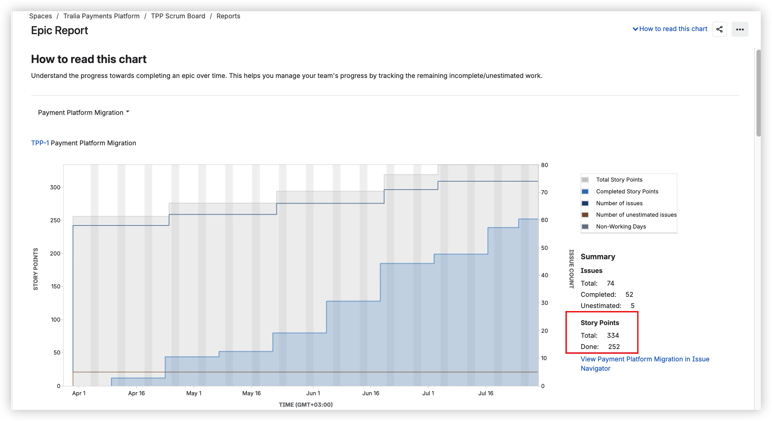
Three questions. The Epic Report cannot answer any of them – because it was never designed to.
What it can't do – and what can
Each section below pairs a native limitation with what Agile Burnup Burndown Charts does instead.
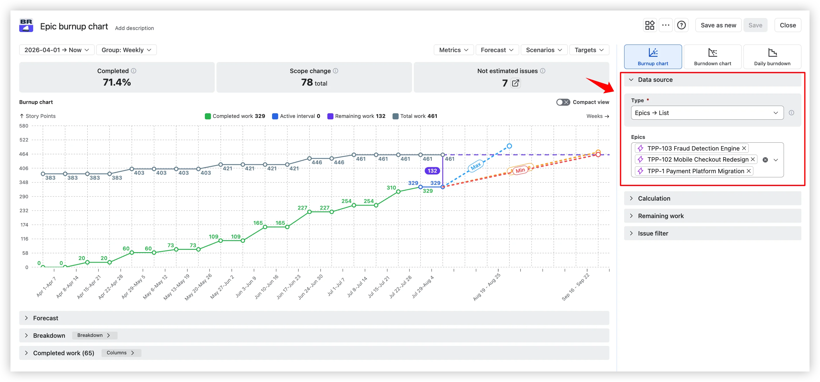
Scrum-only, single-epic, company-managed → any board, any epic set
Native: The Epic Report exists only on company-managed Scrum boards. Kanban boards have no epic reports. Team-managed projects have no epic reports. The dropdown shows one epic at a time; cross-project epics are invisible. Only in-progress epics appear – completed epics are hidden from the dropdown, making retrospective analysis impossible.
Cross-project epic tracking and Kanban epic reporting are among the most discussed gaps in the Atlassian Community.
Agile Burnup Burndown Charts: Any combination of epics across Scrum boards, Kanban boards, projects, releases, initiatives, saved filters, and custom JQL. Team-managed and company-managed both supported. Multi-epic rollups work without workarounds. Any epic is visible regardless of status – including completed ones.
All issues at once → flexible issue filter
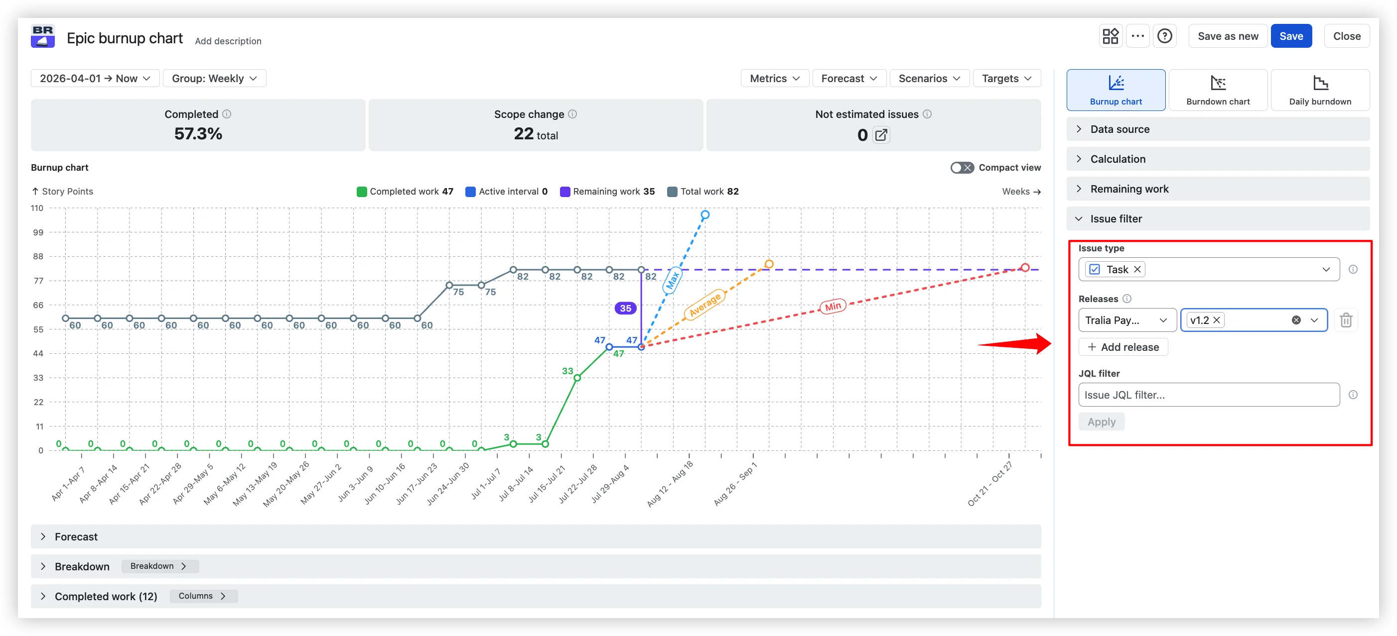
Native: The Epic Report shows every issue in the epic. No way to filter by issue type, component, or label within the report. If you need to see only bugs or only stories linked to a specific release – you can't.
Agile Burnup Burndown Charts: Filter chart scope by issue types, epics, releases, or custom JQL. Focus on the slice of work that matters for your question without creating a separate chart.
"Done" = rightmost column → configurable Done
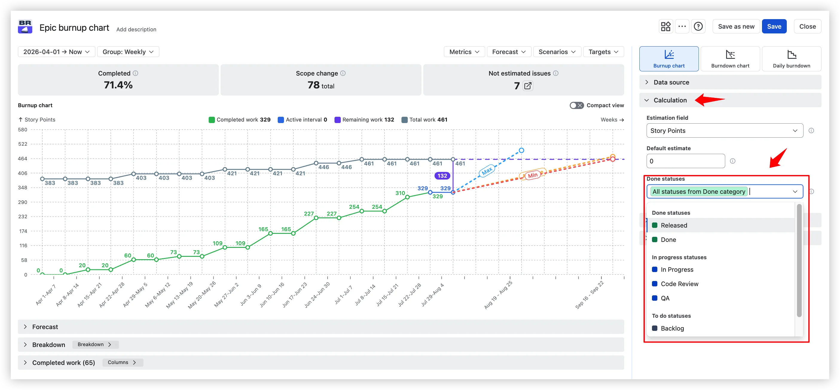
Native: "Done" is whatever the board's rightmost column mapping says. If "Code Review" or "QA" shares that mapping group, the report counts those issues as done.
Agile Burnup Burndown Charts: Configure any statuses as completed work – per-board for Scrum, custom from-to columns for Kanban, global custom statuses for other data sources. Your definition, not the board's.
No forecast → velocity scenarios + Monte Carlo
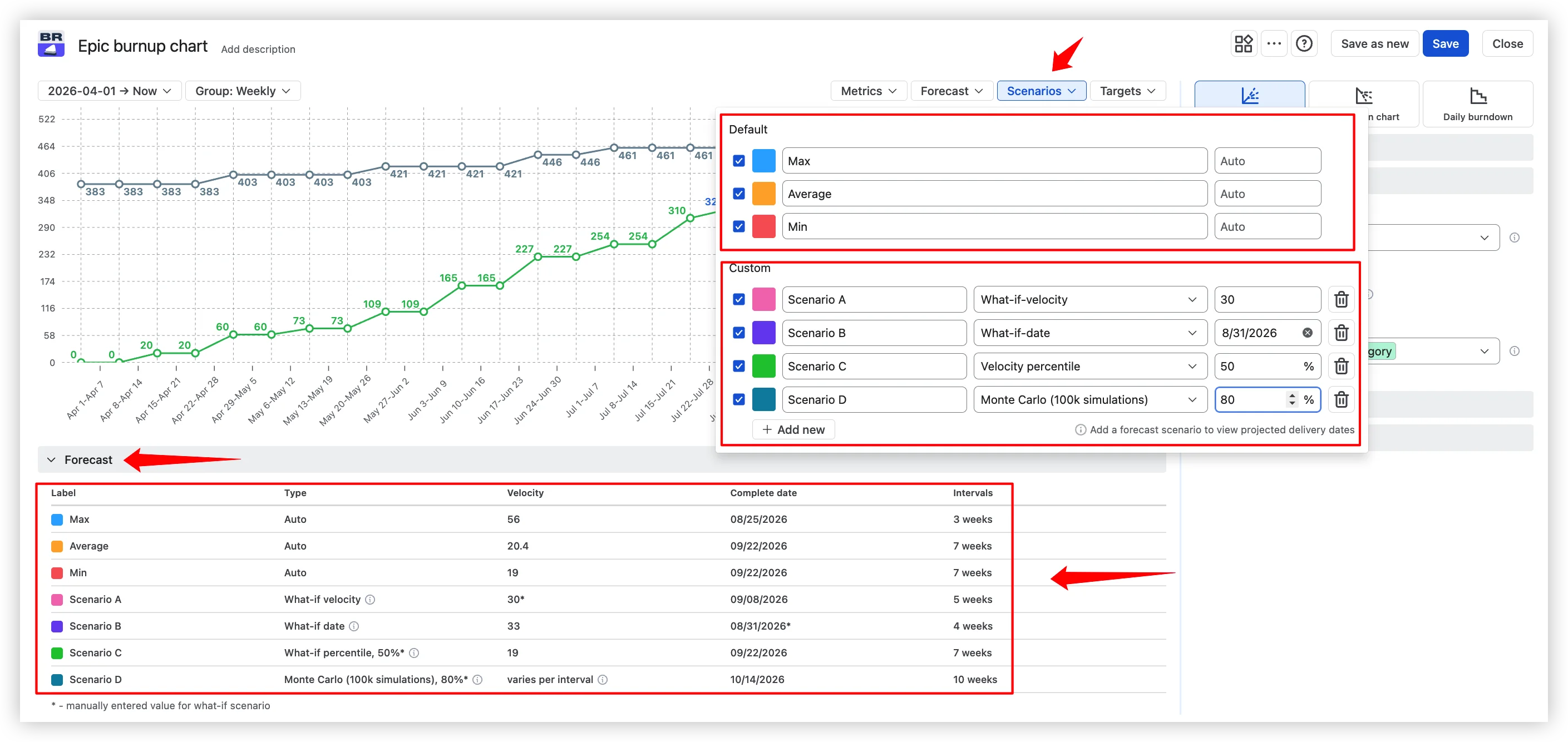
Native: The Epic Report has no forecasting. It shows where you are – not when you'll be done.
As Daniel Vacanti writes in Actionable Agile Metrics for Predictability: "Valid predictions require a date range and arguably a probability." SAFe documentation uses burnup with forecasting for epic tracking. Monte Carlo provides a probability distribution rather than a single-point estimate, enabling teams to make risk-informed decisions instead of betting on a single number.
Agile Burnup Burndown Charts: Three default velocity scenarios (Max / Average / Min) plus what-if scenarios: target date, target velocity, velocity percentile, and Monte Carlo simulation with configurable P50, P80, and P95 probability levels. Every forecast input is yours to configure – sprint count, sprint length, forecast start date, expected scope growth.
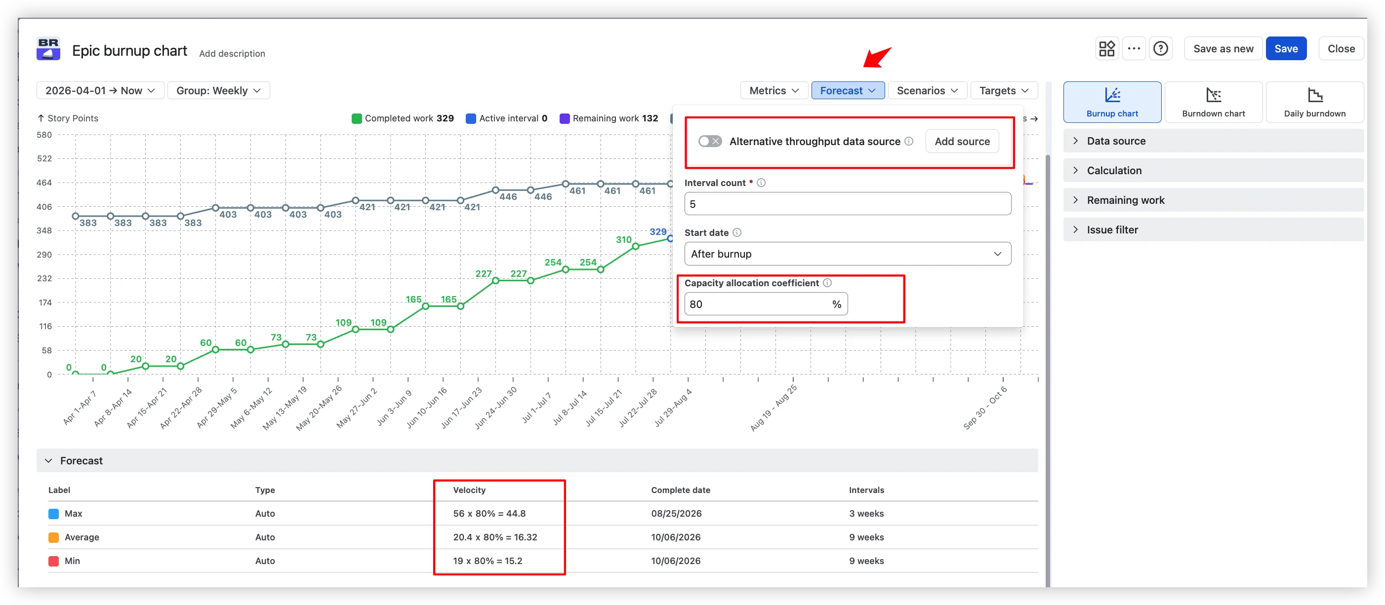
Capacity allocation coefficient for teams splitting time across epics. Alternative throughput data from a different board, project, or JQL – so a brand-new epic gets a forecast on day one.
Static snapshot → real progress tracking
Native: The Epic Report shows a snapshot of completed vs incomplete work – no burnup view, no scope change history, no way to tell whether a delay comes from slow delivery or scope growth. SAFe documentation explicitly uses burnup for epic tracking because it makes this distinction visible.
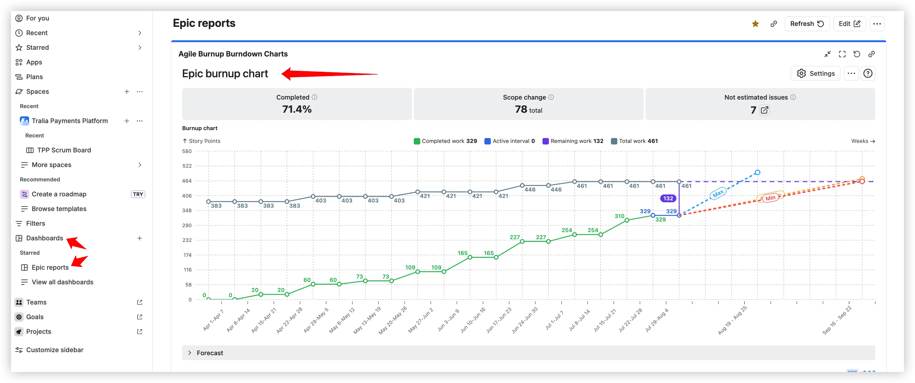
Agile Burnup Burndown Charts: Burnup view with separate Completed, Total, and Remaining lines – so you see at a glance whether a delay comes from slow delivery or scope growth. Scope change traceability shows exactly which issues were added or removed. Health tiles display completion percentage, scope change count, and not estimated issues. Target date lines compare forecast scenarios against milestones.

Trapped in Reports tab → dashboard, Confluence, export
Native: The Epic Report is located under Board > Reports. It cannot be placed on a Jira dashboard, embedded in Confluence, or exported. Showing epic progress on a dashboard is one of the most requested features in the Atlassian Community – and there is no native solution.
Agile Burnup Burndown Charts: Dashboard gadget (Add gadget > Agile Burnup Burndown Charts). Confluence embedding via Smart Links – interactive, with in-page filter editing. CSV, PNG, and PDF export for status decks.
No drill-down → breakdown by any Jira field
Native: One action available: "View in Issue Navigator." No breakdown by assignee, issue type, or component. You know the epic is behind, but you cannot see why.

Agile Burnup Burndown Charts: Click any sprint or interval to open Breakdown by any Jira field, up to two nesting levels – see which assignee, issue type, or sub-epic is dragging the epic or driving scope creep.

Story points or issue count → any estimation unit
Native: The Epic Report toggles between story points and issue count. No other estimation options. No fallback for un-estimated issues.

Agile Burnup Burndown Charts: Story points, Story point estimate, Original estimate, Issue count, any custom numeric field, Time spent and remaining time.

Board-specific overrides for mixed teams and a default-estimate fallback so un-estimated issues don't silently disappear from your chart.

Try Agile Burnup Burndown Charts free | See it live
Side-by-side comparison

Do you need more than the native report?
If you answer "yes" to two or more of these, the native Epic Report will not cover your needs:
- Do you need to see more than one epic at a time?
- Do you use a Kanban board or team-managed project?
- Do you need a forecast with confidence intervals?
- Do you need epic progress on a dashboard or Confluence page?
- Do you need to know whether a delay is caused by slow delivery or scope growth?
Why not other alternatives?
Several Marketplace apps address subsets of these gaps – dashboard gadgets, analytics platforms, export utilities. In our research, none combined forecasting, scope tracking, configurable Done, capacity allocation, and Confluence embedding in a single purpose-built epic chart.


Set up an epic burnup chart in 5 minutes
- Install Agile Burnup Burndown Charts from the Atlassian Marketplace. Free for up to 10 users; 30-day trial for larger teams.
- Open the chart. From a Jira dashboard: Edit > search "Agile Burnup Burndown Charts" > Add. From a board or backlog: open the actions menu > Agile Burnup Burndown Charts
- Select your epic scope. Pick one or more epics. For cross-project epics: "Add Epic from different projects."
- Choose your estimation unit. Story points, time, issue count, or any custom numeric field.
- Configure Done statuses. The statuses that genuinely mean done for your team.
- Сustomize the forecast. Average velocity, Monte Carlo (P85 is a solid starting point), or a target date line.
- Share it. Dashboard gadget, Confluence Smart Link, or PNG/PDF export.
What this looks like in practice
A delivery lead runs a 6-month epic spanning two Scrum teams and one Kanban team across three projects. The native Epic Report shows only one team's board.
With Agile Burnup Burndown Charts, she adds all three projects' epics to one burnup chart. Done is set to "Released" – not the board's "QA Review" column. Monte Carlo P85 shows 85% probability of completion by August 15, two weeks before the Q3 cutoff. The chart is embedded in Confluence so the steering committee sees live progress without opening Jira. Drill-down reveals one team has 40% of remaining scope but only 15% of throughput. The bottleneck is visible without a single spreadsheet.
Interactive example: Epic burnup chart
What changes when you switch
The native Jira Epic Report was built for one use case: tracking a single epic on a company-managed Scrum board. If that's all you need, it works.
But teams outgrow it. They need multiple epics in one view, a forecast with confidence intervals, a way to tell scope growth from slow delivery, and progress visible on a dashboard or Confluence page – not buried in the Reports tab.
Agile Burnup Burndown Charts fills every one of these native gaps – from forecasting and scope visibility to drill-down, estimation flexibilityф, and Confluence embedding. Several of these capabilities, including team-managed project support, capacity allocation, scope separation, alternative throughput data, scope change traceability, target date comparison, and completed epic reporting, we have not found in any other Marketplace app.




.png)