

Native Jira's Created vs Resolved report only tells you whether tickets close as fast as they open. Broken Build's Agile Created Resolved Charts tell you whether any workflow stage is keeping pace with the one that feeds it – dev vs. triage, QA vs. dev, release vs. QA, whatever the real flow is – on any scope, in whatever unit your team plans in.
Native Jira's Created vs Resolved Work Items Report can only answer one question: "on this one board, are issues being resolved as fast as they're opened?" It's tied to Jira's built-in creation date and resolution date events, counts work items only, and scopes to one board at a time – so it can't tell you whether your team is keeping up with intake, only whether the ticket queue is. Broken Build's Agile Created Resolved Charts opens this up: define what "arrived" and "resolved" mean at any workflow stage, measure in story points, time, or a custom field, and run the comparison on any board or JQL scope – so you can spot the bottleneck exactly where it lives, before it shows up as a pile of open tickets.
What is a Jira Created vs Resolved chart?
The Created vs Resolved Work Items Report maps created work items versus resolved work items over a period of time. This can help you understand whether your overall backlog is growing or shrinking.
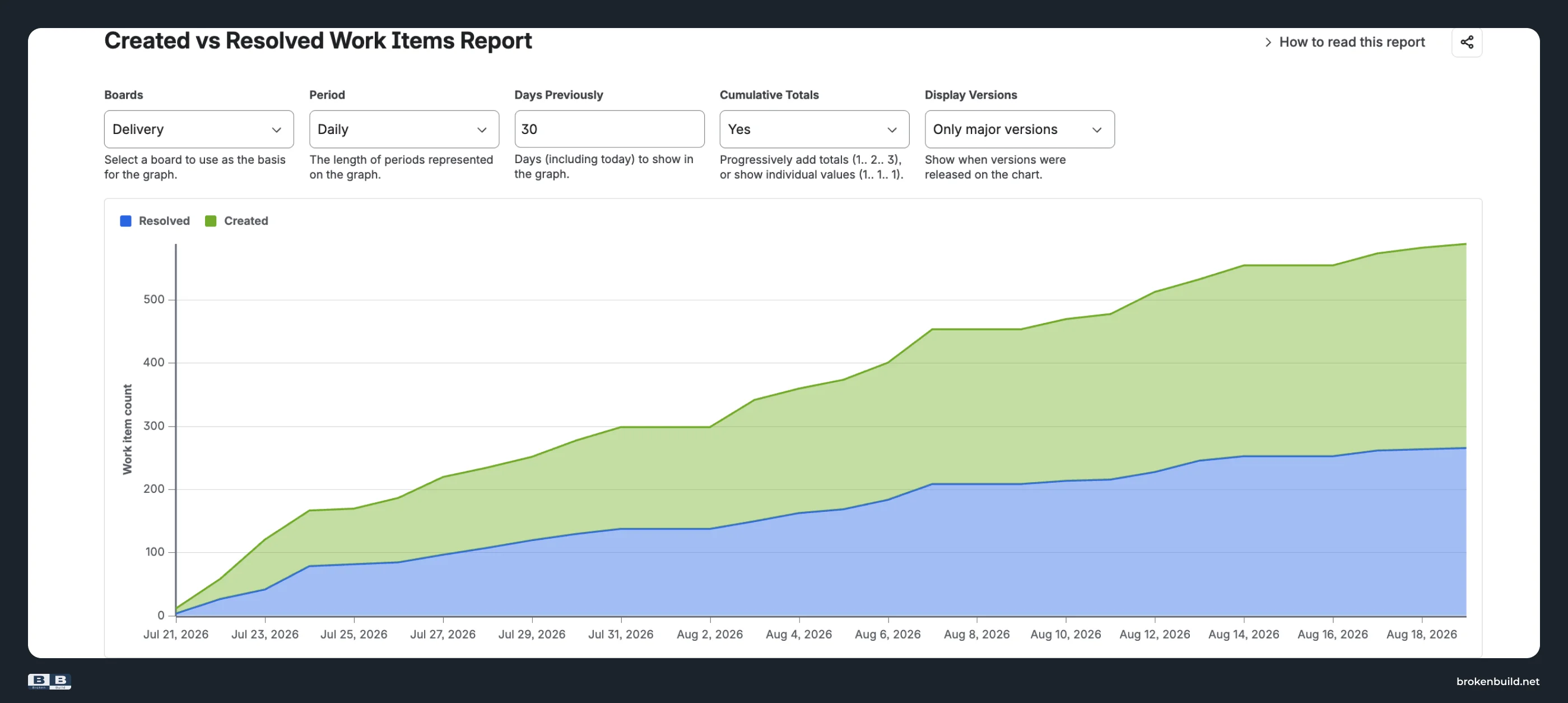
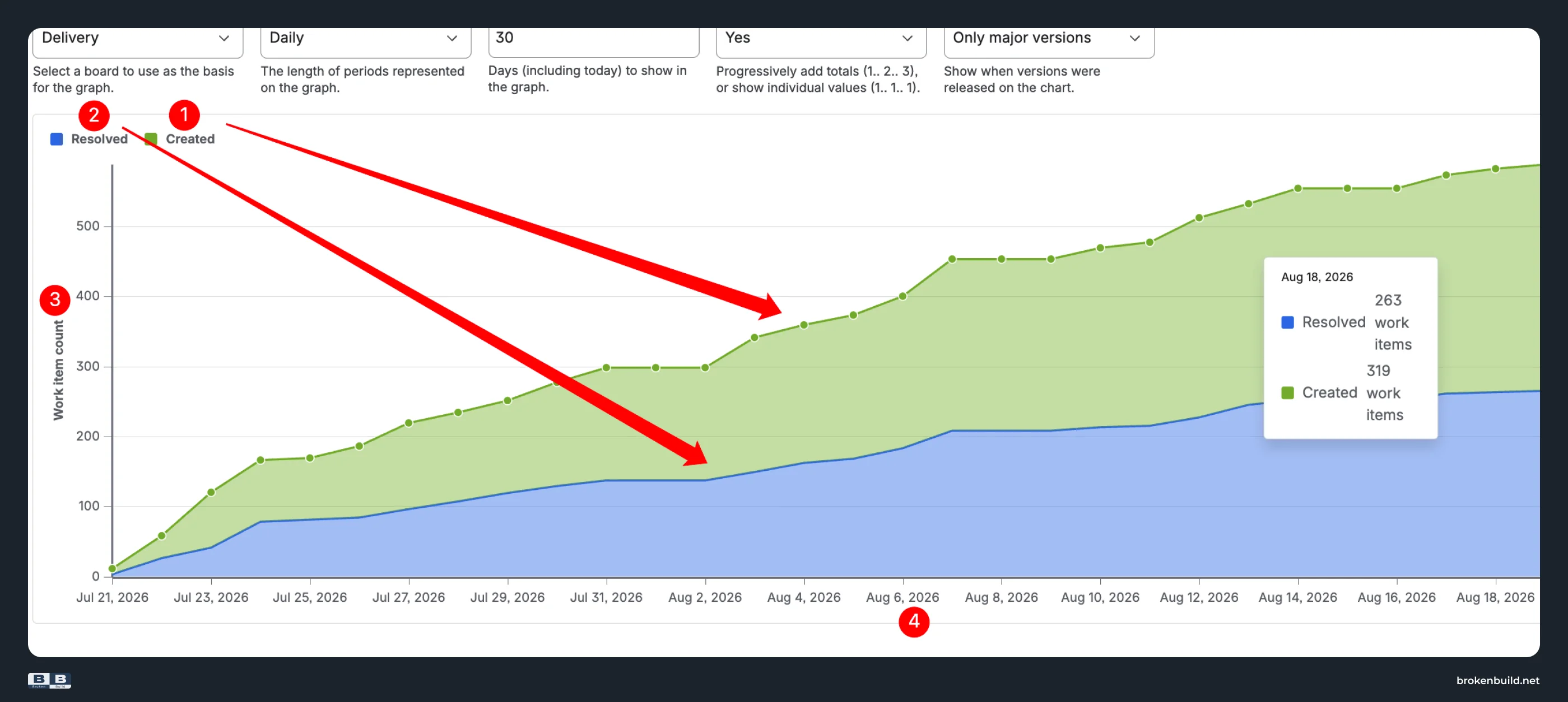
The chart shows the number of work items created vs. the number of work items resolved during the given period. Two overlapping areas on a shared timeline – the green area shows work items created; the blue area shows work items resolved. As the gap between them widens, the backlog grows. When they converge, the team is catching up.
How to read the Created vs Resolved report in Jira
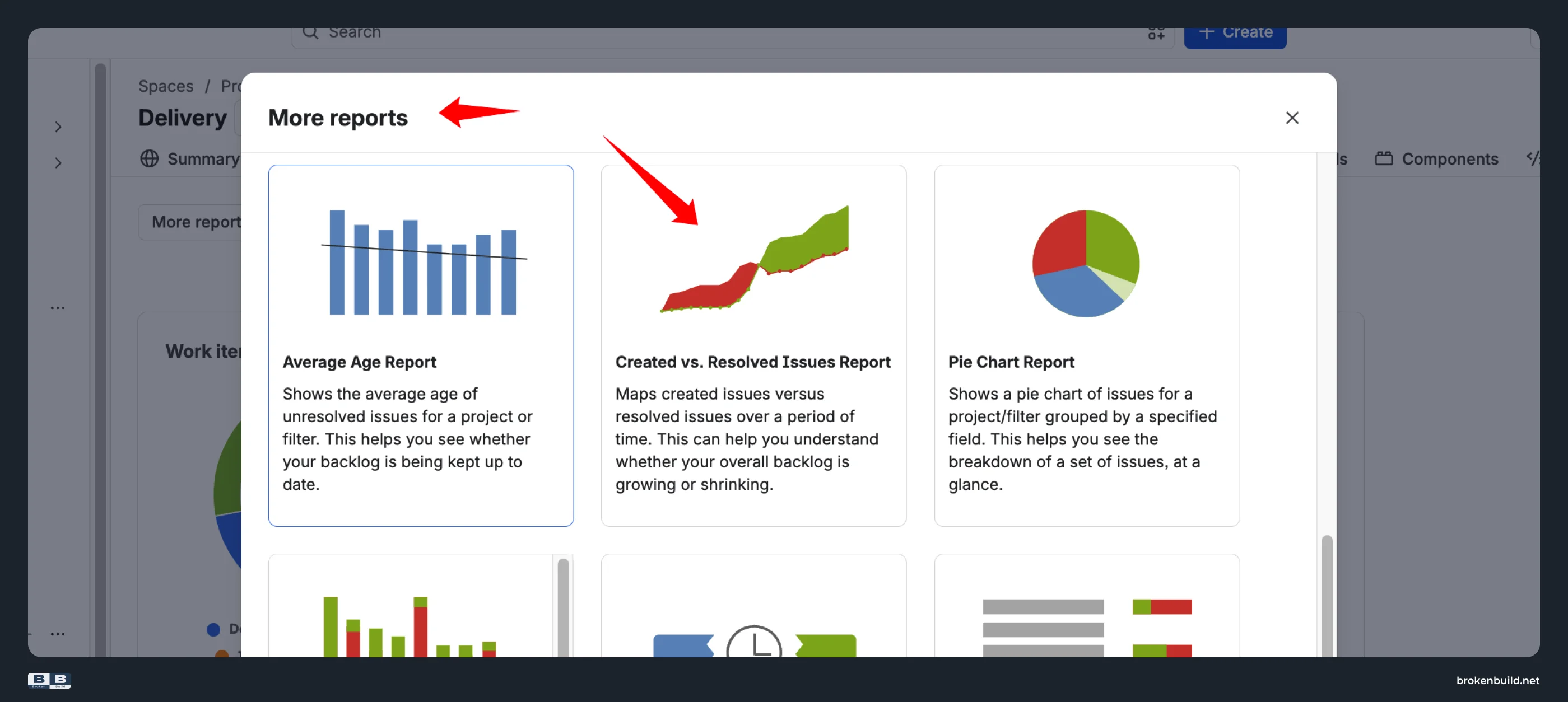
Open any project in Jira and navigate to Project → Reports → Created vs Resolved Work Items Report.
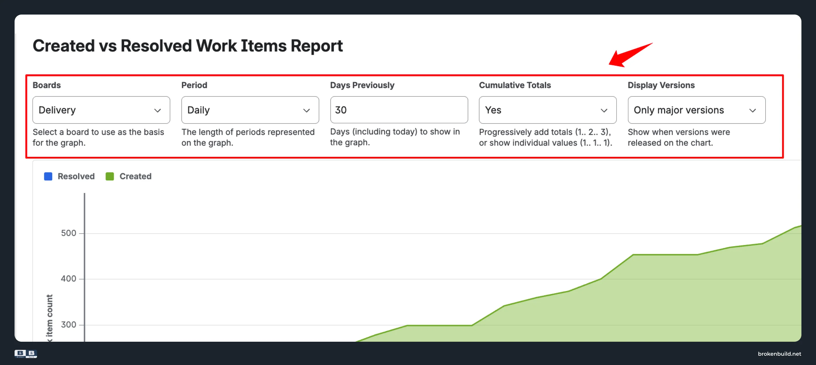
Configuration options
- Boards – select a board to use as the basis for the graph (one board at a time).
- Period – Hourly, Daily, Weekly, Monthly, Quarterly, or Yearly grouping.
- Days Previously – number of days (including today) to show in the graph.
- Cumulative Totals – Yes progressively adds totals (1.. 2.. 3); No shows individual values per period (1.. 1.. 1).
- Display Versions – overlay when fix versions were released (All versions, Only major versions, or None).
What you see on the chart
- Created (green area) – work items created in each period.
- Resolved (blue area) – work items resolved in each period.
- Y-axis – Work item count.
- X-axis – Time periods based on your Period and Days Previously settings.
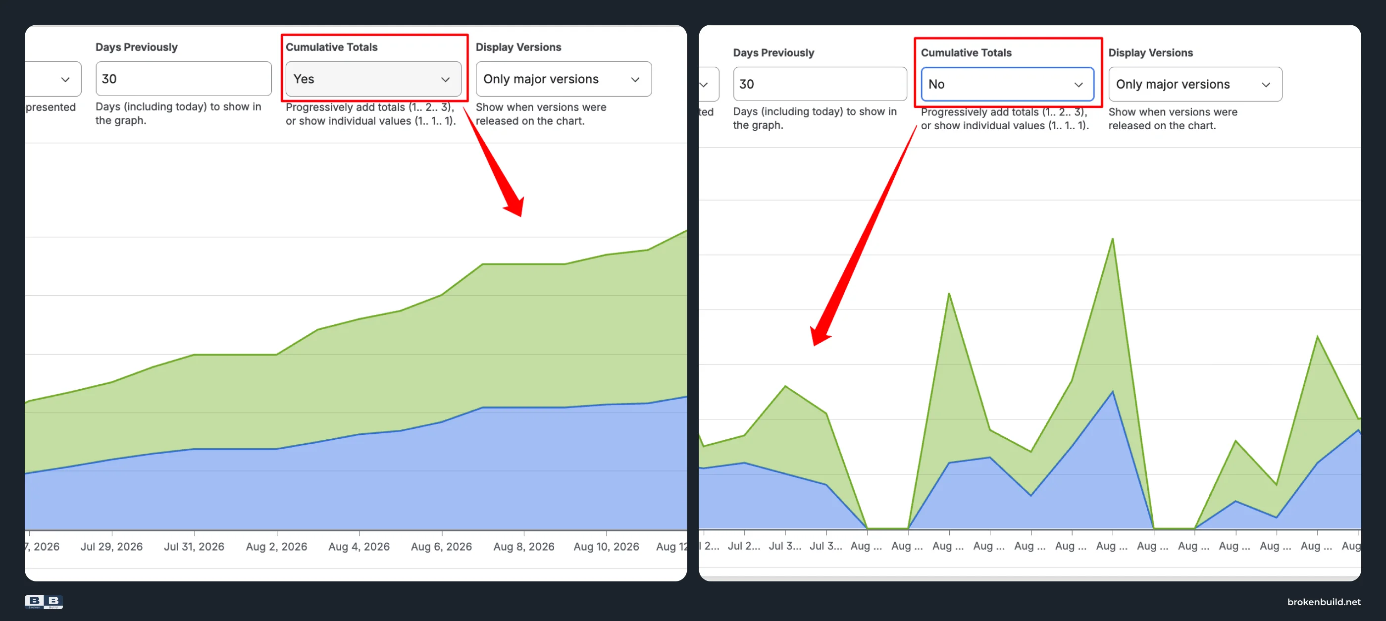
With Cumulative Totals: Yes, the areas show running totals – the gap between green and blue is your current backlog size. With Cumulative Totals: No, the areas show per-period counts – useful for spotting daily or weekly spikes.
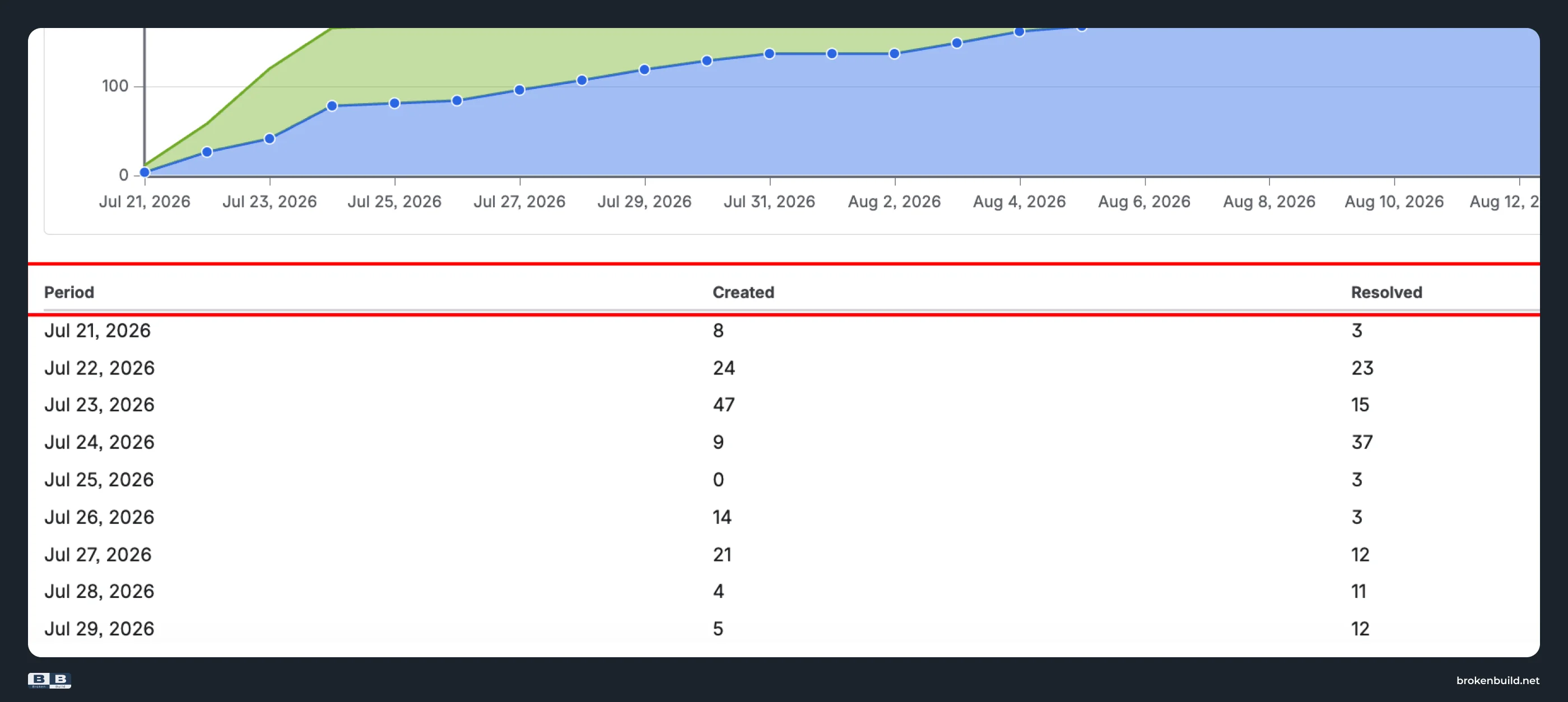
Data table below the chart
A table lists each period with exact Created and Resolved counts – useful for drilling into specific dates.
Patterns to watch for
- Gap widening (cumulative view) – created outpacing resolved, backlog growing.
- Gap narrowing (cumulative view) – team catching up, backlog shrinking.
- Green spike (per-period view) – sudden intake surge (new feature request, bug flood after release).
- Flat blue – team blocked or pulled elsewhere.
Where the native Created vs Resolved report falls short – and what to use instead
The native Created vs Resolved report covers the basics for a single board's backlog balance. Beyond that, it stops.
Agile Created Resolved Charts by Broken Build picks up where the native stops. It offers two complementary views:
- By period – bar or line chart showing Created vs Resolved per time interval. Spot spikes, compare periods, see whether intake or delivery varies.
- Cumulative – running totals over time. The gap between Created and Resolved is your backlog – watch it grow, shrink, or stabilize.
Both views share the same configuration: data source, arrival/departure events, estimation field, filters, and breakdown. Switch between them to answer different questions on the same dataset.
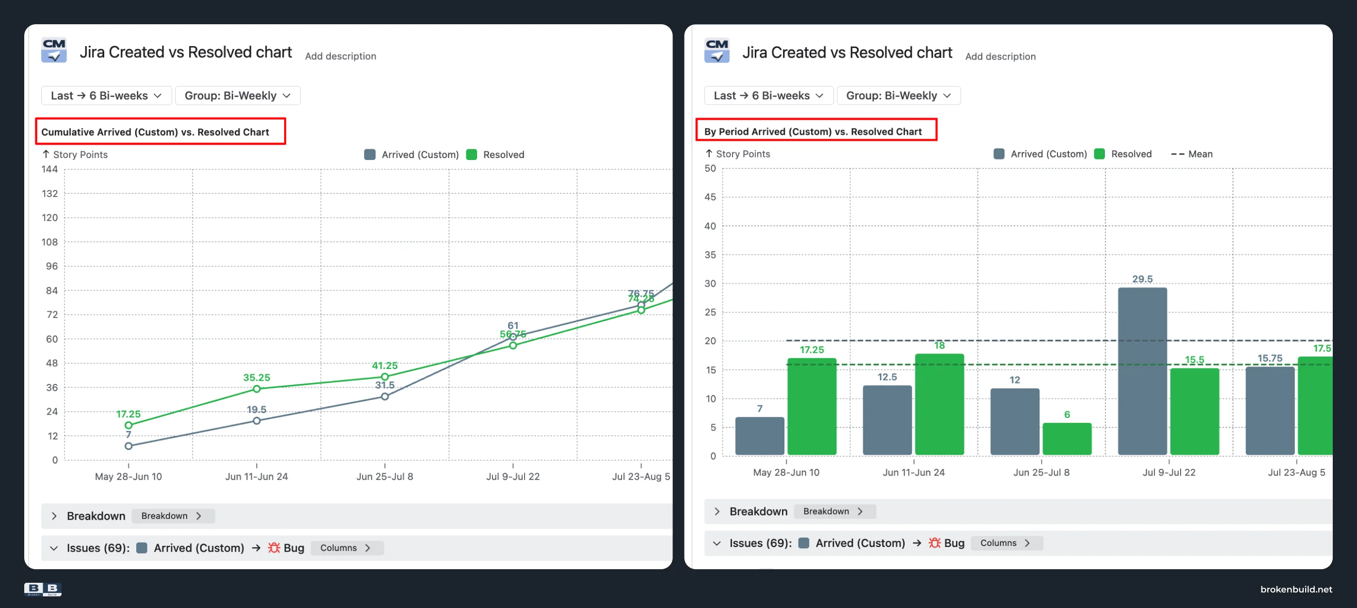
Each subsection below pairs a confirmed native limitation with how Agile Created Resolved Charts addresses it.
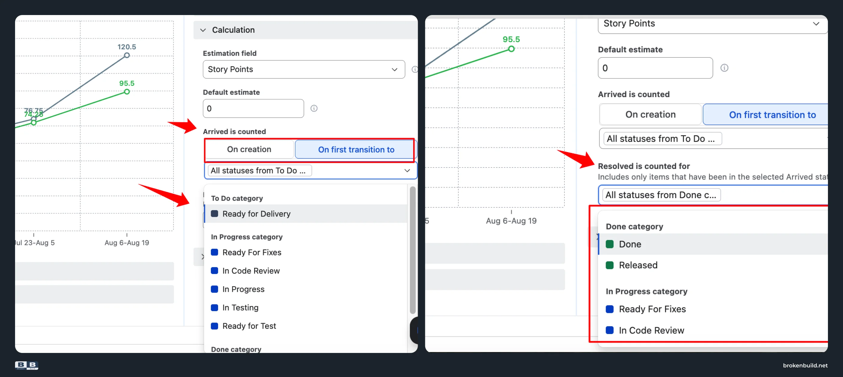
1️⃣ Create and resolve only → any two workflow stages
Native: The chart is locked to two events: issue creation date and resolution date. You cannot track whether dev is keeping up with triage, whether QA is keeping up with dev, or whether shipping is keeping up with QA.
Agile Created Resolved Charts: Define "arrived" as issue creation OR first transition to a specific status (e.g. "In Progress", "Ready for Dev"). Define "resolved" as any set of statuses you choose.
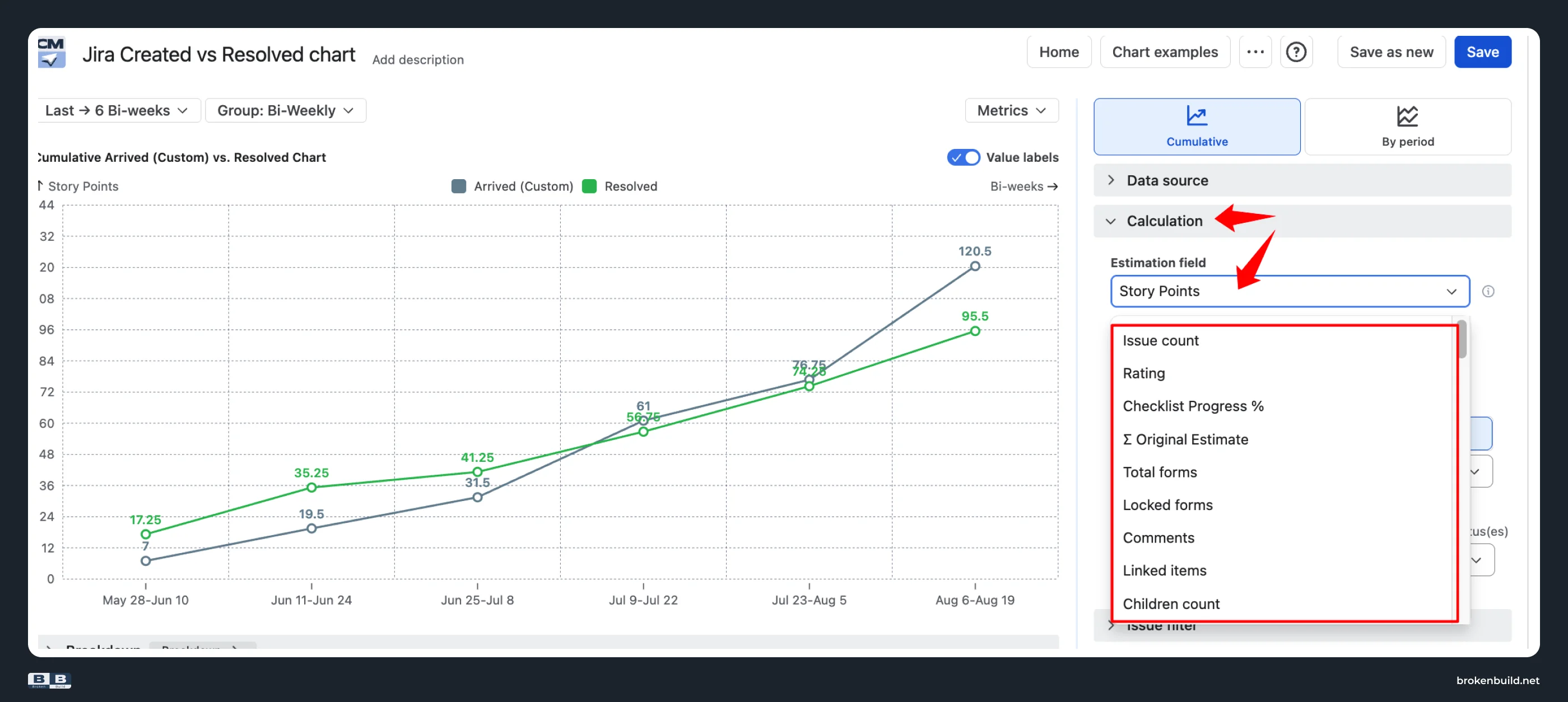
2️⃣ Work-item count only → estimation choice
Native: The Y-axis is work-item count only. A 1-point bug and a 13-point feature count equally. You cannot compare story-point demand against story-point delivery.
Agile Created Resolved Charts: Switch the Y-axis to story points, original estimate, time spent, or any custom numeric field – so you can compare story-point demand against story-point delivery.
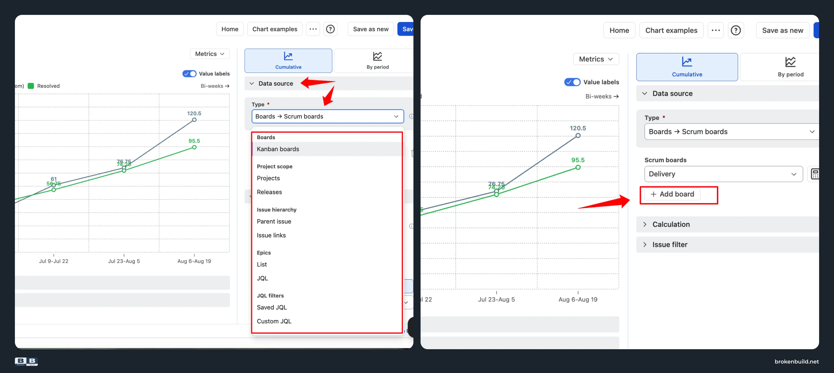
3️⃣ One board → any scope
Native: The board dropdown accepts one board at a time. No multi-board, cross-project, release-scoped, initiative, epic, filter, or JQL aggregation.
Agile Created Resolved Charts: Works on Scrum boards, Kanban boards, projects, releases, initiatives, epics, saved filters, and custom JQL – and combinations of them.
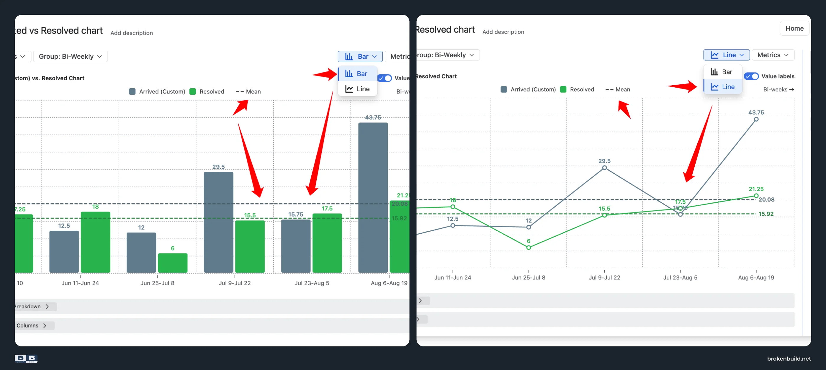
4️⃣ Fixed area chart → bar or line with mean reference lines
Native: One fixed area chart. No average or median reference lines for created or resolved rates.
Agile Created Resolved Charts: Choose a bar chart for side-by-side comparison, or a line chart for trend view. Overlay a mean line on each series to answer "are we above or below our typical rate?" at a glance.
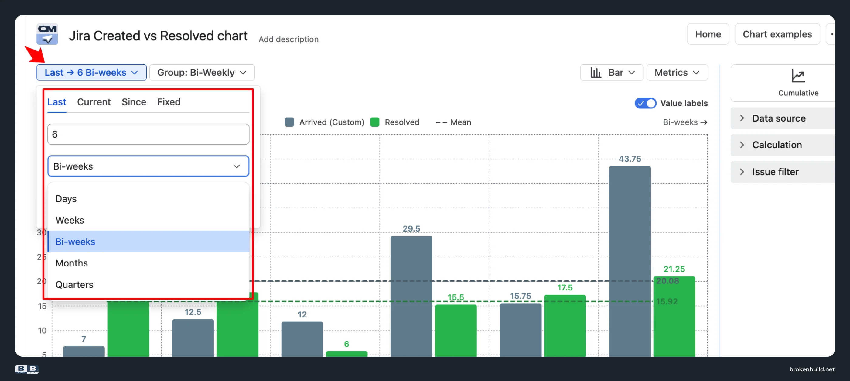
5️⃣ Days previously → flexible date range
Native: Date range is "Days Previously" – a fixed number of days counting back from today. No way to set a specific start date, compare specific quarters, or anchor to sprints.
Agile Created Resolved Charts: Four date range modes – Last X periods, Current period, Since a specific date, or Fixed date range. Period units include Bi-weeks and Sprints in addition to standard calendar intervals.
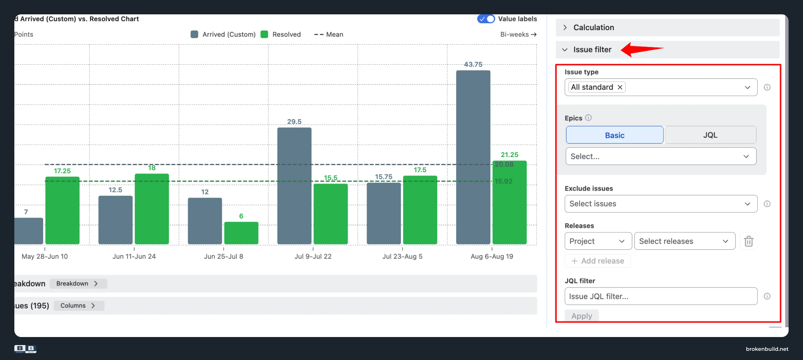
6️⃣ Board filter only → flexible issue filter
Native: The chart only counts what's on the board's saved filter. No additional filtering.
Agile Created Resolved Charts: Filter by issue types, by specific epics, by releases across projects, or by custom JQL.
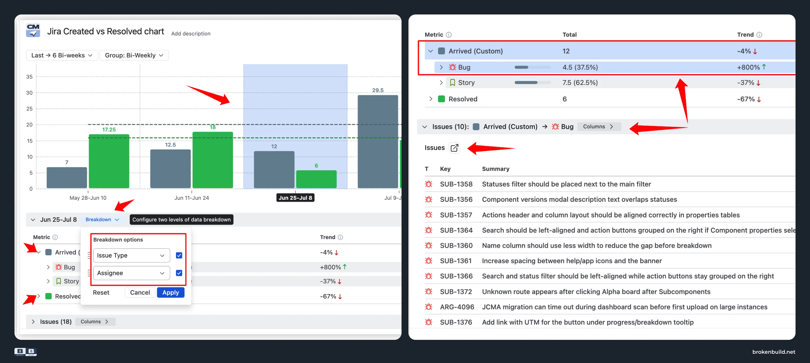
7️⃣ Gap without cause → drill-down that answers "why?"
Native: No breakdown by issue type, priority, epic, assignee, or component. No issue list. The chart shows the gap but not its cause.
Agile Created Resolved Charts: Break the chart down by any Jira field (up to two nesting levels) – so a widening gap turns into "it's a bug influx on one epic" or "one team's throughput dropped last week." Integrated issue list lets you click any data point to see the exact work items.
8️⃣ Reports tab only → lives where your team works
Native: The chart lives on the project's Reports tab. No dashboard gadget. No Confluence embed.
Agile Created Resolved Charts: Dashboard gadget for Jira dashboards. Confluence embedding via Smart Links – filters, grouping, and calculations stay editable inside Confluence. CSV, PNG, and PDF export.
Native vs Agile Created vs. Resolved Charts at a glance
.webp)
Do you need more than native?
If you answer yes to any of these, the native report cannot help:
- Do you need to track flow between workflow stages, not just create-and-resolve?
- Do you need to measure in story points or time, not just issue count?
- Do you need a cross-project or program-level view?
- Do you need to know which epic, team, or issue type is driving the imbalance?
- Do you need the chart on a dashboard or Confluence page?



Agile Reports and Gadgets bundle
Agile Created Resolved Charts is also available as part of Agile Reports and Gadgets – a bundle of nine agile charts covering velocity, burnup/burndown, cycle time, cumulative flow, and more. If your team needs reporting beyond Created vs Resolved, the bundle is the faster path.
Try the interactive examples
See Agile Created Resolved Charts in action on live datasets – no installation needed.
- Cumulative Created vs Resolved chart
- Created vs. Resolved by period chart
- Scrum Created vs. Resolved chart
- Kanban Created vs. Resolved chart
When native is enough – and when it is not
The native Created vs Resolved report does one job well: showing whether work items are resolved as fast as they're created on a single board. If your team runs a stable workflow with fixed scope and just needs a quick balance check, it works.
The moment you need to answer harder questions (is dev keeping up with triage, is QA keeping up with dev, what is driving the growing backlog, how does this look across the program), native stops. It cannot track workflow stages, measure in story points, scope beyond one board, break down results, or live outside the Reports tab.
Agile Created Resolved Charts picks up where native stops: any workflow stage, any estimation field, any scope, breakdown by any Jira field, and interactive embedding in dashboards and Confluence pages.




.png)