

Native Jira's Burnup Chart shows the plan on one Scrum sprint. Broken Build's Agile Burnup Burndown Charts shows whether you'll hit it – on any scope you want to track.
What is a burnup chart?
Atlassian defines the Jira burnup chart as "a visual representation of a sprint's completed work compared with its total scope." The vertical axis measures work – in story points, issue count, or estimates. The horizontal axis measures time.
Two lines rise over a timeline. The scope line tracks how much work exists. The completed-work line tracks how much is done. When they converge, the iteration is complete. If they diverge, more work is being added than finished.
Burnup vs burndown chart – when to use which
A burndown plots remaining work on a single line heading toward zero. A burnup shows two lines – completed work and total scope – rising independently.
The practical difference: a burndown hides scope changes. If the team completes 10 points and 10 new points are added, the burndown line stays flat. You cannot tell why. A burnup separates the two moves, so scope creep is visible the moment it happens.
Use a burndown when sprint scope is genuinely frozen and you only need to watch remaining work approach zero. Use a burnup when scope changes are likely – releases, epics, multi-sprint initiatives – and the team needs to see both signals.
The Scrum Guide names burnup charts alongside burndowns and cumulative flows as practices that "exist to forecast progress," while noting that "these do not replace the importance of empiricism." The implication: a burnup works best when teams actually inspect the two lines – not just glance at a single remaining-work slope.
How to read the burnup chart in Jira
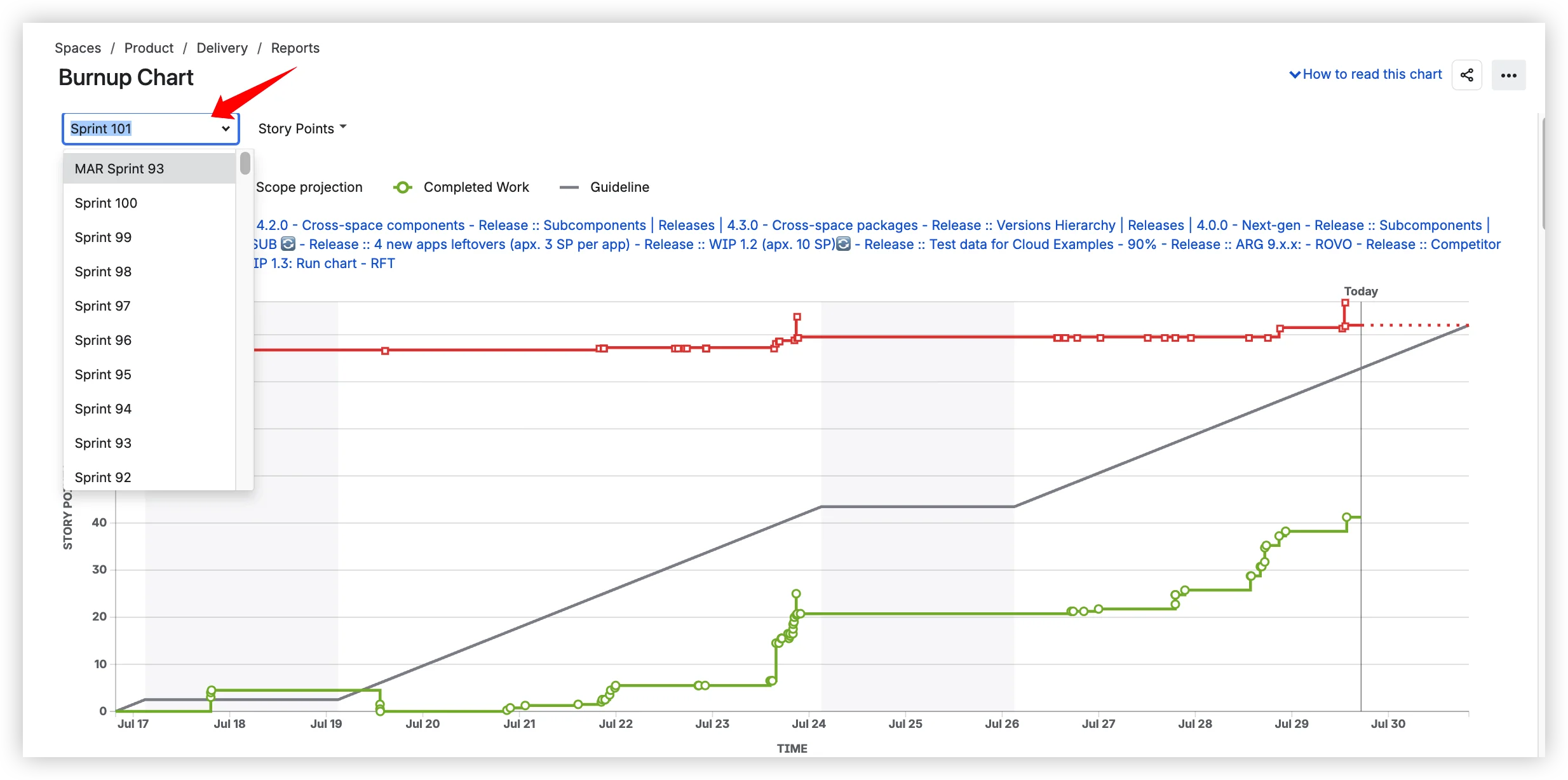
Open any Scrum board in Jira Cloud and navigate to Board → Reports → Burnup Chart. The chart is available on Scrum boards only. Select a sprint from the dropdown.

The chart plots three elements:
- Work scope (red line) – shows work planned for the sprint. If this line increases throughout the sprint, it signals scope creep.
- Completed work (green line) – shows work moved to "Done." The distance between Work scope and Completed work is the amount of work remaining.
- Guideline (gray dashed line) – Atlassian describes it as "an approximation of how your team should be progressing throughout the sprint to finish on time." It is not a velocity-based forecast – it is a straight-line approximation. There is a known accuracy problem when stories belong to multiple sprints: the Guideline may not reflect the correct progress because the same work gets counted in more than one context.
A fourth dashed line – a scope projection that extrapolates the scope trend forward – is visible in the Jira UI but is not covered in Atlassian's official documentation.
Patterns to watch for:
- Converging lines – completed work catching up with scope. Sprint is on track.
- Diverging lines – scope growing faster than completion. Sprint goal at risk.
- Flat completed-work line – team is blocked or pulled to other work.
- Scope drops – issues removed mid-sprint. Investigate: deliberate de-scope or data issue?
One important caveat: subtask data is excluded. Per Atlassian's documentation: "Story points on sub-tasks are not included in the Burnup chart."
Where the native burnup chart falls short – and what to use instead
The native burnup chart covers the basics for a single sprint. Beyond that, it stops. Each subsection below pairs a confirmed native limitation with the corresponding capability in Agile Burnup Burndown Charts by Broken Build.
Sprint-locked, Scrum-only scope → any data source
Native: The scope selector offers only a sprint on a Scrum board. Per Atlassian's docs: "The Burnup chart only applies to Scrum boards." There is no option for a release, epic, initiative, project, or JQL filter. No multi-sprint view. Kanban teams have no native burnup chart at all.
Agile Burnup Burndown Charts: Multiple data source types – Scrum boards, Kanban boards, projects, releases (cross-project), initiatives (three-level hierarchy), epics, and JQL filters. Multi-select supported. Kanban boards are a first-class data source with custom from-to column mapping. Historical multi-sprint views work out of the box.

Guideline is not a forecast → five forecast scenario types
Native: The Guideline is "an approximation of how your team should be progressing" – not a velocity-based forecast. The undocumented scope projection extrapolates the scope trend but does not forecast when completed work will catch up. Neither line can answer: when will we finish? What velocity do we need? What is the probability of on-time delivery?

Agile Burnup Burndown Charts: Multiple forecast scenario types, shown simultaneously:
- Default – three velocity scenarios (Max / Avg / Min) based on historical data, displayed at once
- Target velocity – what velocity does the team need to finish by a given date?
- Target date – at current velocity, when does the team finish?
- Velocity percentile – project at P50, P75, P85 of past velocities
- Monte Carlo – 100,000 simulations producing P50 / P80 / P95 probability lines
Layer as many scenarios on the same chart as the conversation needs.

Forecast fine-tuning: capacity allocation, alternative throughput, and scope growth modeling
Native Jira's Guideline assumes 100% team capacity and offers no way to adjust forecast inputs. Agile Burnup Burndown Charts gives you three tools to make forecasts match reality:
Capacity allocation coefficient. Model partial team assignment – e.g. 80% of team capacity on this scope. Real teams split time across multiple initiatives, support, and tech debt. The coefficient adjusts all forecast scenarios accordingly.

Alternative throughput data. When the current scope does not have enough velocity history, base the forecast on data from a different team, board, project, or JQL scope. Useful for new initiatives or recently formed teams.
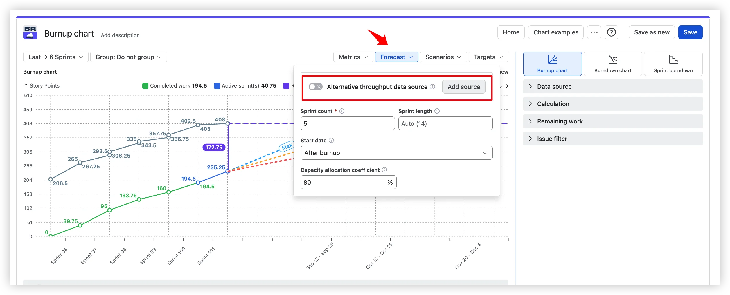
Scope growth modeling. Instead of native's single linear scope extrapolation, model expected scope growth into the future with your own configurable assumptions – so the forecast accounts for the backlog that will be added, not just the backlog that exists today.

Real progress tracking and drill-down that answers "why?"
Native: No health indicators. No breakdown by any dimension. No issue list. The chart tells you that you are behind but not why.
Agile Burnup Burndown Charts: Completed and Total-work lines plus the current Remaining value make burn pace and scope change visible at once. Health tiles above the chart give an instant read on:
- % completed – how far the team is
- Scope change – added and removed work, with a per-sprint average
- Un-estimated work – issues without estimates that skew the chart

Click any sprint or interval to open a breakdown by any Jira field (up to two nesting levels) – see which epic, assignee, or issue type is driving the delta between scope and completed. Integrated issue list with click-through, sort, and inline edit surfaces the specific tickets behind every point on the chart.

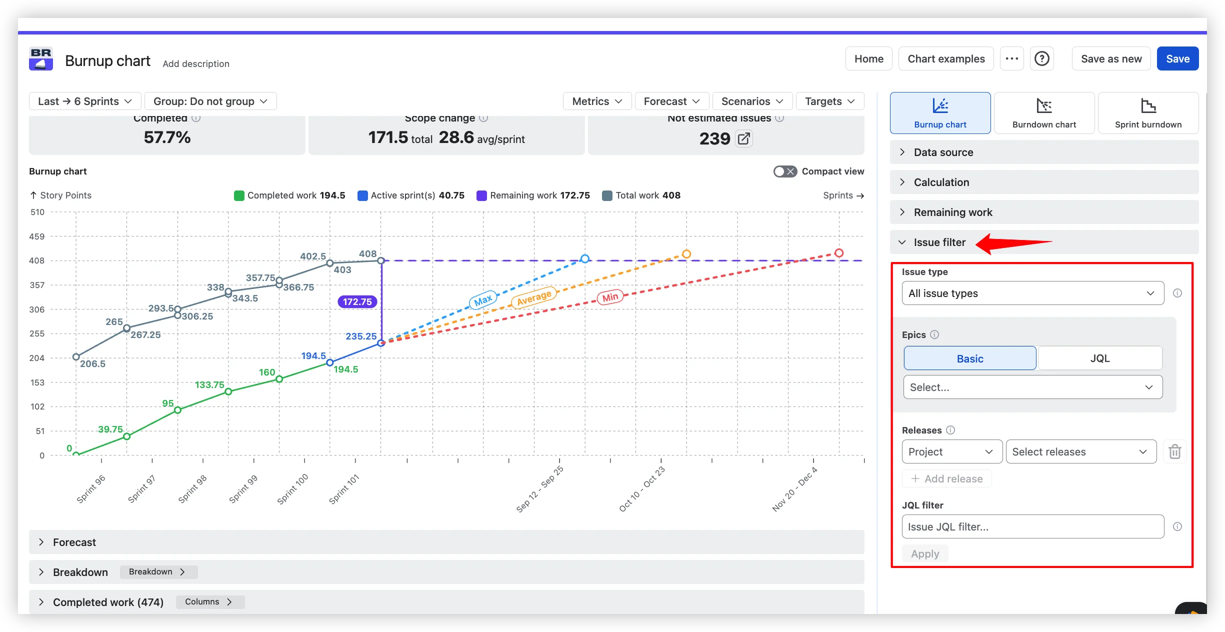
Subtask exclusion → flexible issue filter
Native: Subtask work is silently excluded from the burnup chart – "Story points on sub-tasks are not included." There is no way to change this behavior.
Agile Burnup Burndown Charts: You decide what counts. Filter the chart scope by issue types (any combination, including "all sub-tasks" as a single option), by specific epics, by releases across projects, or by custom JQL for full expressiveness – assignee, component, label, priority, and extended functions from apps like ScriptRunner. The chart shows exactly the scope your team actually plans against.
Limited estimation → flexible estimation
Native: Three estimation options – story points, work item count, or estimates. No custom numeric field support. No time tracking.
Agile Burnup Burndown Charts: Story points, Story point estimate, Original estimate, Issue count, Time spent and remaining time, or any custom numeric field. A default estimate fallback handles issues that have not been estimated yet.

Trapped on Reports tab → dashboard and Confluence
Native: The chart is available only on the Reports tab within a Scrum board. No dashboard gadget. No Confluence embed.
Agile Burnup Burndown Charts: Dashboard gadget for Jira dashboards. Confluence embedding via Smart Links – fully interactive, with settings, filters, and grouping editable inside Confluence. CSV, PNG, and PDF export.
No target overlay → targets on the chart
Native: No way to overlay target dates or milestones on the chart. Users must mentally compare the Guideline with their sprint end date.
Agile Burnup Burndown Charts: Vertical milestone lines with labels – release dates, PI objectives, customer commitments – directly on the burnup. Anyone reading the chart sees what "on time" means without switching views.

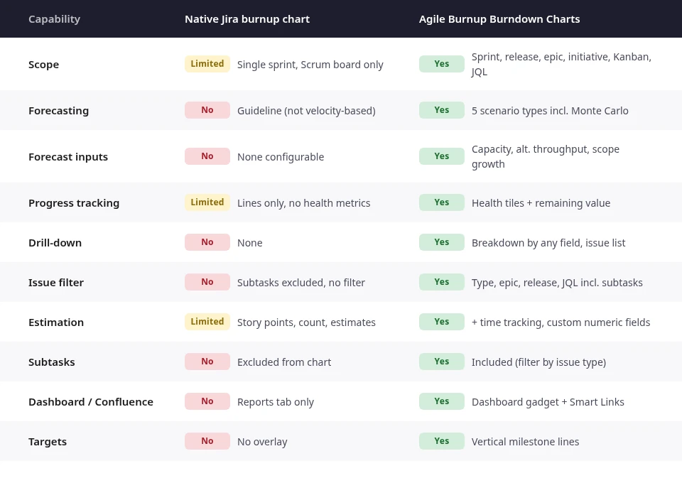
Native Jira vs Agile Burnup Burndown Charts at a glance
Do you need more than native?
If you answer yes to any of these, the native burnup chart cannot help:
- Do you need a burnup for a release, epic, or initiative?
- Do you need to know when you will finish – with a probability?
- Do you need to understand what is driving scope creep?
- Do you need a burnup on a dashboard or Confluence page?
- Does your team use Kanban?
Why not other alternatives?
Tempo's Custom Charts offers time-based burnup but lacks Monte Carlo forecasting and field-level breakdown. eazyBI can build burnup reports with MDX formulas but requires significant setup and a steep learning curve. StonikByte's Great Gadgets provides epic-level burnup with JQL filtering but has a narrower forecasting model. Agile Burnup Burndown Charts combines forecasting, scope flexibility, and drill-down in one purpose-built chart app.



Agile Reports and Gadgets bundle
Agile Burnup Burndown Charts is also available as part of Agile Reports and Gadgets – a bundle of nine agile charts covering velocity, cycle time, cumulative flow, and more. If your team needs reporting beyond burnup, the bundle is the faster path.
Try the interactive examples
See Agile Burnup Burndown Charts in action on live datasets – no installation needed. Each example opens a fully interactive chart: toggle data sources, add forecast scenarios, and click into intervals to see the drill-down.
- Release burnup chart – track progress and forecast remaining work across one or multiple projects with customizable velocity and scope scenarios.
- Epic burnup chart – track progress for one or more epics and model delivery scenarios with custom velocity, target date, or scope growth.
- Scrum burnup chart – track progress and forecast remaining work across one or multiple Scrum boards.
- Kanban burnup chart – the same burnup for continuous-flow teams, with throughput sampled per day or per week.
- Initiative burnup chart – real-time forecasting and backlog modeling for any Jira hierarchy.
- Cross-team burnup chart – track progress and forecast any work scope for multiple boards.
How to set up your first burnup chart
Follow along – install Agile Burnup Burndown Charts free →
- Install Agile Burnup Burndown Charts from Atlassian Marketplace. Free for teams up to 10.
- Open the chart: board or project → Apps → Agile Burnup Burndown Charts.
- Select a data source – sprint, release, epic, project, initiative, or JQL filter.
- Choose an estimation field – story points, issue count, time, or a custom numeric field.
- Customize forecasting – start with Default (three velocity scenarios), then add Monte Carlo.
- Set capacity allocation if the team splits time across multiple scopes.
- Add targets – release dates, PI deadlines, or customer commitments as vertical milestone lines.
- Open Breakdown – segment data by any issue field and drill down to Jira issues. Group by epic, assignee, or issue type to see what is driving progress or scope creep.
- Share – add the chart to a Jira dashboard as a gadget, or embed in Confluence via Smart Links.
When native is enough – and when it is not
The native Jira burnup chart does one job well: showing sprint progress on a Scrum board. If your team runs single sprints with frozen scope, it works. You see completed work rise, scope stay flat, and the sprint ends.
The moment you need to answer harder questions – when will we finish the release, what is driving scope creep, what is the probability of hitting the deadline, how does this look on a dashboard or in Confluence – native stops. It cannot scope beyond one sprint, forecast with real velocity data, break down results, include subtask work, or live outside the Reports tab.
Agile Burnup Burndown Charts picks up where native stops: any scope, five forecast types including Monte Carlo, real progress tracking with health tiles, drill-down by any field, flexible issue filtering, targets on the chart, and interactive embedding in dashboards and Confluence pages.




.png)